Tag: forecast

  • The Art of Hat Holding

    One nice thing about patterns is that they give you something to hang your hat on.  When we drew the Inverted Head & Shoulders Pattern on Jul 3 [see: Holiday Headfake] there was nothing in the news to suggest a 100-pt rally in the ensuing week.

    Yet, SPX and ES landed within a point or two or their IH&S targets yesterday all the same.  Likewise, all the news was rosy yesterday — incessant talk of renewed buyout fever and imminent, glowing earnings reports.Yet, completion of the pattern, combined with a channel midline, put a pause on the rally right where expected.  With its SMA200 now a mere 30 points below its 2.24 extension, SPX can backtest any time it likes with plenty of support around 2700.

    In fact, if ES is able to hold the (formerly broken) channel into which it reinserted itself, the damage would be limited to 20-30 points.

    One key: VIX.  So far, it has put the brakes on at a backtest of the recently broken straw-man trend line.  If it can remain below the red TL and the SMA200, and USDJPY keeps ramping, stocks will suffer a mild pullback.  If the coming drops in oil and gas get going, then SPX will do well to hold 2750 and, depending on the PPI/CPI numbers due out today and tomorrow, could test 2700 again.

    If we should dip below the SMA200 and 2.24 extension again, then it’s time to hold on to your hat.

    continued for members(more…)

  • Is Market Integrity Even a Thing Anymore?

    Want to know where markets are going?  Just check Facebook.  The stock, that is.

    As I pointed out in March [see: Facebook Flops] the stock is a very reliable indicator of overall market direction.  And, right now, it’s threatening new all-time highs.

    But, its accomplishment raises an important question: does it matter how the stock got to where it is?  What about market integrity and price discovery?  Do they matter?

    As we’ve discussed, each time FB tagged or dropped through its 200-DMA (the red line below,) the S&P 500 swooned — or even underwent a full-fledged correction.  The 2015-2016 correction is the most obvious.But, FB’s November 2016 dip was potentially more serious.  Not only did the stock drop through its 200-DMA, but it remained there long enough to produce a bearish death cross, where the 50-DMA crosses below the 200-DMA.

    The impending death cross could be seen a mile away.  So, after a week of the stock lingering below its 200-DMA, the FB board announced a $6 billion stock buyback plan.  The stock bounced a few times, finally clearing the 200-DMA on the very same day that the death cross occurred.  What better way to convince investors that the death cross wasn’t anything to be concerned about?

    Facebook doesn’t publish detailed transaction reports for stock buybacks; but, it seems likely that the shares purchased under the plan were timed to help the stock clear its 200-DMA.FB ran up to new highs, ignoring the 4.23 Fib extension as it had all the others.  A year later, however, it managed to drop back below its 200 DMA.   In the process, it completed a bearish Head & Shoulders pattern that targeted 133-140 — another 17-20% drop on top of the 13% it had already shed.

    After dropping through the neckline of the H&S Pattern, the stock couldn’t even manage a full backtest before plunging anew. The dreaded death cross occurred on April 13.  On the 25th, the company announced a $9 billion expansion of the stock repurchase plan.  This was particularly significant, as there was still $4 billion left over from the original $6 billion plan.

    The very next day, FB spiked up through its neckline and 200-DMA. Since then, it’s tacked on 25%.  Are any shareholders complaining?  Of course not.  Ditto for the many employees who own shares.  So, what’s the problem?  All’s well that ends well, right?

    I suspect most investors would agree with that sentiment.  There has been little outcry, even though 54% of corporate profits — over $5.1 trillion — has been dedicated to buybacks over the past 10 years.

    Prior to 1982, buybacks were prohibited.  They were considered a form of market manipulation. After passage of Rule 10b-18, however, corporations were offered a safe harbor as long as they met certain conditions.

    Supporters of buybacks say they are beneficial.  Over half of all Americans own stocks, even if indirectly through a 401(k.)

    Critics maintain that they are a financial engineering trick, inflating EPS even if profits aren’t actually growing.  Chrisopher Cole of Artemis Capital figures that 40% of EPS growth since 2009 is from share repurchases.

    NYU professor Edward Wolff says they benefit the rich more than anyone else, as the top 10% of households own 84% of all stocks.  Yale professor Robert Shiller calls buybacks “smoke and mirrors.”

    It’s safe to say that as long as corporate management can borrow money at historically low rates in order to drive their stock higher, the practice will continue.  But, it’s hard to look at a stock like FB without wondering whether market integrity is still a thing.


  • The Yield Curve: An Update

    Short and sweet this time…  Previous bounces off the 10s2s yield curve lows haven’t turned out that well for equities.

    related posts:

    Oil & Gas, Inflation and Interest Rates: Delicate Balance or Goal Seeking?
    Update on Bonds: Apr 27, 2018
    Does the Yield Curve Matter? A Closer Look

  • Update on Gold: Apr 11, 2018

    In our last major update [see: Jan 26 Update] we noted that gold, 1355 at the time, had reached the same price level at which it had frequently reversed.  Even though we’d had a bullseye at 1377-1380 for over a year, it had stopped short several times.

    GC is sitting just below the neckline of the huge IH&S that could result in a significant breakout.  The fly in the ointment: I don’t think TPTB will let it break out.  So, you should either take profits here in the 1348-1365 range, or at least set your stops at this level.

    As it happened, 1365 (reached the day before) was the cycle high.  Gold tumbled 4.1%, then bounced around between roughly 1308 and 1362 for the next two months.  Our interim posts caught most of the moves:

      * * *

    Feb 8: Analog Details  “[Gold] has dropped 4.1% since reversing where expected in late Jan, and just reached fanline and double channel support [1321.] Could it finally be ready to tag 1377-1380?”  Bottomed that day, rallied to 1364 over the following week (+2.51%.)

    Feb 15: Where to, Next?  “GC might have run out of steam here [1360.] Cautious types should consider taking profits, while the daredevils out there remain focused on 1380.” Topped out the following day at 1364 (+2.95%.)

    Feb 27: Powell’s French Toast   “Gold is getting clobbered…our analog suggests a Mar 1 turning point. The SMA100 should be around 1303 by then and would be a better bounce spot.”  Bottomed on Mar 1 at 1303.60 (+4.15%.)

    Mar 27: Algos to Markets – All Better  “GC, which tagged its 1362 resistance yet again, has retreated once more… It still has a good shot at 1380, but only if/when DXY finally breaks down.” Reached 1369.40 today (+5.05%.)

     * * *

    So, here we are, sitting on a tidy 14.7% gain.  It’s not terrible for 2 1/2 months work, considering gold has only netted a 0.9% gain during that period.  But, I hate to leave money on the table. Is it time to pull the plug on 1377-1380?  Or, are we about to reach or exceed it?

    continued for members

    The two major factors at work are the ongoing saga of the US dollar and the possibility of a shooting war with Russia in Syria.  I can’t speak to the question of a war other to say anything’s possible, especially with the crew currently running the ship.

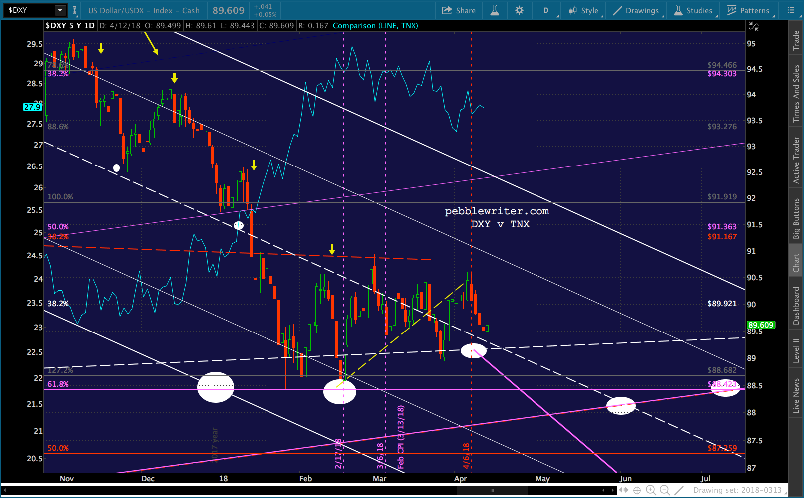
    The dollar is another matter.  While it normally rises and falls in sync with interest rates, this relationship reversed at the end of 2017.    At that point, DXY logged another leg lower while TNX spiked. At just shy of 3%, the TNX became a drag on equities — the whole “going broke” thing [see: Why Rising Rates Are a Problem This Time.]  But, as the gyrations in equities picked up again, great care was taken to ensure it didn’t plunge in value.

    I suppose the thinking was that lower rates would weaken the dollar’s appeal.  Or, maybe it was just fear of a yield curve inversion.  In any case, TNX’s purple TL has refused to break down. DXY also refuses to break down.  And, this could go on for quite a while.  It needs to tag the bottom of the rising purple channel.  But, until mid-July rolls around, that would mean dipping below the .618 at 88.423.  So, it’s quite possible TPTB will prop it up for another three months! 

    Remember, Mnuchin publicly stated he wants to support the USD.  And, it goes without saying that he, like every central banker, loathes any serious price appreciation in gold, as it undermines the value of the mighty dollar. One silver lining, EURUSD suggests a shorter timeframe, say Jun 5.  But, even two months would be a long time to wait for another few points.  An escalation in MENA tensions could obviously accelerate things.  But, is it worth taking the risk for 10-15 points?  I think not.  I’d pull the plug or at least enter stops here at 1367.  If it pops above 1380, great.  No argument with going long, again.  DXY could drop to 87 tomorrow, and GC could easily reach 1377-1380 or higher.

    But, if DXY continues sideways, and unless war breaks out in the next day or two, it seems likely that gold’s next move will be lower.  The most obvious support is at the rising white channel bottom and SMA100, currently around 1315.2-1318.  If the channel breaks down again, the SMA200 will reach the purple channel line later this month, probably around 1300.  I’ll update things if we see a material deviation in either direction.

    GLTA.


  • The Market’s Latest “Lucky” Bounce

    That’s a relief!  For months, pundits have been arguing whether the Fed needed to hike interest rates three times or four times this year — you know, because of all the growth coming down the pike.

    Fed Über-Dove and “Man Who Thinks Market Integrity is Overrated” Jim Bullard just announced that the correct number is zero.  That’s right.  Everything is perfect just like it is.

    Amazingly, and quite by coincidence, this pronouncement occurred on the exact same day that several stock market indices were in danger of falling below a very important technical level of support: their 200-day moving averages.  As we discussed on Monday, falling below the SMA200 isn’t usually very healthy for markets.

    For visitors and new members, this seems like a good time to take a walk down memory lane.  This isn’t Mr Bullard’s first rodeo.  Nor is it the first time “someone” did something clever to ensure the market’s continued ascent.

    The S&P 500 illustrates the phenomenon quite well, having experienced a number of such fortunate events at crucial times. October 2014 – Bullard!

    Bullard appeared on Bloomberg to explain that another round of QE might be in order. As “luck” would have it, this enabled SPX to reverse right as it reached important Fibonacci support, ending a 9.9% tumble and narrowly averting an official correction.

    Big assist from USDJPY, which soared 16% over the next 7 weeks in spite of the fact that more QE should have weakened the US dollar.  The Yen Carry Trade in all its glory.

    August 2015 – USDJPY!

    This 12.5% correction was set up by USDJPY falling back below a critical Fibonacci level (the .618 at 120.11) in the wake of SPX reaching a key Fibonacci extension (the 1.618 at 2138.)

    We had correctly forecast the top [see: The Last Big Butterfly] but it was unclear whether or not USDJPY could remain above 120.  SPX plummeted when 120 finally fell but, as “luck” would have it, was (temporarily) rescued by USDJPY’s bounce back above it.

    February 2016 – Oil!

    The price of West Texas Intermediate Oil (CL) had fallen 77% between Aug 2013 and Feb 2016.  While this crushed inflation to a manageable level, it made investors in and lenders to energy-related companies pretty nervous.

    As “luck” would have it, CL bottomed out on Feb 11, 2016 — the exact same day that SPX reached that critical Fibonacci support level of 1823.  CL doubled over the next four months, and SPX rebounded sharply.  By accurately forecast the bottom in oil, we could confidently call a bottom for SPX [see: USDJPY Finally Relents.]June 2016 – USDJPY!

    Stocks plunged in the wake of the Brexit vote.  As “luck” would have it, USDJPY — which had used CL’s rally as an opportunity to reset — picked this particular day to bottom out and spiked 8% higher over the following month.

    Futures had sold off by 6.5%, but by the time SPX opened the next morning the recovery was well underway.  It was soon back above its recent highs and the critical 1.618 extension at 1.618.  In other words: new all-time highs.

    November 2016 – Trump*!  Unfortunately for stocks, the US election results weren’t conducive to a rally.  Once Trump’s election became apparent, futures plummeted over 5% in a matter of hours.  SPX had bounced off its SMA200 a few days earlier.  Unless something was done quickly, it would drop through this key support the following morning.As “luck” would have it, USDJPY picked this particular day to bottom out.  It spiked 5% over the next few hours and 18% over the next few weeks — a supersized version of the exercise which had saved stocks post-Brexit.

    And, if that weren’t enough, VIX — the widely accepted indicator of fear and volatility — plummeted even as futures were plunging.  It’s the equivalent of calling your insurance broker to cancel your homeowner’s policy as a hurricane bears down on your beach house.  How very, very “lucky” indeed.Futures recovered almost all of their losses by the time the cash market opened the following morning. VIX went on to shed over 50% of its value and broke down through trend line support (above, the white arrow.)

    Stocks were soon registered new all-time highs. The talking heads called it the “Trump Rally” and attributed the gains to the incoming president’s pro-business orientation and deal-making acumen. But, I think it deserves an asterisk…on account of the incredible “luck” involved [see: Why the Trump Rally is a Fraud.]

    The SPX chart isn’t labeled as such, but the rise from 2138 to 2703 (the next major Fib level) wouldn’t have been possible without continued support from oil and VIX.  After doubling in value, CL proceeded to construct a well-formed rising channel (below, in purple) that was very supportive of stocks.  It oscillated between the channel’s top and bottom like clockwork — until December 2017.  We’ll come back to that.Also during that time, VIX was trying something new.  After years of occasionally bouncing off the bottom of a long-term channel (below, the yellow arrows) it decided to plunge below that channel bottom and spend 80% of its subsequent days in the cellar — reaching new all-time lows in the process.This sent a strong all-clear signal to stocks (or, at least the algos that trigger stock purchases) that the coast was clear. It was completely safe to buy stocks, which they did — producing a rally that accelerated all the way up to the 2.24 extension at 2703.

    December 2017 – Oil!

    At that point, oil’s breakout (remember the purple channel above?) and the onslaught of new, daily lows in VIX combined to give SPX the boost it needed to climb above that resistance.  I mean, how “lucky” can you get?  It popped above 2703 and tacked on another 6.3% for good measure.

    Unfortunately for stocks, though, there was a practical limit to how high CL could go without creating problems.  Someone had forgotten that higher oil prices mean higher inflation.  And, higher inflation means higher interest rates.  And, when you’re $21 trillion in debt and pass a tax bill and budget that greatly widen the deficit considerably…higher interest rates are not exactly lucky [see: Why Higher Interest Rates Are a Problem This Time.]

    Between that realization and a growing disconnect between price and supply & demand, CL had to drop.  When it did, and the (dashed, red) trend line from August 2017 finally broke down, stocks didn’t take it well.SPX plunged almost 12% over the next two weeks, one of the sharpest corrections ever.  Luckily, the SMA200 was there to catch it.  A few days later, CL popped back above its channel top and SPX recovered to back above 2703.

    As the bounce began to fade, we had a surprise message from Bullard that “too many rate hikes could slow the economy.”  It was enough to extend SPX’s bounce for another few weeks.  But, ultimately it slipped back down below 2703 to tag its SMA200 again.  And, again.  And, again.  And, again.

    By then, DJIA and RUT had finally risen to the point where they could tag their SMA200s as well.  SPX bounced at our 2561 target.  Investors were in luck!  Until this morning.

    April 2018 – Bullard!

    Apparently, someone forgot to explain to the Chinese that we were supposed to win the trade war (winning them is easy!)  This morning, we found out that China had the gall to fight back.  When I was woken by an price alert at 3:15 this morning, the futures were off 55 points.  SPX would open back below its SMA200.

    But, the futures didn’t know what they were up against!

    Then came Larry Kudlow, the guy who in May 2008 called the impending Great Financial Crisis a “non-recession recession.”  Some people might have misunderstood; but, obviously he meant it would be much worse than a recession.  (I can’t wait to find the pot of gold!)

    As “luck” would have it, the market was quite pleased with all this positive scuttlebutt.   ES, once down 55 points, closed up 34 points.  SPX and the Dow rose about 1%.  RUT added 1.30%.  And, COMP — which never did tag its SMA200 — popped 1.45%.  Take that, 200-day moving average!

    Bounces are nice, whether driven by oil, the USDJPY or Fed cheerleaders.  This one got SPX back above its SMA200, which is a good start.  Next comes the 2.24 Fib, which SPX has crossed some twenty times in the past two months.  Can it rise back above and stay there this time?

    Oil’s limitations haven’t disappeared.  Managing inflation and interest rate expectations will continue to dominate its price action.  Lately, the market has a very narrow range within which it feels comfortable.

    USJDPY is threatening to break out from a falling flag pattern, but one has to wonder why it hasn’t done so already.  Japan got no love from Trump in the trade war chatter to date.  It’s quite possible they’re done cooperating with currency intervention. VIX, after popping back above the yellow channel bottom in dramatic fashion in February, has fallen back to a trend line (red, dashed) from its January lows.  Every time it pops above the trend line, SPX stumbles.  Every time it drops below it, SPX rips.  Today, it tagged it and reversed lower – hence the day’s gains.  It has plenty of additional downside potential, with the potential to drive stocks back above 2700.  But, again, it hasn’t done so yet.

    It makes one wonder whether SPX will be allowed to put in a lower low in order to make the corrective wave look a little more conventional and give COMP a shot at its SMA200.  We have oodles and oodles of downside targets if SPX’s SMA200 should fail.  That white dot at 2138 in the chart above is there for a reason [see: More Where That Came From.]

    There are countless other factors I haven’t even mentioned: our yield curve model (which tentatively turned bullish today), 10yr note rates, the US dollar’s buoyancy, various momentum indicators, and the continuing sagas of FB, TSLA, AMZN and DB — all of which have played a role in the market’s gyrations (mostly of the bad luck variety.)

    Whatever happens, it’s hard to imagine we could reach new highs without plenty more luck.  Trade safe, and stay tuned.


  • Update on COMP: Mar 20, 2018

    Facebook is only 5.5% of the Nasdaq Composite (COMP), but yesterday’s plunge [see: Facebook Flops] was a good reminder to update our outlook.

    In our last update [see: Nov 6, 2017 Update] we identified 7619.37 as our next upside target.

    At this point, it’s pushing into the top quadrant of the rising white channel where it will soon reach the top of the rising purple channel — currently at 7260.

    It probably won’t stop there, though, as the 1.618 and the rising white channel intersect at 7619.37 at the end of the year. It’s too convenient a target to ignore. And, I fully expect it to reach it unless we get a nasty surprise on the geopolitical front.

    As it happened, COMP’s tag of 7619 was delayed by the February correction. It topped out last week and has since retreated 352 points — about 4.5%.  Since COMP reached its important 1.618 Fibonacci extension and the top of a well-formed channel, it’s fair to ask whether there’s more downside ahead.

    continued for members(more…)

  • Facebook Flops

    Everyone’s asking about Facebook, today.  The stock, off as much as 8% earlier, is currently down 6.5%.  It has the dubious honor of leading the FAANG stocks on a pretty rough day.

    The last time I devoted a post to FB was over five years ago on Jan 16, 2013 [see: Should We “Like” Facebook?]  The stock had recently reached 32.21, retracing about half of its tumble from 45 to 17.55.

    Fun fact from the post before that one, on Oct 24, 2012: none other than Donald Trump had been touting the stock, repeating 5-6 times during a radio interview that he’d amassed a large position.  That day the stock gapped from 19.5 to 24.13, a 24% pop.  It’s interesting that Donald Trump and Facebook are back in the news together today…

    But, I digress.  Some key highlights from the 2013 post:

    The stock has retraced about half the losses since its 45 high…Unfortunately, it’s also traced out a Rising Wedge — not to mention a Bat Pattern from its June highs (the purple Fibs above.)

    As such, it is likely to weaken considerably here — with a drop to at least the bottom of the rising wedge — currently at 27.75 or so.  Often, this results in a new channel [the midline of which] is at 27 (a 10% drop from current prices), and the bottom is way down at 22.75.  Bottom line, the road ahead should be very bumpy.

    As it turned out, FB eeked out a slightly higher high, reaching 32.51.  From there, it was a slow, painful decline to the channel bottom at 22.67 — a nice 30% shorting opportunity that was marked by heavy insider selling.

    It bottomed there, spending six weeks below its 200-day moving average before finally breaking out.  It was back above 45 four months later.That was the end of 2013, when the market became “the market” and BTFD went from a cute acronym to a legitimate portfolio management strategy.  All the while, FB has continued to ratchet higher, gapping up through successive Fib levels and occasionally bothering to backtest them.

    Interestingly, it still pays a great deal of attention to its 200-day moving average.  After breaking out in July 2013, it didn’t test it again until May 2015, when SPX topped out.

    FB bounced and made new highs, but was back below the SMA200 three months later when SPX plunged 12.5% from 2138, an important Fib level.  It only spent a day below the SMA200, but it was a memorable intraday dip of 16.3%.FB next dipped below the SMA200 in January 2016, when SPX repeated its swan dive — this time plummeting 14.5%.  Again, FB recovered intraday.  And, again, SPX recovered fairly quickly.

    The next trip below the SMA200 didn’t go quite so smoothly.  It was in the wake of the 2016 US election, when stocks in general needed a great deal of support.  FB fell below its SMA200 on Nov 10 and didn’t recover recover until Jan 6.

    As we’ve documented elsewhere, this was a dangerous time for stocks.  COMP, in particular, was really struggling to break out from an octo-top [see: Update on COMP, Oct 2, 2016.]  If FB couldn’t break higher, COMP stood little chance.

    Quite by coincidence (not!) Facebook’s board decided this would be an excellent time to announce its first-ever stock buyback plan.  The plan was announced on Nov 18 and allocated $6 billion for purchases beginning in the new year. Needless to say, the stock took off at the start of the new year.  By Feb 1, it had gained nearly 70%.

    I won’t go into the heavily-debated fundamental justification for the rise.  Others have done it well and, in the opinion of many, the stock remains quite overpriced.  The latest news throws more cold water on the fundamental story.

    It also puts the stock back in an interesting technical position: testing its SMA200 again (tagged it on Feb 9, too.)Many other views confirm the fact that FB is in a tenuous position.  It’s extending below its bottom Bollinger Band; it’s very near RSI support which, if broken, would be quite bearish; and, it’s MACD is close to rolling over.

    SMA200s have been excellent buying opportunities in the past.  The stock appreciated 680% from its 2013 tag, 171% since its 2015 tag, 117% since its Jan 2016 tag, and 73% since its Nov 2016 tag.  It’s obvious that buying the SMA200 dip was an extremely successful strategy, especially when the company’s billions were used to ensure a bounce.

    Think I’m being cynical?  At today’s close, the 200-day average stood at 172.54.  The stock itself closed at 172.56.  Probably not a coincidence.

    As we know, all patterns work forever… until they don’t.  If FB can recover quickly from this debacle, the next upside target is 205.69, a nifty 19% return.  If it can’t, the closest support is a channel line at 163-165, followed by the nearest Fib extension at 133.83.  Ouch.

    For my money, the stock is expensive regardless of which way it goes.  And, I just plain don’t trust companies where the revenue model is built on what many people smarter than me consider smoke and mirrors.

    Then, there’s the fact that COMP recently tagged our upside target: the 1.618 extension of its drop from its 2000 highs to its 2002 lows [see: Nov 6, 2017 Update on COMP.]  This has been a long time coming (SPX tagged its in 2015) and could represent serious overhead resistance.So, if you’re dying to take a flyer on FB, just keep an eye on its 200-day moving average.  It makes an excellent line in the sand at a time when many of our indices, currency pairs and commodities are in a precarious position.

    GLTA.

     *  *  *

    UPDATE:  Mar 20, 12:50 PM

    FB held its SMA200 yesterday, but fell through it this morning.  It dropped to the support we discussed yesterday.  Again, if the white channel line doesn’t hold, it’s susceptible to another 18.5% drop to the 4.236 Fib extension and channel midline at 133.83.

  • RUT: How it Got Here, Where it’s Going

    About a month ago, as part of the series of charts inspired by our latest analog [see: Analog Details Feb 7, 2018] I hazarded a forecast for RUT that called for a rebound to the rising white channel (which had recently broken down) by Feb 14, a retracement on Mar 1, and a subsequent rally back into the rising white channel. The only serious uncertainty at the time was whether ES’ tag of its SMA200 was sufficient — or whether SPX would need to follow suit.

    In any case, SPX did go on to tag its own SMA200 the following day, meaning RUT posted a slightly lower low before rebounding.  It reached the white channel on Feb 14 as expected, but continued leaking higher for several days before putting in a low as scheduled on Mar 1.Since then, it has nonchalantly rejoined the rising white channel as though nothing was ever wrong.  It has done this many times in the past, of course.  So, that’s not terribly noteworthy.

    What is interesting is that the Feb 9 plunge facilitated an important backtest that should help determine whether it has further upside ahead.  What’s fascinating is the extent to which nearly every one of RUT’s twists and turns has been driven by algos.

    The precision of these moves leaves little doubt that they’re by design.  No random walk, here.

    continued for members(more…)

  • Does the Yield Curve Matter? A Closer Look

    I called a top in SPX on May 20, 2015 [see: The Last Big Butterfly] because it was about to reach the 1.618 Fib extension at 2138 — our upside target from way back in 2012.  SPX peaked the following day and fell over 300 points before it was all over.

    What I didn’t notice at the time was the bond market. We’ve focused on this from time to time, most recently on Dec 29 [see: Should You Fear the Yield Curve?]  We noted at the time that while the spread between 10Y and 2Y was dropping rapidly, it only represented a warning unless it bottomed out and rose rapidly.  From that post:

    …the above shows that while the potential is there for a recession, this is just an early warning at this time. If the yield curve bottoms out here and rapidly steepens, we’ll have a lot more to worry about.

    Two sessions later, the spread did bottom out, and has been on a tear ever since.  What does this mean?  Let’s look at how things unfolded in the past.

    The spread had been tightening since Dec 31, 2013.  It bottomed in Feb 2015 and began rising again.  In early May, it broke above a trend line (red, dashed) connecting its highs.

    About the same time that SPX was peaking, it backtested that TL and continued higher.  It broke trend (purple, dashed) around Jul 31, a few days before SPX fell off a cliff.  It broke down to new lows (the red, dotted line) in Jan 2016, about the same time that SPX bottomed out.What the yield curve said, then, in simple terms:

    – a breakout from the downtrend marked an equity top (bearish)
    – a breakdown of the subsequent uptrend was really bearish
    – a break to new lows represented a potential bottom (bullish)

    Before I go any further, I want to point out that there were four significant bottoms in 2015-2016.  The first two came close to backtesting the 1.272 Fib at 1823, but didn’t quite make it.  The second two did.Now, let’s look at the same period, but comparing the 10Y (TNX) itself to SPX.  Note that SPX peaked shortly after TNX reached the falling red TL, and began having trouble once TNX broke out.

    SPX fell off its cliff when TNX fell back through the rising purple TL, making bottoms each time TNX did. On Jan 20, 2016, TNX tested its Aug and Sep lows, at which point SPX bottomed at 1812.  A week later, TNX plunged below the previous bottoms and didn’t bounce until it reached the Jan 2015 lows (dashed, purple line.)

    The message delivered by TNX was slightly different from the 10Y2Y:

    – rising up to tag the falling trend line represents a bearish turning point
    – breaking out above it is okay, as long as the uptrend continues
    – a breakdown of the subsequent rebound is really bearish
    – stocks won’t bottom until TNX does

    If we look at the chart below, we can see that the 10Y tracked the 10Y2Y quite closely until it diverged in late 2015 in a failed effort to support stock prices.  It didn’t provide decisive support until it bottomed in Feb 2016 at its Feb 2015 lows.  For a few brief days, the divergence disappeared.Why is this even remotely interesting, you might ask?

    As in 2015, we have also experienced a huge divergence between the 10Y2Y and the 10Y itself.  This is noteworthy in and of itself.But, the comparison gets even more interesting.   As in 2015, we have had an extended slump (14 months vs 17 in 2015), a breakout above the falling red trend line, and a backtest of the trend line.The big differences, so far, are that the spread hasn’t gone on to new highs and that the (presumed) low came as spreads were peaking and only two weeks (versus 8 months) following the peak.

    But, so far, the lessons from 2015 are holding.  The breakout above the falling red TL definitely produced a drop in stocks.  The backtest of the red TL has occurred, but it hasn’t quite reached the purple TL.  As long as it continues bouncing and doesn’t drop back through that TL, stocks should be able to continue rising.  The day it drops back through it, things could get nasty.

    Next, let’s look at the current TNX chart.  We could look at the drop since the Mar 2017 highs, but it was rather short-lived and the subsequent rebound has resembled a moon shot.  Instead, let’s look at the big picture.

    A trend line from the 2008 highs connected with the 2010, 2011 and 2017 highs.  After reversing at each, TNX was accompanied by a large drop in stocks.  TNX’s reversal from its 2013 highs never produced a stock selloff; but, then again, it didn’t quite reach the TL.

    Zooming in a little, we can see that TNX reached this trend line a couple of times in 2017: first, in March, when its reversal accompanied by a mild 78-pt drop in SPX, and again on Dec 20 in a reversal which never gathered any steam.  TNX was back to and punched through the TL on Jan 8.  It reached another TL (gray) drawn through other recent highs on Jan 22 at 26.65.  This was a potential top, meaning the bond folks breathed a sigh of relief.

    On Jan 26, however, it popped up through the gray trend line.  Not so coincidentally, that was the day that SPX peaked.Remember our lessons from TNX in 2015:

    1. reversing off the falling trend line represents a bearish turning point – it didn’t reverse

    2. breaking out above it is okay, as long as the uptrend continues – it did, but as it approached 3%, folks started getting nervous.

    3. a breakdown of the subsequent rebound is really bearish – we got a potential reversal at 29.43, but it has a long ways to go before reaching the rebound trend line, currently at 24.40.

    Interestingly, that TL intersects the falling red TL at about 24.60 on Mar 13, the day that CPI for February is reported.

    And this is where it gets interesting.  If TNX continues to rally, bond folks and equity folks will get nervous (the fiscal fiasco.)

    If it were to fall to the rising purple trend line and backtest the red trend line at 24.60, it might be somewhat bearish unless: (a) it reflects a big drop in inflation (in keeping with my oil and gas forecast) and (b) it rebounds there.

    If it fell below 24.60, the TNX lessons suggest that SPX would be in big trouble.  With a Fed meeting a week later, we can assume Powell et al would be focused on preventing that from happening.  But, as our analog suggests, this preceeds an important inflection point by just a few weeks.

    If TNX falls through 24.60, remember lesson 4…

    4.  stocks won’t bottom until TNX does

     *  *  *

    Now, onto our analog update. In our initial post and follow up from Feb 6-7 [see: Analog Watch], we anticipated SPX would rebound from 2533 (our downside target) to 2765 by Feb 14 and 2812 by Feb 23.  Instead, it bounced from 2532.69 to 2742 on Feb 16 and to 2789 — 23 points short and 4 days late — by Feb 27.

    An adjustment was clearly necessary, given that SPX and ES bottomed on different days.  We’ll try to reconcile the two, along with some economic forecasts which are definitely outside the norm.

    continued for members(more…)

  • A Break or a Breakdown?

    The 10Y yield has clearly broken trend as expected, with a couple of Fib tests the only things standing between it and our downside targets.  Our 28.56 upside target from Jan 10 [see: China – It’s Not Me, It’s You] has officially yielded. This is what stocks were waiting for — a sign that interest rates’ climb past 3% wasn’t as certain as most analysts suggested.  ES broke out of its slump and pressed on to new highs, finally joining SPX in regaining its 2.24 Fib extension.

    This leaves our analog on track with our next targets easily in reach.  It also confirms the time adjustment that was suggested by the most recent dip and the redrawing of VIX’s (and everything else’s) path for the next six weeks.

    continued for members(more…)