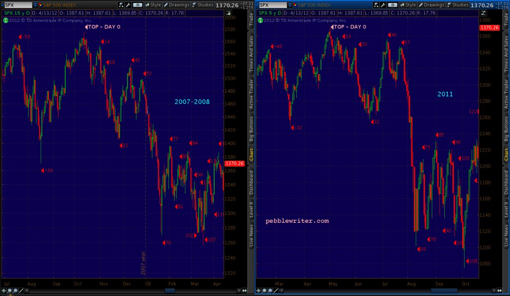
“The 1101 touch occurred 69 sessions after the May 2 high. In 2008, the equivalent bottom was 70 sessions after the Oct 11, 2007 high. The 2011 decline amounted to 19.6% from the high; in 2008 it was 19.4%. The 2007/8 total point loss of 306 points was very closely matched by 2011’s eventual loss of 296 points. And, the eventual low in 2011 came 108 sessions after the top; whereas, 2008’s came 107 sessions after the top.”
Why Do Analogs Work? Part 1. April 13, 2012
I received an excellent question from a reader this morning and found myself pouring a little more into the answer than usual. Maybe the answer — which swerves headlong into the issue of whether chart patterns work — deserves its own post.
The reader suggested that the Fukushima earthquake in Mar 2011 was the cause of the market’s decline and, since such a huge event was unlikely to repeat in our timeline, the current analog we’re following is unlikely to play out.
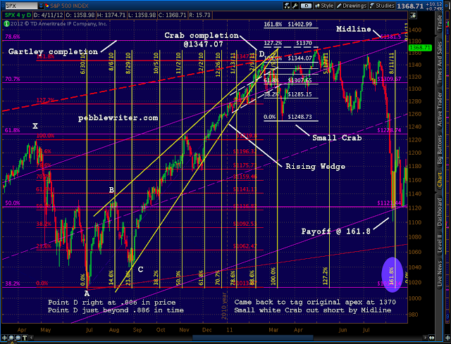
While the earthquake obviously helped the market along, SPX started down in February 2011 because: (1) it was very deep into a rising wedge; and, (2) it had completed a huge Crab pattern that started with the April 2010 sell-off; and, (3) it had just completed a H&S pattern. The following chart clearly shows all three patterns.
Before Fukushima came along…
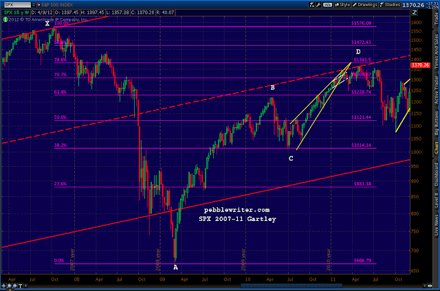
The apex of the rising wedge (solid, yellow) was around 1380 (the .786 of the huge Gartley Pattern set up by the 2007-2009 decline.) SPX had come .886 of the way in time and price towards the apex — very deep indeed.
From months earlier, the Crab pattern (red, with key points in white) had forecast 1348.89. We had reached 1344.07 and were already reversing as typically happens.
And, the Head & Shoulders pattern (dashed, white) had already completed. It targeted 1250, which is exactly where we were 8 sessions later.
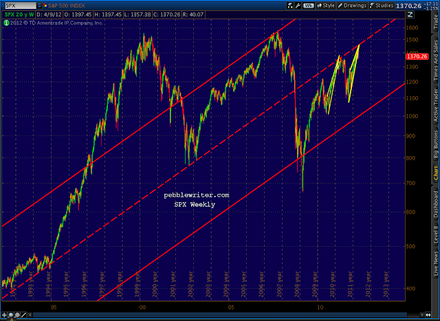
But, perhaps the strongest reason had SPX turned tail at 1344 was because it had just tagged a trendline (bold, red dashed) that dates all the way back to 1935. This TL is actually the midline of a channel that, with very few exceptions (mostly from 1997-2002) , has contained all the major market moves back to the Great Depression.
This midline had been support for SPX since 1991, but became resistance when SPX fell back through in September 2008.
After Fukushima…
The market continued to do what these chart patterns had already predicted. In fact, six sessions after Fukushima, the market had completely recovered — reaching the May 1370 high only 29 sessions later. Stay with me, now, because this is where it gets interesting.
On May 2, SPX was on its way to completing that big Gartley pattern. After 910 points down, and 704 points back up, SPX was a mere 11 points from completing a very well-formed Gartley at 1381.50. Nothing could stand in its way — except that annoying midline, again.
Nine weeks and a Bat pattern later, SPX began its 255-pt swan dive — just as the analog said it would.
With the backstory out of the way, stay tuned for Part 2 in which we discuss how the analog predicted last July’s crash (and what lies ahead.)
Why Do Analogs Work? Part 2. April 15, 2012
I was moved to start the pebblewriter blog on May 2, 2011 because I was convinced we were nearing a top. I knew nothing about analogs, but I knew chart patterns and was starting to learn about harmonics. So, I posted:
“A very long term support line comes into play as resistance. About to intersect with the rising wedge from March ’09 (daily) and the rising wedge from this past April 15 (hourly.) Then, there’s the .786 retracement off the March ’09 lows coming up at 1381.50.”
And followed up a few hours later, adding:
“Price target if the longer term wedge plays out is 46 – 100% of the rise, indicating 320-700 points on the SPX.”
Of course, I had no idea when I wrote those words that the top had just occurred an hour earlier. And, I was dead wrong about the minimum loss coming. Instead of 320 points, SPX fell only 269 points (oh, well.)
The analog came to me as the result of my obsession with patterns. The basic chronology of my observations (with links to earlier posts) was as follows:
On May 31 [Why P[3] is My Top Bear Count] I noted “significant similarities between the past few months and the tops in 2000 and 2007.”
On June 3 [Here We Go] compared the market action between the patterns as related to breaking and backtesting the long term support trendline.
On June 8 [Deja Vu?] detailed the pattern that the 2000, 2007 and 2011 tops had in common, noting how the market…
“…once it drops below its long-term support, looks like it’s in for a free fall. But, it eventually finds new support in a parallel channel as I theorized a few days ago. The bottom of the channel is drawn off a recent major high and the top is drawn off the two most recent peaks. It pencils in nicely for 2000 and 2007…”
On June 10 with SPX below 1270 and amidst warnings of “flash crash!”, [Channel Surfing] showed how the pattern (accurately) promised one last return to the midline of the regression channel at around 1330. I showed how the channel I’d drawn corresponded well with a 2-standard deviation regression channel.
On June 12 [Update: Channel Surfing] reported that almost every major top since 1928 exhibited the same pattern. I suggested that the pattern was not only characteristic of tops, but a requirement. I formalized the description as:
“…characterized by a multi-month pattern within a rising market that has at least two significant touches (of the index or its Bollinger Band) of at least 1.5 standard deviations on the upper and lower extremes of a regression channel commencing after a post-correction new high. It’s capped off by a third touch on the lower boundary and subsequent return to at least the midline before a final plunge to new lows. “
On June 16, [You’ve Got a Fan in Me] showed how the regression channel could also be defined in terms of fan lines from significant previous high and low pivot points. I used examples from 2007, 2000 and 1937 to demonstrate. The prior day’s post [Playing the Bounce] used the pattern to call the bottom at 1261.90 (it was the next day at 1258.07.)
On June 21 with SPX at 1294, [A Different Perspective] discussed how a return to the pattern midline around 1327 and subsequent fall would create a huge head and shoulders pattern that, by mid-August, would begin a decline to around 1200.
On June 23 [Deja Vu, All Over Again] showed how the 2000 and 2007 patterns corresponded, beat for beat, and charted the various trend lines that would govern the pattern’s completion. With SPX at 1287, the pattern still indicated a 1320-1330 target. I reiterated the pattern prediction the following day in the midst of the 25 point intra-day plunge triggered by the strategic petro reserve decision.
On June 26, [Cliff Diving] defined the decline from 1370 to 1258 as 1 of (1) of P[3], and the subsequent rise a corrective wave 2. I suggested the pattern interim target might also follow Fibonacci guidelines. The midline, at 1322, was virtually the same as the .786 Fibonacci retracement line. With the market back to 1268 and bearish sentiment through the roof, I suggested the pattern would take us up 54 points in 5 days. It took 4. As I suggested on June 29, we would likely even overshoot (we did, hitting instead the .886 Fibonacci retracement at 1356.)
In June 29th’s post [Lunatic] I restated that contrary to popular opinion, the rally would not lead to new highs, but would merely complete a corrective wave 2, followed by wave [i] of 3 to around 1300.
On July 4, [Final Destination] suggested the next move down would stop north of 1298.61 in order to keep the bullish count alive.
On July 7, [Confidence Fairies] and [Then and Now] suggested we had reached the pattern high at 1356.87 right at the .886 Fibonacci level. The next day began a 5-day, 46-point decline. In [Friday the Bear Came Early], I suggested the peak was in — earlier than the 87-day cycle would indicate because that’s what happens in market tops.
When a big decline the next morning was quickly reversed and seemingly everyone turned bullish [She’s Come Undone] explained this was simply a throw-over, and that the pattern 1-standard deviation line had stepped in for 2007’s channel midline in defining the top and preventing any further advances. The McClellan Oscillator gave a warning.
On July 11 [The Deathly Hallows] with SPX off 24 points at 1319, I theorized that the -1 standard deviation channel line at 1299 would catch the fall — supported by the H&S target, a key Fibonacci retracement and fan lines.
On July 15, with SPX at 1316, harmonics indicated an imminent low of 1300 and subsequent rise to 1345 [The Waiting Game.] The actual low the following day was 1295, and the subsequent rise was to 1347.
On July 20, I posted about an inverse H&S pattern forming that would signal a huge updraft, but felt we would end up 10 points short — as happened in 2007 [Ten Lousy Points.] In reality, we would end up 8 points shy.
The next several posts were simply warnings of the impending fall. [Merry Christmas] warned that July 21 was the equivalent of December 24, 2007. [Pulling the Trigger] on the 21st correctly advised that…
“1347 might be the last best chance at an excellent short.”
[All Aboard] on the 26th gave visual clues for those who don’t like to read. And, on July 26, with SPX closing at 1331, [Happy New Year] declared that the 27th would be the equivalent of December 31, 2007.
“Those who have been following this blog for any length of time know why I’m wishing you a Happy New Year in July. Under the 2011 is 2007 theory, tomorrow is the equivalent of December 31, 2007.”
SPX was off 27 points the following day, and ten sessions later, bottomed at 1101. It was down 269 points from the day I felt moved to post that it looked like the market was topping in a way that was similar to 2007.
The 1101 touch occurred 69 sessions after the May 2 high. In 2008, the equivalent bottom was 70 sessions after the Oct 11, 2007 high. The 2011 decline amounted to 19.6% from the high; in 2007 it was 19.4%. The 2007/8 total point loss of 306 points was very closely matched by 2011’s eventual loss of 296 points. And, the eventual low in 2011 came 108 sessions after the top; whereas, 2008’s came 107 sessions after the top.
**********
Did the analog play out precisely as did 2007? I’m too lazy to tally all the data points and calculate it; but, just spitballing, I’d say it was about a 95% correlation. We could point to the damage done by Fukushima, the US downgrade, the troubles in the Euro Zone, S&P’s GDP revision, etc., but how could we possibly explain those events falling on the necessary dates in order for the 2007 pattern to repeat so precisely? Exactly.
When all is said and done, I believe the analog played out as scripted because the same conditions were in place as in 2007/8. The rising wedge, the harmonic patterns, the various H&S patterns, etc. worked the way they were supposed to. And, people being people, their reactions to rising/falling markets was the same each time. Fear and greed will always be with us.
At any time, a black swan event might have come along and knock the analog off track. As I watch some of the current analogs play out, I’m wary of the countless curveballs that might come our way: downgradings, upgradings, wars (trade and/or shooting), earnings surprises, elections and the ever-present threat of more QE.
Analogs are a process. They take time, as my daughter whose basketball game I missed today could tell you (hopefully, she’ll forgive me when it comes time to write college tuition checks.) Done correctly, we won’t discover nearly-complete analogs days from paying off. We’ll find them weeks or months in advance — seeing similar patterns setting up, watching for divergence.
The ones I’m watching now look very good — including the one posted below. In the days ahead, we’ll find out just how good. Some will work, and others won’t. But, in an investment environment where so many forces are working to manipulate the markets for their own financial and political gain, I think analogs represent an excellent way to make money.
Good luck to all.
********
Analog Details: April 12, 2012
ORIGINAL POST: 4:15 AM
I’ve been watching several analogs for the past several weeks, and this is one screaming the loudest just now.
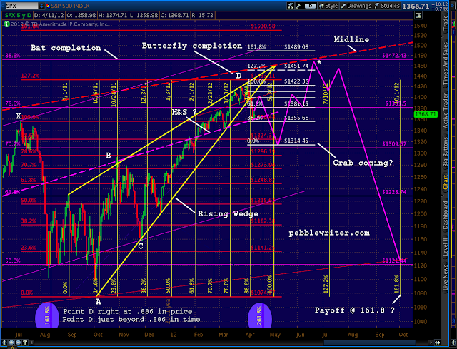
As always, an analog makes a lot more sense when there’s a plausible case to be made for the expected path forward. That was certainly the case last year, when I posted extensively about the 2007/8 as 2000 analog [see: OMG, WTF and Money Back Guarantees and Happy New Year.] I believe this one qualifies, though there are a few hoops to jump through first.
 |
|
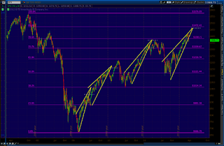
| 2010 Rising Wedge |
 |
|
| 2011-2012 Rising Wedge |
The odds of it playing out rise dramatically if the bump we saw Wednesday extends up to 1380-1400 before any further declines. If so, the bold purple dashed line above — the midline of the channel I expected would stop Tuesday’s sharp sell-off — would make a terrific neckline for a H&S pattern that targets 1305-1317.
Of course, if the neckline holds — probably around April 24-26 — the H&S fails and we head up to 1462 around May 4-8 for the end of the bullish ride. The H&S pattern is key.
Note that Tuesday’s low was at the .786 of the 1340-1422 rise, making it a perfect Point B for a Butterfly pattern. Such patterns extend to the 1.272 (1317) or 1.618 (i.e., 1288, which would slightly overlap the Oct 27 1292 high and might be problematic for the EW picture.)
To me, a drop to 1305-1317 seems fairly plausible. The tricky part comes in calling for a reversal after SPX has fallen 120 points from its recent high. The timing looks to be early May, and we have a couple of Fed-centric events around then: consumer credit on the 7th and minutes from Apr 24-25 on the 16th. So, I suppose anything’s possible.
If the analog is still in play, this is make or break time. Those who, like me, have been resolutely bearish are itching to get the party started. Sentiment would be fiercely negative. But, a strong bounce around 1300 would be the signal that the analog is good.
If so, we’re likely to go back and tag the price level of the original apex (about 1462) of the rising wedge we’ve been in since last August. I’ve seen this phenomenon play out again and again on both large and small scales.
While completion of the Crab pattern which might set up by then would indicate potential to 1489, I believe the .886 Fib of the Oct 07 – Mar 09 decline (a Bat pattern) will step in to prevent a rise in excess of 1472.
* * * * * * * *
Editor’s Note/Mea Culpa: October 2012
I was dead wrong about the upside potential of the above analog. In April, I set the target for the S&P 500 at 1472. It reached 1474.51 instead.
