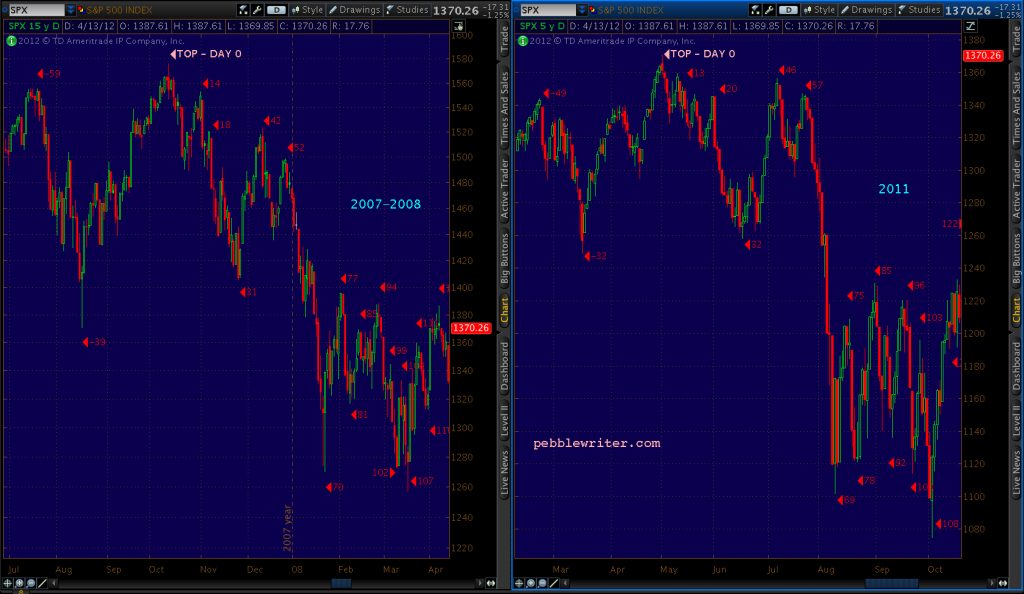
As a chartist, I’m often struck by how similarly the stock market acts at important tops and bottoms. By “important tops” I’m speaking of those which precede large corrections or even crashes. So, with apologies to Tim Knight’s excellent Slope of Hope…
In 2000, SPX retraced a Fibonacci 88.6% of its initial drop before falling off a cliff. If you were to draw a trend line (TL) between the two tops, it would take on the slope of the yellow line below. The 2007 top was completely different: no big retracement, no place for a trend line with a similar shallow a slope to connect, just a setup for a gag featuring a roadrunner and a coyote.
 But, in 2011, we saw the pattern all over again: an 88.6% retracement and a very similar TL.
 What many didn’t realize at the time was that the TL from 2007 TL was simply making a return appearance.
 Isn’t it interesting, then, that the slope of the line between the Sep 21, 2018 high and today’s high (and passes through the 88.6% Fib retracement) is exactly the same?
 The Big Picture…
 Is it possible that all the bad economic and earnings news we’ve had these past few months is just…bad news?


Comments
One response to “The Slope of Nope”
PW, interesting finding with slope of nope.
If you look at one year chart of XLF, it seems to have a similar slope of nope pattern. The current price of XLF is about .886 of its 2018’s high.