UPDATE: 7:30 PM
Any CDS experts out there? If the Greece “haircut” isn’t deemed a default, then it calls into question the value of credit default swaps. Depending on who you ask and how you measure them, there are $2.5 – 600 trillion of these (possibly worthless) things floating around — some presumably on the balance sheets of already under-capitalized banks. Are they marked to market or carried at cost, where plunging value will further inflate banks’ hidden liabilities? If you know a little something about commercial or I-bank accounting, let us hear from you.
UPDATE: 6:00 PM
Wild day for stocks, today; just as wild for bonds. Remember ZROZ, the Pimco zero-coupon ETF we talked about a month ago? [The Forest and the Trees] At the time, it had completed a huge Crab pattern that portended rough times ahead for long bonds.
 |
| Sept 29, 2011 |
We talked about what might presage a 20% price decline indicated by the Crab pattern:
The portfolio’s duration is 27.79, so a 20% decline in prices would indicate a yield increase of 0.72%. Anything could happen, but a .72% increase in long bond yields would hardly be beneficial to stocks.
Of course, other factors can drive down prices — credit quality, for instance. We are talking US treasuries, after all. And, let’s not forget currency fluctuations. A crash in the dollar wouldn’t do much for the value of long-duration dollar-denominated assets.
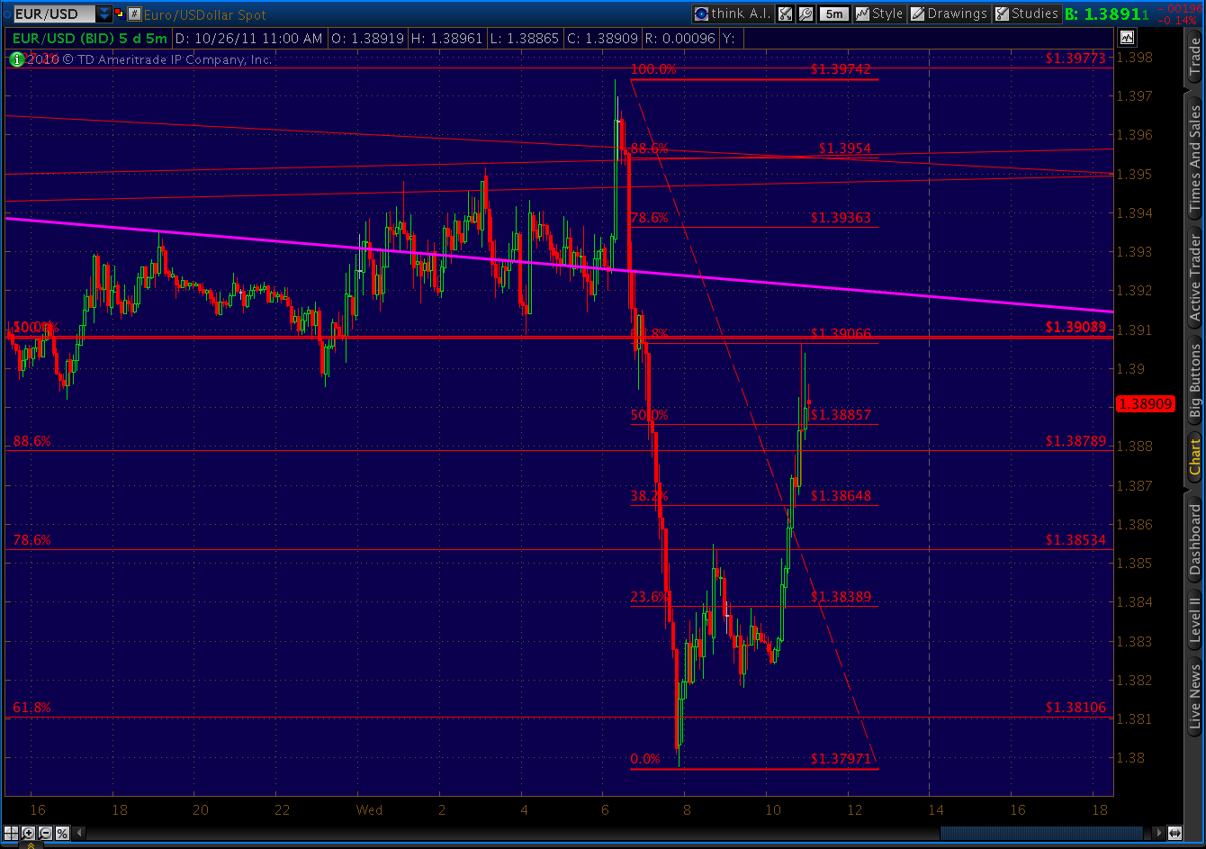
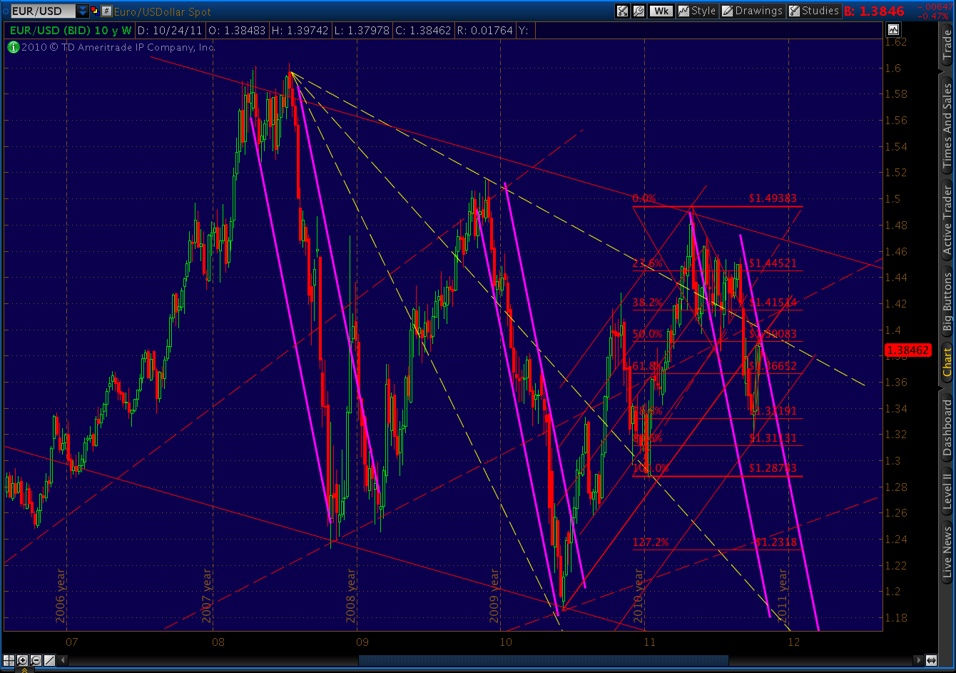
The 20-yr yield hit 3.18 today, up from 2.79 on 9/29. And, we got a pretty significant sell-off in the dollar, courtesy of a 2.45% single-day move in the EUR/USD. While I expect the EUR/USD to reverse sharply, the interest rate bump is likely here to stay (we’re only half way to our .72% targeted increase. ) And, as we noted back in September, such a development is hardly constructive for stock prices.
 |
| October 27, 2011 |
More later.
UPDATE: 12:15 PM
Closing in on the 1.618, which also intersects a channel line (red) from my last forecast. Again, the channel lines are guesstimates based on the similarities between the 2007/8 top and the 2011 top (as modeled on 9/28 and revised 10/24).

The ones I drew in here are parallel to those in 2008, but the spacing of the last two to the right involve speculation on my part that they would follow a similar pattern as each of the preceding channel lines.
Note that since they have a steep slope, the point at which the market intersects them is a function of the time involved to get there. In other words, the fact that we’ve reached the channel line so quickly has allowed us to reach it a higher price than would have been the case had we, say, taken the time to form a more pronounced B wave (a scenario I haven’t completely given up on, BTW.)

As can be seen from a close up of the daily chart, intersecting the next higher channel line now, for instance, would take us to 1332. While, an intersection on Nov 21 would result in a price of 1307. There’s no guarantee that we’ll even reach it, as we have reached the outer boundary of the larger (yellow) regression channel. But, I don’t feel an overshoot is problematic, seeing as how we diverged pretty strongly below it in early August.
ORIGINAL POST:
SPX is 3 pts away from completing a Crab pattern at the 1.618 at 1278.48.