And, no, I’m not talking about Apple. Although, come to think of it…
At some point, the analogy I’ve been drawing since May between the 2007/8 and the 2011 market tops will fail. In the meantime, the 2007/8 top has served as an amazingly accurate guide as to the current market’s direction.
It might be helpful for some readers to get a feel for the bigger picture by integrating the fan lines, trend lines, channels, chart patterns and harmonics I think have a good chance of playing out. My research indicates that some of these patterns and indicators are typical of all tops (one of these days I’ll get around to writing a proper research paper.)
By utilizing the same methodology, anyone with the time and energy should be able to create these same charts and enjoy the same great returns that I have had this past year since I got serious about investing again.
Speaking of time and energy, I plan to scale back on my blogging. Another very profitable business interest that’s near and dear to my heart is ramping up, and I want to give it every opportunity to succeed. I haven’t quite decided, but I’ll probably settle into a once or twice per week blogging schedule while doing a little consulting on the side.
With that out of the way, let’s start with the 2007/8 market top, already supplied with fan lines from the Mar 2003 bottom. We have the benefit of hindsight, so I’ve added in an obvious downward-sloping channel from the top (the yellow lines) and two downward-sloping channels within that channel (the red lines.)
I’ll label the major (yellow) channel lines A-1 and A-2, and the minor (red) channels B-1, B-2 and B-3. Think or Swim’s basic charting package does an excellent job of creating parallel trend lines, so I don’t have to worry about allowing my bias to sneak into the mix. I simply create a duplicate parallel TL and drag it to a place where it fits.
If there is any doubt as to whether the minor channels are drawn correctly, I can create parallel duplicates and see if they fit as well. By “fit” I simply mean whether they are significant and predictive. That is, do they originate at important points in the pattern and, when followed forward in time, lead to other important points? It’s pretty obvious that these parallel trend lines are a good fit.
Now, let’s do the same thing for 2011/2 and label both the major and minor channels. From here, it’s a matter of drawing in market moves that correlate to their 2008 equivalents. With a modicum of care to respect obvious Elliott Wave rules and guidelines, we get something like this.
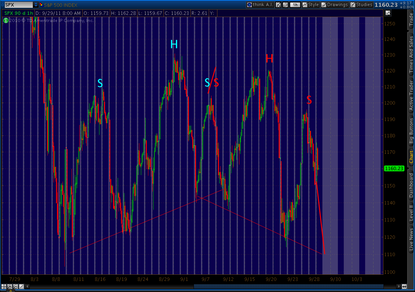
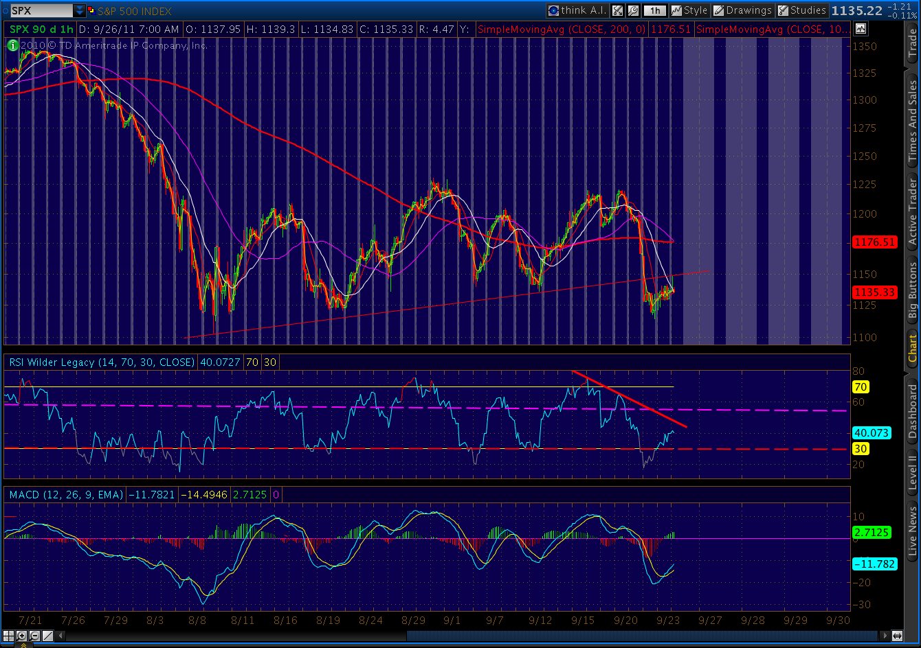
Most of the moves are driven by the channel lines. B-7, for instance, is the upper boundary of the channel that has guided the downside since July. Its 2007/8 equivalent is B-2.
The final wave 5 of Minor 1 has already started and should fall till it reaches B-6. In 2008, however, the decline was arrested by the major channel (A-1 & A-2) before it could reach its potential. I believe the same will happen this time, with A-3 stepping in to provide a floor at around 1040.
Here, I’m speculating a bit. I’ve based the target on completed H&S; and harmonics patterns as well as a similar move in 2008, when Minor 1 ended at parallel support from the W pattern in Jul 06. The equivalent for the current market is the Apr-Sep 2010 swoon.
Further, there’s a major fan line from the 2007 top that skips off the top of that pattern and lands squarely at 1040 when it intersects with A-3.
In 2008, when Minor 1 completed, we had a rally that took prices out of that channel and created a new, parallel channel bounded by B-3. I expect the 2011 equivalent (Minor 2) to retrace about 50% of the May – Sep decline, which would take it back to 1200 or so.
From there, we begin Minor 3 — still of Intermediate 1, of course. It’s worth noting that the distance of each leg down is, like all declines, a function of time and channel slope. We can’t do much to change time, but 2011’s steeper channels (B-6 through B-10) translate each passing week into a greater decline than their 2008 equivalents.
So, while 2008’s Minor 3 fell 700 points, 2012’s could be over 800. It’s easy to see in hindsight that the 2008 channels did an excellent job of guiding the market moves all the way down. B-4, for instance, came back into play over a year after it was forgotten. It’s parallel cousin, B-5, eventually marked the Nov 08 and Mar 09 lows.
I expect the 2011/2 channels to operate the same way, and have attempted to utilize the same movement between channels into my forecast. Even so, I have a healthy degree of skepticism when viewing my own results. Most investors would probably laugh if told the S&P; 500 will decline to 350 by the end of 2012. And, that’s just Intermediate 1 of Primary 3!
There is a possibility that the major channel I have in mind for 2011/2 is off. It’s always a dicey business to draw long term channels with “only” eight months of market action to go from. If I draw a TL parallel to A-1 and A-2, for instance, and drag it over to the current market, there’s an obvious place for it to land. I’ll label it and its companion A-5 and A-6.
There are a host of reasons I’m not as keen on this scenario, but the reality is we’ll know in the next couple of weeks. Wave 5 will plunge to around 1075 instead of 1040 or lower. And, Minor 2 might retrace to 1250 rather than 1200. It’s easy enough to position oneself for either outcome. And, in the end, we should fall from either major channel as we pursue the minor channels down to complete Intermediate 1.
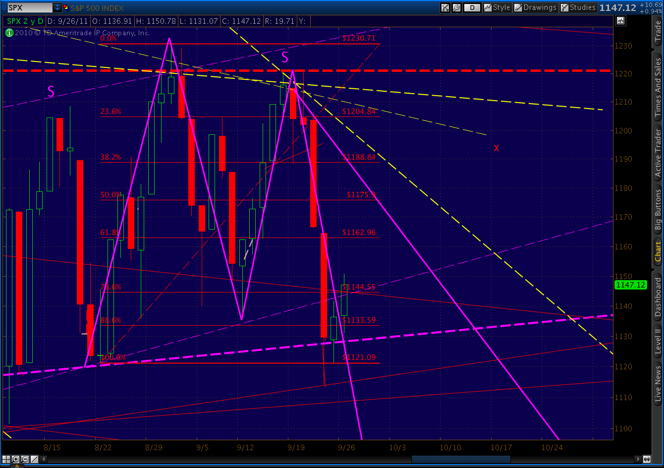
Chart patterns and harmonics corroborate most of this forecast. The bear flag pattern (Aug and Sep) target is 972, while the measured move target is 984 — both somewhere around the end of the second subwave of Minor 3.
The large H&S; pattern we saw play out from Jan to Aug 11 played out with the drop to 1100. The continuation H&S; pattern that’s been established over the past two months signals a move to 1040 (how ’bout them apples?)
The large, sloped pattern we recently completed argues for 828, while the giant H&S; (shown below) that will complete with the decline to 1040 signals a downside of 710. H&S; patterns don’t come with a time frame, but note that 828 and 710 are roughly where my forecasted Minor 3 intersects with the continuation of the 2008 channel lines A-1 and A-2.
The harmonic pattern is also compelling. Crab patterns are characterized by the 1.618 extension of their XA leg and an extreme extension of their BC leg.
The big W pattern we made last summer was a textbook beginning of a Crab pattern. The 1.618 XA extension signaled 1340, while the 3.618 BC extension signaled 1363. As you will no doubt remember, the first crack in the bull market appeared on Feb 18 at 1344; and, the top was May 2 at 1370. Pretty darned effective, no?
Similarly, the Gartley Pattern traced out over four years from the Oct 07 high turned exactly at the required .618 Fib point B and indicated a high at the .786 level of 1381. Of course, we came with 11 points.
So, whether you’re a fan of Harmonics or not, these are patterns you shouldn’t ignore. Now that they’ve both played out, what do they say about the future? For Gartley’s, I look for at least a .618 Fib retracement of the AD leg, or 984.
For Crabs, an initial target is the .618 Fib (at 934), but the more common target is the 1.618 extension of DA which, here, points to 802. Other common targets are the 1.272 extension (at 919) and the 2.618 (at 464.)
So, what could go wrong? Lots of things, obviously. For one, there is plenty of dissension in Elliott Wave ranks as to where we are in the grand scheme of things. I’m operating under the assumption that we’re in Primary 3 down. If wrong, things could go a little differently. We might not be as likely, for starters, to repeat 2008’s fun and games.
There is an endless list of social, economic, natural and political events that could bring about a radical departure from past patterns. Although, it’s worth noting that these types of patterns have played out over many years in many different markets, accompanied by a stunning variety of social, economic and political backdrops.
Sadly, the world seems incapable of going even a year with major wars, political upheaval, colossal financial failure, natural disasters, famine and disease. Although we can always hope, there’s no reason to believe the coming years will be any different.
This forecast is completely consistent with the onset of another Great Depression. The current recession, whether you view it as a continuation of 2007 or the next edition, is obviously having a very difficult time ending. Monetary authorities have nowhere near the ammunition they had in 2009 which, had it been spent on stimulating the economy rather than bailing out Wall Street, might have made a real difference.
Several trillion in debt later, they’re still trying to figure out how to resolve the problem of too much debt by… issuing more debt. The focus is on the Euro zone now, but it will soon return to the U.S., which apparently lacks the political will to deal with the $1.5 trillion annual deficit, let alone the $200 billion annual interest on the accumulated debt.
Keep in mind, that’s with 2% 10-year treasury bonds. If rates return to 2000’s 6%, the annual interest would rival what we spend today on Social Security, Medicare or the military. At 1980’s rates, it would approach $1.5 trillion per year.
Those figures, by the way, assume we miraculously and immediately stop spending more than we take in. Since we currently take in about $2.1 trillion and spend $3.5 trillion, that would entail a 66% increase in tax receipts or a 40% drop in expenditures. I don’t think either of those outcomes is even remotely possible.
In the end, the only solution I can foresee is the one Greece, Italy, Spain, Ireland and Portugal will ultimately choose — the Big Red Reset Button. Borrowers will cast off their debt and start over. It will devastate not only their lenders and financial markets, but pensioners and workers, providers and users of public services, political parties and governments.
But, as Argentina, Mexico, Russia and many others can attest, there is life after default. Most of the Euro countries — including Germany (1923 and 1945) — have defaulted before. It’s not the end of the world. China, which is developing its own debt problems, will have to cope. Primary 3 will eventually end, and the world will get a shot at redemption as Primary 4 kicks in.
I don’t intend this to be a message of doom and gloom. It’s only a forecast — my best guess based on what I see going on in markets and the systems that influence them. Most individual investors have the ability to protect themselves — even profit — from the events ahead. My personal approach is to hope for the best, but prepare for the worst.
Feel free to comment. I ask only that naysayers offer substantive support for their views. A simple “you’re off your nut!” while it may be true, neither educates nor illuminates. Links and data are always appreciated. I’ll update this forecast as conditions warrant.
Good luck to all.


