Category: Charts I’m Watching

  • The Big Picture: January 27, 2012

    UPDATE:  3:10 PM

    SPX has completed most of a head & shoulder pattern that points to 1288ish.  The idealized right shoulder comes in around 1322, although it’s high enough to count as it is.

    ORIGINAL POST:

    Another quiet day price-wise, even though there’s been plenty of negative news.  Clearly, the bulls aren’t going to give up without a fight.

    There are a few different ways to view the past four months price action.  Generally speaking, we have a bearish Butterfly pattern that completed (1.272 ext) at the apex of a rising wedge (in yellow) within a rising wedge (in red.)

    I will consider 1333.47 the Wave 2 top until proven wrong.  There are a few scenarios that argue for a slightly higher price, say 1336-1339.  But, I don’t expect them to come to fruition.  Traders should maintain stops, just in case.

    The chart above also shows that we’ve violated and are back testing one of the trend lines (yellow, since Dec 19).  But, since we’ve cracked previous TLs on this advance, I don’t put much stock in it.  The more important TLs to break will be the purple line off Nov 28 and the red one off of Oct 4.

    But, rather than anguish over which TL will be critical, I suggest keeping an eye on the RSI trend lines.  The hourly RSI TLs (red, dashed) have seen some touches coinciding with instances of meaningful support.  A break of either line would signal a significant drop.  BTW, the yellow RSI TL is great evidence of the negative divergence we’re seeing.

    Now, for the big picture.  May’s top at 1370 was 11 points from the .786 retracement of the 1576 to 666 decline.  That means we came back to within 11 points of recovering 78.6% of the loss from the original 1576 starting point.  This was a Gartley pattern — incredibly effective at signalling potential turning points.

    Once we top at 1370, we need to focus on Fibonacci level retracements of the 666 to 1370 rise.   The most common Fibonacci retracement levels are .236, .386, .500, .618, .786, .886 and 1.000.  We then go into extensions such as 1.272, 1.618, 2.0, 2.4, 2.618 etc.

    There’s a rule of thumb I use to determine post-pattern completion targets: 61.8% of the distance from A to D.  In this case, A is 666 and D is 1370; so, 61.8% of that distance is .618 x (1370-666) or 435.  Subtract 435 from 1370 and you arrive at 935 as the target for the reversal of the big Gartley pattern.  It’s shown on the above chart as the .618 level of the purple pattern.

    The big question is how to get there.  As mentioned above, we just completed both a medium-sized Bat and a Butterfly pattern.   Bats are similar to Gartley’s, but retrace .886 instead of .786 of the initial leg.  I use the same .618 reversal target, however, which in this case would yield around 1173.  Nice, but not quite 935.  Let’s look at the Butterfly.

    Extension patterns like Butterfly’s and Crabs complete beyond the point of origin — 1.272 or 1.618 being the most common.  So, I typically look for a larger reversal upon completion.   A 1.272 extension/reversal from 1333 gets us to 1110 (1.272) or 1050 (1.618) on the downside.  Closer.

    It’s fair to say that reaching 1110 or 1050 would probably involve completion of a H&S; pattern or two.  A casual glance at the chart reveals several potential left shoulders ready for action.  The price level around 1110 also looks like a great spot for a massive H&S; pattern to complete, with the Jun 2010 and Oct 2011 lows as potential neckline points.  Such a pattern would point to 790 or lower.

    Reaching 790 isn’t so far-fetched when you consider we’ve completed 3 of 4 legs for a huge Bat pattern that targets 747 as the .886 completion point.  It would work nicely with a H&S; pattern as that described above.

    I have about twenty other patterns currently under surveillance.  Let’s see how this week plays out, then I’ll try to string them together in a coherent fashion that also takes into account the other chart patterns at work.  Suffice it to say, there are plenty of ways to skin this bull.

  • Do or Die: January 26, 2012

    UPDATE:  3:00 PM

    The H&S; pattern we discussed this morning is “growing” as the decline continues.  The new nominal target is 1306, at which point we have more opportunities for it to expand further.  If this one plays out and if the next one does set up, it could target somewhere around 1280 – 1288.

    The nice thing about rapid ascents is they leave a trail of strong downside opportunities in their wake.

    BTW:  Starbucks reports after the close today.  I don’t follow the company at all, but this is not a bullish chart.  Working against the upside are the 1.272 harmonic level, a long-term trend line of resistance and a very well-formed rising wedge.

    UPDATE:  1:45 PM

    I don’t focus much on the DJIA, but it’s getting a lot of attention right now, as it climbed within 35 points of its May highs earlier today.   It’s an important level, to be sure.  A climb past 12,876 invalidates a lot of wave counts.  A stop at 12,876 makes for a deliciously bearish double top.

    Check out the little Crab pattern setting up on the 15-min chart.  The 1.618 extension happens to be at 12,878.25.   At this point, the Dow is showing much better performance relative to the SPX than it should — a variety of divergence that should concern those betting on new DJIA highs.  Hmmm….

    UPDATE:  1:05 PM

    Here’s the NDX chart, showing the Butterfly pattern completion at the 1.272 extension.  Remember, this follows a Bat pattern that played out perfectly with a 10.9% decline in late October.  All things being equal, Butterfly patterns generally produce greater reversals.

    UPDATE:  12:40 PM

    Here’s the chart concerning the Baltic Dry Index I reference in the comments below.  It’s from InvestmentTools.com, who publishes some really cool charts with all those neat combos and ratios we love to watch.   This one speaks volumes:

    Check out the little H&S; setting up on SPX.  It targets 1311 in the short run and could set up some larger patterns if it plays out.

    ORIGINAL POST:

    More later.

  • Charts I’m Watching: January 25, 2012

    UPDATE:  11:35 PM

    No point in rehashing the Fed news today.  Bottom line, they continue to try to influence the markets with promises of QE.  Actually unleashing more QE is problematic from a lot of standpoints (political fallout, distorted credit markets, etc.)

    The bigger problem is that if the Fed whips out their biggest gun (QE3) and it produces even less benefit to the economy than the last two iterations, it would reveal: (1) just how desperate they are; and, (2) how limited are the alternatives.  Zerohedge has been running an interesting series on the race to the bottom between the Fed and the ECB — well worth your time if you’re into macro-econ.

    It’s interesting to me that the USD’s weakness these past few days outweighs the Euro’s strength.  But, they’re both at a turning point based on harmonics, fan lines and channels.

    Gold was on a tear today, topping 1700 for the first time since Dec 12.  It’s possible it’s breaking off its run to 1357 (or 1200, see Fleeced); I’ve nudged the channel lines just about as far as I think is reasonable to capture today’s rise.

    Recall that we’re still north of a long term trend line that, until broken, points the way to a zillion by Christmas.  With today’s Fed action, there are plenty of folks who are more convinced than ever it’ll get there.

    But, there’s an interesting little fan line off Jan 2011 that provided the July, September and October bounces (white, dashed.)  We broke through in mid-December and have been beneath it for the past month.  Now, however, we’re tagging it from underneath — a back test — at the upper channel boundary.  GC is also showing negative divergence on every time frame of 60-min or shorter.

    (This is the exact same type of back test, by the way, as we’re seeing on BAC.)  If it is going to turn, it’ll need to do it pronto in order to salvage the harmonic patterns.  We’ll watch this one closely. 

    Stocks are likewise rapidly running out of fan line resistance options to halt their advance.   As we examined last week, there are a few different ways to draw these, depending on whether you include shadows or not.  Today, we bumped up against the highest of the four.

    We’re within .81 of the Butterfly completion at the 1.272 extension — the 1329 target I’ve been eyeing.  We’re also just a few points shy of the .886 retracement of the 1370 – 1074 drop (1336.)  Technically, Wave 2 isn’t toast unless we head higher than 1370.  At only 44 points away, the bear case is starting to run out of room.  The 50 day SMA is only 4.43 below the 200 SMA.

    But, many of our technical indicators continue to look bearish.  There’s negative divergence across the board, from 60-min on down.  VIX, which closed below its Bollinger Band yesterday, is also providing nice divergence and is at least 90% of the way towards a falling wedge apex.  It completed a bullish Crab pattern, filled a large gap and tagged the wedge’s lower bound yet again today.

    I see sign after sign of a top.  Whether the market chooses to follow those signs right now, however, is anyone’s guess.  But, we’re drawing very near to the point of “now or never.”  I might be a little early, but I opened some short positions today in anticipation of a turn (and, yes, I’m using fairly tight stops.)

    The first wave down should stop short of 1267 if it’s going to keep bulls’ hopes alive.  It’ll look bullish from a wave count perspective, and allow the channel promising more upside to take proper shape. 

    I’ll leave you all with a chart that illustrates just how overextended this market is.  TZA, a leveraged inverse ETF on small cap stocks, has gone deeper into a falling wedge than I’ve ever seen.   Good luck to all.

    UPDATE:  12:15 PM

    It’s important to keep a close eye on the potential channels and wedges forming on SPX.   But, given the variety of legitimate interpretations, it might be more valuable to watch the RSI trend lines.  On the hourly chart below, two of the more obvious channels are the light blue and the yellow.  You could also easily form a rising wedge by combining the upper blue line with the lower yellow line.

    Rather than agonizing over the right interpretation, focus on the RSI trend line.  It’s repelled each of the dips pretty handily and will be the first sign of a meaningful break to the downside.  Likewise, we can watch for upside breakouts as well.   Consider the 5-min chart RSI:

    A breach of the solid yellow line would be a good warning sign.

    ORIGINAL POST:  1:50 AM

    The Nasdaq 100 futures look to have tagged the fan line off their Oct 2007 highs.  As reported last week and back in July, this has been a very good indicator of a top several times in a row.

    EURUSD looks like it’s completing a back test of the last diagonal as well as a trip across its channel.  

    There’s a Crab pattern completing on the 60-min chart at the 1.618 extension that should put the brakes on any further upside.

    And, gold is also completing a run to its channel boundary, depending on whether you include the shadows.

    I’ve probably written those same words (re the shadows) a dozen times in the past week — which, in itself, is probably a sign of how prices have been pushed to extremes.

    AAPL’s results might be the catalyst to get SPX up to 1329, completing the Butterfly pattern we’ve been watching.  Keep a close eye on this after the cash markets open, especially if we gap up a little on the open.

    More later.

  • Charts I’m Watching: January 24, 2012

    UPDATE:  6:55 PM

    Not much action during the day, but Apple’s making news after the close.  According to unconfirmed reports, Apple is purchasing the other 499 corporations comprising the S&P; 500.  Said CEO Tim Cook, “imagine my surprise when I learned there were other stocks out there; this will simplify things for everyone.”

    In after-hours trading, AAPL is indicating 452 after trading as high as 469.  The only FLi in the ointment is a bearish Crab pattern that completes around 465.87.  AAPL has been locked in a crazy steep channel since 2008, and 469 tomorrow would complete the Crab and take it north of the channel boundary.   Here, for your iZonely.

    It’ll be interesting to see if RSI tags along for the ramp, or whether it falls victim to its two year-old trend line.  If so, could get some nice negative divergence.

    This should also give NDX the last little push it needs to meet its bearish Butterfly target at the trend line we’ve been watching.   Almost there…

    ORIGINAL POST: 

    Another day, another broadening of the rising wedge.  We’ve had three RW failures in a row, so it’s normal to be a little gun shy at this point.  For now, my target remains 1329.

    We completed a little H&S; pattern that points to 1297.60 — the broadening I was alluding to yesterday.  If it plays out,  though, it’ll be in line with the intra-day lows on 12/21 and 1/13 and look suspiciously like a channel.  It might also appear as a “back test” of the wave ending at 1292 — in other words, a corrective wave rather than an impulse down.

    Going out on a limb here, but I don’t think the MM’s are done jerking us around.   I’m watching a lot of indicators, but one that always speaks to me is RSI trend lines.  Check out the 60-min chart.

    The trend line connecting the RSI lows since November 21 has stopped every downturn since from becoming more serious.  I would think twice before loading up on shorts until at least that trend line is broken. 

    I would also tell anyone going long or short here to make careful use of stops.  The game is just about up, but there is plenty of danger in taking an unprotected stand one way or the other.

  • Charts I’m Watching: January 23, 2012

    UPDATE:  12:15 PM

    We’re seeing a little weakness on SPX, off 5 after topping out at 1322 earlier.  We got within 7 pts of the Crab objective and, depending very much on how you draw it, possibly tagged the Oct 2007 fan line.   Those who want to capture most of the move down are already short by now, while those who want to nail the top are probably scaling in.

    As always, we won’t know it was the top until after the fact.  But, my best guess is still 1329, with a possible dip on either side just to fatten out the rising wedge into a channel.  Here’s what I mean:

    We’ve been faked out multiple times on the way up playing rising wedges.  Every time we complete a perfect looking one, it expands into a channel and begins a new, less perfect wedge — the better to suck more bears into the game.  Right now, it’s looking pretty good.  And, we’re obviously approaching the fan line (however you want to draw it) and horizontal resistance.

    I think the MMs will likely allow a little dip just to excite those of us who are looking for a break down from the wedge, then reverse it at a point where it’ll take on more of a channel look.  Whether they do this before or after 1329 is anyone’s guess, but I think it’s coming.  The only positive is that it will very likely establish some nice, fat negative divergence — a signal that’s been AWOL on the daily chart.

    BTW, XLF just busted one of the harmonic patterns we were watching.  By exceeding 14.17, we have a Point C higher than Point A on the Butterfly/Crab.  Although, as discussed last week, I’ll usually wait for a more sizable excess before calling it quits.  After all, 1.0 is a Fib level, and we only reached 1.037.  Could we reverse quickly?  Sure, take a look at BAC.

    I hate to kick a stock when it’s down, but in BAC’s case I’ll make an exception.  It’s forming a double top as it back tests a falling wedge and, so far, has failed to breach a TL from 2006.

    UPDATE:  11:35 AM

    AUDUSD has slightly overshot our Gartley and Crab pattern objectives and seems to be leveling off.   This should be it for the upside, but always remember to use appropriate stops.

    ORIGINAL POST:  10:20 AM

    EURUSD has broken out of the very tight channel it’s been in since mid-October.  I’ve adjusted the fan line from the July 08 high (highlighted in white) to reflect the turn at and am looking at the next fan line higher (highlighted in purple) and/or the previous wave low at 1.3145 to provide the next turn. 

    Note that this would complete a back test of the last diagonal on our stair step lower and probably tag the SMA 50, too.

    Any time we break out of a channel, it’s a good idea to reexamine the channel and any related underlying assumptions.   Initially, I wondered if we were seeing an expansion of the channel — much like occurred in Mar 2010 (in the middle of the middle impulsive channel (purple) below.

    I was disturbed that we were seeing a sizable bounce prior to reaching the fan line off the 2002 low.  I was also having trouble reconciling a breakout from an apparent falling wedge.  When we look at the same chart in log scale, however, we see a perfectly nice touch on the fan line (redrawn in solid red) and the channel is still very much intact (using the 2008 impulse channel slope as a guide.)

    Curiously, in log scale the last fan line provided a bounce on the downside but not the subsequent rise.  In arithmetic scale, it provided no bounce on the downside, but a big one on the way back up.  I can only surmise that the algo’s driving much of the EURUSD trading out there watches both.  So, I will too.

    I examined this with respect to the equities market in an earlier post [see: To Log or Not to Log] back in October, and determined that using log scale was part of the reason I was often early.  I think the best approach is to use log scale for longer term patterns (a 9-year fan line qualifies!) but confirm with the arith scale before doing anything crazy in the short run.  That still seems to be the scale most short(er) term equities traders use.  Here’s the daily chart close up with log:

    We still have a ways to go on our Crab pattern (Point D @ 1.2464) and, of course, there’s the gigantic flag pattern to complete somewhere around 1.13 (depending on timing.)  From 1.3145, 1.2464 would be over a 5% drop — a great way to kick start a nice equities correction.

    Some of you might recall we’re watching a fan line off the 2007 high on our SPX chart, too.  Again, using log vs arith scale can make a small difference.  Here are the two options, each showing a fan line off Oct 11, 2007 through the May 2, 2011 high – both with and without shadows.   Today’s values with log are 1333.90 and 1327.50; with arith they are at 1330.65 and 1324.40.

    More later.

  • Lightning Always Strikes Twice

    It was Saturday the 14th — the day after we normally expect the Universe to throw us a curve.  My brother-in-law and I were day-hiking Mt. Whitney.  It’s a 22-mile scramble from 8,360 up to 14,496 feet and back, not the most relaxing way to spent a day but (normally) a fun challenge.

    Before long, we came across two brothers and their best friend.  We took turns passing each other, sharing words of encouragement and speculating about how hot the waitresses serving margaritas at the summit would be.  At about 14,000 feet, my brother-in-law’s hypoxia forced us to rest while the others pushed ahead.  Unfortunately, none of us could see the huge thunderstorms racing in from the blind side of the mountain.

    That which has been is that which will be,
    And that which has been done is that which will be done.
    So there is nothing new under the sun.

    Ecclesiastes 1:9, 200 BCE

    The weather went from 50 degrees and sunny to sleet and snow mixed with lightning — lots and lots of lightning.  At that altitude, we were in the thunderhead.  Just above us on the summit, the others took refuge in a tin-roofed stone observation hut.  As the storm raged around them, one of the brothers tried to lighten the mood.   Don’t worry, he laughed, when he was young he was hit by lightning while boating. Everyone knows lightning never strikes twice.

    He had intimate knowledge of the dangers of lightning.   He knew not to be out in the open and exposed when a thunderstorm came along.  He was even in the company of several people trained in CPR and survival skills who would stop at nothing to save one another.  None of this changed the fact that they were nearly three miles high in the middle of a thunderstorm.

    The more things change, the more they stay the same.
    Alphonse Karr, 1849

    An average lightning bolt carries 30,000 amps and a trillion watts.  The oxygen in the air literally explodes as it’s heated to 36,000 degrees — three times that of the surface of the sun.  During this particular storm, hundreds of lightning bolts registered in a couple of hours.  There was nowhere to run, nowhere to hide.

    Moments later, the hut was struck by a bolt so massive that a ball of lightning appeared inside, floating around the ceiling for thirty seconds until it exploded, shocking everyone in the hut.  The brother who’d been joking went into cardiac arrest and, despite five hours of CPR by his brother and his best friend, died that day.  Despite his experience and a well-worn idiom, he could not avoid the inevitable.

    A short distance away, I was working on my brother-in-law, who had also gone into cardiac arrest when we were struck. After I finally got his heart beating again, we were struck a second time.  Yes, lightning had struck twice twice.

    The Federal Reserve is not currently forecasting a recession.
    Ben Bernanke, Jan 2008

    I think about that day from time to time, especially when contemplating our economic situation.  Our Fed Reserve chairman, a renowned expert on the Great Depression, has assured us that depressionary lightning won’t strike twice.  But, he’s the same guy who didn’t exactly nail it in 2008.

    In 1933, when Roosevelt took the US off the gold standard, loosened monetary policy and greatly expanded federal spending, markets soared.  Federal expenditures tripled, but GDP kept pace.  Federal debt to GDP maxed out around 40%.  Employment dropped below 20% and deflation abated.  The country turned the corner and sentiment improved, much as it appears today.

    In 1937, however, the wheels came off the recovery express.  Unemployment jumped from 14.3% to 19%; industrial production and the stock market both plunged over 30%.  The causes are subject to great debate.  Depending on whom you believe, monetary policy was either too accommodative or restrictive; taxes were excessive or regulation was too lax; spending was too high or not high enough.

    First comes spring and summer but then we have fall and winter.
    And then we get spring and summer again.

    Chauncey Gardiner, “Being There”

    Like storms, economic cycles have always been a fact of life.  We can try to prevent them with stimulative monetary policy, deregulation and lower tax policies.  But, we invariably overcorrect or undercorrect; we take wrong turns and run down blind alleys.  It’s hubris and human nature at it’s finest.  As anyone who’s ever ducked into a tin-roofed hut to escape lightning would tell you, unintended consequences can be a bitch.

    Witness the continuing fallout from overly lax real estate lending.  Despite Bernanke’s March 2007 analysis that “problems in the subprime market seem likely to be contained,” real estate went through a historic deflationary spiral.  Nearly five years later, amid a meltdown that saw his own boyhood home sold at foreclosure, prices are finally back to 2003 levels. Is the worst over?

    Personally, I’m not sure we’re out of the woods.  I think we’ve come to a cyclical clearing which could precede a denser, darker, scarier forest than anyone can remember.  I question whether issuing more debt can cure a debt problem any better than buying a guy a scotch can cure his alcoholism.  So, forgive me when I question Bernanke’s repeated assurances. To me, it sounds like a plan to reinflate all those bubbles that burst a few years ago.

    The national debt is currently around $16 trillion (equal to GDP) and we’re running a $1 trillion dollar deficit. At the current rate of growth, debt will top $20 trillion by 2017 and $25 trillion by 2020. Can the Fed continue to keep inflation and interest rates at levels that won’t sink the economy, essentially breaking the bond market a la Japan?

    Bernanke and his cheerleading counterparts at the Fed, the White House, Congress, the ECB, the BoJ, the IMF, the WSJ and CNBC all insist there’s nothing to worry about. Would they really tell us if we should be worrying?

    See, in my line of work you got to keep repeating things over and over
    again f
    or the truth to sink in, to kind of catapult the propaganda.
    George W. Bush, 2005

    As a wise man once said, question everything.

  • Charts I’m Watching: January 20, 2012

    UPDATE:  3:15 PM

    VIX slumped another point today, trading near its intraday lows of 18.75.  This is the kind of capitulation we want in order to see a top in stocks.  The small H&S; pattern we were watching has busted, and the Bat pattern has started looking off.  I’ve moved my Point X back to July 1.  Starting at 15.12 gives us a .886 of 18.87 — very close to current values.


    The falling wedge within the falling wedge (red TL) is technically being backtested, yet it’s been undercut by a few points so we should probably forget all about it. 

    Beware: the larger falling wedge is still very much intact, signalling a upcoming surge in volatility.  And, hat tip to SoulJester who correctly points out the Gartley on VXX, the VIX ETF.

    Checking in on XLF, it just scored a double top — coming within pennies of the Oct 27 high (last time the Greece problem was “solved.”)  It blows the smaller Bat pattern we were watching, but I’ll take a double top any day.

    UPDATE:  2:00 PM

    Quick update on Gold…   Note the long term trend line (red, dashed) underlying the rise from the past five years or so.  In July, we split off from the trend and started a formation that’s resulted in several fan lines (white, dashed) being formed, tested, and broken.

    The latest intersects with the Dec 29 low, at which point we saw a $145 bounce.  I expect the bounce to fail as prices back test the 2nd fan line somewhere south of its intersection with the channel that’s been guiding prices downward since August.  Currently, that would be around 1700.

    If we do get a reversal there, the latest Crab pattern (purple) should continue to play out to 1368 and eventually complete the even larger Crab pattern (yellow) to 1200.   For the first, that would mean a C leg down slightly longer than the A wave down from 1926.  For the latter, of course, it’s a 1.618 extension.

    My gut is that gold will accompany stocks down on this next little excursion to bear country, complete an A-B-C correction, then resume its bull market when the Fed takes action to “fix” things.

    The first line in the sand, of course, is the channel line at 1700.  If we can break out of the channel — only 37 away — then the next test is the previous high of 1804.  If we break either the fan line or, more importantly the red trend line, the correction is on.

    ORIGINAL POST:  9:10 AM

    AUDUSD has finally pushed above the channel line — even if just a little.  Recall we’re looking for a final push as high as 1.0519 – 1.0534 to complete both a large scale Gartley (shown in purple) and smaller scale Crab (red).  [see: Jan 18 post] Given the squeeze going on in its RSI, I would view the completion of these two patterns a blow off top of sorts, and if history is any guide, synchronous with a top in equities.

    Updated (1:30PM) daily charts on AUDUSD showing the Butterfly pattern and LT channels:

    We’ve seen the reaction we were expecting on EURUSD, a reversal off the two channel lines.  If the rumors about Greece are true, we’ll likely see a spike higher.  But, really; how many times have we been led down this path? 

    Though, it would fit nicely with the idea of a push slightly higher in stocks — the Butterfly completion at 1329 —  as would the AUDUSD pattern completion mentioned above.

    Stay tuned.

  • Charts I’m Watching: January 19, 2012

    UPDATE:  6:00 PM

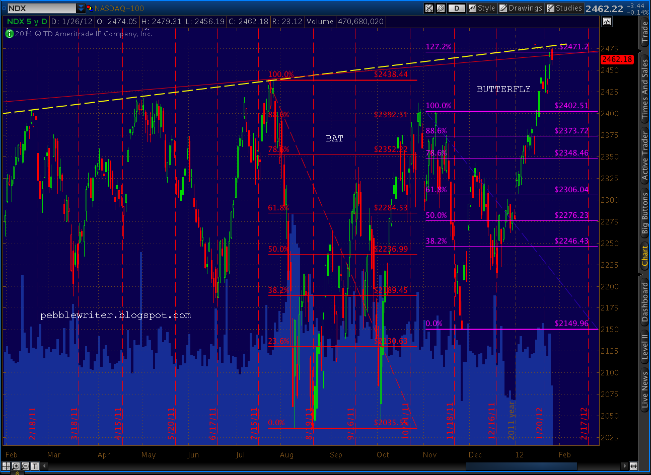
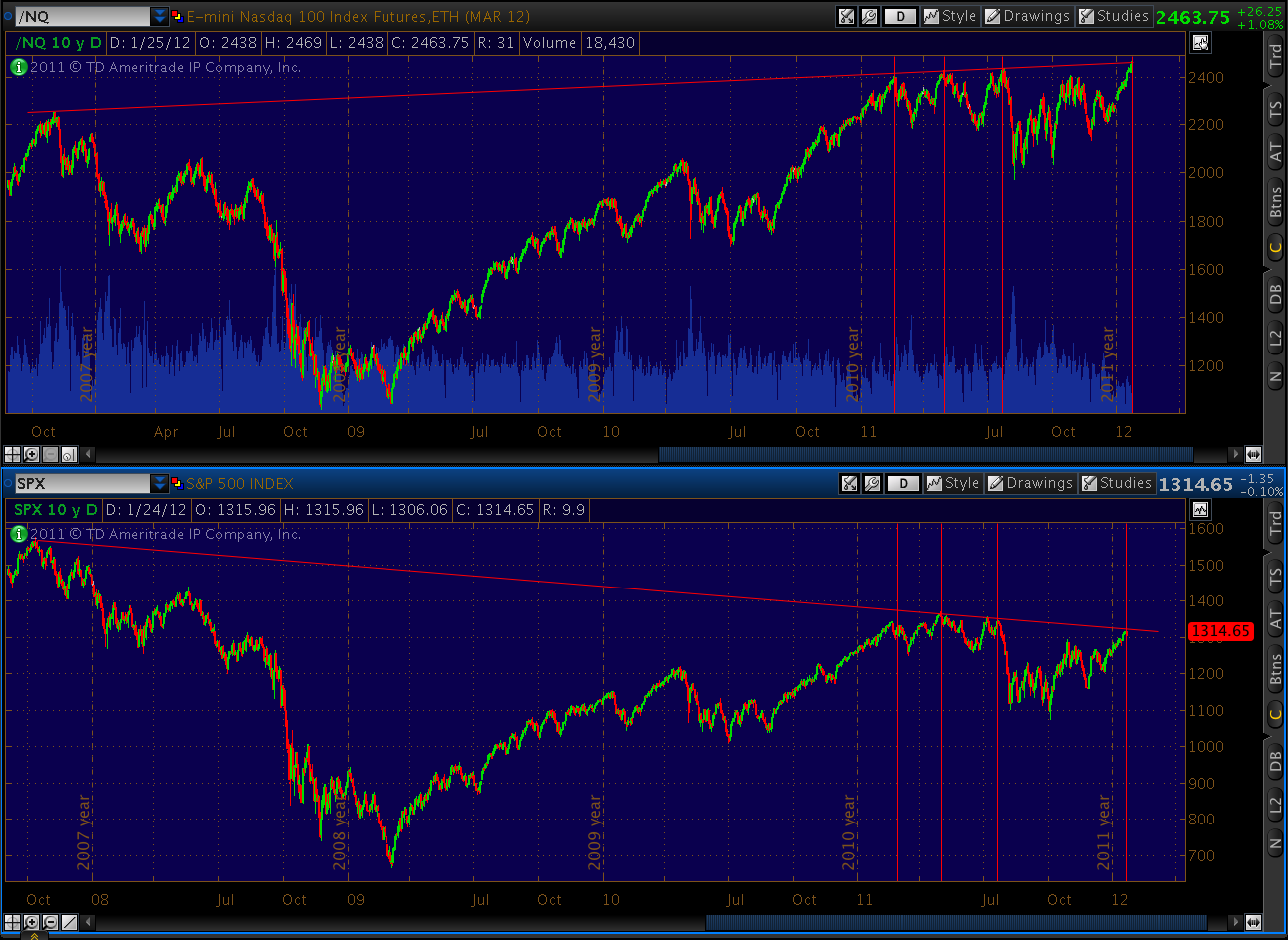
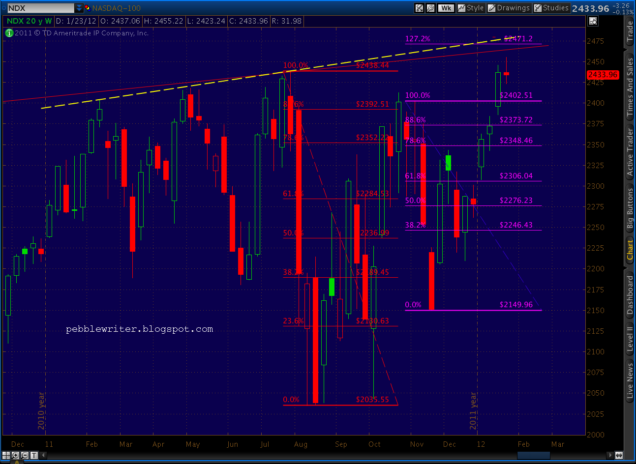
    NDX is suggesting an imminent plunge in stocks.  I started watching NDX last summer, and found it to be a great confirmation of SPX activity.  On July 25, I wrote about it tagging a trend line of previous highs, and how previous tags had led to market corrections [Tale of Two Tops.]  A few days later, SPX began an 18% plunge.  Here’s the chart from back then:

    And, here’s the chart from today, showing us right back at that same trend line — which also happens to be a fan line off the Oct 2007 highs.

    There’s a little wiggle room on the precise price level, because the TL connecting all four differs ever so slightly from the fan line.   It allows for another 30 points up to 2471, but it’s already close enough that a turn could come at any minute.

    What’s significant about 2471?   Remember, we had that great reversal off a Bat pattern in October.  It then jumped right into another pattern — this time a perfectly shaped Butterfly whose 1.272 extension intersects with the trend line and fan line right at (drum roll please) 2471.

    Note also the RSI trend line tag right at 70 — just like the previous tops.   All in all, I’d say we’re getting very, very close.

    UPDATE:  3:25 PM

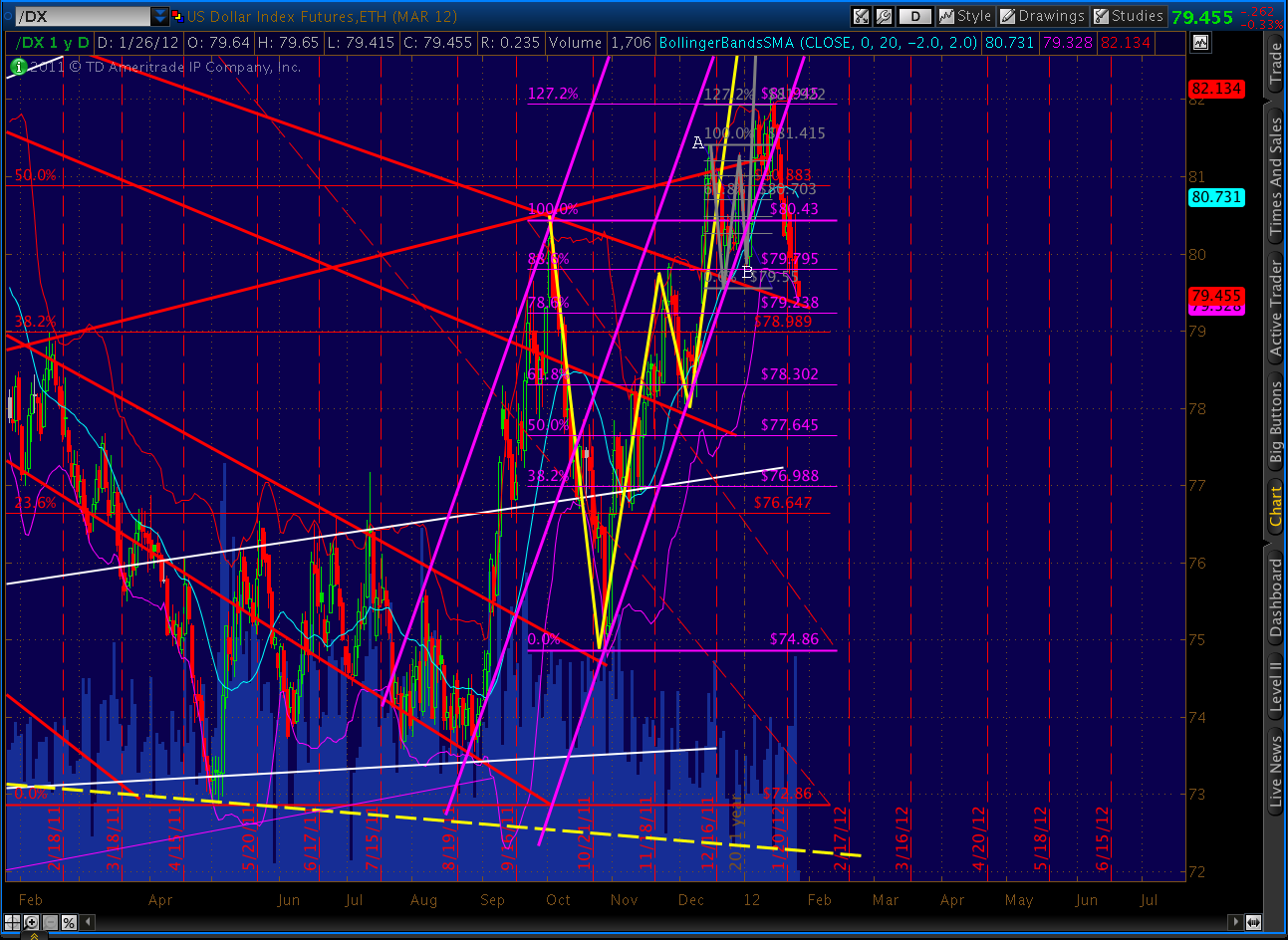
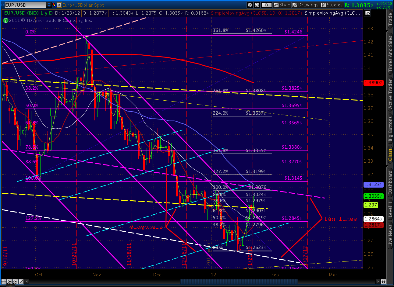
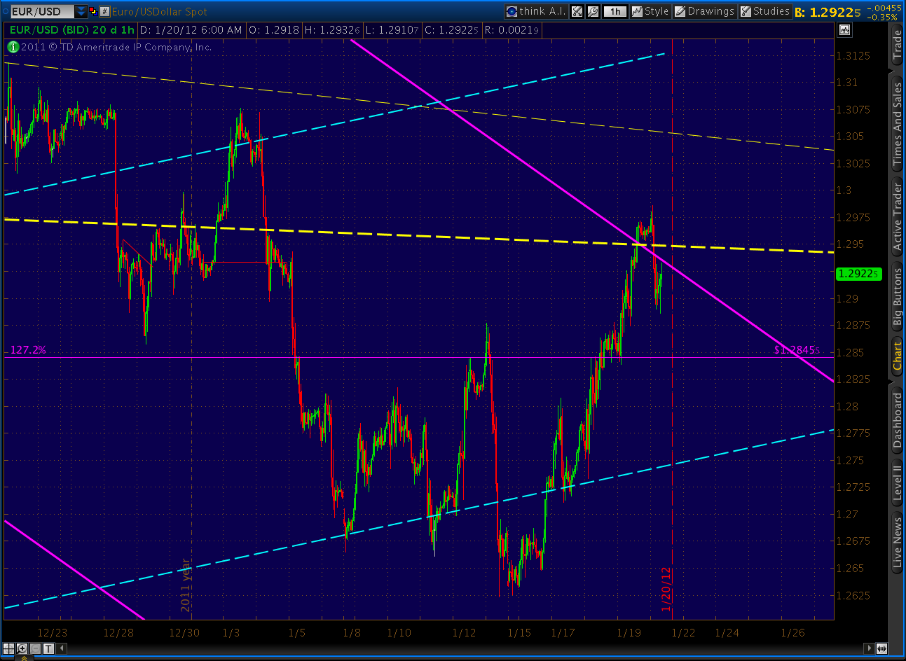
    EURUSD has not only tagged the boundary of the channel it’s been following since October, it’s completed a bearish Butterfly at the 1.272 extension.  This should be the end of the run (although an overshoot to the 1.618 is always a possibility – use stops!)

    A reminder, we’re shooting for at least 1.2464 (Crab pattern), and the slope of this channel line has been proven time and again over the past few years.  Note the purple channel lines on the weekly and daily charts below.  We’re also backtesting one of our channel lines (yellow, dashed) which have done a nice job of guiding intermediate moves.  A decline to 1.2464 from today’s high is a 3.9% drop.

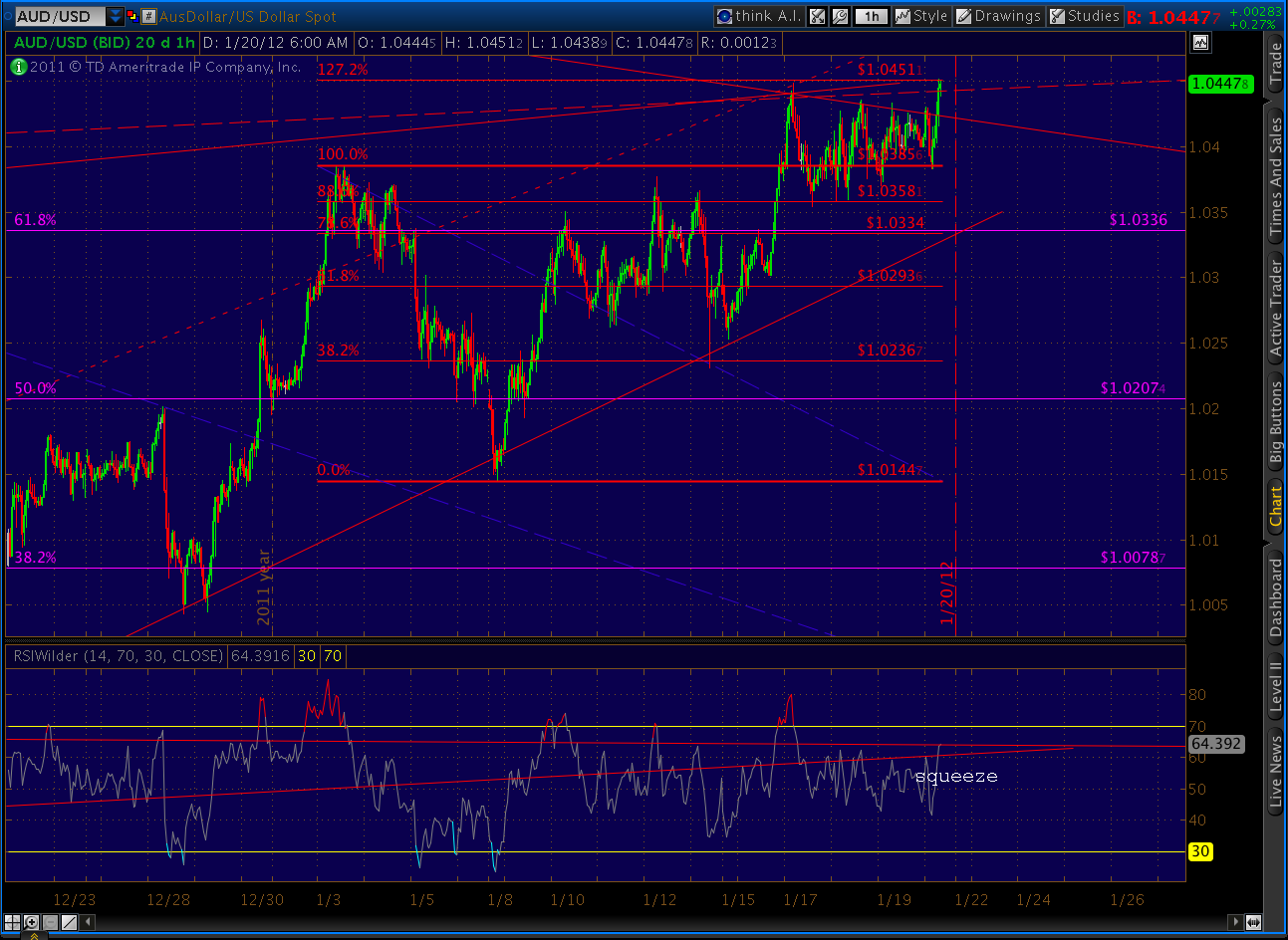
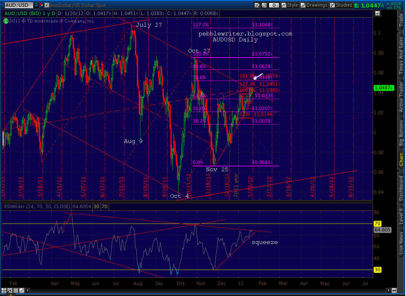
    The AUDUSD has tried to push above its channel boundary to complete the Gartley/Crab, but no joy so far.  A failure to complete it, along with a firm hold here at the boundary would be extremely bearish for it and for equities in general.

    More after the close.

    ORIGINAL POST:

    First, thanks for all the emails yesterday regarding taking this blog private.  I haven’t read all of them yet, but about 80-90% of those I’ve read so far support the idea — particularly if it comes with a steady stream of info on a variety of securities.

    I focus primarily on SPX, but I was thinking (updated daily) charts for SPX, RUT, DJI, NDX, COMP, VIX, EURUSD, DX, GC, SI and maybe a few stocks everyone watches like AAPL.  I could run three sets for each:  (1) long term — weekly or monthly, (2) medium term – daily, (3) intra-day.  I would detail the chart and hamonic patterns I see, and provide a guide to finding and understanding harmonic patterns that many of you have been requesting.

    I think the guide could help everyone be more knowledgeable about the patterns, so we could use a shorthand that would allow me to increase the volume of info rather than spending time on prose describing what I see.  So, for example:

    “rw on SPX, apex @ 1324 intersecting with FL from Oct ’07, May and Jul ’11;  .886 of pseudo-Bat (1370-1074) @ 1331.

    instead of:

    “With today’s push, the rising wedge has expanded and points to an apex of around 1325.  Note that 1325 intersects with a fan line coming off the Oct 07 highs and connecting with the May and July 2011 highs.  It’s also with a few points of the Fibonacci .886 (1331) of the distance between the May highs (1370) and the October lows (1074.)  Recall that it’s not technically a Bat pattern because our Point C (1074) is lower than Point A (1101 on Aug 9.)

    I’d also like to establish a more robust commenting capability to increase the communication among readers.  There are at least 2,000 of you on a daily basis now.   But, these emails are the first I’ve heard from most of you, and I’ll bet you have something to say — even if it’s only about how badly I blew a particular call.

    And, last, I’d like to set up an email or twitter feed for timely stuff that comes out during the day — maybe my take on a bogus earnings report, a fib target being hit, a trend line broken, etc.

    As some of you have pointed out, I announced a few months ago that I’d be scaling back. Well, let’s just say I tried.  I really did.  But, with another big whoosh on the way, it seemed like bad timing.  And, I must admit, I enjoy blogging.  I just have to figure out a way to make it more valuable but require less time… and somehow compensate for the tradeoff between spending time with family and being able to support both said family and my charitable giving.

    Right now, the information is spread far and wide and is all too often posted on other sites that charge big bucks for my ideas (if the shoe fits, RP…)  It’s one thing to give away valuable info, but quite another to provide free product to a “competitor.”  It makes more sense to deliver valuable info to those who value it and cut out the middle man.

    For those of you who have affordability concerns, rest assured that the cost will be reasonable — about the cost of the commission on a round trip trade on which you stand to make many times the fee.   I might even do a special deal of some sort for current followers.

    Please let me know what you think.  This site is for you and I want it to be something you’re excited about.  Again, the address is: pebblescribe at gmail dot com.

    *****

    Lots of stuff going on today.  I’ll post some charts shortly.  First, thanks to Dillzs99 for this comment on yesterday’s post.  I thought it was important to bring it current for all to see as it raises some good questions:

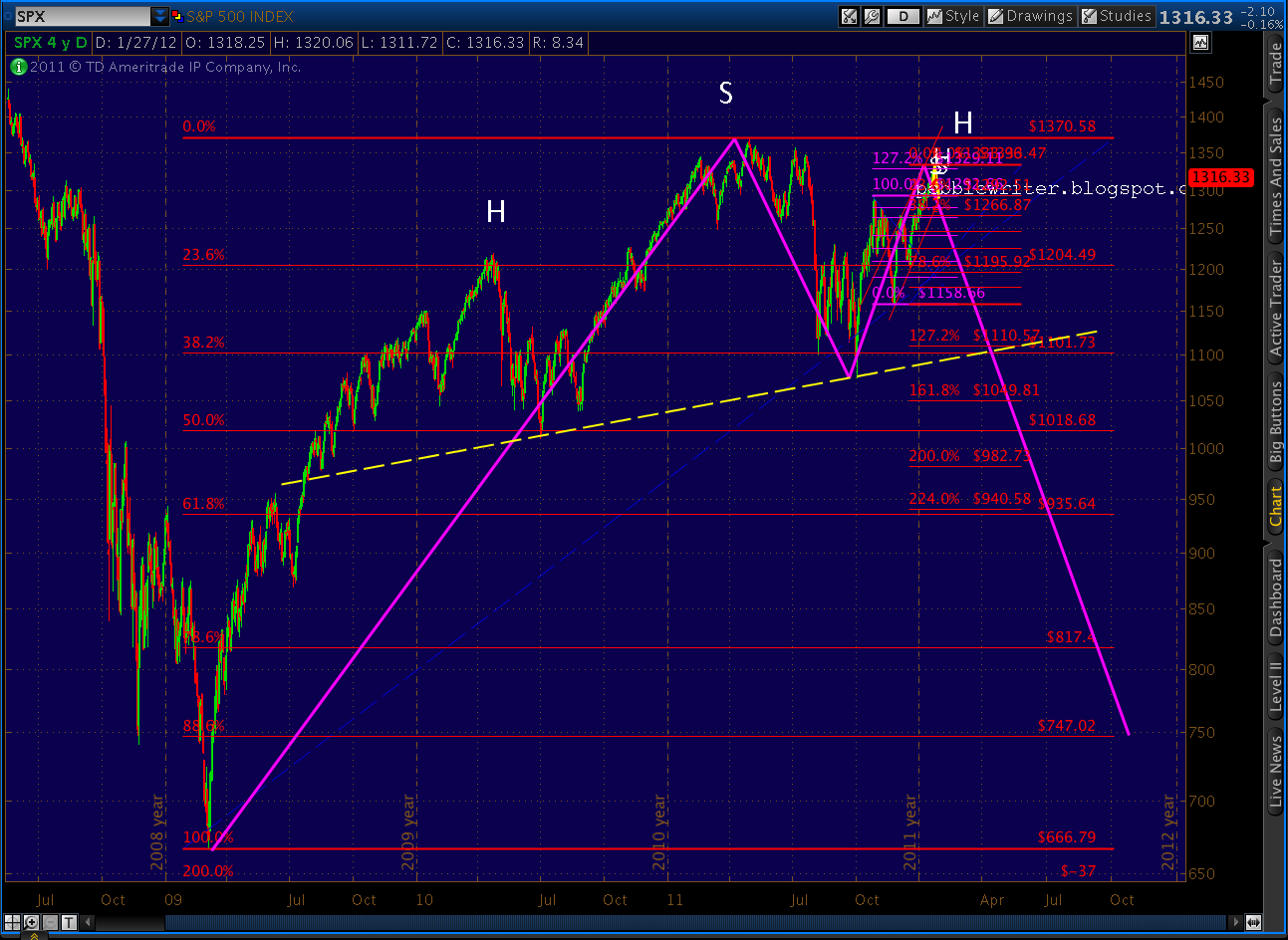
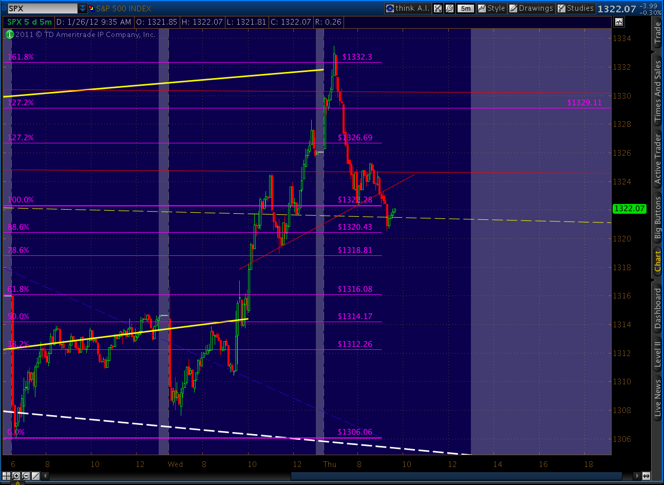
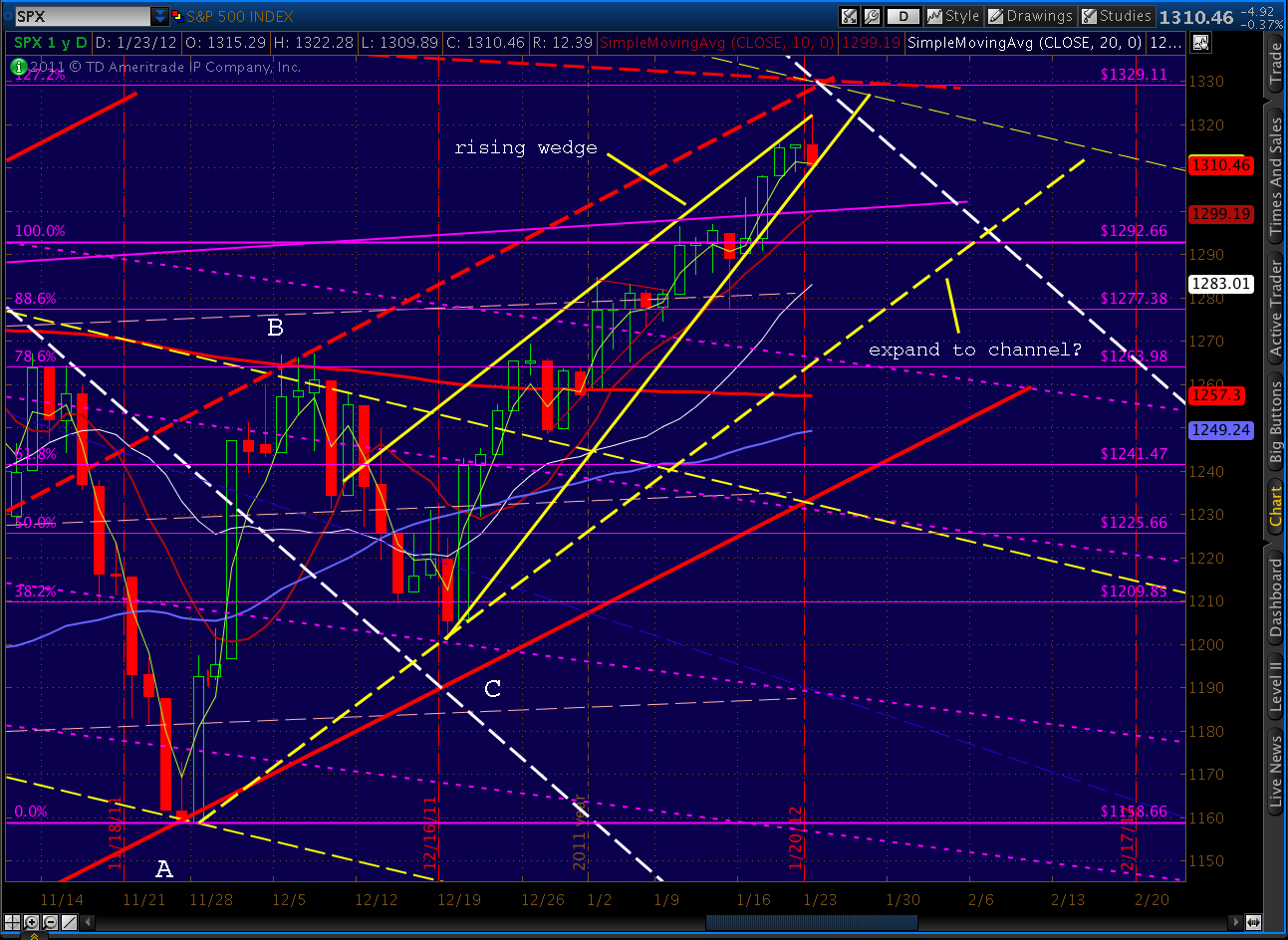
    It looks like SPX may be working on completing a bat pattern at 1336. Using X as the May high and A as the October low, you can make a case that B was hit on 10/12 just below the 50 retracement and C @ the 38.2 was hit on the next day 10/13. The target for D in this case is 1336. 1336 also is almost smack on the descending trend line from the 2007 high.

    I also have been watching the harmonics on the RSI. It seems as though the daily RSI is in the last leg of a butterfly. X in this case is the 10/28/11 peak and A is the 11/23/11 low.

    Additionally, the RSI weekly looks to be finishing a gartley. X in this case is the 2/14/11 peak and A is the 8/8/11 low.

    In my opinion, a final push to 1336 would complete the bat pattern, and finalize the harmonics in the daily and weekly RSI. It also would correspond well with the last push up the harmonics are expecting in the AUD/USD (as you noted above).

    Here’s a chart of the relevant Fib levels involved in the Bat he’s suggesting:

    I agree with 1370 as a Point X.  It’s right up top, where we like X’s to be — major turning points.  Likewise, Point A is at an important low.  My only concern is Points B and C.  It’s entirely possible these two are the right ones, but I’m not thrilled with using them because it means ignoring some otherwise more remarkable turns.

    If we hadn’t seen C go below A, for instance, we might have something like this.  I’d be willing to ignore a point or two and call it a 100% retrace, but not 27.

    We could fix the C versus A problem and go with something like this, but then we have a Point B at the .786, which means Butterfly instead of Bat.  That would spell an extension to the 1.272 @ 1433 — which I just don’t see in the cards — for a variety of non-harmonic reasons.

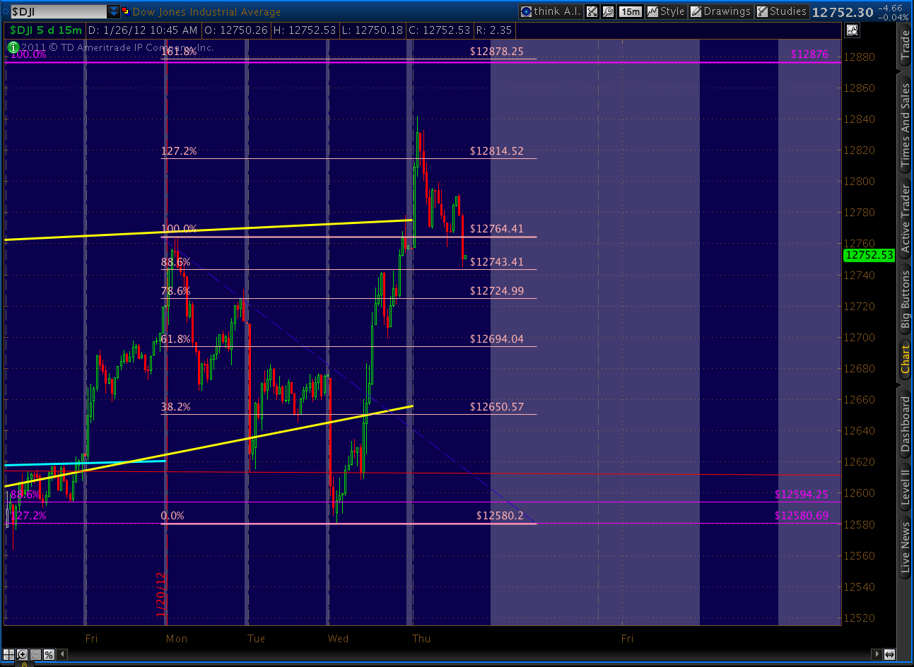
    The only pattern that I really like it this one.  It turns right at the .786 so it’s (so far) a perfectly formed Butterfly that calls for a Point D at the 1.272 extension of 1329.   This fits with your RSI harmonics observation, Dillzs, and it’s one I’m really comfortable with.  It also happens to be darned close to your 1336.

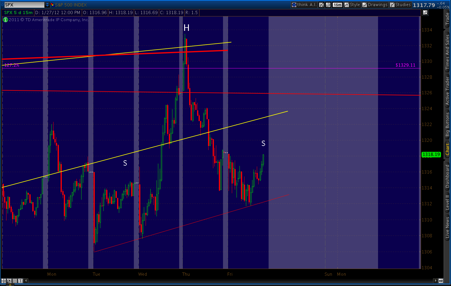
    I’ve drawn the fan line off Oct 2007 as precisely as TOS allows, and I think 1329 is a little closer to 1325 or 1331 (current values, depending on whether you count the May 2 shadow) than 1336.   Here’s a close up.

    Having said all that, we could easily hit 1336.  This rise has a head of steam on it, and Wall Street is pumping the living crap out of it.  I think bears, who have been beat down so many times over the past few months, are licking wounds and picking a place to take a stand.  The fan line from 2007 seems like a good one, and OPEX will no longer be an issue in about 26 hours.

    Whether we turn down from here, 1329 or 1336 isn’t terribly important.  It would be downright silly to try to catch the absolute top within pennies when we’re talking about a potential 300+ point drop (if this is, indeed, P3.) 

    More later.

  • Charts I’m Watching: January 18, 2012

    UPDATE:  11:40 AM

    It’s been a few days since we looked at whether the fractal is still alive or not.  I suspect it, and the analog between 2007/8 and 2011, simply became too well known.   TPTB have very strong vested interest in keeping this crap game afloat, and a July style plunge would be very bad for biz.

    I have to accept some of the blame.  Hoping to share the benefit of my discovery, I probably spread the word a little too wide.   I believe I was one of only a handful who saw it coming in July; but, this time around, there were no doubt many, many more.

    I’ve seen a huge uptick in the traffic to the site, and many of my charts are ending up on other technical websites — with and without attribution.   I’m considering changing pebblewriter to a member-only site, charging a nominal fee and posting all my short-term and longer-term harmonic set ups, along with a guide to understanding harmonics.

    I have a few institutional clients for whom I consult, and I know they would appreciate a tighter circle.  Please drop me a line, let me know what you think.  I can be reached at pebblescribe at gmail dot com.

     ***

    Now, a look at some charts…

    Things were looking pretty good up until about marker #8 on the current (right hand side) chart.  In July, #8 couldn’t push up past #6.  To some of the Ellioticians I follow, this was a truncated C wave.   the ABC also expanded.

    Currently, we’ve completed a more traditional zig-zag pattern where C exceeds A in price and is almost equal in length to A.  Rather than expanding, prices have narrowed — forming a rising wedge.  Obviously, time and price comparisons for the fractal have both suffered.

    It doesn’t invalidate the fact that we’ve formed a robust rising wedge with growing negative divergence and half a dozen other signs of a top.  It remains to be seen whether we’ll see the same payoff as the Feb-Jul time period; my best guess is that we will.

    Regarding the analog between 2007/8 and 2011 that worked so well up until the spike around day 125, it’s also off track.

    Again, the culprit is the day 125 spike — as well as the size of the corrective wave in July.  A trend line drawn off the Oct 2007 top through the Dec highs provided great guidance for the May (day 150) Wave 2 peak.

    This past July, we overshot the corrective wave I expected.  Still, we had a huge downdraft starting on day 57, only 5 days after the analog predicted.  And, the size of the plunge exceeded the 2008 version.  (I’ve made the analogy before — these moves are like rubber bands; stretch an expected move out and it’ll just snap back faster.)

    But, because July was higher, the trend line off the top was tilted upward relative to 2008.  As we’ve discussed before, it ranges from 1303 to 1329, depending on whether one counts shadows or not.  So, although we’re off track in terms of the day count, we’re still very much on track in terms of the chart pattern.

    Throw in all the other indicators (the third rail, negative divergence, narrowing leadership, negative divergence both on technical terms and relative to VIX, XLF, RUT, etc.) and I’d say the upside is very, very limited.  I suspect that, years from now, we’ll look back at the obvious similarities and forget all about the several weeks of divergence between the two.

    In the meantime, that ol’ rubber band just keeps stretching…

    UPDATE:  11:10 AM

    VIX, which broke out of the smaller falling wedge (dashed, white) we’ve been tracking for the past month or so, smacked up against the upper boundary of the larger falling wedge (solid, red).  It also works as a back test of the smaller wedge trend line.

    I suspect that the Bat pattern we just completed at the .886 on the 60-min chart will constitute a Point B for a larger Crab pattern that breaks VIX out of the larger wedge, too.  If so, look for a completion of the inverse H&S; pattern that’s setting up — with potential to 28-29.

    ORIGINAL POST:  10:00 AM

    AUDUSD has been a great indicator for the direction of the stock market.  Currently, it’s saying we’re on a precipice, but there’s likely a little more juice left in the market before the downturn gains momentum.

    The AUDUSD patterns have followed some pretty clearly discernible paths.  In general, the Aussie has been steadily appreciating versus the USD.  But, stock market plunges in 2008 and 2010 dropped it from the channel it’s been following since 1999.

    When the stock market recovered, the AUDUSD regained the channel — always following the same impulse channel slope on the upside, and the same corrective channel slope on corrections.

    Over the past few days, we’ve bumped up against the upper boundary of the current corrective channel.  Recall that this trend line correctly forecast the past two steepest plunges: the July 240-pt selloff and the late October 130-pt drop.

    So, when we approach the channel line for a third time, we should all pay close attention.  As always, the question is “are we there yet?”  There are two harmonic patterns I’ve been watching, a large Gartley (purple) and a smaller Crab (red) pattern (updated 10:30 am).

    The .786 of the Gartley is up ahead at 1.0519 and the 1.618 of the Crab is very close by at 1.0534.  So,  even though we’re pushing that channel line, I think it’s possible AUDUSD has a little more juice in it before the reversal we’ve been waiting for.  If so, I’d expect SPX isn’t quite done yet, either.

    More later.

  • Charts I’m Watching: January 17, 2012

    UPDATE:  12:00 PM

    There are a few alternatives for the 1307-1313 target we’ve been watching for a while.   I’ve always thought the trend line coming off the May 2 high would be important if the analogs we’ve been watching gave up the ghost. 

    And, I’ve always given a range is because it matters whether you include the shadow or not.   The two relevant candles are May 2 and July 7, so there are four possible combinations shown below.  The current values of each TL:  1303, 1315, 1318 and 1331. 

     Obviously we’ve tagged the lowest, marked in white.  It’s been my preferred target because it crossed the .786 Fib line in December — the time frame in which I last expected Wave 2 to be completed if it extended beyond my original expectations (which it obviously has.)   The combination of the TL and the Fib level formed the basis for my target.

    It also comes closest to matching the channel lines that have shaped the past year (shown in yellow).  Actually, a TL off the July 7 high to today’s high almost exactly matches the slope of those channels.

    So, is this the TL that matters?  Is Wave 2 finally done?  Note that this morning’s high also matches the TL coming off the 2010 pattern which tags the March and June lows (in purple.)  In past topping patterns, there were usually similar TLs winding their way through and dictating Wave 2 turning points.

    More later.

    ORIGINAL POST:

    Looking for clues for the turn…  focused on financials this morning.  Citi just completed a nice little Gartley at the .786 Fib on the 60-min chart.

    And, XLF testing last weeks high with a small Bat pattern that should peter out at the .886 (ignore the overnight pricing.)

    BTW, WFC reports an increase in earnings of $700 million, with a $600 million reserve release!?  Total garbage.   It overshot its Crab just a bit on the headlines, but this loser should crap out once investors dig a little beneath the surface.

    It’s very frustrating to see company after company get away with posting results that deliberately misstate reality.   Shame on them and the complicit “regulators” and “analysts,” and shame on the investors who believe the headlines.

    Speaking of  duplicity, Goldman is retesting the trend line that’s rebuffed the past several attempts to break out on the upside.  You could make a falling wedge out of this pattern, which would be potentially bullish.  But, the more likely guiding pattern is the steep channel pointing towards the Bat completion at 64.

    And, last, this from Experian, which reports an increase in first mortgage default rates from 1.9% to 2.19% since August, even as credit card defaults fell slightly.  Apparently, the anecdotal stories balancing their budgets by not paying their mortgages are true.

    I’m pretty sure the Fed’s bailout efforts (buying toxic mortgage debt from the banks otherwise on life support) will do little to reverse this trend.

    More later.