I had an great question yesterday regarding the bond market: “Is it possible the fear of pandemic in spring 2020 affected the behavior of 2yr and 10 yr and then indirectly triggered the crash?”
Pebblewriter longhaulers will recall that our bond cycle model forecast a severe plunge in interest rates long before anyone was talking about a pandemic. In August 2019, for example, we were already anticipating a drop to near or below zero around December 2020. It’s what the charts suggested, as we posted in April 2018 [see: Bonds – a Buying Opportunity]…
 …and it’s what was necessary in order to keep America’s books balanced. Annual debt growth was averaging 5%, and debt:GDP had topped 100% for the past five years.
As we pointed out in July 2019 [see: Why Interest Rates Must Not Rise] the only way to keep debt service from overwhelming other federal expenses had been to crash interest rates.
 The trick was how to force interest rates lower without alarming us economist types. Past maneuvers had involved adjusting Fed policy (not terribly effective for medium and long-term rates) and forcing inflation lower by forcing oil and gas prices lower as occurred in 2014-2016 and late 2018 (detrimental to stock prices.)
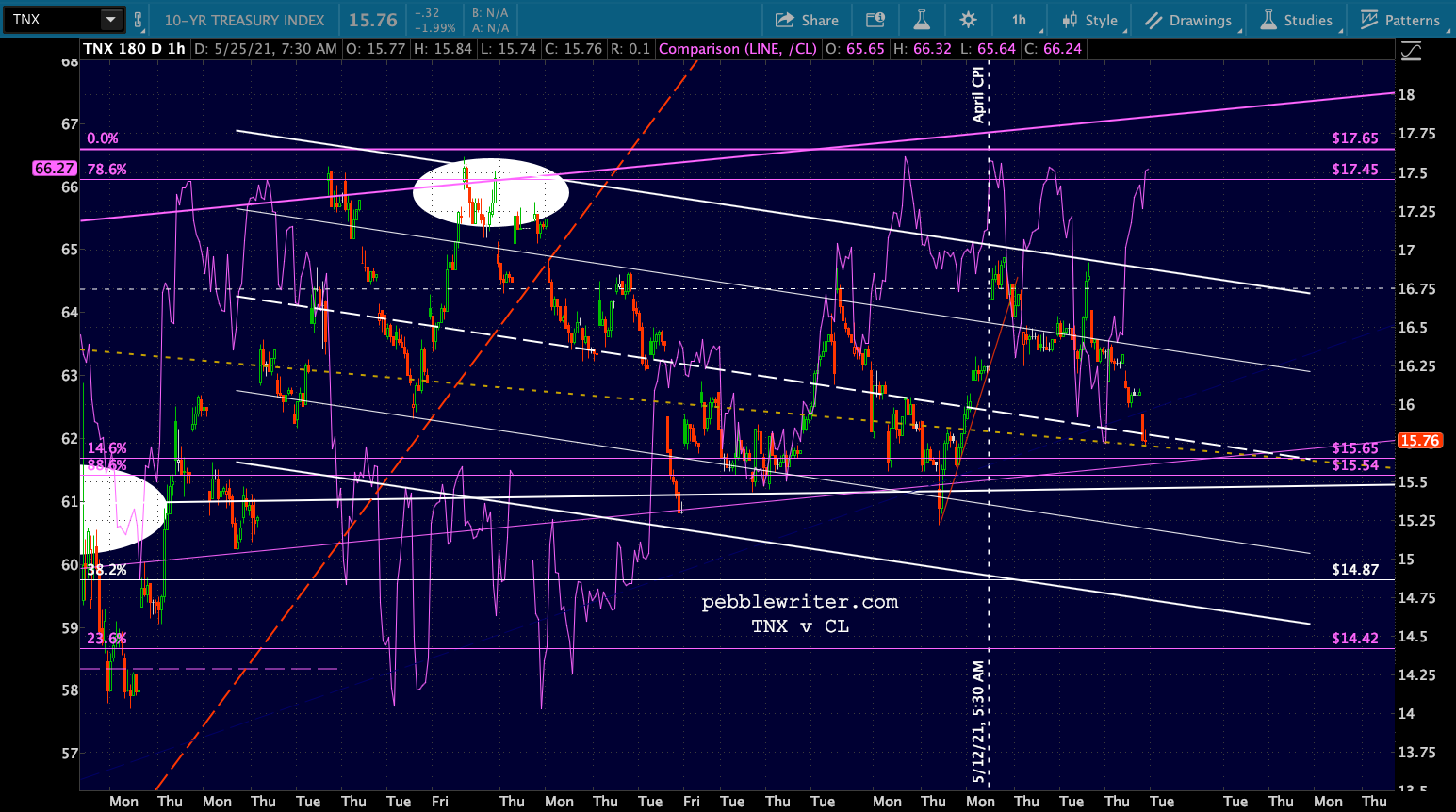
CPI, which had spent most of 2018 above 2%, had declined to a more manageable 1.7% by September 2019. But, the year-end ramp job in oil prices sent CPI up to a troubling 2.3% by December. The 10Y rose from 1.43% in September to 1.95% in December and, as the chart below shows, threatened to break out. Something, as they say, had to give.
 As the big brains at the Eccles Building were spitballing potential solutions, the most extreme case of deus ex machina imaginable landed in their laps. COVID-19 did the Fed a solid – albeit one which went way overboard.
 Oil prices, inflation and the 10Y were suddenly in a race to zero (oil won) and the Fed suddenly faced a slightly bigger problem: how to prevent Armageddon. They needed higher oil prices, interest rates and inflation just to talk equity investors (well, algos) off of window ledges.
 It worked so spectacularly well that they painted themselves back into a corner very similar to the December 2019 one: rapidly rising inflation and interest rates thanks largely to spiking oil and gas prices – exactly what our models predicted would happen. YoY gas price increases and CPI have been so highly correlated that they are now literally on top of one another.
 For the past few thousand years, this would have been a serious problem. Everybody knows interest rates spike when inflation spikes. Since the Fed essentially took over the bond market, however, they’ve been able to convince bond investors (well, algos) that spiking inflation isn’t a problem and, even if it is, it’s transitory.
Want proof? Rates have actually declined since April’s 4.2% CPI print and are nearly back to the same level as before the bomb was dropped. If I walked up to you on a cloudless day and insisted that shaking my rain stick will make it pour, you’d probably double over with laughter. If I had a secret accomplice spray water from a garden hose all over us from an undisclosed location, you might begin to wonder if I was right.
That’s what’s happening with interest rates right now. Except the rain stick is the Fed’s prognostications and the garden hose is actually a low-flying supertanker carrying 20,000 gallons.
Of course bond investors care about spiking inflation. But, with the Fed pumping billions of dollars into the bond market every day (more on days with alarming economic data) to force interest rates lower, they can claim that said inflation (“did we mention it’s transitory?”) is obviously not a problem. And the dopes in the financial press eat it up because, by God, they’re soaking wet.
Instead of rising, interest rates decline, proving to all (especially the algos) that the Fed must know what they’re talking about or — to us more cynical types — that they’ve completely destroyed the bond market’s price discovery mechanism.
So, did fear of the pandemic affect bond behavior and, thus, cause the crash? Absolutely – though it’s a bit of a chicken and egg situation. Everything unraveled at about the same time in the mother of all negative feedback loops.
The irony is that it accomplished what the Fed needed to happen in the bond market — though to excess. The Fed can now use the pandemic as their excuse for the most rapid expansion of monetary supply in history– even as spiraling inflation crushes the disadvantaged whom the Fed claims it’s desperate to help.
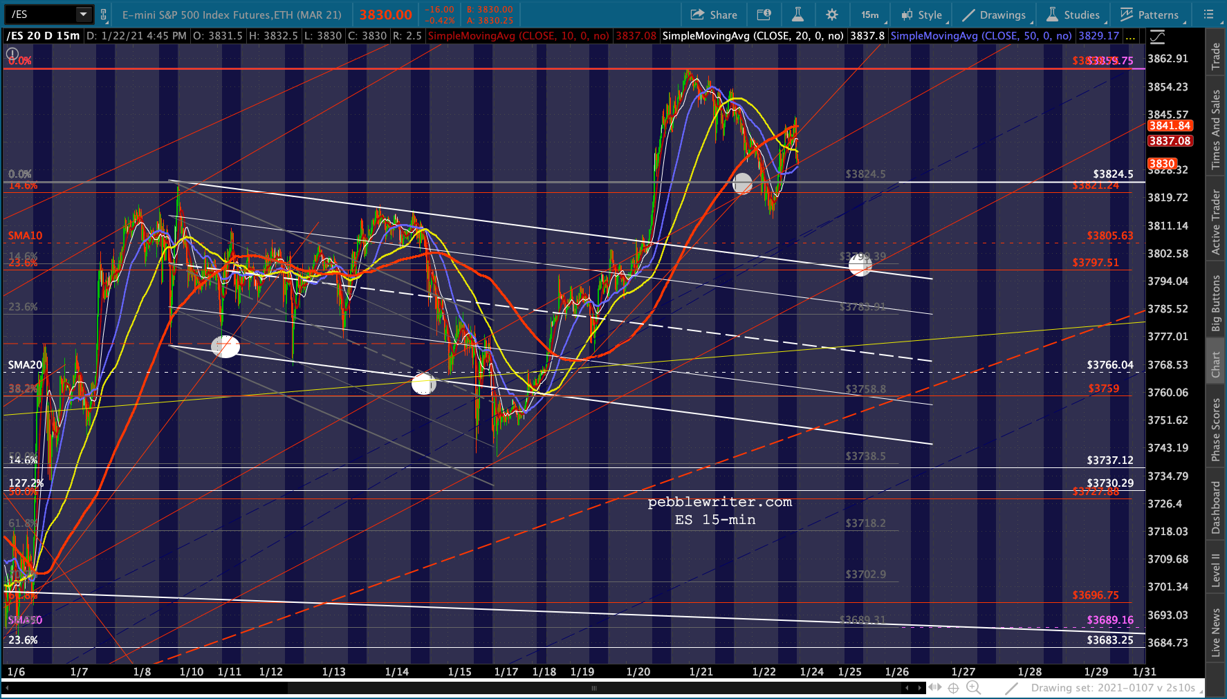
Now, on to the markets. No surprise, but futures managed to ramp higher again overnight – creating the illusion, at least, that the downside case is off the table.  It’s not.
continuing… (more…)


 The most significant chart on my screens at the moment, though, is the US dollar. DXY has had great difficulty breaking out of a tightly controlled consolidation pattern that dates back to July 2020. It tried this past September, but was smacked down to support stocks’ recovery from that terrifying (sarc) 5.8% slump.
 Now, it’s making another bid for a breakout — one we’ve been expecting for months (a very lonely stance BTW) — which wouldn’t bode well for stocks. Is this one for real?