Perhaps a better title would be: Whadda you lookin’ at!?!
In a replay of September 15, the Fed has essentially offered to swap out US dollars for all the crappy collateral the rest of the world can throw our way. Below, in its entirety, is my analysis from the last time. Turn off CNBC and read; I promise it’s worth the 10 minutes.
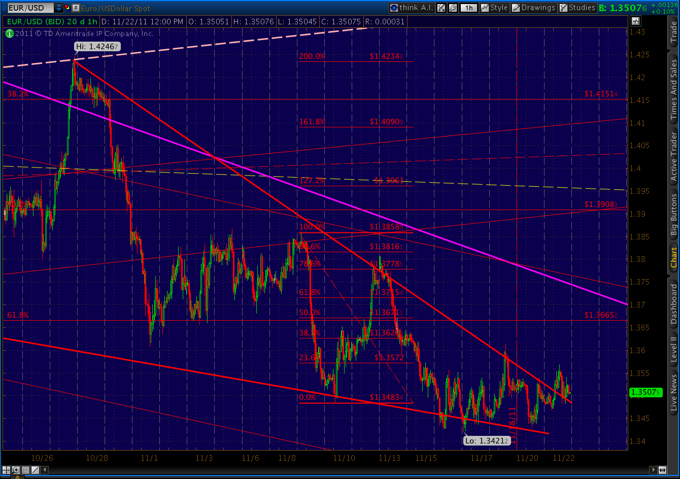
Nothing has changed except the numbers, which are much bigger this time. The punchline? These things boost markets for a couple days, then look out below. These are the interventions I found last go ’round:
SPX DX
December 12, 2007 1512 75.92
low/high next 3 days 1445 77.49
low/high next 35 days 1270 77.85
May 9, 2010 1164 83.07
low/high next 3 day 1156 85.57
low/high next 30 days 1011 88.91
Aug 24, 2011 1208 73.72
low/high next 3 day 1121 74.55
low/high next 35 days 1121 78.30
(so far)
When the September 15 intervention occurred, I concluded that “today’s rally isn’t justified.” Sure enough, the 21 points we gained that day (and 11 the next) were followed by a 1-wk 100-pt plunge. Twelve sessions later, we had lost 146 points to the 1074 low.
The lesson here is that if things are so bad that the Fed needs to resort to these measures, then things are very bad indeed (duh!) And, it’s probably just a matter of days (Friday is day 150) before the rest of the world gets it.
The World’s Biggest Pawn Shop
pebblewriter.blogspot.com
Sept 15, 2011
On a day when Marketwatch warns…

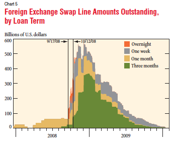
We first started this back on December 12, 2007. From the NY Fed’s research publication Current Issues in Economics and Finance, Apr 23, 2010:
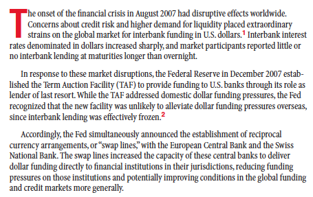
We took Euros and Swiss Francs and Japanese Yen and NZ Dollars that no one wanted and gave them US Dollars in exchange. These central banks could loan these valuable greenbacks to their financial institutions who would (theoretically) lend them out to (theoretically) worthy borrowers — keeping liquidity alive and jumpstarting the economy. It would also (theoretically) put a floor under the foreign currencies’ values and keep them viable in the global finance marketplace.
Back then, financing had dried up because several large banks, investment banks and a hedge fund in insurance company clothing (AIG) had failed or were in the process of failing. They were failing because of a newly developed but widely circulated idea that loans ought to be backed by adequate collateral. Those that weren’t probably weren’t worth all that much.
Today, financing in the Euro zone has dried up because the Euro zone, itself, is in the process of failing. Some foreign and Euro-based investors are convinced that making loans there is throwing good money after bad. As I blogged a few days ago:
Deposits by financial institutions in Germany off 12% since Jan ’10, 24% since Sep ’08. France, oddly, not as bad at 6% and 14%. Italy off 1% in retail dep’s (serious money’s already gone), 13% ($100B) by financial insitutions. In other words, banks don’t trust each other.
Fitch says US Money Market funds cut lending to Euro banks 20% in last 3 months (Germany-42%, French-18%, Spain and Italy 97%.) At $1.5 Trillion, MMF’s are a vital source of funding.
The ECB can’t make up for all that, but it’s trying. Italy – EUR 85B in three months; Greek and Ireland – EUR 100B each in August; Portugal – EUR 46B in July; Spain – EUR 52B in July. Total lending so far = 7X Euro zone central banks’ combined capital.
Total exposure in loans from other Euro countries to PIGS: $1.7 Trillion. Lots more in guarantees and derivatives.
Total swaps outstanding under the 2007 program peaked at $580 billion in December 2008. At the time, this represented about 25% of the Fed’s total assets. The program was officially terminated in February, 2010. As the April 23 Fed article points out, market conditions had improved and financial strains had abated.
Two weeks later, on May 9, the Fed announced…
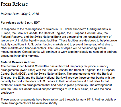
Apparently the system wasn’t quite ready to stop sucking the liquidity teat. The ECB immediately drew down $5.5B, bumping that to $500B in both August and October 2010 and finally zeroing it out in March 2011.
All was fine until last month, when the Swiss National Bank unexpectedly drew down $200B. It was followed the next week (Aug 24) by the ECB and another $500B.
Then, today’s news, and a 20-point SPX rally. Is this really that great a development? Let’s look at how both the dollar and the stock market performed following previous manipulations.
SPX DX
December 12, 2007 1512 75.92
low/high next 3 days 1445 77.49
low/high next 35 days 1270 77.85May 9, 2010 1164 83.07
low/high next 3 day 1156 85.57
low/high next 30 days 1011 88.91Aug 24, 2011 1208 73.72
low/high next 3 day 1121 74.55
low/high next 35 days 1121 78.30
(so far)
Bottom line, each intervention did diddly squat for stock investors. Today’s rally isn’t justified.
But, more importantly, we need to consider the more serious implications. The Euro zone is obviously on life support. The entire scheme is hanging by a thread, and we’ve been brought in to stitch it back together. We, who just last month were in danger of defaulting on our own debt.
The Fed’s balance sheet, only $885 billion in Dec 2007, has ballooned to nearly $3 trillion. And, every time we bail out another entity, whether it be Bank of America, General Motors or the ECB, we minimize the effect markets have on lending and borrowing and saving. We impose a rationale which, in the long run, not only delays the inevitable but exponentially raises the stakes.
And, what happens when one of these sterling borrowers goes under? The Fed article goes to great lengths to explain that we’re not taking crappy foreign loans as collateral. No, we’re simply taking the currency backed by lenders who make the crappy foreign loans — loans that no lender in his right mind would make. So much better, no?
The Fed Reserve article (published when the Fed thought the worst was behind us) details what happened the last time we did this.