UPDATE: 1:15 PM
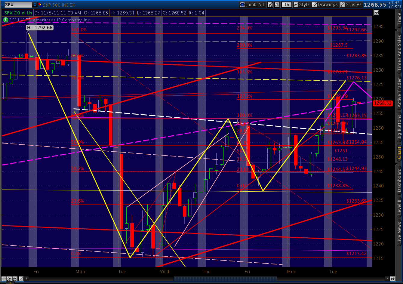
Here’s a little better view of the alternatives I see for the next move. Note the triangle apex is about December 5, which matches the 2011/2008 analog precisely.

Note also that the past two OPEX closing prices have been roughly in a straight line with this month’s 1260. Also, 1257.58 is the .618 Fibonacci retracement of drop from 1370 on May 2 to 1074 on Oct 4. In other words, it’s quite likely we’ll close Friday within spitting distance of 1260. After that, all bets are off.
As to the alternatives, here’s how I see them stacking up.

The Butterfly pattern that’s been forming could complete at 1313.67 (the 1.272), although they occasionally extend to the 1.618, which would be 1340. I consider 1340 unlikely, as it would involve the market breaking through a very important trend line coming off the May 2 highs (the dashed, purple line.)
Also important is 1307, which marks the .786 Fibonacci retracement of the above-mentioned move. Since 1307 and 1313 are so close to one another, I would consider that range a reasonable target for the upside, if it occurs.
Another pattern supporting the upside scenario is a channel that’s formed off the October bottom. The midline points to the 1307-1313 range sometime around December 7-13.

The big question remains whether a higher high is in the cards or not. After doing a lot more research, I am only slightly less confident than the 50/50 I’ve been over the past week or two.
Take a look at the RSI’s major trend lines, seen as a triangle on the daily chart below. The TL’s (solid purple) converge on around December 5. A major increase in stock prices would probably entail a break above the upper trend line — something that’s been very difficult to accomplish going back as far as January 2011.

Each previous occurrence of converging trend lines on the RSI daily chart set up a significant downturn. The downturns, which occurred when the lower RSI trend line was broken, are marked with a yellow asterisk. Follow the yellow vertical time lines upward to see the associated SPX price action.
As mentioned above, the most recent lower trend line (purple, since Aug 9) is converging with the upper TL around December 5. The market must break, one way or the other, out of the converging lines. These similar past patterns suggest that move will be down, as do the ones from 2007-2008:

BTW, it’s interesting that the last TL break on the right occurred on May 2, two weeks before the actual high of May 19. Look closely and you’ll see that, on May 19, RSI was backtesting its trend line. While the market moved 18 points higher, the RSI came in lower — in a classic example of negative divergence. I won’t be surprised if the same happens in this market.
UPDATE: 12:15 PM
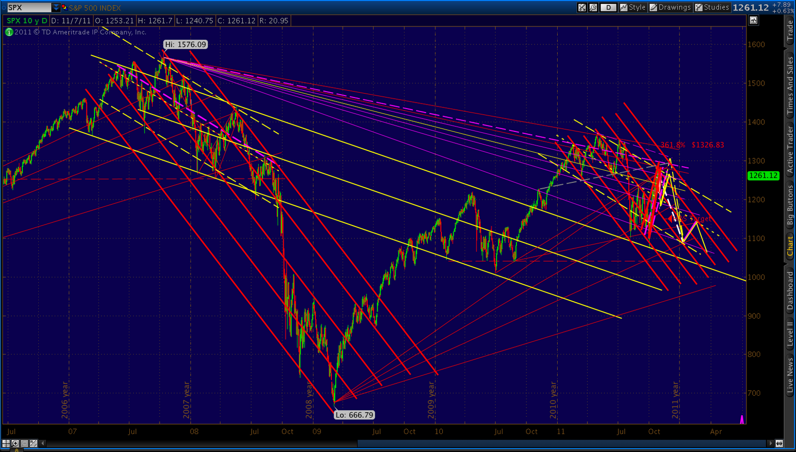
One of the my favorite of TOS’s limited charting capabilities is the regression channel. You get to pick two points — the start and the finish — and it does all the rest for you. It’s not only easy, it’s pretty bias-proof. Other than gaming the start and finish lines, there’s no way to impose my directional bias on the results.
Here’s what I’m studying this morning:

In my opinion, we have at most three weeks during which to match up to 2008’s moves. I’ve selected December 5 as the most likely day the bear market resumes — although it could happen anytime between now and then. The only question, in my mind, is whether we turn down from these levels or whether we go back up and tag a slightly higher high — say, 1307-1313.
Once we do turn down, it will be a much more powerful decline than we saw in August. In fact, it should be at least as powerful as the decline we saw in the latter half of 2008. Those with large equities portfolios should consult with their advisor asap about hedging them, or at least placing stops.
ORIGINAL POST: 2:15 AM
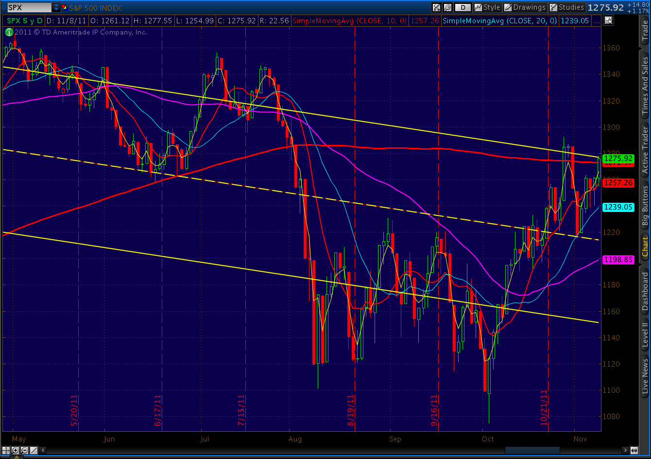
Whether you call it a flat or a triangle, the market is looking very much like a coiled snake. The line we’re oscillating around is 1258, the neckline of the large H&S; that broke to the downside on August 1.


More later.