The fractal we’ve been watching the last couple of weeks Another Fractal: December 7] and [Another Fractal: Update Dec 14] is playing out very accurately.
As I noted in last week’s update:
Remember the fractal I posted last week? It’s, um…, still here. If it were to hold perfectly, it would do a .618 Fibonacci retracement of the 109-point Nov 25 – Dec 7 rise, landing at 1200 — then rise to as high as 1255 before a violent plunge to 980.
 |
| From Dec 7 Post |
 |
| From Dec 14 Post |
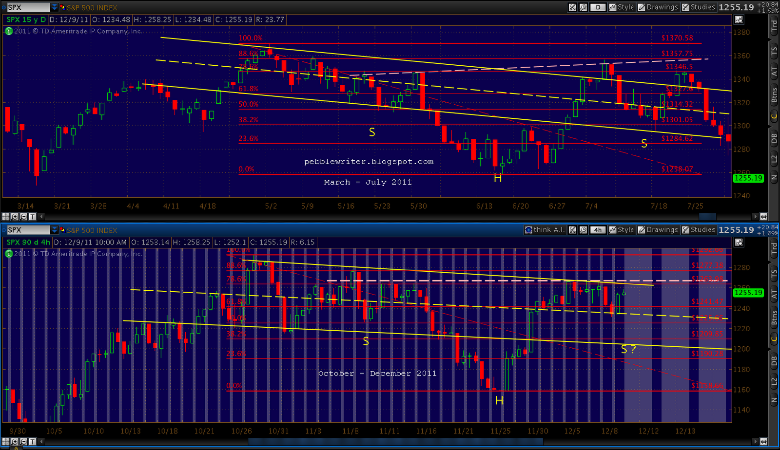
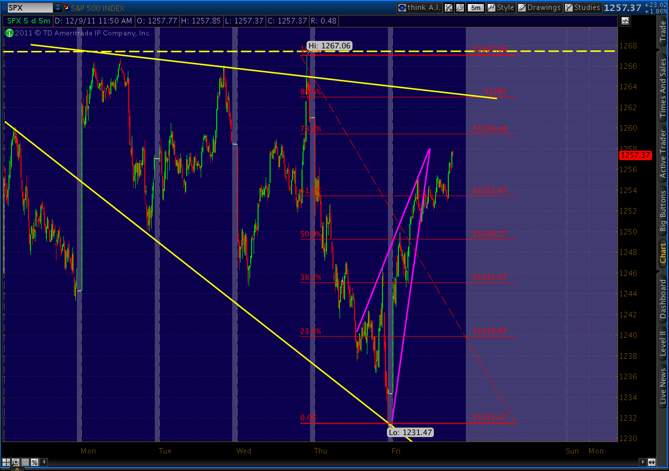
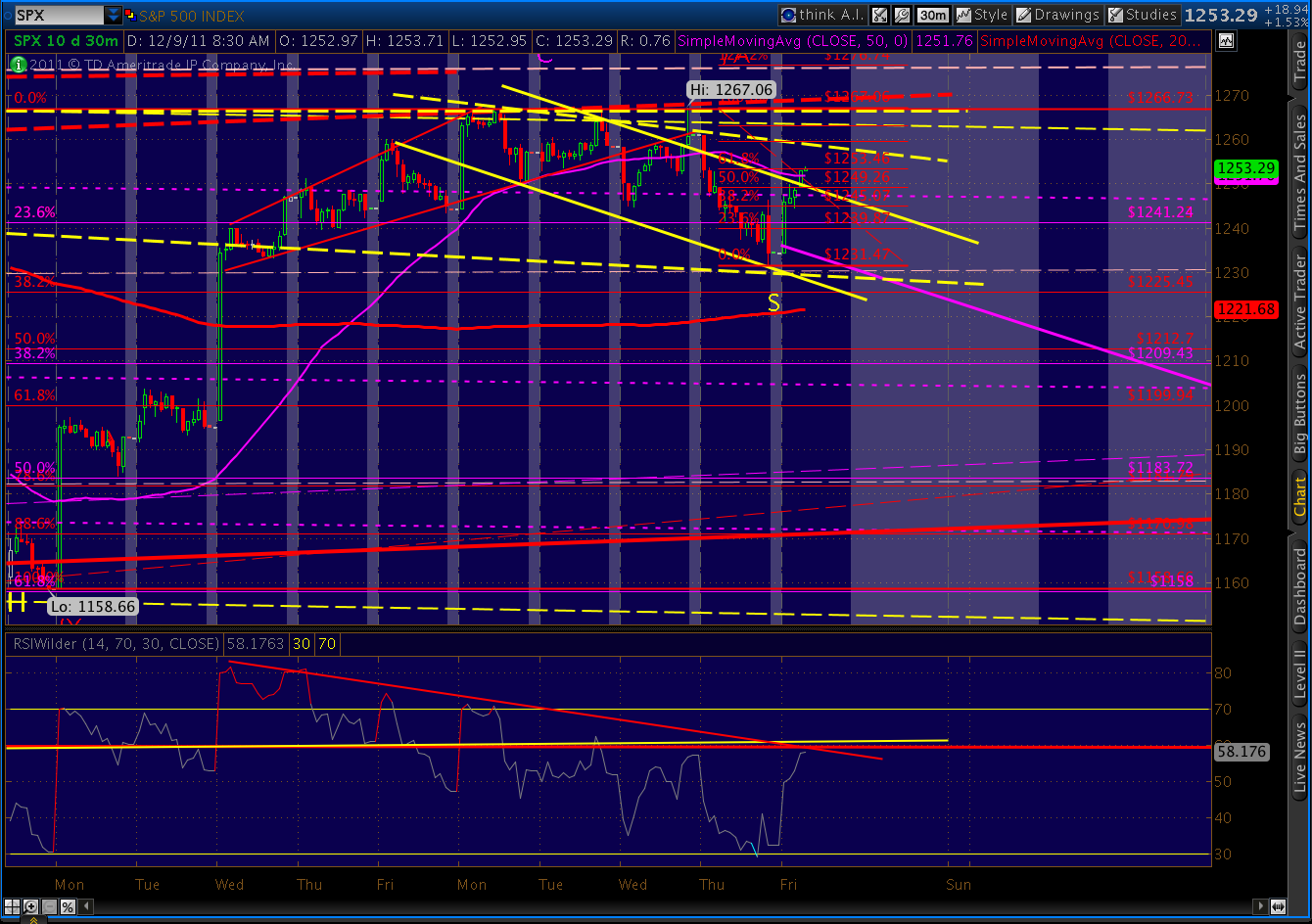
We got the 61.8% Fibonacci retracement yesterday — touching 1202.37 in the afternoon meltdown. This morning, we’re continuing to follow the pattern, thus far scoring a 27-pt gain to 1233. Here’s what the fractal looks like today.

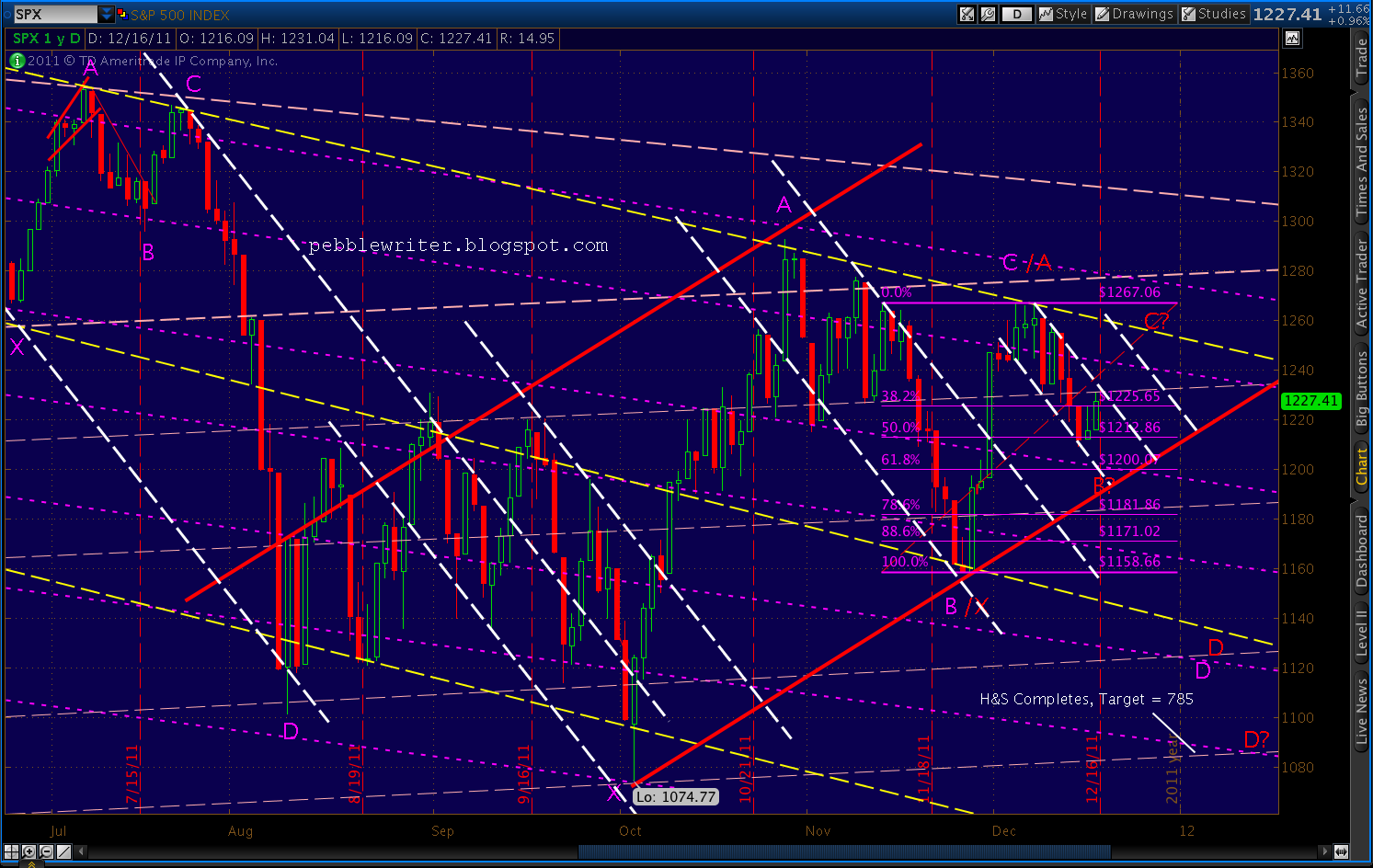
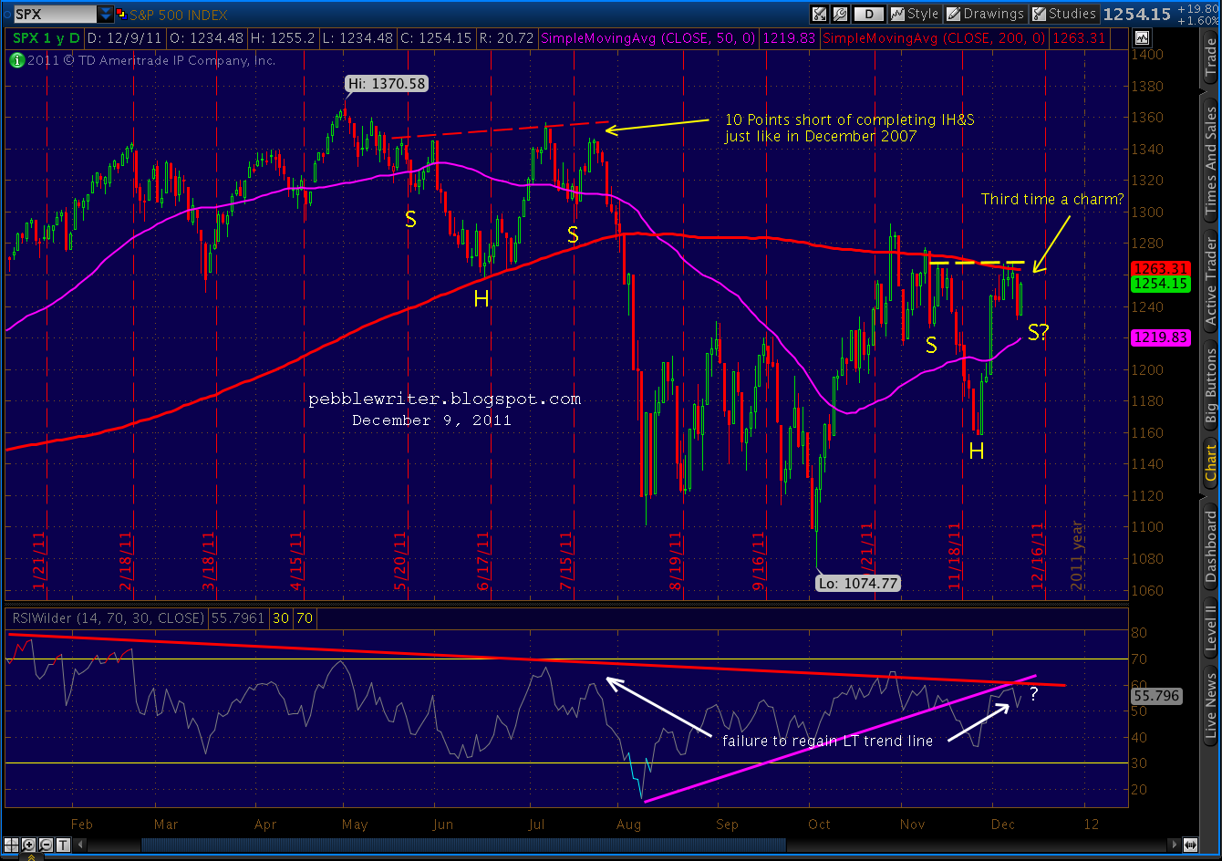
Now, as the rest of the investing world is forgetting about the troubles of the past few weeks, they’re starting to focus on the Inverse Head & Shoulders pattern up ahead. As we talked about two weeks ago:
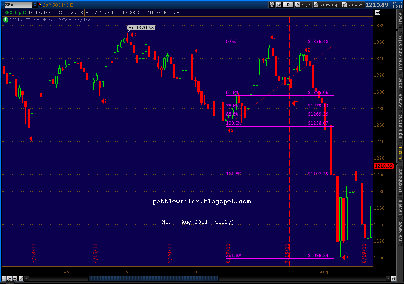
I think this would get a lot of people excited, just like similar moves did back in July and previously in December 2007. Each of those IHS patterns trapped a lot of bulls when they came up 10 points shy of completion. [see: Ten Lousy Points.]

So, where do I think this rise will land us? The IHS pattern would complete today around 1261 or so. Subtracting “ten lousy points” yields 1251 (1261 – 10 = 1251.) But, that’s oversimplifying it, right?
In July, SPX retraced 84.35% of the previous dip in the corresponding period. That points toward 1257 (64.69 * .8435.)

Then, there’s the Fibonacci methodology. The relevant figures are:
Any way you slice it, the turn should come somewhere around 1251 – 1257 (1258 is a key number over the past year.) And, it should happen quickly — by tomorrow or Thursday. After that, watch out below.
There is corroborating evidence in the VIX daily chart. Over the past five years, VIX has traced out very clearly defined channels.

Looking a little closer, it’s apparent that VIX has not only reached the lower bounds of three intersecting channels, but is nearing the completion of a bullish Butterfly pattern (in red) within the last leg of a large Bat pattern (in purple) at 20.88 and 20.66 respectively.

A frantic push to 1251-1257 on SPX could easily knock VIX down to 20.66-20.88, finishing off both patterns and setting the stage for a strong rise in VIX to go with the stock sell-off.
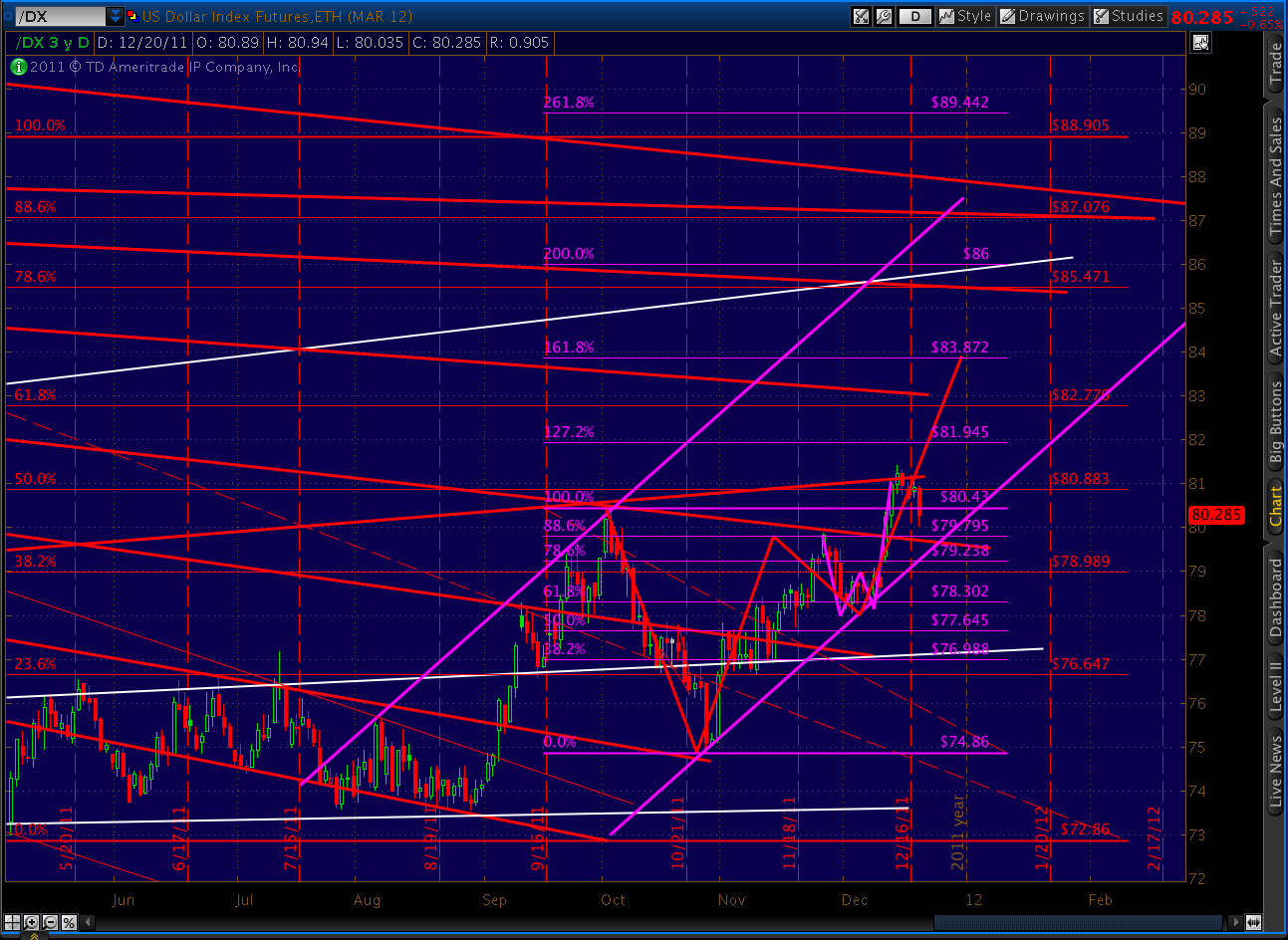
I know what you’re thinking…. we can’t have a panic sell-off without a huge dollar rally. What’s happening with the dollar? Here’s our well-worn daily chart, showing all the major channels and fan lines over the years.

The close-up of the current channel shows the recently completed crab pattern and subsequent (today’s) reversal. I’m expecting a drop back to the fan line we just cracked. It might correspond with a touch on the channel wall, but more importantly, it’ll drop below the psychologically important 80 price level (which was tested today.)
It’ll appear to be a game changer, but it’s a dollar bear/stock bull trap. As the harmonics show, this downturn in the dollar is simply the payoff from a little Crab pattern (purple). The bigger prize is the larger Crab pattern (in red) that completes at a minimum of 83.872.
I say “a minimum” because the similar move in 2008 blew out to a 300% extension vs the garden variety 161.8% that qualifies as a Crab. I don’t know how high this thing can go, but I do know it won’t start with an “8.”
It’ll correspond with a huge sell-off in equities that initially sends SPX to 1181, and thereafter to 983 (if the fractal plays out exactly as July.)
I’m out the rest of the day. Good luck to all.