UPDATE: JAN 3, 2012
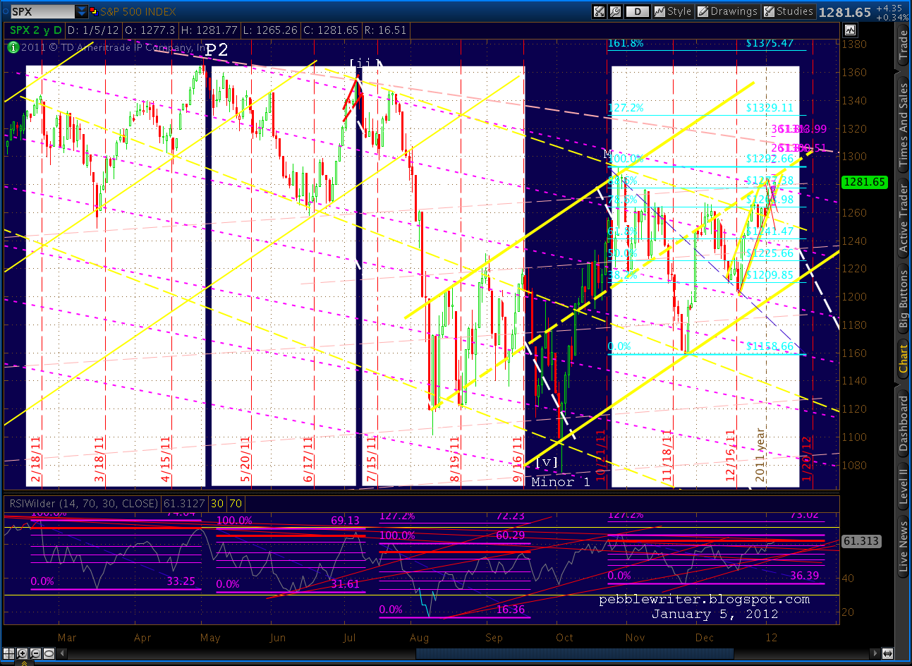
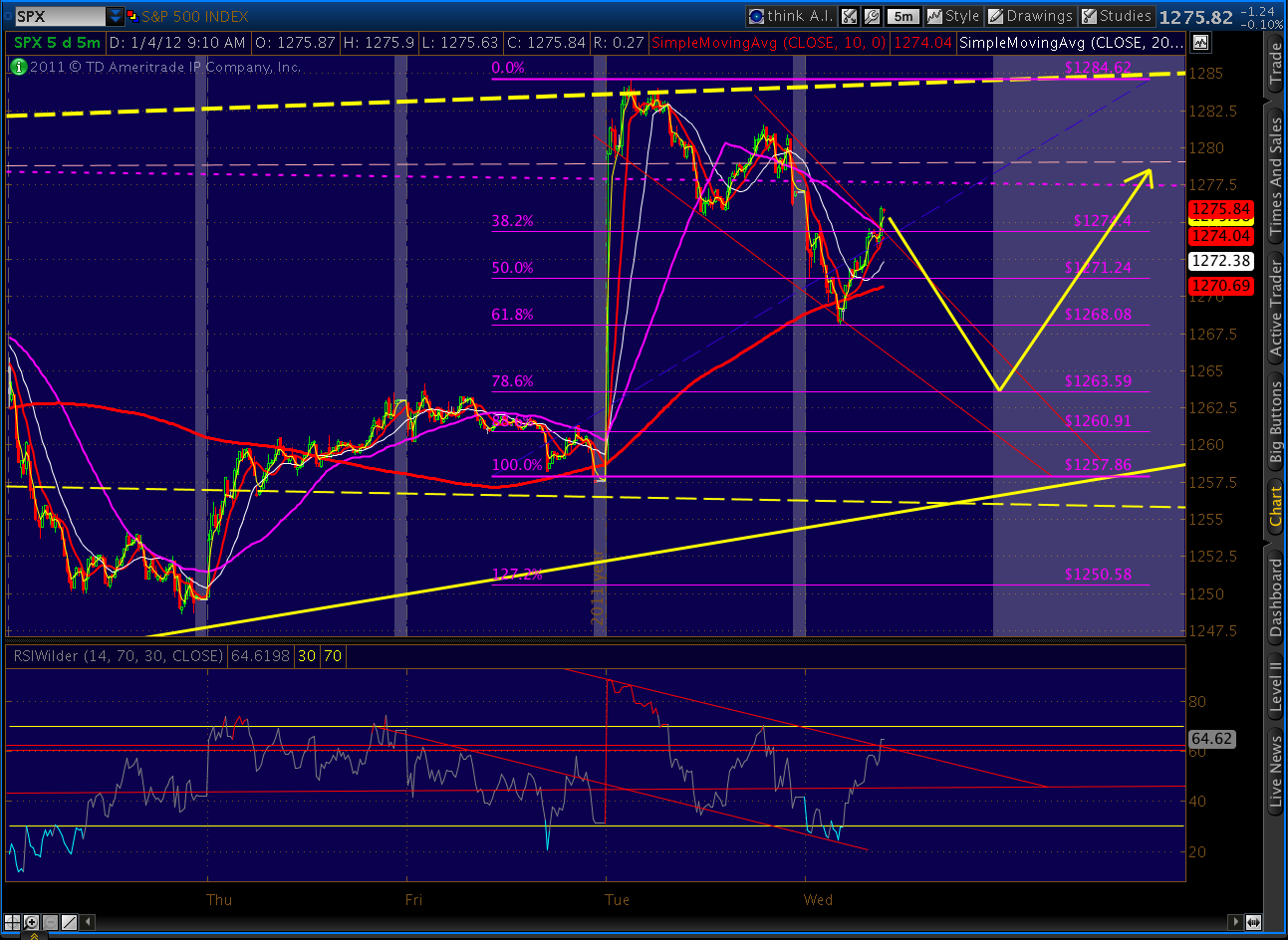
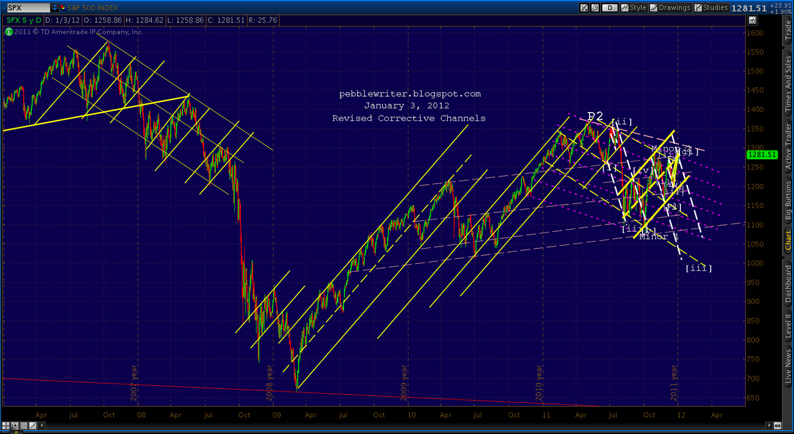
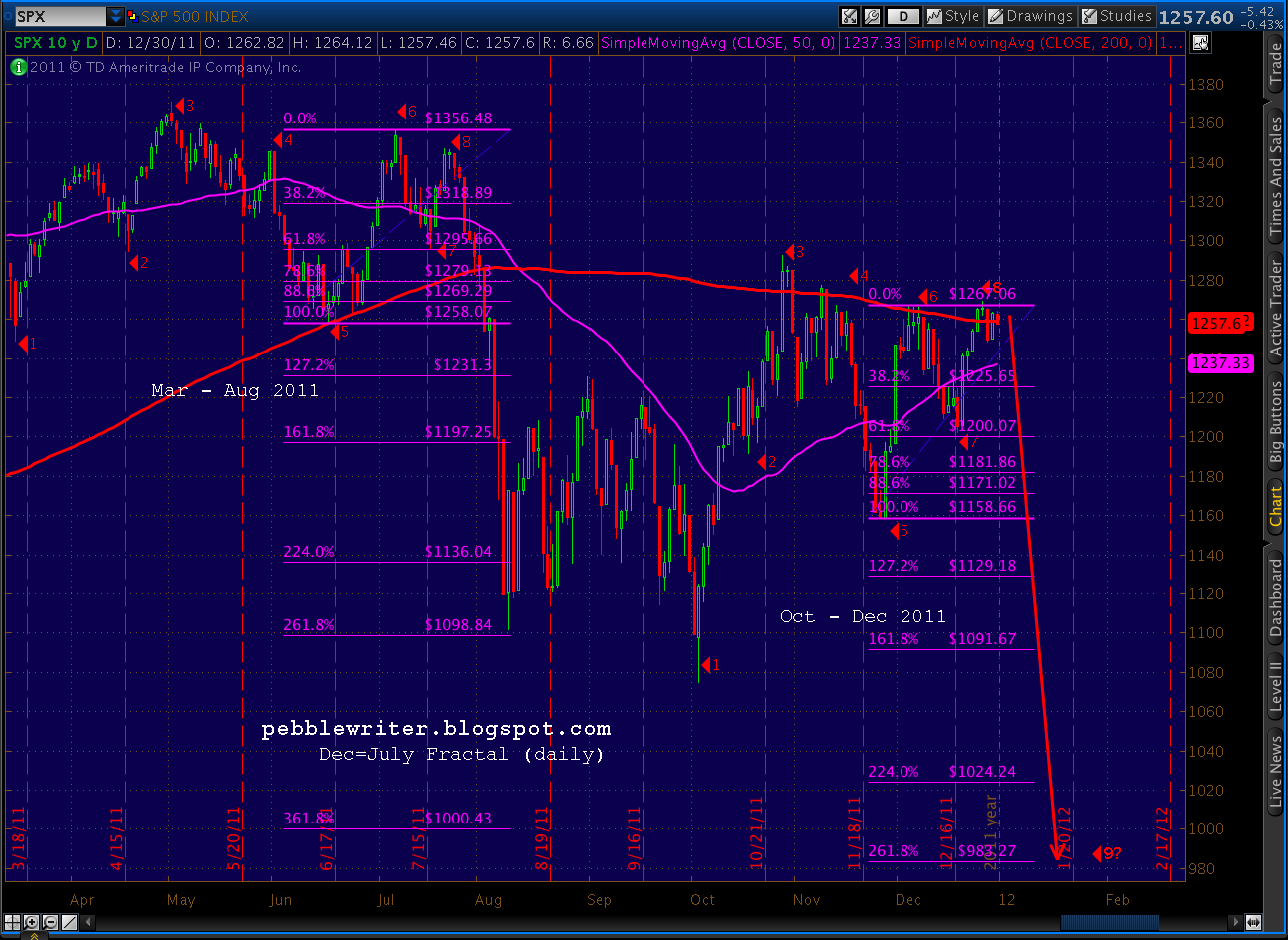
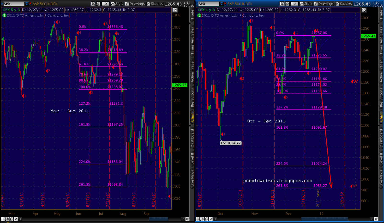
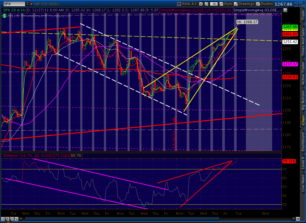
Looks like SPX left us with a Butterfly setup last Friday. If it plays out, it would reverse around 1275.01 — which is dangerously close to a key Elliott Wave price level (we also have a well-established downward sloping channel line there.)
Note that the Nov 8 high was 1277.55. Depending on how one counts the move off the 1292 top, 1275 is too close for comfort to that previous high. It’s also just a few cents off the .886 retracement of the 1292 to 1158 move.
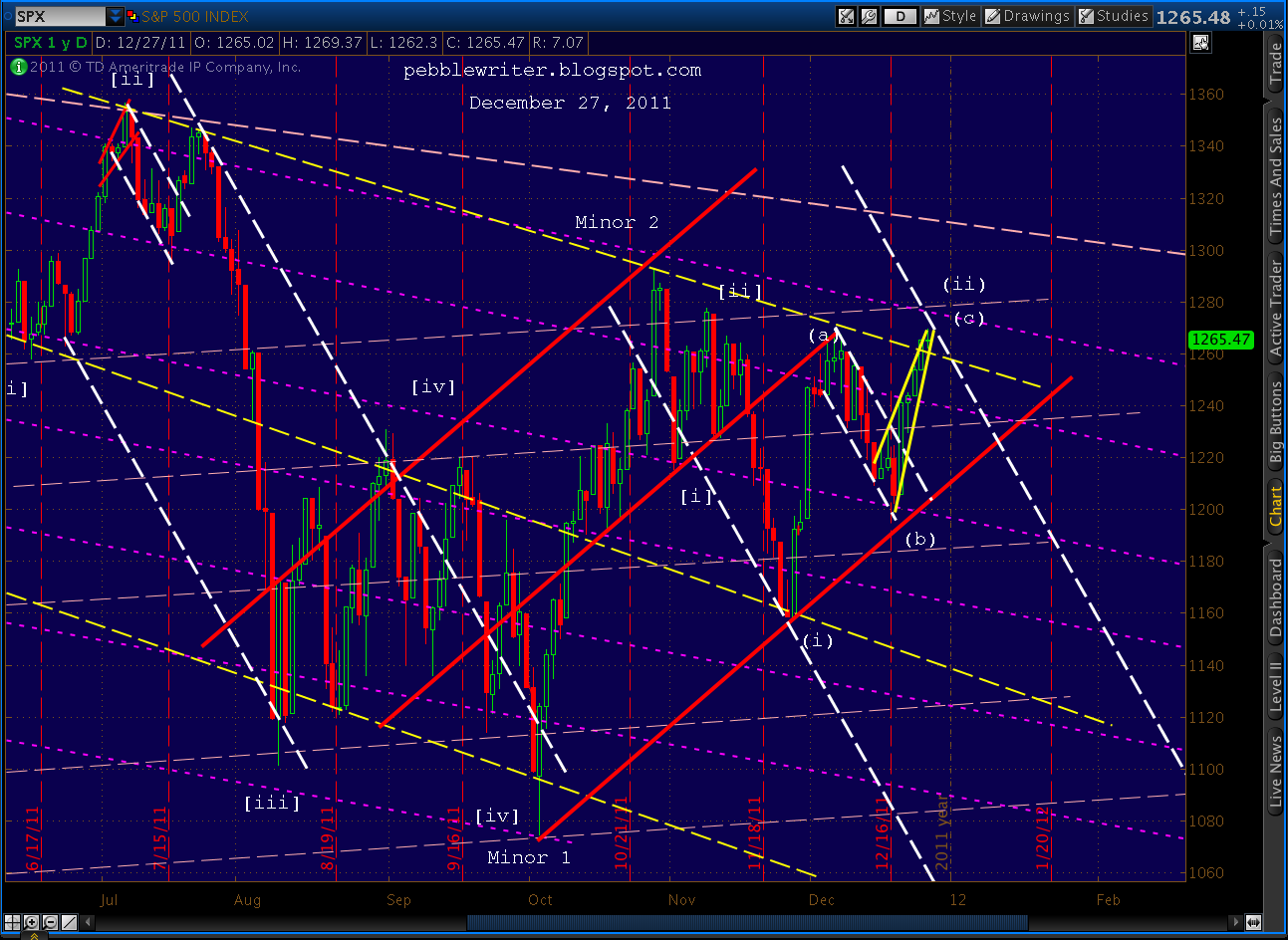
Here’s how the EW count appeared to me last week. I wrote that we were about to commence Minuette (iii) of Minute [iii] of Minor 3 of Intermediate 1 of Primary 3.
If we break 1277 (but not 1292) it means the move from 1292 to 1158 was Minute [i] of Minor 3 , with the three wave retracement to 1277+ being Minute [ii]. This actually makes more sense, as Minute [i] in Minor 1 was 112 points. It’s likely that the same degree move in Minor 3 would be as large or larger.
If we exceed 1292, then we’re likely tracing out the final 5 waves of C of Minor 2 which, as readers will recall, takes prices up to the 1307-1320 area. Whichever way it breaks, we’re either in Minor 3 (my top preference) or about to enter it. It should be significantly uglier than Minor 1, which took the S&P; 500 down nearly 300 points (22%) in five months. A 22% decline from Friday’s close would take SPX down to my short-term target of 983.
European stocks had a big up day, today, with the DAX up 3% and the CAC up 2%, both on light volume. The DAX was boosted by a marginally better PMI reading which still indicates contraction rather than growth — particularly in the area of new orders.
The following are notes on the Euro from The Big Picture, posted earlier today:
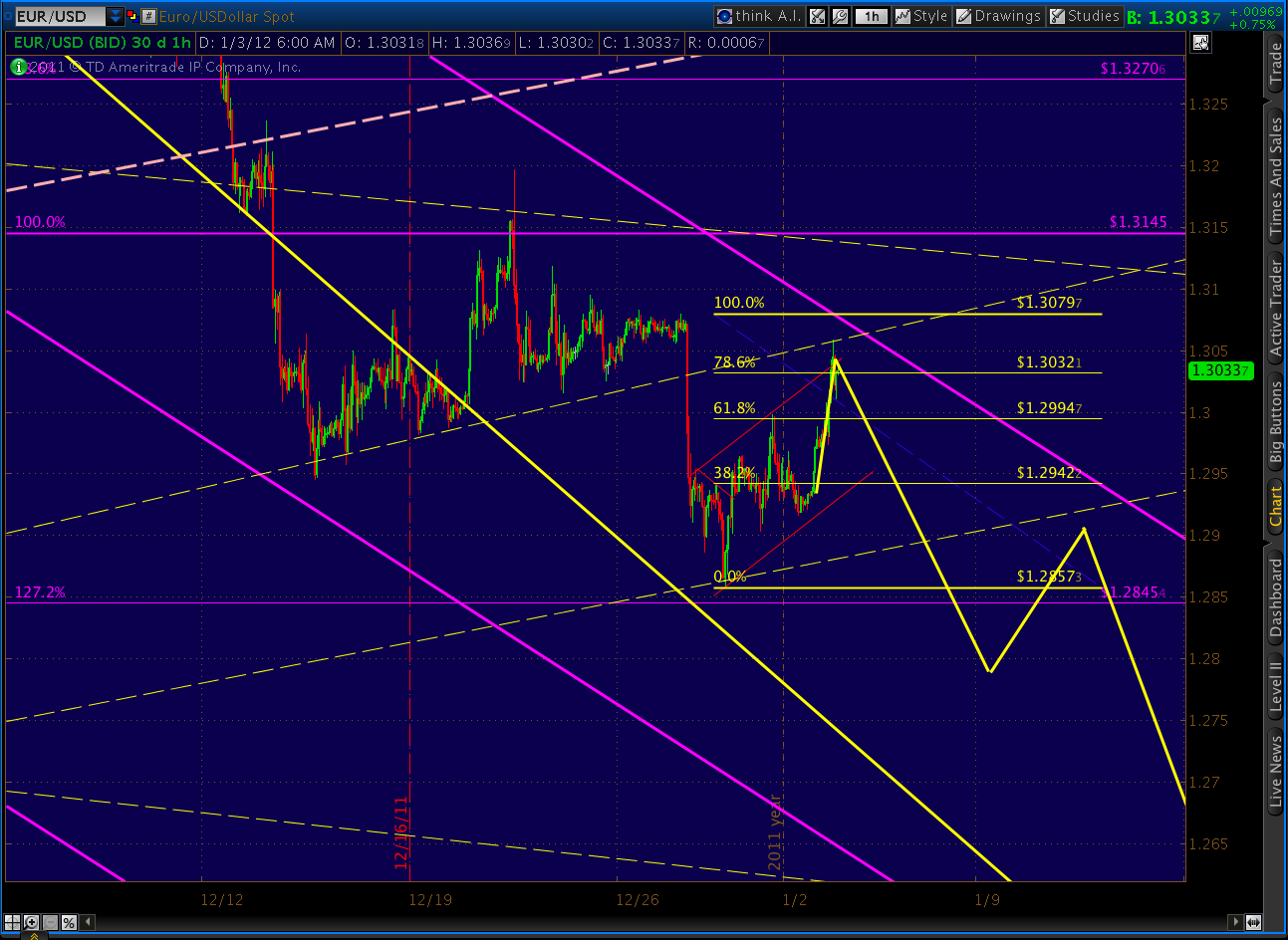
Last, just a quick observation on the Euro. Note how the fast lane we talked about last week is marked by a series of decisive breaks of parallel trend lines. A reminder, this channel is exactly the same slope as the past three two, so I’m inclined to give it the benefit of the doubt.
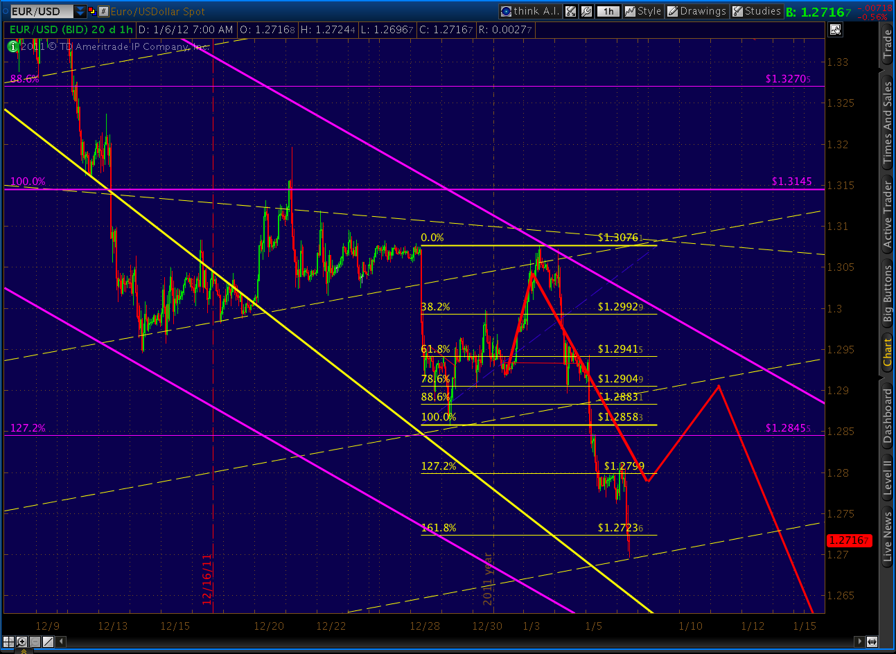
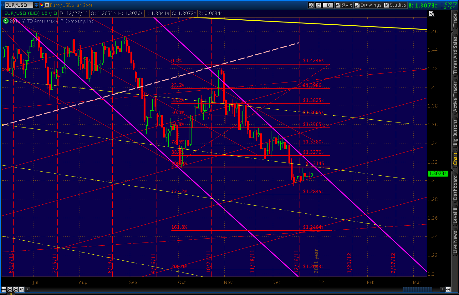
These are worth watching, as lately they are highly correlated with breaks in the US equity markets. EURUSD seems to have established a new on on the 29th at 1.2857. It has since rebounded somewhat, and could be tracing out a Gartley whose .786 Fib is at 1.3032 — right up against the channel boundary.
Whether it rebounds higher or not, a break of the dashed trend line is a great indicator of a bigger downdraft to come. In the end, I expect EURUSD to fall faster than its sub-channel, crossing into the next one down at an accelerated rate as occurred in the last wave down in September.
The ideal spot would be tomorrow, Jan 3, as that’s the peak of channel as it intersects with the trend line just broken. A full back test to the above-mentioned .786 Fib would be the perfect fit for a robust reversal.
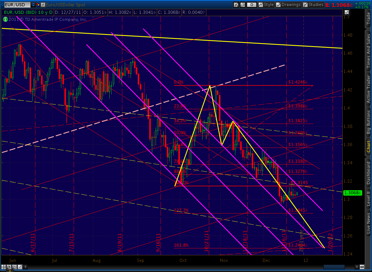
I’m still expecting completion of the Crab pattern (in purple) at 1.2464 sometime around mid-January — a 3.5%+ move that would correlate with a 10%+ move in SPX.
**************************
UPDATE: 7:30 PM
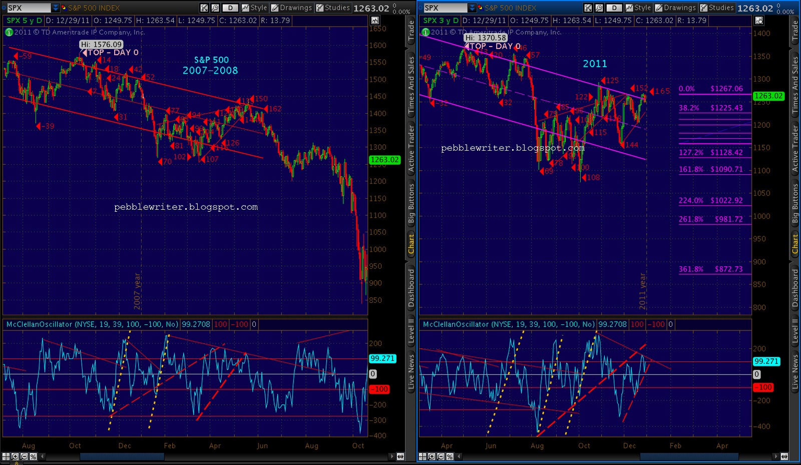
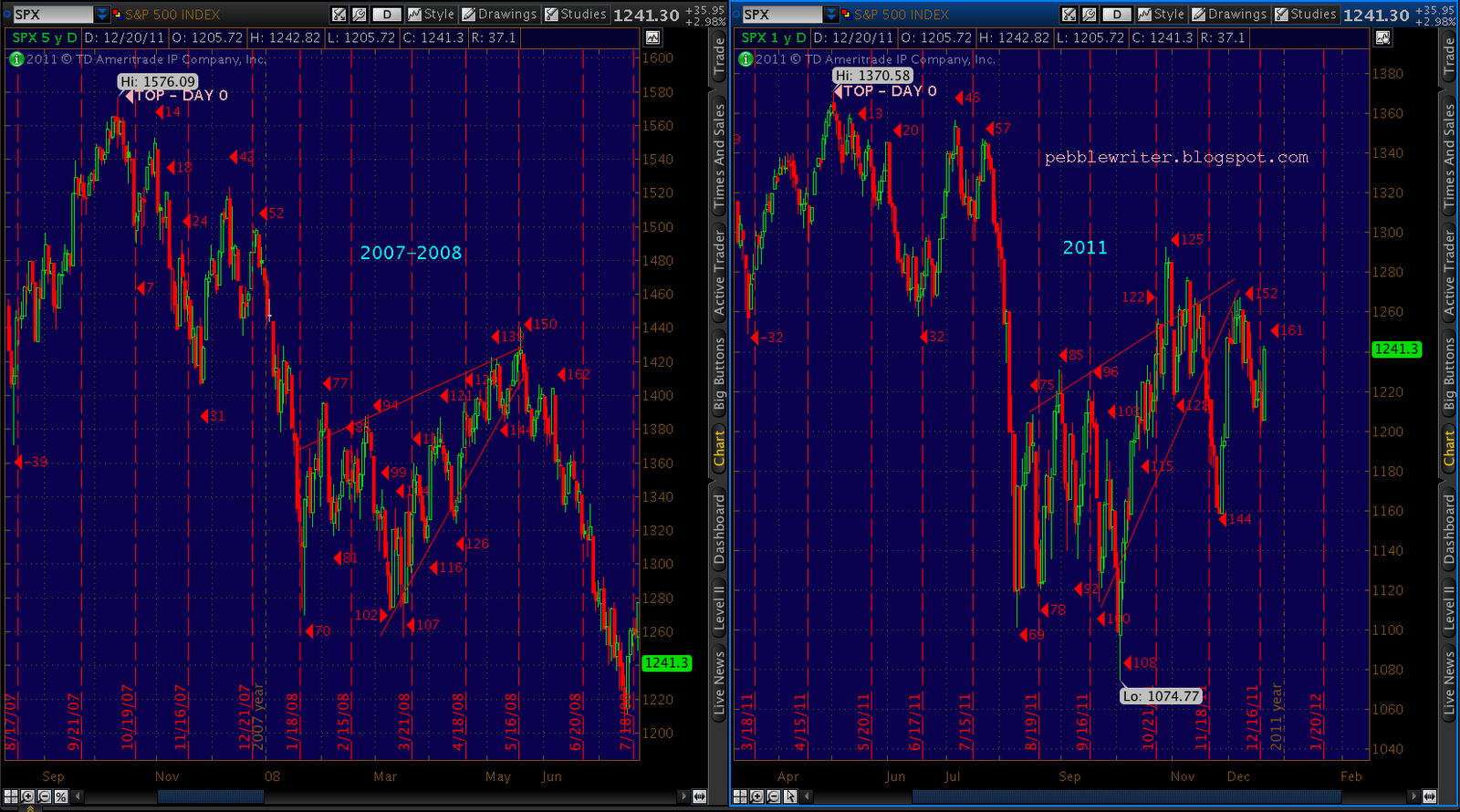
The analog and the fractal…
UPDATE: 10:30 AM
Like this past July, I find myself watching the growing disconnect in the analog and fractal day counts. In the 2007/8 v 2011 analog, the match was very solid going into day 31/32. But, on Jun 22, TPTB decided to flex their egos and announced a release from the Strategic Petroleum Reserve [see: Not Terribly Slick. ] It was a stupid political stunt that took CL — which had already dropped from 115 to 95 in the previous two months — down another $6 for an entire week.
But, it temporarily set stocks (and the analog) back. So, the Day 42 peak didn’t arrive until Day 46; and, the Day 52 peak showed up fashionably late on Day 57. It also occurred to me back then that — thanks to the blogging of yours truly and others — the analog was not as well-kept a secret as it might otherwise have been. Even back then, readership had crept up past 1,000 hits daily.
Imagine you’re a Wall Street Master of the Universe and some flunky analyst mentions to you at the July 4th picnic that a blog she follows is forecasting a 20% drop in SPX over the next two weeks. After firing her for being so gullible, you might assign a VP or two to investigate said blog. When they report back, you might go beyond your typical market manipulation strategic realignment in order to protect your long positions (or, at least get the hell out before your clients realize the theater’s on fire.)
If enough Powers That Be got a whiff of the smoke that threatened to render them Powers That Were, that could account for a collective buying spree in an effort to keep the dream (aka Stock Options) alive. Alas, as the unemployed analyst (now a social worker) will tell you, it delayed but didn’t derail the inevitable 20% crash.
Flash forward five months. The MOTU have skillfully strategically realigned manipulated the markets to the exact same prices seen just before the July down draft. So, thankfully, their bonuses are intact (give or take a few thousand layoffs.) What do you suppose will be their reaction when, whilst bagging a baroness in St Barts or an elephant in Tanzania (photo safaris are for wimps), another chart like this makes it past the junk mail filter?
UPDATE: DEC 30 — 4:30 AM
I believe we have at most two more trading sessions before the bottom falls out of this market. The fractal and the analog are muy preggo, and are simply awaiting the procession of Bentley’s to return from the North Shore. Come Tuesday, the MD’s will take their respective tillers and run this leaky ship properly aground.
Some of the charts I’m watching…
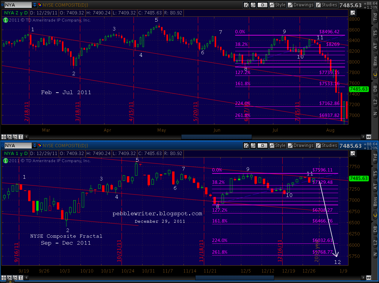
Note that the NYA has better form than SPX for analog purposes. When seen stacked with SPX, the pattern is nearly identical. One key difference is the lack of an overshoot on the latest 2nd peak. This is more in keeping with the July pattern, and makes for cleaner harmonic patterns, as well.
I don’t often look at long bonds, but the ten year tsy’s pretty interesting. For those wondering if yields can go any lower, the bottom of the channel is down at 1.40% – a logical turning point.
************************************************
UPDATE: 3:20 PM
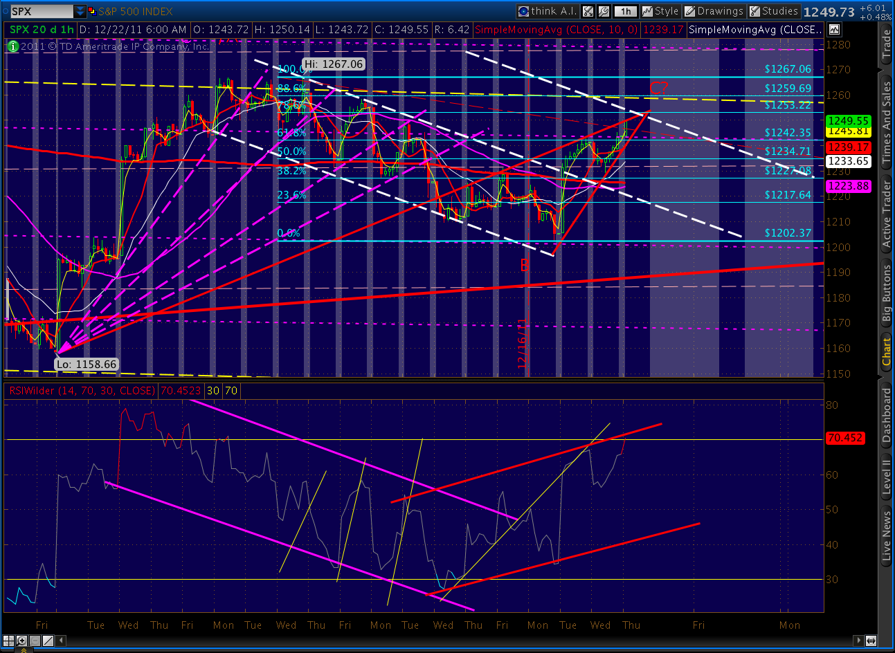
Just tagged the 61.8% retrace and formed a little rising wedge on the day. That could be it for wave 2, although 1264 (the .786) and 1267 (the .886) are still on the table. A benefit the higher targets is that we’d complete a Gartley or Bat pattern — giving us more momentum going into the next down leg.
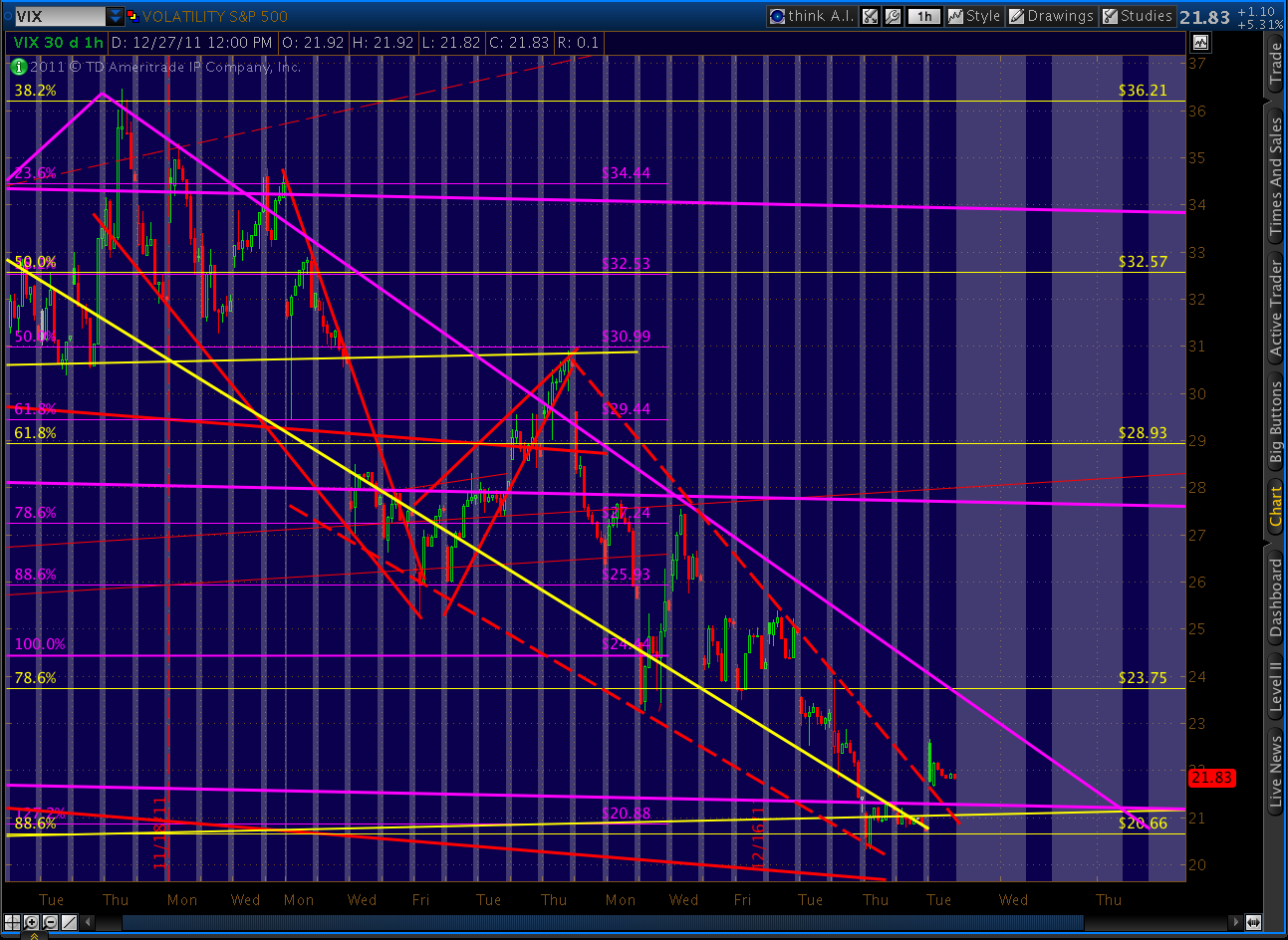
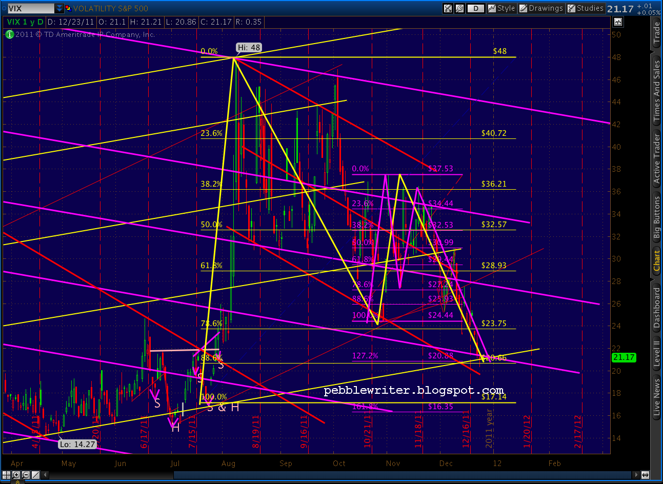
For those of you who follow VIX, it’s interesting to note that even after today’s retracement it’s locked in a nice little rising channel that should see it break out of the very large falling wedge (green, dashed) it’s been in since August — probably on Monday. It completed a 5-wave advance yesterday at 23.56 — a 16% increase in 3 days.
This would be about 72% of the time from inception to apex, compared to 76% for the last falling wedge.
With volume being so incredibly low, it’s cheap and easy for market makers to run stocks up and trap a few more bulls. It’ll be interesting to see the ISEE call/put numbers at the end of the day.
UPDATE: DEC 29 — 10:20 AM
The bounce continues, with SPX up 7 to retrace almost 50% of yesterday’s losses. I imagine we’ll go a bit beyond this and at least back test the SMA 200 at 1258.88 and the 20-period SMA on the 60-min chart at 1260. The 61.8% Fib retracement is just above, at 1261.45. But, be aware that many wave 2 retracements over the past several months have gone as high as the .786 and .886 levels.
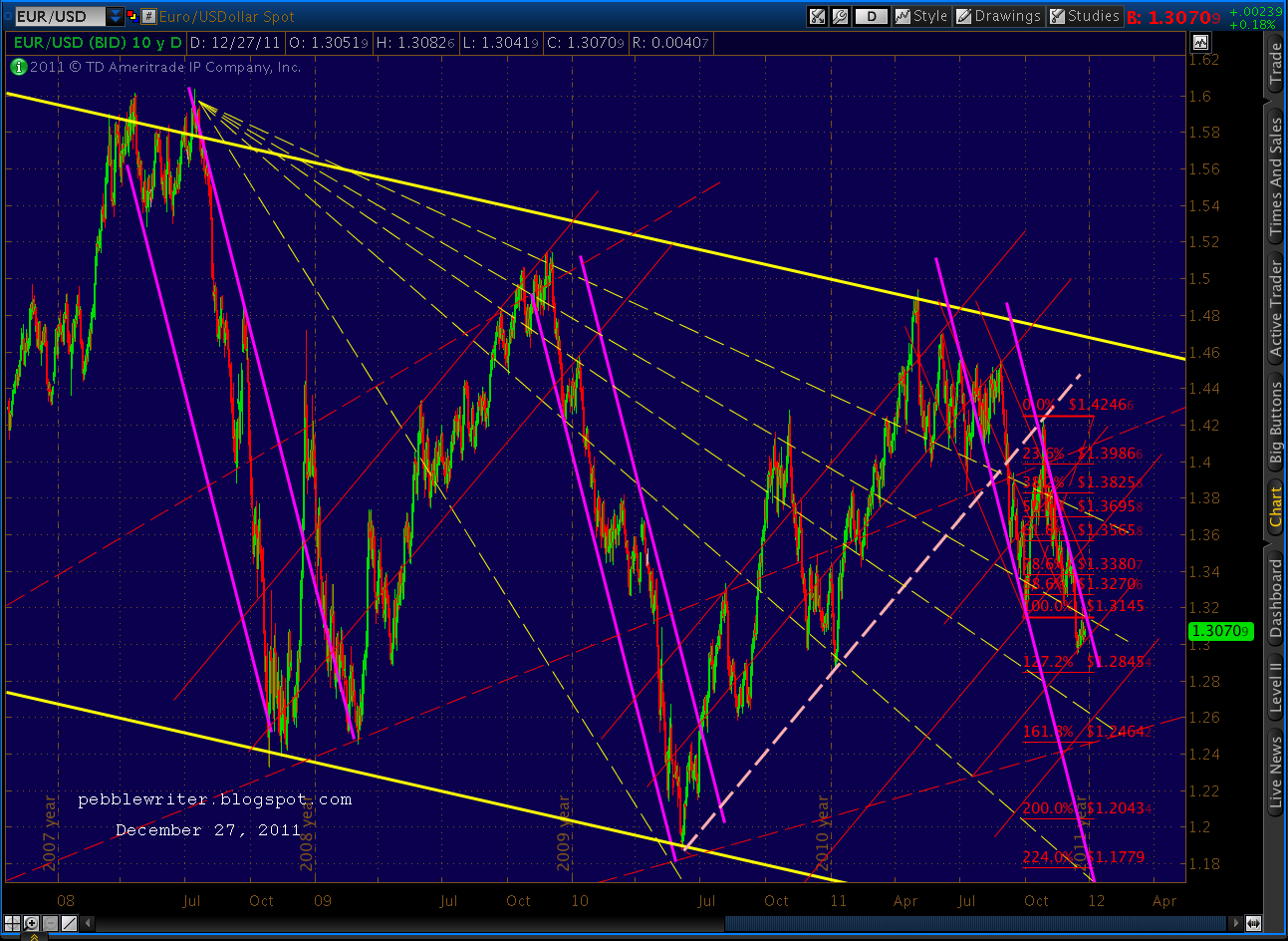
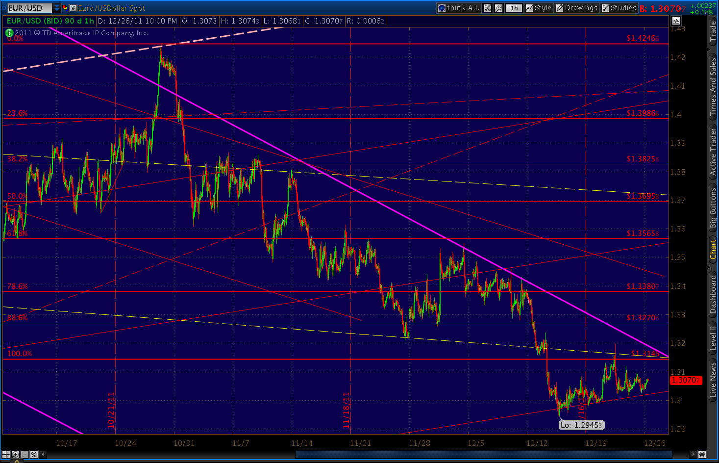
This morning’s EURUSD rally appears to be running out of steam. We completed a small, messy Butterfly pattern yesterday; it never quite reached the required .786 Point B, so is likely a Crab instead. What we got, though, was a little breather at the 1.272 extension.
Looking at the 60-min chart, it’s obvious EUR is running into a buzz saw of overhead resistance and should soon resume its descent to 1.2464.
More later.
*********************************************************
UPDATE: 6:00 PM
We closed at 1249.64, down 15.79 (1.25%) on the day. It’s a pretty good start on what should be a very substantial decline. We traced out a small counterwave from 1250-1254, but it’s not clear whether there’s more of a bounce in store.
More later.
UPDATE: 2:25 PM
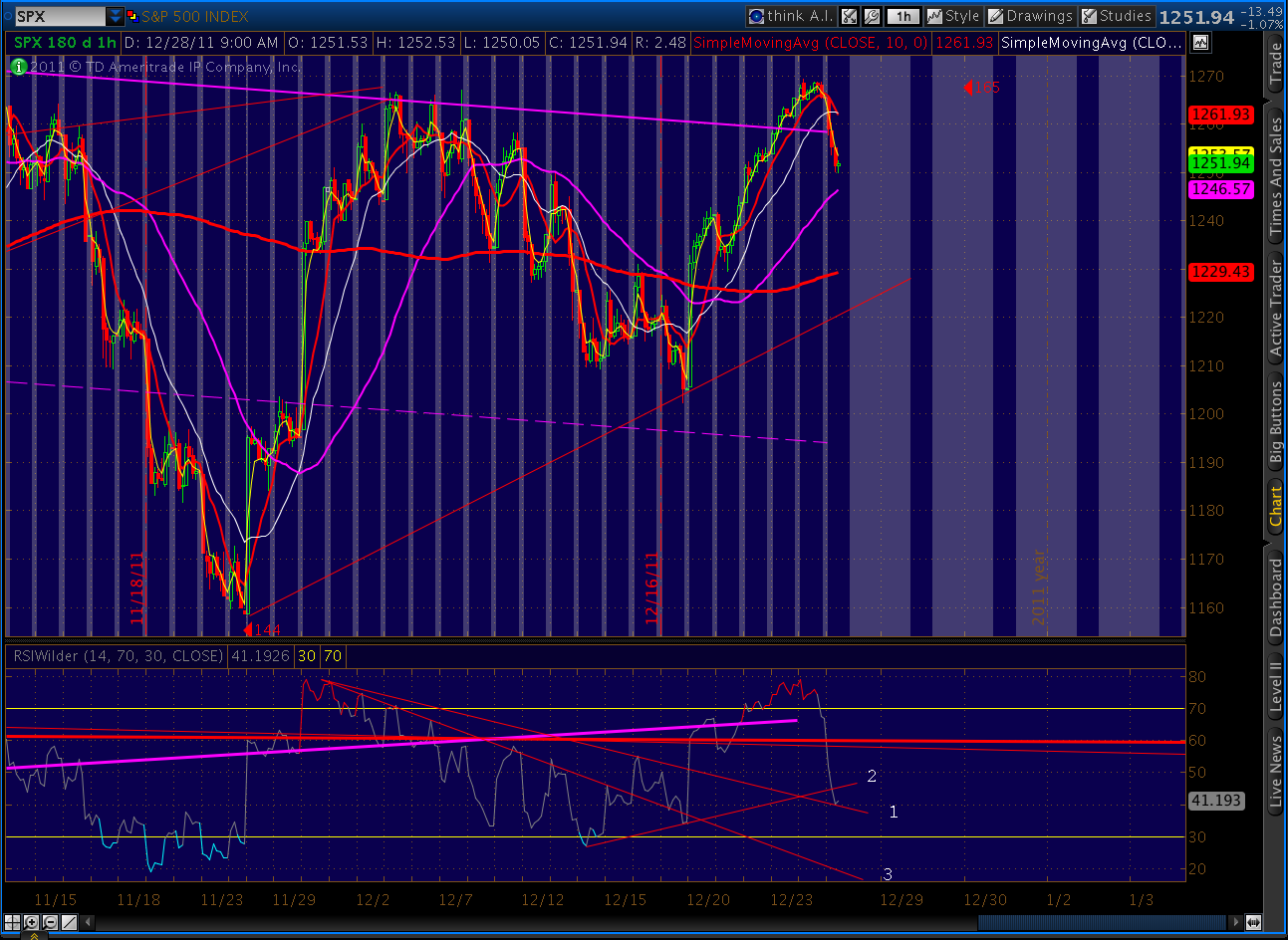
Appears as though we completed the bounce. Decline seems to have resumed as was indicated by RSI TLs (see 12:00 post below.)
UPDATE: 1:40 PM
Bounced at 1250 as expected. Now, just tagged the RSI TL’s on 5, 15 and 60-min time frames at 1254.11, would be an ideal place for the decline to resume.
UPDATE: DEC 28 — 12:00 PM
A nice kickoff for the decline we’re been waiting for…
We should expect to see a little bounce somewhere around 1250, as RSI bounces between a declining support TL (1) and an overhead TL of resistance (2) before resuming the downdraft to TL 3.
*********************************************************
UPDATE: 4:15 PM EST
Signing out with an update of the fractal and analog charts. I wish you all a great rest of the day.
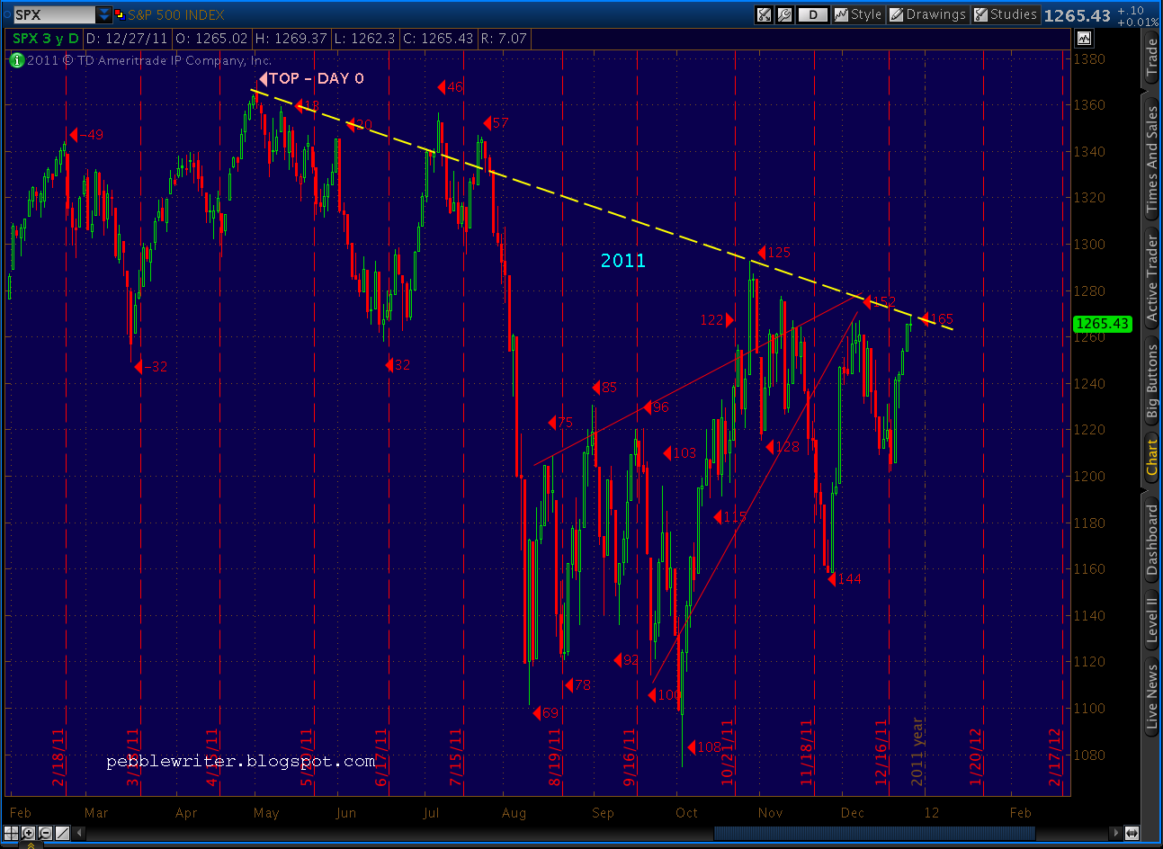
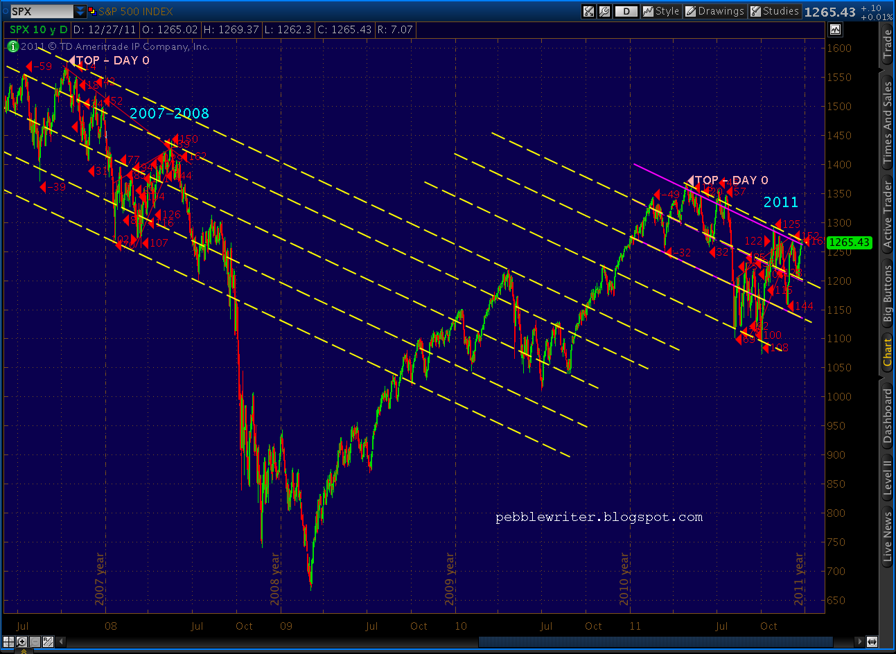
While we’re looking a little hinky on the analog 2011 v 2008 comparison — with a day 165 that exceeds day 152 — I still have faith in its validity.
The most bearish trend line I can draw off the 1370 high is one that eliminates the shadow and cuts right through the July highs and connects with day 125’s high (July was an overshoot for analog purposes.) That trend line was within 1/2 point of today’s high. So, is it valid?
My preferred method for testing the validity of a trend line is to draw parallel lines (channels) and see if they also “work.” I think they do — very well, in fact.
Another favorite method is to slap a regression channel on a chart and see how it compares. The 1 standard deviation regression channel (beginning at the Feb 18 high) lines up almost perfectly with the trend line in question. I fact, a few days passage of time will probably see them overlap perfectly.
The former channels and the regression channels all tie in nicely, by the way, with trend lines/ channels established in the 2007/8 top, so I’m inclined to give them the benefit of the doubt.
Today’s mostly overlooked news included the little tidbit that we’ll exceed our national debt ceiling Friday. Perhaps some investors will revisit the uncomfortable fact that America’s debt problem is just as serious as most other countries — worse than many. It’s fair to say that it represents a bigger challenge than does rising consumer confidence (without commensurate increases in income) an opportunity. Should be an interesting week.
UPDATE 3:30 PM EST
Quick look at the EURUSD charts. First, the big picture…
…and a close-up, showing the current channel segmented into three sub-channels. Each represents a possible path within the same slope channel that’s contained all movement since July. The current sub-channel is essentially the “slow lane”, dropping to the Crab target of 1.2464 (-4.6%) by Jan 13.
A quicker trip is entirely possible, but an arrival any later than mid-February would mean a break from the very well-established major channel.
And, last, the Butterfly and Bat patterns we’ve watching in VIX yielded a nice reversal today, with VIX up to 22.66 from its recent low (and harmonics target) of 20.33.
That 11.5% gain will pale in comparison to the move to 30+ in the next few weeks — easily obtainable as a target of one of the harmonic patterns and/or the latest falling wedge (dashed, red lines.)
UPDATE: 2:25 PM EST
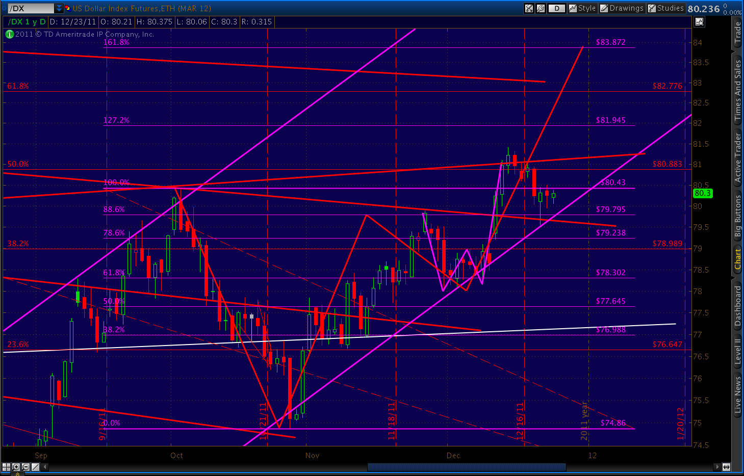
Holding steady below this morning’s high of 1269.37. On the currency front, the dollar appears to have completed its test of the major channel, and should start up any time now. It bounced off a rising fan line (from Apr ’08) at Point A, then a falling fan line (from Mar ’09) at Point B.
The RSI channels offer a good indication of what to expect. At Point 1, RSI bottomed – confirming the falling channel since July 12. The parallel channel line, once drawn, gave us both an upside target (Point 2) and a means by which to determine if/when a breakout occurred.
In back testing the upper channel line from Point 2 to Point 3, RSI established a new rising channel, the upper bound of which is a continuation of a former trend line. Now, at the lower bound of that new channel, RSI has run out of room on the downside and should rebound higher to test the upper end of the channel — as indicated with the yellow arrow.
The slope of the forecasted RSI move indicates a move to the upper bound in the next few days — which would correlate with DX returning to the channel midline in the same time frame. I’m looking for the next move to (at least) 83.872 to complete the crab pattern at the 1.618 extension, although if the downward move in the markets unfolds as I expect, look for it to move much further.
With DX’s daily RSI at only 56.4, there’s plenty of room to run on the upside. As the longer-term chart illustrates, RSI topped 82 in May ’10 and 92 in Oct ’08. If the current channel holds, DX could reach the Bat pattern (and, a Crab) target of 87 (an 8.7% move) as early as next week and as late as mid-March.
At that point, it also reaches the upper end of the channel it’s been in since 2008. I’ll update the EUR shortly.
UPDATE: 10:30 AM EST
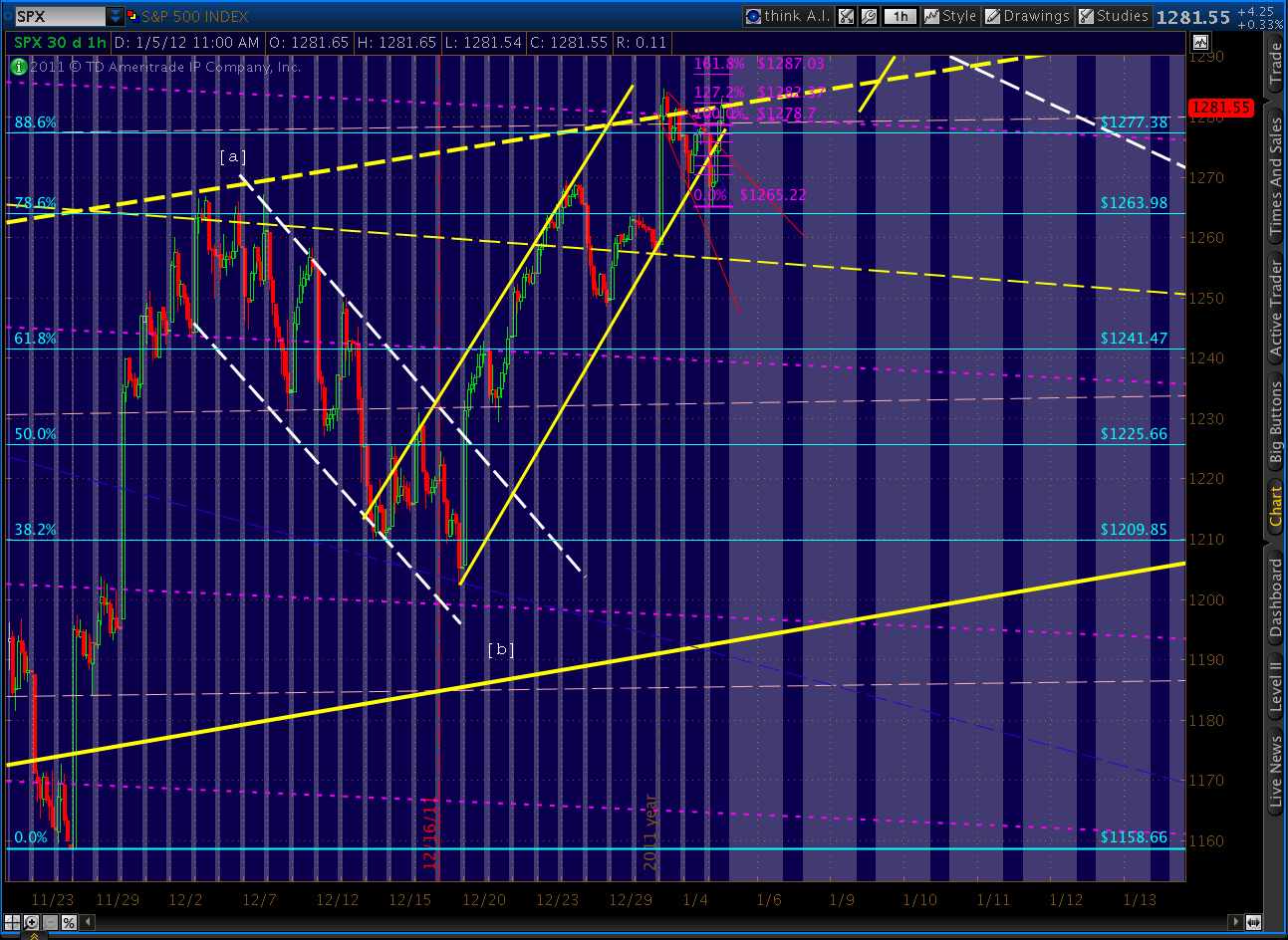
Although we’ve pushed a few points higher on the opening, we’re still within a rising wedge with apparent divergence on multiple time scales. Further, we have resistance up ahead with both the downward and upward sloping channels (intersecting at 1276) that have guided much of the past year. Volume continues to be “holiday light.”
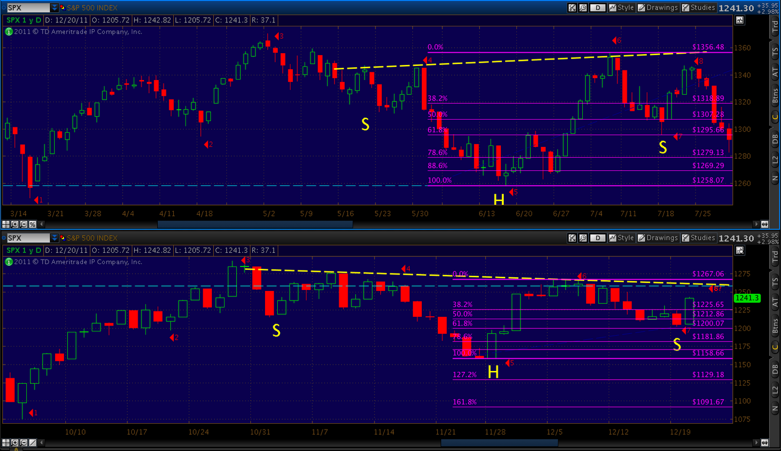
We’ve exceeded Dec 7’s 1267.06, meaning we’re most likely in a more complex minuette (ii) of minute [ii] that should peter out before reaching Nov 8’s high of 1277.55. It would look something like this:
In Elliott Wave terms, it would mean we’re about to commence minuette (iii) of minute [iii] of Minor 3 of Intermediate 1 of Primary 3. A third of a third of a third is a big deal, even if it is in Intermediate 1. We can expect the downdraft to be ugly.
The alternative is well known and, from what I can tell, the more prevalent view: that we’re still tracing out an extended Minor 2 that could take us as high as 1307-1320. It’s definitely a possibility, although the analog and fractal argue otherwise. But, that’s what stops are for — right?
UPDATE: DEC 27 — 2:00 AM EST
Merry Christmas, all. I hope everyone had a blessed holiday, surrounded by friends and family. As for my family, we had a frenzied trip to LA followed by several much more relaxing days up the coast. I don’t mind at all that we’ve a short week ahead of us.
Friday was a surprise to me — not that the market rose, but that it rose above 1261 to complete an Inverse H&S; pattern. The big question now, of course — what does it mean? Are we automatically going up 134 points? In short, no.
First, this pattern doesn’t constitute a bottom. In fact, it comes at a point when we’re already up 185 points from the 1074 bottom. That makes it a continuation pattern, which just doesn’t count as much. On his Busted H&S; Bottom page, Bulkowski states that IHS bottom patterns fail 8% of the time in bull markets. This is not a bull market, so the failure rate should be much higher.
We saw a number of failed continuation H&S; tops in August and September. There’s no reason we couldn’t be seeing a failed continuation bottom here. The last such large IHS pattern peaked (the head) on March 16. In the next four days, we only saw 29 points out of the 82-point objective increase potential.
The other issue that troubles me is that we broke an important trend line connecting July 7 and Oct 27 highs. That TL ran through 1262 Friday, but we closed at 1265.33. The volume was extremely light, which diminishes the validity of the move. But, the move might be enough to embolden the bulls. There are multiple higher trend lines of resistance ranging from 1306 – 1328.
So, which way Tuesday? For a hint, I’m watching currencies. Thing have been quiet on the EUR front for several days; but, there are still downgrades out there in the near future. A very small increase could be immediately ahead, but the next big move will be down as we run smack dab into the channel boundary.
The dollar is similarly poised for a sizable move, pinballing off fan lines on its way to 83.872.
I think it’s likely we’re seeing a very deep wave 2 retrace and the next step is down. While .618, .786 and .886 Fib retracements are the most common retracements, there have been a few wave two’s in the past year that retraced virtually the entire previous first wave. 1.000 is a Fib number, too. And, to do so on a low volume “vacation” day seems especially right.
Still, I think it’s still prudent to employ stops to protect against any further upside surprise. More later.
*********************************************************
UPDATE: DEC 23 — 3:00 PM EST
Sorry for the delay in updating. I’m sitting in a Los Angeles Starbucks with the world’s slowest internet connection — 150 kbps. Playing havoc with TOS desktop.
Bottom line, we reached 1263.69, which technically completes the Inverse H&S; pattern. We’re also within spitting distance of a double top, which is a four-of-a-kind to the Bat pattern’s full house. On the other hand, we’re still well within a (slightly adjusted) rising wedge and all the other bear signals. So, as the market loves to do, we’re going into a 4-day weekend with the maximum ambiguity possible.
We’ve got some real negative divergence going, and RSI has broken three successive fan lines on the 15-min, a big one on the 60-min chart. Looking very precarious for the market…but there’s still that IHS to consider. I think this is a bull trap, so I’m going into the weekend very short with some reasonable stops — just in case.
I’ll be out of pocket for the rest of the day, so this will be my last post today. But, I’ll post either later tonight or tomorrow and we’ll see what the rest of the day brings.
Good luck to all.
*********************************************************
UPDATE: DEC 23 — 10:10 AM EST
I’m continuing on this thread to make it easier to follow the fractal story. From a bear’s perspective, we’re dangerously close to the inverse H&S; pattern completion at around 1261-2. From a bull’s perspective, we’re dangerously close to the .886 Fib level at 1259.69.
At the .886, we’ve officially completed a bearish Bat pattern — which is the full house to the .786 Fib level’s two pair. Does it make me nervous to be flirting with the IHS? Like the woman says, “you betcha.” Although nothing is certain, the RSI trends, the rising wedge (right at the apex) and the completed Butterfly within a completed Bat pattern provide reassurance. Some charts:
Remember the VIX charts from this past Tuesday? It looked like we were completing a Butterfly pattern (purple) within a large Bat pattern (yellow.) They completed at 20.88 and 20.66 respectively. Yesterday, we reached both targets — along with the intersection of two important channel lines.
Two other tidbits… Isn’t it downright poetic that the final leg down starts at 1258ish? As we’ve discussed many times, this has been a pivotal level going back to the last top.
I also find it mathematically satisfying that the next leg down starts on December 27 — though it would be December if Monday weren’t a holiday. As astute readers will remember, December 26, 2007 was the lip of a 230-pt crevasse.
More later.
UPDATE: 12:15 PM EST
Good time to update the fractal chart… As Reason #9’s go, it’s a doozy.
The Dec=July fractal is complete. We could start down any time, though I imagine the ugliness will probably wait until Tuesday (it is Christmas, after all.) If the Crab that concluded in July were to repeat to the same extent and at the same speed, we’d be looking at 983 by Jan 10. That’s a 21% drop in 3 weeks time.
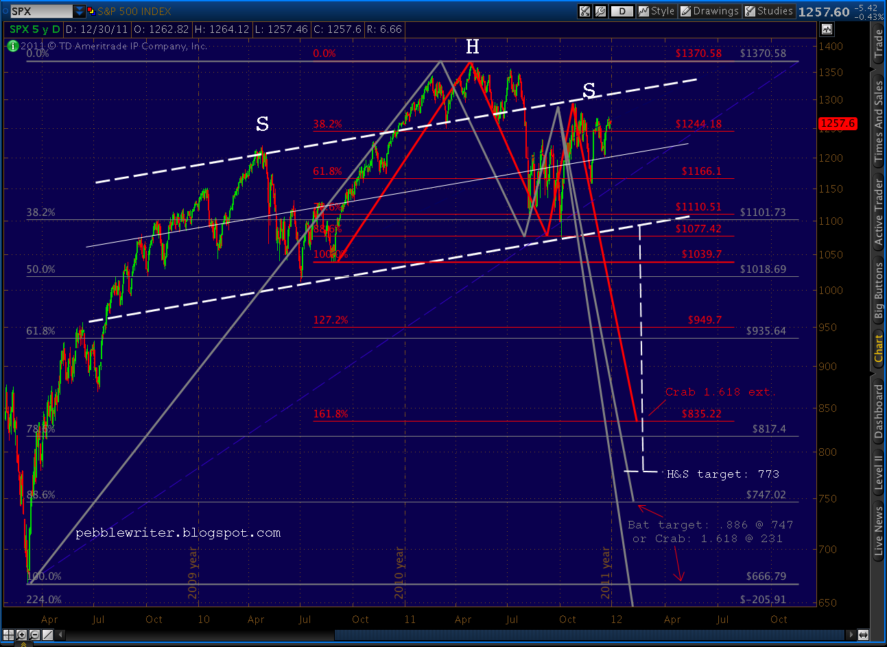
And, finally, Reason #10: the 2011 v 2008 analog.
There are two key differences: (1) the spikes around days 125 and 144; and, (2) the harmonic patterns. In 2008, the market produced a Point B at the .382 Fib level in May, establishing a Crab pattern that paid off nicely with pushes to the 1.272, 1.618, etc. all the way down past the 3.618 extension at 666.
On Nov 25, 2011, we established a Point B right at the .618 Fib level, meaning this is at least a Gartley pattern targeting 1121. From there, we’ll see. But, there are other patterns such as the fractal shown above that argue for an extension to at least a Crab’s 1.618 at 940.
Whichever way this works out, it’s been an adventure. I take no joy in being bearish, because if this forecast works out it means many more months — maybe years — of continuing recession or even depression. I haven’t talked much about the economy lately, as I’ve tired of pointing out the obvious.
But, IMO, we’re hanging by our fingertips. It would be quite the Christmas miracle if we somehow resolved our financial challenges and pulled ourselves up without a great deal of real pain. I pray we can; but, unfortunately, I don’t think we will.
Many refuse to see it coming — wishful thinking, I guess. Or, it just hasn’t affected them yet. My Christmas wish is that friends/followers will at least take proper precautions — lightening up on equities, buying protective puts, etc.
If I’m wrong about the past 6 months research, I think the worst that happens is a little lost profits. A stop at 1265-1270 should take care of the upside risk. But, if I’m right, the trip down to the 700’s will decimate many more portfolios than the last go-round. And, given the more precarious economic situation we’re in this time, the feedback effect on the global economy will be devastating.
I’ll watch these patterns over the next several days and let you know what I see. In the meantime, good luck to all.
–PW
UPDATE: 10:05 AM EST
And, that’s within a point of my 1253 target — close enough. I’m going to assume this is THE TOP until the market proves me wrong. I may be early (usually am) but I think it’s time.
For anyone counting, it completes or establishes:
(1) a small crab that started Tuesday
(2) the .786 Fib retracement of the decline since 1267
(3) the apex of a rising wedge from the 14th
(4) a parallel channel line equidistant from the last
(5) an 88.6 Fib retracement of 1267 – 1158
(6) the 5th back test of a fan line off 1158
(7) negative divergence on the 5-60 min charts
(8) the 60-min RSI channel touch I mentioned below
Not saying it couldn‘t go up any more, it wouldn’t be unusual for SPX to dance around these levels — give or take a few points — for the rest of the day. But, those eight arguments are pretty convincing in my book.
UPDATE: 9:35 AM EST
So far, so good. 1253 looks safe as the turning point.
We’re looking at a back test as well as a channel touch for the 60-min RSI.
And, there’s negative divergence on all charts through the 30-min. Shouldn’t be long.
UPDATE: 9:15 AM EST
With a little bump this morning, we should be able to complete a small Crab pattern up to 1251, shown here on the 15 and 60-min charts.
It also completes a rising wedge and, most importantly, approximates the .786 Fib level (1253) of the previous decline. This has been my favorite price target for the fractal. This should be the last hurrah.
ORIGINAL POST: 2:45 AM EST
Yesterday’s intraday recovery probably portends a positive open in the morning, but there’s plenty of economic news coming out (initial claims, GDP, etc.) that could easily influence direction and distance.
Our channel (white, dashed) was officially broken Tuesday. Between it and the fan lines from the Nov 25 1158 bottom, it’s been pretty easy to anticipate this past week’s moves. However, the push we saw Tuesday and Wednesday saw the last fan line broken to the upside and the previous fan line tested again.
In a vacuum, this is a pretty bullish sign. But, look at the rising wedge that’s being developed (with the red dashed line added). There’s also an increasing amount of negative divergence that spells trouble for the bulls. Any pop in the morning is likely to be limited to 1251 (1259 at the most) and short-lived.
More later.