UPDATE: 12:30 PM
Okay, lots going on. This will be a long post, but I’ll save as I go.
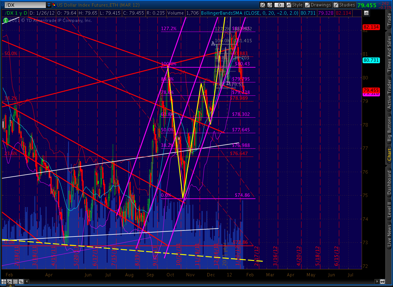
First, I immediately looked at the DX after the employment figures came out. The dollar quickly dropped to an important fan line at 78.815, then reacted very strongly, shooting up to 79.485 before settling back down to the current 79.245.
I went to the DX because I’d been studying a very bullish fan line pattern on it last night. Here’s the updated longer-term picture. I’ll show it in phases, so you can get my drift. First, fan lines from the 2008 lows. As you can see, there’s good strong support at current levels.
Next, we add in fan lines from the 2009 top. Note, we now have two fan lines of support at the current prices.
And, last, we add in fan lines from the most recent June 2010 high. We now have three fan lines of support, all at the current prices.
Clearly there is resistance above from the lines running through the highs in January — probably around 81.70. But, the trend is still up — with both higher highs and higher lows.
And, the harmonic picture is positive, with the larger Bat pattern (in red) pointing to the .886 at 87.076 and the smaller Crab pattern (in purple) pointing to the 1.618 at 83.872. Interestingly, the 87 level intersects with the fan line running through both the Mar 09 and Jun 10 highs (solid yellow line.)
Unless we’re going to have a stock rally that also sends the dollar up, something’s gotta give. I think the currency markets know it. Gold traders seem to know it, too. The back test we’ve been watching has completed and prices are currently down 16.
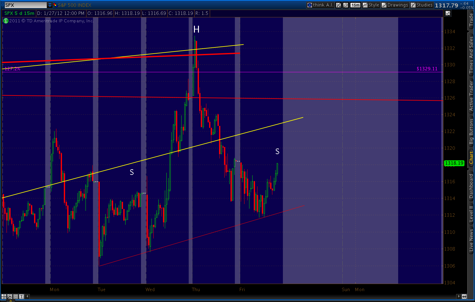
Okay, so what about stocks? First, here’s one chart that should really matter.
Here’s the same chart in logarithmic scale. Both exclude shadows and tails.
If we fiddle with the critical line (through current prices) a little, it ranges from 1345 to 1380, as follows:
- arithmetic, no shadows: 1345
- arithmetic, w/ shadows: 1354
- log, no shadows: 1369
- log, w/ shadows: 1380
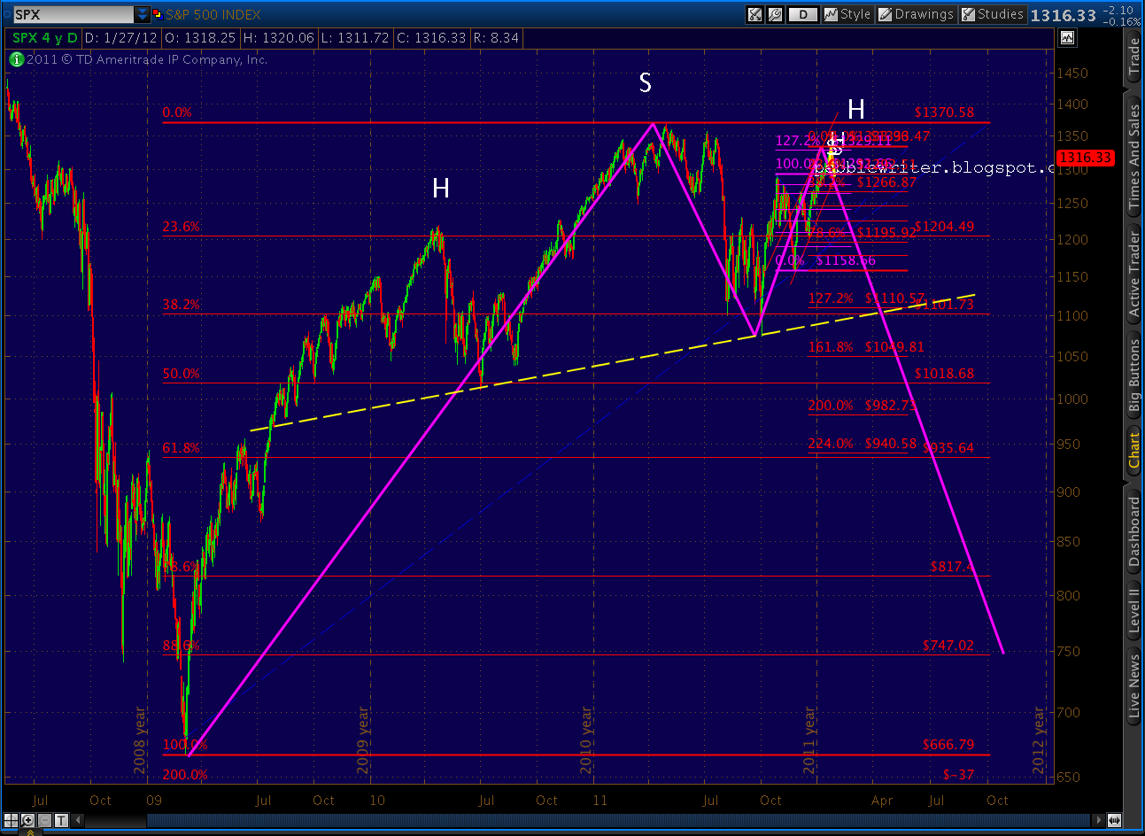
These values are of today; obviously they increase with each passing day. That’s a pretty wide range, of course, with pretty important implications — since 1370 has been presumed to be the P2 top. Let’s look for some guidance from harmonic patterns.
The price action since Oct 07 makes for a near perfect Gartley pattern. Point B was a 60.8% retracement of the 1576 to 666 drop (61.8% is ideal.) And, 1370 came in at 77.4% — just 11 points shy of the ideal 78.6%. Now, at 1344, only 37 points from 1381, is it possible we’ll make it back there for a precise completion?
The affirmative case is sound. As mentioned just above, the fan line from Mar 09 hits 1380 in a log chart, utilizing shadows on the Oct 27 high. And, we’ve surpassed the fan line from the Oct 07 high, so it no longer provides upside resistance. So, 1381 is a distinct possibility.
Of course, it’d wreak havoc with the Elliott Wave counts most folks have been using. The drop to 1074 a few months ago obviously overlaps with the Apr 10 high, and they tend to frown on Wave 1 and Wave 4 overlaps. We’ll set EW stuff aside for another post.
There’s an equally good case to be made for the other levels. As the chart above shows, the arithmetic fan line comes in at 1345 w/o shadows on the Oct 27 high (add those in, and we’re looking at 1354.) The current level also makes plenty of sense if you toss the Oct 27 spike and take out the other shadows (more on Oct 27 this weekend.)
That way, today’s rise is just a blow off top that pierced the Oct 07 fan line and we’re still reasonably close to a proper turn on the Butterfly pattern (the smaller letters) and we can head back down Monday after the Greece deal blows up. Otherwise, there’s not much to put a cap on the rise until 1367.
Remember, the same chart in log scale without shadows gets us to 1369 — right below the previous high. Obviously 1370 would provide tremendous horizontal resistance. And the inverse head & shoulder pattern target of 1367 is right there. It’s also pretty close to the the 1375 target of the Butterfly pattern (smaller letters) if it should play out at the 1.618 instead of 1.272 extension (as they sometimes do.)
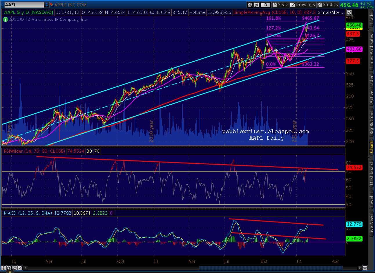
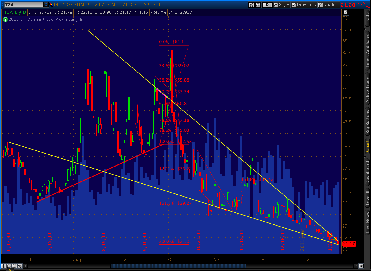
Some other patterns I’m watching: AAPL has reached the channel boundary, but still hasn’t completed the Crab pattern at 465.87. In fact, its failure to participate in the rallies of the past few days has to be a bearish indication.
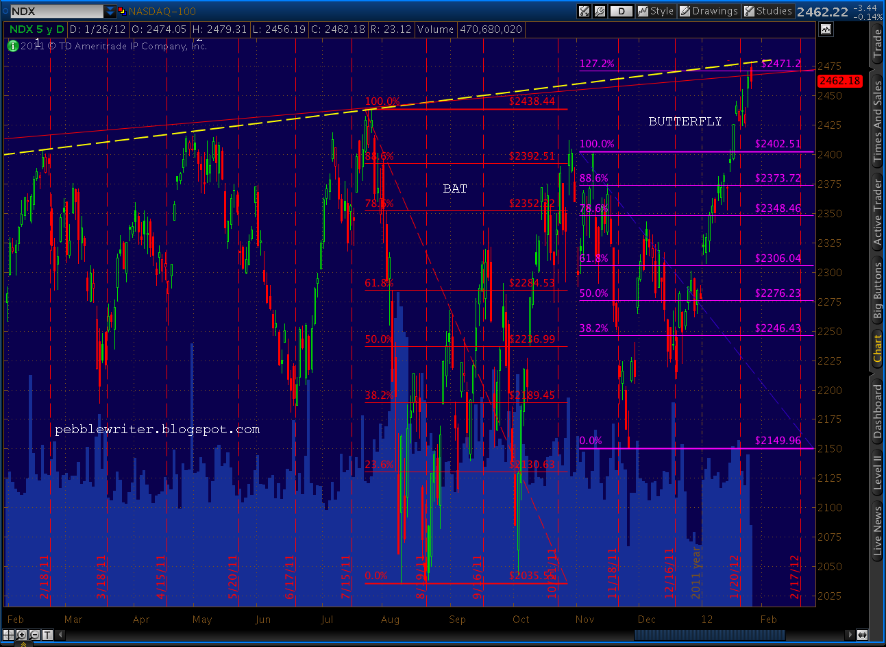
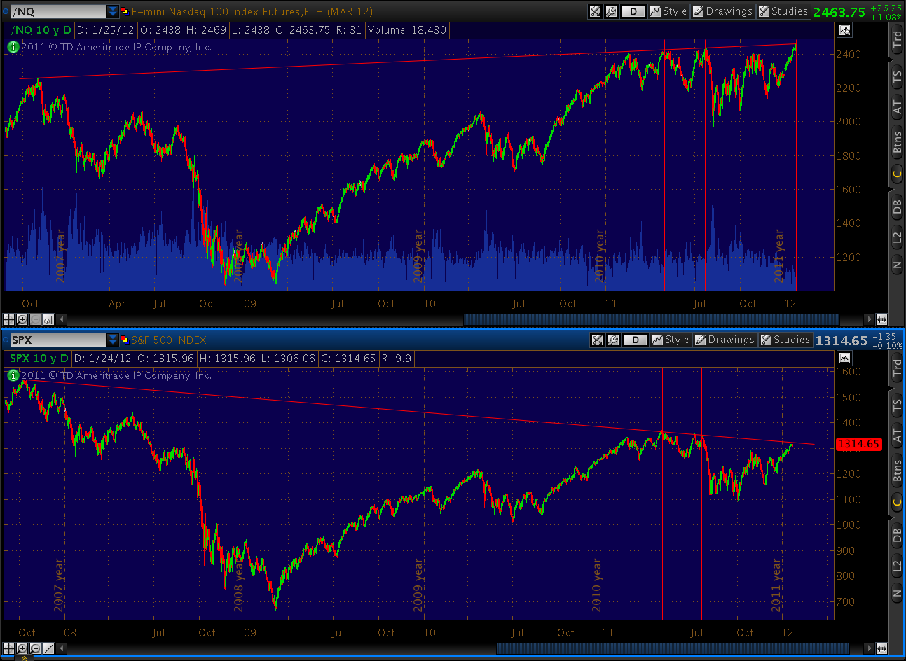
NDX has broken through the fan line and trend line that aligned the previous three tops with Oct 2007 high. Looking back over the past 5 years, it’s likely heading for the 1.272 Fib level at 2571 (although Point B is sorta in no-man’s land, halfway between the .786 and .886.)
The 2571 price level roughly coincides with the currently Crab/Butterfly (purple) we’ve been tracking and lends credence to the previous pattern (red) being a larger Butterfly itself. The 1.618 extension of the purple pattern is at 2574 and the red 1.272 is at 2548.
On a broader index, the NYSE Composite clearly points to a rise to the 8225 level — a 2.2% increase over current prices. It’s the intersection of the .786 of a very clear Gartley pattern and fan lines from the 2007 high and the 2009 low.
The RUT looks even more out of gas. The fan lines off the highs and the lows intersect right at 831 — where we are now. There’s a perfectly formed Bat pattern with an .886 at 838.15 and a perfectly formed Butterfly with a 1.618 at 835.74. Getting much beyond 838 will be very difficult.
I’ll write more over the weekend, but that’s the technical picture right now. There’s ample justification for a little more upside on SPX — perhaps 1367-1370. Though, I suspect financial and geo-political events over the weekend will have a lot to do with how far this goes. Looking at the pathetic volume, I’d say this is a last gasp, one way or the other. SPX is clearly not being emulated by broader indices, which tells me it’s not going to last.
NYA is just about there — maybe another 2-3% — and RUT should be pretty much done. The dollar looks to rise strongly, but will run into some resistance around 81.6. The Euro put in a spinning top today, which perfectly reflects the binary nature of it’s future. A quick .05 move either way is almost certain. And, check out gold, which closed nearly $40 off its highs.
Last, let me address the question of bias. There are many technical analysts who blithely and consistently offer both bullish and bearish alternatives. While some of these guys offer good alternative viewpoints, I’ve always found it frustrating to read between the lines and discern their real opinion. There are others who throw out forecasts without providing any rationale so that we may judge for ourselves whether or not they’re sound. These are even less useful.
I find it most useful to have an opinion and trade accordingly, using stops in case my opinion turns out to be wrong. I’ve been stopped out of bearish positions four times since SPX 1202. But, each position was the result of forecasts driven by sound technical analysis techniques that, while not always perfect, have a better than 50-50 track record.
I trade aggressively for my own account, using options more often than equities or funds. In July – August, using these very same techniques, I was up 28X. So, I’m very comfortable taking a 1-3% hit here and there. Many of you trade stocks or mutual funds, and so these numbers aren’t going to be comparable. But, if you use stops (which you must, especially in this market) your returns should still be in the 20% + range since I started this blog on May 2, 2011.
If you go out and buy puts or calls every time I say we’re going up or down and let the position ride without stops or adjustments, it will be very difficult to make money. This, in my opinion, would be speculating and not investing or even sound trading.
I am still bearish because the economic indicators and my technical analysis tells me the next major move will be down. But, I fully recognize the possibility that the enormous amount of QE (by whatever name) will drive prices higher. It happened during the Great Depression, in the midst of arguably much worse economic conditions. But, I don’t think it’s sustainable — given the enormous debt we have and the persistent budget deficits that will continue to make it worse.
If something happens to change my point of view, rest assured I will let you know. In the meantime, I will continue to do my best to have an opinion that makes for successful trading. Have a good weekend.
ORIGINAL POST:
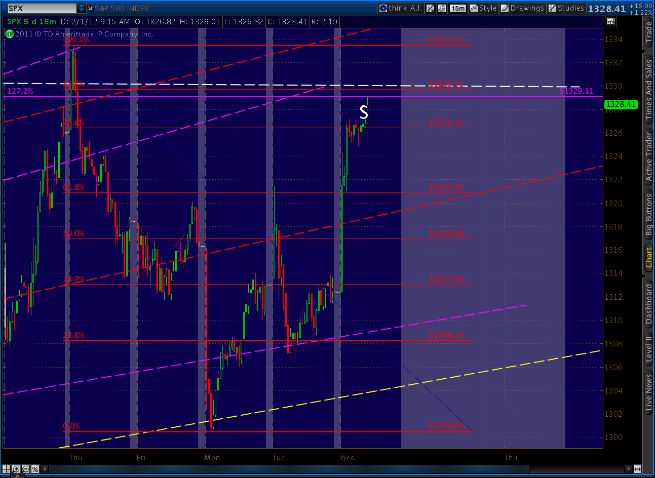
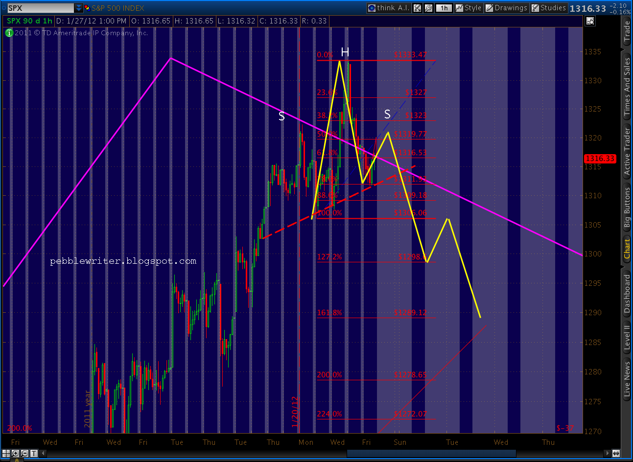
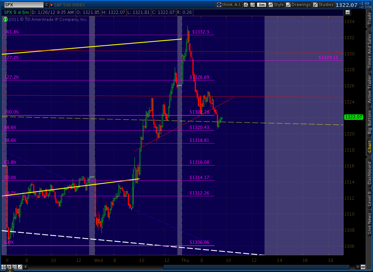
Well, obviously 1333 was not the Wave 2 top. On the other hand, this is just as obviously 5 waves up.
That .886 retrace at 1336.86 that we just exceeded is an 88.6% Fib retracement of the whole shooting match — the 1370 to 1074 Wave 1 decline.
BTW, the ISM Services report can be read here. It’s not as amazing as one would think.