

Now that everyone has jumped on the inflation bandwagon (better late than never) the bond market has thrown them a curve. Rates have plunged in the face of Fed promises to throttle back inflation by raising rates, leaving many economists scratching their heads.
This is nothing new. Fundamentals have increasingly been an unreliable source of information for fixed income traders/investors in recent years. Chart patterns, on the other hand, have trumped the economists all along.
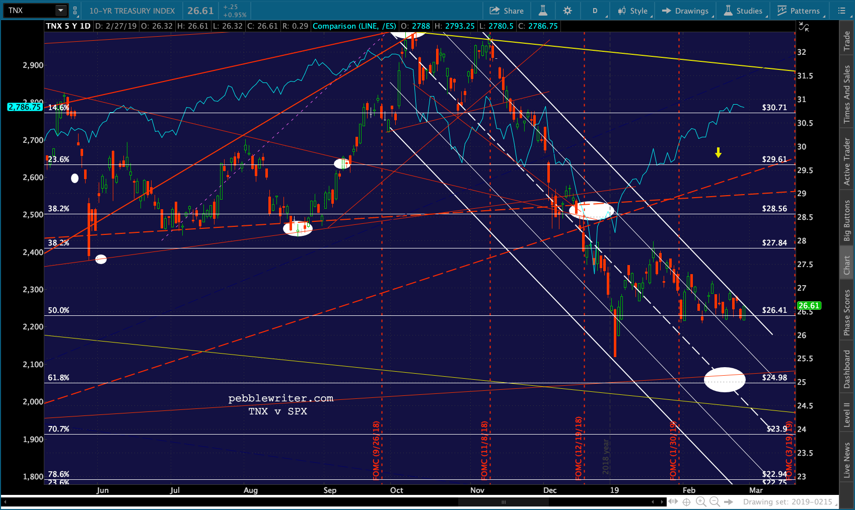
As 2Y10Y approaches our downside target, this seemed like a good time to check in on the bond “market.”
continued for members…
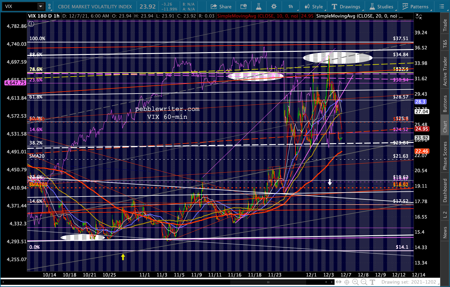
First, a quick check on equities. VIX’s resistance did, in fact, hold. VIX plunged as much as 12% overnight, sending ES up over 60 points. It has potential support here at the white channel midline. But, the channel isn’t exactly a thing of beauty. With CPI coming out on Friday, this could well be the early stages of a pre-bad news ramp job.


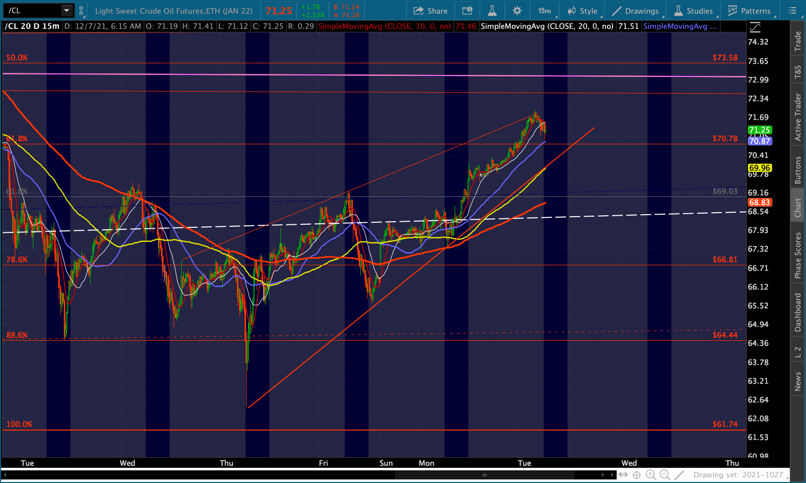
 Like VIX, CL is being highly supportive of stocks this morning. It pushed up through its SMA200, SMA10 and .618 overnight. Though, in the process, it has completed a little rising wedge – usually a setup for a breakdown.
 RB, on the other hand, has merely backtested its white channel bottom.
 Although NG is up this morning, it remains below its SMA200. Only a close back above it would justify a long position. And, even then, it remains in a bear market.
 The dollar is catching a bid this morning courtesy of both the yen and the euro.


 GC and SI are both still on the wrong side of support…
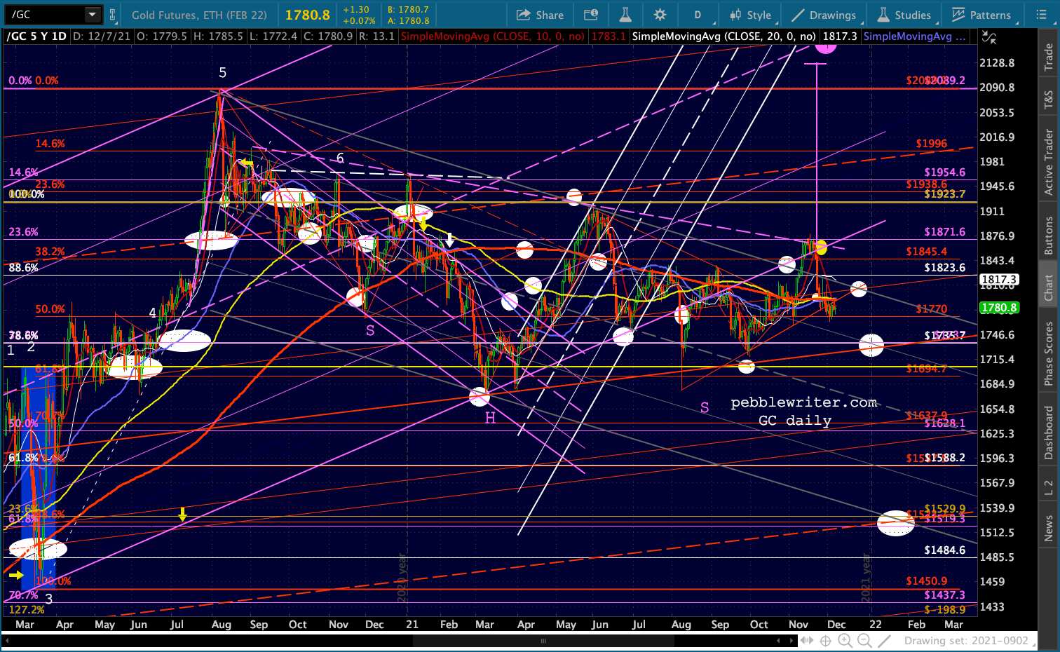
 …and BTC has backtested the broken channel bottom.

UPDATE: 11:40 AM
This is one of those spots that could mark a turning point. Note that CL has backtested the top of the purple channel it broke out of on Sep 27.
 …while USDJPY has backtested its SMA10 and SMA50…
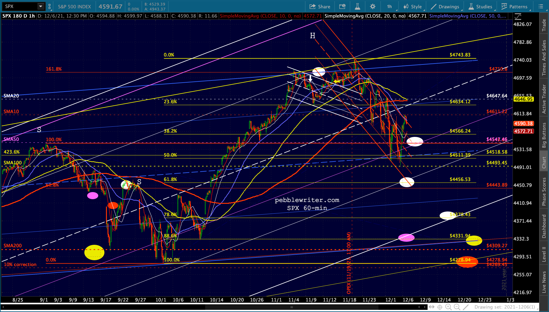
 …and ES has reached a level such that an C=A leg would land it exactly at the yellow .618 Fib.
  If we get more upside, it will probably depend on additional downside by VIX. It is approaching its SMA20, a potential source of support, but it still has a gap to close at 20.96.

Back to bonds…
TNX is getting a bump this morning off of CL’s rally. But, I continue to expect it to move lower, even if CL stabilizes in this range as discussed last week. My argument is the same one that has driven most of my bond market calls: What’s the Fed’s motivation?
By this, I mean that what the Fed needs interest rates to do (or, more often, not do) will usually outweigh the economic factors which have historically influenced interest rates. Thankfully, charts have been extremely helpful in sussing out these instances.
From 1979 to 2006, the falling red channel on the logarithmic chart [from: Are Lower Interest Rates Good for Stocks? in July 2016] below provided an excellent guide to turning points – particularly those cases where interest rates were in danger of breaking out.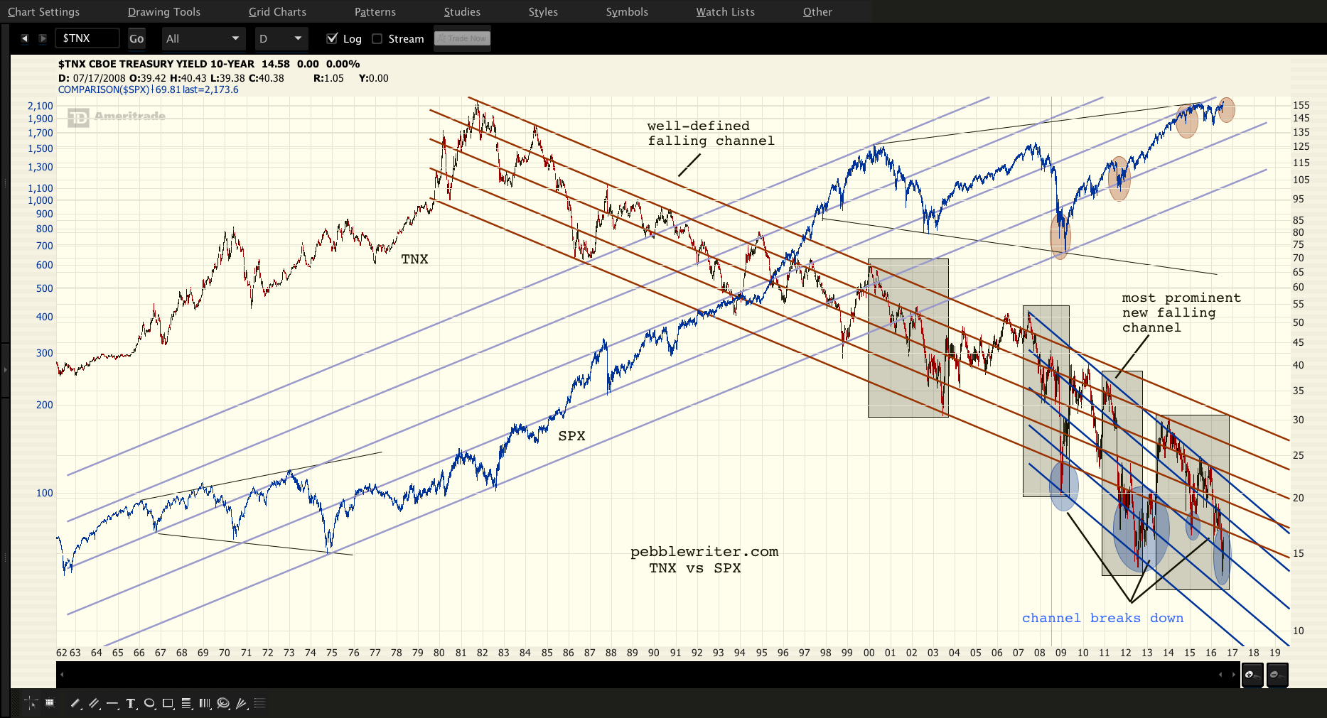 One could make the argument that TNX’s breakout above the channel top in June-July 2006 was an excellent warning to the overall markets that conditions were getting worse. Recall that the mortgage market’s difficulties were just then coming to light, with median prices having soared to 4.6X median household incomes (now 5.6x) and subprime mortgages rising to over 20% of all originations.
In any case, that breakout was the beginning of a chart pattern regime change of sorts. Although the 2006-2007 breakout above the channel top was quickly corrected, rates subsequently plunged below the channel bottom in Dec 2008 as investors fled crashing equity markets into any safe haven they could find.
The advent of QE sent rates back near the red channel top in 2009-2010, but they never quite made it. The channel broke down for good when the 2011 correction came along, establishing a new, much steeper falling channel shown in blue that accurately connected the top in 2007 to those in 2010, 2011, 2013, 2014 and 2015.
The channel bottom, however, was very ragged. By the time 2012 rolled around, it was clear that the tops and bottoms were diverging on log charts. But, I wasn’t clear as to the implications other than to label it a megaphone pattern.
 The arithmetic chart and yield forecast I had put together the year before was a distant memory. From Fractal Countdown on Dec 30, 2011:
I don’t often look at long bonds, but the ten year tsy’s pretty interesting. For those wondering if yields can go any lower, the bottom of the channel is down at 1.40% – a logical turning point.
As it turned out, TNX bottomed out at 1.394% on Jul 24, 2012. But, I was focused on equities at the time, so didn’t give it much thought. As I began to formulate my views on algorithmic factors, however, I came back to the role that bonds played – particularly in terms of the messages being sent.
It occurred to me while looking at the price charts (ZN) in 2013 that we were not only at another potential turning point, but that turning points were popping up at times when inflation was deemed too high or too low. In June 2013, for instance, inflation was pushing 2% – too high for the Fed’s comfort.
 Rates pushed up to 3.04% by December, bringing inflation back down to 1.50% – a little low for the Fed’s tastes. Rates then fell fairly sharply, reaching 1.65% by the end of 2014 – a year in which CPI averaged 1.62% with peaks around 2.13%. Better. The Fed could plausibly argue that additional stimulus was needed as long as CPI never stayed above 2%.
In 2014 I gave up on charting TNX with a log chart and switched over to arithmetic. It made a great deal more sense. This chart from Mar 14, 2014 showed TNX pushing up against a TL that had held since 2007.
 Things were going fairly smoothly until late 2017, when CPI again topped 2%. By the middle of 2018, it had reached almost 3%. This dragged the 10Y up to over 3%.
 In fact, TNX was breaking out of the falling channel from the last century.
 By now, it was clear that the huge runup in oil/gas prices had produced an unacceptable level of inflation which had, in turn, threatened a breakout in rates.
Only a sharp downturn in oil/gas (thanks to the Saudi’s assassination of journalist Jamal Khasshogi) was able to drive inflation back below 2%…
 …which in turn reversed TNX’s breakout.
 I subsequently began charting TNX and CL together, which led to the some wonderful charting discoveries such as oil’s cycle…
 …which led to the discovery of TNX’s cycle. Note that it pretty accurately signaled every bottom in yields except for the one scheduled for 2007, when the bond market was a little preoccupied with “the end of the world as we know it.”
 Significantly, the combination of the falling channel and the cycle did a pretty amazing job of forecasting the 2020 crash in yields.
Here’s the exact same chart patterns from the September 2019 chart above, updated with TNX’s price action since then: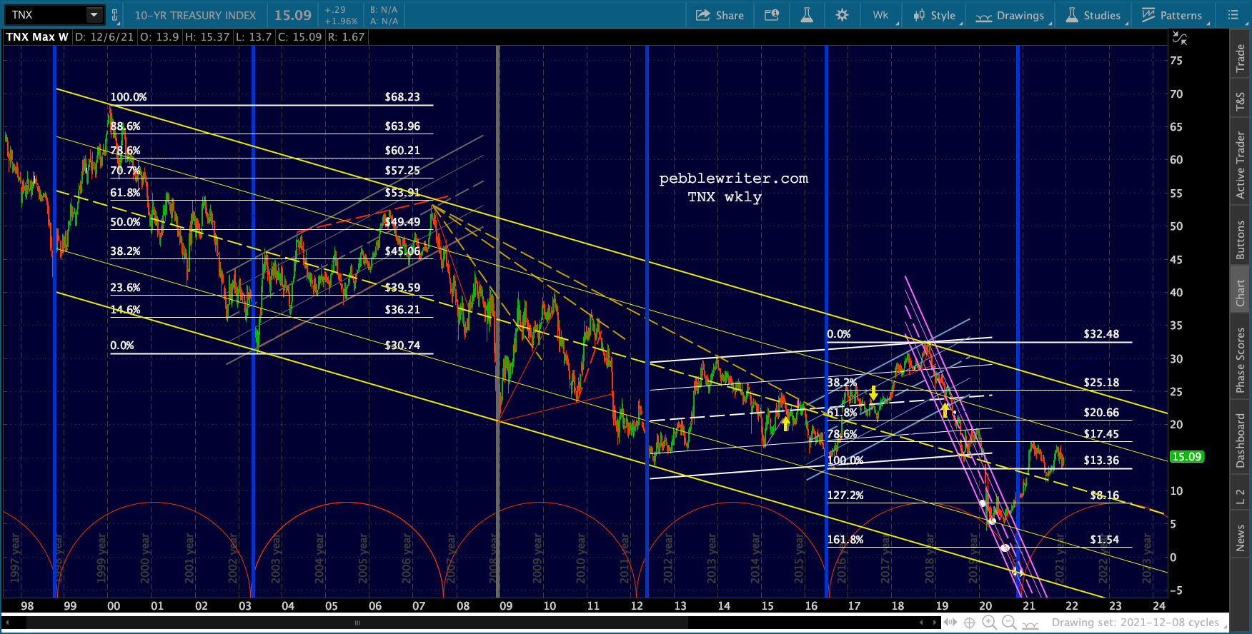 Zooming in, there was a very good case to be made for 0.15% in late 2020.
 Not surprisingly, the point at which TNX bottomed and headed back up (the yellow arrow) instead of dropping to 0.15% was the same time at which:
- CL pushed above its SMA200 since its fling with negative prices in April 2020
- the FOMC committed to continuing its $120 billion in monthly bond purchases
- the DJIA completed a golden cross
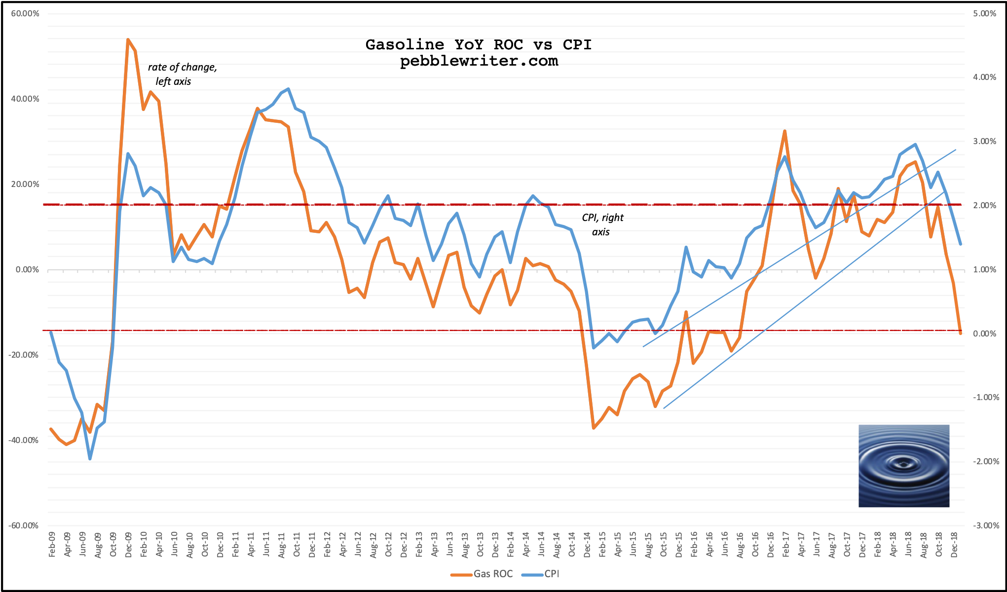
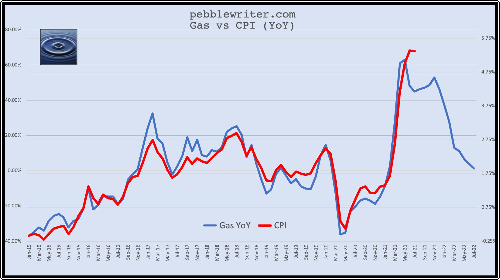
Bottom line, it was a clear sign that inflation was coming. A few days later, PPI confirmed that outlook by posting a 0.6% MoM increase vs 0.1% expected. Our Gas v CPI model also signaled the eventual blowout in inflation which, ultimately, soared higher than changes in gas prices alone would suggest.
 The Fed’s “reflation is good” mantra flipped to “too much inflation is bad” in a heartbeat. But, the Fed didn’t really give up on the “transitory” argument until just recently. Why?
Note the inverted H&S pattern in the chart below. It targets a whopping 3.2%…
 …which would represent a significant breakout from the 30+ year falling yellow channel. Ordinarily, this might not be a big deal. The problem is that the US now sports $30 trillion in debt which is growing at a rate exceeding $1 trillion per annum. 3.2% instead of 1.4% would hurt.
Elsewhere, we’ve discussed how oil/gas prices’ decline of about 20% from recent highs will take some of the pressure off inflation and, thus, interest rates. It remains to be seen whether the other categories of expenses can similarly be brought under control.
At this point, I believe they can – because that’s what the Fed needs to happen. I believe in the next month or two we’ll see the red channel break down and the purple come into its own with a tag at the purple .500 at 1.08% or .618 at 0.92%. If TSHTF and those levels don’t hold, then we could theoretically get down to that 0.15% level next Spring.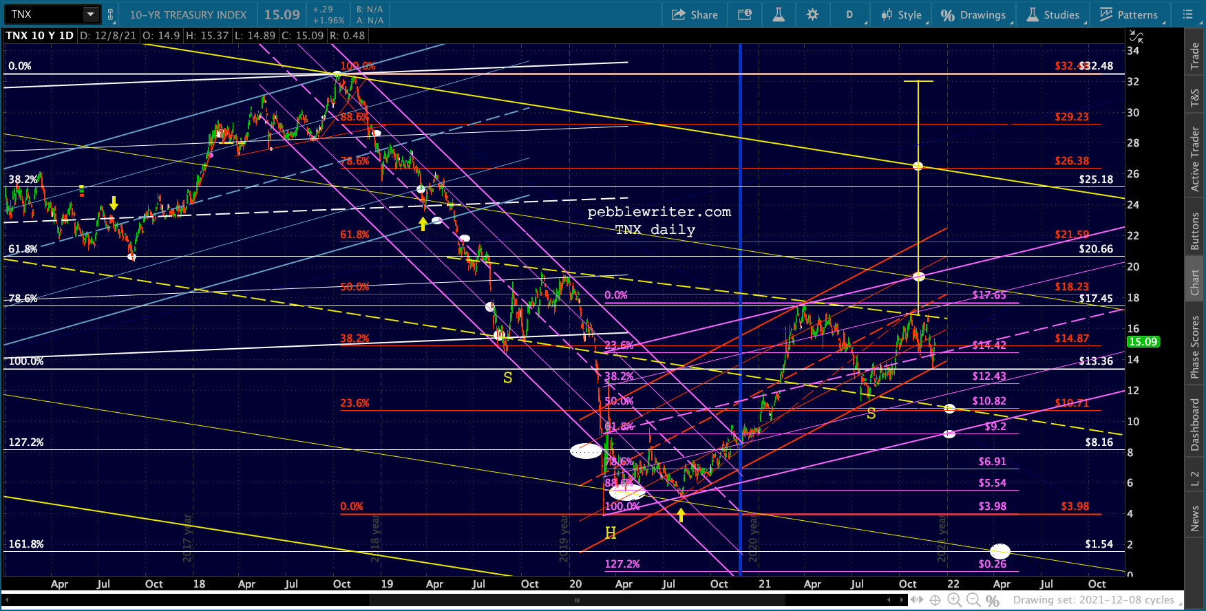 If I’m wrong, and the IH&S plays out, we’ll know fairly soon. The first stop would be 1.94%ish with potential up to 2.64% before the FOMC freaks out.
Bottom line, I believe the Fed fully intends to get inflation back down to a 2 handle before they’re done tapering and, importantly, before they’re expected to start raising rates. If this means crashing the oil/gas market, so be it.
continuing…