LATER
Okay, so post-S&P; downgrade… ignore everything I wrote today. It doesn’t matter anymore. I think.
Was this priced into the market? Question du jour, possibly l’année. My gut says it was. I think most institutions that are required to divest themselves of anything less than AAA will do so over time, if at all. Investment policies are, by and large, set by people who understand the downgrade doesn’t create new risk; it reflects existing risk.

Those investors subject to specific ratings-related regulations (insurance companies, escrow accounts, etc.) are likely be granted exemptions in the case of instruments that carry the full faith and credit, etc. Ditto with bank and brokerage capital requirements.

So, who’s going to dump treasuries? China can tell you, it’s not easy. There aren’t a lot of good alternatives. After the dust settles, interest rates will probably be a little higher. Bonds and stocks loath uncertainty, so will likely sell off very sharply, bounce back, then resume the declines they were pursuing anyways.
Going to do a lot of thinking about this over the weekend. Should be a very interesting Monday!
EOD: I’ll be traveling this weekend and Monday, and will probably not get a chance to update this blog until late Monday night. Hope everyone has a great weekend!
Last note: I’m thinking about starting a petition to change “the trend is your friend” to “the trend line is your friend.” TL’s were very good to us this week.

UPDATE: 3:45 PM EDT
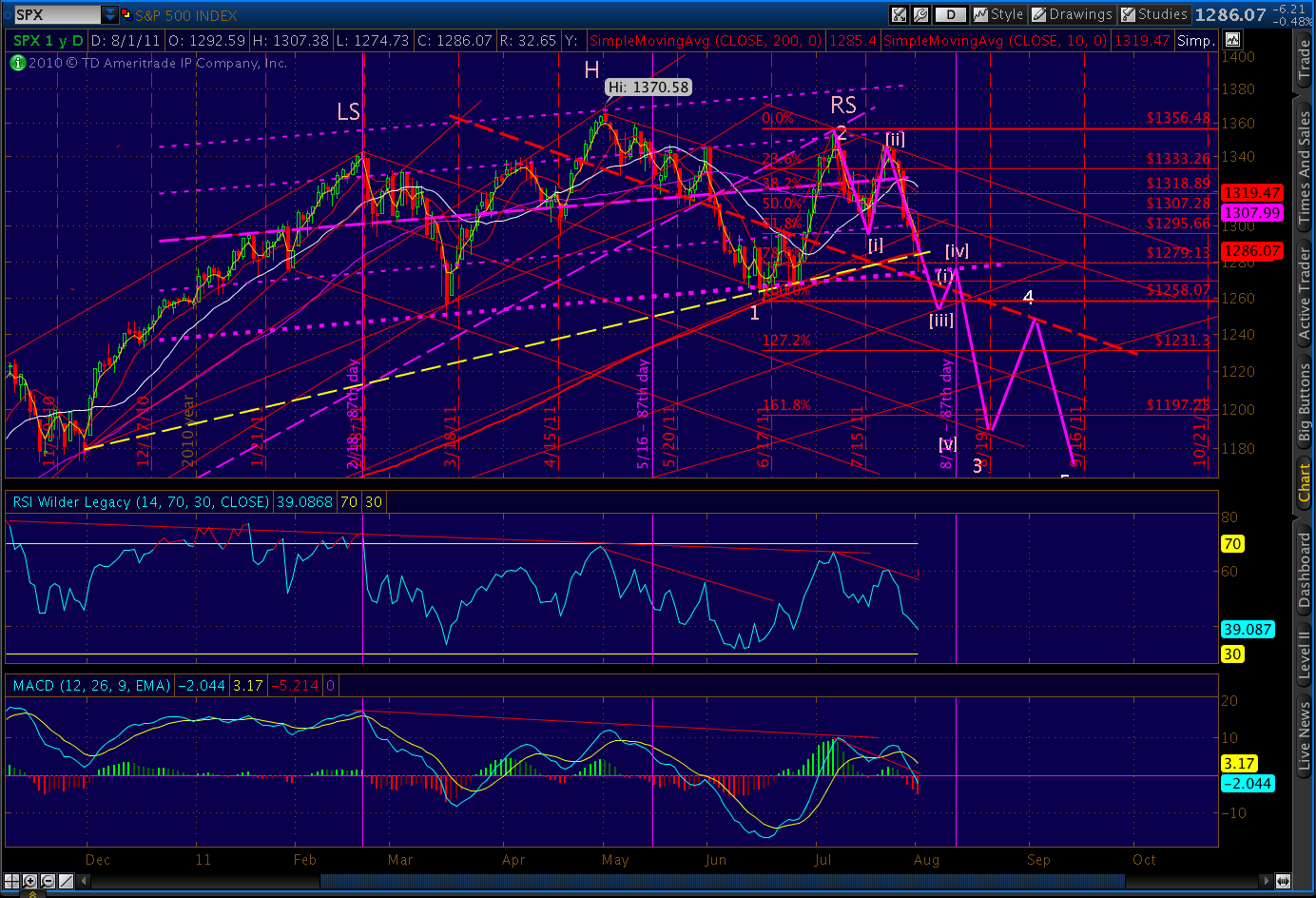
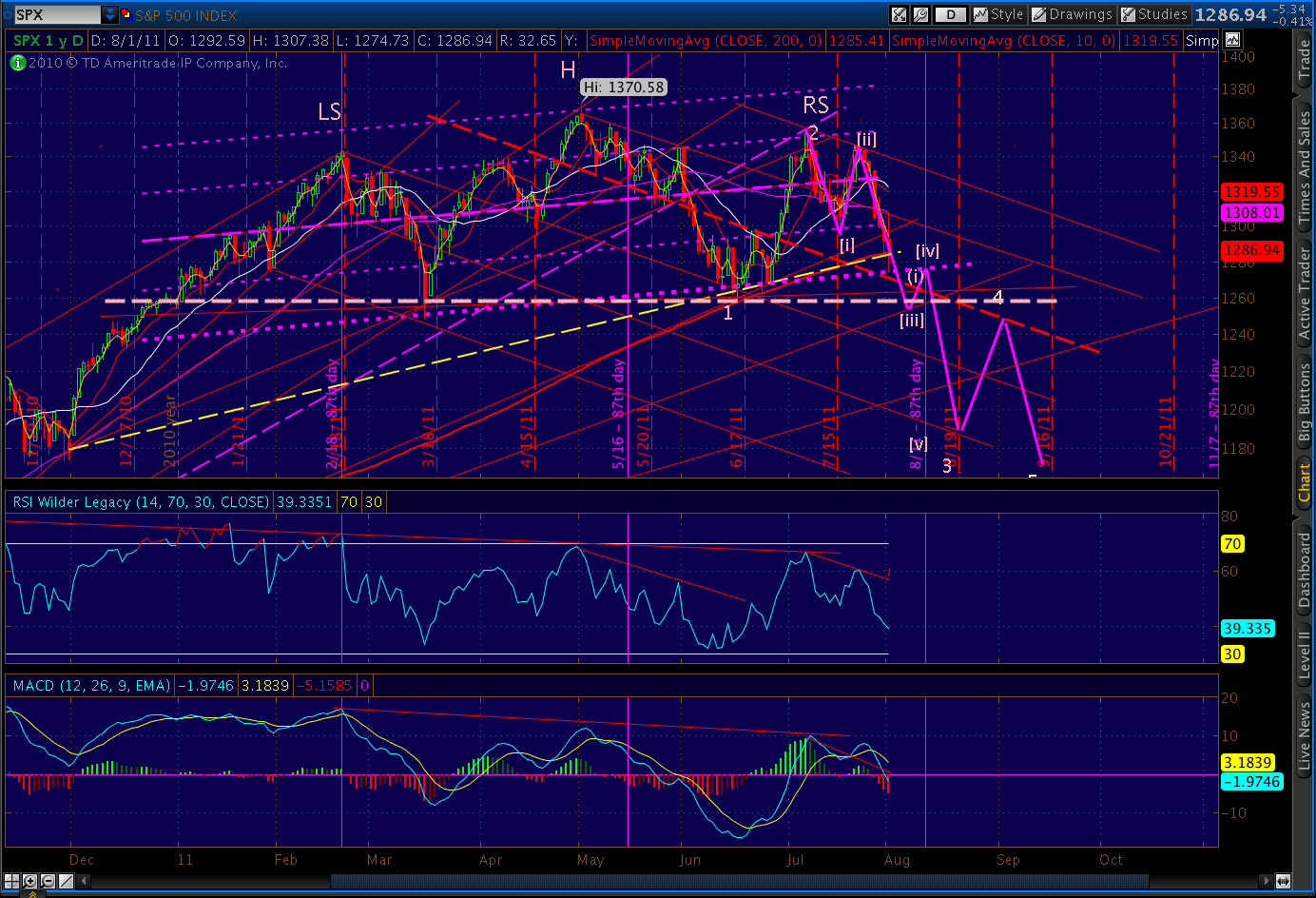
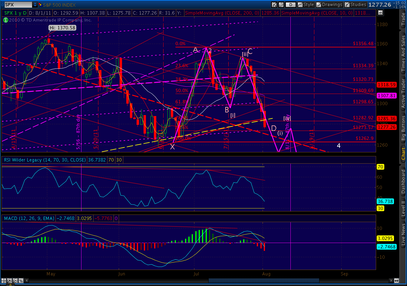
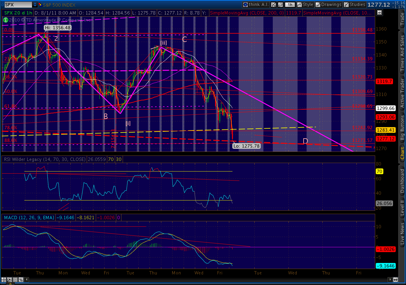
There are now no fewer than three IHS patterns setting up on SPX — two that have completed that indicate 1252 and another that might mean 1256, if they play out.
My best guess, heading into the weekend, is we’ll probably close fairly flat on the day, then pick up the “everything is just fine” mantra from Jackson Hole next week. Investors counting on QE3 will likely be disappointed, and this week’s decline should resume.
This is all pure conjecture, of course, and is subject to revision based on today’s close and news over the weekend. Economic news is light early in the week, with productivity on Monday and wholesale inventories on Tuesday. Initial claims comes out Wednesday, and after today’s employment fairy tale news, will be closely watched. Most attention, though, will be on the Fed. Just the way they like it.
One last look at gold: I really like this fan line configuration and divergence, and picked up a few GLD puts during the day.

UPDATE: 3:10 PM EDT
Consumer credit just came out at a 7.7% increase (June over May). Non-revolving grew at 7.6%, while revolving grew at 7.9%. If it were new cars or refrigerators that were charged, rather than groceries and electric bills, this would be good news. Note the rather alarming increase of late.

UPDATE: 3:00 PM EDT
Insider sales disclosures are popping up faster than Berlusconi mistresses. Here’s a couple that just went by:


$2.3 million in proceeds, from an exercise price of $35K. $11.5 million for $200K. Not shabby. Guess I’d be thinking about cashing in, too, if my stock had done this in the past year. You have to think they know their company pretty well. Why do you suppose they’re dumping their stock en masse?

UPDATE: 2:00 PM EDT
Here’s the inverse Head and Shoulders pattern on SPX. If it plays out, it could mean a bounce to 1253 — awfully close to the 1258.07 Fib level and our previous pattern low.

That makes 1258 my top candidate for this move if it really gets going. What might really get it going?
As most know, the Fed meets in Jackson Hole next week. According to Pimco’s Bill Gross, they will unveil the next iteration of QE — probably in the form of language designed to reassure investors that interest rates will remain low for a very, very long time. Other Fed-watchers are wondering if something more stimulative is coming.
As damaging as it might be to the economy long-term, it would most certainly create some upward momentum for stocks. Needless to say, anything less than a full-bore stim job by the Fed will send stocks and gold south in a jiffy.
UPDATE: 1:20 PM EDT
So, another bounce has arrived, courtesy of the ECB. Seems they’re so impressed with how well QE has worked in the States, they’re going to run it up their own flagpole.
Like here, it will purchase a lot of bonds that no one else wants. It will also inject a lot of cash into an otherwise credit constrained market. And, it will save a lot of (especially German) banks that would otherwise be looking at unbearable losses (by “unbearable” I mean not just unpleasant but capable of inducing systemic failure.) And, like QE1 and QE2, QEe will do absolutely nothing to resolve the root causes of the coming Euro-zone implosion.
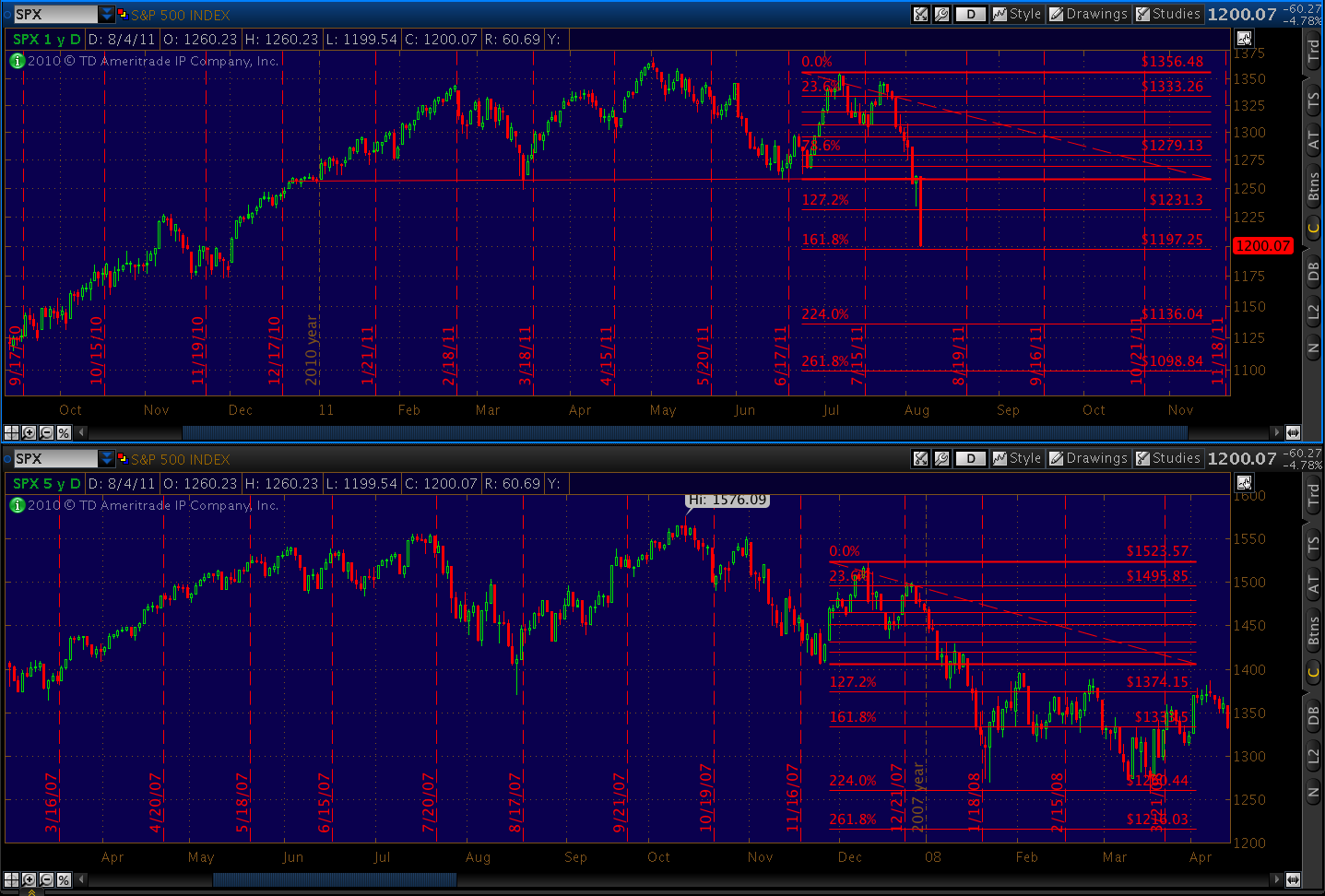
Whether this blip turns out to be more than 40 points is anyone’s guess. Watch the Fibonacci levels, seen here in yesterday’s post…

…and both the Fib’s and the TL’s on the daily chart.

There’s strong upcoming TL and Fib resistance at 1231, and additional Fib resistance at 1258 and 1269.
There’s also an inverse H&S; pattern that just completed on the S&P; futures. If it plays out, it indicates 1249 or so on the upside. Kudos to 200DayMA on Daneric’s blog for pointing it out.

Interestingly, Gold is not participating in this rally. It completed a little head and shoulders pattern this morning that might well trigger either of two larger patterns. If it plays out, GC could be on the brink of a nice tumble to the 1600 level or lower. [see: All That Glitters].


UPDATE: 10:15 AM EDT
Got a great question from Zimzeb on last night’s post that I wanted to address…
“What potential development which would derail the 2007 analogy most concerns you right now?”
From a technical standpoint, I am slightly troubled by the divergence between yesterday and its 2008 equivalent. But, my gut is that the faster/stronger move was simply because we were there, just 3 1/2 years ago, and we remember how nasty it can get. Shouting fire in a crowded theater always produces a panic; we’re like an audience sitting in a theater where a fire broke out last week, and now someone’s shouting fire again.
Fundamentally speaking, there are some differences between now and 2007. My crystal ball is no better than anyone else’s, but I think this will be worse. At least back then, when TSHTF, the system wasn’t as stressed. Total debt was only $9 trillion and inflation was nowhere to be seen. I keep wondering, if I were BB, what would I pull out of my arse to make this all go away? Policy is as accommodative as possible, dollar is cheap, inflation lurking out there somewhere…
I just don’t think there’s much he can do. I’m sure he’ll try another QE at some point; but jeese, if it doesn’t work then we’re really screwed. Right now, the threat of QE is all they have. And, I just don’t think it would work a third time — even if they had the balls to try it.
To me, 2007 was about over-leverage. And, while there’ve been some adjustments, we’re still massively over-leveraged in many ways. Big corps are sitting on lots of cash, but consumers sure as heck aren’t; they’re using credit cards for cash flow. Homeowners, who kept the economy humming until 2005 through the miracle of home equity lines, don’t have any more home equity — let alone the lines. And banks, if you look very closely, have massive understated — or, in many cases, unstated — liabilities that are just plain scary.
This problem started with housing, and it won’t end until housing is fixed. In the meantime, every aspect of the economy that depends directly on housing — construction, finance, consumer credit, employment, consumer durables, municipal finances, property taxes (a biggie that no one’s talking about), education — those areas will take it on the chin until the root problem is solved. And, just about everything else is at least indirectly dependent on housing.
In the 30’s, the New Deal offered recovery, relief and reform. Our response, thus far, has been to send more boatloads of cash to Wall Street to replace the hundreds of billions they stupidly blew. We’ve offered ordinary Americans no real relief; thus, the recovery ain’t happening. And, as for reform, ask Elizabeth Warren how that’s going so far.
As we all know, the stock market isn’t the economy. It’s not difficult for corporations to book increasing profits in the face of a poor economic backdrop. Some, like Apple, have quality products that consumers demand. Others, like GM, will channel-stuff the living daylight out of their dealers to keep the illusion alive. But, most of the rest are ultimately dependent on industrial and/or consumer demand.
When that demand falls off, as it has in this country and the Euro-zone, those companies are up a creek. They can play accounting, M&A;, tax and currency games to “meet expectations” but eventually someone has to be willing to buy something. Who? Right now, there’s demand in Asia. But, will that hold? How about in the face of a stronger dollar? How about post-contagion when global demand falls off? I suspect China has its own problems that we won’t know about until they’re patently obvious.
In my opinion, the only solution is to let the crash that started in 2007 play itself out. That means hitting the great big red “reset button” and aligning debt with actual asset values, not to mention debt servicing capabilities. It’ll be doubly difficult if rates bump up at all. “Aligning” is one of those euphemisms that really means “write-downs.” It means lower asset prices, stocks included.
ORIGINAL POST: 9:15 AM EDT
Jobs report just out, and despite ample evidence to the contrary, the Labor Department reports a decrease in the unemployment rate to 9.1% and the creation of 117,000 new jobs in July.

“Created” is the operative word, as in “out of thin air” as the Dow plunged 500 points yesterday. But, that’s okay, we know how the game is played. The S&P; will likely run up 20 points, the Dow 150; the crises will have been averted.
Watch the key price levels we discussed last night. There will be ample opportunities to play the bounce and/or establish new bearish positions. No matter what unfolds today, the trend is still down. Smart investors will remain glued to their computers and/or use stops. More later.