
It was a big gamble, but it paid off – at least so far. The Fed took a page from Ben Bernanke’s famous 2002 speech in which he said, “The U.S. government has a technology, called a printing press (or today, its electronic equivalent), that allows it to produce as many U.S. dollars as it wishes at no cost” and went to town. It bet the house that the “at no cost” qualification would hold.
A staggering $4.2 trillion (since March 2020) later, the whole world now knows that there was a cost: inflation. Initially, we were assured that it wouldn’t happen at all. The message then shifted slightly, suggesting that a 2% target represented a range that would accommodate deviations above and below 2%.
Finally, when it became obvious that inflation had moved well beyond normal deviations, the Fed insisted such a departure was transitory – whatever that meant. When you think about it, isn’t everything either transitory or permanent? Technically, a condition which persists less than a million years could be considered transitory, right?
All this was obfuscation. The Fed’s real game was to reinflate failing markets just long enough so that COVID could be contained and the economy could recover. An important codicil was to pour so much money into bond markets that rising inflation would have no effect on interest rates. If rates remained at all-time historical lows, who would care about inflation?
 As it turned out, lots of people — especially the ones without any capital, political or otherwise. The cheers of asset owners who gleefully watched their real estate, stock portfolios and collectibles appreciate could be heard around the world. The poor and middle class, borrowers, pensioners, renters, unemployed, families living paycheck to paycheck – not so much.
Jay Powell’s insistence that the recovery would be “broad and inclusive” conveniently neglected the fact that the Fed’s policies were the primary obstacle to such an outcome. Wealth inequality has never been so extreme. The top 1% now own more wealth than the bottom 92%, and the 50 wealthiest Americans own more wealth than the bottom half of American society – 165 million people. The top 0.1% owns over 20% of the nation’s wealth, up from 7% in 1978. Political pitchforks everywhere are being sharpened.
Inflation matters greatly to most Americans. The most recent CPI data at 5.4% greatly understates just how much of a burden it is. The three largest categories of expenses for Americans are rent, food and transportation. September saw annualized price increases of 11% for food, 15% for gas and 20% for a 1-bedroom apartment.
Even as inflation spiked higher over the past year, Powell continued to insist it could be controlled. A typical response, this one from testimony in July, went something like “One way or another, we’re not going to be going into a period of high inflation for a long period of time, because of course we have tools to address that.” He talked about tools quite a lot.
As our members know (because we’ve been writing about this very problem for well over a year) there are only 3 tools which can effectively bring down inflation. Tapering and raising rates, the ones most often discussed, take time and cause market disruptions. Lowering prices on key commodities is another option and, given the power and resources of central bank trading desks, has been an increasingly popular choice.
We saw this in the 2014 and 2018 oil price crashes when CPI had topped 2% and the 10Y had topped 3%. It’s possible they might employ the same tactic today, though a modest price decline followed by stable prices could accomplish the same goal until the base effect adjustments (the inspiration for the “transitory” meme) kick in.
 The problem, of course, is that the Fed let the game go on too long. High oil and gas prices fueled high food, manufacturing and transportation prices. These in turn have resulted in upward wage pressure and, well, you get the idea. Unraveling the whole thing without disrupting markets is a rather risky business.
* * *
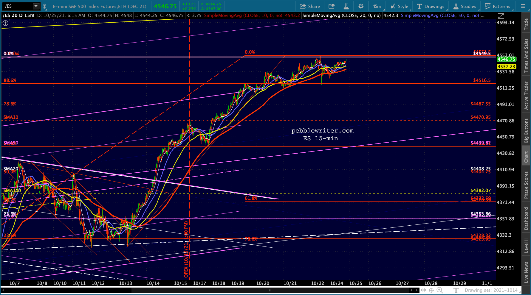
Meanwhile, ES melted up to within 1.24 of our upside target yesterday – fairly normal behavior as we approach an important Fed announcement.
 Stay tuned.
continued for members… (more…)