UPDATE: Sunday night
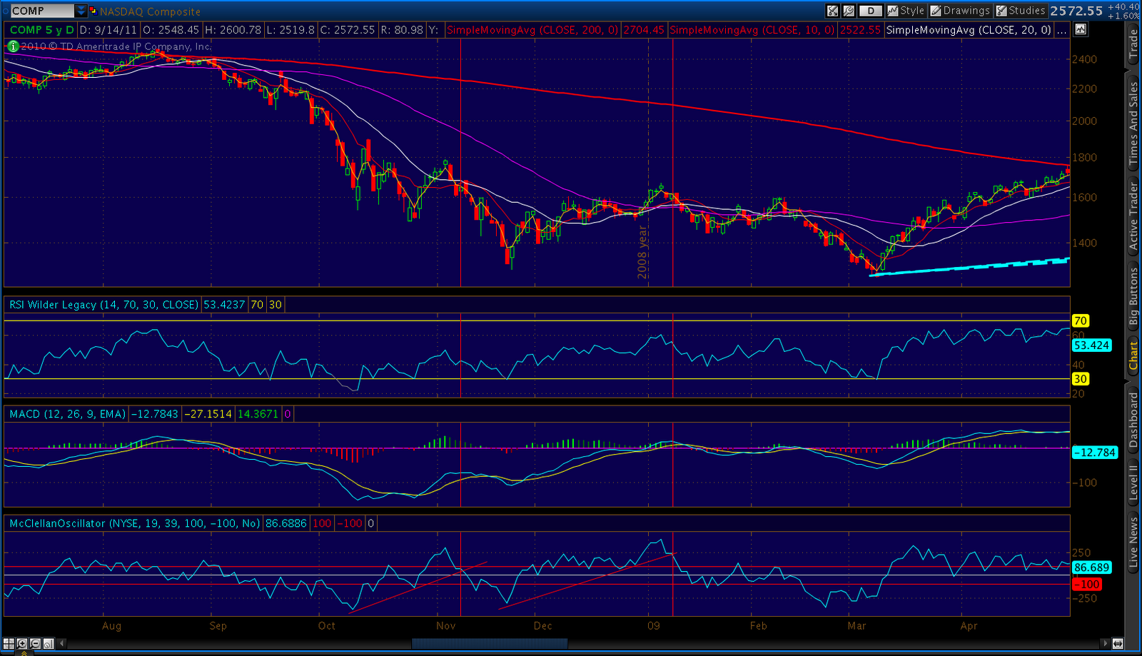
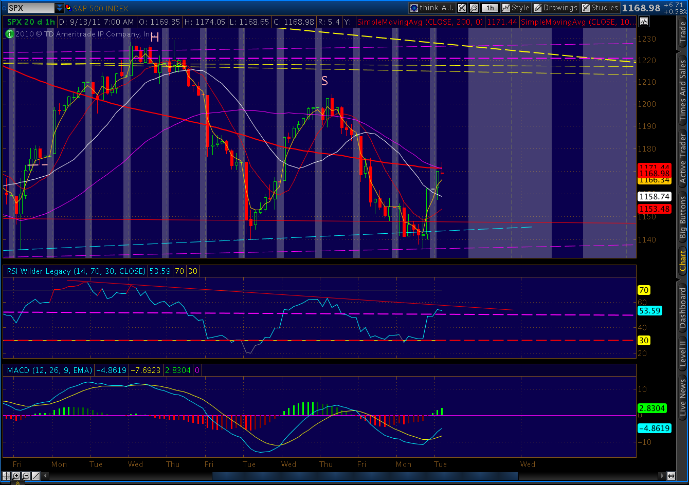
A quick update on our 2011 v 2007/8 comparison chart:

Here’s a close-up. On Feb 27, 2008,SPX had climbed 120 points off the bottom (24 days) and was 8 points away from establishing a new higher high. Instead, it fell 131 points over the next 13 trading days.

As of this past Friday, we have climbed 120 points off the bottom (27 days) and are 10 points away from establishing a new higher high. If this doesn’t mean anything to you, go back up and read the last paragraph again.
A 130 point drop from here, BTW, would take us to 1090. All we need is 1145, however, to complete the head and shoulders pattern discussed below with a 1040-1050 target.
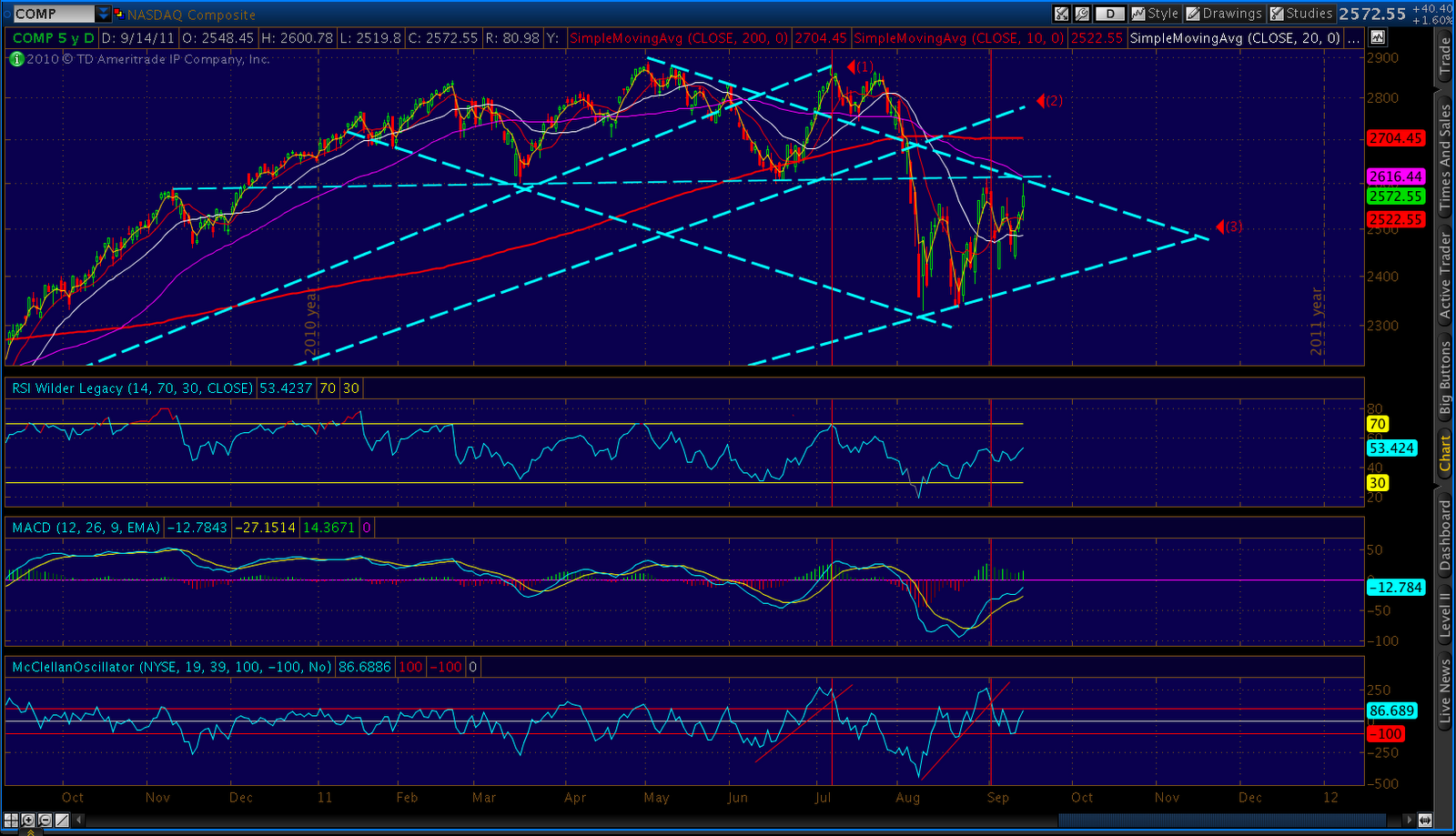
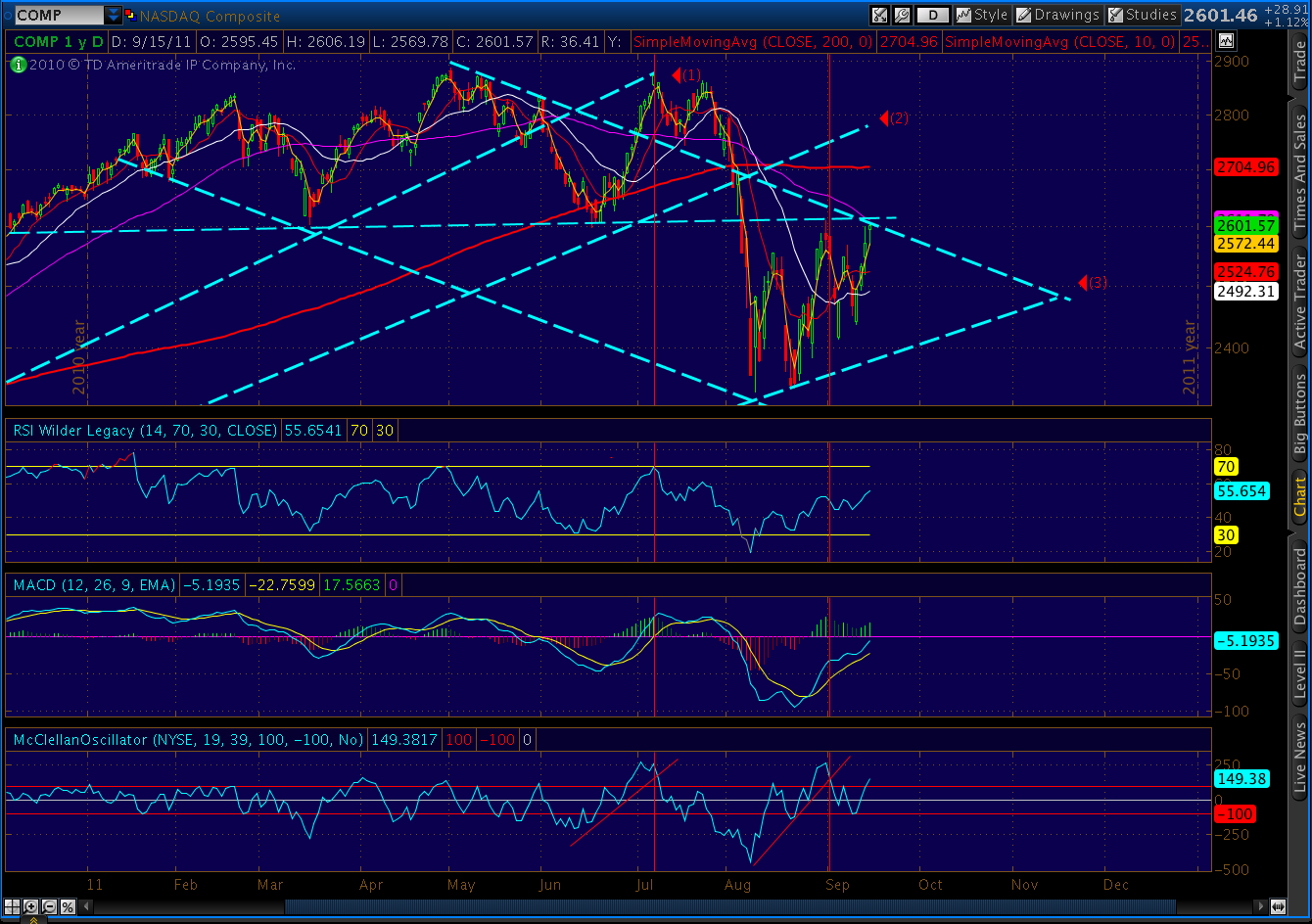
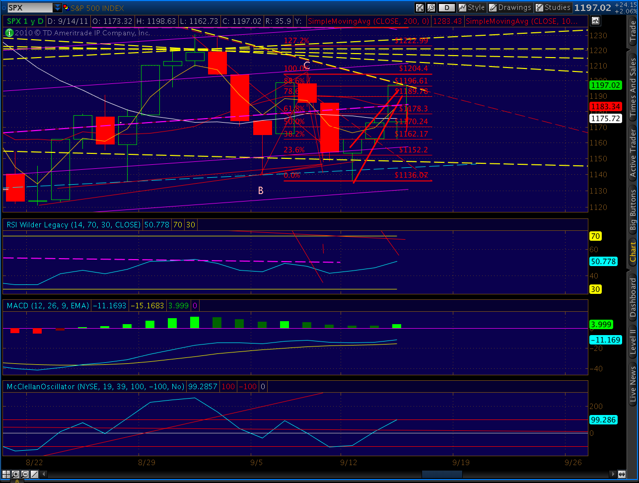
And my last chart for the weekend — the comparison between the past 5 weeks and the overall 2011 topping pattern. Eerily similar.

Some believe that Greece and EUR problems are baked into current prices, that we’ve seen the bottom. I say the problems are just beginning to get much worse. I think the only thing baked into prices is the belief that the Fed can wave its magic wand and bring back the bull. I believe there will be a lot of disappointment in the weeks ahead.
I think the huge rally engineered over the past 5 weeks was a do or die effort by market makers to salvage their books after massive losses sustained in the 250-point plunge. They got through OPEX alive, and will position themselves better in the coming leg down.
ONE LAST COMPARISON…
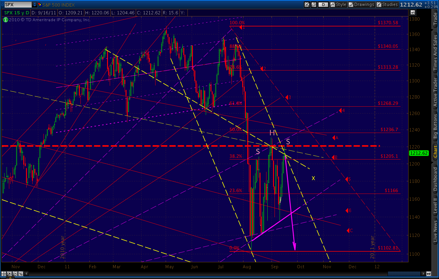
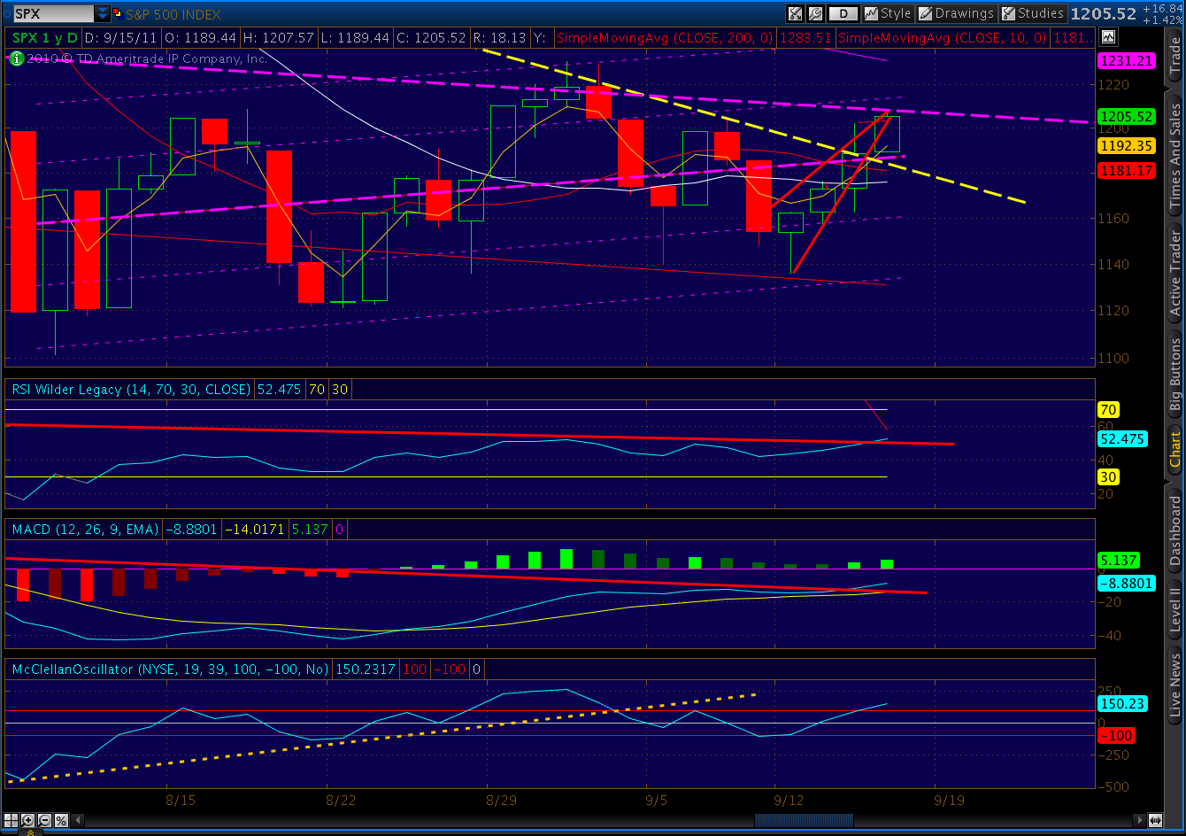
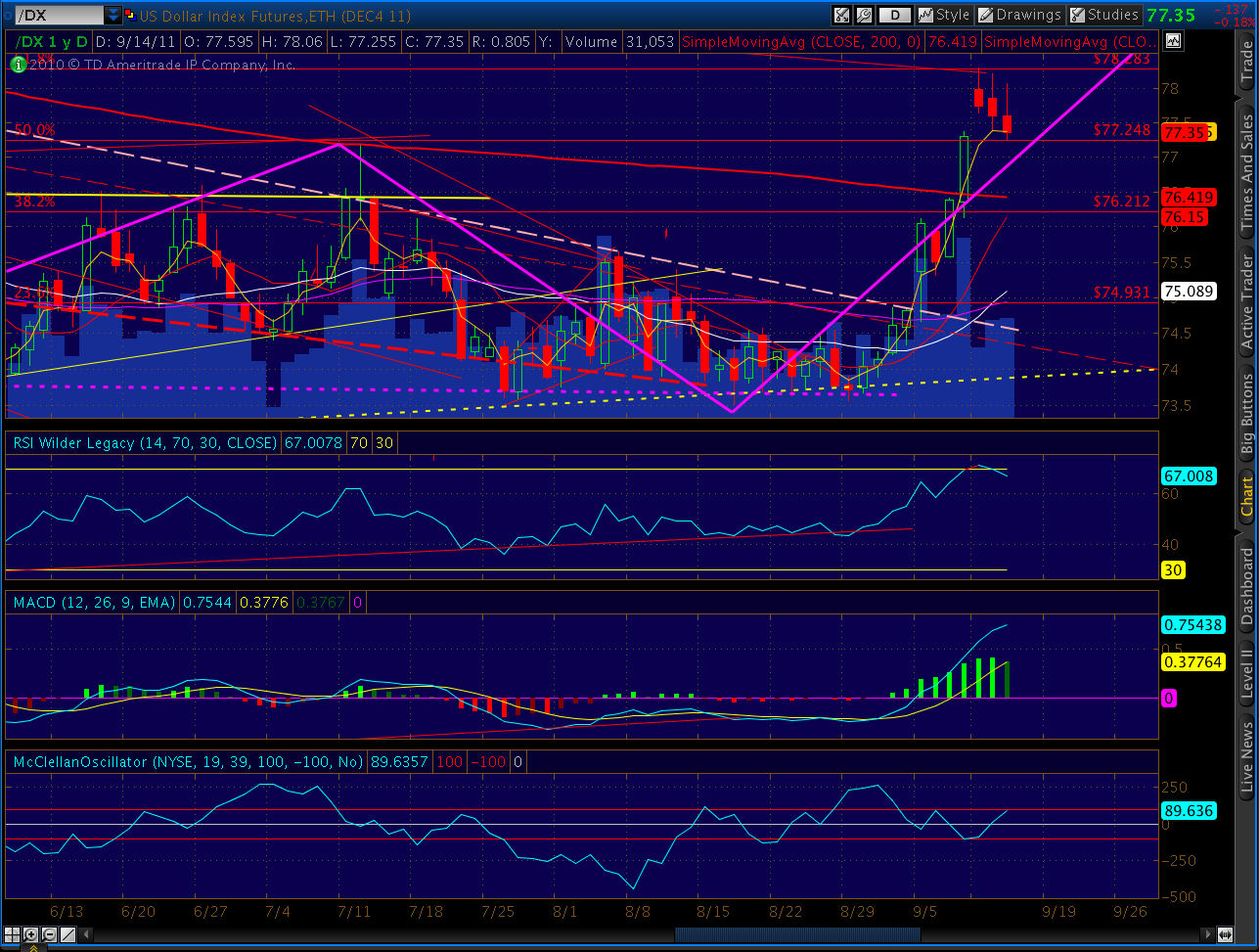
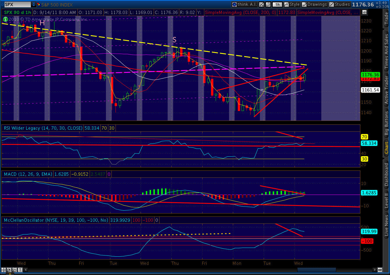
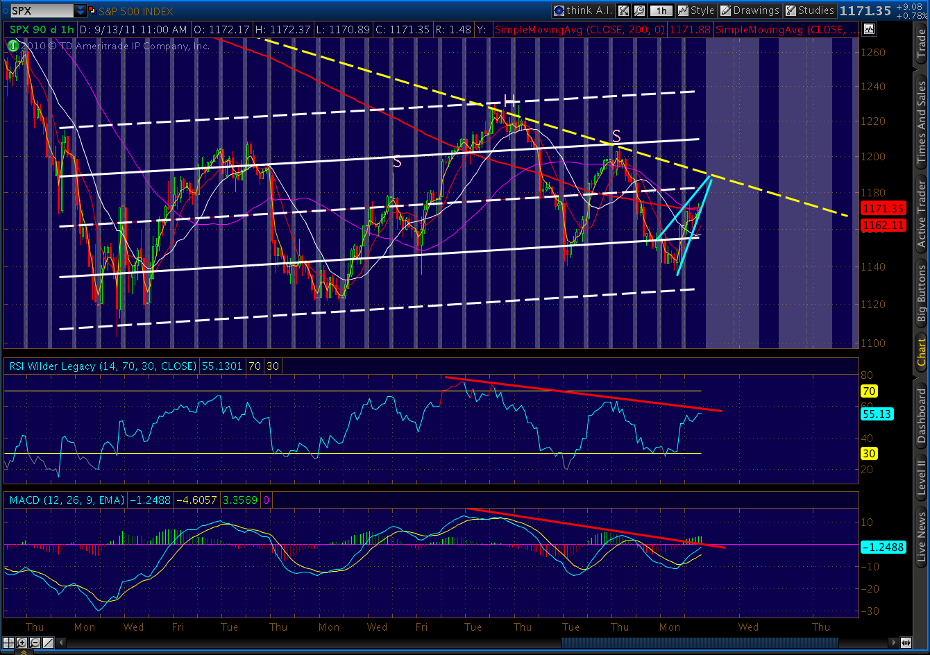
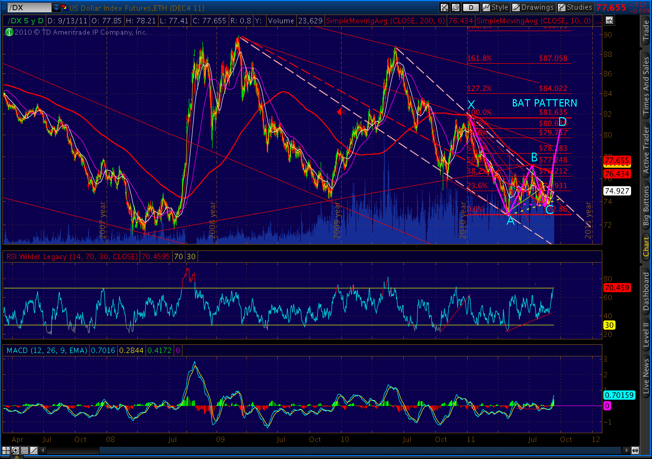
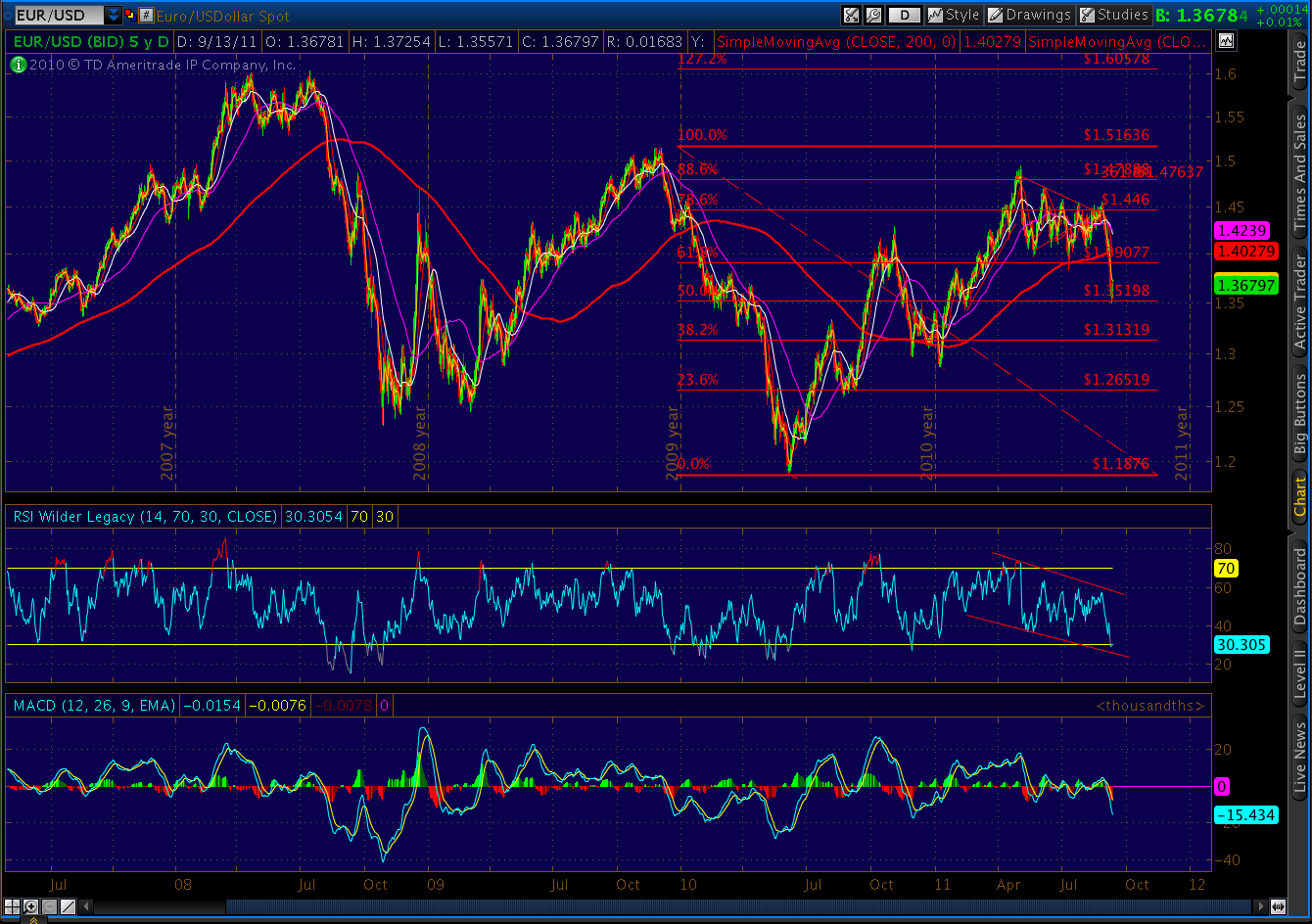
Sorry, couldn’t resist this one. Maybe it’s nothing, but the bearish Bat pattern we completed Friday reminded me of similar patterns I’d seen on dates I consider equivalent. The pattern shapes vary, but they all end with a .886 Fib retracement. You decide.
 |
|||
| Bat completed 9/16/2011 |
 |
|
| Bat completed Feb 26, 2008 |
 |
| Bat completed July 21, 2011 |
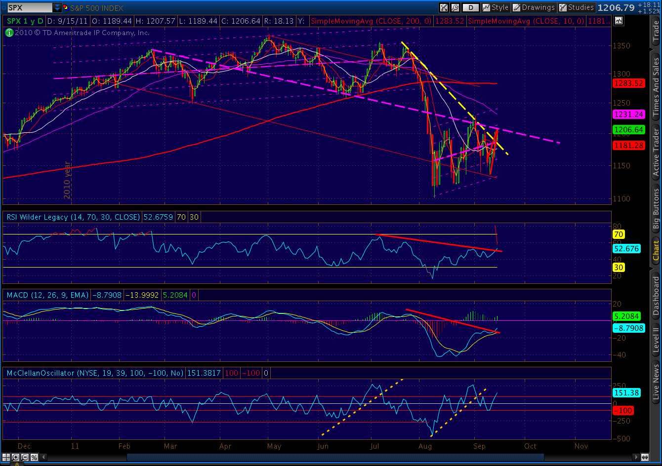
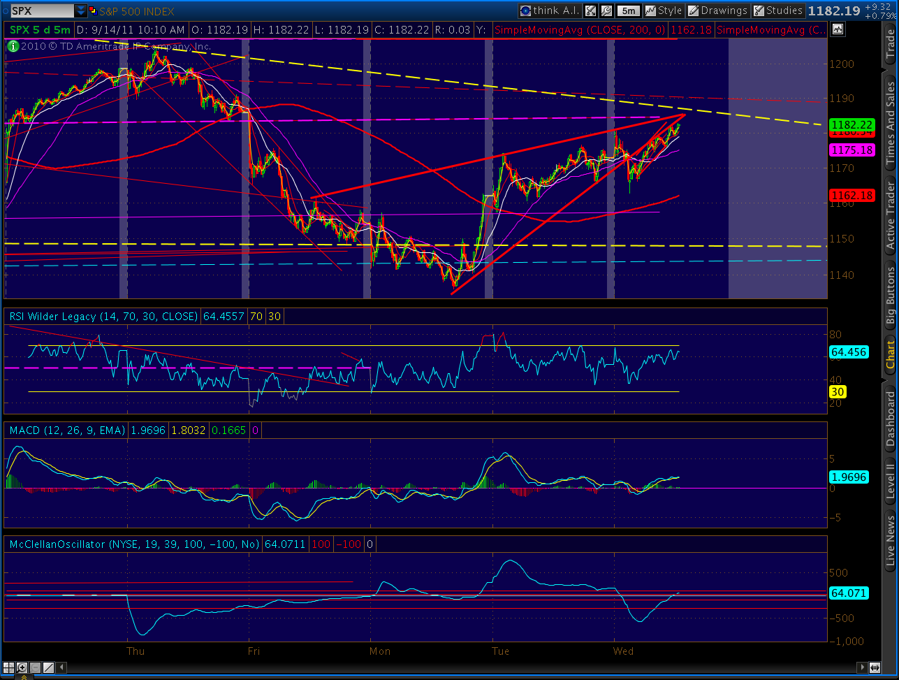
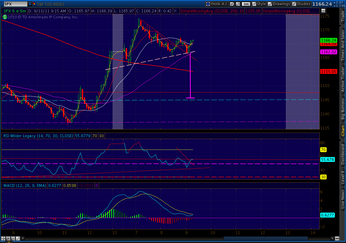
FRIDAY – EOD:
Long, long week for us bears. But, the day went well. And, next week should be a lot more fun.

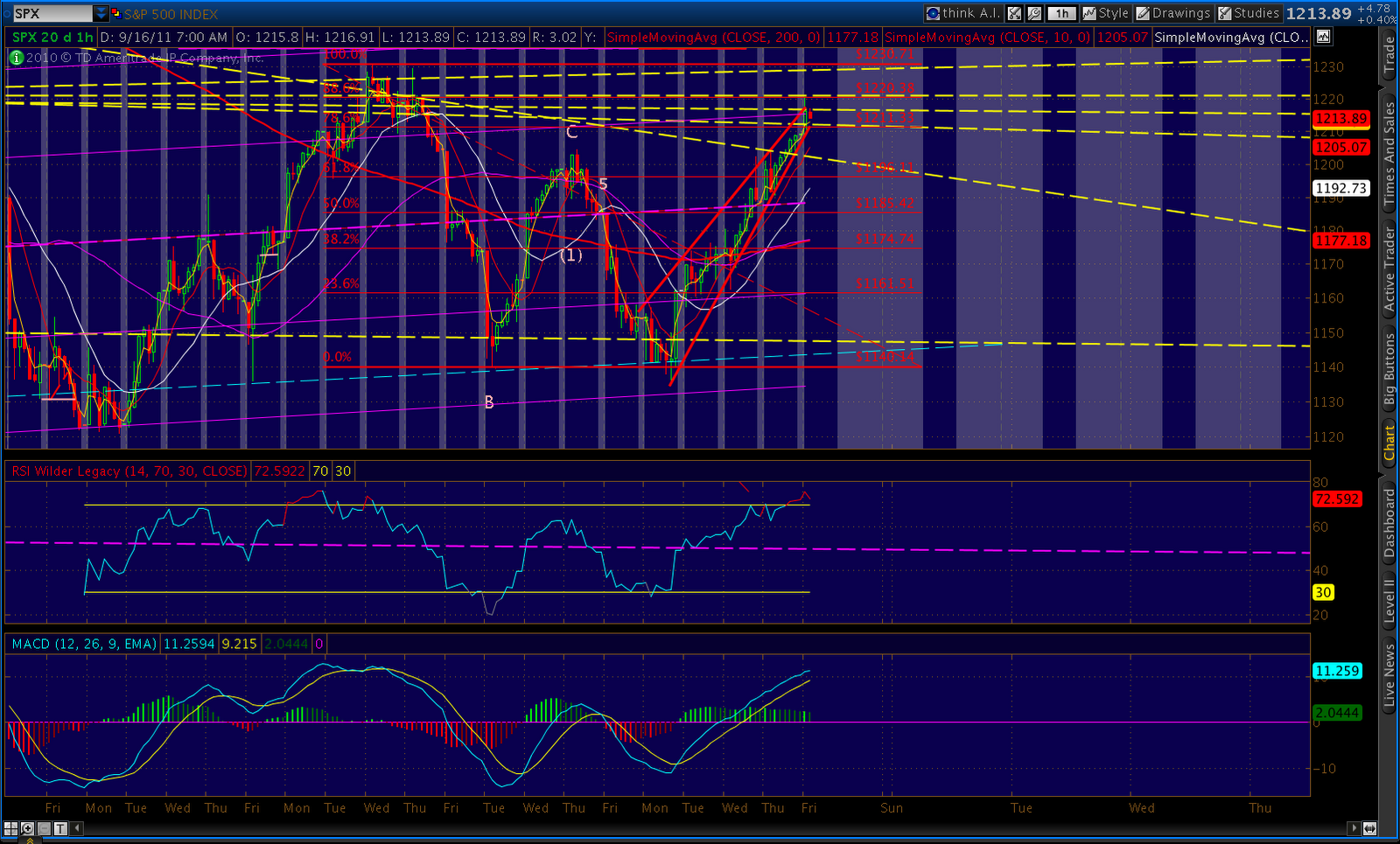
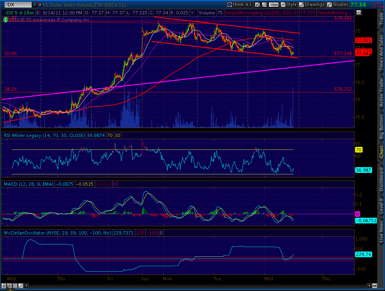
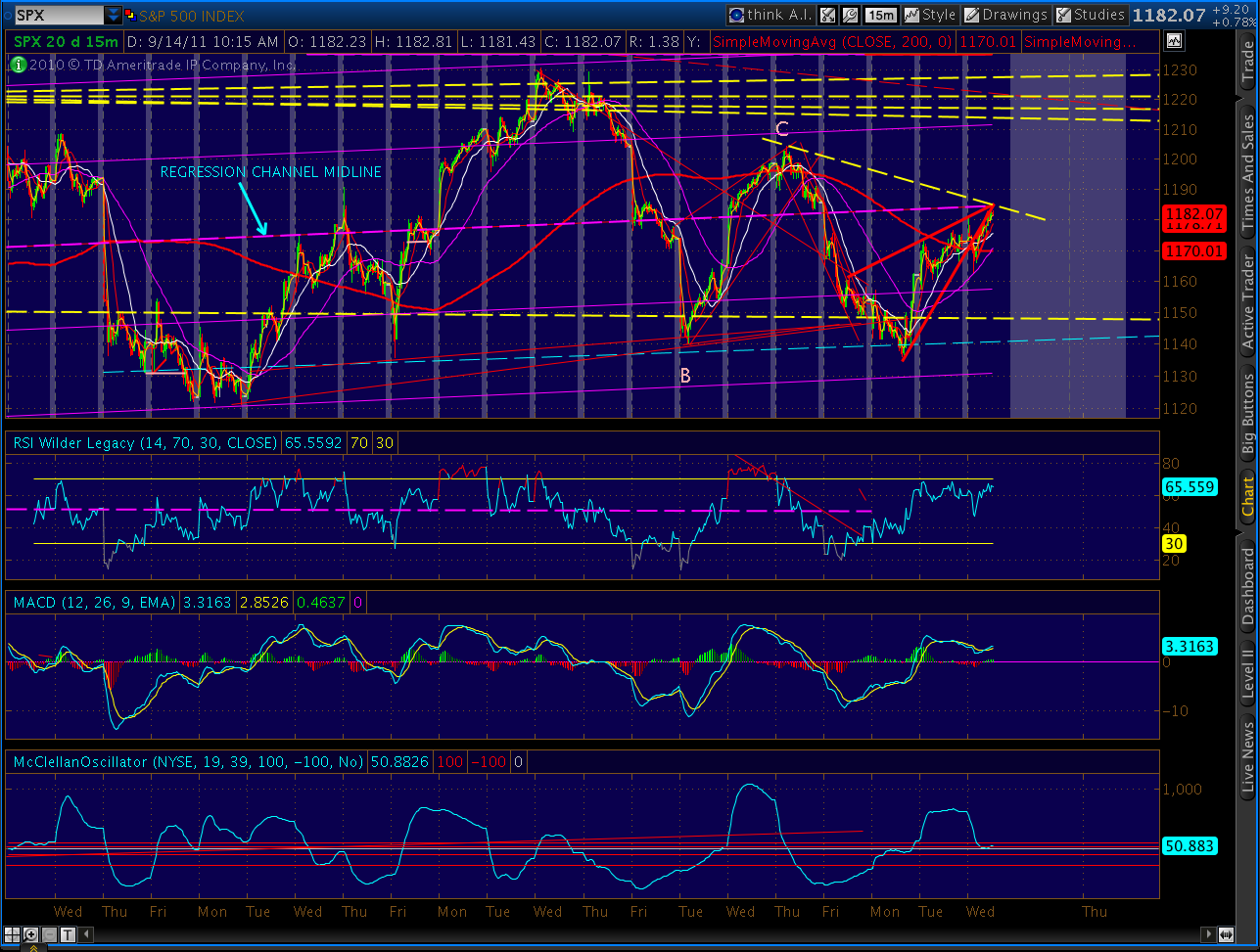
As someone recently told me, you can’t make this stuff up (no matter how often I try.) For instance, check out the 2 standard deviation regression channel from the Aug 9 low.
The 2nd line from the top is the +1 std dev line. It landed at 1220 today. As in…the high of the day. This would be easy to ignore if not for the fact that such a channel guided the Feb – Jul 2011 top. A final touch at the +1 std dev line on July 7 marked the beginning of the end.