

Futures are flat as we enter the final month of a pretty solid year.
 Questions remain, however, regarding the economy’s ability to withstand the coming policy changes.
continued for members… (more…)
Futures are flat as we enter the final month of a pretty solid year.
Questions remain, however, regarding the economy’s ability to withstand the coming policy changes.
continued for members… (more…)
August CPI came in hot, rising 0.1% in August instead of the consensus 0.1% decline. Core was even worse: 0.6% versus 0.3% consensus. The annual print also disappointed, coming in at 8.3% versus expectations of 8.0% or less. Having slightly overshot our 4153 target overnight, ES is now reversing sharply.
 continued for members… (more…)
It seems like everyone’s talking about the yield curve. Will it invert? If so, when? Would it imply or even precipitate a recession? How would it affect Fed policy? What would it mean for the stock market?
Since our work focuses on forecasting markets, let’s set aside for the moment whether an inversion means a recession is any more or less likely. After all, the stock market is not the economy. Instead, let’s turn our attention to how markets react to yield curve inversions.
February 2000
Since 2000, we’ve had four inversions: instances of 10-year yields falling below 2-year yields. The first began on Feb 2, 2000, about 7 weeks before SPX topped out and 5 weeks before COMP topped out.  The inversion didn’t last long, however. By the end of December, the 2s10s had swung back to positive.
  SPX, which had recently corrected nearly 20%, rallied 10% by the end of January, peaking on the same day as the 2s10s (the white arrows on each chart.)
 At that point, SPX began another leg down which would see it shed a total of 30% from the top, a third which totaled 40%, and a fourth which totaled 50%. Notably, these more dramatic plunges didn’t occur until 2s10s spiked higher.
When 2s10s broke out above a trend line (below, in red) which connected the former highs in 1996 and 1998, stocks’ losses accelerated.  In other words, the initial inversion coincided with a modest 20% correction which lagged the 2s10s by 14 sessions. It was the 2s10s breakout – a sharp rise from 33 bps to 234 bps once it cleared that red trend line – that coincided with the crash.
Once the 2s10s began its ascent, its oscillations continued to correlate with stocks’. Zooming in, we can see that the 2s10s repeatedly bounced off a rising yellow trend line (TL) for the next six months, finally topping out and dropping through the TL in June 2001 (point 1 on the chart below.) Initially, SPX consolidated.
 When 2s10s popped up through overhead resistance (the purple TL) however, SPX began another sharp leg down. It happened again at point 2, breaking down through another yellow TL from the 2000 lows and popping up to new highs above the purple TL.
We can draw two general conclusions from this inversion:
December 2005
Let’s look at the next inversion, which began in December 2005. The 2s10s bounced back and forth until June 2007 – five weeks before the legitimate July 16, 2007 high and a full 4 months before the October 11 high. Anyone rushing to cash out when the inversion first occurred would have missed out on the last 25% of upside.
 Again, the correction began about the same time as the breakout. An 8% correction occurred in May 2006 (point 6) when 2s10s briefly turned positive. The big correction waited until shortly after the lasting breakout at point 8.
SPX shed 20% by the time 2s10s reached point 9, bounced 15% as 2s10s retraced to point 10, then cratered as 2s10s broke out of the recent trading range.
Note that the crash picked up steam when 2s10s pushed to new highs in Oct 2008. When 2s10s topped out in November, SPX began bouncing again, rallying until 2s10s reached its former lows at point 12.
By March 2009, QE was taking hold. Stocks were rescued by massive amounts of liquidity which transformed the bond market from a barometer of economic conditions to a tool by which the Fed could signal algorithms to buy stocks. It was the beginning of the end for price discovery.
 Once the Fed assumed control of yields, all bets were off. The 2s10s rallied along with stocks and pretty much everything else that wasn’t nailed down.
The lessons learned from this inversion were quite similar to the one in 2000:
August 2019
We now turn our attention to the most recent period and the impending inversion everyone’s talking about. Spoiler alert: There will be one, probably by Friday.
We’ll start with the big picture. Remember, the yellow TLs usually reflect horizontal levels through which 2s10s break down (and, sometimes, backtest and break out through.) The red TLs are longer term – typically multi-year – and highlight major breakouts which presage sharp rallies in 2s10s and corrections in stocks.
 There has been no shortage of yellow trend lines over the past 12 years, with most breakdowns usually presaging a correction. Some examples:
– Point 15: 17%
– Point 16: 22%
– Point 18: 15%
But, of course, the real action occurred when 2s10s broke out above the red TLs. The most glaring example is the one extending almost 6 years from December 2013 to October 2019. It validates the adage that “the bigger they are, the harder they fall” and set the stage for the 35% drop in Feb/Mar 2020 [see: Buckle Up.]
That breakout, however, was really a series of breakouts and breakdowns that helped position 2s10s for a very bearish move. A closeup illustrates, for instance, the 20% correction beginning in Sep 2018 which followed the breakout of a red TL from Feb 2018 (point 21) and the subsequent breakdown below horizontal support.
 2s10s spent the next year in a very narrow range, finally dropping through horizontal support again and becoming inverted in August for a grand total of 2 days. It wasn’t exactly dramatic. In fact, SPX actually rallied in what would turn out to be the calm before the storm.
After the inversion, 2s10s push up through the yellow TLs representing previous support (now resistance) and three separate multiyear red TLs. When it finally cleared the last one (the white arrow) the equity market fell apart, crashing 35%.
I should mention here that it also pushed above a very important trend line we haven’t yet discussed, the dashed white TL connecting previous inversions dating back to 1995.  I mention this because at point 25 we also broke back down through this same TL, all but guaranteeing that SPX’s recent bounce is over and lower lows are in the offing.
April 2022
Since topping in March 2021, the 2s10s has broken down through multiple yellow TLs of support. It also dropped through the dashed purple TL connecting the 2000 lows and the Sep 2019 lows and another TL from 1980. If you knew nothing else about investing, you would correctly assume that this positions it for the correction which has already begun.
The 2s10s has already inverted intraday a few times this week (also coming very close, therefore, to breaking below the Sep 2019 lows.) As we’ve seen in past, inversions aren’t in and of themselves terribly bearish for stocks. It’s the bounce, subsequent rally, and spike higher following its inversion that do the most damage to stocks.
Let’s take just a moment to discuss what causes inversions. Below we can see a chart of the 2Y versus the 10Y for the past few years. Periods during which SPX corrected are shaded in blue. We can see that just prior to those periods, the 10Y and 2Y converge. Think of it as a coiling.
When stocks finally plunge, we see the 2Y drop much more rapidly than the 10Y, causing the gap between them to rapidly grow larger – the spike in the 2s10s. The same thing has happened almost every time since 2000. The single anomaly was in 2011, when the 10Y dropped much further and more rapidly than the 2Y. Recall that this coincided with the US credit downgrade and it precipitated a 21% correction in SPX anyways. It also coincided with the most precise crash warning I have ever issued, but that’s another story.
 As discussed above, the 2Y’s plunge hasn’t always occurred immediately after the convergence. In some cases, such as 2006, they continued in lockstep for over a year.
But, combined with the signals generated by the breakdowns and breakouts in the charts above, we have a very strong argument that the correction is not finished and could, in fact, get much worse.
If you’re thinking to yourself “sure it works in practice, but what about in theory?” there’s a very simple explanation for all of the above. Think about those previous equity meltdowns. As stocks rolled over, short-term treasuries yielding anywhere from 0-5% with little downside risk were very preferable to equities with plenty of downside risk.
Remember, markets aren’t about those participants in the tails changing their tune. Bears will be bears, and everyone else buys the dip. But, when the 90% of all investors who are direction agnostic (index funds, program sellers, etc.) panic or are stopped out, it doesn’t take much of a shift for the pendulum to swing in favor of the bears.
There are also many fundamental economic arguments for the inversion and its unwinding. The most important one is that as the economy begins to slow, recession fears increase. Capital is reallocated. Risky long-term investments are reined in and short-term, fixed income investments are favored.
In the past, the Fed has “fixed” this phenomenon by reducing short-term rates dramatically enough to stimulate more risk taking. But that’s difficult to do when rates have spent years at zero, and impossible to do when said policy has led to an inflationary spiral that has the economy teetering on the verge of stagflation.
I’ll leave you with one last chart. For the past few decades, the 10Y has followed a very well-formed path. The channel shown below has been extremely reliable in forecasting tops. It was also very reliable in forecasting bottoms until 2020, when a return to the channel bottom would have meant negative interest rates.
 The 10Y recently completed an Inverted Head & Shoulders pattern, a fairly reliable pattern that in this case targets 3.2%. Given that inflation is currently pushing 8%, a 3.2% 10Y would be, if anything, too low.
But, it would also cause the 10Y to break out of this 30-year channel – a very serious threat given that the national debt now exceeds $30 trillion. The Fed can’t be excited about letting this happen. They probably have this very same chart on the wall, smacking it for luck a la Ted Lasso every time they head into an FOMC meeting.
In any case, the channel top is currently at 2.58% – meaning the Fed is officially between a rock and a hard place. They have little choice but to watch the 30-year downtrend in rates to come to an inglorious end in an effort to rein in the inflation that they obviously and inevitably caused.
It’s simply too late to engineer an economic slowdown that would resolve the inflation problem without entailing higher rates. Given the Ukraine invasion and the shortage of journalists willing to give their lives in exchange for lower oil/gas prices, CPI will remain elevated for at least a few more months.
If stocks fall far and fast enough, the 2s10s could invert for more than a few days – a coiling that would ultimately unleash an even larger correction. My crystal ball says that the S&P 500 will drop to 3956 and possibly 3855 in the next month or two. If those support levels don’t hold, we could be in for a drop as low as 3047.
Should we fear a yield curve inversion? Not particularly. But what comes after one could ruin your whole day. Stay tuned.
Watching the “market” melt up and bonds barely budge in the face of all-time highs in the monthly and annual PPI print…  More grist for the Fed’s “transitory” inflation scenario.
 Inflation is no longer dominated solely by soaring oil/gas prices. In other words, not transitory.
 Will the party end? Not as long as the Fed can control volatility and interest rates – which are, for now at least, ignoring reality. Tomorrow’s another day…

continued for members… (more…)
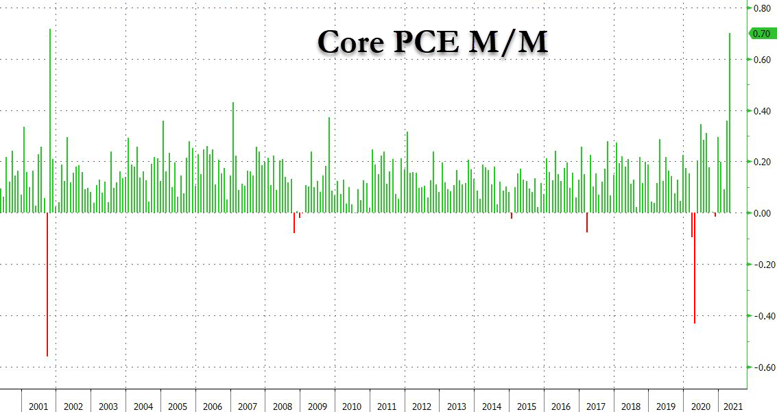
You could argue that the annual PCE print of 3.6%, the hottest since 1992, is merely a function of the base effect – last year’s crash in inflation. But that argument falls flat when you consider that MoM Core PCE, which is completely unaffected by the base effect, soared by a record 0.7%.
 Naturally, both stocks and bonds ignored the data. After all, VIX has plunged 36% in the past 7 sessions, so everything must be okay, right?
 Not so fast.
continued for members… (more…)
USDJPY just reached our 140.74 target from three weeks ago [see: Analog Update Aug 5, 2019.] continued for members… (more…)
The markets weren’t exactly reassured by Powell’s testimony yesterday. Bottom line, no one in their right mind buys the idea that we can have such strong GDP and wage growth but still need such accommodative policy. IMO, Powell was curt and sometimes downright evasive, which didn’t help matters.
Stocks plunged to our initial downside target, closing well below the SMA10 (a rarity, lately) with additional downside potential this morning.
 AAPL tested its channel top and retreated. As we discussed yesterday, this failure to break out has weighed on the overall market.
 continued for members… (more…)
PPI just confirmed what CPI declared yesterday: Despite official White House discourse, there is inflation. Of course, it’s very clear that food, energy and trade services are the primary drivers. Without them, PPI is as low as it was in Aug 2017.
 As a reminder, when Aug 2017 PPI was announced, the 10Y was about 2.1% versus the current 2.5%. WTI, shown below in purple, had doubled in the previous year and was on its way to a near tripling in price, eventually driving the 10Y to 3.248% as CPI topped 3%.
 We were reminded yesterday that the deficit has ballooned since then. We’re on pace to top $1.1 trillion in fiscal 2019, putting the new total public debt around $22.7 trillion. This is obviously not a great time to be ramping up interest rates.
 Yet, if oil and gas prices were to continue rising, this is exactly what would happen.
While the algos are happy to track rising oil and gas prices, the handful of carbon-based traders out there who have done the math know that this is not a sustainable path.
The Fed can pretend that food and energy prices aren’t relevant to their policy decisions. But, they know full well that the consumers who are expected to keep the economy humming have to buy food, gas up their cars, and fork over their soaring rent payments (not owner’s equivalent rent.)
continued for members…
(more…)
In our last update on the Dow, we noted that it had not only fallen through an important trend line but its SMA200 as well. From All Good Things on Oct 11:
DJIA is flirting with breaking below a long-term trend line and SMA200. A failure here opens the door to 23781, another 6.2% lower.
Two months after the breakdown, DJIA is indeed flirting with the 2.24 extension at 23781. Like SPX, it has completed a Head & Shoulders Pattern as well as a Flag Pattern. Also, like SPX, it came up just shy of its .886 Fibonacci retracement yesterday (23881 vs 23781.)
The big question, then, is whether it’s done or whether it’s simply preparing for a more dramatic plunge.
continued for members… (more…)
Don’t look now, but COMP is approaching our 6760 target. As we discussed on Oct 10 [see: Plan B] COMP faced significant downside if its 200-DMA didn’t hold.
 Bottom line, it didn’t. It was off as much as 13.3% last month before beginning a bounce that was destined to fail. Next week, it will get another chance at tagging some meaningful support around 6760-6800 – depending on whether it happens Monday or later in the week.
 Members will recall we had two near misses on the 200-DMA in Feb and April, followed by a breakout that defied logic. Now, two months after it broke down through the important moving average, COMP has been laid low.
Can it hold here, or will AAPL’s continuing meltdown drag it even lower?
My 144.48 target for AAPL remains unchanged since Nov 14, the day it broke below its SMA200 [see: When Push Comes to Shove.] Then… …and, now.
 Stay tuned.
