UPDATE: 7:20 PM
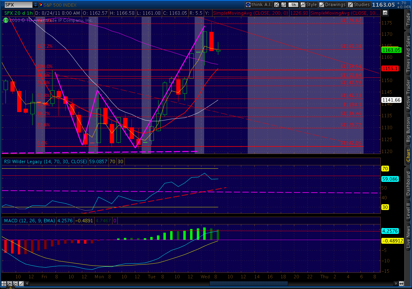
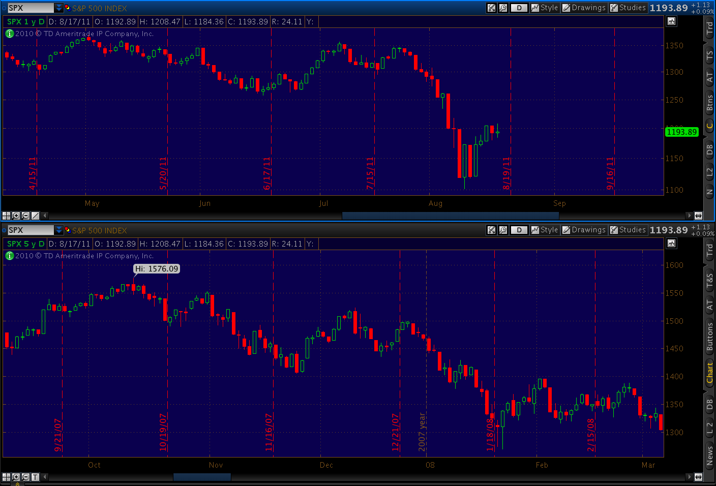
Here’s the latest 2007 v 2011 comparison. As we discussed last week, the current pattern is slowing relative to 2007/8. But, for the bears, it’s worth the wait.
New home sales are due out in the morning. Consensus for July is 310K versus June’s 312K and 315K in May. Keep in mind that July’s figures will reflect only the early few days of the current market swoon, so we may not see as great an impact on sales as we will in subsequent months.
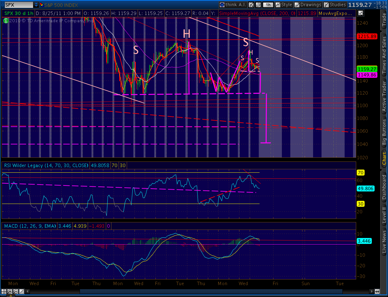
UPDATE: 4:05 PM
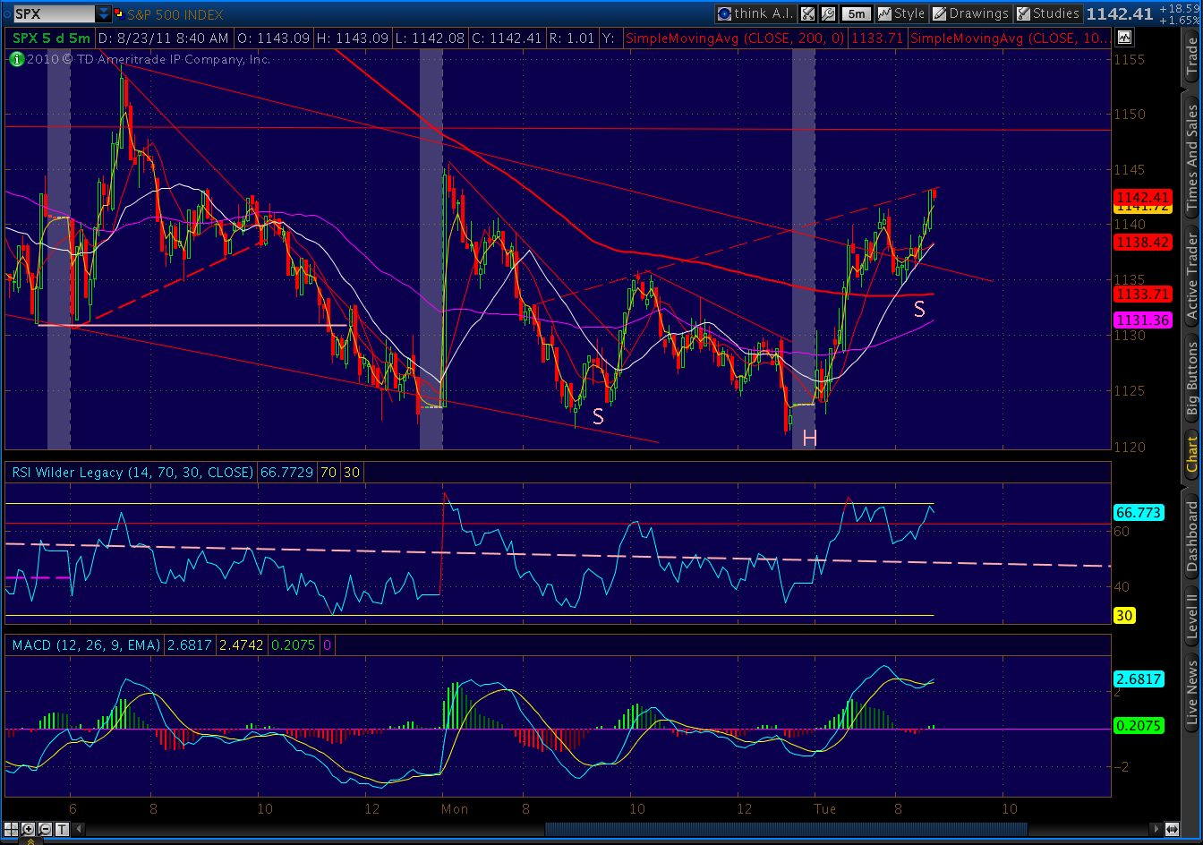
This one worked out pretty nicely so far. Note the role that the RSI trend line played, as well as a TL off the three pattern tops (the head, the right shoulder and the backtest.) We’ll see tomorrow if it plays out all the way, reaching its target of 1117.
Not all of these work out perfectly. They can be overwhelmed by greater forces, especially these little ones. But, they’re very effective for day trading and giving guidance on the bigger forces at work. And, as I mentioned earlier today, they often kickstart larger patterns.
This one, for instance, gave us a good push below the neckline of the big, ugly H&S; with potential to 1032 (see 1:35 update below). It also confirms the target of a small H&S; pattern from Friday that targets 1114.
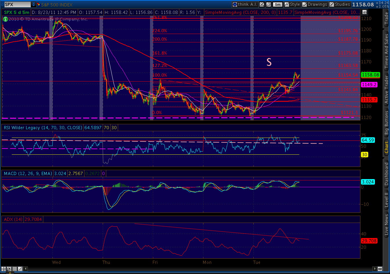
UPDATE: 3:10 PM
Got a more substantial wave down and are coming back for a larger backtest. Might fail here, or with another touch of the original RSI trend line (dashed purple.)
UPDATE: 2:40 PM
So far, so good on the little H&S.; Broke the neckline, and are backtesting it now. Never even came close to the RSI TL, so I’ve drawn a new one to reflect the next trend.
From the looks of things, we should turn down from here.
UPDATE: 2:15 PM
To better answer dm’s question…. Here’s another little H&S; setting up within the shoulder of the 5-minute chart. If the right shoulder of this pattern exceeds the head, obviously it’s busted. Such a move will likely play into a harmonic pattern and reverse at the .786 or .886 retrace.
But, if it confirms by moving decisively (“closing” if on a daily chart) below the neckline around 1128, it’s good for an 11-point decline to around 1117. I know it’s not a huge move, but it’s very tradeable if you’re so inclined. More importantly, it takes us below the neckline of the larger H&S;, which would help nudge that larger pattern into action. Like ripples in a pond.
Let’s see how it plays out. I’m also keeping an eye on the RSI, in particular the shaded oval. The right shoulder should complete somewhere before the RSI passes through the TL drawn through that oval.
UPDATE: 1:35 PM
Here’s yet another way of looking at the big, ugly H&S.; This drawing has bearish potential to 1032.
Tom Bulkowski has a fantastic website (and great books, too), and discusses H&S; patterns extensively.
UPDATE: 1:15 PM
I watch for harmonics all day long on the 5-minute chart. And, I try to take a frequent peek at the 60 minute and daily charts, too, just in case I’m missing something that’s bigger than my screen.
Here are several possibilities shaping up right now, as we bounce off the just completed H&S; neckline — a bounce that’s almost always to be expected, by the way, just like trend lines.
This is a bearish bat pattern that would reverse around 1138.50.
This one has an alternate entry (X) point, but the B retracement is not quite to the .382 level. I slightly favor this pattern, because the .886 retrace (1142.83) takes us almost to the right shoulder and traps a lot of bulls who think the H&S; won’t play out, before plunging back down.
Here’s another possibility — a bearish butterfly that’s already completed at the 127.2 extension. But, because it’s smaller, it might be good for only a smaller reversal on the way to completing one of the larger patterns shown above. These things very often nest inside one another.
By the way, the white dashed line you can see just above (and stopping) the last advance at 1135.83 is the neckline from the other H&S; pattern I just posted at 1:10. So, if we’re able to hold below these levels, it makes me like that H&S; pattern that much more.
UPDATE: 1:10 PM
Here’s another H&S; pattern with bearish potential to 1053. It’s not very well formed, but sometimes the ones with ugly right shoulders perform the best. We could look at this morning’s rally as backtesting the neckline.
UPDATE: 11:30 AM
We’re 7 points away (1121) from completing a H&S; pattern that, in a normal market, would take SPX down to 1095 or so.
Since it would represent such a massive reversal of this morning’s action, I would expect it to have a lot of momentum as it falls, especially once we crack 1100.
UPDATE: 10:50 AM
The rally this morning can be characterized as a backtest of the fan line we broke through several sessions ago. It’s the red dashed line, drawn off the Oct 2007 high through the high of the Nov 2010 “W” pattern.
Seen here, closer up.
Once the backtest is completed, we should be able to get on with wave 5 to 1067 or below.
UPDATE: 9:50 AM
We got the reversal at 1146.50, a little shy of the target price. It’s possible we’ll go back up and tag the target price before the decline progresses any further. But, this is looking like a pretty good reversal so far.
Interesting, in that the cash market is following the futures’ lead on this one. Often, the cash market takes over on the opening and can negate a pattern established in the futures.
These harmonics patterns can obviously be very effective. Like Elliott Waves, they don’t care much about earnings per share or Fed comments or CNBC breaking news. Although, those triggers are often credited for the move that the harmonics pattern correctly forecast days in advance.
Aside from creating great trading opportunities, they can mentally prepare an investor for a coming turn. This comes in handy when, like this morning, you wake up to a 20-point rise in the futures market that threatens your short positions. A quick look at the bat pattern, and I knew there was a good chance the bulls run was about over.
My gut tells me that when the rebels take full control of Tripoli, oil will resume its near-term decline (light sweet crude hit 84.43 this morning.) This is good for our economy in the long run, but I expect it would hurt stocks in the short run. Oil companies have used high crude prices to generate record profits; they compose 12.5% of the S&P; 500.
Another angle is that falling oil prices might give the Fed the inflationary headroom it needs to bring on another round of QE. It’s still an awful idea, but lower prices at the pump might justify their contention that stagnation and deflation are the greater risks to the economy.
After the Fed pumps another $500 billion into the system, oil companies can go back to raising prices and making billions in earnings and the Fed can go back to inflation whack-a-mole. Just a thought.
UPDATE: 1:00 pm … a WSJ reporter’s take on the situation:
ORIGINAL POST: 9:25 AM
The futures, at 1144.75, are completing a bearish bat pattern, with the .886 retrace at 1148.46. This rally should reverse very soon.
This rally is the follow through to the bullish butterfly pattern I discussed in Friday’s 2:40 post. We were looking for a turn at 1124, and got it at 1122.05 instead.
Here’s the chart I posted at that time.
And, here’s the completed pattern. Note we also completed a falling wedge, that also forecast a bounce.
The little H&S; pattern that indicated a downside to 1114 has likely played out, as this morning’s rise exceeds the right shoulder high.