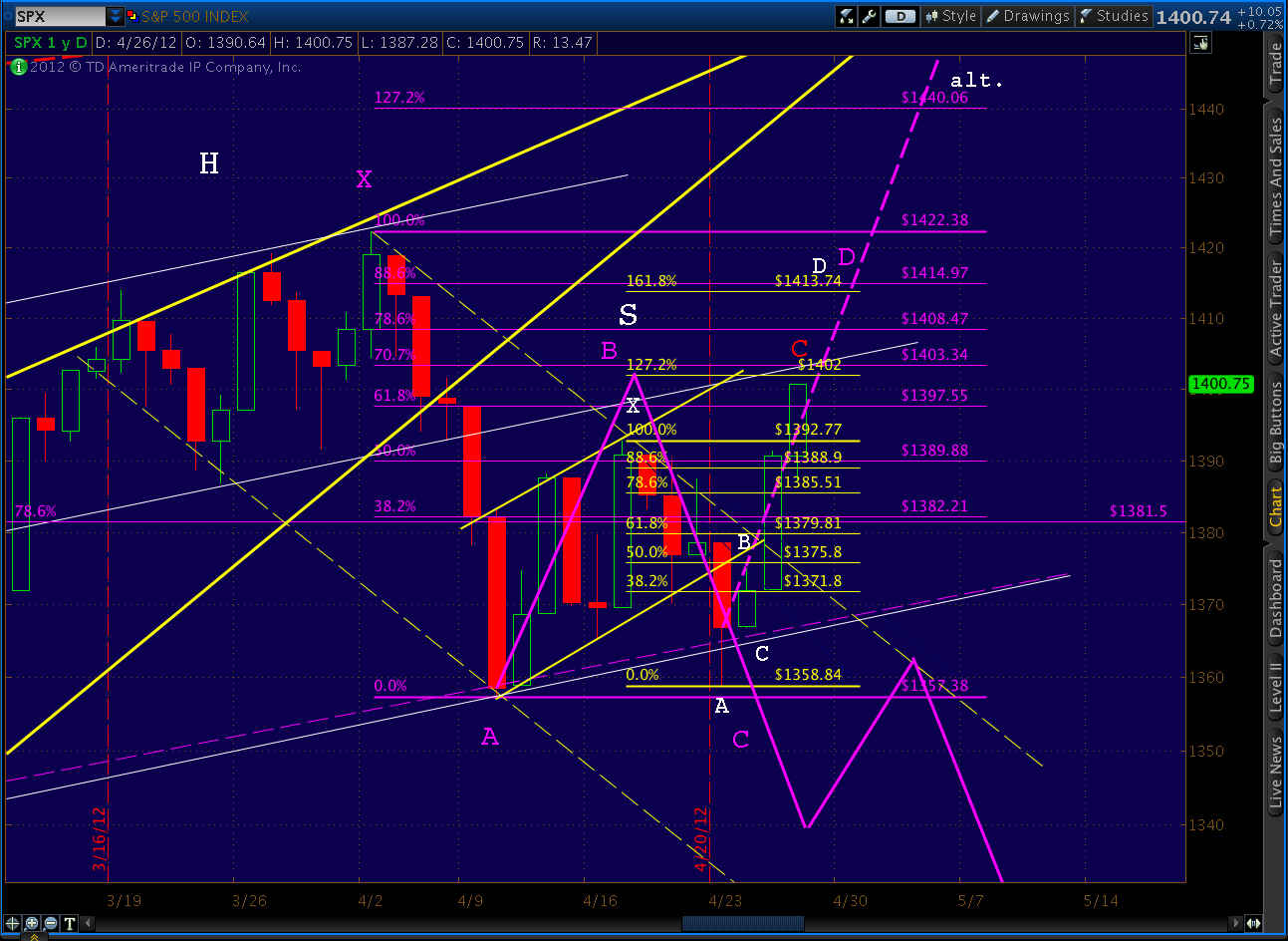
Yesterday we explored the alternate path in detail, noting that one of the two RSI trend lines we’ve been watching had broken, and the second was coming into play.
There is the possibility that the downward sloping red, dashed TL will catch it on the way up, but the yellow TL just broken was a major feat. A close above the TL would imply a definite momentum shift.
This morning, the second (red, dashed) trend line just gave way, lending more credence to the alternate path higher if — and this is key — we can manage to close above it.

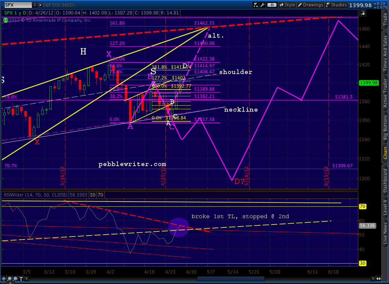
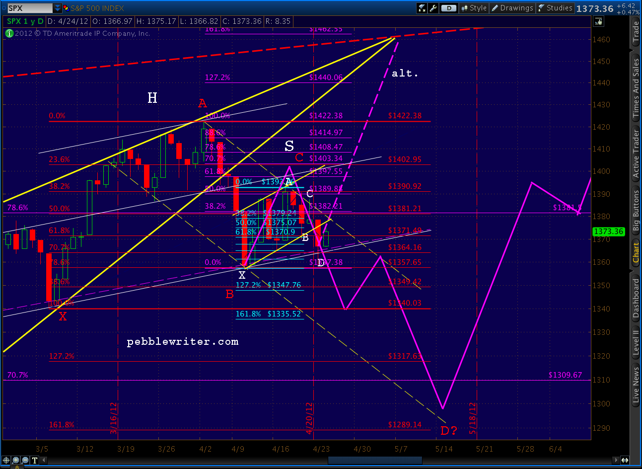
As can be seen on the chart above, there’s very little in the way of resistance between here and 1462. We’re at the H&S shoulder line now, and it’s possible that the pattern will still play out. But, as discussed in Bulls Fight Back, the pattern will start looking lopsided with much higher prices or passage of a few more days before it resolves. It fails definitively at 1422.
Harmonics give us some ideas as to the path forward and potential turning points.
Here’s the bullish case — a Crab (the larger purple pattern) with the 1.618 At 1462.55. There’s a good possibility that we’d see a reaction at 1414, which is the .886 of a Bat pattern and the 1.618 extension of the smaller Bat (in red, labeled in white) that’s nestled in the last two legs of the larger purple pattern.
But the ultimate target is Point D at the 1.618 extension of 1462. This is the apex of the rising wedge pattern (yellow) we’ve been in since 1074 and intersects with the SPX channel mid line (red, dashed.)

Yet, there are plenty of reasons for the market to turn down and complete the H&S pattern, including the very faint possibility that reality sets in. Here’s the bearish case — a Butterfly (in red) — that points to a low of 1305-1317. BTW, red Point C can go as high as Point A, but no higher, in order for the pattern to hold.

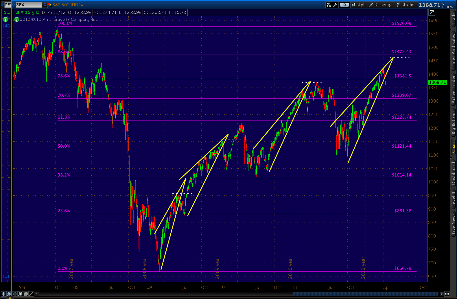
That red, dashed channel mid line at which either alternative ends is a biggie. Here’s the view of the past 20 years…

And, the even more stunning view since 1935…
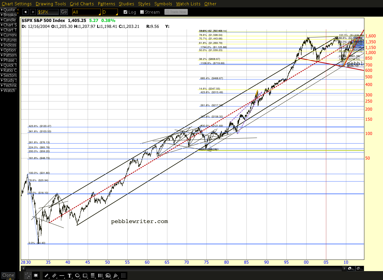
There’s the possibility of a slight miscalculation when graphing anything over 77 years. So, when I say it comes in at 1462, that’s an educated guess based on my best interpretation of what I can see. But, it’s helpful to know that it corresponds with the Crab patttern 1.618 –and is darned close to the Fibonacci .886 retracement level of the 2007-2009 drop at 1472.
I believe we’re destined to tag that line again before the next big downturn. But, whether we get there directly from here or after a more extended wave 4 is not clear to me at the moment. For now, the momentum is clearly with the bulls, especially when we can rally off of horrid economic numbers.
Personally, I’m reigned in quite a bit right now — at least until the picture is a little clearer.
**************
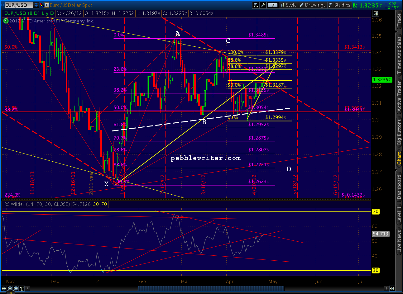
The EURUSD has also defied logic, gaining slightly on the day to the point where it’s exceeding the channel that’s guided it for over a year. But, the last month has traced out a Gartley that could see prices reverse around the .786 retracement of 1.3297. Our high for the day so far is 1.3269.

Stay tuned.