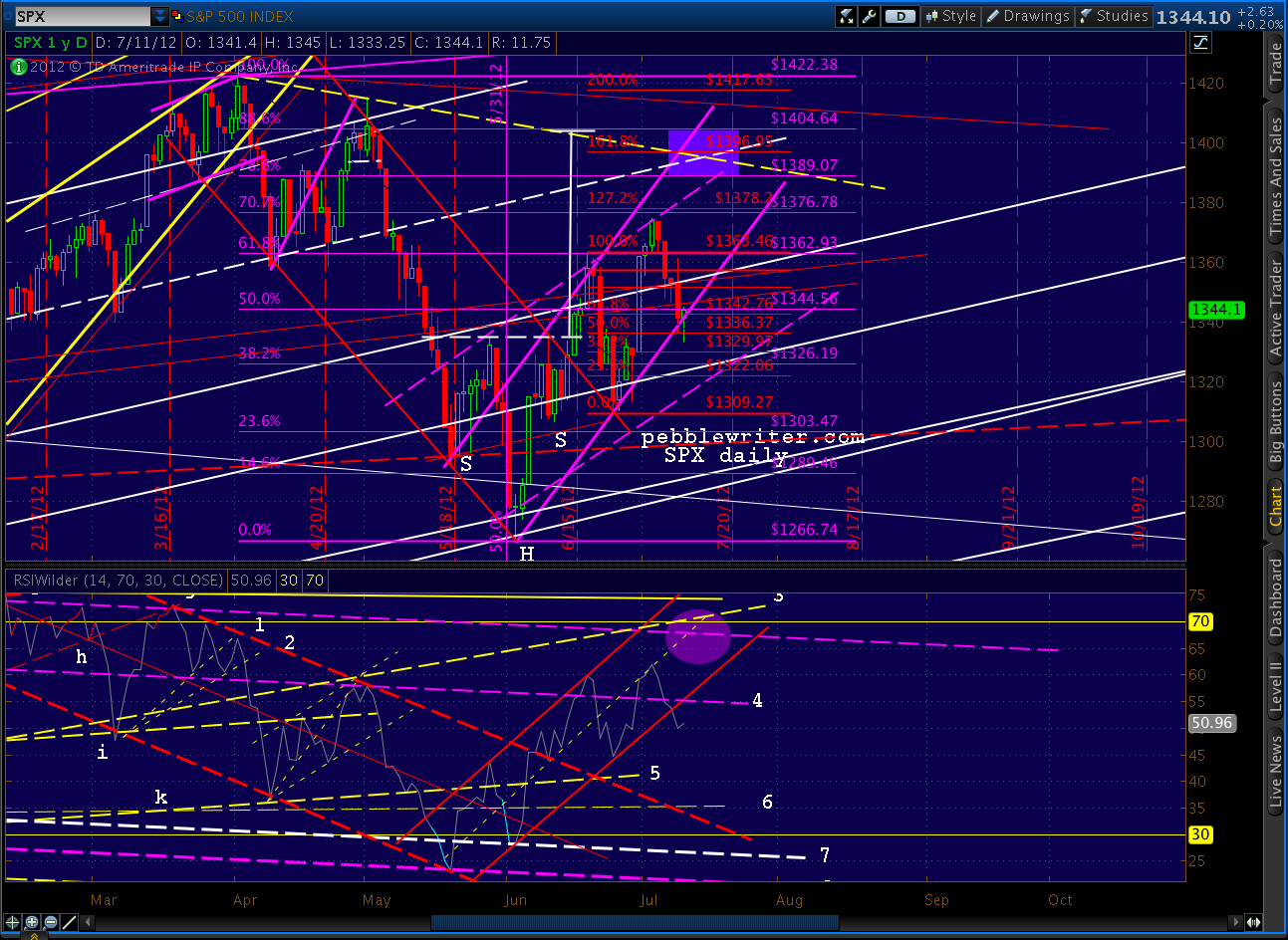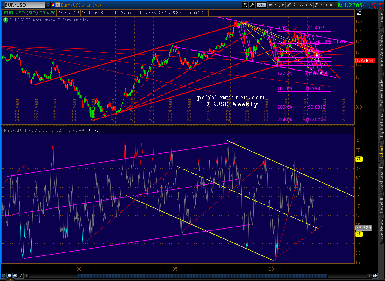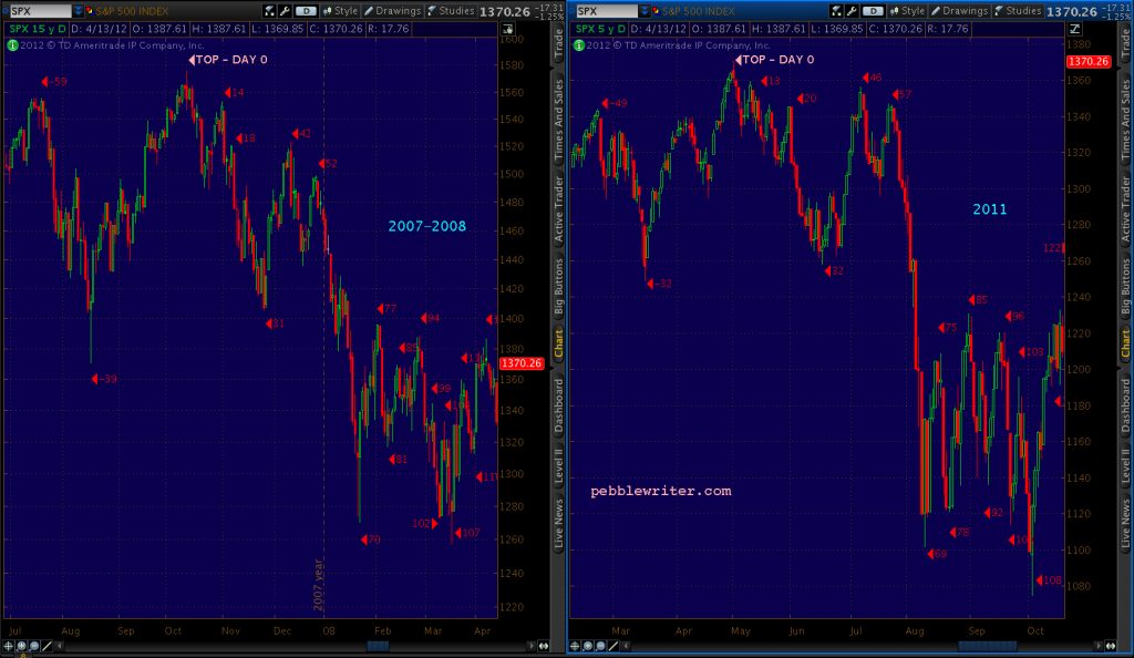

Going long again at 1327 is paying off nicely [see: Shakeout or Fakeout], with SPX currently trading at 1353. We had a nice reaction off the Fib .382 at 1326.19 and have obviously broken out of the little red channel that was guiding the downside. (more…)
Category: Charts I’m Watching
-
Shakeout or Fakeout?
ORIGINAL POST: 9:00 AM
There comes a time in the construction of every channel when the market either obeys a presumed channel boundary, morphs it into something else or breaks it entirely.
We’ve had a very well-behaved channel off the 1266 bottom on June 4. I’ve had to make small adjustments to the channel on the daily chart a few times. But, the 60-min chart shows just how precisely yesterday’s low fits with the previous lows. (more…)
-
Holding On
Sorry about the GoDaddy issues this morning. Guess I need to add changing web hosting services to my to-do list this weekend. To make matters worse, the guy helping me get the site up again kept wasting time trying to sell me on a longer-term contract. As if!
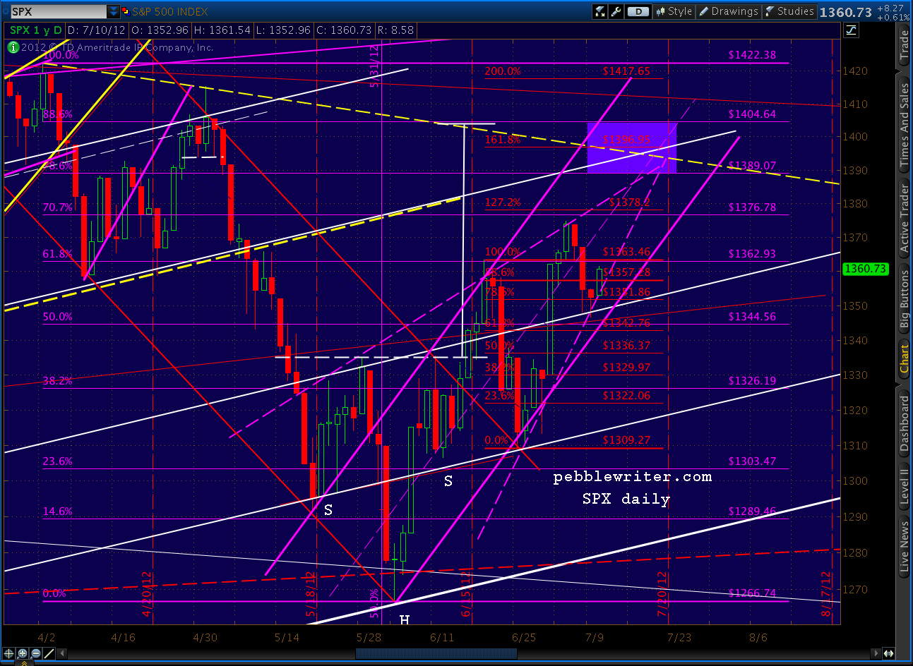
SPX is clinging to its channel — which had a little wiggle room in it. But, frankly, the rising wedge formed by the channel lower bound (solid purple) and the dashed purple TL looks like the best fit right now.
And, IMO, it better fits the RSI picture. We’ve had this really cool channel in the daily RSI that’s given us a great deal of confidence along the way to the upside. Yesterday, it broke.
 Many times, the channels can be redrawn (usually widened) to a less aggressive slope, etc. And, sometimes, we just get an aberration that sends values up out of the channel, only to return a day later with a sheepish grin on their face and an apology.
I don’t know which to expect here, but at the very least it’s a potential crack in the dike. We’ll need to see many more of these before the market screeches to a halt and starts down.
Oddly, the eminis RSI channel looks just fine, as I posted earlier via email.

VIX is showing a great deal of indecision this morning. It’s currently flat, but has been up .20 and down 1.00. At the very least, the falling wedge has been widened. Another possibility is that it intends to open up to a channel. But, we still haven’t exceeded the former neckline (white, dashed) which currently runs around 19.17.

Last, I want to show you what happened in the options market yesterday. Most of you have seen these charts before. The fabulous ISE tabulates opening put and call positions intraday and EOD and formulates a ratio. Here’s how it played out yesterday:
 This shows that in the first 20 minutes of trading, the ratio of opening call positions to opening put positions was over 2:1 (that 205 on the bottom row.) That’s a very high number, and can indicate a top. By the end of the day, the ratio had fallen to 53 — an extreme on the other end. In fact, it’s the lowest closing value since December 1, 2011.
 This is a great way of reading sentiment among buyers of long put and call positions — who are usually wrong. It’s not foolproof, though.
On December 1, SPX closed at 1243 (after gaining 50 points the previous day.) In that case, the put buyers were right, as the market meandered 40 points lower over the next few weeks. Of course, it then gained another 220 points.
In the first 20 minutes of this morning, the calls:puts ratio was 0.15. Food for thought.

Bottom line, the market is waiting for any sign of the upside. Maybe it’ll be the Fed notes, maybe the German constitutional court. I don’t know. But, I’m long here and expecting good things to the upside before TSHTF (with tight stops, of course.)
More in a couple of hours.
UPDATE 3:50 PM
Nice comeback here at the end of the day, going to leave some bullish candles and a viable channel bottom — whether it’s a channel or RW.


And, for those who found the above options info interesting…here’s how we wound up today. Despite the comeback at the end of the day, it wasn’t enough to convince call buyers — which bodes well for the upside.

-
They’re Back
ORIGINAL POST: 10:00 AM
I’m reminded of the guy who fell off the roof of a 20-story building. With each window he passed, people inside heard him call out “so far, so good.”
We’re still in this crazy channel/rising wedge to who-knows-where, and, well…so far, so good. Just hope it doesn’t end with a dull thud followed by someone screaming “call 9-1-1!”

We’re getting the reversal we called for Friday after dipping to 1346.65 (vs Friday’s 1347 forecast.) Our white channel lines continue to earn their keep — and then some.
Note that the channel (solid purple on the chart above) vs rising wedge (dashed) argument continues. The implications are significant, since wedges are a topping formation — whereas channels can (theoretically) go on forever. Hopefully this will resolve without the need to involve Jerry Springer.
I find it fascinating that the apex of the wedge roughly intersects with one of our white channel lines and a trend line off the April 2 (1422) and May 1 (1415) highs. And, that’s not just any white channel line; it’s the neckline of the H&S pattern that got this whole party started. It’s the white dashed line below.
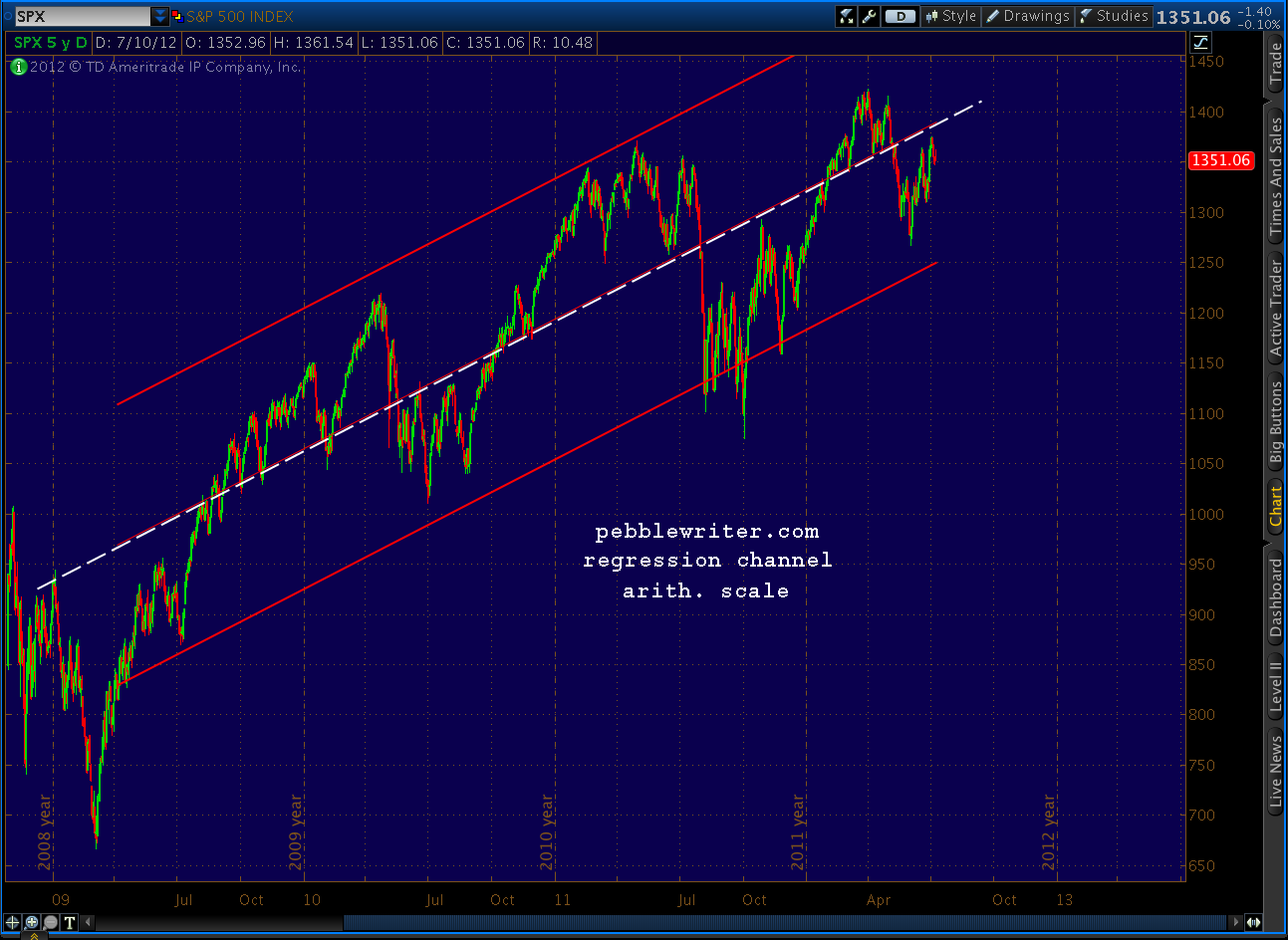
 We’ve studied this same TL before (who could forget the classic Random Walk My A$$?) If you squint a little, it makes a pretty good midline for the past three years of overall activity. That’s because it is. It’s easier to see in arithmetic vs logarithmic scale.
 This is a one-standard deviation regression channel, drawn courtesy of ThinkorSwim, and our TL perfects overlaps the midline.
UPDATE: 11:45 AM
In the time it took to put up the last post, the early morning gap evolved into a classic gap and crap. The first issue is Super Mario (elections? we don’t need no stinkin’ elections!) Monti’s rumored resignation. He last threatened to quit a couple of weeks ago if Eurobonds weren’t approved. This morning, he announced that he will resign after his next term. It’s not exactly a resignation; more a reattachment to the vampire squid from whence he came.
The second issue is antics of the German Constitutional Court. These whacky knuckleheads have ignored the pleas of Merkel et al and announced they might actually take some time to think about whether the ESM is konstitutionellen, much less eine gute Idee.
In an announcement that is certain to delight EZ politicians and bankers alike, the red-hatted ones have announced they might take up to three months to render a decision. This last bit of news was enough to do a little damage to the rising wedge theory. It doesn’t kill it, merely gives it an upset stomach (for the time being.)
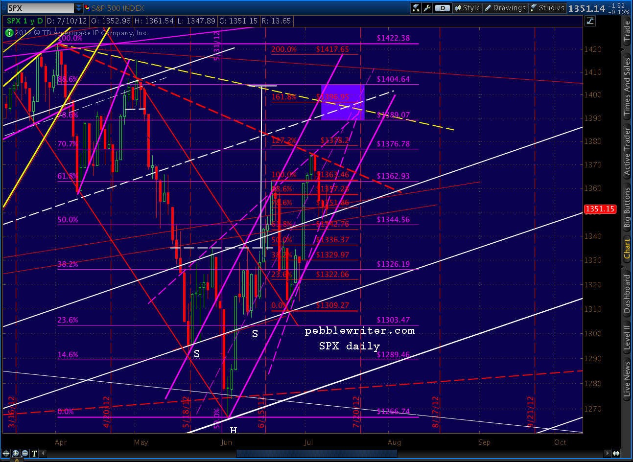
If the market decides it can’t live with this uncertainty, look for the party to end pretty quickly. There’s even a TL (red, dashed) that could come into play – valid if one ignores the shadow formed on May 1.
 Otherwise, our original TL (yellow) has plenty of validity. It touches the 1422 and 1415 daily highs and is echoed many times over the past couple of years. And, we still haven’t dipped lower than yesterday’s 1346.65 (nor exceeded 83.67 on DX.)
UPDATE: 2:00 PM
SPX down 6 1/2, getting dangerously close to the channel lower bound. As we discussed last week, this is the best scenario for the next leg up — as long as we get a reversal.
The rising wedge is looking skankier by the minute — at least the lower bound (the upper bound could remain inact.) The key looks to be about 1342.76-1344.56, the .618 and the .500 of the current harmonic grids. A close below could spell big trouble for the upside, while a convincing reversal would pay huge dividends.
The closing price is key, as June 28’s huge rebound reminded us. For those not already long and who don’t mind a little risk, 1338-1340 would be a cool place to jump in (with tight stops, etc.)
 Interesting that the dollar — typically the grown-up in the room — still hasn’t broken through to a new high. 83.65 is the daily high, just .02 below the June 1 high.
I have to run out for a meeting, but might have a chance to post again before the close. If not, it’ll be later this evening.
GLTA.
-
2nd Quarter Results
Many thanks to everyone who’s been a part of the new pebblewriter.com.
We just completed our first full calendar quarter. 2Q2012 came in at 37.74% — which would have ranked us #1 among managers if we were an equity mutual fund or (at least, according to one website) a hedge fund. Now, if we can just repeat that!
Since the March 22 inception, the numbers are slightly better…
as of July 6, 2012:
Inception to date: +40.47%
S&P 500: – 2.74%
Performance Differential: +43.21%

The Fine Print:
- Represents performance of a theoretical portfolio, where SPX is bought at called bottoms and shorted at called tops. Your mileage will vary.
- Assumes 100% long, 100% short or 100% cash (such as when stopped out.)
- Prices listed reflect the index at the time tops/bottoms are called and/or trades are made and are believed, but not guaranteed, to be accurate. Dividends ignored.
- MTM = marked to market.
- Results are since inception of pebblewriter.com on March 22, 2012.
- Past results are not necessarily indicative of future results. See Disclosures and Use Agreement for important information.
-
Update on VIX: July 9, 2012
VIX tagged 18.32 this morning which, as Brett and ewtnewbie point out, is the Fib .786. of the current (red) grid below. This makes a nice turning point, but also because:
- it represents a tag of the upper bound on VIX’s daily RSI channel
- it tags the falling wedge upper bound
- it tags both a yellow and a red channel line
Remember, we’re still looking for the previous H&S pattern to play out (dashed white neckline, nominal target is 11.48.) In the meantime, we just completed another H&S pattern (yellow, dashed neckline) that targets an improbably low 5.5. Where are we likely to go?
continued… (more…)
-
Euro Watch: July 9, 2012
A quick recap of the euro issues currently at play, for anyone who’s been living under a rock the past week. From last week’s The Fork in the Road:
I suspect the biggest deciding factor will be the upcoming summit of European Finance Ministers on July 9-10. There are several issues at play.
The recent Spanish bailout announcement boosted markets because, in a nutshell, banks would get up to $100 billion directly (asset purchases) from the ESM. Importantly, existing debt would not be subordinated to the new debt and the ECB would gain more control over the various sovereign central banks.
Now, with Eurogroup/ECOFIN only a few days away, some serious problems remain with the “solution.” First, the ESM doesn’t actually exist yet. As the effective successor to the ESFS, its existence requires approval by member states representing 90% of the capital base. So far, Finland, the Netherlands and Slovakia (combined, about 9%) are balking. As long as everyone else is aboard, this should not be an issue. But, if not…
Second, Germany is balking. Not Angela Merkel, of course, but seemingly everyone else is dead set against backstopping failing foreign governments and banks. They are justified, as we discussed at length when Greece was in the cross hairs. Why should Germany, with a retirement age of 67, put itself on the line for countries whose retirement benefits kick in at age 60?
Pulling out now would be a no-brainer, if not for the fact that so much of the German economy relies on its less fortunate neighbors. Sales, production, suppliers, investment, etc — it’s a tangled web. The $64 billion question is whether Germany would suffer more pain/expense from pulling out now or from seeing the whole mess through to the bitter end.
Germany’s constitutional court is considering an injunction that would impede ESM ratification. Oral proceedings are scheduled for July 10. German Finance Minister Martin Kotthaus has been quoted as saying he doubts whether the troika (EC, ECB and IMF) can approve the ESM by Monday.
Last, even if the ESM survives the various challenges, will it be enough to do the trick? Nearly 40% of the fund’s capital contributions would presumably come from Italy, Spain, Greece, Portugal and Ireland. Add in France, and the total is closer to 60%. Can the ESM maintain its value if 40-60% of its guarantors are in or near insolvency?
This situation is very fluid, and has potentially devastating consequences. I highly recommend staying on top of the steady flow of news from sources such as Zerohedge.
SPX’s low Friday precisely tagged one of our white channel lines and, though we never quite reached the 1.272 Fib of the latest (red) pattern, was a typical-looking reaction. Interestingly, SPX came within 1.66 points of the 1.618 of the yellow pattern — making for a nice Crab completion.
Let’s look at some charts. (more…)
-
Update on EURUSD: July 6, 2012
The euro is again hanging by a thread. Recall it already broke down from and is back-testing a big channel (solid red, below) that dates back to 1997. Its weekly RSI, however, looks like it could have some life left in it.
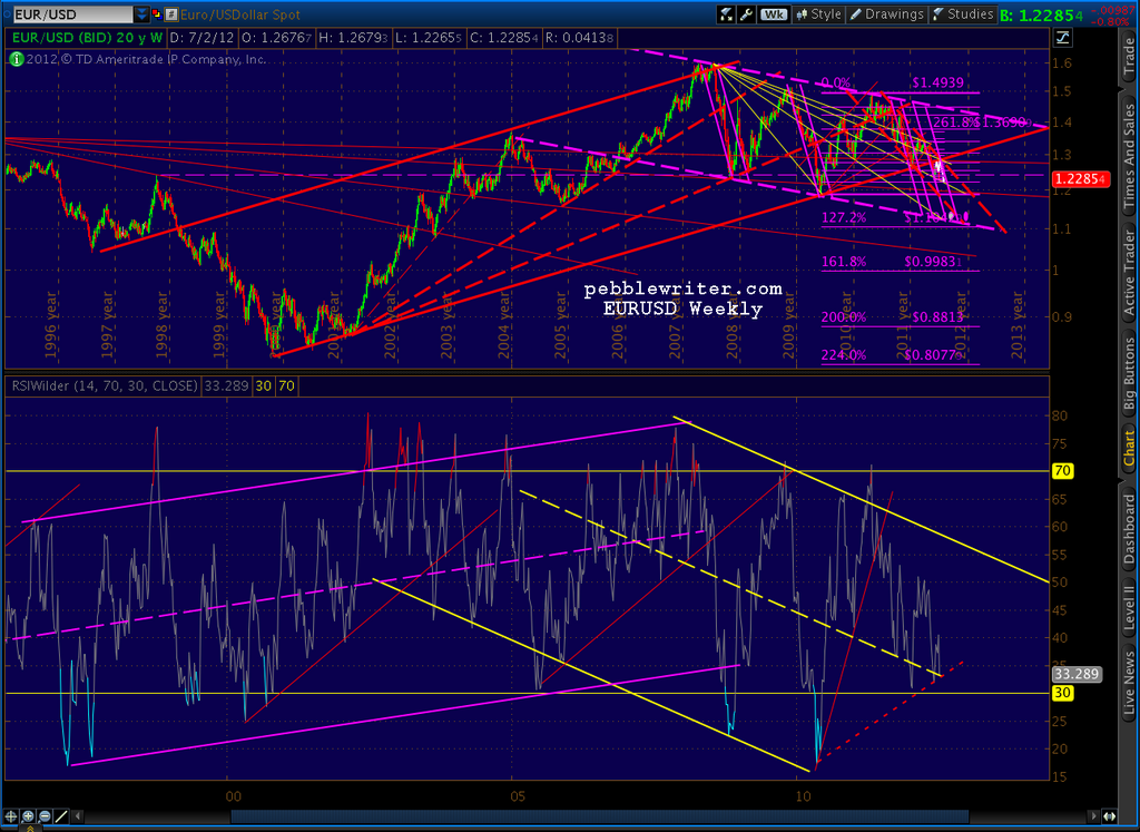 First, I should make clear that I think the euro zone is toast. The only thing holding it together right now is Germany’s indecision as to whether it’ll save money in the long run by going its own way.
But, one of these days, investors will turn their attention back to the US dollar. When that happens, there’s a fair chance that the American problems will be judged to be every bit as serious as the EZ’s. In the end, it’s a dirty shirt contest and either currency could take first prize — especially if everything starts melting down — stocks, bonds, metals alike.
With that said, let’s look at the charts. (more…)
-
Charts I’m Watching: July 6, 2012
ORIGINAL POST: 9:15 AM
The ugly NFP has been called “not ugly enough” to bring on more QE immediately. Let’s look at how the current 10-pt ES loss might shake out on the opening.

continued…
-
Update on RUT: July 5, 2012
RUT is again nearing its previous highs of 856 (July ’07) and 868 (May 2011.) It’s already exceeded the .886 of each of those, and is rapidly approaching the .886 retracement of its most recent dip from 848 to 730 (March 27 – June 4, 2012).
As charted back on June 15 [see: Forecasts, Darts and Ouija Boards] we completed an Inverse H&S pattern that reversed the traditional H&S completed on May 8.
 continued…