In typical end-of-the-quarter fashion, the markets seem to be running in place. But, by one measure, the melt-up might already be finished.
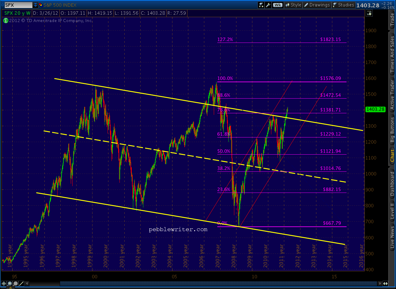
 Recall we were looking at 1419 as one of two possible tops (the other being 1433) when SPX was at 1402 back on March 23 [see: The Tipping Point.] I mentioned it as a target of certain harmonic patterns. We also recognized it as the .886 Fib price level of a small rising wedge within a larger rising wedge.
There are actually three potential harmonic targets suggested by the Butterfly pattern that features 1074.77 as its Point A and 1292.66 as its Point B. All of them assume the pattern completes at the 1.272 extension; but, keep in mind that Butterflies can also complete at the 1.618 extension. If you have no idea what I’m talking about, visit Crabs and Butterfly Patterns Explained for more info.
Like all harmonics, Butterfly Patterns begin at a meaningful peak or trough (though frequently you can find smaller patterns within patterns.) The primary requirement is that the Point B be at the .786 Fib level. Here are my three candidates for the pattern we’ve been watching for the past several months.
#1 is the most bullish and begins at 1370. I like the fact that 1370 was the high for all of 2011, back on May 2. But, it leaves us with a less than ideal Point B — 14 points below the .786 (1292 v 1306). It would complete at 1451.

#2 begins at 1356 on July 7 and features a Point B only 4 points below its ideal .786 of 1296.19. It completes at 1433. Closer still.

Butterfly #3 — my personal favorite — begins at 1347 and Point B ((at an intra-day high of 1292) is 4 points above its ideal of 1288.74. The closing price of 1284 was 4 points below. This particular pattern completes at 1421.05 — just 1.90 from the Mar 27 high of 1419.15.

Could 1419 have been the end of this wave? You bet.
I always like it when one harmonic pattern matches up with one or more other harmonic patterns and chart patterns. Here’s one I just can’t get out of my head.

Seems just a little too coincidental that a TL connecting current prices to the 2007 high would be exactly parallel (log scale) to a TL connecting the two major bottoms of the past decade — all at a time when we’re:
- at .618 (in time) of the huge rising wedge dating back to Mar 2009, and;
- within a stones throw of the .786 or .886 retrace (take your pick) of the 2007-2009 decline.
Here’s a couple of charts with the Fibs thrown in.


Of course, if you are an überbull, you’ll probably want to use the arithmetic instead of log scale and draw your channels more like this: