Tag: forecast

  • USDJPY Update: May 8, 2013

    USDJPY has continued to slide since our Apr 8 call for a top [HERE.]   It back-tested the broken purple channel midline on May 6, and is signalling a sell-off to at least the bottom of the purple channel (96.25 – 96.66) where it intersects with the white channel .75 line in the next day or two.

      But, if the most obvious harmonic patterns play out, we could easily see the purple channel break down and the white midline come into play at the intersection of the .886/1.618 at 93.40/93.26 towards the end of May.

    Remember, it was the white channel that confirmed the harmonic pattern reversals at 100 last month.

    “…there is growing risk of a downturn as it approaches 100… it appears the pair might have hit at least interim resistance at today’s high.”

    April 8, 2013

    continued for members(more…)

  • Charts I’m Watching: Apr 16, 2013

    We’re set to get a nice bounce here at the bottom of the purple channel — as revised in last night’s last post.

    Based on where the futures are pointing, I’m not sure whether it will have legs or not.  But, I’m inclined to play along on the upside, but with relatively tight stops in case it peters out.

    The EURUSD has rebounded nicely as we anticipated, but has reached a point of resistance at the midline of the rising channel at a price level that’s proven difficult to exceed since early March.

    The daily chart shows a bounce off the bottom of the purple channel as expected, but plenty of overhead resistance in the 1.33-1.34 range if it’s able to break through 1.316 or so.  The .618 is up at 1.3341.

    The dollar continues to tread water.  I’ve drawn a tentative new wider channel that might represent the expected range now that the rising white channel is officially kaput.

    Remember, this decline is a backtest of the broken red .25 channel line.  If the decline continues on track, we could reach that channel line (at about the .red .382) in very short order.  It’s currently at about 81.74.

    But, there’s no reason DX must retrace all the way to that line.  It has already back tested the purple .618 — a reasonable pullback after the Bat Pattern that completed at our 83.616 target back on Apr 4.

    The daily RSI, in fact, shows strong support from the bottom of the rising purple channel and the .25 of the rising white channel.

    The yellow midline on the RSI chart represents that dashed white channel midline cutting across the middle of the price chart above.  A thrust up through it should accompany the next big equities dump.  And, to my eyes, that’s the next major move.

    Though SPX is safely back in the purple channel, it can’t go on forever — right?  Even if our most bullish scenario plays out, there would need to be pauses of more consequence than the past two sessions.

    In that pullback, SPX reached the .786 of the 1539 – 1597 rally between Apr 5-11 (1552.36 vs 1551.88.)  The bullish case will consider that reversal as the full extent of the pause — a proper corrective wave that reversed at the bottom of a very well-defined channel dating back 5 months and 230 points.

    If so, SPX should head up and push through the trend line extending from the 2000 and 2007 tops — currently around 1593.50 — on the way to its 1823 target.

    The bearish case suggests we slap a Point B on that reversal and call it a Butterfly Pattern that targets 1523 or 1503.

    So, which is it going to be?

    continued for members

    (more…)

  • USDJPY Update: Apr 8, 2013

    The largest channels are all pretty loose fits, with plenty of incursions that make forecasting with them iffy at best.

    But, the smaller channels and Harmonic Patterns have been pretty effective.  Even though USDJPY has been running like a 燃える尾を持つ猫, there is growing risk of a downturn as it approaches 100.

    Consider the new channel constructed by today’s high.  It lines up with the Oct 31, 2011 and Mar 14, 2012 highs.  It would carry more weight if there were more than one tag on the bottom, but we shouldn’t ignore the potential for a correction.

    Given the tear the pair has been on lately, it would probably be motivated more by a weak US dollar than a strong yen.

    The pair put in a decent correction at the red .786 (of the decline from 101.44 in Apr 09), hinting at a future Butterfly Pattern.  The 1.272 is at 108.47 and the 1.618 is at 117.43 — right next to the large purple .886 at 118.59.

    There’s also a small Crab Pattern (white, above) completion at 99.26.  So, though I wouldn’t necessarily put money on it (the trend is your friend), it appears the pair might have hit at least interim resistance at today’s high.

    A failure to reverse here will likely mean a trip to the purple .618 (at least) at 105.57.

    But, that would mean barging back into the daily RSI channel (in green below) that broke down in mid-Feb and is undergoing its 2nd back test.  It’s certainly not impossible, but it would be easier after a pullback to reset RSI to lower levels.

    Stay tuned.

  • Anatomy of a Top: 2000

    The 2000 top shows just how “messy” tops can be.  Here’s the finished picture in perfect hind-sight.  It’s a very crowded chart, but every single pattern had a say in how the top unfolded.

    SPX had zoomed from 442 to 1478 in about 5 years, a not-too-shabby 234% gain for an annually compounded 27%.

    Once SPX broke out of the falling purple channel, it had “permission” to pursue several harmonic patterns in the works.  SPX shot up 66 points in that one day — blowing through every Fib level between .618 and 1.000.

    It finally came to rest at 1458, completing a Bat Pattern at the purple .886.  But, the small white 1.272 was just above at 1477, as was the rising purple channel midline and the 1.272 from a much larger pattern seen below.  An IH&S target waited at 1497 – tantalizingly close to a nice round number of 1500.  And, the all-time high of 1478 from two months earlier beckoned.

    SPX got up to 1477.33 before reacting, falling to 1466 over the next two days.  Close, but not quite.  Someone watching closely might have noticed the Flag Pattern it constructed, targeting 1562.  Someone else probably pointed out the biggest Crab Pattern target of all — the 1.618 extension of the 13% correction from 1420 to 1233 from Jul-Oct 1999.

    On Mar 21, 2000 SPX shot up through the channel midline, the cluster of Fibs around 1477 and, importantly, the 1478 high and raced up toward those higher targets.

    On Mar 24, it reached 1552.87, which cleared the IH&S target at 1497, the purple 1.272 at 1519 and the last remaining Crab Pattern at 1535.  What ultimately stopped it?  The .75 line from the big purple channel dating back to Jul 1999 — almost to the penny.

    Total move: 17% and 227 points in 20 sessions.  Can it happen again?  Stay tuned.

  • Interest Rates: Breaking Out?

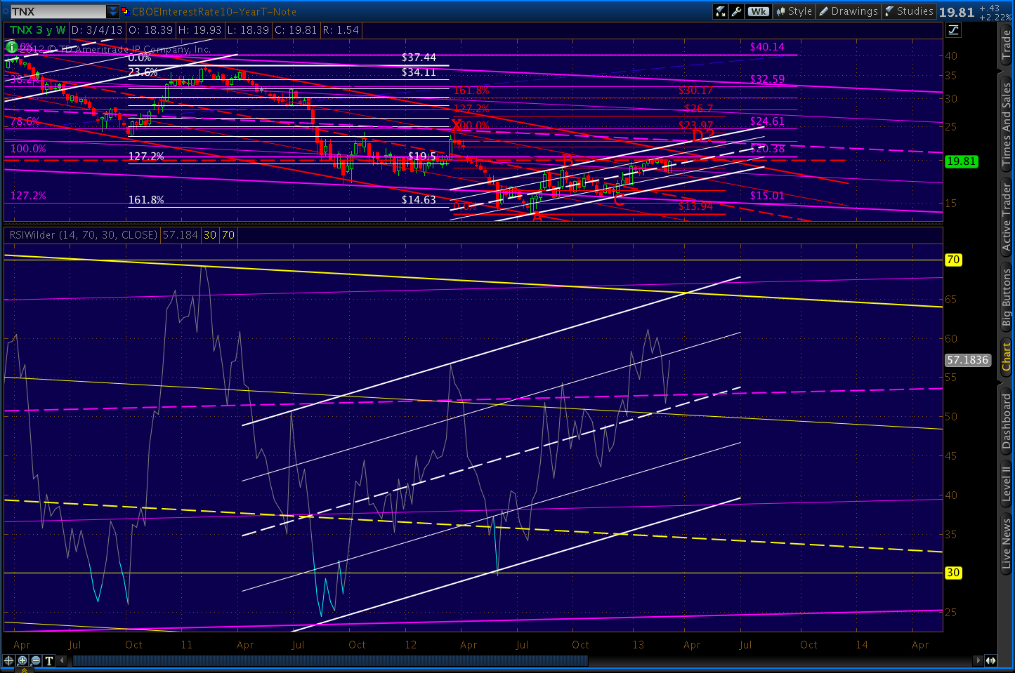
    With the usual caveat that I’m not a bond guy (seriously, what’s the point?) I took a fresh look at interest rates on the 10-year note.

    The obvious downtrend over the past 15 years is well-captured by the purple channel below.  It has been marked, however, by a series of rising white channels, some of which I have charted.

    When rates fell below the channel bottom last May, it might have ushered in a new, steeper decline suggested by the falling red channel.

    However, since bottoming in July, TNX regained the purple channel bottom, backtested it, and has put in a series of higher highs and higher lows that precisely echoes the slope of the previous channels.

    Its latest feat is pushing up through and backtesting both the red channel .75 line and the purple channel .25 line.  In the process, it has climbed back above the white channel midline and faces the psychologically important 2% mark yet again (the red, dashed TL.)

    From a harmonic standpoint, TNX looks well-positioned to test 2.28% in the next month.  Note that the July lows completed a Butterfly Pattern at the 1.272 on the purple grid and a Crab Pattern on the 1.618 on the white grid.

    Note the precise turn at the .500 Fib level, hinting at a Bat Pattern completion at the .886 of 22.83.  The .886 intersects with the purple channel line late next week — though the precise placement of such a long-term channel is always subject to some interpretation.

    To get there, however, TNX will have to push back through 20, the .618 Fib line at 20.14, and the top of the red channel – currently around 21.34.

    The RSI picture is promising.  The weekly chart shows the positive trend, regardless of whether you subscribe to the pessimistic (yellow channel) or optimistic (purple channel) view.

    A close-up of the above chart shows steadily improving relative strength since April 2011 and an important reversal at the midline.  The intersection of the white and yellow channel tops looms out there around April 3.

    The daily RSI, in addition to showing a steadfast refusal to become overbought, shows the recent break above the yellow channel’s 25% line.  Provided RSI can push through the dashed red trend line (corresponding with the .618 and 2% price levels discussed above), there is plenty of room to run.

    The intersection of the yellow midline and the purple channel top is around March 20.

    Like many markets, TNX is at a critical juncture.  It’s put up or shut up time.  A push through 2% would likely usher in 2.28% in short order, followed by a backtest of the red channel and subsequent push higher.

    If we expand the white channel (yellow, above) we get a glimpse of what the upside case looks like.  A turn at the red .886 would intersect with the .382 Fib of a harmonic grid drawn from the Feb 2011 highs.  The .618 of that pattern — not all that distant from the red 1.618 — would intersect with the midline of the yellow channel at 28.46 around the middle of August.

    A return to the top of the purple channel, currently around 3.4%, could come as early as July, but a more moderate case would be between Oct 2013 and Jan 2014.

    GLTA.

  • What Gives? Feb 13, 2013

    It was worth watching the SOTU last night just to see Boehner’s contortions, trying to scowl in a dignified, statesman-like way.  Nothing much new in the speech or the response.

    More interesting was Mitch McConnell’s comment on CNBC last night that the sequester will go into effect. I don’t know any reputable economist who believes we can go through sequester without a sizable hit to GDP.

    But, the market is ignoring the tenuous economic situation and continues to edge higher.  What gives?  Aside from the $85 billion mainlining into the banks every month courtesy of the Fed, that is…

    Zerohedge ran a BofAML study last night that pretty much says it all.  The market is currently reflecting bullish sentiment that’s higher than almost any time since 2002.  I imagine it’s even a little higher this morning.

    Most past ventures into this sentiment range have not ended well for the markets – especially when there is a huge divergence between soaring markets and faltering economic backdrops, as the charts below show.

    Notably, the market is ramping these past few days on negative divergence in every single time frame – from weekly on down to 5-minutes.  And, it has completed some very significant harmonic patterns at the very top of a massive ending diagonal/rising wedge that’s precisely aligned with several previous tops (Jul 2011, Apr 2012, Sep 2012.)

    SPX surpassed our IHS target of 1522.60 from yesterday.  I’m closing out longs here at 1524 and will play the downside.

    UPDATE:  3:15 PM

    Getting a nice little push to the downside here — now 7 points off the daily high.  The white channel line that had been providing support is now providing resistance at around 1518.60 (the purple Crab’s 1.618 Fib is 1518.57.)

    SPX just completed a little H&S pattern that targets about 1510.80.

    Stay tuned…


  • Charts I’m Watching: Feb 1, 2013

    ORIGINAL POST:  9:15 AM

    E-mini futures are up big overnight, but have yet to exceed Wednesday’s high.

    A positive revision in BLS’s Nov and Dec employment numbers makes 2012 look better than it did, but I’m not sure how it helps today’s 12.3 million unemployed or 8 million underemployed or 2.4 million marginally attached…


    Markit Mfg PMI actually a little lower than Jan 24 flash numbers.

    Verdict: not chasing this ramp job unless it exceeds recent highs — which I don’t believe it will, at least not from this news.

    Remember, we have Reuters/U of Michigan Consumer Sentiment coming up at 9:55 and ISM’s Mfg Report on Business at 10:00.

    Watch the channel midline here…

    continued for members(more…)

  • Charts I’m Watching: Jan 29, 2013

    Currencies are relatively quiet this morning in the midst of a slew of earnings and economic data. The dollar looks like it could hit our downside target of 79.50 – 79.59 from Jan 25 [see: Update on DX] this morning if the yellow channel holds, but note that its midline intersects with the bottom of the white channel (support) just below current levels.

    EURUSD looks like a lock to tag the 1.618 at 1.3490 we’ve been tracking the past few days.

    This e-mini chart caught my eye this morning…

    With the overnight slide of 8 points, the e-minis give the impression of a broken channel and back test.   Now, it might be one of those dips from which we quickly recover as occurred on the 16th.  But, for those playing the intra-day moves, this bears watching.

    This ES channel equates to the small purple channel within the larger white one on SPX.  So, as yesterday, watch the channel midline for signs of something more significant.  It’s currently around 1498.30.

    The 15-min RSI should see a bounce at the red trend line if the trend is to remain on track.

    As we discussed yesterday, there is a great deal of economic data due out this week.  But, all pale in comparison to the FOMC announcements following their two-day meeting getting underway right about now.

    Last we heard, dissension was growing over how and when to throttle back on QE.  The language that alarmed the Dow 20,000 crowd:

    While almost all members thought that the asset purchase program begun in September had been effective and supportive of growth, they also generally saw that the benefits of ongoing purchases were uncertain and that the potential costs could rise as the size of the balance sheet increased. Various members stressed the importance of a continuing assessment of labor market developments and reviews of the program’s efficacy and costs at upcoming FOMC meetings. In considering the outlook for the labor market and the broader economy, a few members expressed the view that ongoing asset purchases would likely be warranted until about the end of 2013, while a few others emphasized the need for considerable policy accommodation but did not state a specific time frame or total for purchases. Several others thought that it would probably be appropriate to slow or to stop purchases well before the end of 2013, citing concerns about financial stability or the size of the balance sheet. One member viewed any additional purchases as unwarranted.

    Needless to say, an increase in hawkish rhetoric could really do a number on this rally.

    Odds are we’ll see another day like yesterday, with market makers shuckin’ and jivin’ to try and convince us a larger move is underway — the better to shake loose some of our hard-earned money.  But, I unless we see a huge miss on economic data or earnings, I don’t expect any fireworks until Bernanke steps up to the microphone (though much of the juicy stuff will have to wait for the minutes to be released.)

    UPDATE:  10:00 AM

    The Conference Board’s Consumer Confidence Index came in well below expectations: 58.6 vs expectations of 65 and Dec 2012’s 66.7.  Most of the rise in pessimism was the result of worsening job market conditions.  Those expecting more jobs in the months ahead dropped from 17.9% to 14.3%. Twenty-seven percent expect fewer jobs — unchanged from last month.  A full 22.9% (up from 19.1%) expect their incomes to decline.

    Briefing.com tracks the data and puts it in a nifty little chart (reflects data through December.)  There are a lot of potential interpretations here, but to me it comes down to “expectations coming back in line with reality.”

    And, though I don’t have the time to construct a chart, I’m pretty sure that expectations — the yellow line — have tagged the top of a descending broadening wedge (megaphone) while present conditions have formed a garden variety falling channel.  Both appear to be at or near their upper bounds, meaning a breakout or a fall is imminent.

    Global Economic Intersection posted an interesting article last month that showed the relationship between consumer confidence and past recessions.  Definitely worth a read for those who pay attention to such things.


    So far, the market is pretty much shaking it off, with a dip to the white channel midline the extent of the reaction.  If the midline holds yet again, there’s a good chance we’ll hit our upside target later today or tomorrow.

    continued for members(more…)

  • Update on DX: Jan 25, 2013

    Currency markets have been quiet the past few days, with the dollar showing some indecision as investors try to wrap their minds around a potential new high for equities.

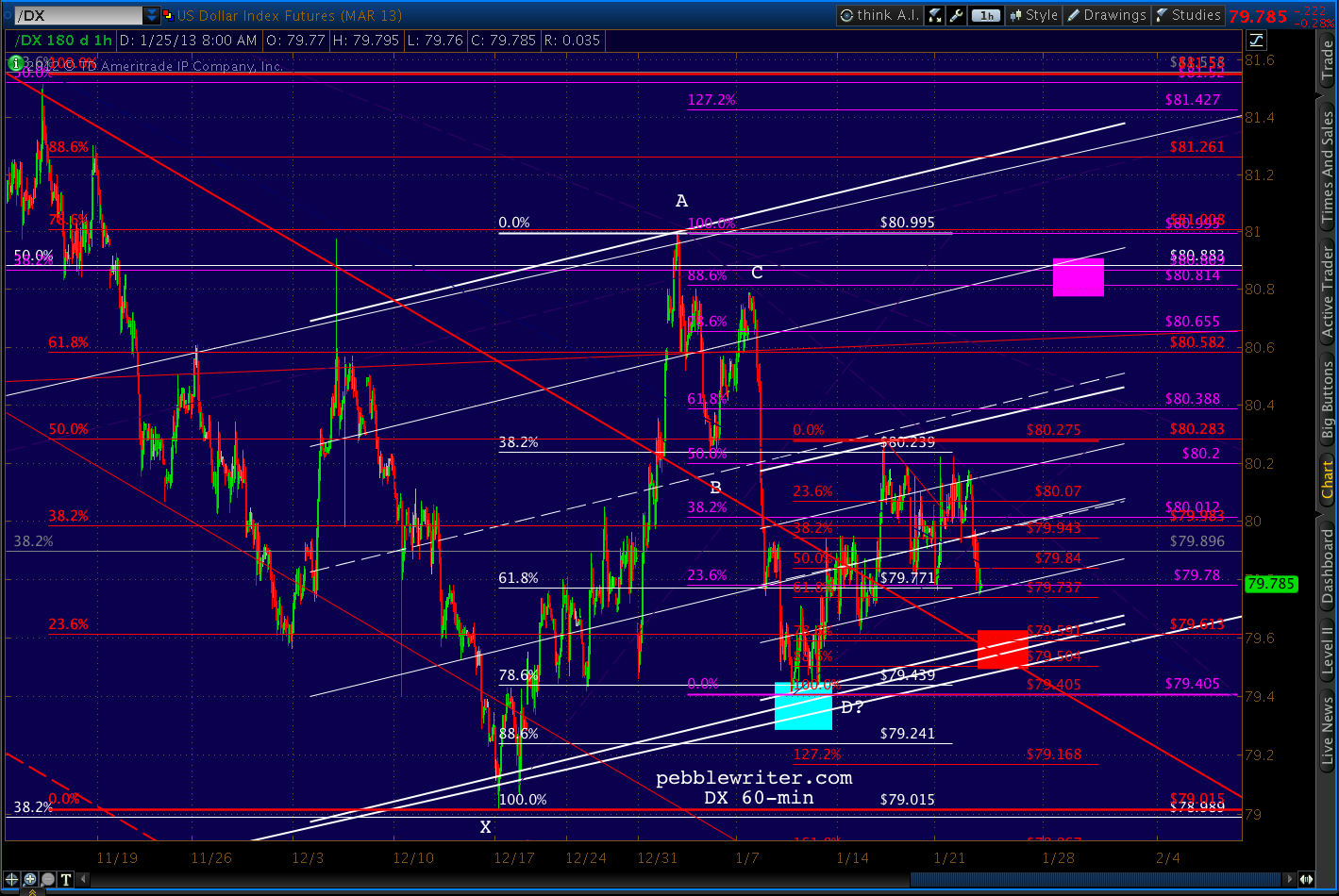
    Since we hit our downside target at the white .786 on the 13th, DX has been non-committal.  My best guess is a repeat of the .786/.886 retrace down to the red zone before DX takes off higher, but this is neither assured nor necessary for our equity forecast to play out as expected.

    continued for members(more…)

  • Now What?

    First, a quick overview…

    The dollar got clobbered overnight, knocking it temporarily out of the white channel that’s guided it since Jan 11.
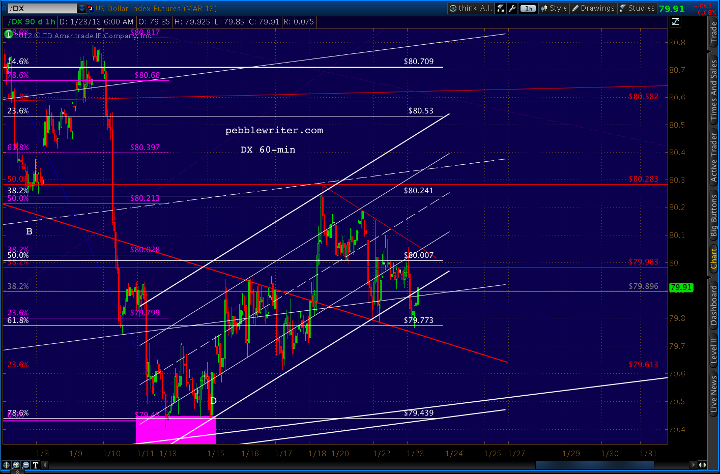
    But, interestingly, its RSI channel is doing just fine, thank you.
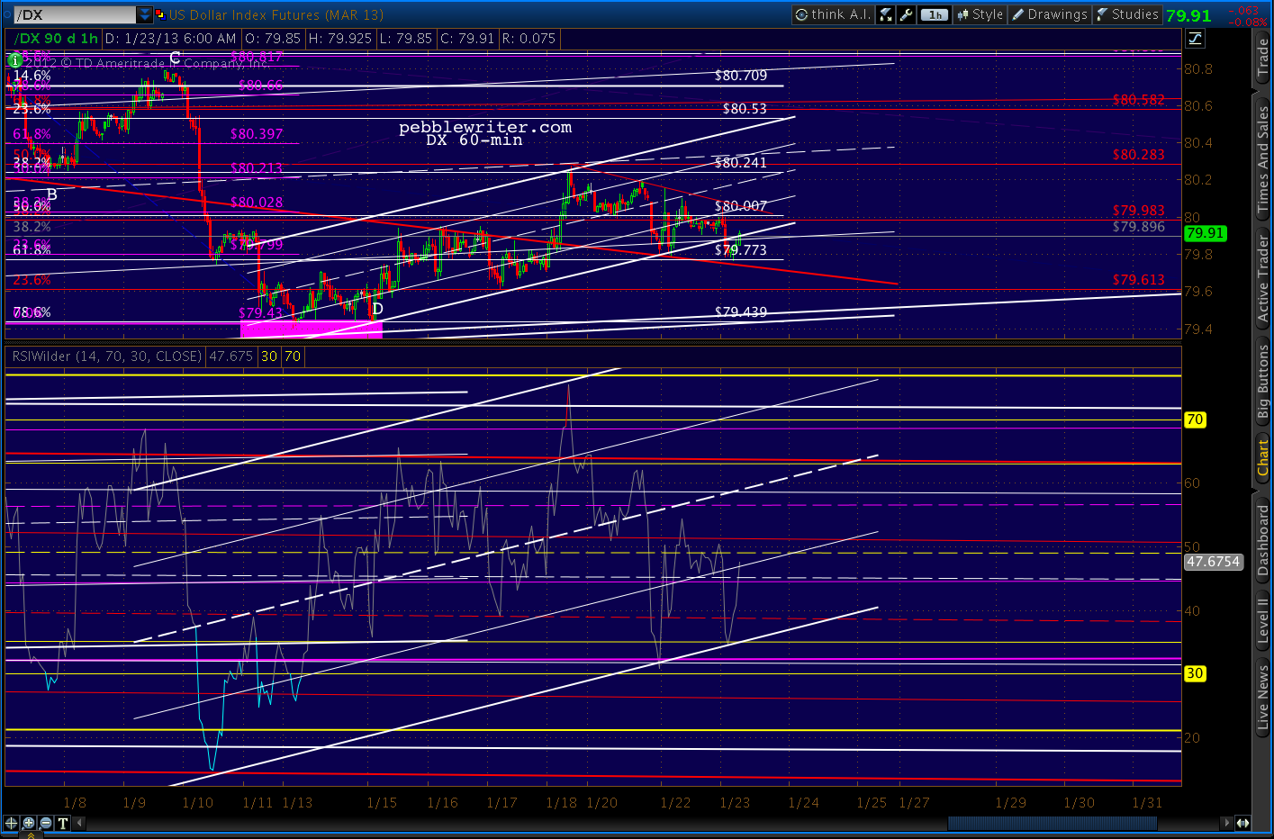
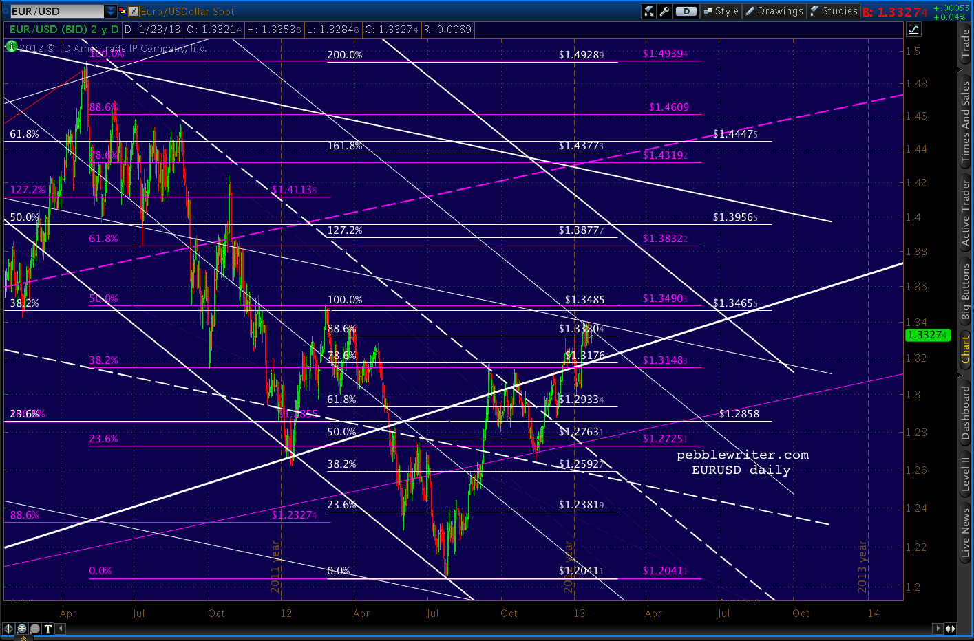
    The EURUSD continues to levitate, but still hasn’t broken the last important interim top put in on Feb 24.  It is also bumping up against two 25% channel lines, so could very well stall out here at the .886.
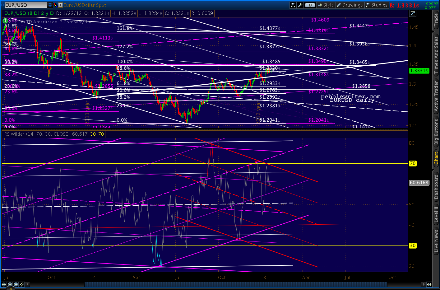
    There is still ample negative divergence regardless of which channel ultimately wins out.
     

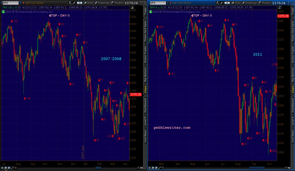
    With the market exceeding the recent 1474 highs, the analog that did so well for us since last April is officially dead.  This begs the question: “now what?”  I see three big issues hanging over the market right now:

      1. earnings season —  AAPL in particular
      2. the US budget/debt ceiling imbroglio
      3. new highs justified?

    Earnings

    GOOG and IBM both gapped up this morning, but the earnings that can really move the market — AAPL — comes after the close.  We’ll take a fresh look at the AAPL chart later today.

    Budget/Debt-Ceiling

    In a few hours, the House will probably pass a measure to postpone the debt ceiling debate until May.  Reid and Obama have both said they’re on board, so this appears to be a done deal.  If House Republicans don’t fall in line, as occurred with “Plan B,” the market will sell off precipitously.

    New Highs

    The market’s strength has caught many off guard, including yours truly.  Many are calling for new all-time highs for SPX. The 2007 high of 1576 is now only 84 points away, so a few good sessions could do it.

    We’ll take a fresh look, focusing on the harmonic and chart pattern picture as well as the establishment agenda.  “What’s that?” you say.  Say all you want about random walks, CAPM, dividend discount models and Dow Theory.  Like any government-managed enterprise, the market is subject to the policy goals and needs of those who attempt to control it.

    Even to my cynical ears, this sounds a bit like rants from the tin-foil hat crowd.  But, consider the news on Egan-Jones yesterday.  This is one of the biggest stories of the month, yet predictably earned only this from WSJ/Marketwatch:
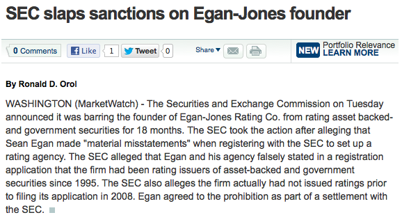
    CNBC was slightly more generous, yet still presented only the SEC’s side of the story.  It’s a story that deserves to be told because it speaks volumes about the degree to which the market is presently being controlled.  And, I’m not just talking about quantitative easing, though I suppose we’d have to consider QE exhibit #1.

    Last summer the market crashed 22%.  It was an analog (replay) of the 2007 top, so we saw it coming in plenty of time to profit quite handsomely.  But, it was a huge wake-up call for The Powers That Be (TPTB) or Plunge Protection Team, Wall Street Cabal — whatever you want to call it.

    With virtually unlimited power and unlimited resources, why couldn’t they prevent something like that from happening?  More importantly, if the top was a replay of the 2007 top, might the rest of 2011 play out like 2008-2009?

    It didn’t, because they learned from the crash of July-August.  First, they tweaked the markets just enough to bust important chart patterns that were playing out.  Second, they tweaked the rules to provide for more time to contain any damage which might otherwise occur (circuit breakers, etc.)  Third, they attacked those who had “caused” the crash.

    S&P CEO Deven Sharma was one of the first victims.  In the wake of the 2007 financial crisis, S&P was rightly pilloried for having pulled its punches — particularly on mortgage and banking related debt.  This was no surprise to anyone who’s ever worked on Wall Street — which pays for these supposedly unbiased views.

    An infamous exchange between two S&P analysts in April 2007 aptly illustrates:

    “BTW, that deal is ridiculous.”

    “I know, right . . . model def(initely) does not capture half the risk.”

    “We should not be rating it.”

    “We rate every deal. It could be structured by cows and we would rate it.”

    Imagine if Hollywood studios funded the reviews of their movies.  Would you care if they received thumbs up or down?  So, in August 2011 S&P found religion and bravely downgraded US debt.  Seventeen days later, Sharma was fired and replaced with the COO of Citibank, the bank whose existence relies on the absence of any future downgrades.

    Egan-Jones beat S&P to the punch, downgrading US debt on July 16.   Two days later, the SEC’s Office of Compliance Inspections and Examinations called looking for information on the downgrade.

    On October 12, Egan Jones was formally notified of a Wells Notice — they were being investigated.  On April 24, the SEC filed a cease and desist order against Egan-Jones — the only rating firm not on the take — stating the action was “necessary for the protection of investors and in the public interest.”

    The financial establishment’s interests, sure.  But, to frame this obvious smack down as “in the public interest” is laughable alarming.  Egan-Jones was the one rating firm with the balls to point out the country’s crumbling financial condition and stick to their guns.  Now they’ve been branded as deceitful, dangerous.  George Orwell spoke the truth in 1984:

    “In a time of universal deceit, telling the truth is a revolutionary act.”

    That other deep thinker, Jim Morrison, provided a similarly profound observation:

    “Whoever controls the media controls the mind.”

    The extent to which the market has been manipulated is deserving of its own post.  But, this Zerohedge article, forwarded by a member, is a great preview.

    Okay, so I know what you’re thinking: if the market is so heavily manipulated (and, presumably, insulated from downturns) why bother trying to beat it?  Simple.

    1. Chaos theory tells us they won’t have enough fingers to plug every hole in the dike (TPTB have similar “never again” strategy sessions after every crash.)
    2. Even when things do run as programmed, we can still effectively capture enough significant swings in the markets enough of the time to boost returns and, more importantly, try to avoid huge downdrafts.

    Over the very long-term, stocks return 8-10% — depending on the time frame examined.  But, sadly, most of us are limited to 40-60 years of investing.  And, a 60% crash right before starting a business, buying a home or beginning retirement could be devastating.

    So, we’ll keep plugging away, letting the markets tell us where they want to go…while trying to get there first.

    So, the question is “Now What?”  We’ll start by looking at the harmonic picture.  As detailed in our last review of all the previous tops, harmonic patterns are very likely to come into play.  So, we’ll start with the charts, then move on to the agenda question and, last take a look at AAPL.
    Since we’ve exceeded the range at which this rally could be considered a double top, we’re probably going higher still. So, we’ll examine the 1.272 and 1.618 extensions.

    In terms of a trading strategy, I’d be comfortable going long here at 1491.  But, disappointing AAPL earnings could knock the stuffing out of the market.  So, those with weak hearts should probably stay on the sidelines until tomorrow morning.

    The most recent patterns show a few possibilities, some of which are clumped together in fairly narrow ranges.  The largest of the patterns — the yellow grid — shows a 1.272 Butterfly Pattern extension at 1510.19 that intersects with the 2.24 extension of the decline (purple grid) from 1448 – 1343.

    A Butterfly Pattern is a good bet, as the Dec 18 reversal at 1448 pretty much nailed the .786 Fib level Point B (1446.44) which Butterfly Patterns require.
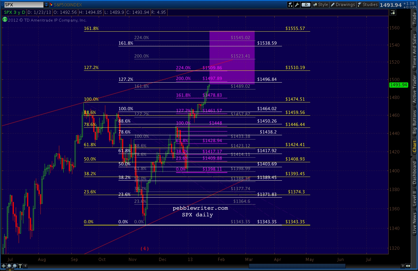
    1510.19 also falls within the confines of the thin red line — the TL connecting the Apr 2 and Sep 14 highs that would probably satisfy the EW requirements of an ending diagonal.  I know you’re out there, my Waver friends.  Please weigh in, as I know only enough EW theory to be dangerous.
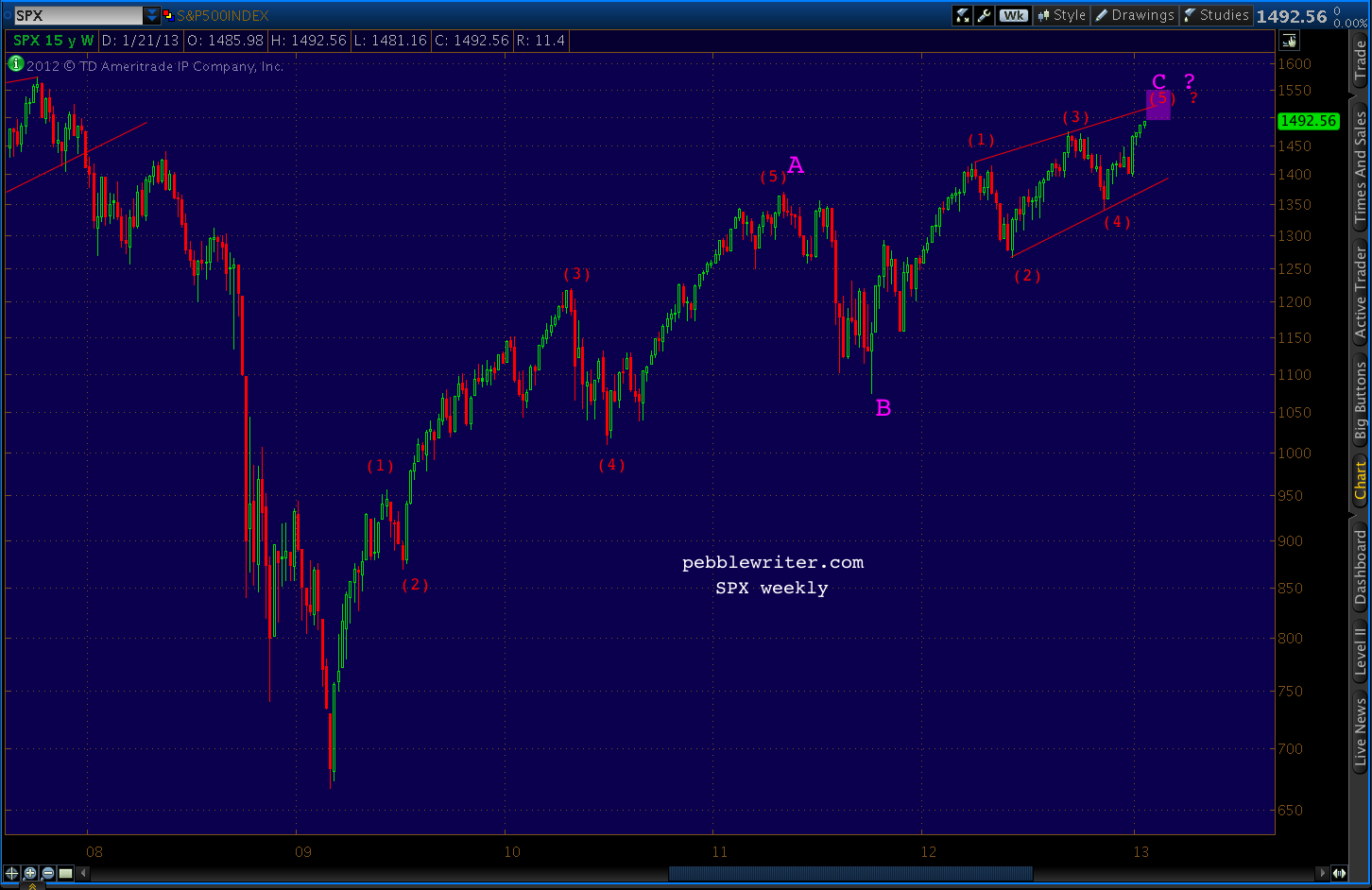
    The white pattern is appealing enough, but I would have to consider it secondary in importance to the yellow since it began at a less momentous point X.  Ditto for the grey pattern.

    Although it should be noted that we faced a similar dilemma when choosing between the Point X’s for the Butterfly patterns beginning in 2011 [see: All the Pretty Butterflies.] In the end, it was a point similar to the white pattern 1.0 Fib at 1464.02 that determined the April 2 turn.  It featured a Point B closest to the .786 Fib.

    Zooming out, we can see that the 2011 highs could very well still influence the outcome of the current top.  The chart that includes everything is a little busy…
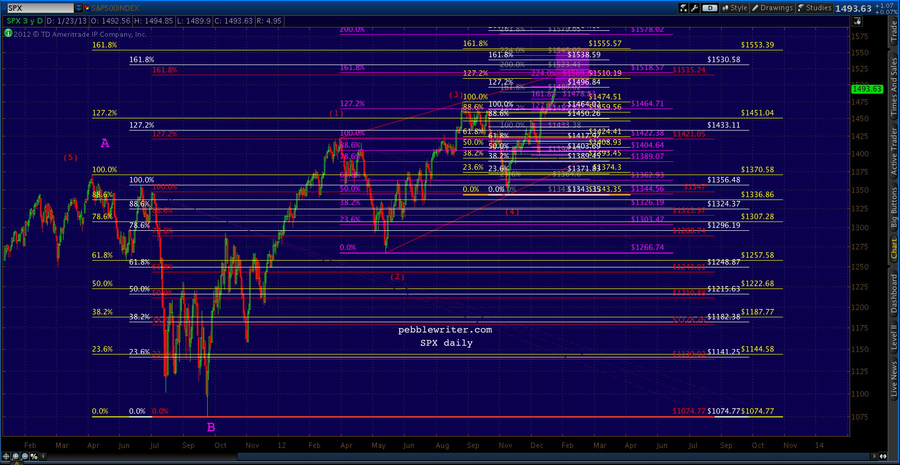
    …so I’ll clean it up by eliminating the interior retracement levels and switching to weekly.
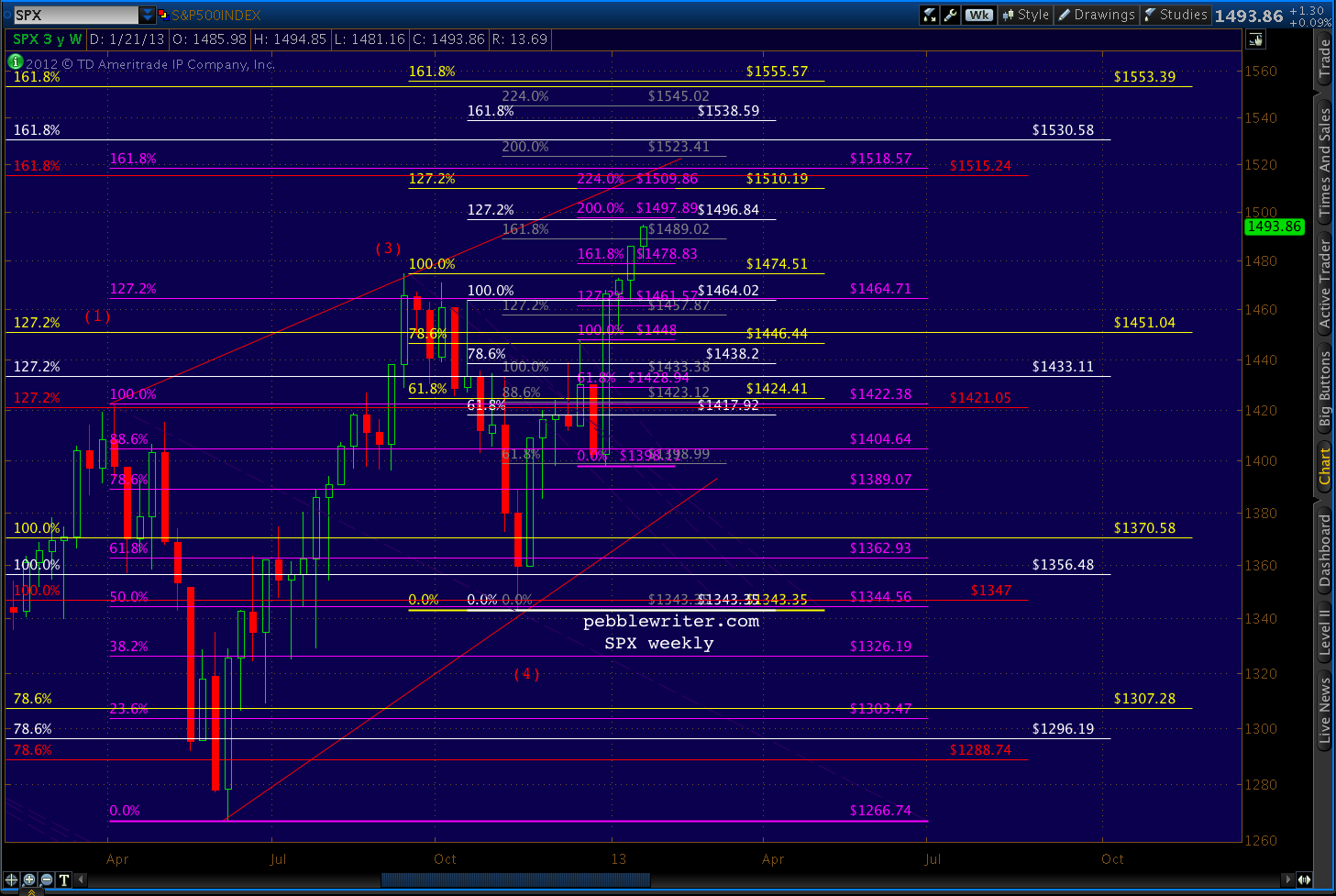
    The target areas can be more easily seen in this close up.
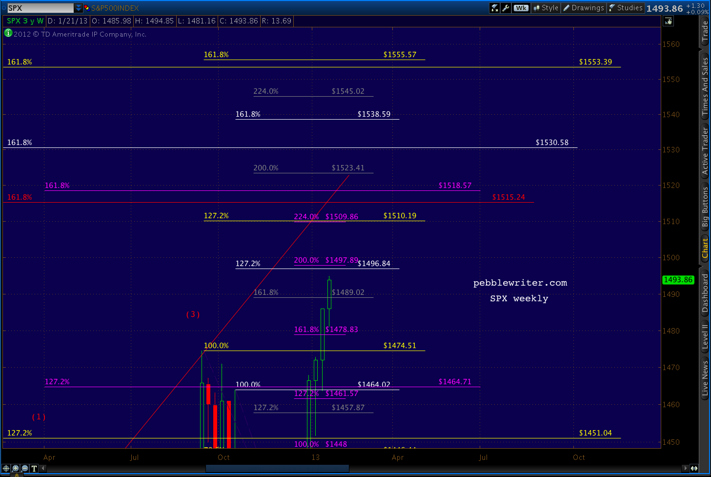
    Note that the large red pattern, the one whose 1.272 extension helped me accurately forecast the April top, comes into play at its 1.618 extension of 1515 – only a few points away from the 1509-1510 level discussed above.

    This is promising, as patterns that influence markets once (that was an 11% correction, after all!) are more likely to do so again.  And, patterns that the market completely ignores — such as the yellow and white patterns from May and July 2011 — are less likely to suddenly leap into a position of authority.

    And, there’s also a purple 1.618 extension (set up by the 1422 – 1266 decline) at 1518.57.  Again, this is close enough to be considered significant.

    If 1520 is exceeded, then we’ll look at the next higher grouping: 1553-1555.  This “group” is basically the two yellow 1.618’s.  Again, the larger pattern’s 1.272 had no influence on the market.  The smaller pattern’s 1.272 is the one coming up at 1519.

    Summary

    My leading harmonic forecast is for 1509-1515.  I can’t imagine getting this close to 1500 and not snagging it for the trophy case.  And, I like the idea of dancing with the harmonic patterns that brung us.

    My secondary goal is slightly higher at 1553-1555, so there should be opportunities to jump back in and capture most of any upside above 1520 if/when appropriate.  Such a move would likely follow a reversal from 1509-1515 back down to 1474ish and would constitute a fifth wave rather than the ending diagonal suggested above.

    If AAPL’s earnings stink up the joint after the closing bell, going long won’t have looked very smart.  But, judging from the steadily appreciating share values, I’m guessing that a relatively positive result is already being leaked.

    Chart Patterns

    I won’t rehash the stuff already posted in the past couple of weeks.  Just take a look at the rising wedge that would be confirmed by a reversal at 1510 as early as tomorrow.  The target would come at the .886 of the base to apex price range and .618 of the time range (almost too good to be true.)
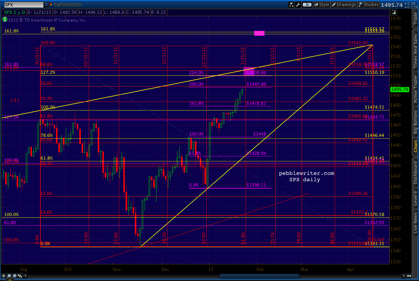
    We’re currently very close to the .786 of 1498, which tells me there’s a decent chance of a run up to 1500ish into the close.

    UPDATE:  3:45 PM

    AAPL is up almost 9 points at the moment.  A rally past 1426 would take it up out of the falling white channel it’s been in since last August.
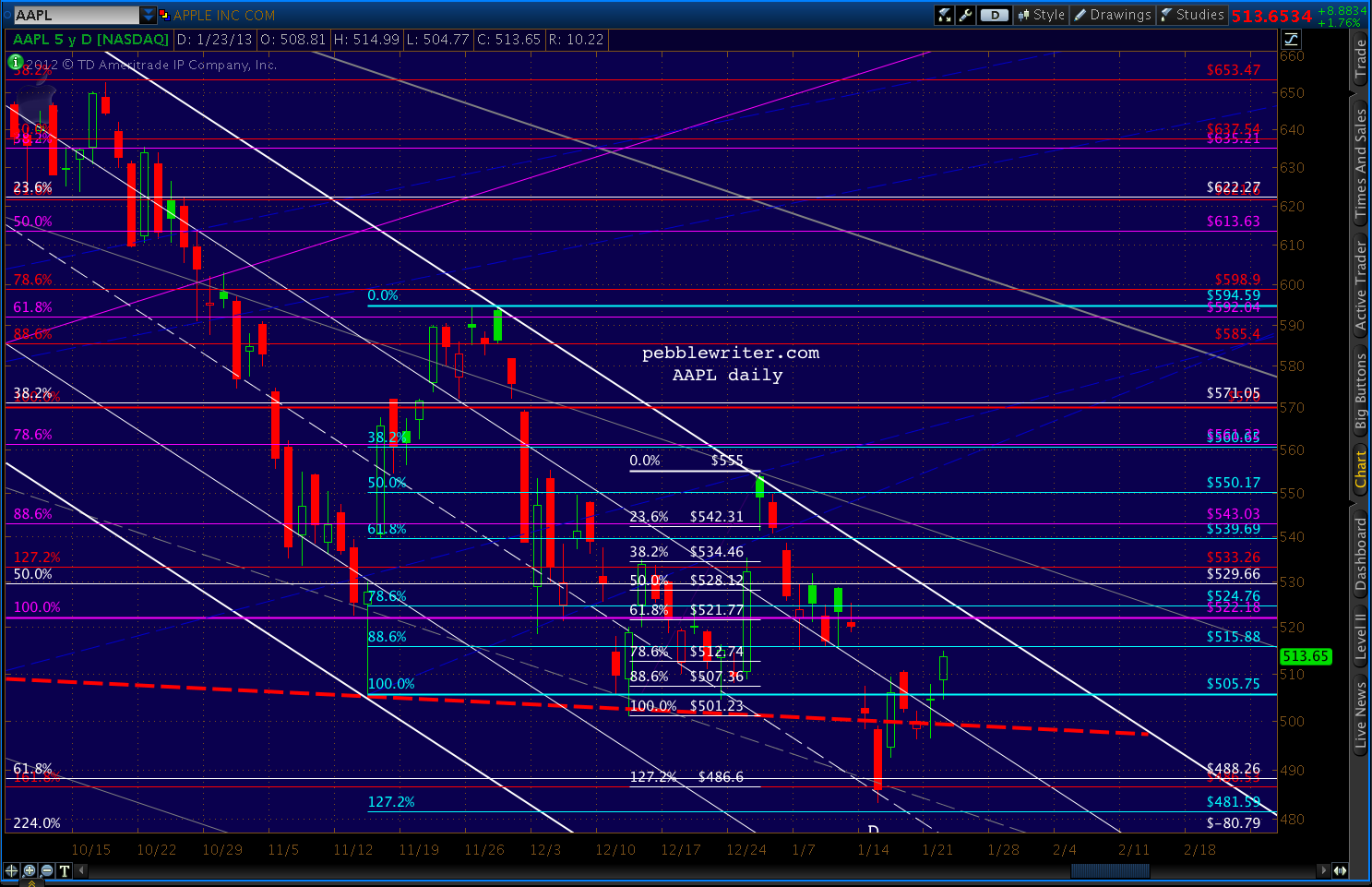
    Anything over 515 would take RSI above the white and purple RSI channel midlines.   So, as expected, much is riding on the earnings report and how it’s perceived.
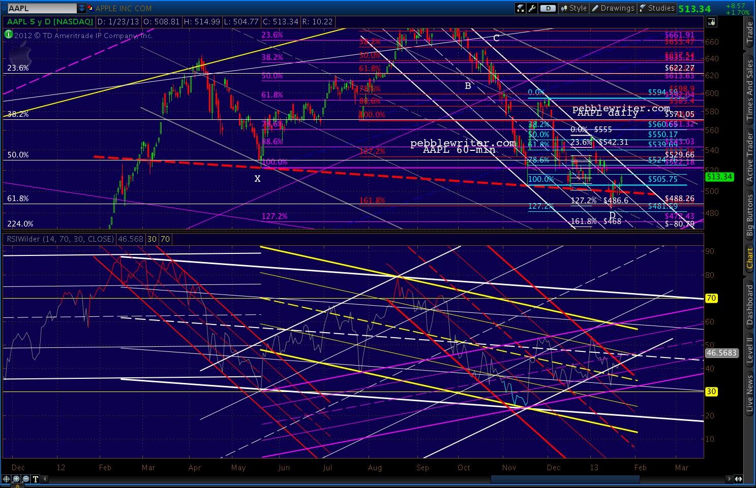
    We’ll watch these RSI channels, though. A return to the top of the yellow (and, especially the white) channel would surely spell a reversal.

    The Agenda

    I think it’s pretty straight-forward — bag an important new high, but without setting the bar so high that expectations can’t be managed.  At 1510, SPX clears 1500 but buys some time before the pressure of “will it exceed 1576?” comes to bear (no pun intended.)

    Then, get through the budget mess (or, more kicking of the can) and see where we are.  If we get a sequester, so be it.  The establishment will be well positioned ahead of time and the correction will be managed.

    After the shock of it wears off and prices have firmed in the 1200-1300’s, time to establish the next leg higher.

    Now, the big question is whether TPTB can engineer such a move without it getting out of hand — as it often does.

    Stay tuned.