Tag: fibonacci

  • Forecast Revision

    Note:  only six charter memberships are left as of EOD Thursday.  I’ll keep this going until they’re gone.  Congratulations to E.J., P.B. and T.J. for locking in today’s annual rate for the life of the site.

    * * * * * * * *

    Well, we got the rebound we were expecting…although it was a little unnerving.  As I posted at 10:30 yesterday — with SPX down 16 points at 1315:

    We had a similar dip the day before Q1 ended, too.  March 29 opened at 1405, dipped to 1391, and closed at 1403.  Money managers like to end quarters on an up note whenever possible.  This feels like a fake out.

    Sure enough, by late in the day we had rebounded to within 2 points of the opening, just like on March 29.  More importantly, we were right back on track with our forecast (the solid yellow line.)

    Likewise, the dollar caught up to our forecast (solid yellow line) in one fell swoop.  I was getting a little nervous, watching the growing divergence over the past few days.  The previous H&S was in danger of being busted; and, although we kept one foot on the long-term channel line, we were moving further and further away from the presumed right shoulder target.  No more.


    The pattern over the past 10 sessions suggests we’ll top out this morning at 1357.28.  That’s a Bat pattern retracement from the June 19 1363 high.  I’m also altering our forecast going forward.

    continued…

    (more…)

  • Harmonics Scenarios

    Periodically, I like to go through and chart the various harmonic scenarios for both the upside and downside.

    It helps to pass the time while sitting and staring at the computer monitor, watching our forecast play out (so far, so good.)

    It’s also helpful in generating a set of potential outcomes for the market over both the near and longer-term.

    DOWNSIDE SCENARIOS

    Remember, all harmonic patterns begin with a significant reversal which we call Point X.  Over the past year, we can identify several obvious Point X’s, each of which generates its own set of Fibonacci retracements when paired with the recent 1422 high.

    continued…

    (more…)

  • Harmony

    Harmony and me…we’re pretty good company.  From the moment I first heard about Fibonacci, I was l hooked.  A numerical sequence that produces mysterious and magical ratios that show up in everything from the design of pine cones and nautilus shells to the layout of pyramids of Giza and dimensions of the Parthenon?  Sign me up.

    When I heard these ratios could be applied to investing, it was music to this math geek’s ears.  Most of my early efforts were focused on prices, but I’ve spent the past few months studying the application of Fibonacci ratios to time levels, as well.

    Fibonacci time ratios are a trickier than price ratios.  It’s pretty simple to eyeball a stock’s move from 10 to 20 and calculate a .618 retracement of the 10 points.  Just make sure the starting and end points are significant, and check to make sure you’re considering all the alternatives, and Bob’s your uncle.  Okay, so it’s a little more work than that, but not terribly complex.

    Time series, on the other hand, deal with periods that can extend well beyond the standard computer monitor.  It can be really, really tricky to find start and end points that provide a good fit for a set of ratios,  not to mention a reliable long-term stream of market data.

    I’ve tried hundreds of combinations over the past few months, trying to find a set that fit the actual market results well, i.e. it captured the major moves with the primary Fibonacci ratios.  And, I’ve found one that’s very interesting in that it fits the two market crashes in the past 10 years.

    October 8, 1998 represented the bottom of a 22% decline — the first 20%+ decline the market had seen since Black Friday in October of 1987.  It’s been largely forgotten since the arrival of its two more dramatic siblings in 2002 and 2009.

    Setting October 8 as the starting point, the October 10, 2002 bottom falls about a week from the .146 Fib level, and the March 6, 2009 bottom falls only a few days away from the .382 level.

    And, as you might have noticed, the last Fib level of .500 occurred a week ago on June 1.  Like the .236 level, it hasn’t been (so far) accompanied by a 50% drop in the markets.  Does that mean we’re out of the woods?

    continued…

    (more…)

  • Moment of Truth

    As Ben Bernanke scolds Congress for how pitiful a job they’ve done on fiscal policy, SPX has staged an important break out.

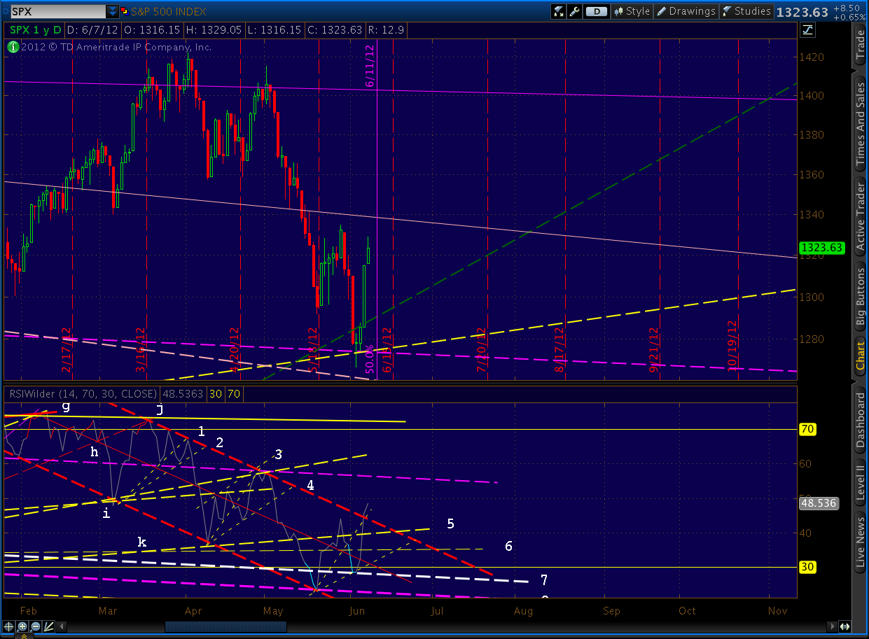
    Daily RSI broke out of the channel that goes back to January.  It has done a phenomenal job of providing guidance, and a clean break out is unlikely to occur without at least a back test.  If fact, don’t be surprised if RSI closes back within the channel, given that we’ve just reached the .382 Fib level.

    Of course, it’s ALL up for grabs in the event Bernanke actually tips his hand — beyond “we have lots of options” and “all options are on the table.”  Let’s see if we can make some sense of the path forward.

    continued…

    (more…)

  • XLF Update – June 5, 2012

    Financials play a pivotal role in the markets.  They led the way as they enabled the previous run-ups and bubbles, and they led the way down when the house of cards was revealed for what it was.  The survival of nearly all markets is hanging by a QE thread, so we’ll take a fresh look at XLF to see what the charts are saying.

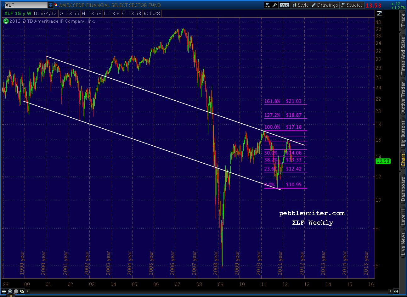
    We’ll start with the weekly chart going back to inception in December 1998 — lot of water under the bridge with this ETF.

    Fortunately, for us analyst types, it’s been very amenable to chart patterns and Fibonacci analysis.  Consider this chart, that helped me call a top in banking stocks in late March [see: End of the Line and Lots More Where That Came From.]  Note the well-defined channel and the Gartley Pattern reaction at the .786 Fibonacci level.

    I’ve put together a series of charts that, I think tell a pretty compelling story regarding XLF’s future.

    continued…

    (more…)

  • SPX: The View from 30,000 Feet

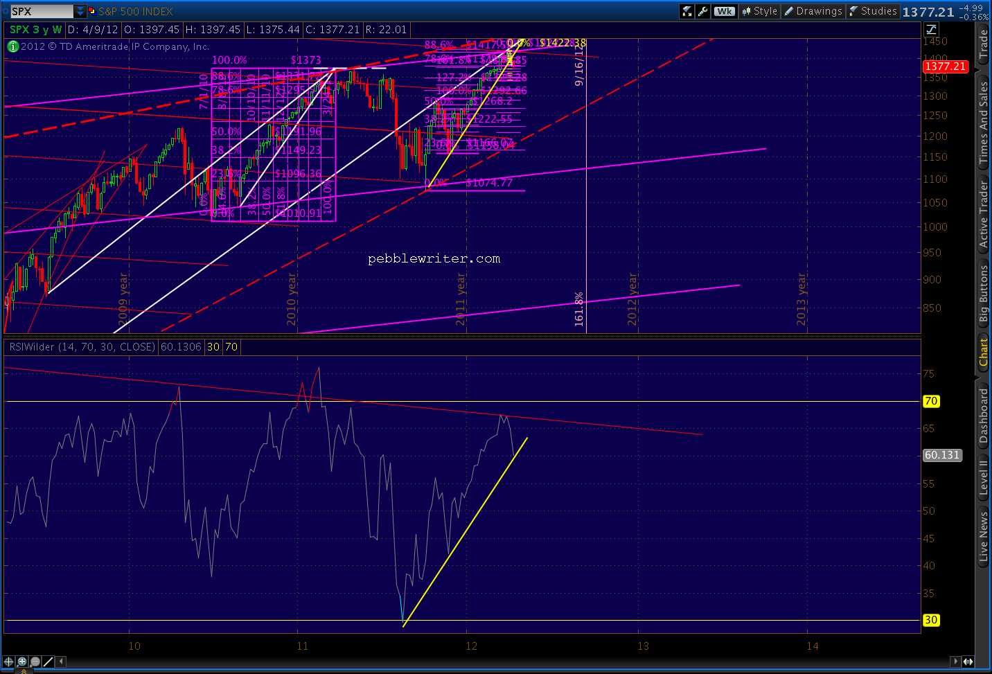
    Our charts have grown fairly “busy” lately, what with harmonic patterns, chart patterns, fan lines, channels, etc.  I find it helpful every now and then to take a step back and examine those elements that have had the biggest impact in recent years — and are likely to continue doing so.

    In my opinion, the two patterns that have influenced prices more than any other are Fibonacci levels (primarily related to the 1576-666 decline) and fan lines.

    Note how strongly prices reacted to each of the Fib lines off the Mar 09 lows.  Every Fib level played an important role in providing support and/or resistance at pivotal points.  The .236 didn’t slow the advance much, but it provided much needed support after a 9% decline.  A tag of the .618 touched off a 17% correction (caught by the .382) and set the stage for the Gartley pattern completion at the .786 a year later.

    (more…)

  • Random Walk, My A$$

    As we close precisely on the trend line between the Oct 27 high (which kicked off a 112-pt Inverse Head & Shoulders pattern) and the just completed (for the 2nd time) Head & Shoulders pattern, I’m reminded of how little fundamentals have come to matter.


    Oh, and for any Fibonacci haters out there, check out the time and price relationships between the two patterns.


  • Bottom Fishing

    EOD:  2:25 AM

    SPX overshot the Crab’s 1.618, whichever Point X we use.   The next major lines of harmonic support are are the red pattern’s 2.24 at 1342, correlating with the purple pattern’s 2.618 at 1341.

    Given the level of oversold on the day, here’s an alternative view.

    UPDATE:  11:55 AM

    The Crab Pattern I posted about earlier pulled a fast one on us.  It either busted, or I drew it wrong.

    Technically, it’s forbidden for Point C to exceed Point A — kind of like Wave 1/Wave 4 overlaps in Elliottworld.   But, it happens.   I’ve redrawn the Crab to begin with the March 23 1386 low instead of the March 29 1391 low — which means that the 1.618 extension is 1364.92 instead of 1372.51.

    Note the daily RSI tag on the same trend line (red, dashed) that stopped the Oct 4 and Nov 25 declines. The previous tags are highlighted in light blue.   This decline is picking up momentum, so the RSI TL and the Crab pattern might get mowed down.

    But, be cautious.   Like any trading system, once you start bending the rules in Harmonics, it opens up a can of worms.  Markets frequently overshoot logical targets, and it’s no cause to discard the methodology.

    I’m taking some profits off the table at these levels, and will let the rest ride essentially risk free.  Note that 1364 is the .707 of the 1340-1422 move.  If it doesn’t hold, the next support is at the .786, which would equal 1357.  An intra-day push to 1357 and close at 1364 would be interesting.


    ORIGINAL POST

    After yesterday’s close below the rising wedge, we can safely consider it officially broken.  Now, the question is whether SPX will freefall in an epic fail of the bull market, or find support at some interim level for another leg up.

    In the near term, we’re approaching a potential Crab Pattern turning point at 1372.51.  We might have reached it yesterday but for the little acceleration channel SPX has been in since 1422.  Today, the channel passes right through 1372, so we could get a good test.

    This isn’t a big pattern, so we might not see earth-shattering results, but it should be good for at least a nice bounce if not an outright reversal.

    I think an outright reversal might be in the cards, though.  The hourly RSI shows positive divergence with this morning’s leg down, and daily RSI shows a tag of an important internal trend line.  But, it’s the weekly RSI chart that, as a bear, really gives me pause.
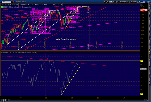
    Expanding the RSI chart gives us a clear view of a trend line that might provide significant lift at these price levels (ignore the compressed upper chart.)

    I’ve also been watching VIX’s price action, constructing some probable channels months ago: the yellow channel guiding the downside, transitioning to the red channels for the subsequent rise.  Since then, I’ve barely adjusted them.

    Note how well they’ve called the turns.  At this point, they hint at a likely breather for VIX.  All things considered, I think we’re likely to see a backtest of the VIX falling wedge that will correspond with a return to the other side of the red channel.  It could happen any time, but might well occur coincident with the afore-mentioned bounce in SPX.

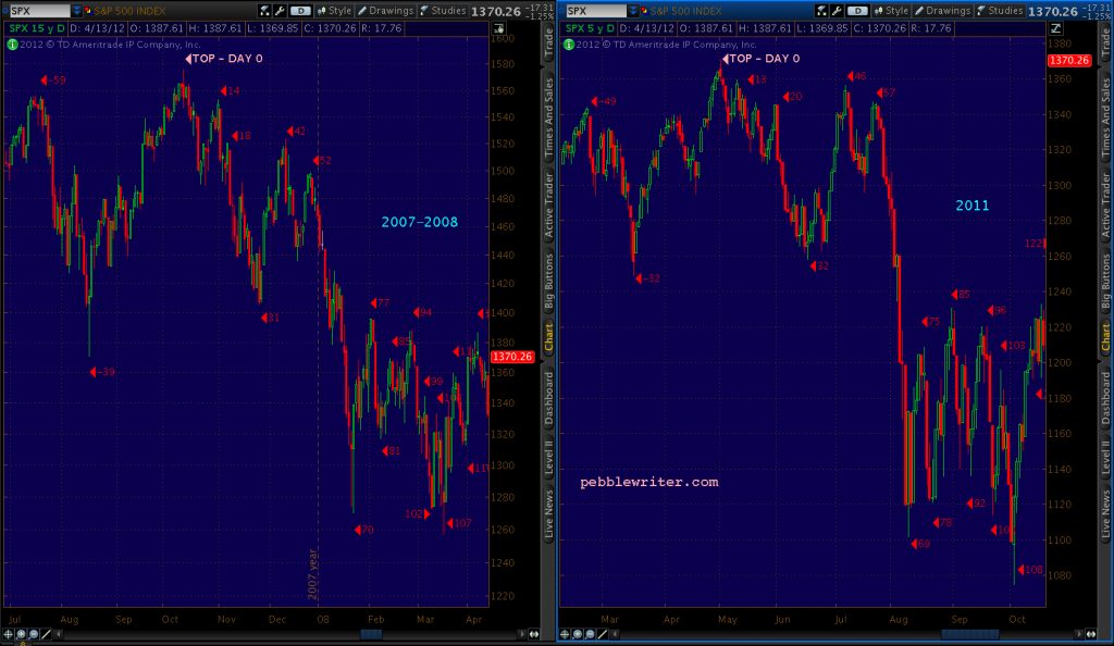
    All this begs the question, what kind of bounce will we see?  As we discussed the other day, this rising wedge is a reasonable facsimile of the 2010-2011 one [see: Analog Watch.]

    The most likely drawing of the current wedge puts the apex around 1460-1470 somewhere around May 7-11, meaning we reached only 88.6% of the potential in both time and price at the recent 1422 high.  [see: Was That It?] If we repeat the pattern, we’ll head back up to tag that apex — exactly as we did in May 2011 at 1370 (note the dashed white line that connects the March 2011 apex to the May 2011 top.)

    More importantly, however, we’d tag the upper bound of the huge rising wedge (red dashed) that dwarfs the rising wedge (yellow, solid) that just broke down.

    I’ve drawn its upper bound as the biggest, boldest red line I can muster on the above chart.  Why?


    Stay tuned.