Financials play a pivotal role in the markets. They led the way as they enabled the previous run-ups and bubbles, and they led the way down when the house of cards was revealed for what it was. The survival of nearly all markets is hanging by a QE thread, so we’ll take a fresh look at XLF to see what the charts are saying.
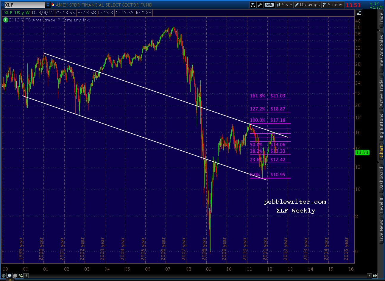
We’ll start with the weekly chart going back to inception in December 1998 — lot of water under the bridge with this ETF.
 Fortunately, for us analyst types, it’s been very amenable to chart patterns and Fibonacci analysis. Consider this chart, that helped me call a top in banking stocks in late March [see: End of the Line and Lots More Where That Came From.] Note the well-defined channel and the Gartley Pattern reaction at the .786 Fibonacci level.
 I’ve put together a series of charts that, I think tell a pretty compelling story regarding XLF’s future.
continued…
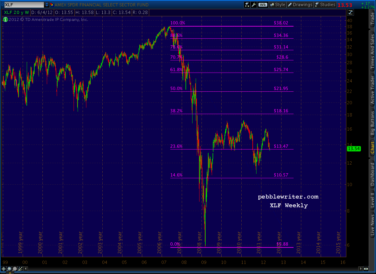
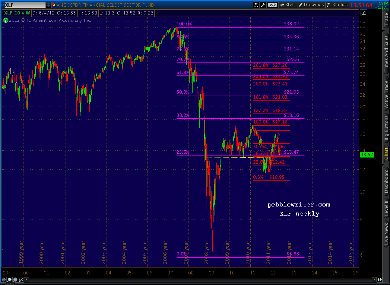
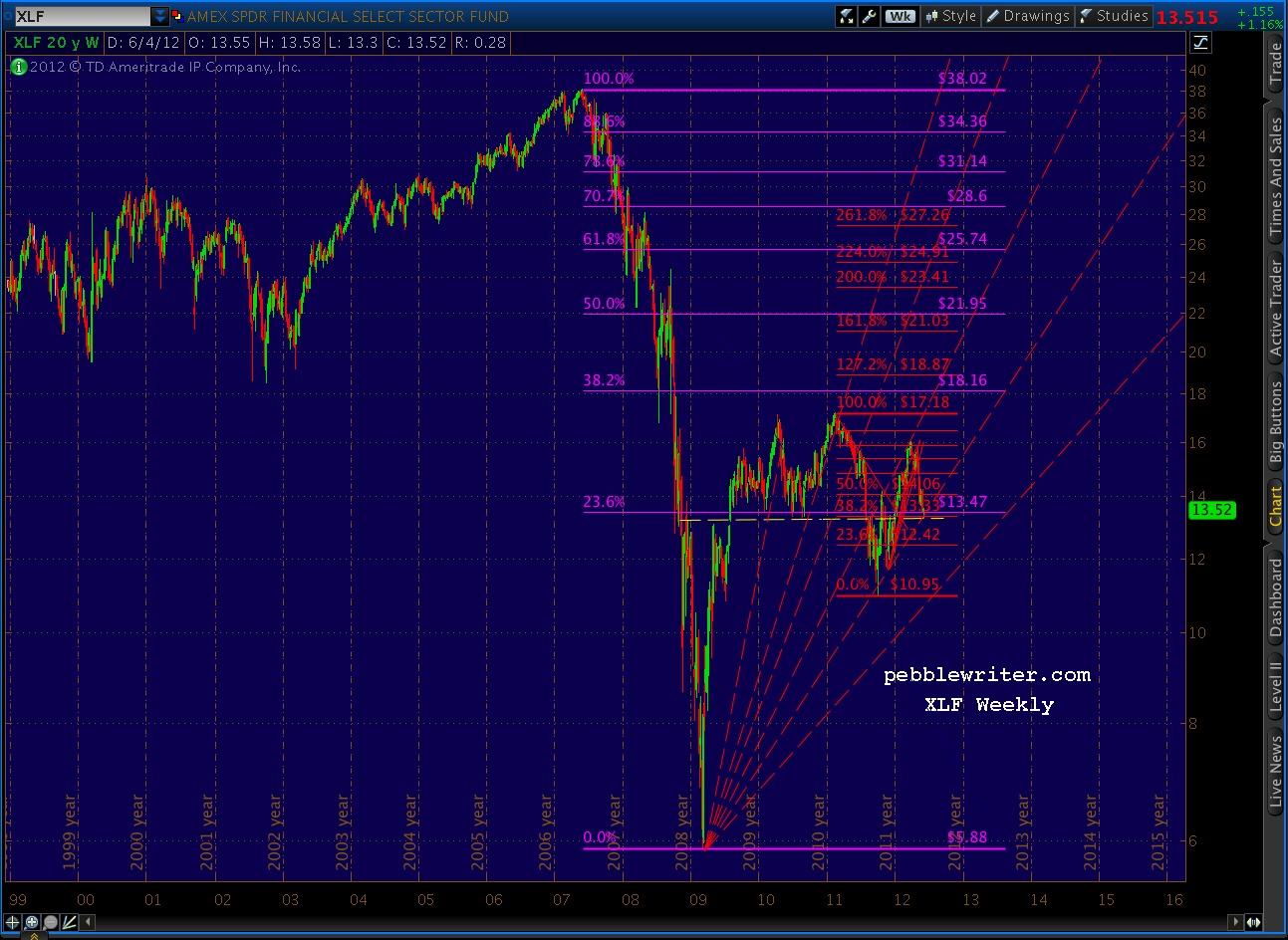
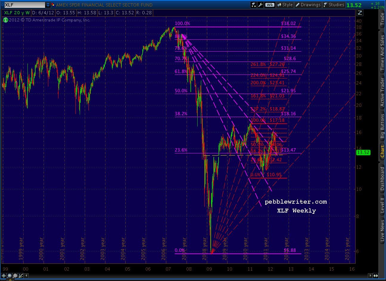
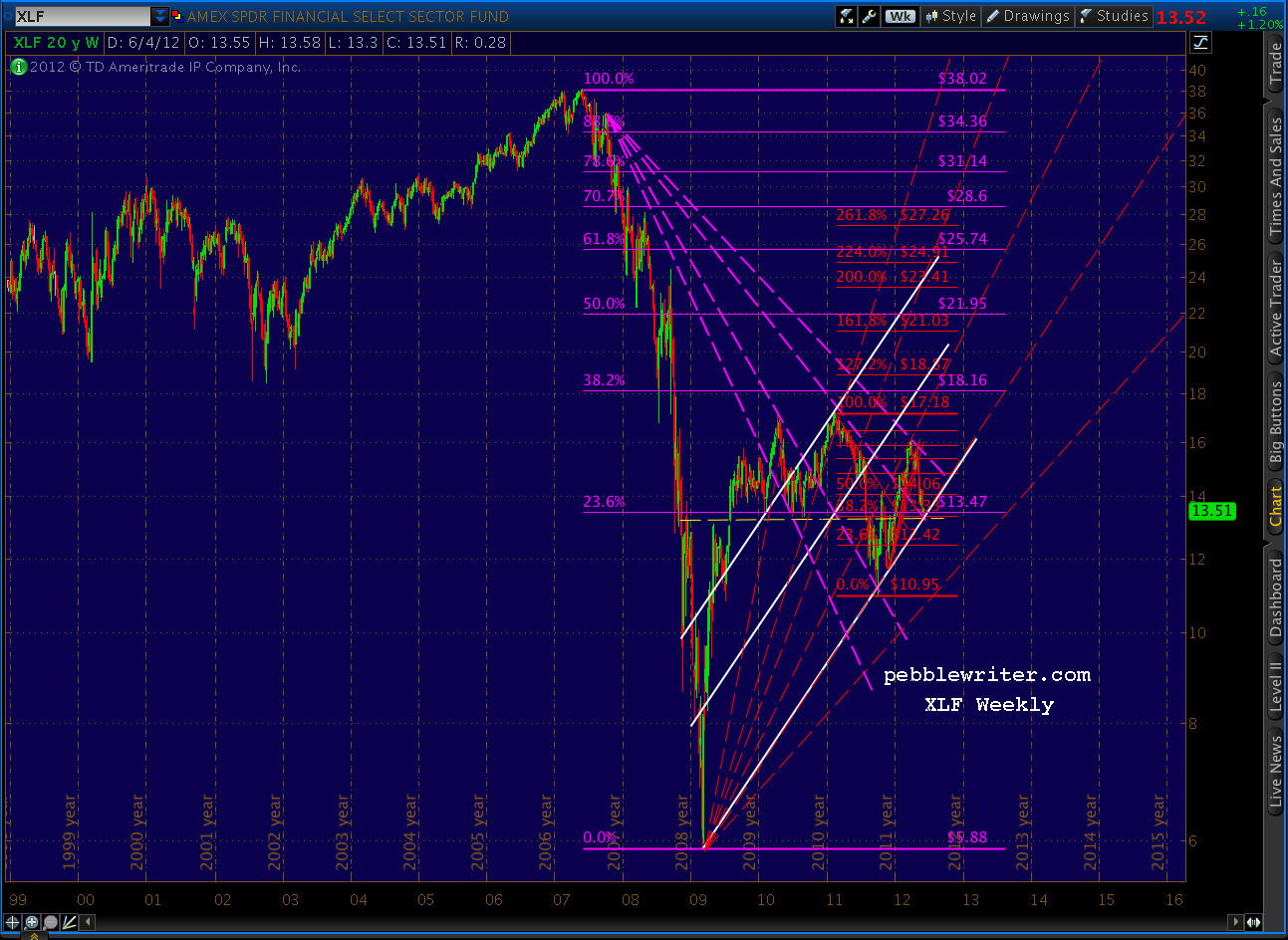
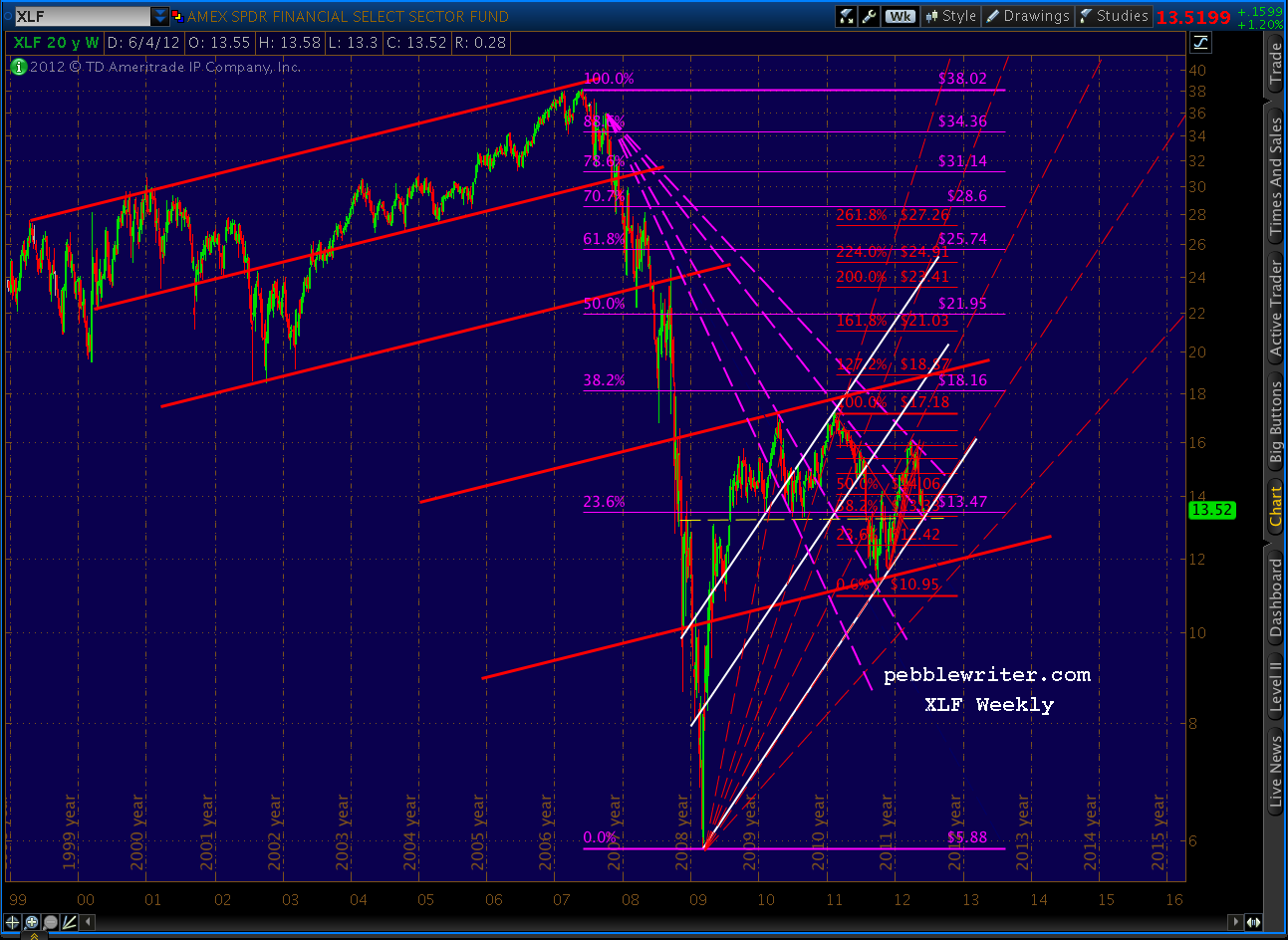
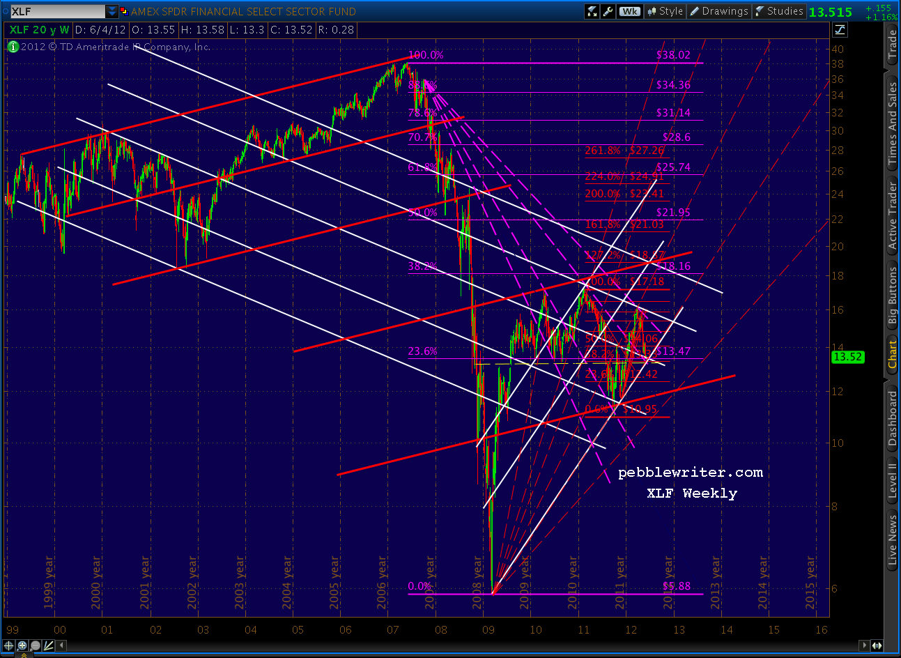
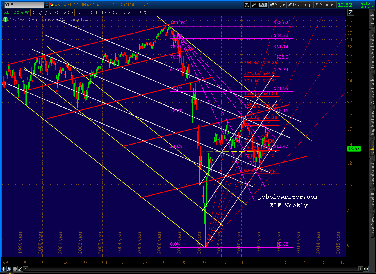 With all those channel lines and harmonic patterns in place, I like to look for points of intersection that might indicate a potential price/time target. One that leaps off the page is the 1.272 Fib level of the small (red) Butterfly Pattern. It intersects with a lot of channel lines around the middle of July at 18.87.
I’ll be the first to admit that climbing nearly 40% in five weeks would be quite a feat. But, it’s happened before — such as July 2008, several times in 2009, and most recently in October 2011.
If I’m wrong, and the politicians/central planners completely drop the ball, look out below. Banks, in particular, face the biggest financial time bomb [see: Wipeout Ratio] since Lehman/AIG days — particularly as concerns their derivative portfolios (which are suddenly absent from the headlines, hmmm…). A break of that bottom-most fan line would surely send prices down 40% instead of up.
Stay tuned.
***********************************
As Tommy correctly pointed out in his comment below, a 40% ramp in XLF would mean some big returns for important components such as BAC, C, JPM, etc. This is very true. Though it pains me to say it, I see banks exploding in the next few weeks.
CAVEAT: this entire exercise isn’t worth the bytes it’s written with if Kumbaya Banking and Quantitative X don’t come to pass. And, don’t get me wrong — I think most banks are dead meat in the longer term. I just think we’re looking at a sizable bounce here and now if the rumors are true. OK, with that huge caveat out of the way…
- JPM: current price 31.99, price target = 38.69 (+21%)
- C: current price 25.75; price target = 34.79 (+35%)
- BAC: current price 11.34; price target = 11.34 (+60%)
I’ll put some charts on another post, just for grins. That way, it’ll be easier to delete this whole mess when I’m proven miserably wrong and justifiably tarred and feathered.

Comments
3 responses to “XLF Update – June 5, 2012”
I am unable to edit my post. The prior post was not done yet. Sorry about that.
Regardless, in summary, if XLF has an increase of 40%, it implies all the big bank stocks C, BAC, JPM, MS would increase by more than 40%. Example, if C and BAC recover the March 26 price, XLF would only recover back to $16. For XLF to move to $18.87, C and BAC need to move higher their March 26 prices.
And at $18.87, XLF would be highest since the financial crisis in 2009. Much higher than 2010 and 2011 highs with QE1 and QE2.
Something to think about.
Yeah, pretty crazy huh? But, that’s what the charts are showing — UNLESS QE and Kumbaya Banking go down in flames.
Just as crazy, I’ve got targets of 11.34 on BAC, 38.69 on JPM and 34.79 on C. Posting above tonight.
Hello PW, climbing 40% in five weeks (or in five months) is indeed a challenge.
If you look at individual big bank stocks, C, BAC, JPM, MS, even if a 40% increase is still below the March 2012 prices. They might bounce back only to recover the drop since March.
30% or 40% might be possible.
C at $25.75 today. a 40% increase would be $36.05 compared to $38 March high
BAC at $7.1 today. a 40% increase would be $9.94 compared to $9.93 March high
JPM at $31.99 today. a 40% increase would be $44.79 compared to $46 March high
MS at $12.86 today. a 40% increase would be $18 compared to $21 March high
GS
However, XLF did not drop that as much since March. It is about 15%
XLF at $13.58. a 40% increase would be $19 compared to $16 at March high.