UPDATE: EOD
The fractal we discussed yesterday played out perfectly today (the equivalent of July 8-11, 2:3 time ratio.) Look for more downside (targets discussed earlier today) before a rebound next week. The cynic in me expects the July 22 rebound high to line up with OPEX Friday, but we’ll see as we move along.

Clearly someone trading in SPY had the same idea about an IH&S; pattern, and ran up the equivalent of 27 SPX points in the minutes after the cash market closed. It came right back down, of course.

ORIGINAL POST:
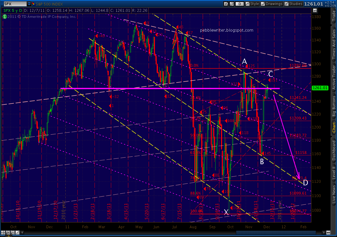
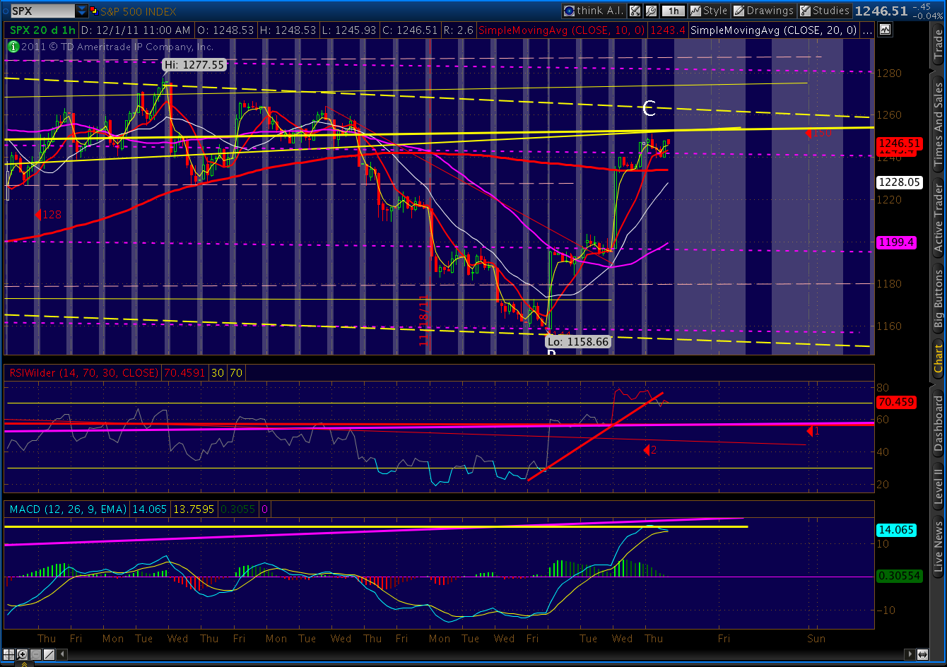
We’re seeing the (initial) payoff of all the harmonic patterns we’ve been watching. SPX is currently off 22 from yesterday’s forecast/actual 1261 close — a little over a 25% retracement of the last rise. First, the daily picture:

The reversal at the triple top of 1266 goes a long ways toward validating the primary channel lines (yellow, dashed) I’ve been assuming are correct. The contra-channel lines (red, upward-sloping) should provide some guidance on the way down from here.
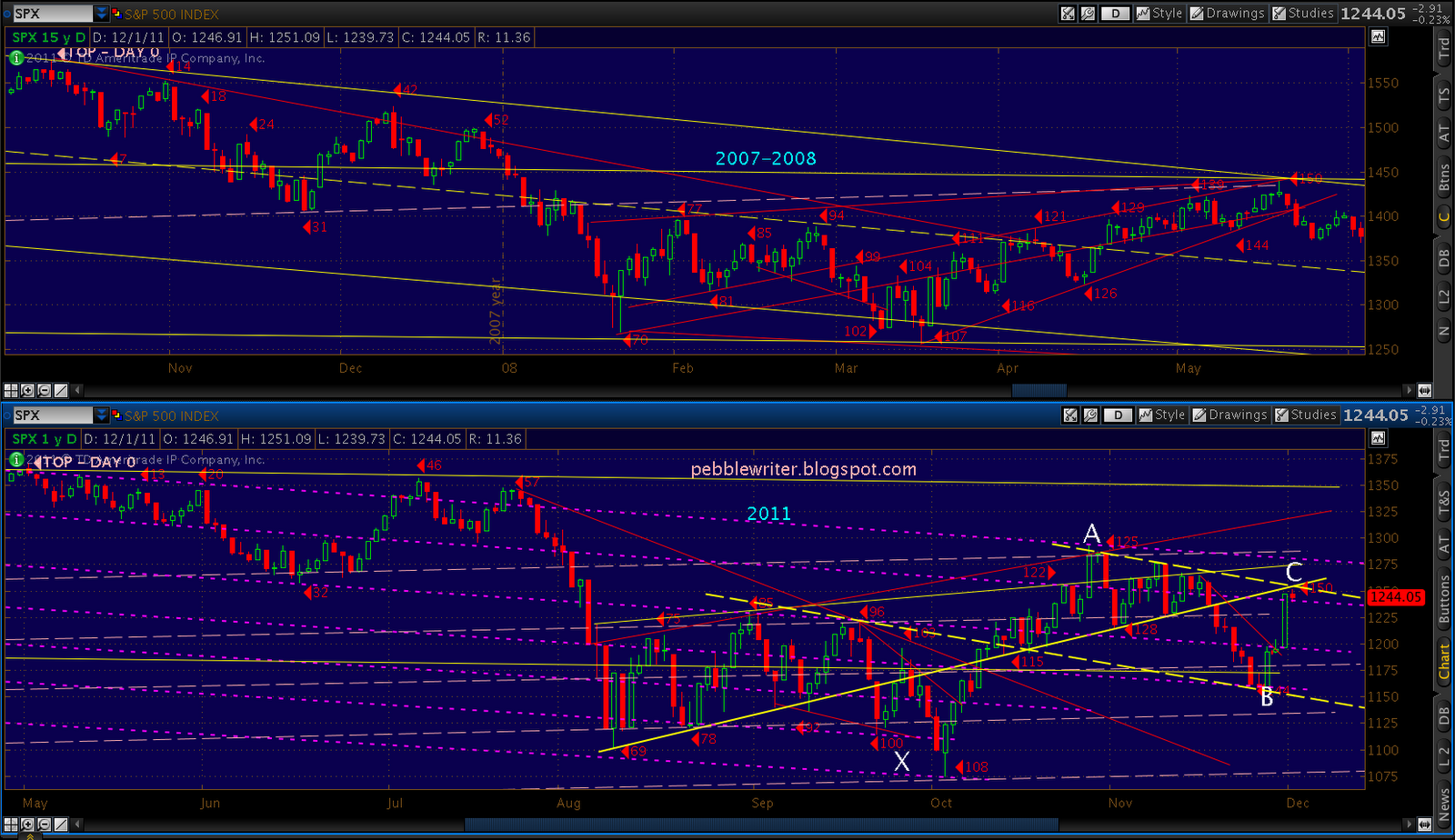
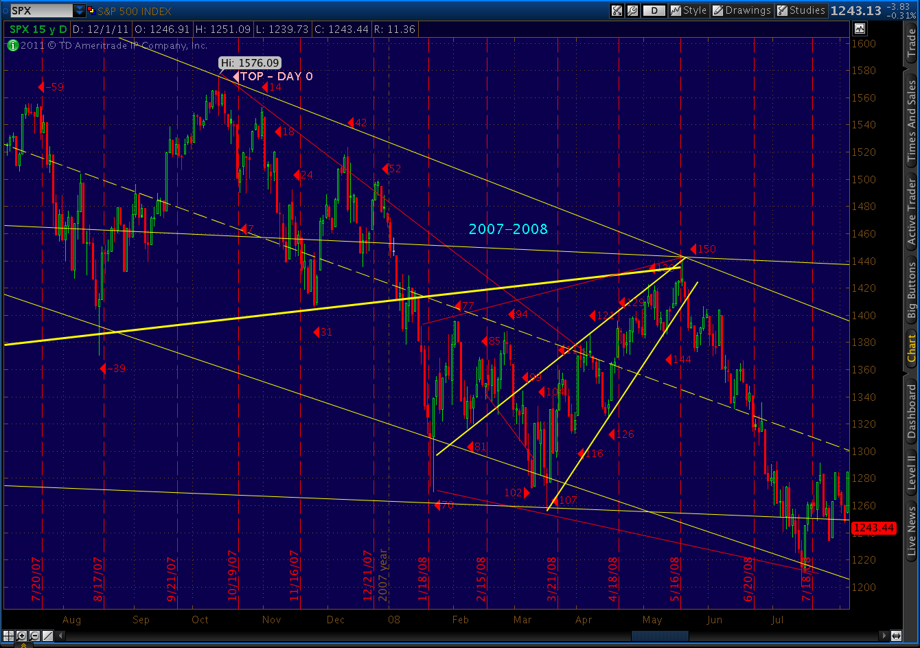
We know they’re important because lines of the same slope have played such an important role in the past. Consider the past three years:

As always, the primary channels become contra after a change in direction, and vice versa. Naturally, they aren’t the only channel lines that matter — far from it. But, they’re the ones that have most of the action since the March 09 lows.
There are many possibilities for how this plays out. For one thing, this move down says nothing about whether there’s another leg up past 1292 or not. Some Elliott Wavers are adamant that this is the B wave down in the C wave up of a larger A-B-C move from 1074 to 1307 or so — a corrective wave 2. Looking at the charts, there is a very good case to be made for 1307-1313. It’s my top alternate.
It’s also just as likely that this is the first wave down of an impulsive wave 3 down. If so, things will get real interesting real fast. Since we won’t know till we know, let’s look at some near-term possibilities.
Remember, we’re working on a large Gartley pattern (in purple, below.) Our Point D target is 1121. With that in mind, it makes sense to see how we might get there.
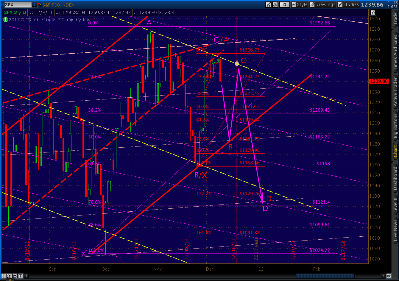
As can be seen above, 1121 is very close to the 1.272 extension of the 1158 to 1266 rise (1129 is the actual 1.272 fib). This would suggest a Butterfly pattern, which requires a .786 Point B — which would be 1181. [There’s no reason these patterns must be in sync, but I like to look for such intersections as they often portend a more likely outcome.]
The other reason I like this Butterfly pattern — and I’m speculating here –is that it would entail a Point C up around 1256-1258 (the white circle), which would mean we come within 10 points [see: Ten Lousy Points] of completing a rather large Inverse Head & Shoulders pattern. [see: Big Pictures]
We discussed this possibility over the past few days. It’s an analog to both the July 2011 and the December 2007 markets and would trap an enormous number of bulls. It would also crush the many bears who would go max short for the move down, only to see a rebound right around OPEX next Friday.
The same IHS fakeout possibility exists with other right shoulders, BTW, including any of the fib levels between 1181 and 1225. The key ingredient is a bounce back to just short of 1266.
If our December as July fractal holds, the move back to C at 1256 would correlate to July 21, meaning the next leg down could be massive. After July 21, the Gartley I had predicted sailed beyond the .786 Fib retracement level to the 2.618 extension (eventually to the 3.000 at 1074.)

Reaching even the 1.618 extension on the current Gartley would take us to the 3.00 on the Butterfly, both at 940ish. Of course, a move below 1085 or so completes a massive H&S; pattern that would target 785 on the downside. Remember what I said above about things getting interesting?
With all that out of my system, please understand this is a like a high stakes game of “If You Give a Mouse a Cookie.” Something benign leads to something else ominous that leads to other stuff that’s just plain ugly. But, there is absolutely no requirement that we dip all the way to 1182.
There are plenty of channel, fib and fan lines that could arrest us in the very near future. The most obvious coming up are 1225-1230 (channel and .382 fib) and 1209-1212 (.382 and .500 fib’s.)
As I speculated yesterday, we have established a downward-sloping channel (dashed, yellow) that would take us to any of the afore-mentioned targets. If, however, we place another trend line (purple, dashed) in just the right place, today’s move down looks a lot like a falling wedge.

A breakout here could go back up and test the upper limits of the channel, or further — finishing off a proper A-B-C corrective wave 2 and thrilling the EW crowd. As before, the key is 1292 (and, now, 1266.)
On the downside, the key is 1200. It’s not only the .618 of the proposed Butterfly, but also marks a critical contra-channel line that, if broken, would likely result in a massive sell-off. (It’s held twice before — 1074 and 1158 — but its days are numbered.)
Good luck to all.