
Month: September 2011

  • The News So Big… It Had to Wait

    UPDATE:  9:40 AM
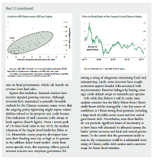
    And, now, the rest of the story.   From the IMF website itself, the long awaited September 2011 Global Financial Stability Report Chapter One comments on China.  Highlights from Box 1.5, shown in its entirety below:
    • projecting significant write-downs of public sector liabilities, which amount to 27% of GDP
    • total debt 173% of GDP
    • rapid growth in off-balance sheet and non-bank loans
    • 60%+ surge in property prices since YE 2006, yet many new projects unoccupied
    • authorities’ efforts to cool property speculation might induce sharp correction
    • real estate correction = more pressure on local govts, which rely heavily on land sale revenue
    • Chinese bank stocks have fallen from 2.8 X book value in late 2010 to 1.6 X
    • Property developers funding costs have shot up as high as 16% in offshore market
    • Growth in sovereign CDS and renminbi put options reflects growing investor concern
    These are not the qualities one usually seeks in a rescuer…
    As I’ve observed many times in these pages, the entire global financial recovery has been built on bailouts.  The Fed bails out banks and sovereigns; the ECB bails out Greece; China bails out the US and Euro zone.  Wash, rinse and spin until, finally, there’s no one left to do the bailing.   Perhaps China will inspire a new moniker:  “Too Big to Bail.”
    At some point, recoveries require growth and employment.  Underlying growth has been negligible, as families here and abroad have been left to their own devices to deal with devastating unemployment, plummeting property values, rising inflation and, now, cutbacks in social services.
    Reimbursing banks for losses from bad investment decisions has done little to improve the financial stability of everyday people.  Families in Greece, Ireland, Iceland, Portugal, Italy and Spain have learned they’re expendable, collateral damage in a war over collateral.
    Now, Americans are learning they’re next.  Bernanke’s trillions may have delayed the day of reckoning for bankers.  But, for the millions who’ve lost a home to foreclosure or a job to a Chinese day laborer; it’s here (and, cutting Medicare, Social Security, Veterans Benefits and unemployment compensation won’t help — at least not in the short run.)
    The boot on the necks of those afflicted is debt, plain and simple.  There’s way too much of it, and it often exceeds the value of the underlying collateral, not to mention the ability of the debtor to pay it off.   It’s true for American families, and it’s true for the country.
    source: CBO
    The U.S. takes in just over $2 trillion annually in taxes.  We spend around $3.5 trillion, including $200 billion in interest payments.  But, that’s with 10-year treasury’s at 2% and 90 day bills at 2 bps.  
    What happens if we go back to 1980’s conditions, with the 10-year at 10% and bills at 15%?  If debt remained at only $15 trillion, annual debt service would skyrocket to over $1 trillion, dwarfing expenditures on defense, medicare/medicaid and social security.  Even at 2000’s rates of around 6% for bills and notes, debt service would triple — rivaling every other category.  Which of those categories can we afford to replace with interest payments?
    Instead of dealing with our budget shortfalls we’ve turned to counties like China to finance them (with money Americans have paid for their cheap crap produced by an army of dollar-a-day laborers.)  Now, like the snake who’s discovered it is eating its own tail, we learn that the cycle might just be broken.  
    Instead of continuing to recycle those dollars back to us, China has squandered them on an American-style real estate and development binge.  We’re heading toward a cliff on a bus that’s losing its wheels.
    **************
    The full text of the China Section, Box 1.5:
    From the WSJ Blog:
     ORIGINAL POST:  11:15 PM
    I love end of the day live news feeds on Think or Swim.   That’s when all the Form F-4’s come across the wire, in the hopes that investors are already tucked in bed and won’t notice.  Being a left coast kind of guy, I notice.
    Are these insider sales (some quite large) indicative of a bull market?  I think not.
    I was just about to turn in when I noticed this puzzling “never mind.”  
     
    Does it mean the IMF isn’t worried about China’s economy?  That it is, but we shouldn’t care?  What the heck are they trying not to tell us?
    A quick Google search produced lots of hits, which then started disappearing from the screen as I watched.   You’ve got to have friends in high places to disappear Google hits in real time.
    The WSJ blog page produces the old “page not found.”

    Which, of course, just made me more curious.  All 6 of the remaining references to the article (which contained more than the title) simply linked back to the blog, but a few showed a snippet of the article that’s been withdrawn.

    So, what’s the big, bad secret?
    Which, under a microscope, reads:
    While the International Monetary Fund forecasts torrid 9.5% growth this year in China, the IMF is clearly getting a little more worried that China’s boom could turn to bust.  In the IMF’s Global Financial Stability Report, released on Wednesday morning [oops], economist Andre Meier assessed the risk of a banking crisis in China and is less than reassuring.  A huge expansion of credit in China since 2008 helped that country prosper despite the global financial crisis.  But that lending spree may produce “significant write downs” on debts by local governments, the IMF report says, citing private sector analysis.

    If you go to the IMF’s website and search for Global Financial Stability Report, you’re told that it was just updated.  However, when you try to look inside the report, only Chapters 2 and 3 are available.  They’re interesting reading, but don’t touch on the China matters discussed in the excerpt above.

    There’s a transcript and video of the press conference wherein the report is presented.  But, Chapter 1,  the one discussing China, isn’t presented.  Instead, there’s this cryptic note:

    Seems to me this news is kinda important, since the world is counting on China to ride to the rescue with its trillions in reserves.  If China’s problems are so big that the IMF has developed a cold sweat, that rescue might take a little while…
    It’ll be really interesting to see if the blog reappears in the morning when due to be released, or it’s been permanently disappeared like a Tien Min Square protestor. 
  • Last Call?

    Not much commentary needed, here.
    And, just for grins…
    Et tu, Apple?
    Come on in, the water’s fine.
  • A Tale of Two Tops – part Deux

    Way back on July 24, there was a lot of noise about NDX, and in particular AAPL, making new highs.  Some considered this a sure sign that the broader market would soon play catch-up and make new highs of its own.  In A Tale of Two Tops, I detailed why this wouldn’t happen.

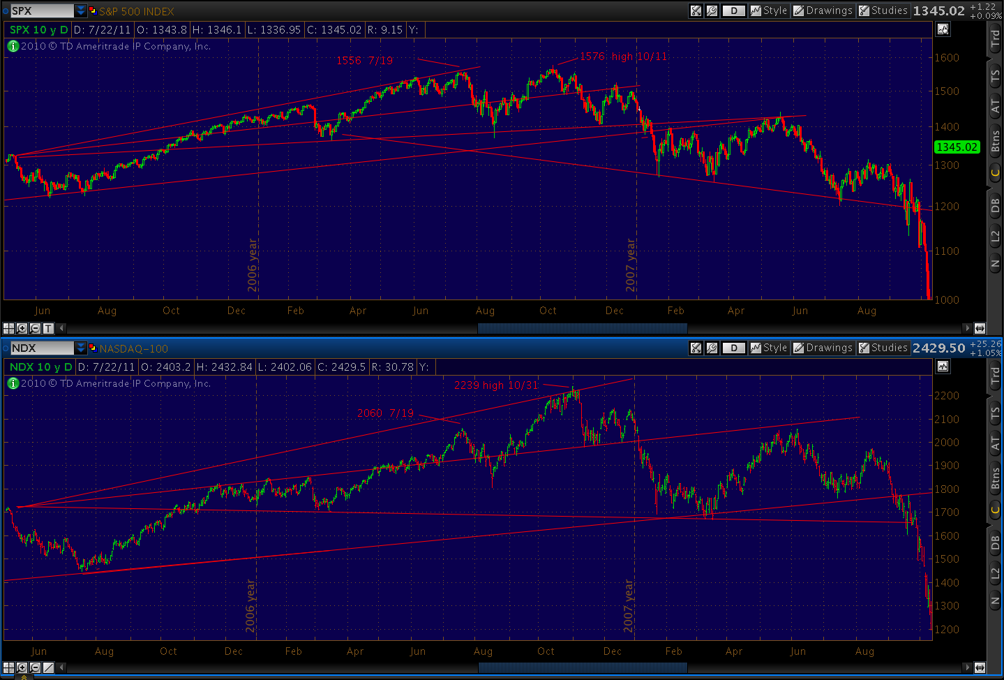
    A glance at the chart below tells the 2007 story.  NDX followed the same general pattern as SPX, but failed to spike as much in July.  Only in October did reluctant investors finally forget the past, bidding it up at a much faster clip than SPX.  Between its July and October peaks, for instance, SPX gained 20 points (1.2%).  In the same period, NDX gained 179 points (8.6%).

    When SPX reached its all-time high on October 11, it was tired.  Twenty points in 3 months is a lot of effort for little reward.  But NDX, playing catch up, still had plenty of momentum — gaining another 108 points before finally peaking two weeks later on October 31 after making three higher highs in a row.

    Many investors no doubt wondered, as NDX hit 2239 on Oct 31, whether SPX would join it in making a higher high.  It was only 27 points away from completing a massive Inverse Head & Shoulders pattern that might have sent it up 190 points.  Instead, SPX made its first lower high at 1553 (spitting distance from its first topping pattern high of 1556 on 7/19).  It would go on to make successive lower highs, eventually completing a traditional H&S; pattern and tumbling 58%.

    In retrospect, NDX’s peak — coming two weeks after SPX’s — was a great indicator of bearish capitulation.   Understandably reluctant investors, by finally turning euphoric, marked the top in a way that would make Prechter proud.  The divergence between NDX’s higher high and SPX’s lower high was a great warning sign.

    We then looked at the 2011 comparisons between NDX and SPX.   The divergence between three successive highs (NDX) and a potential H&S; (SPX) was striking.   It was one of several factors that convinced me that the top had been made two weeks prior [see: Merry Christmas and Pulling the Trigger] and that we’d already started down.

    Big deal.  We already had the 250-pt plunge on SPX and 400-pt annihilation of NDX.  Ancient history.  Isn’t it?  (Regular readers know that all such questions are rhetorical, serving only as dramatic props;  irregular readers are on their own.)

    I’ve blogged ad nauseum about the similarities between 2007 and 2011, as well as some very striking similarities between Feb-May 2011 and the past five weeks.

    So… here’s another little chart worth considering.

    TPTB would have us believe that Fed governors and Troiksters have things well in hand.   That in spite of impending defaults, trillions in debt, unending unemployment and plunging home prices, these will be the best of times for bulls.

    Take a quick look at this rising wedge, completing a possible Butterfly pattern at the 1.272 Fib level (also possibly a Crab, which would have potential to the 1.618 at 2364.) 

    If we back out a bit, it looks even better as a bearish Gartley that nailed its .786 Fib today.

    In my opinion, this new high by NDX, combined with the all-time high for AAPL and significant weakness/divergence with SPX, is yet another clear sign of bearish capitulation.   Spring of hope or Winter of despair?   Stay tuned.

  • Bats and Crabapples — September 19, 2011

    UPDATE:  3:50 PM

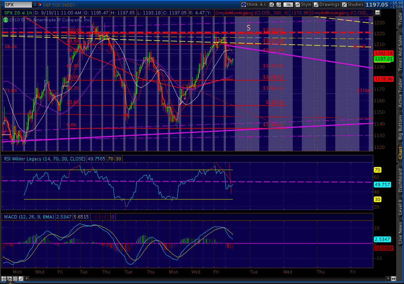
    SPX bouncing on the non-news of Greece, etc.  Should be limited to the .786 of Friday’s Bat pattern at around 1210.50.

    ORIGINAL POST:  2:45 PM

    Friday’s Bat patterns are playing out nicely, with SPX down to within .45 of its .618 Fib level before getting a good bounce at the 10-day moving average.

    A Bat pattern target is normally .618 of the DA retrace, meaning just below 1170.  The pattern .382 level at 1168.14 correlates nicely with the larger (since May 2 high) .236 Fib retrace at 1166.  I’m thinking it’s a reasonable level at which to rebound to the channel line one last time a la July 21.

    Don’t expect a straight line, though, as Fed mania and stick save Euro zone conference calls will provide plenty of upside impetus.  A good target for today’s rebound:  the .382 Fib level (from the May 2 high) at 1205.1.

    BTW, I normally don’t pay much attention to individual stocks, but a bellwether like AAPL is hard to ignore.  Recall it recently completed a Gartley pattern at 392.08.  Here’s the chart I posted on Aug 31.

    Along with the Gartley on SPX, a neckline backtest on COMP and SMA 200 on NDX, it helped convince me to call 1230 the interim high.

    We got a nice reversal almost immediately, retracing 26 points (.618) in the following three days.  Now, it’s back with a vengeance, hitting an all-time high of 411.82 just minutes ago.

    Of course, in the process, it completed another bearish Crab pattern.  Crabapples, if you will.

    It’s actually overshot the 1.618 ideal D point of 407.90.   So, the pattern could be busted.  Or, it could be it just got a little ahead of itself.

    But, looking at the long term picture, there’s a rising wedge that’s clearly coming to a head.  If so, AAPL could end up spoiling the whole barrel.

    More after the close.

    ADDENDUM:  3:30 PM

    Take a peek at the divergence on AAPL’s weekly chart.  Does the RSI have the juice to break through the TL?

  • Weekend Update: September 16, 2011

    UPDATE:  Sunday night

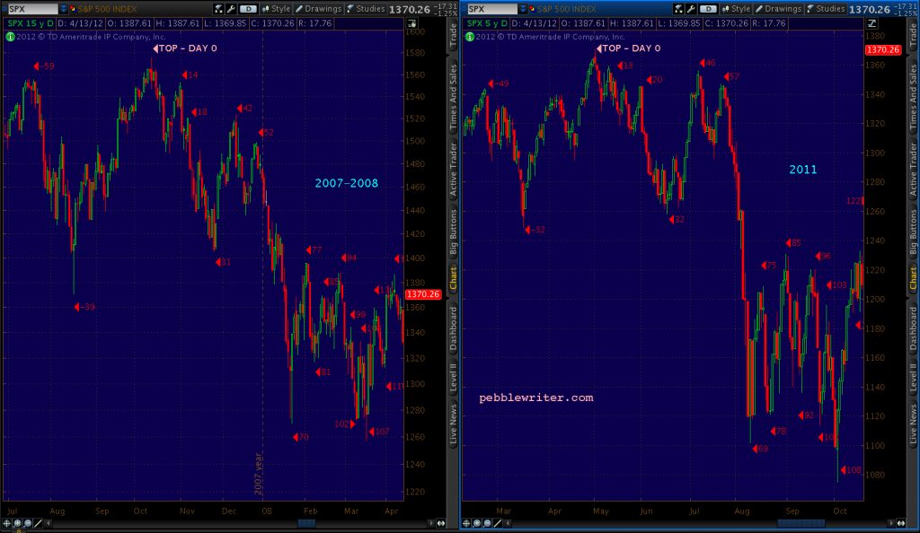
    A quick update on our 2011 v 2007/8 comparison chart:

    Here’s a close-up.  On Feb 27, 2008,SPX had climbed 120 points off the bottom (24 days) and was 8 points away from establishing a new higher high.  Instead, it fell 131 points over the next 13 trading days.

    As of this past Friday, we have climbed 120 points off the bottom (27 days) and are 10 points away from establishing a new higher high.   If this doesn’t mean anything to you, go back up and read the last paragraph again.

    A 130 point drop from here, BTW, would take us to 1090.  All we need is 1145, however, to complete the head and shoulders pattern discussed below with a 1040-1050 target.

    And my last chart for the weekend — the comparison between the past 5 weeks and the overall 2011 topping pattern.   Eerily similar.

    Some believe that Greece and EUR problems are baked into current prices, that we’ve seen the bottom.  I say the problems are just beginning to get much worse.   I think the only thing baked into prices is the belief that the Fed can wave its magic wand and bring back the bull.   I believe there will be a lot of disappointment in the weeks ahead.

    I think the huge rally engineered over the past 5 weeks was a do or die effort by market makers to salvage their books after massive losses sustained in the 250-point plunge.  They got through OPEX alive, and will position themselves better in the coming leg down. 

    ONE LAST COMPARISON…

    Sorry,  couldn’t resist this one.  Maybe it’s nothing, but the bearish Bat pattern we completed Friday reminded me of similar patterns I’d seen on dates I consider equivalent.  The pattern shapes vary, but they all end with a .886 Fib retracement.  You decide.

    Bat completed 9/16/2011    
       
    Bat completed Feb 26, 2008
    Bat completed July 21, 2011

    FRIDAY – EOD:

    Long, long week for us bears.  But, the day went well.  And, next week should be a lot more fun.

    As someone recently told me, you can’t make this stuff up (no matter how often I try.)   For instance, check out the 2 standard deviation regression channel from the Aug 9 low.

    The 2nd line from the top is the +1 std dev line.  It landed at 1220 today.  As in…the high of the day.  This would be easy to ignore if not for the fact that such a channel guided the Feb – Jul 2011 top.  A final touch at the +1 std dev line on July 7 marked the beginning of the end.

    If I’m right, and we get a strong reversal off this 1220 high that takes us back to 1145, we’ll complete a nice 100-point Head & Shoulders pattern that has potential to 1040-1050.
    Here’s a view of the big picture.  I like this chart, also, because it does a good job of showing the Big Red Line that’s being backtested right now (along with Trend Line X.)
    It made a couple of pretty important stops in Apr and Nov 2010.  Fan Line E (from Oct 2007 through the Apr 2010 high) might play an important role in the near future.  I’m drawn to the intersection of E and a horizontal TL marking May, Jun and Aug 2010 lows — wondering if this might be the terminus of the wave 5 unfolding (pure speculation.)
    But, notice what happens if we connect with the neckline (Fan Line 5) at 1145.  The H&S; completed over the past month becomes the right shoulder in a larger H&S; pattern that has potential to 860.
    But, why stop there?  If we first get a nice bounce at 1040, say a Intermediate Wave 2 of 100 points or more that backtests Fan Line 5, the trip down to 860 would complete an even bigger H&S; pattern (neckline = Trend Line at E) that targets 710.
    That’s a lot of “what if’s” and “once upon a time’s.”  Could it happen?  It certainly fits with my view of the world economy over the next few years.  Will it happen?  Stay tuned.
    ADDENDUM…
    Thanks to “Just Me” for bringing a very cool chart to my attention.  In the past 20 years, there hasn’t been a serious incursion through the SMA 500 that didn’t “take.”  In other words, no false signals.
    Someone would have done pretty darned well just buying and selling on the crossovers.   The current crossover doesn’t hold much hope of a return to 1370 anytime soon.
     
  • Intra-day: September 16, 2011

    UPDATE:  2:45 PM

    A quick look at the big picture.  Check out the Big Red Line.  Looks like a backtest, no?

    A closer look:

    UPDATE:  12:50 PM

    Very interesting Butterfly completing on Nasdaq 100 (NDX.)

    The 5 year daily chart shows it’s backtesting a three-year trendline. 

    UPDATE:  12:40 PM

    SPX just a couple bucks from an intra-day Gartley completing.  The .786 is just over 1216.

    UPDATE:  12:00 PM

    ORIGINAL POST:  10:15 AM

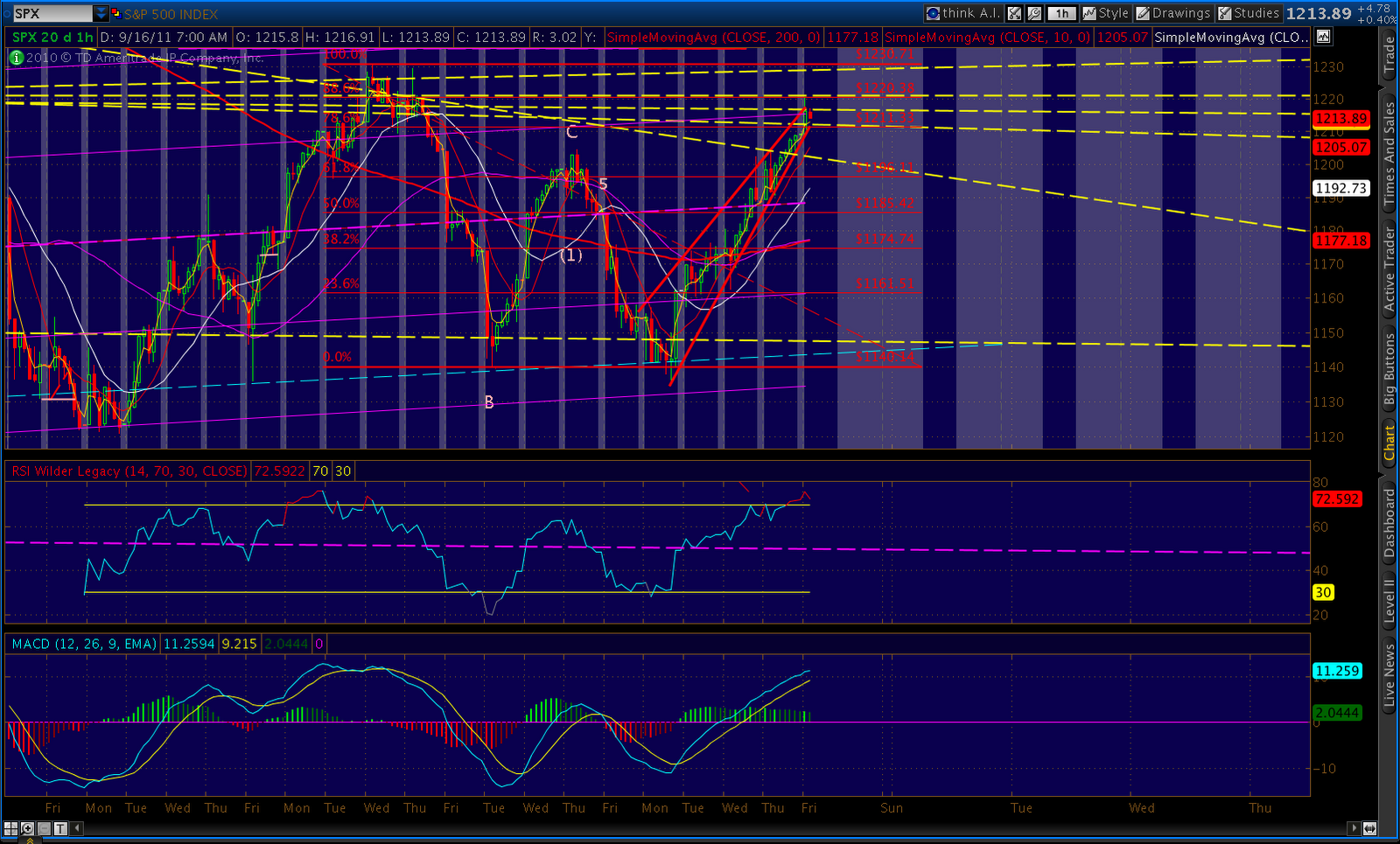
    SPX completed a Bat pattern at the .886 Fib level.  It’s not terribly well-formed, with point B being too high and C too low.  But, the .886 Fib retrace is right on the money.  It roughly corresponds to the +1 regression channel line (dates back to Aug 8) as well as Trend Line B that saved the bears’ bacon back on Aug 31 and Sep 1.

    This rally has gone 30 points past the highest level I thought it was capable of; so, I call this the top with a great deal of trepidation.  However, similar reversal patterns are setting up across the market.

     
  • Intra-day: September 15, 2011

    UPDATE:  EOD

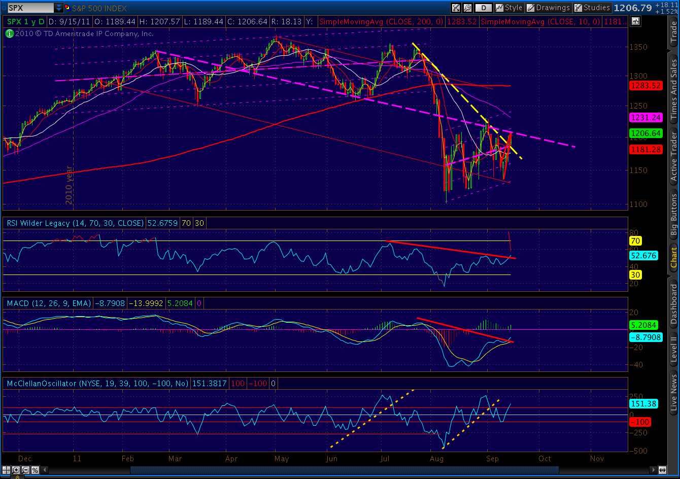
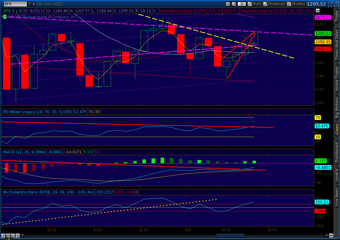
    I’ve redrawn the channel to include today’s market action.  The existing line (w/ shadows) would have accommodated yesterday’s rise, but not today’s.  Channels can and do shift all the time, but this one caught me off guard.

    I believe the MCO indicator I discussed last night is still in play. The indicator has risen above +100, which is typically a reversal signal.

    Also, a fan line that didn’t even earn a label the last time I drew these appears to have come to the bears’ rescue.  I’ll label it X for now.

    I’m distressed (and poorer) at having called the top a few days early.  This same thing happened at the end of the Feb – July topping pattern.  On Jun 24, when seemingly everyone was calling for a flash crash, I called for a rally from 1267 to 1330 within the next 5 trading days.  It happened in 4.  I happily took my short position, only to see the market rally another 40 points before peaking.

    In that case, too, the market rallied to the +1 regression channel line instead of the midline as I had been expecting (based on the 2007 analog.)  We are within a point or two of the midline right now.

    If you’ve read my stuff for very long, you know that I’m usually early.  I’m not sure why.  But, I’ll spend this weekend thinking about the comparisons between this miss and the one from July 7.

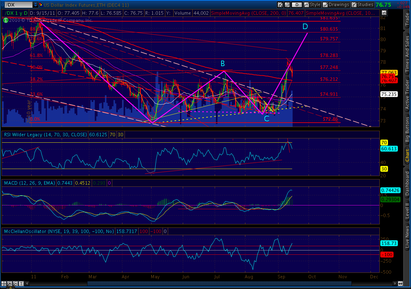
    Last, DX is only .17 from its 200-day moving average.  The .382 Fib level is only .19 below that.  I see absolutely no possibility that we won’t get a huge bounce off one of those important support levels.

    In closing, we are going down.  OPEX (actually, quad-witching) might delay things a day or two.  But it will be soon, and it will make your head spin.

    ORIGINAL POST:  2:20 PM

    Apparently, the channel I’ve been expecting to hold this advance wasn’t up to the task.  I’m nominating a different candidate (the purple dashed line instead of the yellow.)

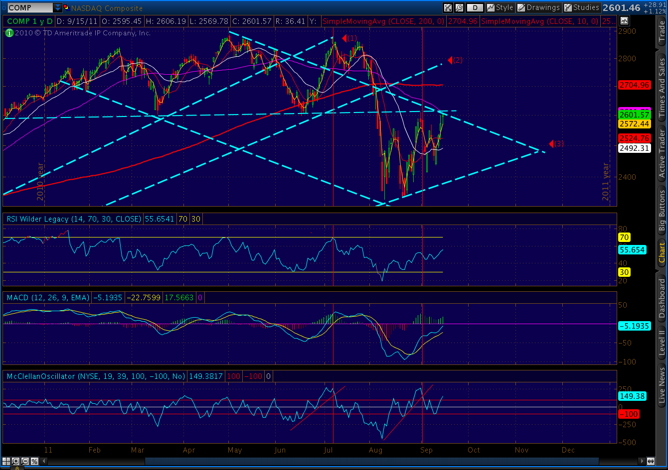
    Compare it to the lines I drew on last night’s post for COMP. 

    Here’s how it’s done so far today:

    We’ll discuss more later.  Right now, I’m analyzing this Euro mess.

  • The World’s Biggest Pawn Shop

    On a day when Marketwatch warns…

    …the Federal Reserve goes out of its way to increase US exposure to Europe’s debt crisis.
    The good news is they’ll be able to pay us back the money they owe us.   The bad news is, they need to borrow $500,000,000,000 from us in order to do it. 
    This puts the “pawn” in Ponzi.

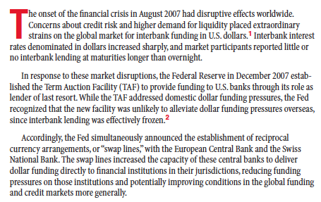
    We first started this back on December 12, 2007.  From the NY Fed’s research publication Current Issues in Economics and Finance, Apr 23, 2010:

    We took Euros and Swiss Francs and Japanese Yen and NZ Dollars that no one wanted and gave them US Dollars in exchange.  These central banks could loan these valuable greenbacks to their financial institutions who would (theoretically) lend them out to (theoretically) worthy borrowers — keeping liquidity alive and jumpstarting the economy.  It would also (theoretically) put a floor under the foreign currencies’ values and keep them viable in the global finance marketplace. 

    Back then, financing had dried up because several large banks, investment banks and a hedge fund in insurance company clothing (AIG) had failed or were in the process of failing.  They were failing because of a newly developed but widely circulated idea that loans ought to be backed by adequate collateral.  Those that weren’t probably weren’t worth all that much.

    Today, financing in the Euro zone has dried up because the Euro zone, itself, is in the process of failing.  Some foreign and Euro-based investors are convinced that making loans there is throwing good money after bad.  As I blogged a few days ago:

    Deposits by financial institutions in Germany off 12% since Jan ’10, 24% since Sep ’08.  France, oddly, not as bad at 6% and 14%.  Italy off 1% in retail dep’s (serious money’s already gone), 13% ($100B) by financial insitutions.  In other words, banks don’t trust each other.

    Fitch says US Money Market funds cut lending to Euro banks 20% in last 3 months (Germany-42%, French-18%, Spain and Italy 97%.)  At $1.5 Trillion, MMF’s are a vital source of funding. 

    The ECB can’t make up for all that, but it’s trying.  Italy – EUR 85B in three months; Greek and Ireland – EUR 100B each in August; Portugal – EUR 46B in July; Spain – EUR 52B in July.  Total lending so far = 7X Euro zone central banks’ combined capital.

    Total exposure in loans from other Euro countries to PIGS: $1.7 Trillion.  Lots more in guarantees and derivatives.  

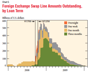
    Total swaps outstanding under the 2007 program peaked at $580 billion in December 2008.  At the time, this represented about 25% of the Fed’s total assets.  The program was officially terminated in February, 2010.  As the April 23 Fed article points out, market conditions had improved and financial strains had abated.

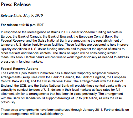
    Two weeks later, on May 9, the Fed announced…

    Apparently the system wasn’t quite ready to stop sucking the liquidity teat.  The ECB immediately drew down $5.5B, bumping that to $500B in both August and October 2010 and finally zeroing it out in March 2011.

    All was fine until last month, when the Swiss National Bank unexpectedly drew down $200B.  It was followed the next week (Aug 24) by the ECB and another $500B.

    Then, today’s news, and a 20-point SPX rally.  Is this really that great a development?  Let’s look at how both the dollar and the stock market performed following previous manipulations.

                                                                             SPX              DX

                           December 12, 2007                 1512              75.92
                           low/high next 3 days               1445              77.49
                           low/high next 35 days             1270              77.85

                            May 9, 2010                            1164              83.07
                            low/high next 3 day                1156              85.57
                            low/high next 30 days             1011              88.91

                            Aug 24, 2011                          1208              73.72
                            low/high next 3 day                1121              74.55
                            low/high next 35 days             1121              78.30
                                      (so far)

    Bottom line, each intervention did diddly squat for stock investors.  Today’s rally isn’t justified. 

    But, more importantly, we need to consider the more serious implications.  The Euro zone is obviously on life support.  The entire scheme is hanging by a thread, and we’ve been brought in to stitch it back together.  We, who just last month were in danger of defaulting on our own debt.

    The Fed’s balance sheet, only $885 billion in Dec 2007, has ballooned to nearly $3 trillion.  And, every time we bail out another entity, whether it be Bank of America, General Motors or the ECB, we minimize the effect markets have on lending and borrowing and saving.  We impose a rationale which, in the long run, not only delays the inevitable but exponentially raises the stakes.

    And, what happens when one of these sterling borrowers goes under?  The Fed article goes to great lengths to explain that we’re not taking crappy foreign loans as collateral.  No, we’re simply taking the currency backed by lenders who make the crappy foreign loans — loans that no lender in his right mind would make.  So much better, no?

    *****************

    The Fed Reserve article (published when the Fed thought the worst was behind us) details what happened the last time we did this. 

  • My Absolutely, Positively Favorite New Old Indicator (if it works again)

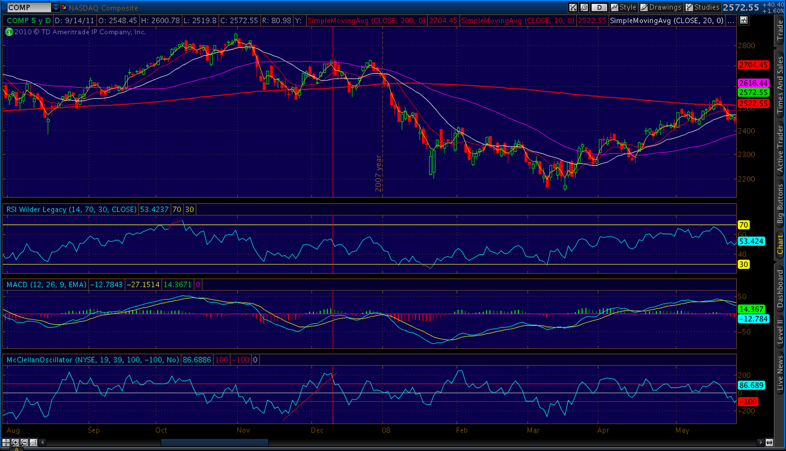
    The McClellan Oscillator has been around for a while.  As Stockcharts.com says, it puts momentum in the AD line.  I first noticed a particular pattern while looking at the 2007 comparisons to 2011 in SPX.

    In short, when the indicator bounces sharply higher after a distinct low, draw a trend line that connects the low to the subsequent dips.  When it breaks that trend line, there’s a pretty good chance we’re putting in a high.

    It works best when the starting point is relatively low, say -200, the number of touches is 3 or more,  the shape of the indicator is very convex relative to the trend line, and the indicator makes it to +200 or so.

    When each of these conditions is met, I’ve yet to see an instance where it didn’t result in a pretty healthy drop.

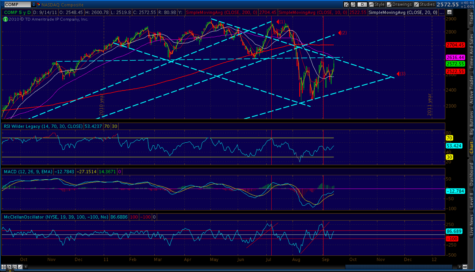
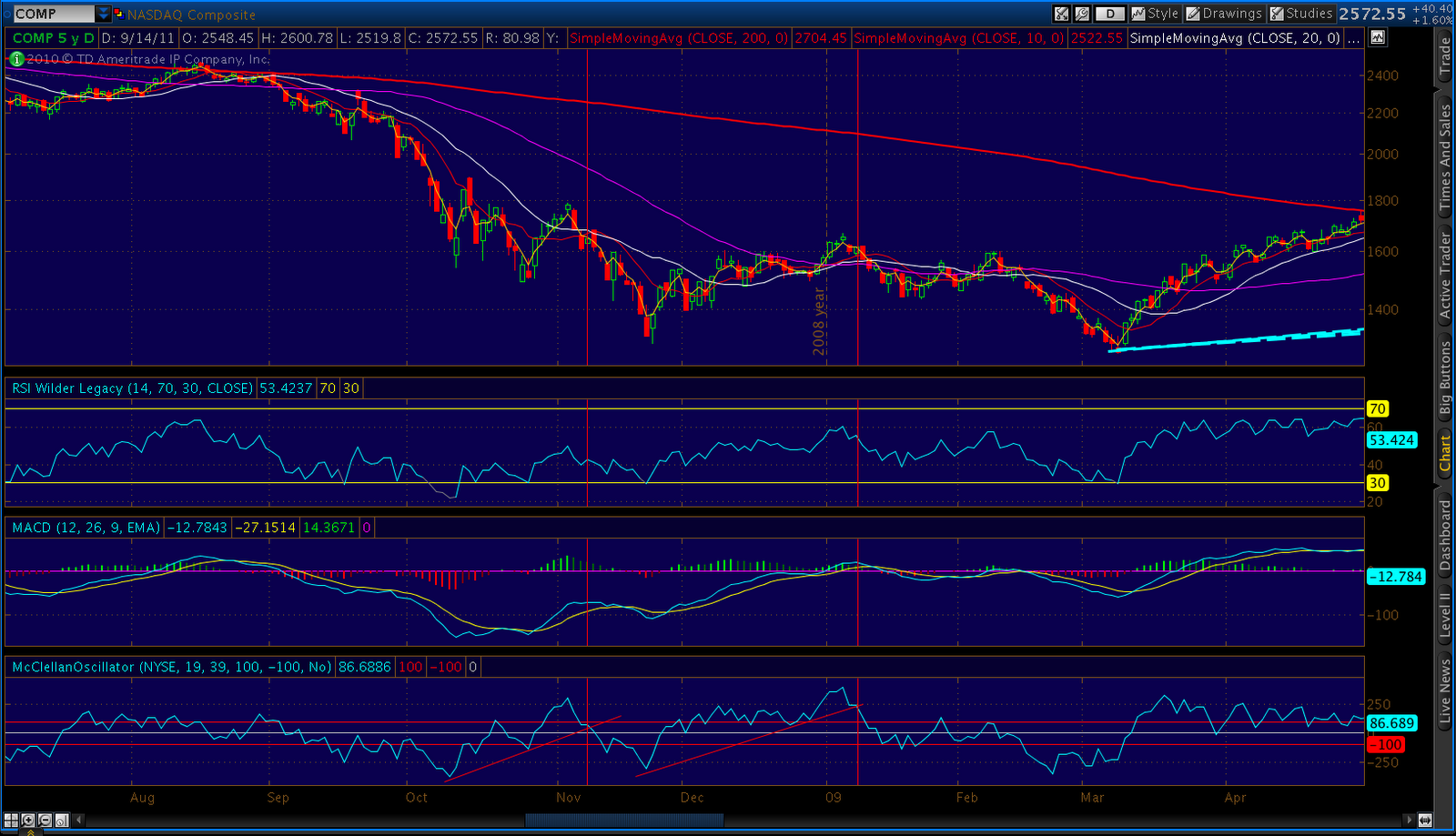
    Here are a few examples from the past five years using COMP.

    Dec 07
    Nov & Dec 09
    Jun 10

    And, the latest examples…  Note the most recent case corresponds to the Aug 31 interim high.  The previous one belongs to the Jul 8 high, which I view as the beginning of the end of the latest bull market.

    In both cases, the market high was quickly followed by another slightly lower high that registers as a (post-trend line break) lower peak on the MCO indicator.  It typically comes in at around 100.
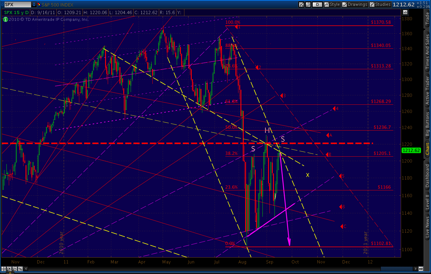
    Jul and Sep 2011

    In many previous cases, it’s this second, lower high which marks the start of the most dramatic phase of the downturn.  It was certainly true in 2007 and in Jul 2011.

    I’ve thrown a few other goodies in that last chart.  I’ve drawn in another way of looking at the downward sloping channel.  Beginning with the pattern high, it intersects with a horizontal support line which also happens to be the broken neckline for the gigantic head & shoulders pattern that just played out.

    Here’s the view from 20,000 feet.  Note that the three upward sloping TL’s are actually fan lines originating at the Mar 09 lows.  The old adage with fan lines is “three strikes and you’re out” which means, the next drop below a fan line will be the most memorable.

    Fan Lines

    So, where does SPX stand with all this?

    Should be a memorable next few days.