Posts

  • Charts I’m Watching: Jan 21, 2014

    Battling computer issues this morning…  Fortunately, the markets are cooperating (after the usual holiday weekend ramp job.)  EURUSD continues to weaken as expected…

    …as does USDJPY.

    Once the white acceleration channel fails, things will start happening pretty quickly. 

    continued for members(more…)

  • Currencies: Jan 16, 2014

    USDJPY reached our target range and is reversing.  This is the key, today.

    The rising white channel is clearly bigger than the falling purple channel, and as such could be expected to hold.  But, remember, it’s positively puny in comparison to the larger channels now in control of the big picture.

    If they can’t arrest the slide at the potential H&S neckline, the next downside targets are the white 1.618 at 100.68 and purple .786 at 98.46.

    We’ve been watching the USDJPY as it has been very highly correlated with US equities.   In the not too distant past, the key was the EURUSD.  For the past 9 months or so, the correlation has been pretty strong.

    If we examine the 10-yr EURUSD chart, we can see that it’s been locked in a falling channel since the 2008 highs.  Interestingly, it has returned to the top of that channel — where past reversals have not been kind to US equities.

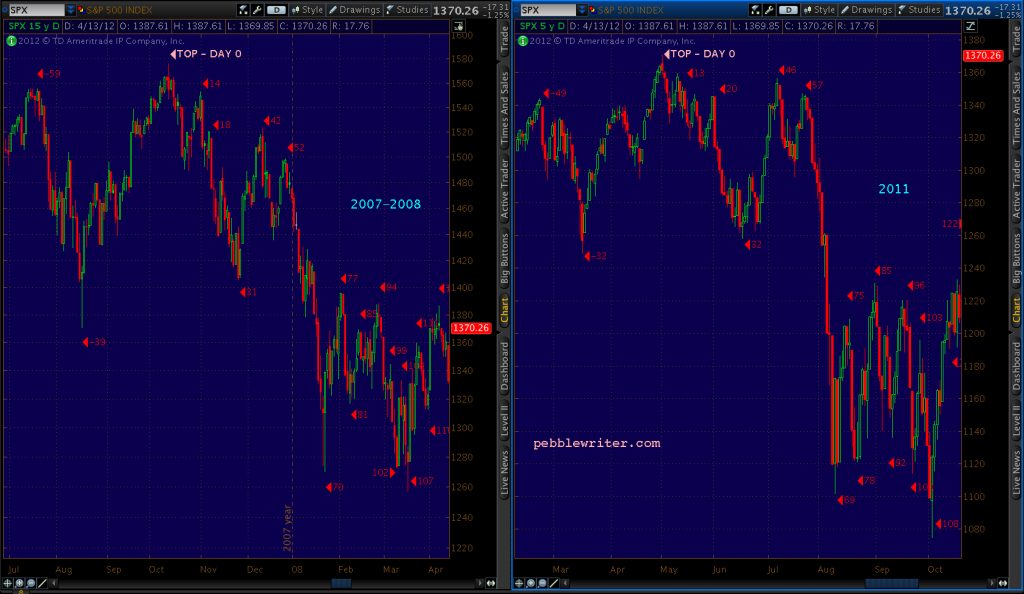
    The last two channel-top tags were accompanied by significant SPX drops of 53% (from Apr 2008) and 22% (May 2011.)

    The future of the euro is anything but certain, but my interpretation of the charts is that the rising red channel is the most dominant.  I’ve highlighted the .618 channel line, which EURUSD is currently backtesting.

    The backtest was touched off by a third bounce off the neckline of a completed H&S Pattern (in yellow.) Had the bounce not occurred, I suspect the pair would have tested the white .618 Fib at the bottom of the falling white channel in Aug 2012, backtested the neckline, and proceeded to the bottom of the red channel at the .786 Fib (still a good possibility.)

    The H&S Pattern didn’t pay off (yet) because the pair strengthened when the Fed maintained and even discussed increasing the pace of QE in mid-2012.  The pair bounced, even managed to gain a toe hold on the recently lost yellow channel bottom — which it has since again lost.

    To summarize: EURUSD has reversed off the top of the falling white channel, fallen below and is backtesting the red .618 channel line, fallen below and is backtesting the yellow channel bottom, and has reached the white .618 Fib line.

    Another, simpler way of looking at it is in the context of the neckline — which makes for a terrific channel midline as seen below:

    Note that yellow channel also does an excellent job of capturing SPX’s moves over the years.  The area to the lower right — SPX below 1000 and EURUSD below 1.20 — is interesting to me.  It represents, I suppose, the downside case.

    That is, if the market should fall apart in the next few years and retreat to the falling purple trend line at, for sake of argument, 550 in mid-2016, would it surprise anyone if EURUSD also fell below 1.00.  Surely, such a market meltdown would be accompanied by tough times on the continent, and the USD would likely revert to safe-haven status.

    If the EURUSD and USDJPY are both poised to drop — and, it’s by no means a foregone conclusion — it implies that the dollar is strengthening against the euro, but the yen is strengthening against the dollar.

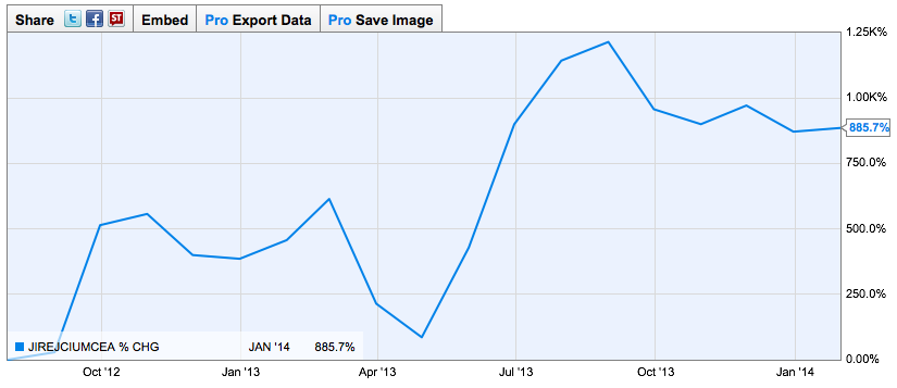
    This implies to me that the catalyst might come from Asia.  There’s little question that QE has done a marvelous job of inflating bubbles across Southest Asia:  Singapore, Thailand, Indonesia, Malaysia, Philippines.  Their stock markets are up 3-5X, and their currencies have all soared versus the yen — especially since Abenomics kicked in.

    The Singapore dollar is up over 40% since its lows.

    Ditto the Thai baht.

    Collectively, Singapore, Thailand, Indonesia, Malaysia and the Philippines represent about $755 billion in currency reserves — about 60% of Japan’s $1.3 trillion.  Throw in Hong Kong’s $309 billion and Korea’s $345 billion, and the total exceeds the yen’s $1.3 trillion.

    Money supply tells a similar story.  The five “smaller” countries total about $1.8 trillion; adding HK and Korea brings the total to $5.3 trillion — about half of Japan’s total.  And, the growth has been completely lopsided, with a significant concentration in the smaller, faster-growing countries and little growth in Japan.

    The reality is that much of the money invested in the fast movers comes from Japan.  Naturally, when markets roil, money would return there — boosting the yen and throwing the others in a 1997-like plunge.

    So, what happens when both the EURUSD and the USDJPY decline in unison?  Since they began moving roughly in tandem in 2006, it hasn’t worked out well for US stocks.  SPX declines have ranged from 11 to 49%.

    Stay tuned.

  • Charts I’m Watching: Jan 15, 2014

    We’re nearing another Bat Pattern completion (on the red grid) that also retraces .786 of the drop from Dec 31.  A rally to the white .886 (1842.28) would mean repeating the Jan 10 high.

    For those wondering whether it can turn without the cooperation of the USDJPY, not to worry.  The pair is running into its own “issues” with 104.80 (if not sooner) looking like serious resistance.

    And, remember this chart from on Dec 31 [see: “The Top?”]  That nice white channel above recently took USDJPY to 105.43 and the trend line at which — if the past is any guide — we can expect a correction ranging from 22% to 57%.

    The big question is whether all that technical logic can overpower the biggest POMO of the month ($4-5 billion), the latest feel good Empire State Survey from the Fed (it’s a survey, does it really need seasonal adjustment?), and an earnings report from BofA that proves they know how to release just enough reserves to top the Street’s expectations — but haven’t quite figured out how to make money in banking.

    SPX seems to be mulling it over.

    UPDATE:  12:00 PM

    SPX just topped its previous high, while ES came within 0.75 and reversed (so far.)

    If it seems we’ve seen this movie before, think back to a few weeks ago.  On Nov 29 ES hit 1805.75 and dropped 34.5 points over the next 4 sessions.  When it rebounded, it ran up to complete a Bat Pattern on Sunday afternoon, Dec 8th.  It seemed like a good short opportunity.

    But, on Monday, ES edged higher, stopping out many who shorted the Bat Pattern completion the day before.  Surprisingly, it only reached 1805 — never topping the original Point X at 1805.75.   So…short opportunity #2 at 1805, right?  Not so fast.

    At 3AM, ES reached 1805.25, stopping out those positioned for another leg down.  Naturally, the market gapped down and ES plunged 50 points over the remainder of the week (reversing 32 points between 10pm on a Sunday night and 6am Monday morning, of course.)

    This sequence of late night reversals, blatant stop running, etc. is emblematic of the market of late.  But, what was the point — besides the usual market makers fleecing investors theme?  It was all about timing.

    When SPX reversed on Nov 29, it began to trace out a nice little Butterfly Pattern that, along with an Inverted H&S Pattern and two channels pointed right at the 1823 high — the Big Butterfly that had been predicted by the drop from 1576 in 2007 to 666 in 2009.

    The only problem was, the pattern would complete when the market opened on Monday morning, and it was only December 9.  If the market turned down before the end of the year, then 2013 gains would be lower.  Headlines would be less impressive.  Bonuses would be lower.

    To make matters worse, the Fed was talking about tapering QE — the engine in the Little Market That Could.  There was an announcement coming up on Dec 18.  Talking about pouring kerosine on the fire…

    The Butterfly Completion had to be postponed.  On the morning of Dec 11, before the market opened, the futures started selling off on no news.  Congress had agreed on a budget deal late the night before, so the market should have been through the roof.  That’s not me talking, but permabull Cramer, who was incredulous:

    By the end of the day, the narrative had spun around to the notion that the budget deal had removed an important impediment to the Fed tapering — the old “good news is bad news” bit.  From CNBC’s daily wrap-up:

    The narrative had traction.  For the next week, the market continued selling off in anticipation of the Fed’s taper — which was broadly expected to be the bull market’s undoing. Naturally, when the Fed finally announced the taper on Dec 18, the market plunged — for all of 2 minutes.

    Apparently, in that two minutes, investors did some serious soul searching and embraced the idea that if the Fed felt good enough about the economy to scale back on QE, then gosh-darn it, they should too!  They bought the dip, then bought it some more.  They bent the dip over the nearest chair and bought it over and over again ’till it begged for mercy.

    By the time all was said and done, the market was up 43 points, closing at the highs of the day.  Off the lows, it was the single largest daily gain in all of 2013 and nearly made the top 25 daily gains of all time.  That’s some serious soul searching.

    Needless to say, the bears were demoralized.  Even those of us who fully expected the dip to be bought were demoralized.  Noting it was a POMO day, I wrote earlier that morning:

    There’s little argument that today’s decision will impact the markets.  My expectation?  Whether they taper or not, TPTB are standing by with buckets of cash to buy any dips that appear.

    If they hadn’t bought the dip?   SPX 1700ish — a modest 4-5% decline to 1680-1710, for starters.  Given the normally reliable completed H&S Pattern, well-formed harmonic patterns and channel lines, it would have made perfect sense.

    After that, who knows?  TPTB didn’t even trust the market to bounce back from a 5% decline.

    So, we’ll have to wait to find out what happens when it does — if ever.

    Yes,the market will always go up…until it doesn’t.  It should go without saying that the higher it rises on the basis of QE, share buybacks, fuzzy accounting and outright manipulation, the further it will fall when it finally comes undone.

    I don’t know what the catalyst will be.  For now, it seems everything is stacked in favor of the bulls.  Sentiment is as bullish as ever — and, why not, with only 4 sessions with 1.25% or greater declines in the past six months.

    Rating agencies know that any future downgrades will be punished severely.  Banks trade the markets (they certainly don’t lend anymore) with free trillions courtesy of the Fed, while $1.5 quadrillion in largely unregulated derivatives hangs over their heads while regulators look the other way.

    China seems intent on joining the ranks of the US, Portugal, Spain and Greece with more debt than it can ever reasonably hope to service.  The Baltic Dry Index is acting like it’s 2008.  And, the world’s biggest currencies are engaged in a race to the bottom.

    The unemployed are being defined out of existence, while the newly homeless compete with one another to rent their former houses from landlords whose affiliates foreclosed on them.  Disposable income per capita is sagging, savings is plummeting, and interest rates are on the rise — but, still the market climbs, driven by equally huge stores of liquidity and hubris.

    I can live with the embarrassment of jumping at shadows, missing a few percentage points of upside here and there in order to protect myself and my partners from the decline that’s coming.  Better embarrassed than broke.  What I can’t live with is lying blissfully in the long-only sun, trusting in the Fed, the banks, and the politicians to warm and protect me.  They’re the same ones who were in charge in 1987, 1998, 2000, 2007 and 2011.


  • Charts I’m Watching: Jan 14, 2014

    Yesterday’s market action was remarkable: an actual decline of greater than 1%!   I had almost forgotten what they looked like…

    USDJPY reached the bottom of the tight rising channel, so was due for a bounce — which the futures were only too happy to emulate.

    But, it leaves ES backtesting both the rising purple channel line and the falling red channel line at the white .786 — in other words, decent resistance.

    The question, then, is whether or not the tight, white channel in USDJPY will hold.

    Stay tuned.

  • If the Sky Should Fall…

    After roughly $1,000,000,000,000 in QE in 2013, the US added a total of 2,186,000 jobs — if you believe the BLS numbers (surely, none of our readers do.)  By my calculations, that comes to roughly $457,000 per job.  Just think of the difference a $1 trillion investment might have made in infrastructure, medical research or alternative energy.

    Sure, the unemployment rate is down to 6.7%.  But, that’s only because the labor force participation rate is down to 62.8% — the lowest in 35 years (the Great Depression’s 50% rate doesn’t seem all that far off.)  I heard one commentator explain the participation rate as the percentage of people still looking for jobs.  That’s nonsense.

    Many years ago, the government stopped counting folks whose unemployment benefits had run out.  Adding the long-term and short-term discouraged workers back in, the historically comparable unemployment rate is approaching 25%.   From economist John Williams’ excellent ShadowStats.com:

    So, if quantitative easing hasn’t boosted employment, what was the point?  Without a doubt, QE has been effective — at inflating asset prices.  From stocks to modern art, farmland to Ferrari’s, investment assets have benefited hugely from the huge influx of cash. But, no one has benefited as greatly as have the banks.

    Remember when all the big banks went belly up in 2008?  The reason you don’t is because the Fed has been throwing money at them hand over fist for the past six years.  Most folks know all about the $700 billion from TARP.

    But, it wasn’t until November 2011, when Bloomberg won a Freedom of Information Act ruling giving them access to information so secret that even some Fed governors were in the dark, that we learned about the other $7.77 trillion in Fed below-market rate loans (read more HERE.)

    Then, there’s the permission to carry worthless securities on their books at cost, dump said securities on the Fed, write their own rules in the foreclosure debacle, the Madoff debacle, the MF Global debacle, etc., etc., etc.  As philosopher George Carlin put it in his own colorful style, you’d think “they own this f&#$ing place.”

    Unfortunately, they do — and, at a surprisingly low cost.  According to OpenSecrets.org, 2013’s bank lobbying totaled $73 million — a little more than half the amount JPMorgan Chase spent to update its private jet fleet the year it took $25 billion in TARP money.

    Perhaps that’s why — six years after the financial crisis began — banks have not been required to deal with the derivatives crisis that threatens to bring the entire financial system crashing down.  That probably sounds overly dramatic.  It’s not.

    Recall that a derivatives contract is an agreement between a financial institution, such as a bank or insurance company, and an entity that wishes to protect itself from a financial risk (e.g., a corporate borrower concerned about rising interest rates, an exporter worried about fluctuations in currencies, an investor concerned about creditworthiness of bonds it buys.)

    The total size of the global derivatives market is estimated at somewhere around $1.5 quadrillion.  Yes, quadrillion — as in “a quadrillion here, a quadrillion there… pretty soon you’re talking real money.”  You don’t see “quadrillion” very often, so I’ll write it out:

    $1,500,000,000,000,000

    It works out to about $214,000 per every man, woman and child on earth. It’s also equal to over twenty times the combined gross domestic product of every country on earth.  If you counted out $100 bills, one each second of every single day, you would reach $1.5 quadrillion in the year 477,659.

    The banks will tell you it’s no big deal, because these are notional amounts.  They contend the true exposure is much lower after netting — essentially, everyone subtracting out what they’re owed from what they owe.  For instance, if I owe you $20 and you owe me $15, we just simplify things and say I owe you a net $5.

    It gets complicated, of course, if you and I both have agreements with lots of other folks.  Obviously, I might have trouble paying you what I owe if I can’t collect from those who owe me money.

    It gets even more complicated when everyone slices up these agreements into little pieces and sells them to scores of investors or pledges them as collateral.

    And, that’s exactly what happened.   In fact, by agreeing to protect everyone from higher interest rates, currency volatility, credit risk, etc. (for a reasonable fee, of course) the biggest banks, brokerage firms and insurance companies did quite well for themselves.  AIG, for example, made a mint by guaranteeing hundreds of billions in credit default swaps.

    But, as we learned from the AIG debacle (no shortage of debacles, are there?), a guarantor can screw up.  It can model the risk poorly, enter too many agreements, misprice its services.  AIG bit off more than it could chew.

    $58 billion of its $441 billion in credit default swaps were on structured securities backed by sub-prime debt.  When the world suddenly realized that most of the sub-prime mortgages underwritten rubber-stamped by the banks weren’t worth all that much, AIG was left holding the bag.  Wait, that’s not quite right.

    The folks who had netting agreements with AIG were left holding the bag.  Fortunately for them, the Federal Reserve came to the rescue and ponied up $85 billion — not for the benefit of AIG, but for all those counterparties with netting agreements.  In other words, they prevented the sky from falling.  But, did they?

    Ah, yes, the $1.5 quadrillion…  The seven largest US banks alone report an aggregate $235 trillion in derivatives exposure — 15 times 2012 US GDP.  This compares to a paltry $571 billion in Tier 1 Capital.   In other words, reported derivatives exposure is 413 times Tier 1 Capital.

    To look at it as would a lender, a mere 0.24% decline in the value of the assets (the $235 trillion in derivatives contracts) would wipe out all Tier 1 Capital.  That’s the equivalent of $2,400 equity for a $1,000,000 loan.  For Goldman Sachs, the multiple is an astounding 2,404 for a wipeout ratio of 0.04% — $416 equity on that $1,000,000 loan.

    Remember, this is reported derivatives exposure.  The vast majority of the contracts are over-the-counter.  No exchange exists to provide a fair market value, which is left open to the interpretation of the banks doing the reporting. It’s the banking industry’s version of grading your own open-book final exam.

    Given the events of 2007-2009, one might think the regulators would be working feverishly to rein in systemic derivatives exposure.  Yet, Sunday, we were again reminded just who is in charge of setting the rules.

    A key Basel III rule that would have required disclosure of gross (notional) derivatives exposure has been watered down to allow net exposure reporting.  By the time the rules are actually implemented in 2018 (if then), don’t be surprised if they are watered down still more.

    What might trigger the collapse of the $1.5 quadrillion house of cards?  My best guess is Thailand and another Asian financial crisis.  The political turmoil surrounding the Yingluck Shinawatra government has been spilling over into the markets.  The Baht, already under pressure, is threatening a repeat of its 1997 unwinding.

    But, it could just as easily be the eurozone.  The markets were obviously unimpressed with Draghi’s latest assertion that the ECB is ready for “decisive action” with “ample resources” and ” all available tools.”  These promises are sounding more and more like empty threats as sovereign debt levels continue to climb amid deteriorating employment and trade.

    Or, how about the good ol’ US of A?  How many more jobs reports like Friday’s might it take for investors to realize that the stock market rally is all about abnormally low interest rates, accounting sleight of hand, share buybacks and excessive liquidity rather than strengthening fundamentals?  Does anyone really believe tapering won’t matter?

    Regardless of the triggering event, the hell it might unleash — should things get out of hand — could make the 2007-2009 financial crisis look minor by comparison.   If the Fed and the Treasury Department can’t stop the sky from falling next time, there might be no banks left to bail out.

    *  *  *  *  *

    Out of necessity, this article merely scratches the surface of the incestuous relationship between the Fed, the Treasury Department, Congress and Wall Street.  For more, I highly recommend Matt Taibbi’s Jan 2013 article in Rolling Stone:  Secrets and Lies of the Bailout.

  • Charts I’m Watching: Jan 13, 2014

    Keeping an eye on the Thai baht, the yen and the euro this morning now that the ES has completed its Bat Pattern and likely its 2d wave.

    The USDTHB has broken out…

    …while the THBJPY is breaking down.

    The yen, strengthening as fear of unrest in Thailand spreads to the markets, seems to be making the move we anticipated — the one that signals a significant equities correction.

    One interesting chart that demonstrates the enormous lengths to which market makers are going to frustrate and fleece those seeking to follow the new trend I believe began after the market topped out on Jan 2:


    Of the 7 trading days since the Jan 2 plunge, five were a “gap and crap” while one was a “plunge and lunge.”  The latest, #7, has yet to show its stripes — but our prognosis remains bearish.

    continued for members(more…)

  • Charts I’m Watching: Jan 9, 2014

    Nothing new here, just a typical late night ramp job on no news to complete a Gartley Pattern at the .786, though there’s room for a romp to the .886 at 1847.51 if the MOTU so desire.

    Chase it if you dare, but there’s much more downside risk at this point.  Though there’s an obvious Inverted Head & Shoulders Pattern brewing, this is likely just the deeper retrace we’ve been expecting — a second wave that prepares the way for something rather unpleasant.

    If it comes back to close the gap at (1837.95) it might be worth a short-term play.  But, as always, watch your stops carefully.

    UPDATE:  10:50 AM

    Gap close and then some.  SPX just completed a .886 retrace and test of the rising red channel bottom — definitely worth a shot at these levels.  Stops even more important…

    The next level of support is 1827.90, the .786 retrace of 1823 to 1843 and the falling white midline.

    UPDATE:  1:00 PM

    PPT kicked in 1830 and SPX got the easy bounce back to 1837.  It’s all heavy lifting from here.  Ditto for ES, which looks like it’s running out of steam.

    USDJPY is threatening another leg down…  I’ll be shocked if it doesn’t at least test the white or red midline here.  And, just think, this is with the dollar’s strength courtesy of the euro.

  • Charts I’m Watching: Jan 8, 2013

    The market is having a hard time deciding whether the better than expected ADP report is good news (economy strengthening) or bad news (more tapering.)

    The chart shows a falling channel (white) since our top call on Dec 31, and a backtest for the past two days of the broken red channel.

    At some point, we’ll probably get a deeper retracement than .618 seen yesterday morning. If it happens today, it’ll no doubt be driven by a positive reaction to the FOMC minutes due out at 2pm EST.

    But, the move would look a heck of a lot better with a deeper retrace on the white grid first (.500-.886.)  The .786/1.618 combo at the white midline looks like the best fit all around.

  • XLF Update: Jan 7, 2014

    While most of the major indices have retraced 127.2% of their drops from the 2007 highs, XLF has finally reached the 50% mark.  In dollar terms, it’s back to 22.01 after plunging from 38.15 to 5.88 (an 85% bloodbath, for those who’ve forgotten.)

    From a harmonic standpoint, the .500 is an average turning point — not as effective as the .618, but better than the .707.  A substantial downturn from here might suggest an eventual Bat Pattern (the yellow .886 at 34.47.)

    But, the top of the rising white channel is already at 34.47 and XLF ain’t there.  So, it’s safe to say that 34.47 isn’t right around the corner.  The steeper, tighter purple channel doesn’t reach the .886 until the end of 2014.

    It’s more likely we’ll get a downturn either here or at the .618 at 25.82.  The top of the purple channel is already there.  But, the white midline — which has signaled reversals in Mar 2012 as well as May and Jul 2013 — doesn’t reach it until May or Jun 2014.

    The close-up supports the notion of a reversal here at the .500, also the scene of a rising wedge and Crab Pattern completion.

    Downturns always come easier with catalysts.  It remains to be seen how banks, the principal beneficiaries and raison d’être of QE, will perform in the face of Fed tapering and renewed instability in Europe and Asia.

    Stay tuned.