Some time ago, I noticed that CL’s (WTI light sweet crude oil futures) three important tops since 2008 were almost the same number of days apart. This cycle certainly caught my eye. After tugging on that thread, I found a similar situation regarding CL’s lows. The 2001-2009 cycle was only 31 days longer than the 2009-2016 cycle — a 1.2% difference.
 This is exciting stuff for many reasons. In addition to supporting the fact that markets often move in cycles, it offers some very strong suggestions regarding financial markets over the next few years.
 I gave up on the Efficient Market Hypothesis about the time that central banks and other wealth-effect proponents began directly and indirectly propping up stock and bond prices in the wake of the Great Financial Crisis.
The first few rounds of QE were effective — but expensive and difficult to fine tune. There had to be a better way than throwing trillions of dollars into stocks and bonds.
 Since fundamental discretionary traders account for only 10% of trading volume, it turns out it is much easier and infinitely cheaper to “influence” the instruments (the tails) which signal the machines (the dogs) to buy stocks.
The 90% of trading volume which is, in turn, driven by machines (indexers, ETFs, etc.) is only too happy to let the tail wag the dog. Since it typically drives stocks higher, very few investors complain.
* * *
I had traded in most of what I believed before 2007 for a mélange of chart patterns, harmonics, analogs and technical analysis. By mid-2011, it became apparent that patterns and cycles could be at least as valuable as fundamental economic data in forecasting markets.
But, as machine-based trading gathered steam, these patterns often broke down. In some cases, the patterns actually marked opportunities to force short covering by predatory algorithms — giving rise to such “strategies” as Buy the F-ing Dip.
I devoted more effort to understanding algorithms and the factors they used to drive stock prices — a pursuit which has paid big dividends. Price movements in the factors themselves are much easier to anticipate if one knows how and when they’ll be utilized. And, by accurately forecasting the factors, it is much easier to forecast the broader markets.
We saw in 2018 what can happen when markets aren’t supported: an 11.8% plunge in February and a 20.2% nose-dive between October and December. The latter decline so alarmed the market’s caretakers that the Fed backpedaled on its plans to normalize rates and the Treasury Secretary convened the Plunge Protection Team.
Since then, stocks have recovered most of their losses, causing some participants to exclaim that the worst is over and we’re one trade deal press conference away from new highs. Yet, many others see lingering cracks in the market’s veneer — cracks that presage new lows. Which is more likely? Can our new models offer any guidance?
This post will attempt to elucidate the macro factors at work, how and when they are utilized to effect desired outcomes in the markets, and what they suggest about the next few years.
continued for members…
First, a quick review of the most influential factors: VIX, USDJPY and CL.
VIX
The chart below shows the obvious: VIX declines are strongly correlated with SPX advances. I doubt that there’s an equity trading algorithm anywhere in the world that didn’t recognize this years ago. It wasn’t much of a surprise, then, when bearish events in VIX began to be engineered in order to prop up the stock market when it was distressed as well as to drive it higher. At first, it was just a dip at the end of the day to propel stocks back into the green.
Somewhere along the way, though, the dips became significant declines – often below significant trend lines, moving averages, or Fib levels. The chart below shows how decisively the occasional spikes were hammered.  Plunges from VIX’s highs during this period were initially in service of allowing SPX to defend important Fib support at 1823. That worked so well that the same maneuver was used to rescue stocks from the shocks of Brexit and the US election in 2016.
The US election was a watershed moment for VIX as a factor. As it became evident that Trump was going to win the presidency, futures plummeted by 4.5%. Yet, along the way, VIX started selling off. It was hammered by 33% that night. SPX actually closed in the green the following day.
Who would sell downside protection in the midst of the sharpest downturn in over five years? It was akin to cancelling your homeowners policy as a tornado bears down on your house. The only explanation that makes any sense at all is that VIX was hammered in order to trigger algos to buy stocks.
Everything changed following that particular rescue. VIX broke below horizontal support, TL support and moving averages. Most notably, tags on the yellow channel bottom changed from once every year to two of every three days.
VIX, long known as the “fear gauge,” had officially become a tool with which to prop up stocks. It isn’t the only one — though it is the only one which is mostly free from economic consequences.
USDJPY
The yen carry trade hinges on a sustained drop in the value of the yen to drive stocks higher [see: The Yen Carry Trade Explained.] It has been instrumental in two strategic moves and countless tactical moves over the past twenty years.

A decline in the yen relative to the US dollar drives the USDJPY higher. The chart below shows the USDJPY and SPX moving in sync during two significant stretches — each of which culminated in an equity selloff.
From SPX’s point of view… From USDJPY’s point of view…
 Unlike VIX, USDJPY can only rise so high before it causes problems. If the yen becomes too cheap, Japanese inflation rises to a level (Japan imports much of its food and all of its oil) which pressures interest rates higher.
  CPI reached nearly 4% in 2014 as USDJPY broke out of its falling white channel. With debt-to-GDP approaching 250%, Japan had a very strong incentive to ensure rates kept falling.
 Recall that in the wake of the 2011 Fukushima disaster Japan shut down all of its nuclear reactors and turned almost exclusively to oil and gas for power. Oil had risen 345% since bottoming in 2009, meaning power costs soared.
Soaring debt and inflation is a bad combination. If the USDJPY was going to break out of its falling channel and drive stocks any higher, something had to give. That something was oil. Oil began its 76% crash on the exact same day that USDJPY broke out.
 Nineteen months later on February 11, 2016, as USDJPY was plunging below its critical 120.11 support and stocks were being pummeled to a 2-year low, WTI bottomed out. It is no coincidence that Feb 11 was the low for the S&P 500, the NASDAQ, the Russell 2000 and the Wilshire 5000.

Oil
February 11, 2016 was a very odd day. Janet Yellen testified before the Senate Banking Committee that the Fed’s decision to raise rates in December (the first time since 2007) made so much sense that the Fed might continue to raise rates.
This was an extraordinary comment, given that CPI averaged just 0.12% in 2015, spending half the year below zero. How could Yellen be so confident in raising rates unless she knew something the rest of us didn’t about oil prices and inflation?
It sure seems as though she did. CL tripled over the next 32 months, topping out at 76.90 on Oct 3, 2018. The S&P 500 followed its lead — soaring by 62% over the same period.
 The chart above raises plenty of questions. The most obvious is whether the third period ended on Oct 3, 2018. If so, it would be only about 965 days. The two previous periods were 1823 and 1925 days. Adding the average of those two (1874 days) to Feb 11, 2016 would put the end of the period at Mar 30, 2021.
It’s a fair question. After the 2003-2007 period, the rally in CL far outlasted that in SPX. After the 2009-2014 period, SPX far outlasted CL. There were economic and market reasons for both.
In 2007, stocks had already doubled when the GFC came along. As markets fell apart, I believe an effort was made to prop up stocks with CL. But, all it accomplished was driving CPI up to 5.60% and the 10Y above 5%. Clearly, stocks were no longer inspired by high interest rates and inflation as SPX sunk into a bear market and GDP turned negative.
 Remember, USDJPY was in the process of crashing too. As stock markets around the world began crashing, Japanese hot money came pouring back into Japan. The USDJPY plunged (yen soared) 30% from 124 to 87 between Jun 2007 and Jan 2009. It wasn’t until CL finally found its feet and QE was ramping up that stocks finally bottomed.
We already discussed the divergence between stocks and CL in 2014. It was necessary in order to give the USDJPY room to rally. Oil, which in the wake of the Fukushima disaster was pushing Japan’s inflation and interest rates to unsustainable levels, needed to crash.
Before we move into the analysis and forecasting segment of this post, I think it’s helpful to look at the combined influence of USDJPY and CL. Note that the most serious downturns between 2002 and 2019 were those not “covered” by USDJPY and/or CL: the 2007-2009 crash and the 2015-2016 correction. SPX’s Feb 2016 lows were prevented from getting any worse by CL’s bottoming and subsequent tripling and, of course, our old friend VIX.
VIX broke down through a trend line which had been in place since Aug 2015 and began construction of the falling purple channel which guided VIX lower for the next two years.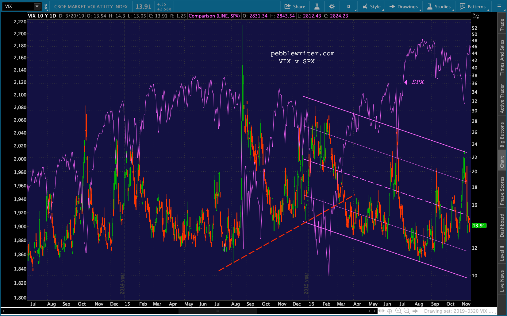
Continued Mar 21, 2pm
A quick aside: Powell and the Fed essentially threw in the towel yesterday: full tilt dovish. This fits our forecast nicely. We’ve been looking for rates to drop for months — even after the phoney baloney December bounce. The 10Y tagged our next downside target 2.498% and bounced a bit. The ZN (10Y price) came very close to our next upside target.

ES which had dropped through its neckline, rose after the dovish announcement and then dropped into the close, shedding more points overnight. It was forming a nice little falling channel until shortly after Thursday’s open when it started climbing… …primarily on USDJPY’s bounce off its SMA50 (which was just a backtest) and DXY’s rebound.
  It was also helped by AAPL, which shot up through its SMA200 but is closing in on its .618 and channel top.
 VIX has tagged TL support.
 Ok, back to the forecast…
I’ll lead off with where I think this is going and then see whether or not the charts support that outcome or something else entirely. I know it’s somewhat ass-backwards, but I think it’ll make sense once I lay it out.
Here’s my favorite case: a drop to 2138 shortly before the 2020 US election. This is a more alarming alternative.
 I’ll explain — and, my apologies in advance if I step on any toes. I tend to dislike most politicians, so I’m not taking sides here — merely speculating on what those who are writing the script of this market might have in mind.
If I’m a Fed President, senior Treasury official or senior commercial or investment banker, I live in fear of a second Trump presidency.
Yes, I know that the market has rallied nicely so far under his term — though I would argue it is largely because of the algos and has little to do with what he has actually done (other than front-loading corporate profits via the tax bill.)
Unless he resigns, dies or is impeached or indicted, he’ll be running for office again. I believe most people in government and finance think he’s a loose cannon (one of the more polite criticisms) and would love to have him out of office next go ’round.
The democrats would be stupid to impeach him. It would merely stir up supporters and, if successful, it would land Pence in the presidency. Pence would plainly be harder to campaign against — lots less ammunition. If they’re smart, they’ll drag out the investigations, etc. as close to the election as possible and release the most damning stuff in, say, October.
Now, even those who hate Trump have to admit the market is up 33%. It’s a good argument for him to hang his hat on. I can see the bumper stickers: “He might be a dolt and a sexual predator, but the market is up 33%!”
But, what if the market cratered between now and then? I think that might be the plan — though with a couple of caveats. First, the decline could be halted very quickly if he were no longer in the picture — as long as no one truly looney on the left or the right became the front runner. Second, if it became quite obvious (much more than in 2016!) that he was not going to be reelected there would be little incentive to force it any lower.
How did I jump to this conclusion? Simple, the charts suggest it. If SPX can successfully defend 2703, then this theory falls flat on its face. But, it has dipped below 2703 many, many times in the past 14 months. Since the next lower major Fib is 2138, it’s the logical target if SPX breaks back below 2703.
As it happens, next Fall represents the intersection of the rising channel bottom from 2009 and 2138. So, the timing is perfect. 2138 is also the Fib where SPX was when Trump was first elected. So, it would represent a return to the starting point.
 At 25% from here and 27% from the top, it would alarm plenty of people — except the insiders who have hedged on the way up and those who study Fibs.
And, we have a pretty good example of how to execute it in the 2015-2016 backtest of 1823 which lasted 2 full years from the time SPX pushed up through 1823 for good in Feb 2014. In 2015, SPX obviously pulled back before reaching 2138. It made the short call much easier. I think the same thing was planned for 2703, but circumstances got in the way. RB and CL spurted higher at the end of 2017 – sending SPX up well past 2703. By the time CL and RB moderated, the damage was done.
Note that the difference between 2703 and 2138 is 565 points. The drop from January’s highs to December’s lows was 526 points — not much of a difference. Had it started when the channel top reached 2703 in June 2017, it would have had 5 months to accomplish the drop and tag the channel midline — comparable to the 21.6% drop from between May and October 2011.
Members might believe I entertained this notion before. The big channel shown below is clearly a better fit than the one above which includes the Jan 2018 highs. Note the multiple tags on the channel top all along the way — and plenty of midline tags, too. The problem, though, is that it called for a drop to 2138 by the end of March 2019 – next week. I haven’t ruled it out completely, but the odds of that big a drop by March 30 are certainly a lot lower than they were when I posted this three months ago.
Then, there’s the Dec 24 lows — a much bigger problem. Remember how alarmed everyone was? Mnuchin even called in the PPT! Why such a big deal?
The answer lies in the white channel midline. If SPX had stopped at 2410.90 — its low on Dec 21 — the 1.618 extension of the drop would have been exactly 2138.04. But, SPX plummeted through the midline on Dec 24. This was an accident.
 How do we know? Because USDJPY dropped through its SMA200 on the 24th — probably because the guys who normally watch such things had taken off for Christmas, and the poor kid who was stuck in the office got caught by surprise.
 This is all pure conjecture, of course. There was plenty of negative news coming into the session. But, look at how ugly USDJPY got over the next few days. If the PPT hadn’t crushed VIX beginning on the 24th, SPX would likely have headed much lower.
Let’s look at whether 2138 is even feasible. As we noted above, big drops like this depend largely on a lack of support from CL and USDJPY. We’ll start with a look at CL. Here are the cycle charts from above, but with lots of members-only good stuff. We’ll look at all the reasons why CL might have already put in a significant top and is ready to decline.
1. First, let me point out the huge rising yellow channel which does a fantastic job of demarcating the highs, lows and the breaks in between. It is perfectly aligned with the smaller channel connecting the 2016 and 2018 lows. 2. Note that the latest bounce from Dec 24 looks an awful lot like the bounce in early 2015 which led up to the 2015-2016 correction (a perfect duration match would be Mar 31.) The price ranges are even almost exactly the same: 42.41 to 62.58 in 2015 versus 42.36 to 60.39 for CL (the SMA200 is just above at 61.85.)
  I’ve highlighted the latest range and copied it to 2015 for comparison purposes. What made the 2015 drop especially unsettling was that CL never quite tagged its SMA200. It went sideways for six weeks, then gave up and plunged 57% over the next 8 months.
3. The cycle tops are almost exactly the same distance apart — arguing that the 10/3/18 top was a major one.
4. The falling white channel from 2008 is a pretty good fit — almost as though it was planned. CL just bounced off its midline and is closing in on its .786 line – which is also the midline of one of the smaller rising white channels. I put the exact intersection of the two channel lines right at the SMA200.
5. Economics:
There are three causes of rate declines: economics (usually low inflation), central bank manipulation, and fear. When the 10Y reversed off 3.25% in October, the economics were increasingly scary. Shortly thereafter, it became about fear. Since January, the Fed has been in the process of trying to shift into manipulation mode.
Most readers will remember this chart which shows how a slight rise in rates would exacerbate an already frightening debt and interest expense crisis.
 At 3.25%, TNX had reached the top of a long-term channel. Given the above, a breakout of this long-term trend would have been unthinkable.
 Interest rates had to be brought back down, which as we’ve discussed meant bringing inflation back down which, in turn, meant bringing oil and gas back down. That’s why when CL peaked on Oct 3, TNX peaked two days later.
 I’ve charted this relationship many times in the past, but a quick reminder wouldn’t hurt. CPI is highly correlated to oil prices.
 Though, the more dramatic comparison is between CPI and the YoY changes in oil prices.
 We see an even closer relationship between CPI and YoY changes in gasoline…
 …especially over the past few years. When CPI fell below 0%, YoY RB spiked. When it topped 2%, YoY RB slumped. The last two years has been focused on keeping CPI in the sweet spot: right around 2%.
 Changes in CPI have been very strongly related to “problems” in interest rates over the years.
The 10Y usually peaks before CPI, presumably as bonds “price in” expected shifts in inflation. There have been seven tests of the channel top over the past 30 years — the last one occurring on October 5, 2018. Each test and reversal was accompanied by an inflation “event.”
The events varied in nature. In Jan 2000, for instance, the 10Y (the blue line) shot up to 6.8% when CPI (red line) pushed above the highs reached in 1991. CPI topped out two months later at 3.8%.
 Between 2003 and 2007 the 10Y had difficulty keeping up. The 10Y peaked at 5.3% even as CPI surged above its 2000 highs to 5.6%.
Since the crash, the moves in CPI have been tailored to keeping the 10Y on track — with the latest drop delivering a 2.50% 10Y yesterday.
 I have meetings outside the office most of the day Friday. I’ll continue this post Friday afternoon.
(more…)

 …and ZN tagged our next upside target…
  …which was first posted on May 18, 2018 [see: Bonds and Value.]
 The fact that the tag took so very long to play out has certainly tested our patience. More importantly, though, it offers vital clues about the next 18 months in the markets.


