
Month: March 2012

  • All the Pretty Butterflies

    In typical end-of-the-quarter fashion, the markets seem to be running in place.  But, by one measure, the melt-up might already be finished.

    Recall we were looking at 1419 as one of two possible tops (the other being 1433) when SPX was at 1402 back on March 23 [see: The Tipping Point.]   I mentioned it as a target of certain harmonic patterns.  We also recognized it as the .886 Fib price level of a small rising wedge within a larger rising wedge.

    There are actually three potential harmonic targets suggested by the Butterfly pattern that features 1074.77 as its Point A and 1292.66 as its Point B.  All of them assume the pattern completes at the 1.272 extension; but, keep in mind that Butterflies can also complete at the 1.618 extension.  If you have no idea what I’m talking about, visit Crabs and Butterfly Patterns Explained for more info.

    Like all harmonics, Butterfly Patterns begin at a meaningful peak or trough (though frequently you can find smaller patterns within patterns.)  The primary requirement is that the Point B be at the .786 Fib level.  Here are my three candidates for the pattern we’ve been watching for the past several months.

    #1 is the most bullish and begins at 1370.  I like the fact that 1370 was the high for all of 2011, back on May 2.  But, it leaves us with a less than ideal Point B — 14 points below the .786 (1292 v 1306).  It would complete at 1451.


    #2 begins at 1356 on July 7 and features a Point B only 4 points below its ideal .786 of 1296.19.  It completes at 1433.  Closer still.


    Butterfly #3 — my personal favorite — begins at 1347 and Point B ((at an intra-day high of 1292) is 4 points above its ideal of 1288.74.  The closing price of 1284 was 4 points below.   This particular pattern completes at 1421.05 — just 1.90 from the Mar 27 high of 1419.15.


    Could 1419 have been the end of this wave?  You bet.

    I always like it when one harmonic pattern matches up with one or more other harmonic patterns and chart patterns.  Here’s one I just can’t get out of my head.


    Seems just a little too coincidental that a TL connecting current prices to the 2007 high would be exactly parallel (log scale) to a TL connecting the two major bottoms of the past decade — all at a time when we’re:

    • at .618 (in time) of the huge rising wedge dating back to Mar 2009, and;
    •  within a stones throw of the .786 or .886 retrace (take your pick) of the 2007-2009 decline.

    Here’s a couple of charts with the Fibs thrown in.


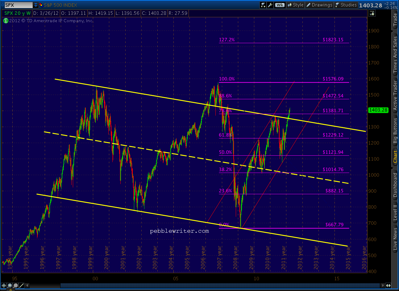
    If you’re an überbull, there’s a potential silver lining.  The May 2nd 1370 peak — a .786 retrace of the 2007-09 drop, could be the Point B of a much larger Butterfly pattern.  If it were, we’d have a 1.272 extension up around 1823 and a 1.618 at 2137.

     
    Of course, if you are an überbull, you’ll probably want to use the arithmetic instead of log scale and draw your channels more like this:
     >

    Of course, that scenario would probably mean $8 gas, 12% T-bills and $3000 gold to go with our $20 trillion in debt.  But, that might just be the price of a “healthy” economy, right Ben?
  • What Do Bankers Dream Of?

    When Wells Fargo CEO John Stumpf sleeps, he dreams — like all good bankers — about numbers.  He probably doesn’t dream about the number 600 — the number of foreclosure packages signed each day by his robosigners.  He probably doesn’t dream about 14,420 — the number of conveyance claims fraudulently submitted to HUD in exchange for $1.7 billion from the FHA [Inspector General report.]

    And, he almost certainly doesn’t dream about his share of the laughably small $25 billion penalty he and his fellow bankers might have to pay to slough off legal liability for the millions of Americans they’ve helped make homeless (don’t know why they’re bellyaching…they’re all getting $2,000!)

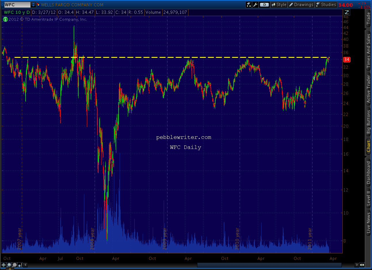
    No, I imagine the number he fixates on is 35 — the third rail around which his stock seems to go into spasms every time it gets close.   I’m exaggerating, of course; it’s only happened three of the last four times since November 2007.  The other time, in September ’08, the stock soared right through 35 to nearly 45.  That would be great — except it plunged to 7.80 six months later.

    See that yellow resistance line?  At least that’s what we call it.  To Stumpf, it’s a 625-volt reminder of all the ugliness of the past five years: bailouts, Occupy Wall Street protests, and that humiliating testimony before Congress (what’s a fella gotta do to buy off a few Congressmen?)

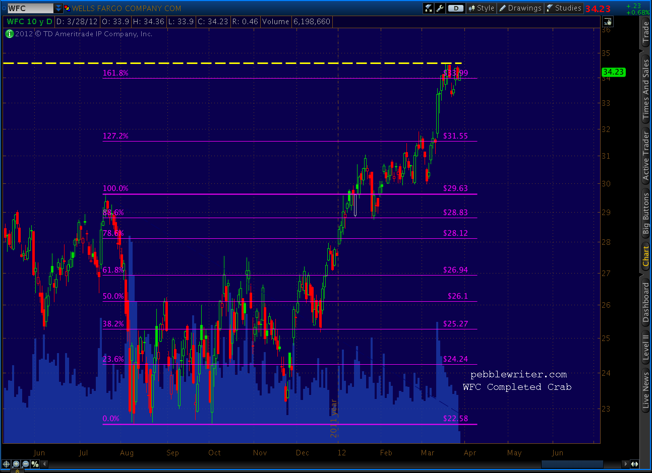
    Stumpf might be dreaming about 35 a lot this week, as the stock’s edging toward that buzzing rail yet again.  It’s really crummy timing for the stock to have completed a bearish Crab Pattern.

    And, darn it, did the SEC have to pick this week to file that subpoena to compel him to hand over the documents he promised in regards to a $60 billion fraud investigationNow, with earnings coming up in a couple of weeks?

    That reminds me of another number, 13 — as in the number of times WFC got zapped after reporting earnings in the last 17 quarters.  Earnings reports that came in the vicinity of that third rail have been particularly eventful.

    Let’s not forget 6,867,990 — the number of shares of Stumpf’s WFC stock and options that’ll be worth considerably more if the 35 price point is breached.  A 22 cent bump will make up for the horrendous pay cut he’s suffered over the past two years (from $21.3 million to $19.8 million, and we all know how tough it is to live on a lousy $54,000 a day!)

    Hey, how about $85 million — the amount the Federal Reserve Bank fined Wells Fargo last year?

    And, $25 billion — the low-interest loan the Fed slipped Wells Fargo a few years back when its survival seemed iffy.

    Which brings to mind $29.4 million, the amount the money-center banks spent on lobbying in 2010 (not including the ABA.)

    Then there’s $19.8 billion — the amount of hyper-hypothecation exposure on Wells Fargo’s books,  17% of Tier 1 capital?

    Which reminds me — $1,274,000,000 in pre-tax trading losses for 2011.

    And, lest we forget — $2.8 trillion notional in derivatives on the books.

    I could go on all night, but I think you see where I’m going with this.  We should all keep John Stumpf in our thoughts and prayers; with all those numbers to think about, the poor guy might have trouble getting a good night’s sleep.   Somehow, I think he’ll manage as long as he sees $35 in the rear-view mirror…and soon.

  • Lots More Where That Came From

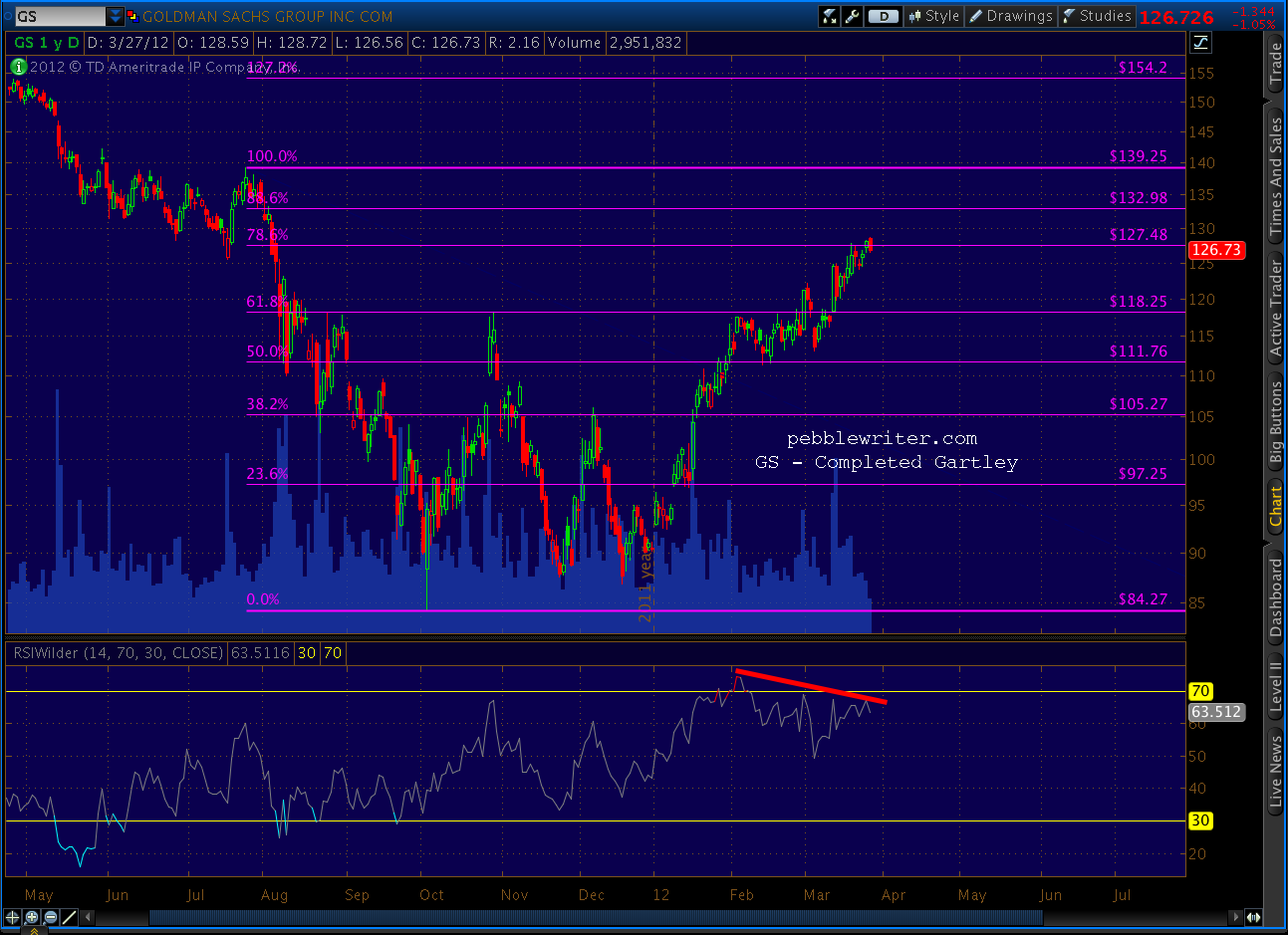
    Not to be outdone, GS just completed a bearish Gartley Pattern on (need I say it?) strong negative divergence.


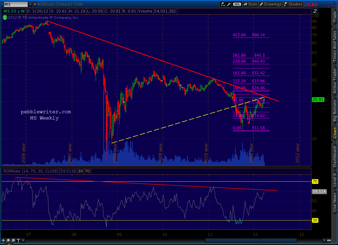
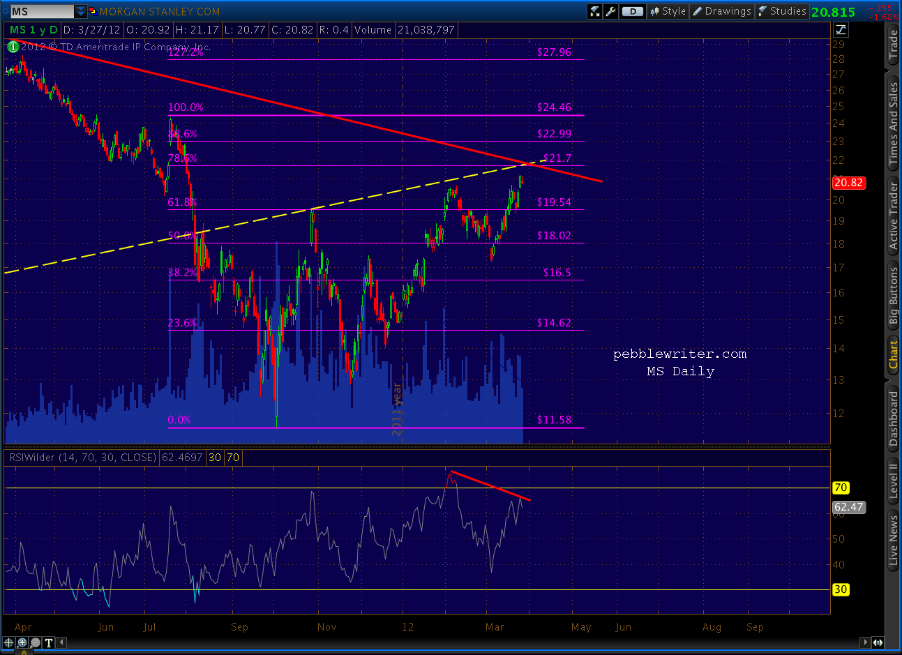
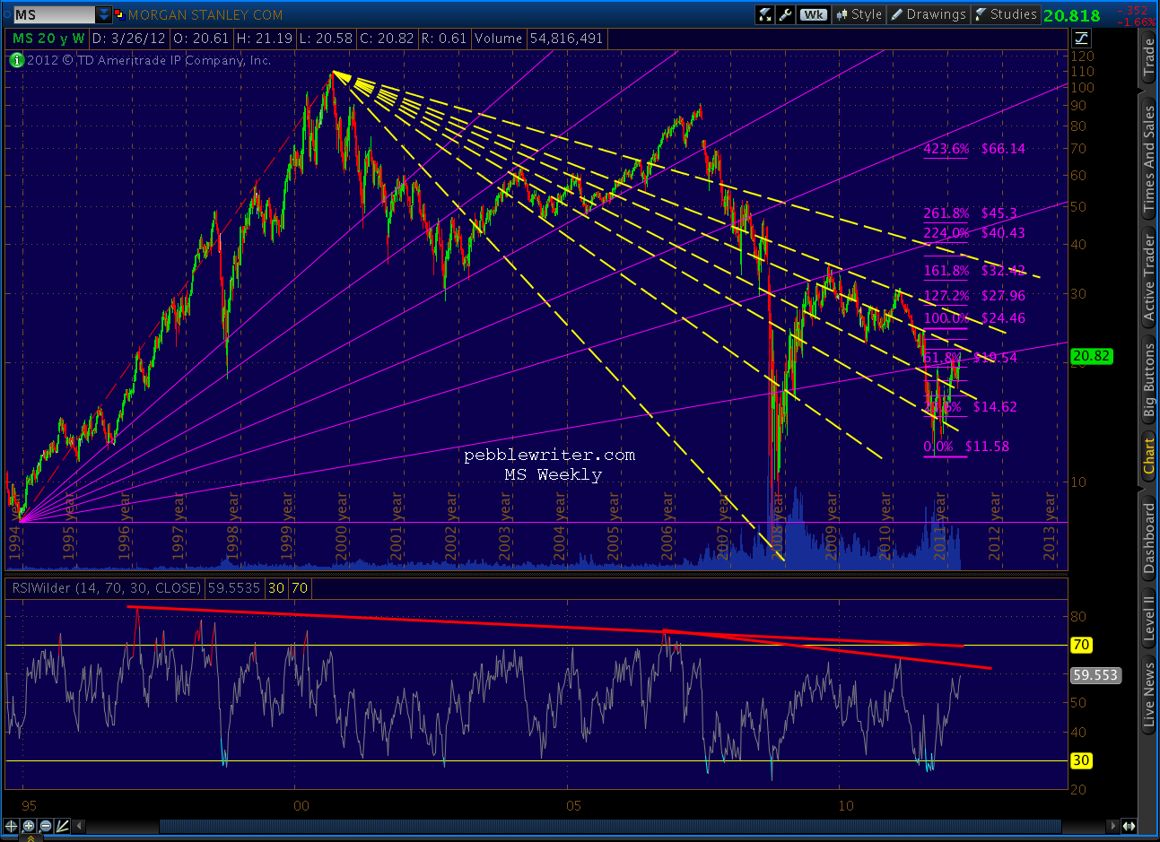
    And, because Morgan Stanley wants to be just like GS when it grows up (rumor has it MS is negotiating an exclusive deal with The Grouch)  it’s .51 away from completing its own Gartley at the intersection of fan lines off its Jun ’07 high and Nov ’08 low.


    And, speaking of fan lines…


    More later.

  • End of the Line

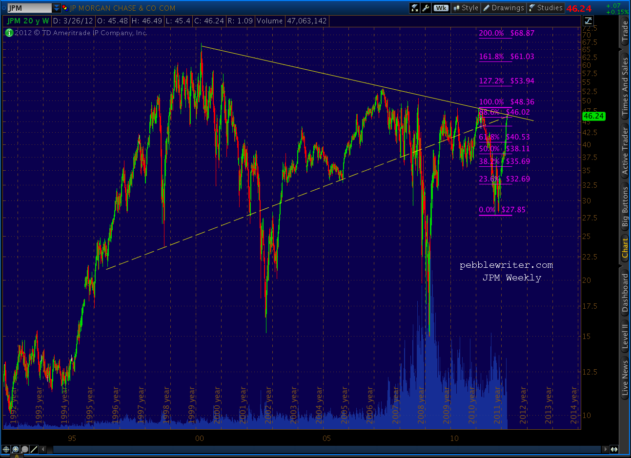
    JPM has had a phenomenal run of late, but a long term fan line off the Mar 24, 2000 all-time high should put an end to all the fun.

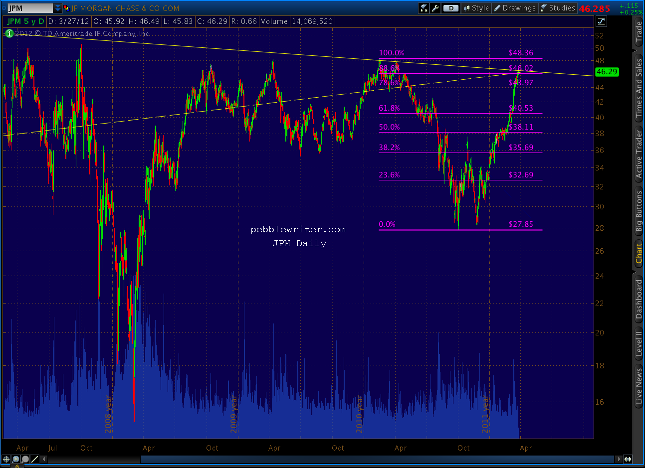
    It doesn’t help that JPM also just completed a bearish Bat pattern and is back-testing an internal TL that dates back to 1996.

    And, that over the last week, JPM has completed a Crab pattern way up in the tip of the Bat.

    Dimon’s pulled off some pretty slippery tricks in his tenure; we’ll see if he can beat the odds this time.

  • A Tipping Point: March 23, 2012

    Bears are understandably shell-shocked after the past three months.   Top picking has been a frustrating and humbling experience, as markets — like an addict in search of his next fix — have ignored everything but the promise of additional QE.  But, the improbable low-volume, non-stop melt up might finally be at a tipping point.

    As noted in yesterday’s post, several key indices have finally reacted off their harmonic pattern targets.

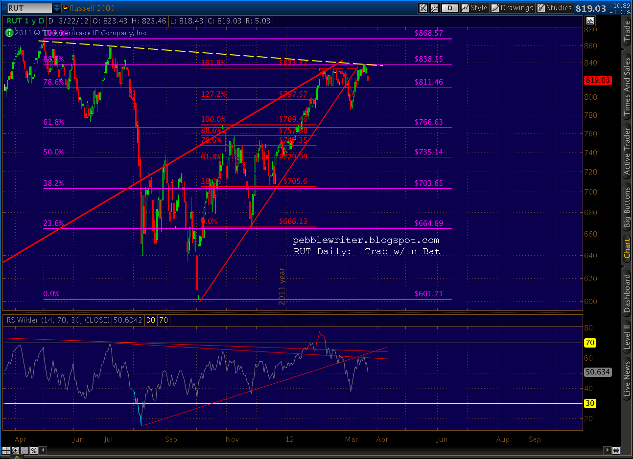
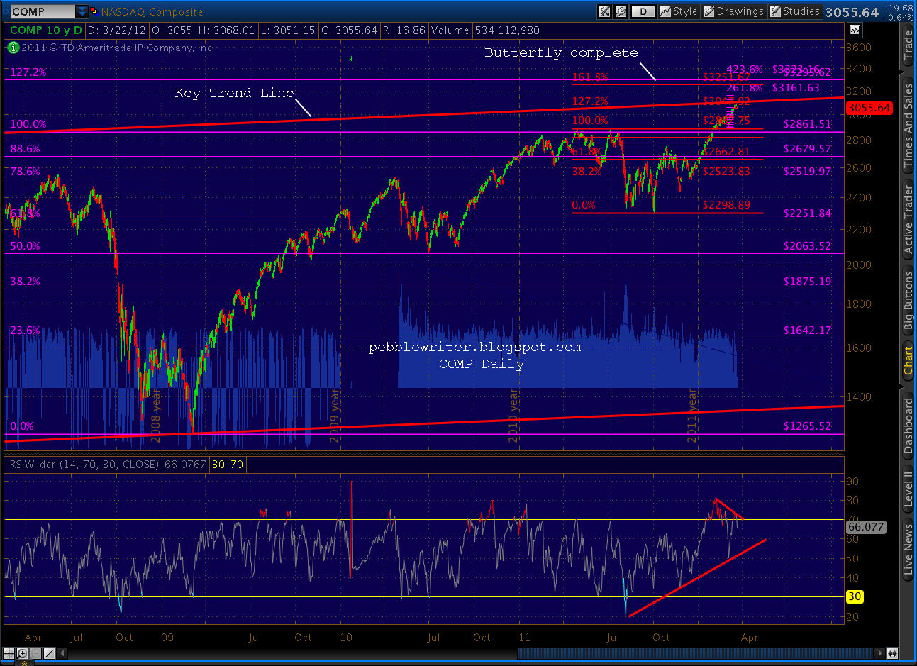
    RUT completed a Crab Pattern within the last leg of a Bat Pattern and has yet to clear a key trend line off the May and July highs.  COMP completed a tiny Crab within a little Butterfly pattern and tagged a key trend line off the 2007 highs.  DJIA completed a Crab pattern just a few points away from completing a Butterfly pattern and large Bat pattern.

    Each of the indices is showing bearish divergence on the daily time frame within an overextended rising wedge that’s in danger of being broken — but haven’t broken yet.  In spite of the completed patterns, there are some potential bullish patterns, such as the Dow’s Bat and SPX’s Butterfly, that should take prices just a little higher.

    I’ve spent the past several days wandering the charting desert in search of some sign of things to come.  I posted a bit the other day about the SPX wedge within a wedge and how we’re at Fibonacci levels of time and price in each.   I started by charting some basic channels and fib levels, along with the rising wedges.

    As we discussed the other day [see: Big Picture, Part 2], the smaller yellow wedge apex is not only right at the .886 of the 2007-2009 price decline, but also the .886 fib levels of the larger rising wedge apex.  On top of all that, it’s also at the .618 of the large rising wedge in terms of time.  This is significant, because rising wedges commonly give up the ghost around 61.8% of the way to their apex.

    And, within the smaller rising wedge, we can also see we’re at important fib levels — .786 in terms of price and .886 in terms of time.

    All this is well and good, and we clearly got the reaction we were looking for when we were looking for it.   The key level coming up is the small rising wedge bottom at 1374.   If we take that out, we could find our way down to 1300 in a jiffy.  And, the bottom of the large red rising wedge is currently all the way down at 1165.

    But, I know I don’t have to remind anyone here that rising wedges can hang on for a long time — especially lately.   And, as mentioned earlier, there are still some potential bullish Butterfly Patterns that could fulfill to the upside — notably SPX 1419 and 1433.  And, sometimes harmonic reactions are pathetically small bumps on the road to bigger and better things.

    Bottom line, I believe we’re not quite to our turning point.  But, we will be in the next couple of weeks.  Stay long, but stay frosty.

    ************

    Thus, the days spent wandering the desert.  And, let me be clear, this is pure spit-balling folks.  I’ve been looking at long-term patterns in the markets, trying to discern similarities that might offer a clue as to the big picture.  One era that fascinates me is the 1970s.

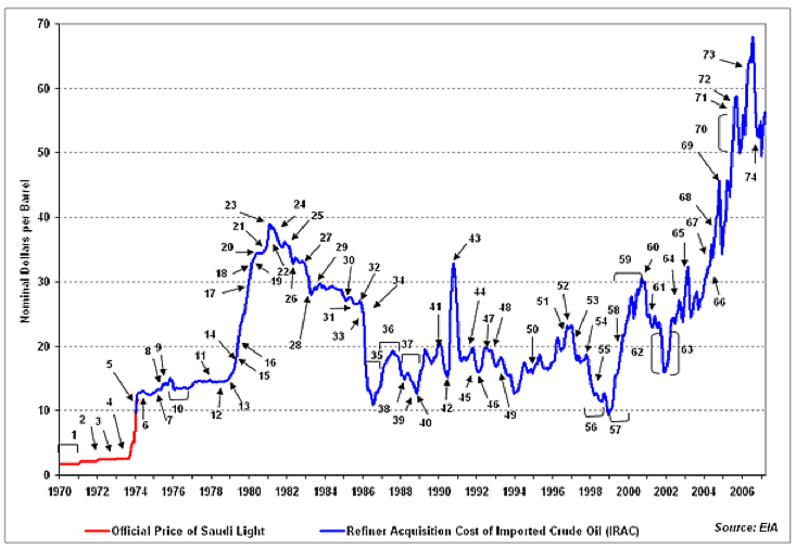
    We had a decade-long war in Vietnam and an oil shock when OPEC imposed an embargo in response to our military support of Israel in the Yom Kippur War.  Oil prices went from $3/bbl in 1970 to nearly $40 in 1980.  The following chart, from the EIA and posted on Wikipedia, shows the blow by blow.  (For history buffs, there’s an interesting chronology available here.)

    Inflation went from 3.6% in 1973 to 11.8% in 1975 and 13.9% in 1980.   P/E ratios went from 17.7 in 1970 to 6.7 in 1975.  The 1-yr went from 4.62% in 1972 to 11.03% in 1974.  And, stocks were all over the map.  After gains of 25% from 1970-72, the S&P; 500 had losses of 23% in 1973, 29% in 1974 and 14% in 1977; and, gains of 29% in 1975.

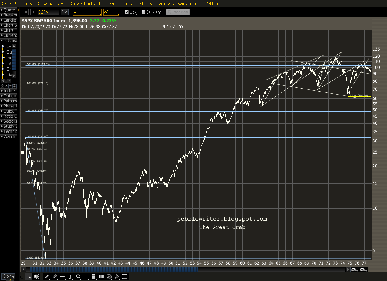
    In short, it was an important inflection point. To Elliott Wave guys, it was an important turn in wave counts.  To all the rest of us, it was the payoff to The Great Crab.

    What?  You don’t remember The Great Crab?  Okay, so it’s possible I just made that name up.  But, it’s kinda catchy.  And, more importantly, it fits.

    First, well… it’s a Crab pattern.   It features a point B at about 50% of the XA price difference (for those who skipped the lesson, go back and read: Crab and Butterfly Patterns Explained.)   Second, it began in the Great Depression, so that gives the name a ring of authenticity.

    And, finally, what else would you name a pattern that in 1937, after a 90% drop, 300% rally and subsequent 60% drop, pretty accurately predicted the following reversals at key Fibonacci points?

    Fib.          Year       Decline

    1.618         1956        19%
    2.618         1961        28%
    3.618         1969        36%

    All that coolness aside, I believe the 1970s offer important clues to what lies ahead.  I’m doing some research that I’ll publish in the next day or two that, quite frankly, is knocking my socks off.

    Stay tuned.

  • Charts I’m Watching: March 22, 2012

    ORIGINAL POST: We’re finally seeing reactions on the harmonic pattern completions we’ve been watching for what seems like forever [see: Everything’s Coming Up Crabs.]RUT completed a Crab Pattern (in red) within the last leg of a Bat Pattern (purple) off the 2011 highs.  It never has cleared the TL off the May and July highs.  The May 2011 high was a double-top to 2007’s.

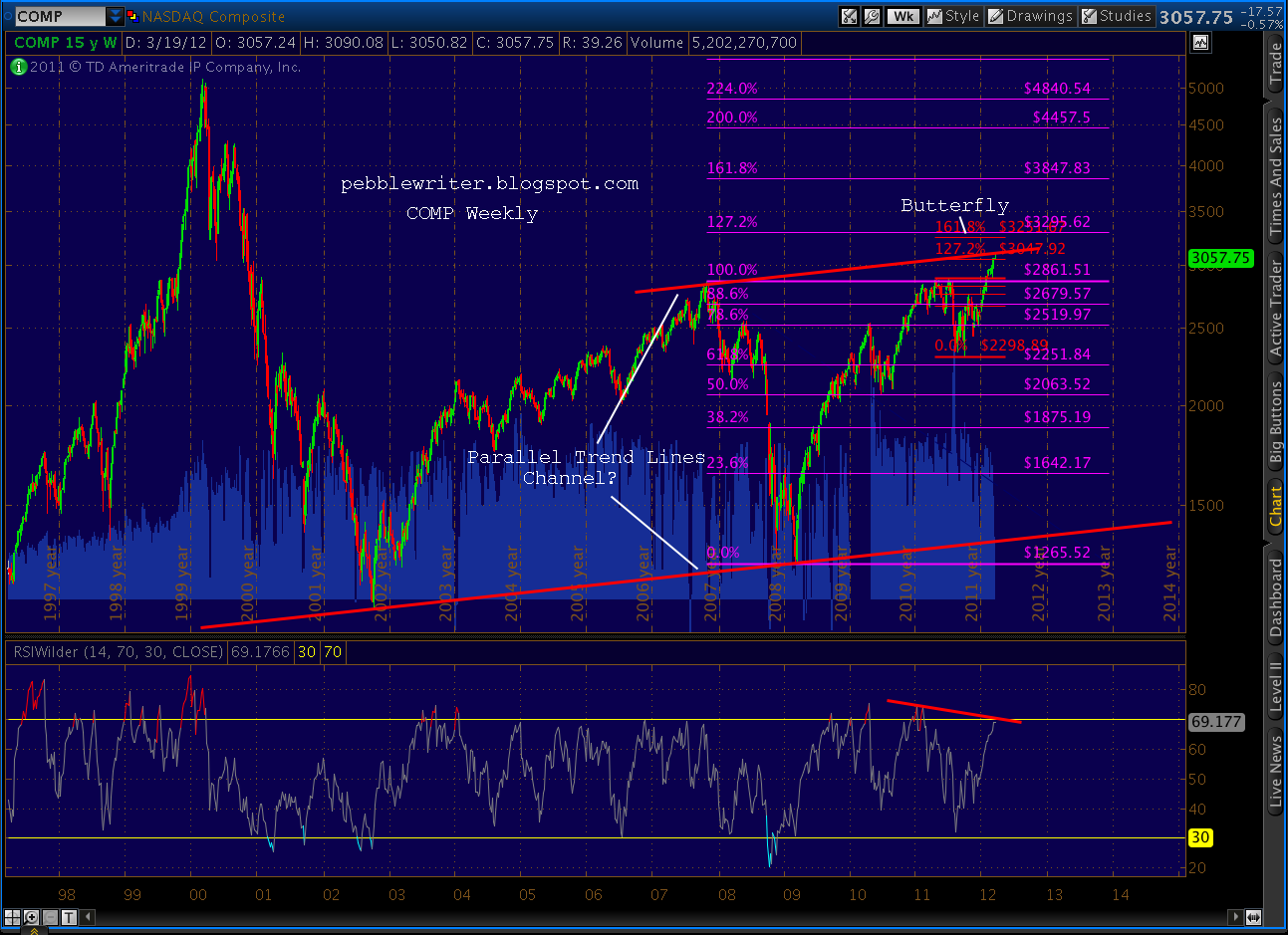
    COMP completed a tiny Crab within a little Butterfly pattern and tagged a key trend line off the 2007 highs.

    I call it a trend line because it’s exactly parallel to the line connecting the 2002 and 2009 lows.  A reversal here would make for four touches — i.e. a channel.  But, COMP could continue bucking its bearish divergence and go up to complete the larger Butterfly pattern (purple) at 3250-3295.

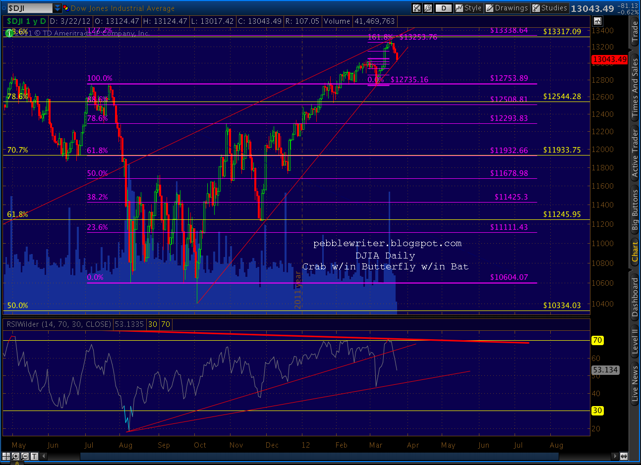
    DJIA still hasn’t made a new high since completing a Crab Pattern a stone’s throw away from a Butterfly Pattern (purple) completion at 13,338.64.  We’re still watching for a clean break of the rising wedge in the price chart and the trend line in the RSI chart.


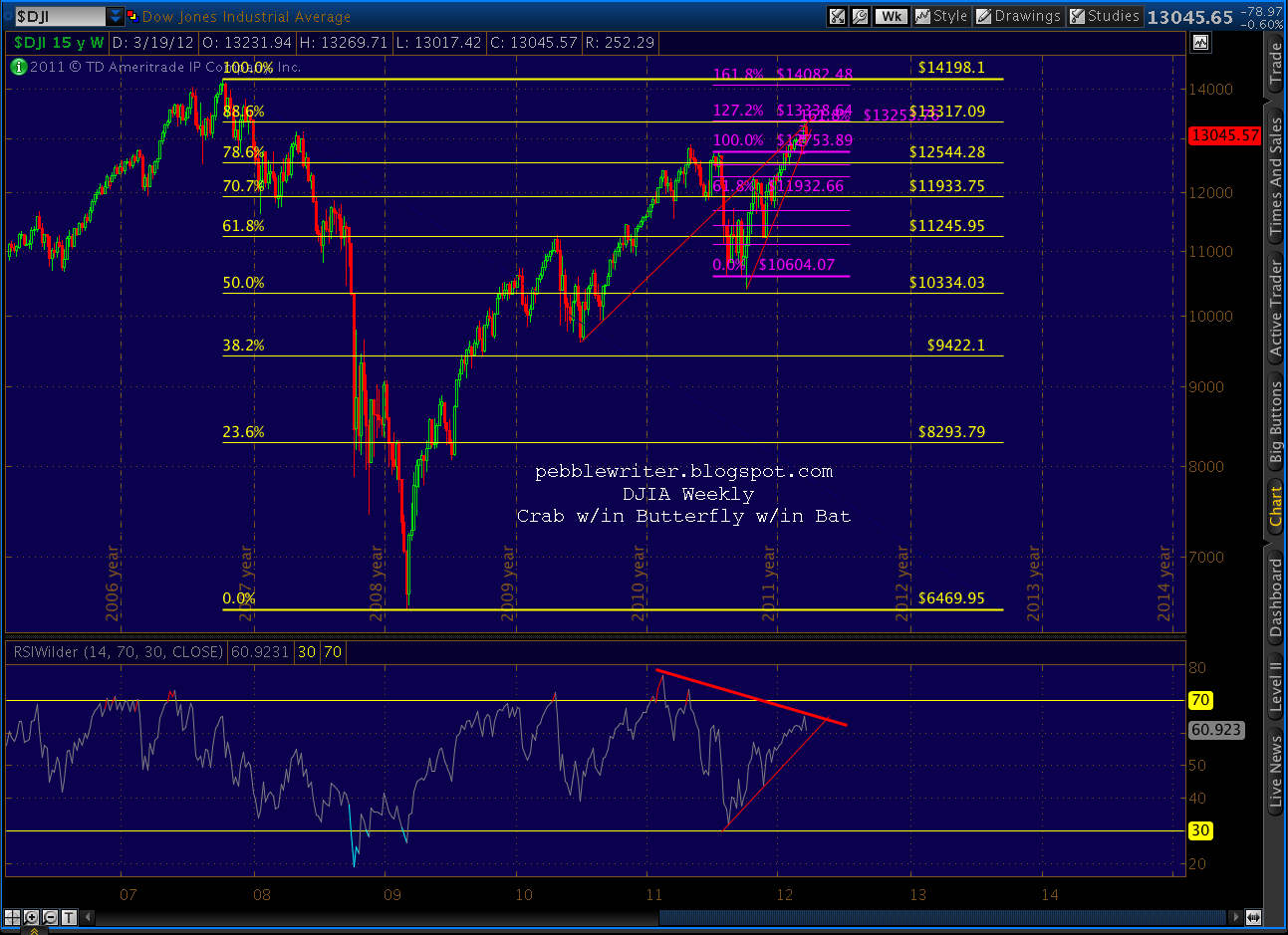
    Though, it’s important to note that, at these prices, we came within 28 points of completing a Bat pattern (yellow) at the .886 (13,317) in the weekly chart.  That would make for a logical back test if/when the rising wedge finally breaks.  It might also be the 5th and final wave target if today’s move stays within the wedge itself — which is just as likely.

    Coming up….SPX.

  • Charts I’m Watching: March 20, 2012

    A quick summary of the major charts…

    RUT has completed a Crab Pattern (in red) within the last leg of a Bat Pattern (purple) off the 2011 highs.  Significantly, it hasn’t been able to clear the TL off the May and July highs.  The May 2011 high was a double-top to 2007’s.

    COMP is tagging a trend line off the 2007 highs which is exactly parallel to the line connecting the 2002 and 2009 lows.  A reversal here would make for four touches — i.e. a channel. 

    While the largest potential Butterfly Pattern 1.272 completion is still some distance away (3295 v current 3071), it completed a small Crab within a small Butterfly at 3062 and 3048 respectively.  I think that between the TL and the smaller Butterfly, we should get at least an interim low in the short run — even though there’s more medium-term upside to the 3250-3300 level.

    DJIA peaked at 13,289, completing a Crab Pattern a stone’s throw away from a Butterfly Pattern completion at 13,338.64.

    Zooming out, we see that we’re also bumping up against the .886 of the Oct ’07 to Mar ’09 drop at 13,317.09.  Either of these patterns could be considered close enough to be complete, but a small intra-day bump to tag the actual target is very feasible.

    SPX is closing in on the .886 of the Oct 07-Mar 09 drop at 1472.43.  But, we’re reaching important resistance levels in the rising wedge — which is getting long in the tooth.

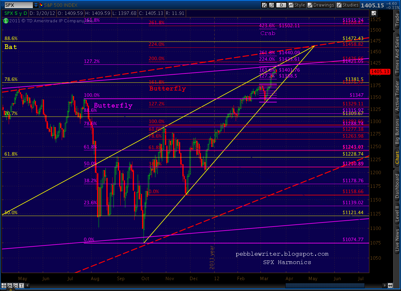
    On a smaller scale, the Butterfly pattern from last July is approaching its 1.272 extension at 1421 — assuming a Point X of 1347 on July 21.  This is the best fit for the Butterfly pattern, but it could be started at May 2’s 1370 or July 7’s 1356 — resulting in slightly higher 1.272 extensions.

    There is ample bearish divergence in every time frame.
     

    More later.

  • Big Picture, Part 2: Mar 19, 2012

    We’ll start with the weekly version of the chart of channels I posted last night…

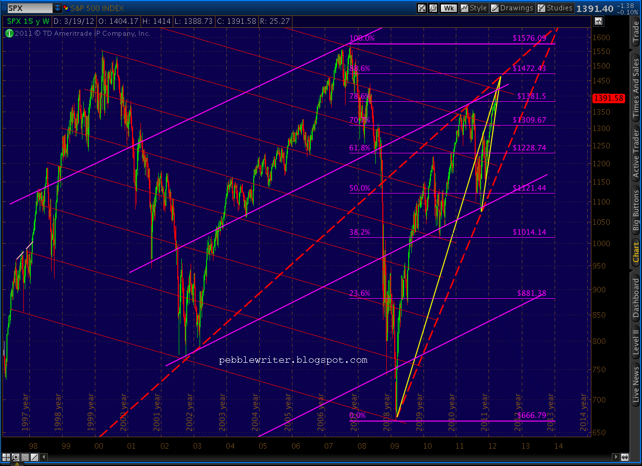
    The parallel diagonals are by no means the only way to skin this cat, but they do demonstrate the market’s tendency to relate future moves to past and present.  Just about all the turns are guided by the red downward-sloping trend lines; most of those that aren’t are guided by the purple upward-sloping lines.  The handful of turns that don’t relate to either all correlate with a Fibonacci level.

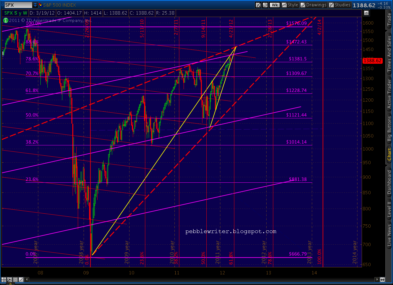
    There are two rising wedges visible on the chart.  The dashed red lines both originate off important lows — the late 80’s/early 90’s and the Mar 09 low and come together for an apex around January 2013 at about the 2007 high of 1576.  The solid yellow lines originate off the Mar 09 and Oct 11 lows and feature an apex around May of this year at about 1472.

    What’s particularly interesting to me about these two wedges, besides the bearish implications of rising wedges in general, is how they relate in time and price.   Note that the average rising wedge breaks down at about a Fibonacci .618 of the time from its origin to its apex.   And, in most cases rising wedges break down at Fibonacci price levels as well.  Let’s look at our two wedges.

    First, the smaller yellow wedge’s apex at 1472 comes in right at the .886 Fib level of the Oct ’07 – Mar ’09 decline — which is also at about a Fibonacci .886 of the red wedge’s rise from Mar 09 to its apex.

    Second, the time from inception to apex for the small yellow wedge is 3.1 years.  The time from inception to apex for the larger, red wedge is about 5 years.  Divide the former by the latter and you find the time relationship between the two is a Fibonacci .618 — seen in the following graph.

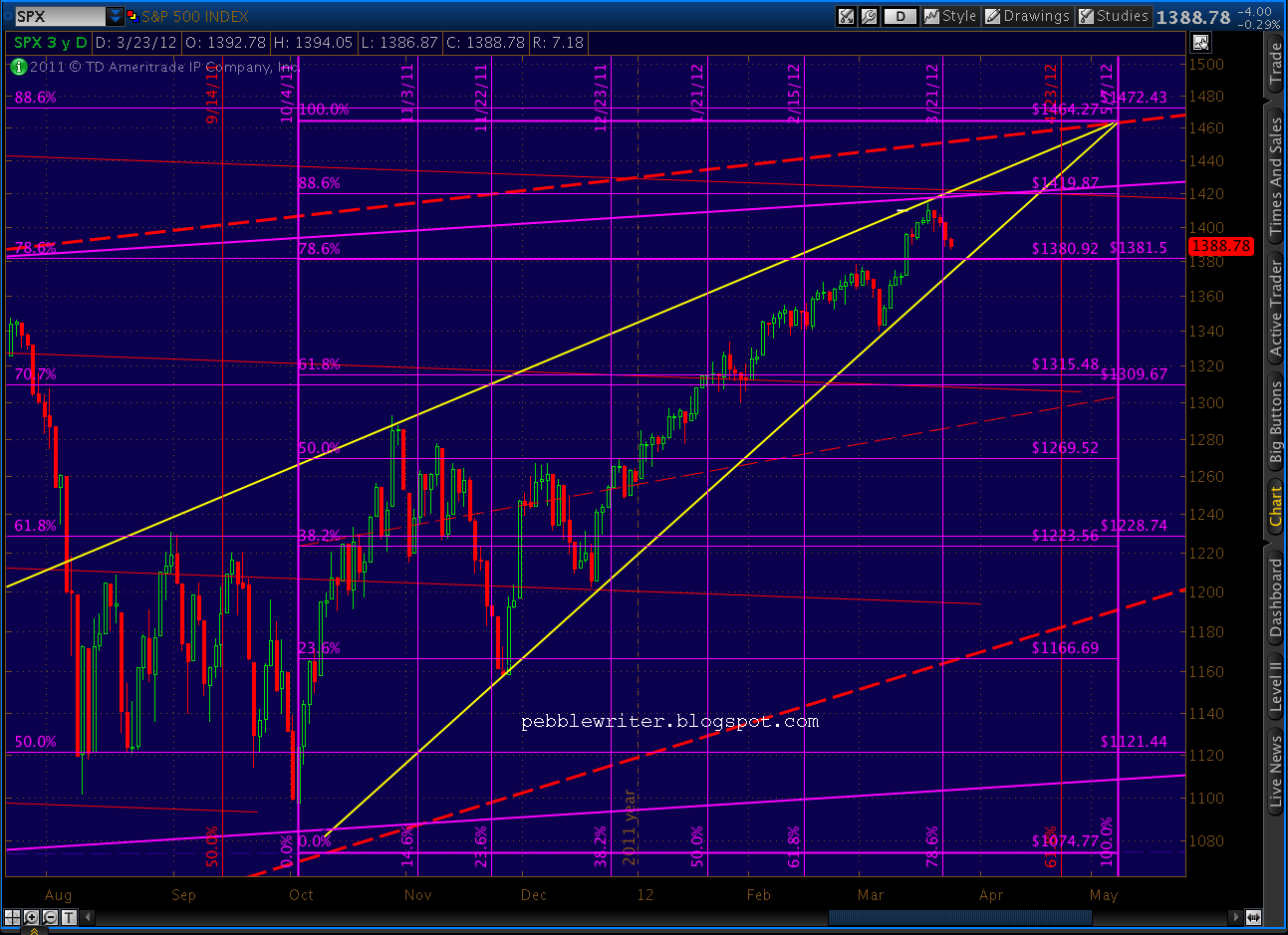
    A close up reveals that movements within the small, yellow wedge are nearing some important Fib levels.  Prices are very close to the .886 (1418) of the price range.  And, Wednesday Mar 21 will mark the .786 of the time range.  Again, both of these measurements assume an apex of 1462 on May 7 — a location which is as close as I can draw it, but a bit of an approximation.

    Last, note that the intersection of these to Fibonacci levels occurs at the intersection of two of the channel lines we drew in that first chart above.  While channel lines are much more guidelines than absolute rules, a bounce at that four-way intersection would certainly make a lot of sense.

    From what I read, the most logical Elliott Wave count is that we’re setting up for a wave 4 correction — unless this is the 5th and final wave up in this monster bear market rally.  This would be a very logical place.  Note also that there is very noticeable divergence on the daily chart, with the mother of all back tests on the dashed yellow TL that was broken two weeks ago.

    One last note on this RSI chart… the drop in RSI from that brief downturn was massive compared to a measly 38-point price drop in SPX.  Compare this to the RSI drop in July, for instance, and it’s pretty clear that the technical damage done to the market’s internals has yet to be reflected in prices.  A strong downturn in the next few days could rectify that.

    Last, thanks for your patience this week as I rush to finish the new website layout.  Lots of moving pieces that I think folks will enjoy, but it’s taking time.  I’m watching during the day, of course, as things develop (or not.)  But, I’ll be keep my posts to a minimum unless there’s something important to say.

    Good luck to all.

  • Big Picture: Mar 18, 2012

    Every once in a while, I make myself sit down and reassess everything I believe about the markets.  As most readers know, I’ve been bearish ever since my first post on May 2, 2011.  The excessive bullishness I saw in the markets had finally gotten to me and, as fate would have it, I sat down to write about it.

    Back then, I saw we were approaching a trend line coming up from the late 1980’s and drawn through the 2002 lows.  We were also approaching the .786 Fib retracement of the Oct 2007 – Mar 2009 Gartley.  We were very deep into a rising wedge, and we were also about to complete a large Crab pattern that dated back to Apr 10.

    Sure enough, that was a potent combination.  The market topped that day, and didn’t finish dropping until almost 300 points later in what was widely considered (by bears at least) to be the first wave of P3.  Now, 330 points and many redrawn wave counts later, it’s a great time to reassess the big picture.

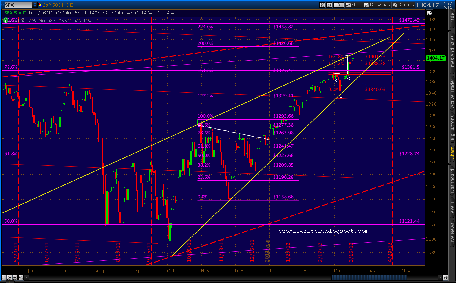
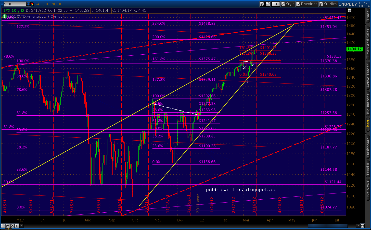
    First, it’s worth noting that we’re back to within 45 points of that long-term trend line — currently at 1451 and rising about 8 points per month.  We’re also bumping up against a new rising triangle.  And, the .886 Fib retracement of the Gartley is up ahead at 1472 — around the end of May on the TL.

    Interestingly, we recently completed a large Butterfly Pattern and Inverse Head & Shoulder Pattern for a 46-point reaction at the Gartley’s .786, which led to a Crab Pattern within a Crab Pattern and Inverse H&S; pattern that all point to current prices (1405-1409.)  It’s not a perfect fractal of the last move, but it’s pretty darned close.

    Also entering the picture above is one of the purple channel line drawn from the 1576 Oct 07 high.  It’s placement is somewhat inexact, but note that it is precisely parallel to the trend line connecting the 2002 and 2009 lows, and all the other parallels which have been influential over the past 10 years.  Today, it crosses in the vicinity of 1439.

    While a move down from here would make perfect sense, it seems odd that we’d leave the .886 Fib line untouched at 1472, particularly given its proximity to the trend line from the 1980’s and the rising wedge apex — all towards the end of May.  There’s also a 1.272 completion at 1451 of the large Butterfly pattern ranging from 1370 to 1074.

    All this leads me to believe we’re likely to see a reaction in the next few days, a decent-sized drop down to 1380 or so, followed by one last ramp up to the 1450-1470 area.  If I’m wrong, and we see a larger drop here, things could get ugly in a hurry.

    More tomorrow.