
TNX nailed our 22.94 target last week, completing the move we forecast in December when the red trend line shown below broke down [see: Dec 26 Update on Bonds.] It has taken considerably longer than originally anticipated because the more violent downdrafts in 10Y rates prompted violent equity sell offs. Some cooling-off periods — long, drawn-out bounces — were necessary.
 While the rising purple channel has now been fleshed out, our price charts indicate the move might not be complete — a view shared by our yield curve model.
 We’ll take a fresh look at the big picture, and the dramatic move it implies for stocks.
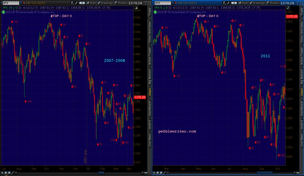
continued for members…The price chart from back then…
 …and, the current price chart.
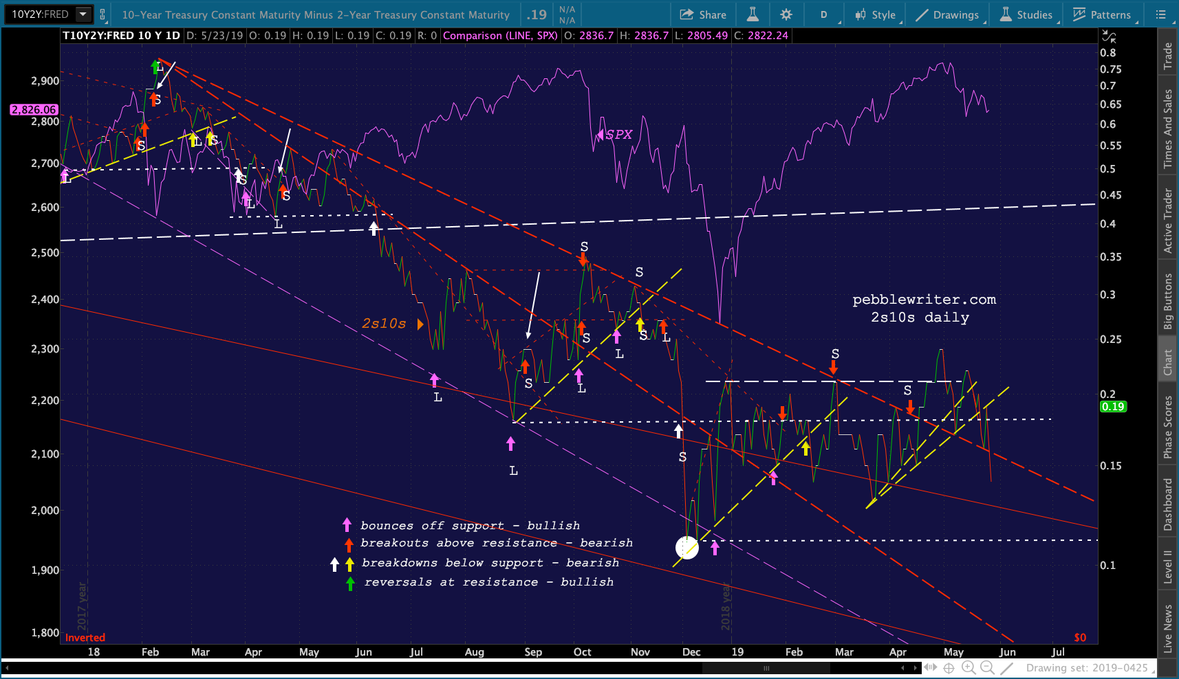
 The bigger picture for the yield curve model shows the worst of all worlds for stocks, another breakdown below the rising yellow TL and failure of the falling red TL.
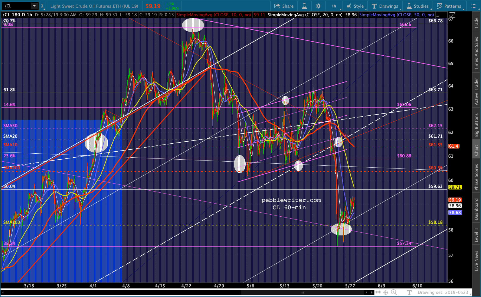
 So far, the effect is being offset by a bounce by CL and RB. Both remain susceptible to a breakdown.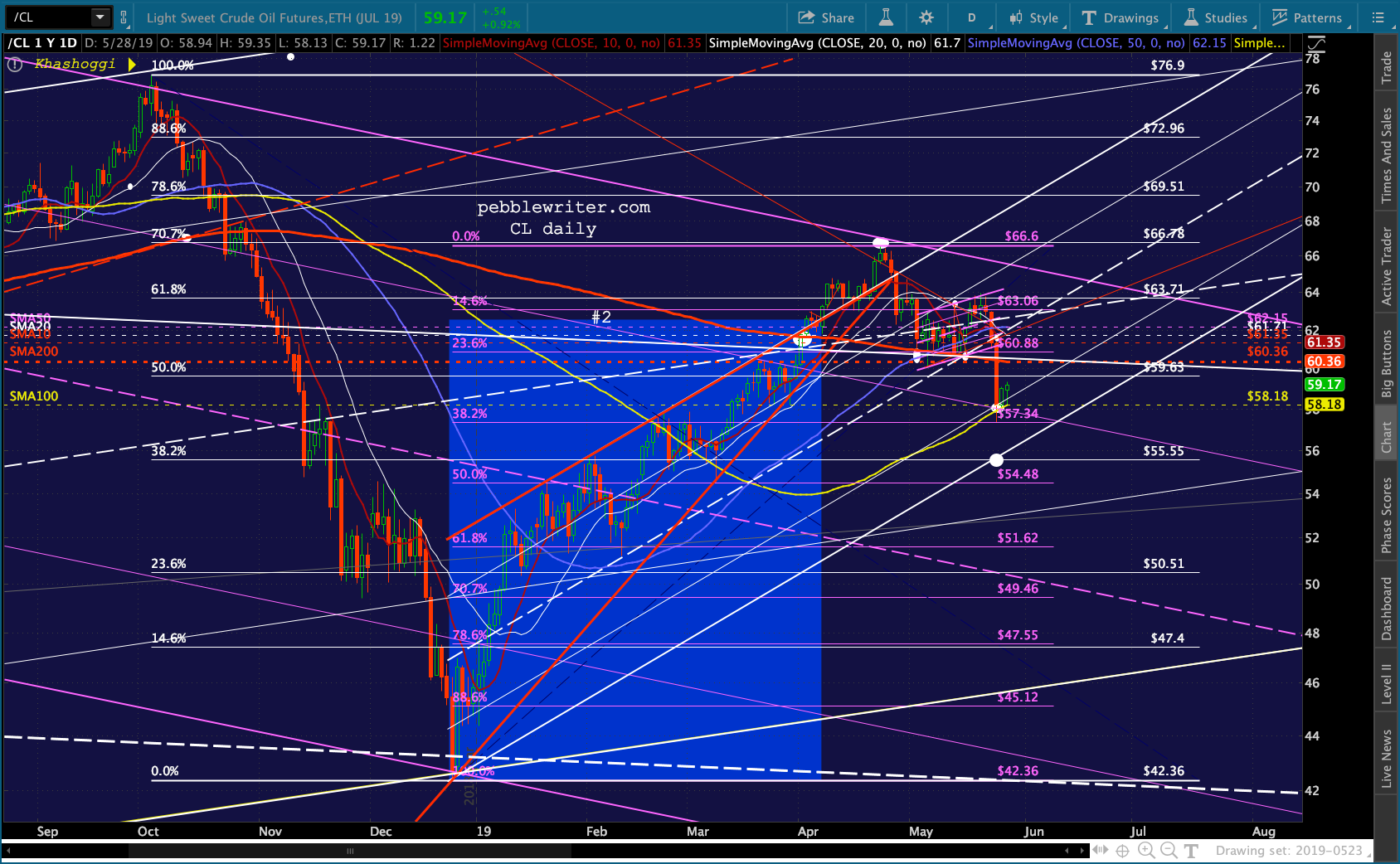
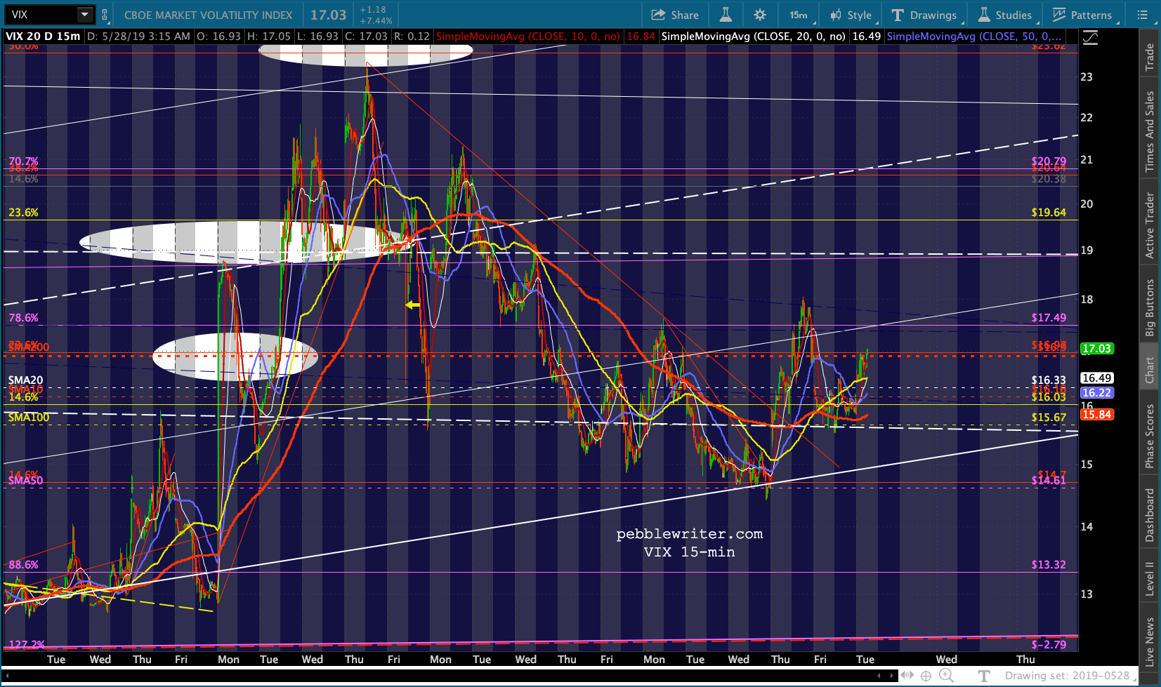
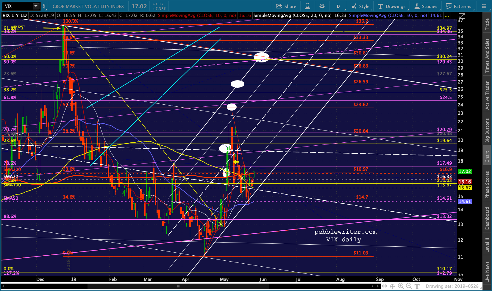
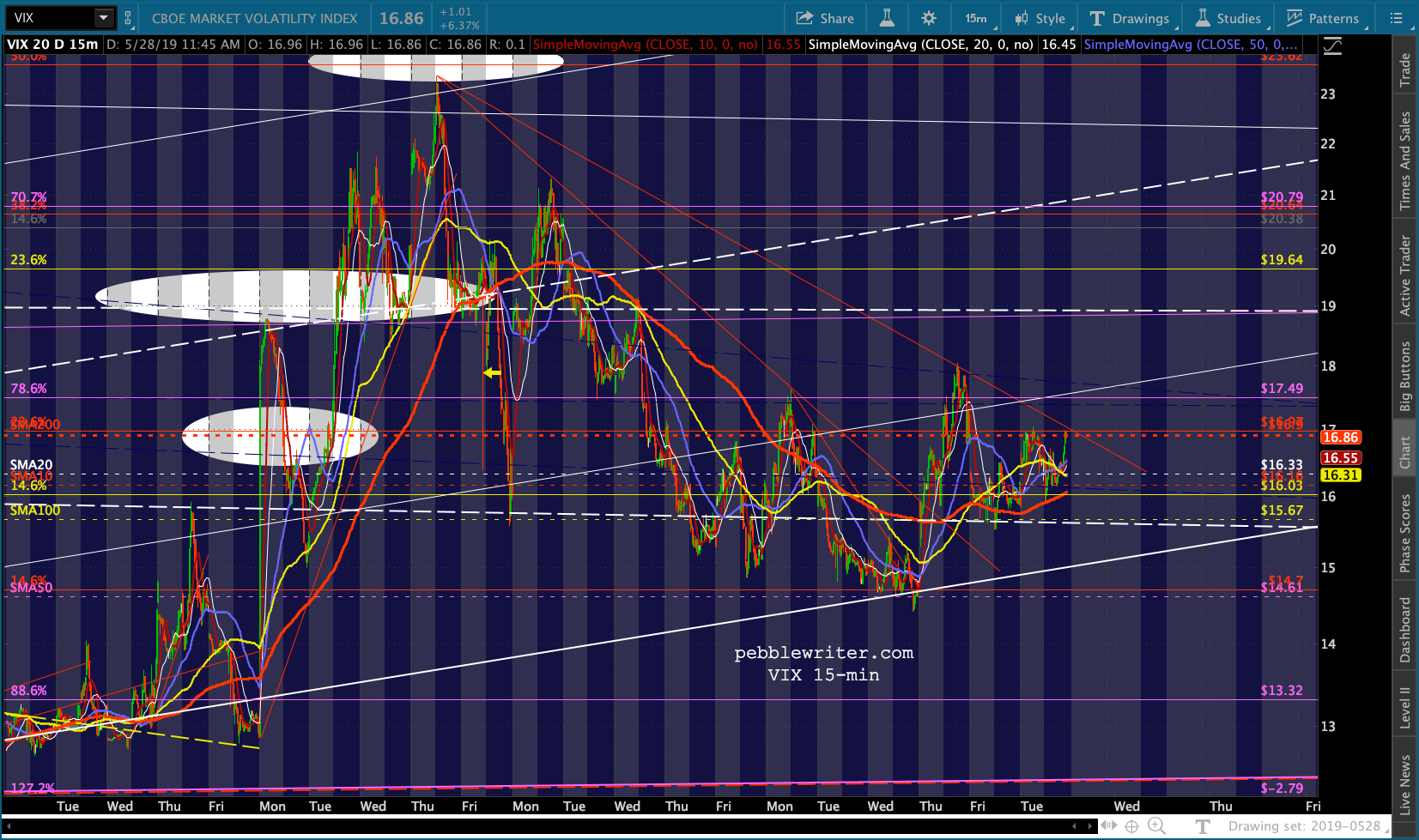
 And, VIX is currently sitting at its SMA200, suggesting a breakout but not really accomplishing it yet.
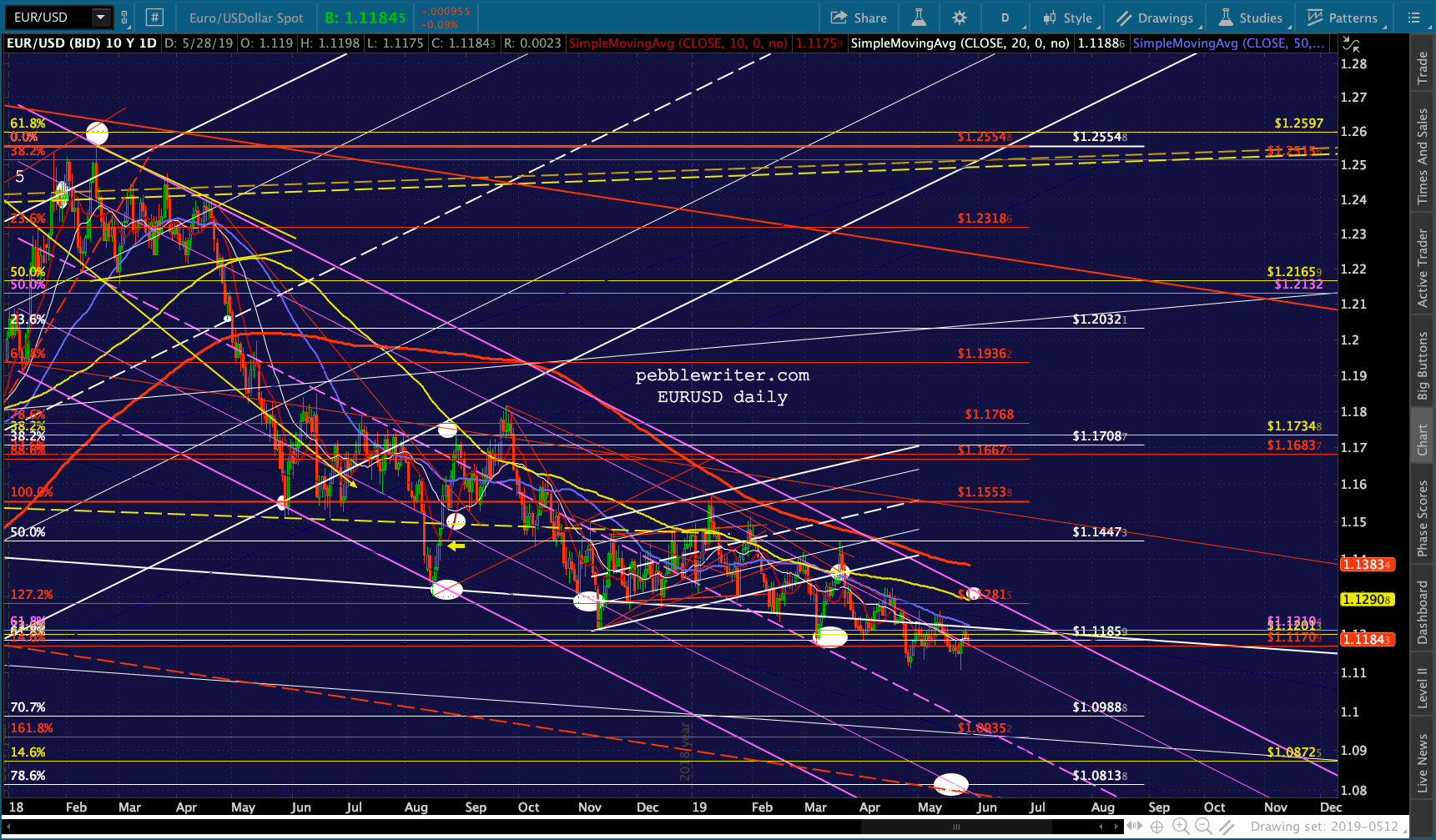
 Ditto for USDJPY — which is in prime position to drive stocks lower by dropping to our target.
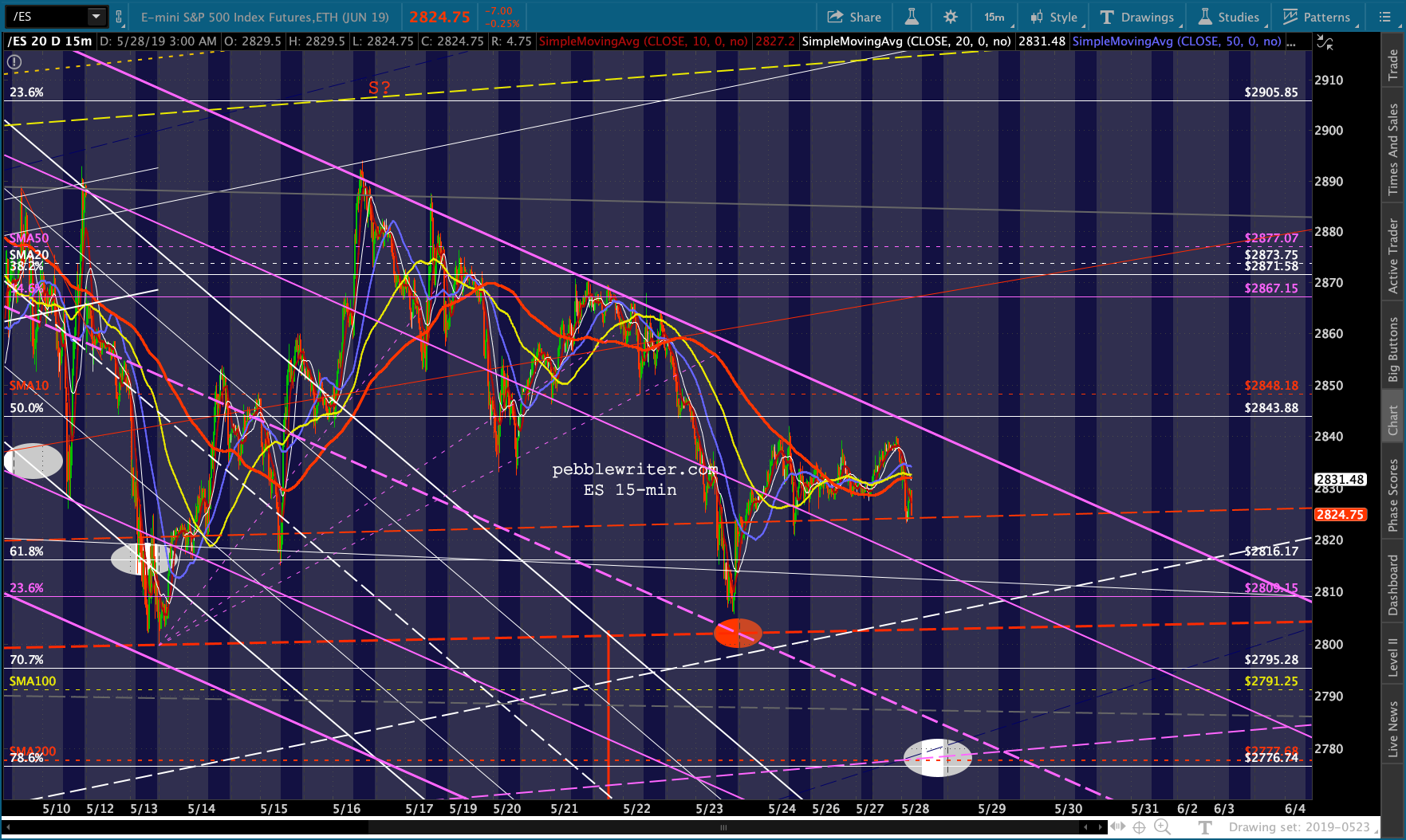
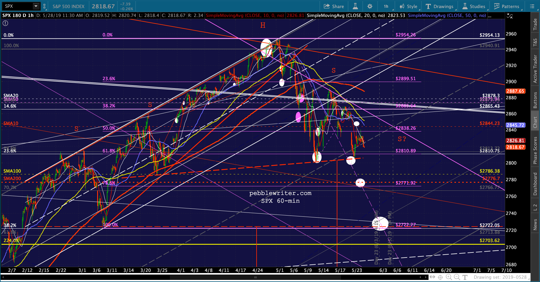
 This leaves stocks in a good position to complete the moves we’ve been waiting for for weeks.
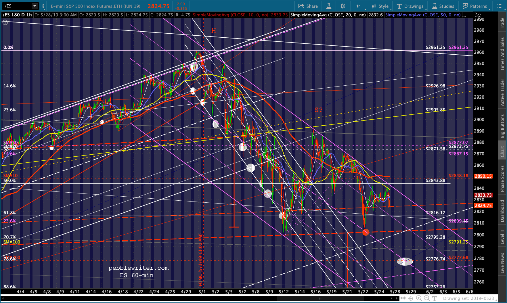
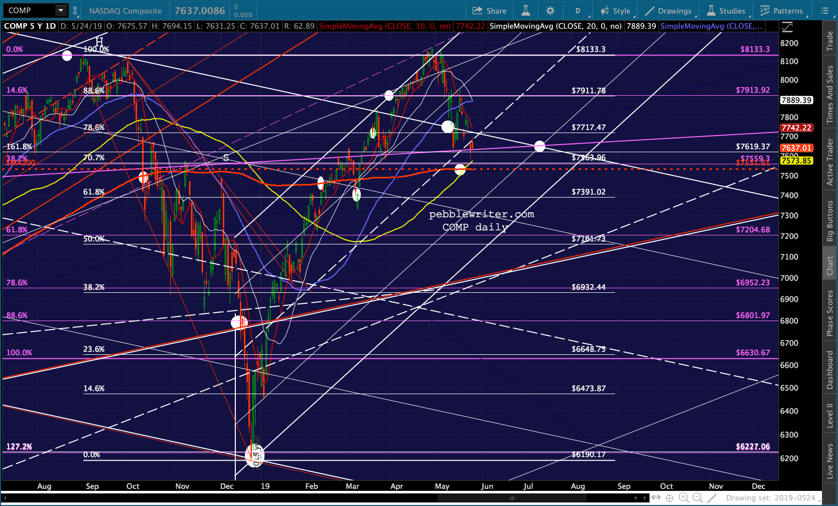
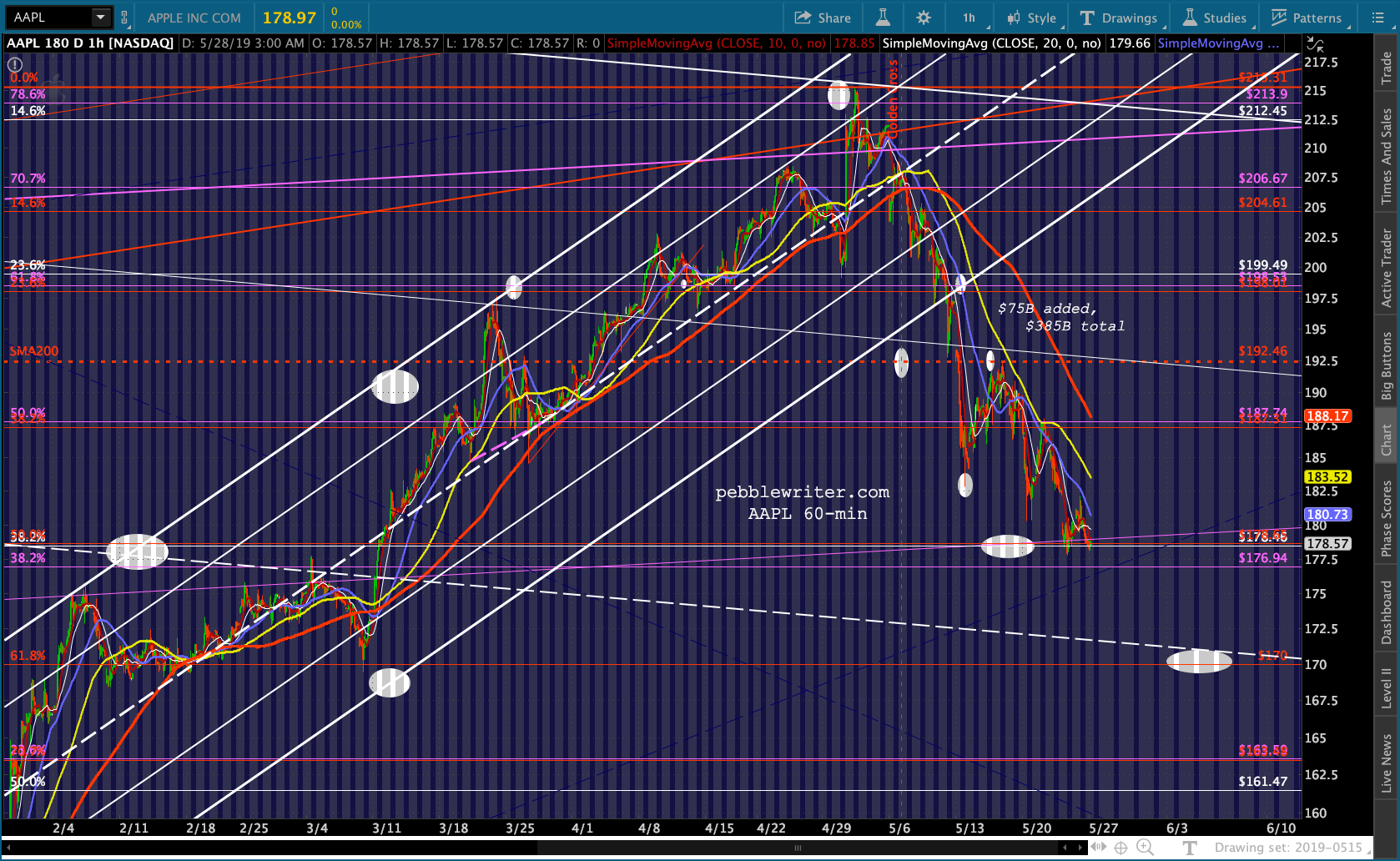
 I’ll be out of the office most of the day today, will post more towards the close.
GLTA.
UPDATE: 2:40 PM
ES/SPX are picking up a little momentum. VIX is creeping up toward its SMA200 again, which would be the all-clear for bears. Watch for a bit of an uproar when it happens.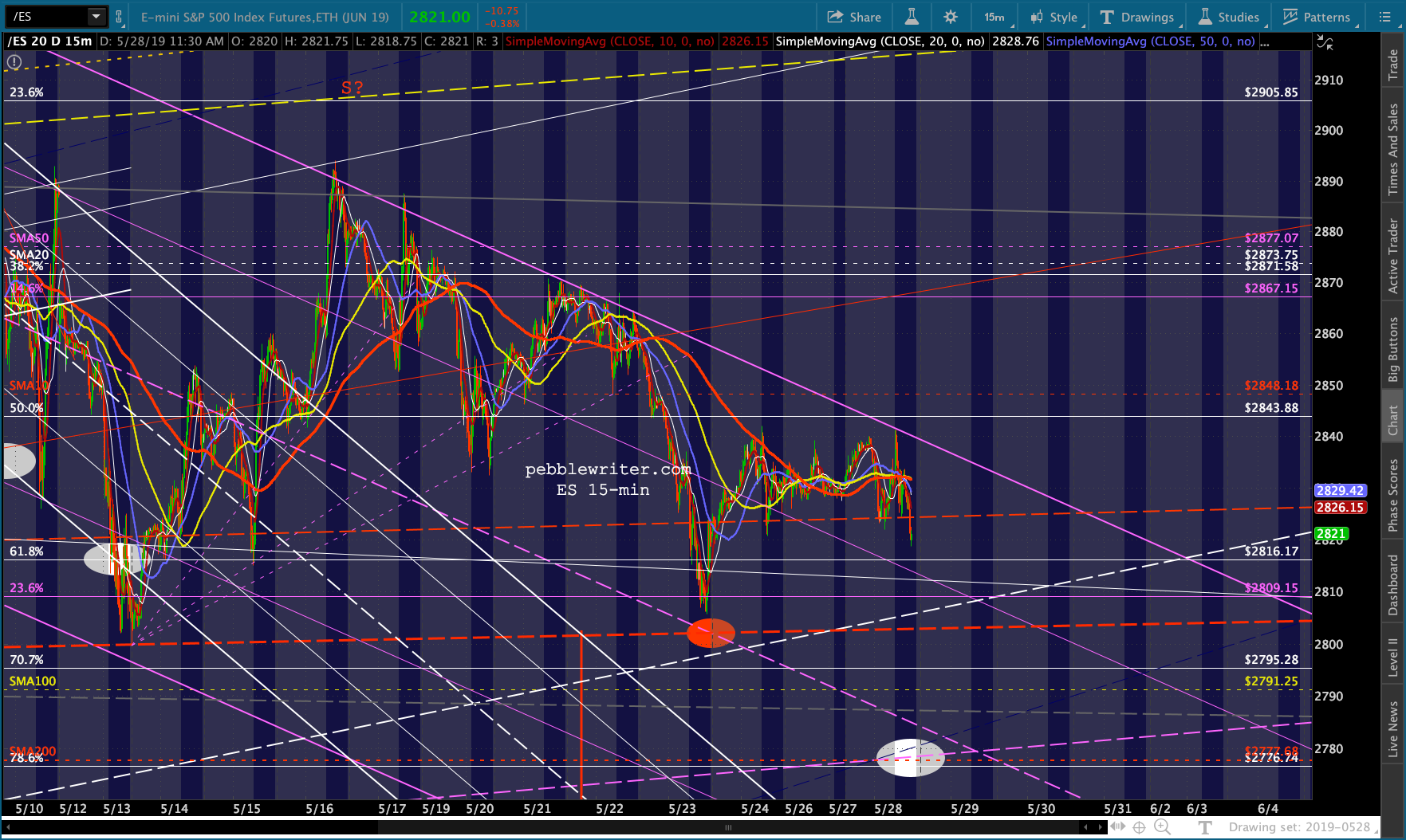
 CL and USDJPY are pretty much staying out of it.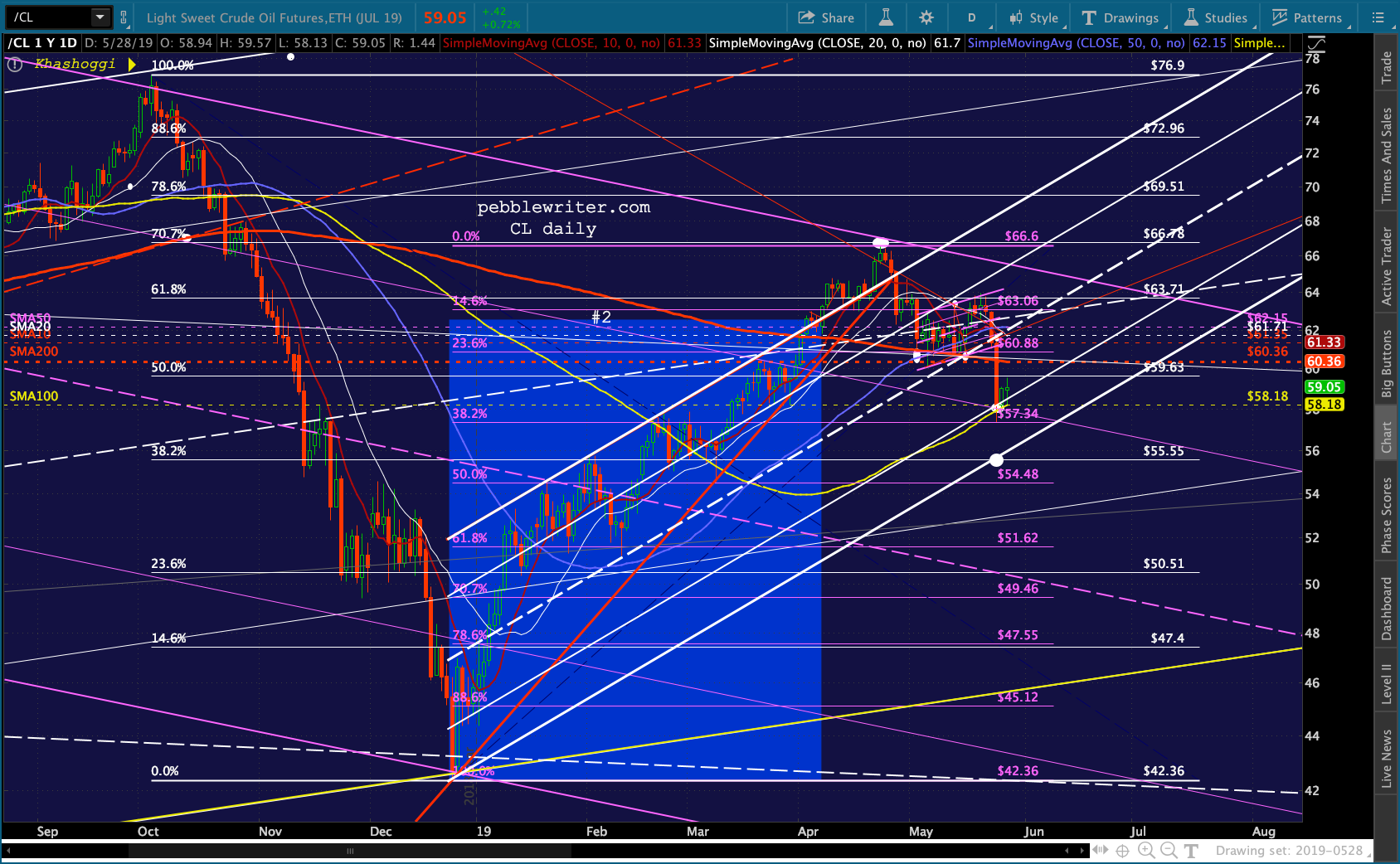
 GLTA.
GLTA.