Tag: rising wedge

  • On Our Way: Feb 21, 2013

    ORIGINAL POST:  9:50 AM

    SPX is off another 10 points so far, for a total of almost 30 since we went full short at 1530.50 on Feb 19.  Look for a bounce at 1499/1500 – a psychologically important line in the sand, and also the .886 of the rise from 1495 to 1530.

    It also satisfies pebblewriter’s corollary, which is that the market seeks levels at which the greatest ambiguity can be maintained.  At 1499, the market could be setting up a bearish Crab Pattern down to  the 1.618 at 1472.82 (shown below in purple) which would find support around the Sep 2012 high of 1474.

    OTOH, SPX could be setting up a bullish Crab Pattern (in yellow) to the 1.618 up at 1555, which also happens to be the 1.618 extension of 2012’s 1474 to 1343 decline (1555) and the 1.618 of 2011’s 1370 to 1074 decline.

    So, which can we expect?

    continued for members

    (more…)

  • What Recovery?

    source: eurostat.ec.europa.eu

    It was thoughtful of eurostat to include the US in their chart.  Funny, that’s not the chart one would picture based on the MSM’s steady drumbeat of “recovery!”

    Germany, which had previously taken an ambivalent attitude about the soaring euro, might change its tune following its worst GDP print since Q408.  The main culprit?  Exports, which fell 15.4% from November – the worst monthly decline since 2007 – and 5.7% YoY.  Straight from the Bundesbank:

    Housing figures for Q4 should be out soon, but look for a continuation of the slide.

    A falling euro might increase exports, but make oil even more expensive – the same energy/export conundrum in which Japan finds itself.

    UPDATE:  12:20 PM

    SPX continues to move sideways.  The H&S pattern completed yesterday busted, completed again, busted, and is working on completing a third time.  This is a very ugly pattern, with hardly anything normal about it — especially the 3 right shoulders.

    It should have already paid off yesterday with a trip down to 1511ish.  The red channel I drew yesterday is holding nicely so far, but a departure to the downside this morning was quickly erased.  It even fell through the larger red channel midline but rebounded.

    Clearly, the bulls are trying valiantly to defend the 1520 level.  But, can they?

    continued for members(more…)

  • What Gives? Feb 13, 2013

    It was worth watching the SOTU last night just to see Boehner’s contortions, trying to scowl in a dignified, statesman-like way.  Nothing much new in the speech or the response.

    More interesting was Mitch McConnell’s comment on CNBC last night that the sequester will go into effect. I don’t know any reputable economist who believes we can go through sequester without a sizable hit to GDP.

    But, the market is ignoring the tenuous economic situation and continues to edge higher.  What gives?  Aside from the $85 billion mainlining into the banks every month courtesy of the Fed, that is…

    Zerohedge ran a BofAML study last night that pretty much says it all.  The market is currently reflecting bullish sentiment that’s higher than almost any time since 2002.  I imagine it’s even a little higher this morning.

    Most past ventures into this sentiment range have not ended well for the markets – especially when there is a huge divergence between soaring markets and faltering economic backdrops, as the charts below show.

    Notably, the market is ramping these past few days on negative divergence in every single time frame – from weekly on down to 5-minutes.  And, it has completed some very significant harmonic patterns at the very top of a massive ending diagonal/rising wedge that’s precisely aligned with several previous tops (Jul 2011, Apr 2012, Sep 2012.)

    SPX surpassed our IHS target of 1522.60 from yesterday.  I’m closing out longs here at 1524 and will play the downside.

    UPDATE:  3:15 PM

    Getting a nice little push to the downside here — now 7 points off the daily high.  The white channel line that had been providing support is now providing resistance at around 1518.60 (the purple Crab’s 1.618 Fib is 1518.57.)

    SPX just completed a little H&S pattern that targets about 1510.80.

    Stay tuned…


  • Charts I’m Watching: Feb 5, 2013

    The dollar is taking a breather after a strong reversal off the latest .886 and channel bottom, but appears ready to break out.

    The EURUSD back-tested the broken channel line and rising wedge lower bound, and is likely about done.

    SPX fell 19-pts after we shorted last Friday.  We positioned for an intra-day bounce, but SPX added only 4 points before falling back to complete a little H&S pattern at the close.

    continued for members(more…)

  • Charts I’m Watching: Feb 1, 2013

    ORIGINAL POST:  9:15 AM

    E-mini futures are up big overnight, but have yet to exceed Wednesday’s high.

    A positive revision in BLS’s Nov and Dec employment numbers makes 2012 look better than it did, but I’m not sure how it helps today’s 12.3 million unemployed or 8 million underemployed or 2.4 million marginally attached…


    Markit Mfg PMI actually a little lower than Jan 24 flash numbers.

    Verdict: not chasing this ramp job unless it exceeds recent highs — which I don’t believe it will, at least not from this news.

    Remember, we have Reuters/U of Michigan Consumer Sentiment coming up at 9:55 and ISM’s Mfg Report on Business at 10:00.

    Watch the channel midline here…

    continued for members(more…)

  • But, When It Was Bad…

    In my younger days I played Rubgy, a drinking party with a little sport thrown in to make it legit.  I don’t know if it’s still so, but back in those days, when the parties (always with the opposing side, much more civilized than American football) reached a certain level of inebriation, someone would start up with some limericks.   Who knows why…

    They were always off color, often hilarious, and sometimes even made sense in spite of the fact that the guy delivering it was, by then, completely arseholed.  There were no less than a dozen variations on the Longfellow poem There Was a Little Girl.

    There was a little girl,
        Who had a little curl,
    Right in the middle of her forehead.
        When she was good,
        She was very good indeed,
    But when she was bad she was horrid.

    One of the cleaner variations finished with “and when she was bad she was incredible.”

    As I watched the news roll in over the past 12 hours, I couldn’t get that poem out of my head.  Got an economic boo-boo?  Not to worry, the Fed will kiss it and make it all better.   We’re all so conditioned to that idea that no one bats an eye when it’s reported like as did CNBC:

    Frankly, I’m surprised they even threw in the word “possibly.” It’s probably only because, as Cramer assures us, this enormous GDP contraction from the previous quarter was a “one-off” event.

    More details on the report — the first negative quarter since 2009 — shortly.  But, the chart from Briefing.com clearly illustrates a lower low to go with the Q3 lower high.  Sorry, folks, but that’s a trend that points downward — especially when you layer in a sequestration and tax increase coming up next quarter.

    Of course, this horrid economic news pales in comparison to the importance of the Blackberry 10 launch.  Which, of course, will hopefully distract our attention from the craptastic AMZN earnings report — which, almost got the stock back to where it was two days ago…imagine if they’d had two positive footnotes in there! — and Boeing, the future of which is sitting on tarmacs in the form of fifty 110,000 kg paperweights (with another 800 on order.)

    The market’s reaction to all this?  Off a whopping 3 points on SPX and 20 on the Dow.  Oh, well, I suppose it could be up 10.  I’m taking on odds on how many minutes it takes for the BB-10 launch to replace the GDP headlines on CNBC.com…

    continued for members(more…)

  • Trading with Harmonics

    The first of a two-part article on harmonics trading strategies.

    Part 1.  January 28, 2013

    Harmonics are a great source of information about the market, but they don’t tell you how or when to trade any more than do MACD crosses or breadth indicators.  So, how do you use them?  This discussion of the basic process might serve as a good starting place for beginners.

    I consider harmonics like trade alerts.  That is, every time we approach an important Fib level, I stop and consider whether the market is likely to react or not, then make a trade decision accordingly.

    There are pages for each specific pattern under the Learn>Harmonics tag on the Home Page.  But, they all relate to one another.  Let’s walk through a real world example.

    SPX has fallen from 1576 to 666 and seems to have bottomed (how to know it’s bottomed is the real trick.)  I draw a Fibonacci Retracement grid on the price range (100% for 1576, 0% for 666) and make sure every important level is showing as on the chart below.  For a discussion of Fibonacci levels, click here.


    ThinkorSwim makes this very easy with a built-in drawing tool, as do many other platforms.  If your platform doesn’t provide it, you might want to think about changing, or at least opening up a TOS account to facilitate your charting (and, no, they don’t pay me to say that.)  You can read about harmonics and study the charts I post, but there’s no substitute for doing your own charting.

    Back to our example: because we went long at the very bottom, we set our sights on the higher Fib levels.   All harmonic patterns are marked using the letters X, A, B, C and D.The inception point (high) is X, the low is A.  B is the first reversal, C is the next, and D is the completion. The location of the reversals relative to specific Fib levels tells us what kind of pattern we probably have.

    Suppose we’ve watched SPX climb all the way up to 956, where there’s a 9% correction down to 869.  Because this reversal occurred below the .618 Fib level, we might have a Bat Pattern on our hands.  Bat Patterns complete at the .886 (1472) so we’ll make a note of that for future purposes and consider 956 a potential Point B.

    We sail right through the .382 and .500 levels, then experience another 9% correction at just above the .500 (1150 to 1044.)  Again, it’s below .618, so it could be signalling a Bat Pattern.  But, it’s a relatively minor reaction, so we treat it as only a potential Point B.

    Now we’re approaching the .618 at 1228.74 — the most important of the Fib levels.  Because the two prior reversals were pretty tame, we might suspect more from this one. We begin to contemplate a short position, and look for other signs of a reversal.

    Because we’ve been watching closely, we notice a smaller Crab Pattern setting up as we approach the .618 (the purple pattern below.)  It features a Point D at 1215.93 — slightly below our .618 at 1228.74.  So, we feel pretty confident about this being a good trade entry.

    Are there other chart patterns such as a rising wedge, channel, fan line, etc. that also hint at a reversal?  In fact, there’s a nice channel that’s formed over the past 9 months, not to mention a broken RSI channel (in red) just shy of the Crab completion.  And, we’re nearing the 1240 target of the Inverted Head & Shoulders pattern completed at the 2009 bottom.

    These would all be good reasons to consider a short.  Taken together, they make for a pretty compelling argument.  Where, though?  Other traders are watching the same charts we are, so there’s a chance the reversal will come a little early.  We don’t wait to wait too long and miss the top.  But, of course, every point too early is a point of lost profit.

    In the end, timing is a judgement call based on many factors, including liquidity, risk tolerance, the type of instruments we’re trading, other positions in the portfolio, etc. and is worthy of its own article.

    Let’s assume we make the decision to open a short position around 1213 on the April 15 — in case SPX doesn’t make it all the way to 1215 or 1228.  We feel pretty good about our decision when SPX is down to 1186 the following day and 1183 the next.  That’s a 2.5% move in two days — not bad.

    On the third day, however, our plan is looking iffy.  SPX gaps up on the open and hits 1208.  Three days later, it pops above the Crab target of 1215.93 and tags 1217, seemingly in search of the .618 at 1228.74.

    Suddenly, we’re underwater by 15 points or 1.25%.  Is it time to bail?  Again, it depends on the type of investor you are.  Options traders might have closed their puts for large profits already, while swing traders might be happy as long as SPX doesn’t exceed 1230-1235.  Buy and hold types might have used the Fib level as a warning of a potential downturn and hedged or lightened up on their long positions.

    Checking our charts, we can see that neither the price nor the RSI channels have been broken to the upside.  In fact, the little red RSI channel which helped convince us of the downside potential shows the latest push higher came with a lower RSI score (negative divergence) and a pretty pathetic back test.  So, we’re inclined to hang in there.

    It turns out to be a great decision.  The following day, RSI plunges through the midline of the purple channel.  SPX plunges 38 points from its high, stabilizes for four days, then really starts falling apart.  On May 4, SPX reaches the white channel midline, a possible bounce spot.  We’ve already made 4.5% since shorting at 1213 less than 3 weeks ago.  Time to bolt?

    To be continued…

  • The Dow: Time to Double Down?

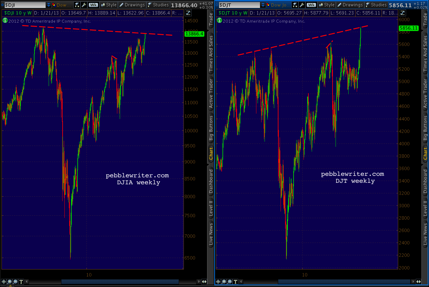
    Many are watching the Dow Transports’ recent all-time highs, wondering if Dow Theory suggests new highs for the DJIA as well.

    Without wading into the debate over which interpretation of the theory holds water and which are all wet, I think it’s important to recognize that the DJIA is one of those indices not making new all-time highs lately.

    Should the Industrials not break above 14,198.10, this would be considered a Dow Theory non-confirmation, at least on a larger scale.  The last time this happened was in July of 2011, when the Transports made a new high of 5627.85 and the DJIA failed to best its May 2 12,876 high.

    We can argue about cause and effect, but there’s no argument about what happened next.

    Eighteen months later, the DJT has again broken out to new all-time highs.  DJIA has not.  Here’s the current visual, which shows the current degree of divergence is much larger than back then.

    The Industrials, in fact, are a great candidate for a double-top.

    Drilling down, we can see DJIA has nearly completed a Crab Pattern at the Fibonacci 161.8% extension (14,201.84) of the July-October 2011 crash (the white pattern.)

    It intersects nearly perfectly with the previous 2007 high of 14,198.10 at the very point where the purple channel top and white 25% channel line also intersect.  But, it need not even reach that level to be considered a double top (within 1%.)

    And, only a few points away we find a Butterfly Pattern target (small red pattern) at 13,985.65 and a Crab Pattern target (in white) of 13,963.50.

    The last leg up in the move since October 2011 has been 1424 points — roughly 87% of the leg 3 rally between June and September of 2012.  A Fibonacci 88.6% of the leg 3 rally would register at 13,912 — well within the margin of error for any of the harmonic patterns mentioned above, and only 16 points above today’s high.

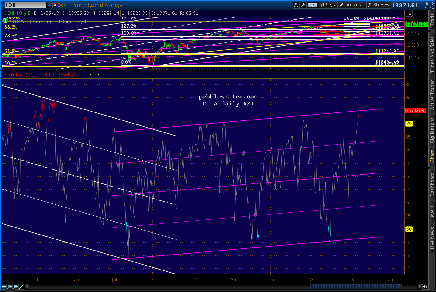
    And, for those who, like me, love to channel stuff, the DJIA’s daily RSI has its own bearish tale to tell.

    Could DJIA blow through 14,200 confirm the Transports’ all-time high and spoil the bears’ party?  Of course.  There are still plenty of earnings reports to sift through, including AMZN, CAT, FB, YHOO, IP, PFE and F in the next few days.  We could get great Durable Goods numbers Monday, Case-Shiller Home Price Index on Tuesday, or a bullish FOMC outcome on Wednesday.

    But, anyone counting on new all-time highs should remember July 2011 and consider protecting their downside.

  • Now What?

    First, a quick overview…

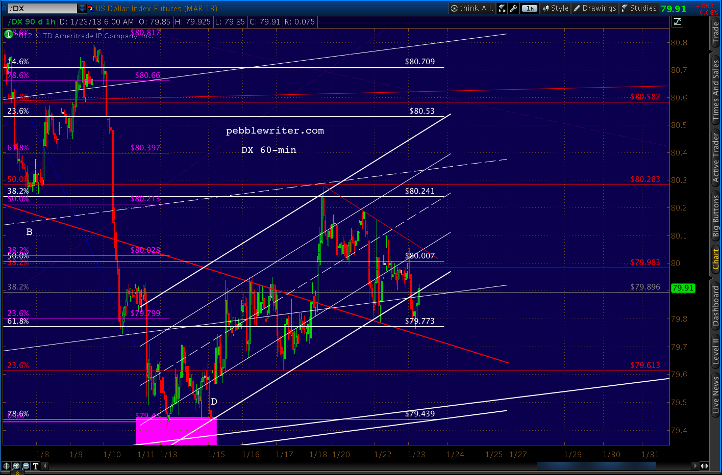
    The dollar got clobbered overnight, knocking it temporarily out of the white channel that’s guided it since Jan 11.
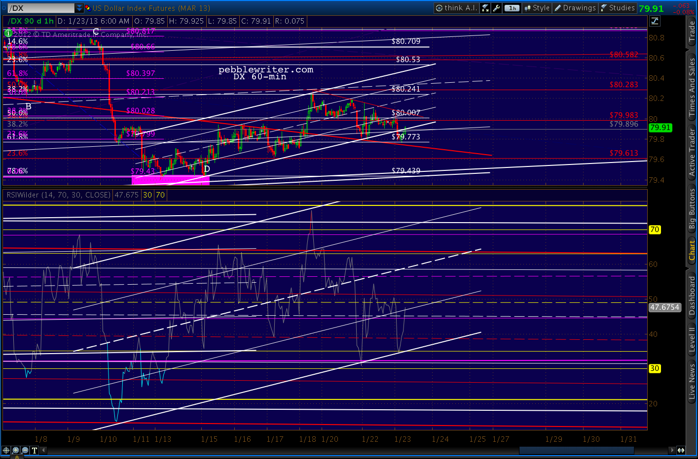
    But, interestingly, its RSI channel is doing just fine, thank you.
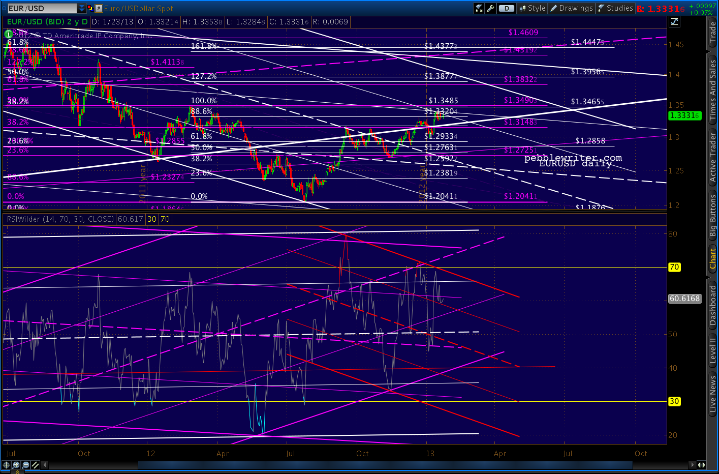
    The EURUSD continues to levitate, but still hasn’t broken the last important interim top put in on Feb 24.  It is also bumping up against two 25% channel lines, so could very well stall out here at the .886.
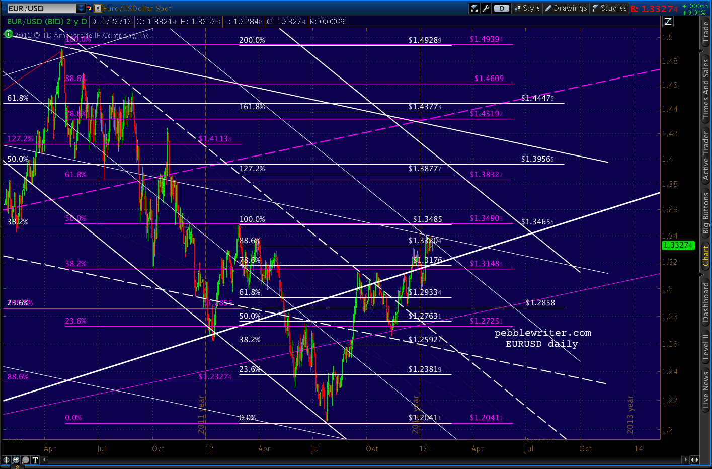
    There is still ample negative divergence regardless of which channel ultimately wins out.
     

    With the market exceeding the recent 1474 highs, the analog that did so well for us since last April is officially dead.  This begs the question: “now what?”  I see three big issues hanging over the market right now:

      1. earnings season —  AAPL in particular
      2. the US budget/debt ceiling imbroglio
      3. new highs justified?

    Earnings

    GOOG and IBM both gapped up this morning, but the earnings that can really move the market — AAPL — comes after the close.  We’ll take a fresh look at the AAPL chart later today.

    Budget/Debt-Ceiling

    In a few hours, the House will probably pass a measure to postpone the debt ceiling debate until May.  Reid and Obama have both said they’re on board, so this appears to be a done deal.  If House Republicans don’t fall in line, as occurred with “Plan B,” the market will sell off precipitously.

    New Highs

    The market’s strength has caught many off guard, including yours truly.  Many are calling for new all-time highs for SPX. The 2007 high of 1576 is now only 84 points away, so a few good sessions could do it.

    We’ll take a fresh look, focusing on the harmonic and chart pattern picture as well as the establishment agenda.  “What’s that?” you say.  Say all you want about random walks, CAPM, dividend discount models and Dow Theory.  Like any government-managed enterprise, the market is subject to the policy goals and needs of those who attempt to control it.

    Even to my cynical ears, this sounds a bit like rants from the tin-foil hat crowd.  But, consider the news on Egan-Jones yesterday.  This is one of the biggest stories of the month, yet predictably earned only this from WSJ/Marketwatch:
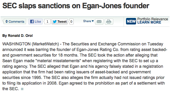
    CNBC was slightly more generous, yet still presented only the SEC’s side of the story.  It’s a story that deserves to be told because it speaks volumes about the degree to which the market is presently being controlled.  And, I’m not just talking about quantitative easing, though I suppose we’d have to consider QE exhibit #1.

    Last summer the market crashed 22%.  It was an analog (replay) of the 2007 top, so we saw it coming in plenty of time to profit quite handsomely.  But, it was a huge wake-up call for The Powers That Be (TPTB) or Plunge Protection Team, Wall Street Cabal — whatever you want to call it.

    With virtually unlimited power and unlimited resources, why couldn’t they prevent something like that from happening?  More importantly, if the top was a replay of the 2007 top, might the rest of 2011 play out like 2008-2009?

    It didn’t, because they learned from the crash of July-August.  First, they tweaked the markets just enough to bust important chart patterns that were playing out.  Second, they tweaked the rules to provide for more time to contain any damage which might otherwise occur (circuit breakers, etc.)  Third, they attacked those who had “caused” the crash.

    S&P CEO Deven Sharma was one of the first victims.  In the wake of the 2007 financial crisis, S&P was rightly pilloried for having pulled its punches — particularly on mortgage and banking related debt.  This was no surprise to anyone who’s ever worked on Wall Street — which pays for these supposedly unbiased views.

    An infamous exchange between two S&P analysts in April 2007 aptly illustrates:

    “BTW, that deal is ridiculous.”

    “I know, right . . . model def(initely) does not capture half the risk.”

    “We should not be rating it.”

    “We rate every deal. It could be structured by cows and we would rate it.”

    Imagine if Hollywood studios funded the reviews of their movies.  Would you care if they received thumbs up or down?  So, in August 2011 S&P found religion and bravely downgraded US debt.  Seventeen days later, Sharma was fired and replaced with the COO of Citibank, the bank whose existence relies on the absence of any future downgrades.

    Egan-Jones beat S&P to the punch, downgrading US debt on July 16.   Two days later, the SEC’s Office of Compliance Inspections and Examinations called looking for information on the downgrade.

    On October 12, Egan Jones was formally notified of a Wells Notice — they were being investigated.  On April 24, the SEC filed a cease and desist order against Egan-Jones — the only rating firm not on the take — stating the action was “necessary for the protection of investors and in the public interest.”

    The financial establishment’s interests, sure.  But, to frame this obvious smack down as “in the public interest” is laughable alarming.  Egan-Jones was the one rating firm with the balls to point out the country’s crumbling financial condition and stick to their guns.  Now they’ve been branded as deceitful, dangerous.  George Orwell spoke the truth in 1984:

    “In a time of universal deceit, telling the truth is a revolutionary act.”

    That other deep thinker, Jim Morrison, provided a similarly profound observation:

    “Whoever controls the media controls the mind.”

    The extent to which the market has been manipulated is deserving of its own post.  But, this Zerohedge article, forwarded by a member, is a great preview.

    Okay, so I know what you’re thinking: if the market is so heavily manipulated (and, presumably, insulated from downturns) why bother trying to beat it?  Simple.

    1. Chaos theory tells us they won’t have enough fingers to plug every hole in the dike (TPTB have similar “never again” strategy sessions after every crash.)
    2. Even when things do run as programmed, we can still effectively capture enough significant swings in the markets enough of the time to boost returns and, more importantly, try to avoid huge downdrafts.

    Over the very long-term, stocks return 8-10% — depending on the time frame examined.  But, sadly, most of us are limited to 40-60 years of investing.  And, a 60% crash right before starting a business, buying a home or beginning retirement could be devastating.

    So, we’ll keep plugging away, letting the markets tell us where they want to go…while trying to get there first.

    So, the question is “Now What?”  We’ll start by looking at the harmonic picture.  As detailed in our last review of all the previous tops, harmonic patterns are very likely to come into play.  So, we’ll start with the charts, then move on to the agenda question and, last take a look at AAPL.
    Since we’ve exceeded the range at which this rally could be considered a double top, we’re probably going higher still. So, we’ll examine the 1.272 and 1.618 extensions.

    In terms of a trading strategy, I’d be comfortable going long here at 1491.  But, disappointing AAPL earnings could knock the stuffing out of the market.  So, those with weak hearts should probably stay on the sidelines until tomorrow morning.

    The most recent patterns show a few possibilities, some of which are clumped together in fairly narrow ranges.  The largest of the patterns — the yellow grid — shows a 1.272 Butterfly Pattern extension at 1510.19 that intersects with the 2.24 extension of the decline (purple grid) from 1448 – 1343.

    A Butterfly Pattern is a good bet, as the Dec 18 reversal at 1448 pretty much nailed the .786 Fib level Point B (1446.44) which Butterfly Patterns require.
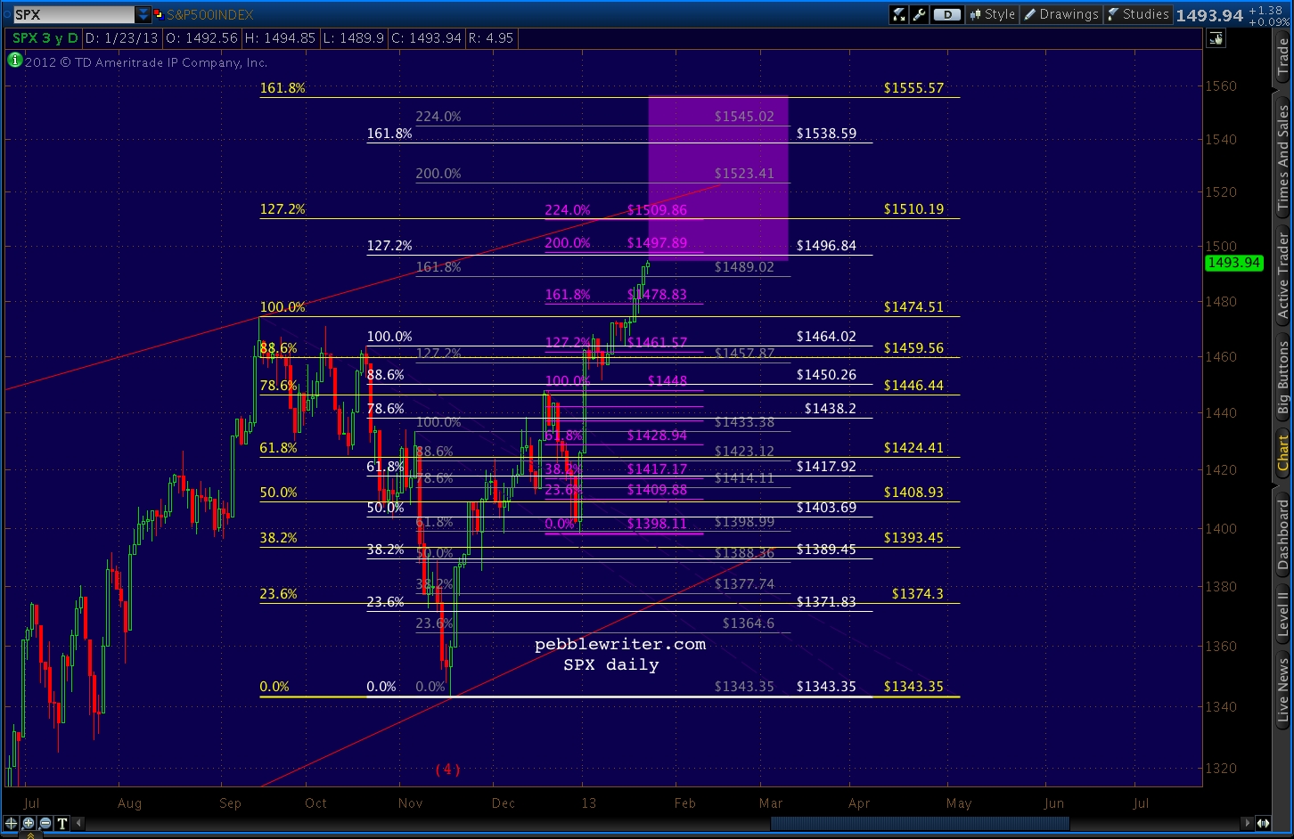
    1510.19 also falls within the confines of the thin red line — the TL connecting the Apr 2 and Sep 14 highs that would probably satisfy the EW requirements of an ending diagonal.  I know you’re out there, my Waver friends.  Please weigh in, as I know only enough EW theory to be dangerous.
    The white pattern is appealing enough, but I would have to consider it secondary in importance to the yellow since it began at a less momentous point X.  Ditto for the grey pattern.

    Although it should be noted that we faced a similar dilemma when choosing between the Point X’s for the Butterfly patterns beginning in 2011 [see: All the Pretty Butterflies.] In the end, it was a point similar to the white pattern 1.0 Fib at 1464.02 that determined the April 2 turn.  It featured a Point B closest to the .786 Fib.

    Zooming out, we can see that the 2011 highs could very well still influence the outcome of the current top.  The chart that includes everything is a little busy…
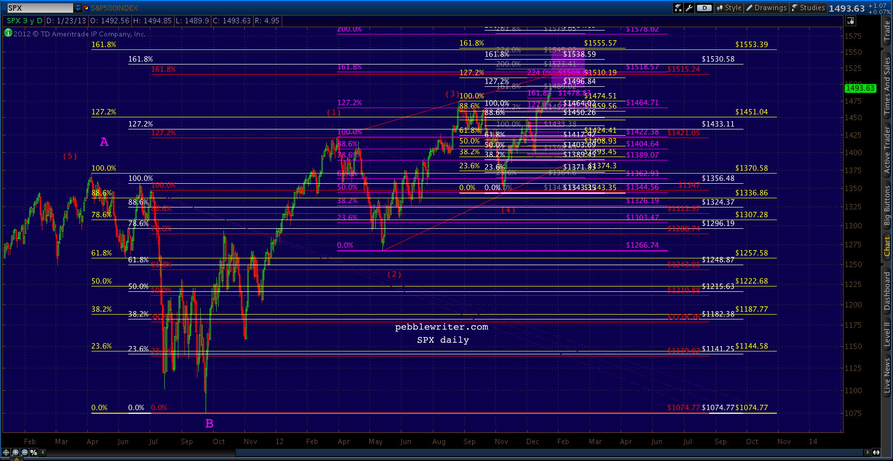
    …so I’ll clean it up by eliminating the interior retracement levels and switching to weekly.
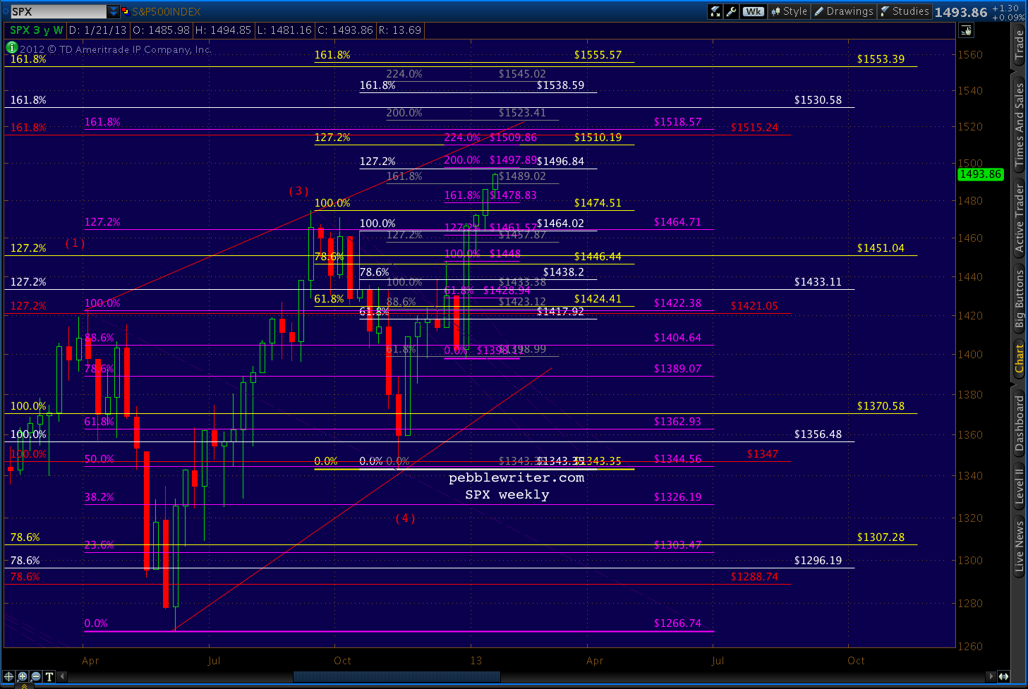
    The target areas can be more easily seen in this close up.
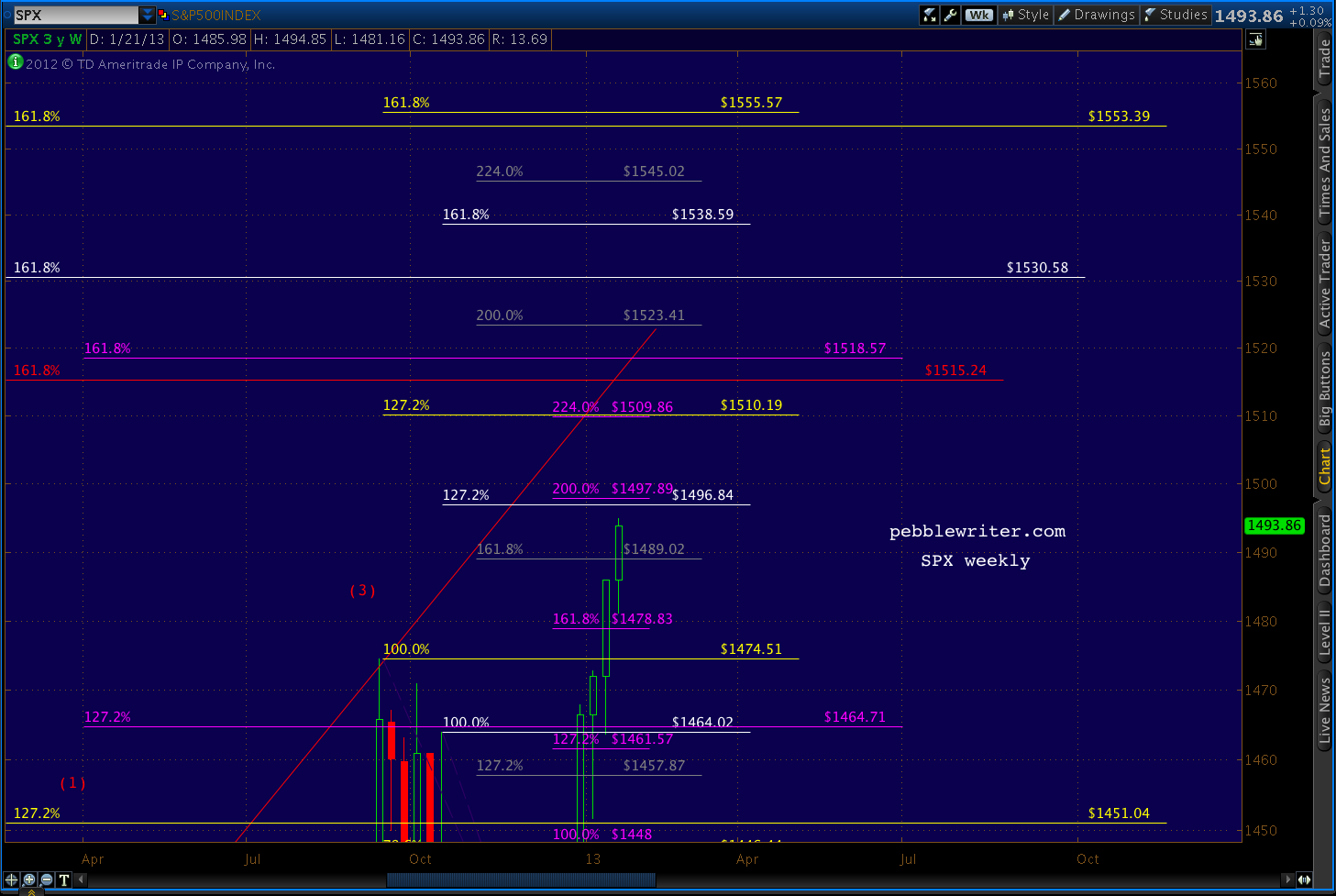
    Note that the large red pattern, the one whose 1.272 extension helped me accurately forecast the April top, comes into play at its 1.618 extension of 1515 – only a few points away from the 1509-1510 level discussed above.

    This is promising, as patterns that influence markets once (that was an 11% correction, after all!) are more likely to do so again.  And, patterns that the market completely ignores — such as the yellow and white patterns from May and July 2011 — are less likely to suddenly leap into a position of authority.

    And, there’s also a purple 1.618 extension (set up by the 1422 – 1266 decline) at 1518.57.  Again, this is close enough to be considered significant.

    If 1520 is exceeded, then we’ll look at the next higher grouping: 1553-1555.  This “group” is basically the two yellow 1.618’s.  Again, the larger pattern’s 1.272 had no influence on the market.  The smaller pattern’s 1.272 is the one coming up at 1519.

    Summary

    My leading harmonic forecast is for 1509-1515.  I can’t imagine getting this close to 1500 and not snagging it for the trophy case.  And, I like the idea of dancing with the harmonic patterns that brung us.

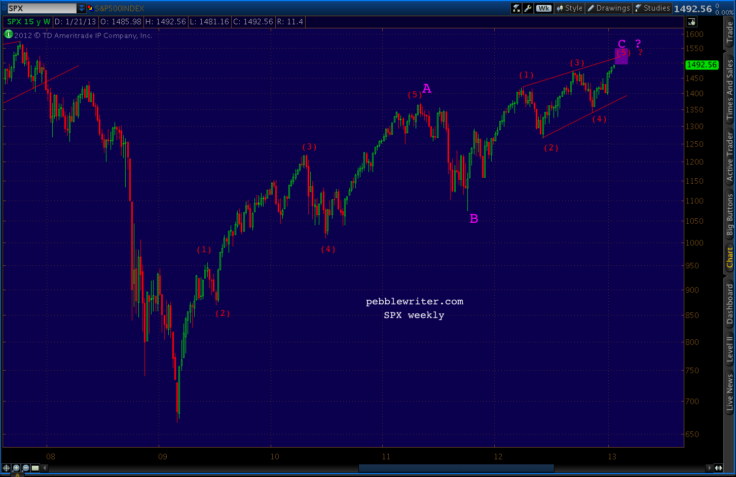
    My secondary goal is slightly higher at 1553-1555, so there should be opportunities to jump back in and capture most of any upside above 1520 if/when appropriate.  Such a move would likely follow a reversal from 1509-1515 back down to 1474ish and would constitute a fifth wave rather than the ending diagonal suggested above.

    If AAPL’s earnings stink up the joint after the closing bell, going long won’t have looked very smart.  But, judging from the steadily appreciating share values, I’m guessing that a relatively positive result is already being leaked.

    Chart Patterns

    I won’t rehash the stuff already posted in the past couple of weeks.  Just take a look at the rising wedge that would be confirmed by a reversal at 1510 as early as tomorrow.  The target would come at the .886 of the base to apex price range and .618 of the time range (almost too good to be true.)
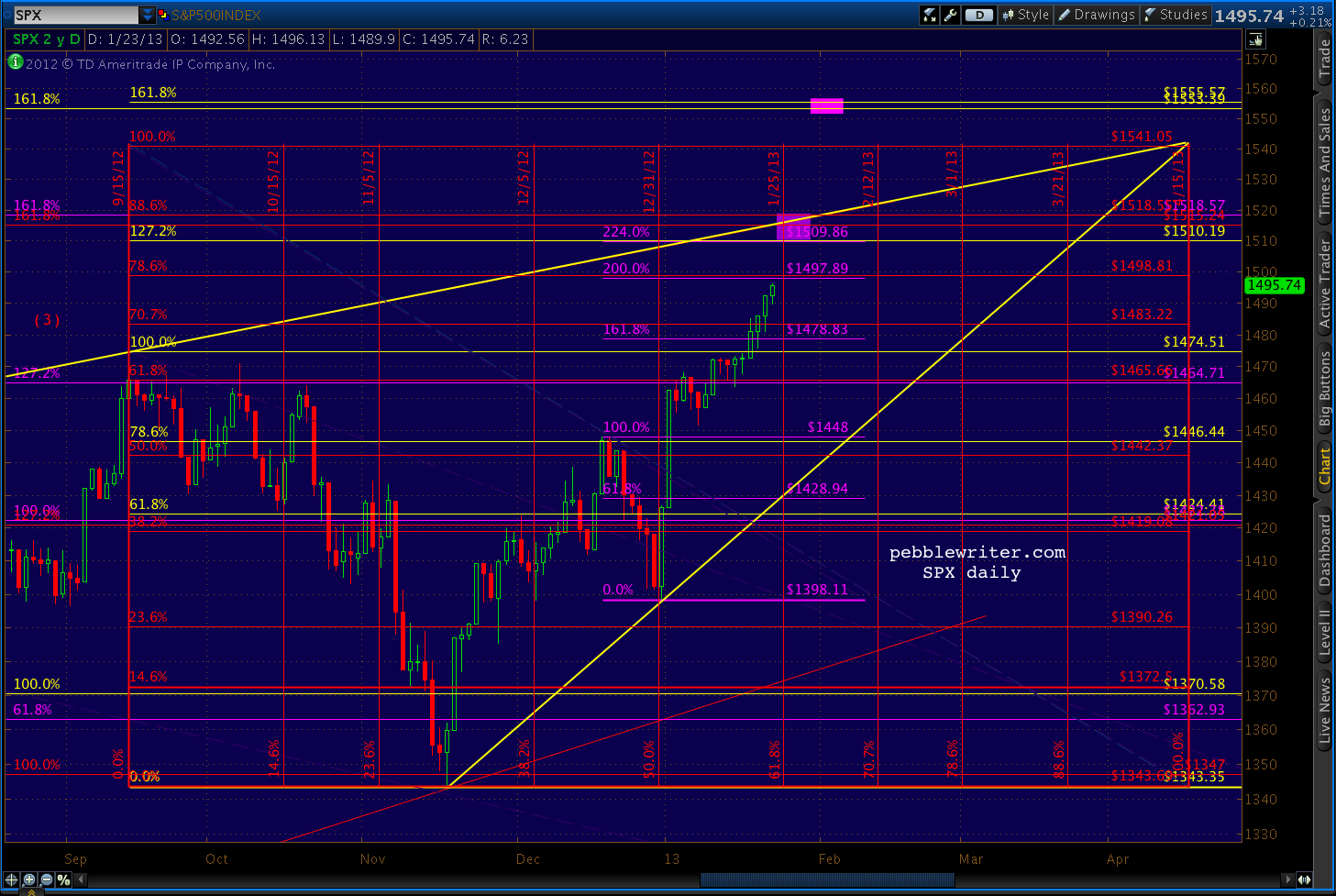
    We’re currently very close to the .786 of 1498, which tells me there’s a decent chance of a run up to 1500ish into the close.

    UPDATE:  3:45 PM

    AAPL is up almost 9 points at the moment.  A rally past 1426 would take it up out of the falling white channel it’s been in since last August.
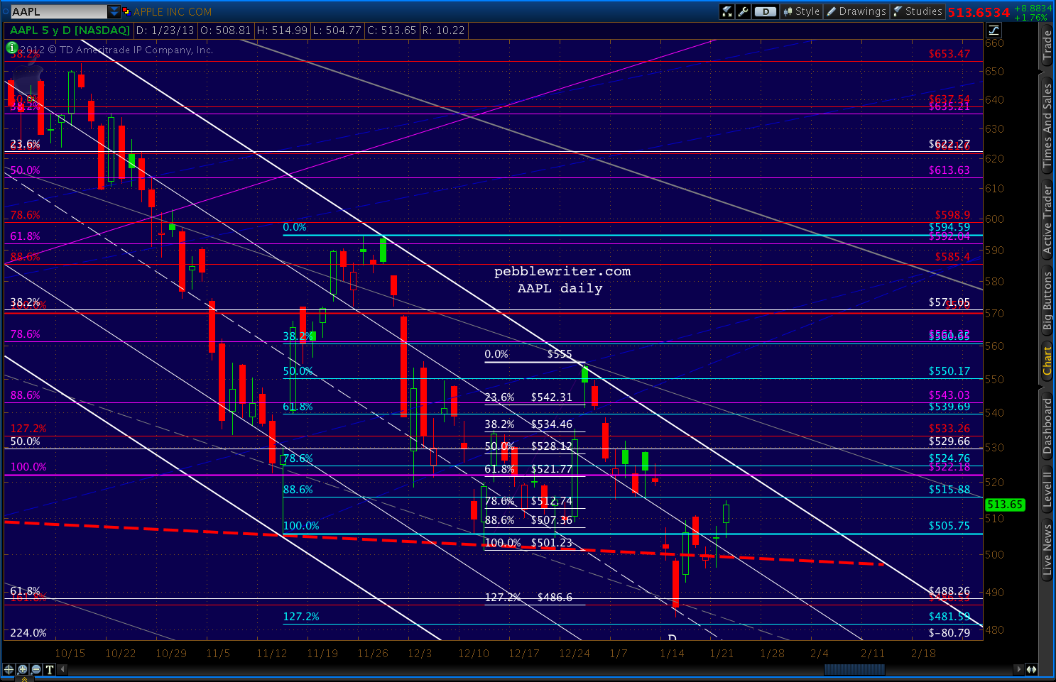
    Anything over 515 would take RSI above the white and purple RSI channel midlines.   So, as expected, much is riding on the earnings report and how it’s perceived.
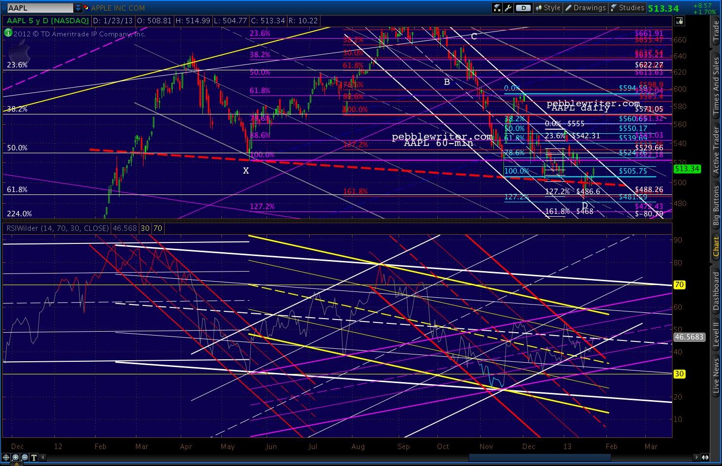
    We’ll watch these RSI channels, though. A return to the top of the yellow (and, especially the white) channel would surely spell a reversal.

    The Agenda

    I think it’s pretty straight-forward — bag an important new high, but without setting the bar so high that expectations can’t be managed.  At 1510, SPX clears 1500 but buys some time before the pressure of “will it exceed 1576?” comes to bear (no pun intended.)

    Then, get through the budget mess (or, more kicking of the can) and see where we are.  If we get a sequester, so be it.  The establishment will be well positioned ahead of time and the correction will be managed.

    After the shock of it wears off and prices have firmed in the 1200-1300’s, time to establish the next leg higher.

    Now, the big question is whether TPTB can engineer such a move without it getting out of hand — as it often does.

    Stay tuned.
  • Ay, There’s the Rube

    Oil is often viewed as a proxy for economic health.  In a growing economy, energy consumption increases.  This increased demand generally pressures prices higher.  Likewise, a decline in oil prices often accompanies declining demand.

    That’s a greatly oversimplified view, of course.  It ignores such important issues such as Middle East tensions, weather and refinery anomalies, etc.

    But, the most important of these external factors is the US dollar — the currency by which oil is traded globally (for now.)

    A weakening dollar is great for the many US companies that export overseas.  In general, it makes dollar denominated assets — such as stocks, real estate, etc — more attractive to overseas investors which helps the US attract and retain capital.

    But, it makes foreign-sourced oil much more expensive.  This isn’t an issue if you travel everywhere via America’s world-class public transportation system.  But, it really sucks for the guy with a 3-ton SUV — or anyone who consumes anything made overseas, for that matter.  Imports are about 18% of GDP.

    So, what’s a central banker to do?  Boost stocks and investment in US assets, and there’s a pretty good chance you blow the budget of every American consumer.  (Of course, it only really affects those who eat and drive — hey, buy a Chevy Volt already!)

    Boost the dollar to make gas and food more affordable for the 50 million Americans living in poverty (1 in 5 children, 2 in 5 African American children), and you risk a true disaster — a stock market decline.

    Never fear… Bernanke and his fellow Guardians of the American Dream know whose bread to butter.

    The chart below shows how crude light, the US dollar and the S&P 500 correlated over the past seven years.  In 2006 and 2007, oil and the stock market soared pretty much in sync while the dollar took it on the chin.  When SPX topped in late 2007, oil kept right on soaring — because the dollar was still plunging.  Nationwide, gas hit $4.12/gallon in the summer of 2008.

    We’re all conditioned to think of dollar strength as a function of risk off.  But, as the financial crisis worsened, the dollar couldn’t catch a bid.  Money fled to the euro, the swiss franc, the sterling — anywhere but the dollar. There were several best-sellers on bookstore (remember those? shelves that advised putting every last cent into the euro.

    From October 2007, when SPX peaked, until July 2008, stocks and the dollar moved pretty much in tandem.  But, as euro zone problems became more apparent, the dollar finally bottomed.  In August, as stocks began sliding again, the dollar finally took off.  Now deemed a safe haven, DX soared 27% by March of 2009, while stocks shed another 54% in value (58% in all.)

    Of course, this did a number on oil — already reeling from declining global demand.  CL plunged an astounding 78% in only six months — from 147 to 33.  Fortunately for the stock market — and especially the oil industry — Ben Bernanke came to the rescue.  The first round of QE was a resounding success and both promptly reversed.

    In the first three months alone, CL more than doubled to 73.  SPX added on a respectable 44%.  And the dollar took one for the team, shedding an initial 13% on its way to an 18% loss.

    So, why the history lesson?  By now most of you have noticed a slight discrepancy over the past 3 1/2 years.  Oil and the dollar have formed triangles.  They’ve had their ups and downs, but in general the highs have been getting lower and the lows getting higher.  I use the term “coiling” because eventually prices won’t be able to compress anymore.

    This pent-up energy will eventually be released in the form of sharply higher or lower prices, though it won’t necessarily happen tomorrow.   Both have drawn close to one side of the pattern, but there’s still plenty of room for a reversal.

    Oil, if it doesn’t suddenly shoot higher, will probably bounce back down.  Likewise, the dollar is poised to bounce higher.

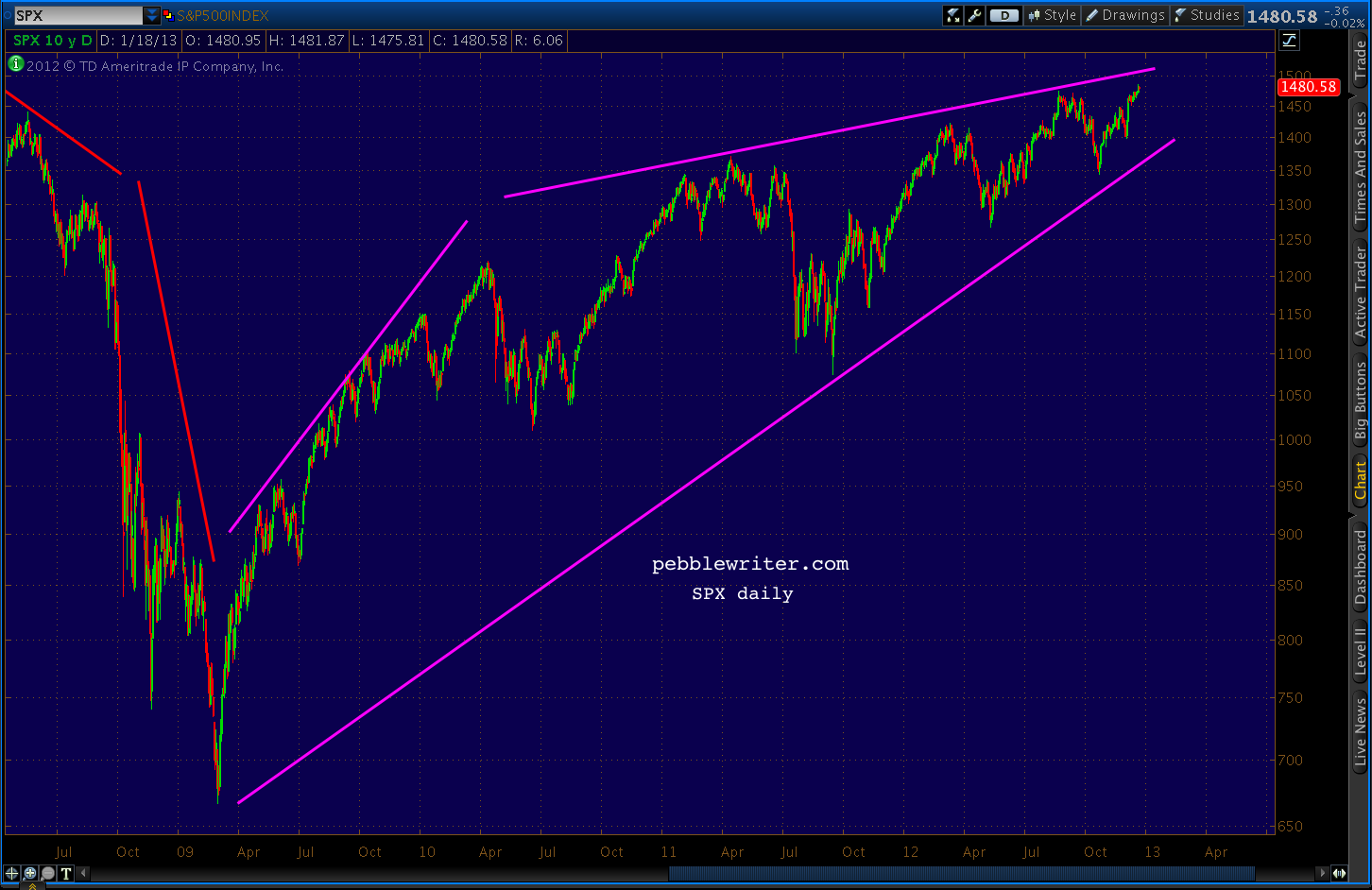
    Stocks, on the other hand, have made a series of higher highs and higher lows in what’s known as a rising wedge.  These patterns also can’t last forever, and they almost always resolve to the downside.

    Prices are much closer to the upper bound than the lower, which also suggests the next major move will be lower.  In fact, when rising wedges break down, they typically target their origin. Needless to say, a return to 2009 or even 2010 prices would be a huge blow to the rosy scenario TPTB are crafting.

    Does oil offer any hints as to which way prices are likely to go?   I’m drawn to a few periods in particular.  From June 2009 to May 2010, oil gained 19% compared to SPX’s 27%.  Yet, they both shed roughly 20% in the May – June 2010 correction.

    We had another round of QE, which collapsed the dollar and sent stocks up 36% and oil up 70% through May 2011.  This time, SPX corrected 22% and oil 35% (through Oct 2011.)

    At that point, CL sold off strongly — dropping 23% through the end of June.  SPX, however, lagged.  It lost 8%, then promptly regained 90% of it in the next three weeks (compared to CL’s 40% retracement.)  When the slide continued, however, SPX caught up — in spades.

    It lost 80% of its gains from June 2010, while CL only lost about half that.  SPX then went on to make three new highs in a row, adding 38% through today’s close.

    CL managed an 88% retracement of its May-October losses for a 47% gain through Feb 2012, and has made two lower highs (each a 61.8% retracement of the previous high) since then.  Total gain from Oct 2011: 27%.  And, it’s been a fairly neutral currency market.

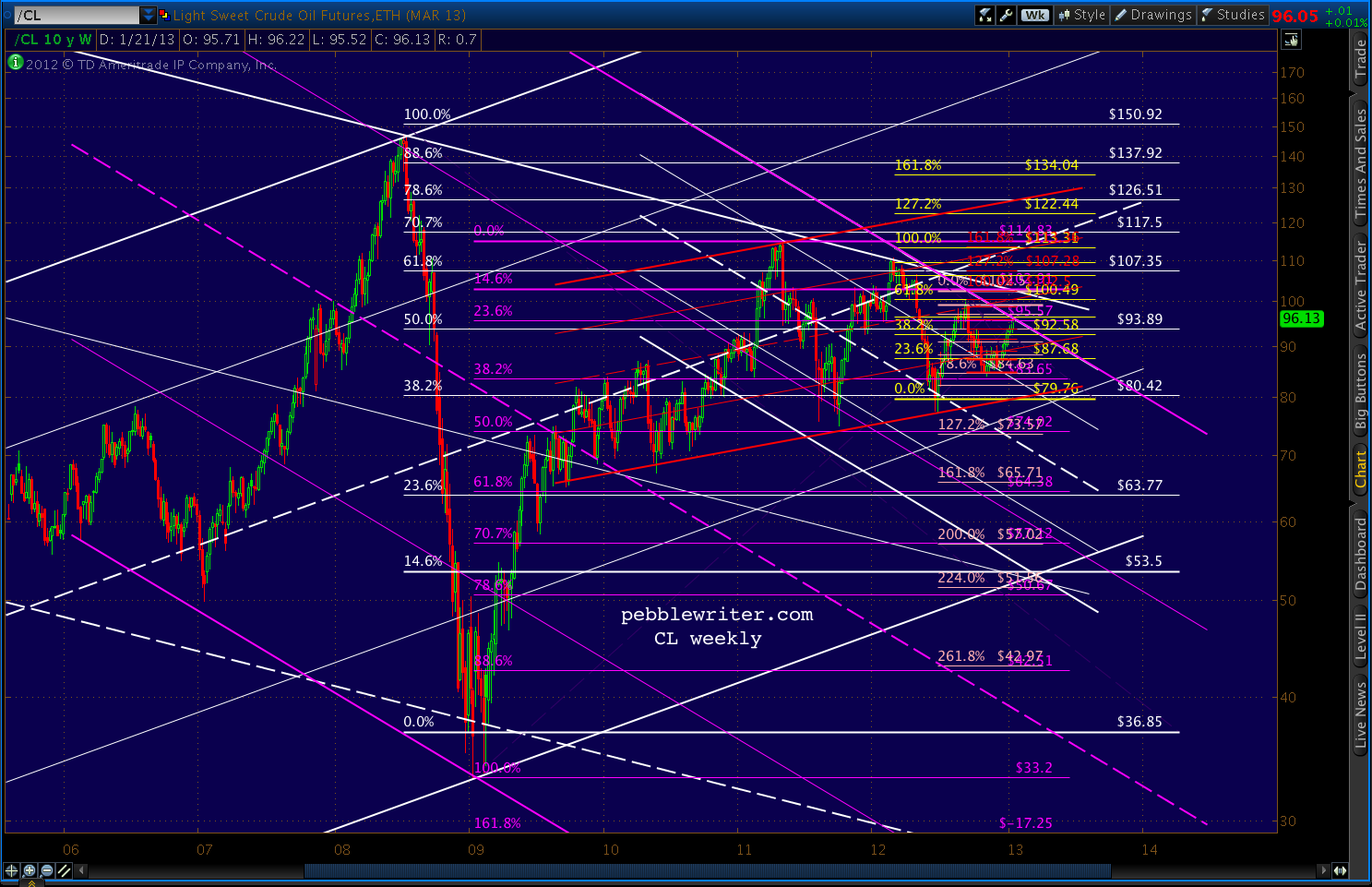
    I can’t help wondering what the oil and currency markets know that the stock market doesn’t.  A look at the CL charts indicates more downside.  Will SPX again play catch-up?

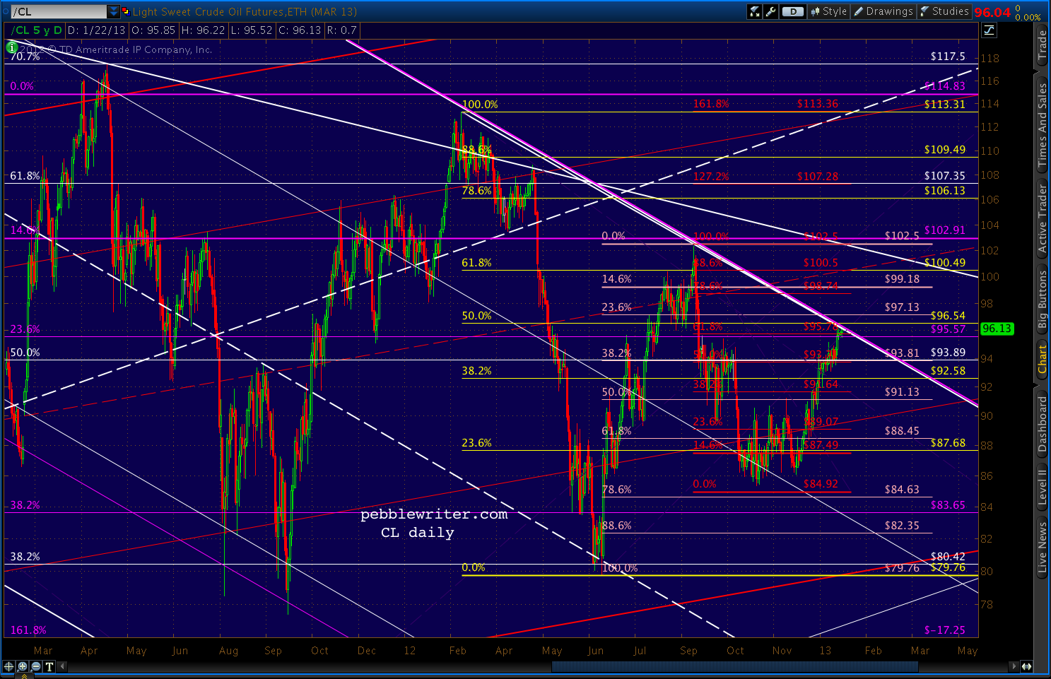
    Even ignoring what I suspect about the dollar and equity markets, CL presents a bearish picture.

    Whether it breaks down or out, CL is obviously at a turning point.  We’ll keep an eye on it…