Tag: economics

  • Charts I’m Watching: May 3, 2012

    NOTE:  New on the MEMBERSHIP>MY PROFILE page, a sign up area that will allow subscribers to be texted whenever a new post is added or added to [note:  additions don’t seem to be generating additional texts — working on this].   I tested it last night, and it took only 3-4 minutes for a SMS text advising me of a new post to appear on my mobile.  It doesn’t appear to handle non-US cell providers, so I’m looking for additional vendors that can accommodate those outside the states.


    UPDATE:  1:15 PM

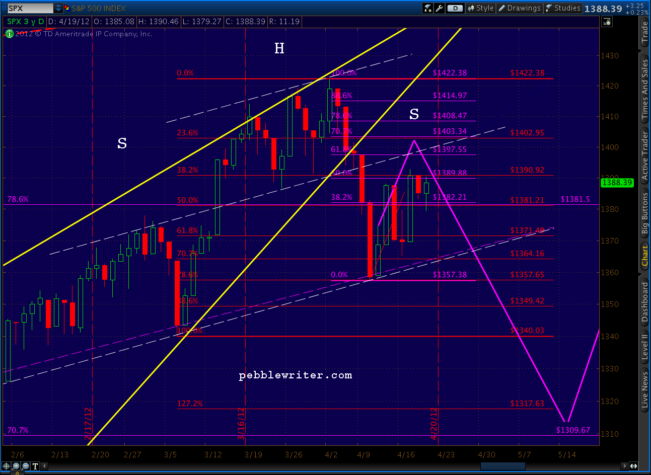
    Be cautious with this smaller pattern, though.  The 60-min chart shows a distinct possibility of a bounce at the neckline (as happened with the larger pattern.) Focus on the bold, yellow TL on the RSI below.  I would suggest anyone considering piling on shorts protect themselves, as always, with tight stops.

    UPDATE:  12:30 PM

    Over on the right shoulder of the Head & Shoulders pattern we’ve been watching is a… H&S pattern.  It would complete somewhere just below 1394 and targets 1372 — the (wait for it…) neckline of the larger pattern.

    Ever get the feeling the market is just toying with you?  Seriously, though, this fits rather well with the RSI indicators, which as I posted earlier, support the idea of another test of the neckline.

    If we get crazy positive non-farm payroll numbers in the morning, all bets are off.  Barrons is reporting consensus estimates of 165,000 (below), while Briefing.com estimates 140K.


    UPDATE:  12:30 PM

    Non-manufacturing ISM numbers confirm the economy’s slowdown.  Recall that the recent national numbers for manufacturers inexplicably showed an improvement — in stark contrast to the regional numbers and most other economic indicators I watch.

    The services sector (the larger share of the US economy) confirms what I suspect was a bad print a couple days ago.  We see worsening in the overall index (from 56 to 53.5 and vs expectations of 56.5) and in the categories of business activity, new orders, employment and prices (the largest drop of all.)


    ORIGINAL POST:  11:00 AM EST

    The RSI channel we analyzed (in excruciating detail) yesterday is holding so far.

    If we can break that last little fan line (k-4) things should accelerate a little to the downside, probably to test the k-5 line, which I believe will correlate with the H&S pattern neckline.

    It seems like the market is waiting for a sign of some sort for any serious downside to develop — which will likely come from Europe, China or MENA.  Why?  If good economic news drives the market up, and bad economic news increases (even falsely) the odds of QE, then it stands to reason that only an exogenous shock — one over which the Fed has less control — will drive prices lower.

    Having said that, the entire economic picture has the feel of a triangle pattern.  We careen from good news to bad, euphoria to despair — all the while drawing closer to the (IMO) inevitable day of reckoning where the mountain of debt shakes just enough to unleash a major landslide.

    We see a preview of the effects in places like Greece, Ireland, Portugal and increasingly Spain.  Total debt to GDP is much too high in these countries, but the US tops them all.  Official reports put acknowledged debt/GDP in the US at 101.5%.  But, as this Zerohedge article points out, the contingent liabilities such as the NPV of unfunded pension and health care drive our true debt/GDP to well over 300%.

  • Go Away in May?

    Maybe it should read “be put away in May?”

    It occurred to me over the weekend that Friday’s posts probably sounded a little schizophrenic.   “Next Stop 1462?” does seem a little out of step with “VIX Ready to Rumble.”  Is it me, or is the market perhaps a little schizophrenic?

    This morning’s drop does little to clarify things.  Again, we reversed right at the H&S pattern shoulder line — dropping as low as 1395 on the Chicago PMI survey (off 6 points to 56.2 for the third monthly drop in a row — see details below.)

    Furthermore, the RSI TL we were watching so closely last week appears to be holding.  It broke on Friday, but has snapped back to the point where we can probably ignore Friday’s action.

    As anticipated, VIX did do a little rumbling this morning, up almost 7% to 17.41, currently loitering at 17.30.  These RSI channels have done an amazing job at forecasting VIX over the past couple of months.

    Unfortunately, we’re no closer to resolution of last week’s “analog vs alternative” quandary.  For a long, tedious discussion please re-read the past few posts from last week.  The cliff notes version is: “50:50.”  That is, both options are on the table, and will be until we see some sort of break out. I’m keeping my powder mostly dry until the path forward is more clear.

    I’ll continue to watch the red-dashed RSI TL on SPX above.  I’m also watching the McClellan Oscillator, which is often a good indicator.  Like many other indicators, it’s on the verge of a breakout or breakdown.  Now, if we can only figure out which one…

    The economic data continues to forecast slowing.  But, at what point will the market care?  As we’ve discussed many times — good news is good, and bad news is good (if it stimulates another round of QE.)  It seems the only thing that might quash the QE hopes is an announcement from the Fed that it’s off the table (don’t hold your breath.)

    Stay tuned.

    ******************
    The April PMI survey isn’t pretty.  The production component dropped a huge 11 points — the largest drop in 11 months.  But, the Buying Policy component is particularly telling.  It asks respondents to report how far in advance they must order what they need for their businesses.  It’s a good handle on the tightness in the supply chain.  This month, it fell dramatically — from 45 to 28.  In other words, there’s plenty of capacity — not a good sign for those expecting the economy to heat up.


  • City of Dreams

    I’ve been harping on the incredible threat represented by the $250 trillion in almost entirely off-the-books, unregulated derivatives market — 95% of which is should be but isn’t on the books of the top five US banks [see: The Wipeout Ratio.]

    It’s an astonishing 550 times the tier 1 capital on the books of these same banks — all of which are considered too big to fail.  Looking at it another way, a two-tenths of 1% decline in the value of those derivatives could completely wipe out all tier 1 capital altogether.  If that weren’t bad enough, it’s dwarfed by the global derivatives market of $707 trillion.

    It’s hard to appreciate just how much money we’re talking about.  But, demonocracy.com does an outstanding job of putting it into perspective, focusing on the 9 largest banks’ $228.72 trillion in exposure.

    Take the time to read this, and please pass it along. Click anywhere on the nice pretty picture below.

  • Who We Rooting For, Again?

    It’s a sputtering economy in one corner, OPEX in the other.  But, wait, that’s no ordinary boxing ring; it’s a house of mirrors and Ben Bernanke is the referee.

    If bad news is bad, this is bad.  Unemployment claims are up.  Housing sales are down.  Philly Fed survey numbers are down.

    Then again, maybe bad news is good.  The slumping economy has the QE crowd salivating again (you’d think they’d run out of spit sooner or later.)

    Even if we could forget the economy, QE and the 5/6ths completed H&S pattern, tomorrow is OPEX.  And, as we all know, that means the fight is rigged — at least until Monday.