Tag: Channel

  • Slip Sliding Away

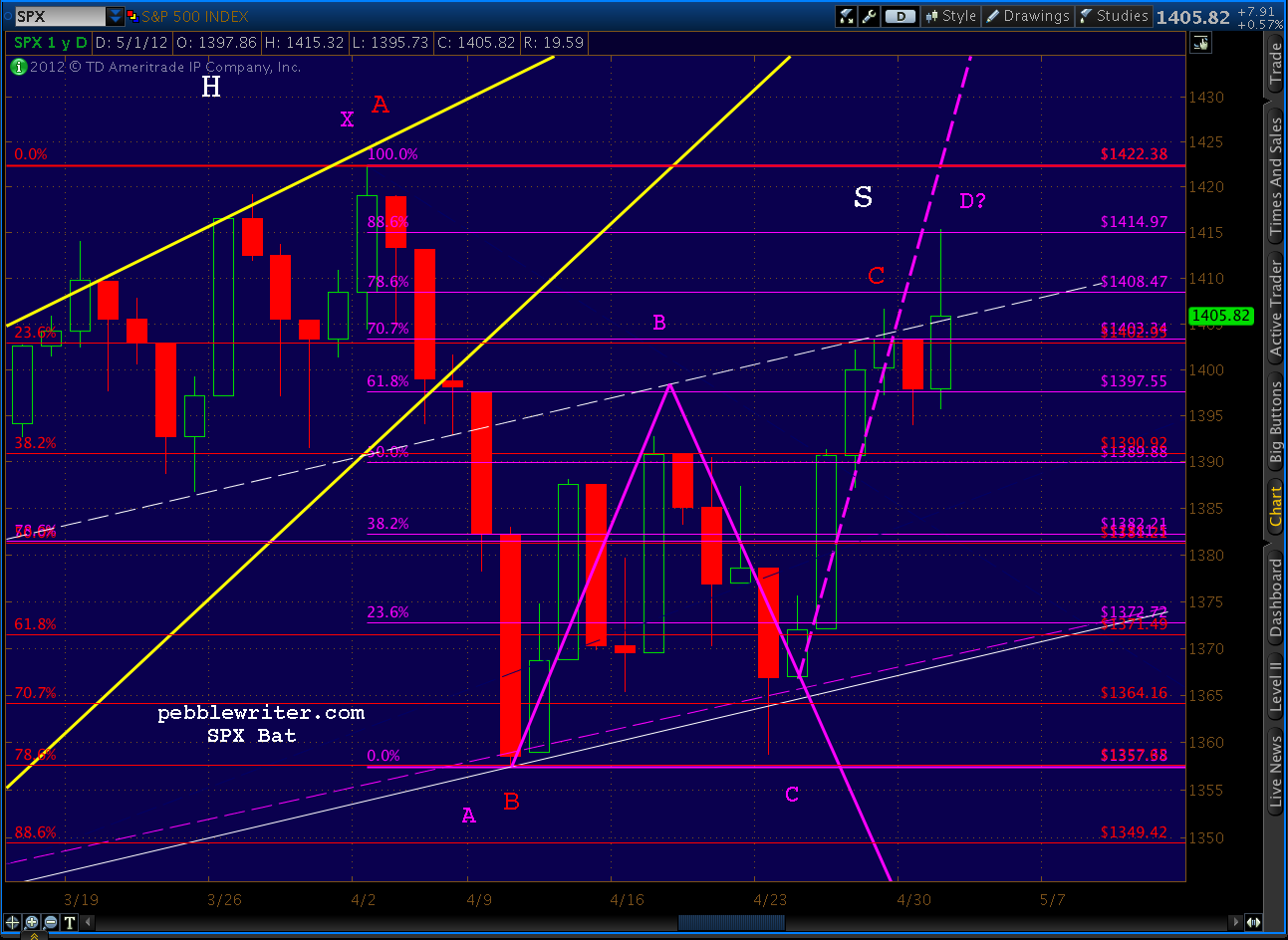
    We’re getting dangerously close to our downside target range of 1295-1323, first discussed back in April.

    • 1349.42 — .886 of the purple Butterfly (tagged)
    • 1343.41 — 1.272 of the yellow Crab pattern (tagged)
    • 1340.03 — horizontal support, prev. Point X  (tagged)
    • 1323.85 — 1.618 of yellow Crab (next)
    • 1317.63 — 1.272 of purple Butterfly
    • 1289.14 — 1.618 of purple Butterfly (and 2.24 of Crab)

    I have been viewing the downside as consisting of three basic scenarios:

    (1)  stick save: Fed freaks over Europe, QEish leak limits downside to 1349 (fail)
    (2)  top case: normal Butterfly completion to 1.272 (1317) or 1.618 (1289)
    (3)  panic sets in: crash and test bottom or large red rising wedge around 1200

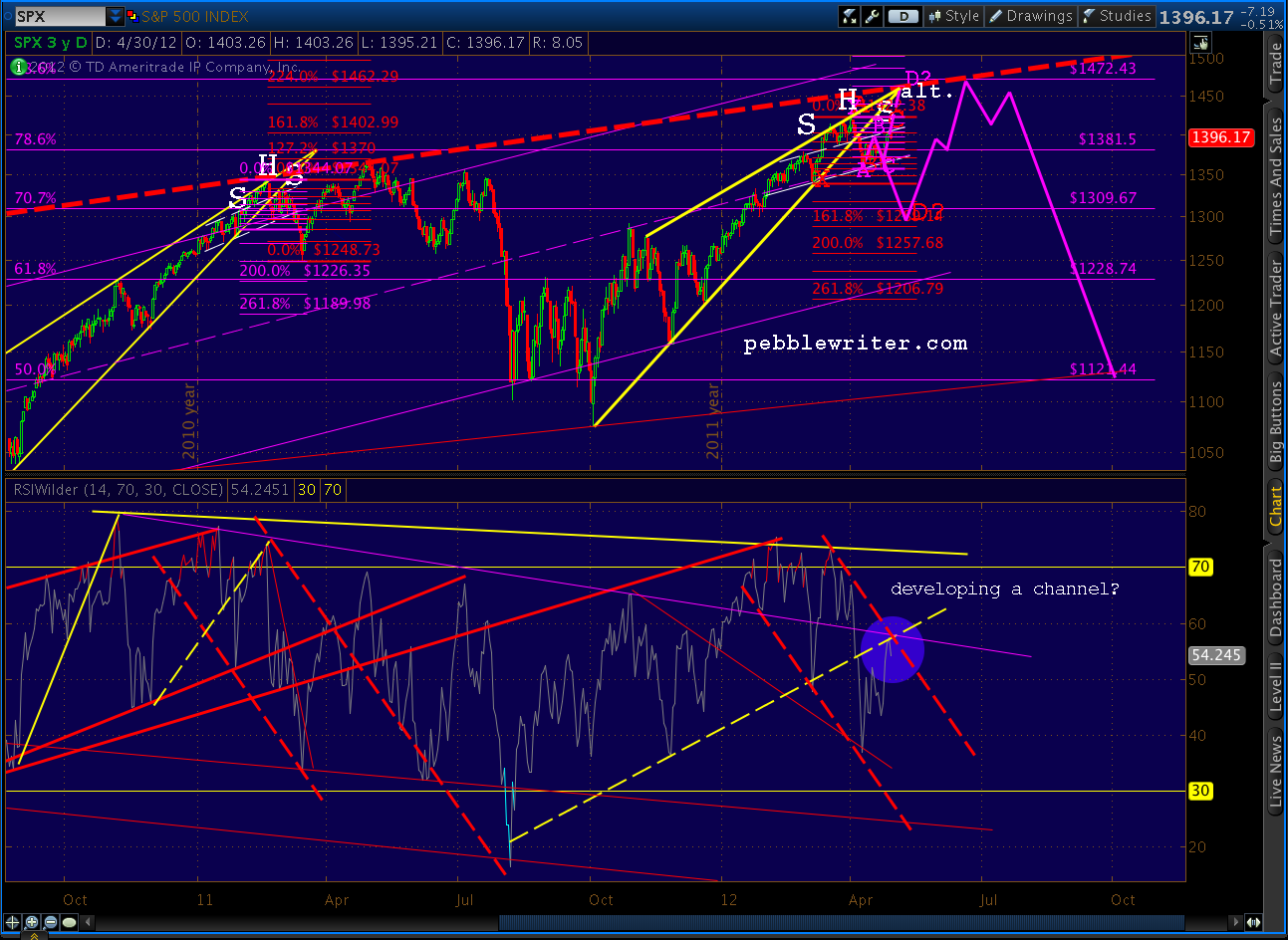
    The daily RSI has reached an important trend line of support (solid, purple) and, unlike FTSE, has yet to exhibit positive divergence — meaning it could go lower and tag the dashed purple line.

    I suspect the solid line represents 1323 and the lower, dashed line 1289-1295, but that’s pure speculation on my part.  As we approach 100-pts off the 1422 top, look for lots of investors to throw in the towel.  It’s this capitulation that we need if we’re to see a meaningful rebound.

    As I wrote back on April 12 [see: Analog Details]:

    To me, a drop to 1305-1317 seems fairly plausible.  The tricky part comes in calling for a reversal after SPX has fallen 120 points from its recent high.  The timing looks to be early May.

    Will the Fed and ECB come to the market’s rescue yet again?  I think so.  I think they understand as well as the rest of us how close to the precipice we are. It’s stupid economic policy that will make things worse in the long run, but since when did that matter?

    On the other hand, I have no doubt that the looming derivatives disaster [see: There is Nothing Wrong] I’ve been writing about — handily verified by JPM — could be beyond their ability to control (hint: 2008 all over again.)

    Stay tuned.

    **********

    And, for fellow Simon & Garfunkel fans…

  • Still on Track

    ORIGINAL POST:

    In yesterday’s post [see: Two Targets Down], I theorized we would go up and trace out a right shoulder to complete a small H&S pattern in the right shoulder of the larger (completed) H&S.  So far, that’s exactly the way it’s playing out.

    As discussed, the perfectly-formed shoulder would take prices up around 1370 — a shoulder line parallel to the neckline, as well as the neckline of the larger H&S pattern.

    The 60-min RSI chart from May 8 forecast a back test of the solid yellow TL intersecting with the downward sloping yellow channel.  We got that, along with a clear rising wedge in the RSI to go with the triangle in SPX itself.

    From a timing standpoint, the ideal pattern will take 3-4 more days to play out — though there’s enough of a right shoulder now to consider it legit.  The target looks to be about 65 points below wherever we break back through the neckline, probably around 1275 (1340-65=1275).

    This is actually lower than the larger pattern’s target of around 1295.  I favor 1295 simply because I think the bulls will throw a fit if we threaten to take out the 1292 October highs.  Some of you more savvy Elliotticians know better than I what turmoil that would bring to the bullish case.

    More later.


  • Two Targets Down…

    Yesterday, we hit our initial downside target laid out over the weekend [see: So Far, So Good] when we nailed the Fibonacci .886 retracement of the Butterfly pattern (purple) we’ve been following since April 10.

    We bounced hard there, as the RSI chart indicated we might [see: 3rd Time a Charm] and completed a back test of the H&S pattern neckline [see: Back Test Complete] by actually closing on the neckline.

    This morning, we bagged the next target on our list, the 1.272 extension of the smaller Crab pattern (yellow) at 1343, which has me wondering…what’s next?

    Not that it always works this way (enjoy the streak!), but here’s the original list:

    • 1349.42 — .886 of the purple Butterfly
    • 1343.41 — 1.272 of the yellow Crab pattern
    • 1340.03 — horizontal support, prev. Point X
    • 1323.85 — 1.618 of yellow Crab
    • 1317.63 — 1.272 of purple Butterfly
    • 1289.14 — 1.618 of purple Butterfly (and 2.24 of Crab)

    The charts say there’s plenty more downside.  My top case remains 1289-1317.  Though we’re back to that RSI trend line (k-5) that provided yesterday’s bounce.  We can get to 1289 with a cross of that trend line or without. It’s a matter of “recharging” RSI with bounces such as we saw yesterday and this morning.

    At the end of the day, the “bottom” should exhibit positive divergence, and we’re nowhere near that yet.

    So, is it time to pile on more shorts?  If we’ve scored 5 waves down, we should see an a-b-c corrective wave.  As I posted last night, there’s a potential small H&S pattern developing in the right shoulder of the larger pattern.  Prices could loiter in the 1340-1370 area for a day or two and flesh out the small right shoulder before continuing down.  A 7-pt gain at the close would shake out lots of shorts.

    This would offer the added benefit of fully recharging RSI/MACD for the next push down — a very helpful development, should it occur.  I’ll be watching to see if RSI heads up into the intersection of that bold yellow trend line above with the bold yellow channel.

    Good luck to all.

     ********

    Now, we see that the euro zone is considering holding back the next installment of Greece’s bailout, some $5 billion or so. They have this crazy notion that the Greeks might renege on the austerity package/debt restructuring previously agreed to.  All together, now: “duh!”

    Whatever your opinion of why Greece has money problems, the bailout did very little to help the Greek people, who just expressed their heart-felt feelings about austerity in the voting booth. It mostly bailed out the bankers who made too many stupid loans to Greece (gee, where have we seen this before?)


  • Update on NYA: May 8, 2012

    UPDATE:  May 8, 2012

    NYA has completed its Head & Shoulders pattern, targeting 7340 on the downside.   The Mar 30 forecast has played out nicely, although it took a little longer than expected.

    My gut is that NYA will remain stalled between 8300-8450 and not complete the larger Bat pattern at 9679.  I suspect it will chew up the next two weeks or so, ranging from 8100-8450 before breaking down on the smaller rising wedge.

    NYA has also overlapped its October 2011 high, which has serious implications for the Elliott Wave picture, as waves 1 and 4 are not supposed to overlap.

    I’ll defer to folks who know much more than I about EW, but I believe this overlap strongly suggests the past seven months rise is a corrective, rather than impulsive, wave.

    The harmonic picture continues to be a bit obtuse, as has been the case with NYA.  The recent top completed (and overshot) a Gartley pattern.  But, 7340 is pretty much no-man’s land from a harmonic standpoint.  It’s about .500 of the Aug 2011 to Mar 2012 rise, and .707 of the Nov 2011 to Mar 2012 rise.

    It also intersects with the larger rising wedge/channel bound around the first week of August 2012, so we’ll put a pin in that time/date for now.

    Longer term, NYA appears to be tracing out a diamond pattern.  Whether it breaks up (continuation) or down (a top) remains to be seen.  But, the next move would seem to be to the lower bound of the pattern.

  • Update on AUDUSD

    AUDUSD can be viewed as having dropped into a long term channel back in 1997.  As its 2011 efforts to break out indicate, any significant upside will be limited by that channel.

    It now sits at a critical juncture —  the last fan line coming off the 2008 lows is the only thing standing in the way of a plunge to the midline currently around .85.  A hard bounce on this fan line, on the other hand, would buy it some time.

    From a fundamental standpoint, AUDUSD is probably as good a canary in the inflationary/deflationary coalmine as there is.

  • Charts I’m Watching: May 3, 2012

    NOTE:  New on the MEMBERSHIP>MY PROFILE page, a sign up area that will allow subscribers to be texted whenever a new post is added or added to [note:  additions don’t seem to be generating additional texts — working on this].   I tested it last night, and it took only 3-4 minutes for a SMS text advising me of a new post to appear on my mobile.  It doesn’t appear to handle non-US cell providers, so I’m looking for additional vendors that can accommodate those outside the states.


    UPDATE:  1:15 PM

    Be cautious with this smaller pattern, though.  The 60-min chart shows a distinct possibility of a bounce at the neckline (as happened with the larger pattern.) Focus on the bold, yellow TL on the RSI below.  I would suggest anyone considering piling on shorts protect themselves, as always, with tight stops.

    UPDATE:  12:30 PM

    Over on the right shoulder of the Head & Shoulders pattern we’ve been watching is a… H&S pattern.  It would complete somewhere just below 1394 and targets 1372 — the (wait for it…) neckline of the larger pattern.

    Ever get the feeling the market is just toying with you?  Seriously, though, this fits rather well with the RSI indicators, which as I posted earlier, support the idea of another test of the neckline.

    If we get crazy positive non-farm payroll numbers in the morning, all bets are off.  Barrons is reporting consensus estimates of 165,000 (below), while Briefing.com estimates 140K.


    UPDATE:  12:30 PM

    Non-manufacturing ISM numbers confirm the economy’s slowdown.  Recall that the recent national numbers for manufacturers inexplicably showed an improvement — in stark contrast to the regional numbers and most other economic indicators I watch.

    The services sector (the larger share of the US economy) confirms what I suspect was a bad print a couple days ago.  We see worsening in the overall index (from 56 to 53.5 and vs expectations of 56.5) and in the categories of business activity, new orders, employment and prices (the largest drop of all.)


    ORIGINAL POST:  11:00 AM EST

    The RSI channel we analyzed (in excruciating detail) yesterday is holding so far.

    If we can break that last little fan line (k-4) things should accelerate a little to the downside, probably to test the k-5 line, which I believe will correlate with the H&S pattern neckline.

    It seems like the market is waiting for a sign of some sort for any serious downside to develop — which will likely come from Europe, China or MENA.  Why?  If good economic news drives the market up, and bad economic news increases (even falsely) the odds of QE, then it stands to reason that only an exogenous shock — one over which the Fed has less control — will drive prices lower.

    Having said that, the entire economic picture has the feel of a triangle pattern.  We careen from good news to bad, euphoria to despair — all the while drawing closer to the (IMO) inevitable day of reckoning where the mountain of debt shakes just enough to unleash a major landslide.

    We see a preview of the effects in places like Greece, Ireland, Portugal and increasingly Spain.  Total debt to GDP is much too high in these countries, but the US tops them all.  Official reports put acknowledged debt/GDP in the US at 101.5%.  But, as this Zerohedge article points out, the contingent liabilities such as the NPV of unfunded pension and health care drive our true debt/GDP to well over 300%.

  • A Swing and a Hit!

    We didn’t have to wait long for the Bat pattern I posted at 11am to play out.

    The .886 target was 1414.97, and we reversed at 1415.32 at 11:50am — closing just a fraction above the subsequent low for the day of 1405.25.

    I was disappointed to be stopped out of my short position early this morning, but more than made up for it by establishing new shorts at 1415.  I enjoy 60% intra-day profits as much as the next guy, but what’s really cool about the way the day closed is the effect on the RSI channel.

    I posted yesterday about the RSI channel that was setting up on SPX.  I added another post late last night (early this morning?) showing essentially the same pattern on all the other indices I watch.  It strongly suggests that the rise since 1357 is nothing more than a back test.  Here’s the view at yesterday’s close.

    This morning’s elevator ride sent RSI right through that dashed, red line — making the channel look about as valid as a $3 bill.  In fact, RSI spent most of the session ignoring my channel line. But thanks to the Bat pattern reversal, at the end of the day (literally) the channel held.

    And — wouldn’t you know it — SPX closed right at the shoulder line (white, dashed line) where it can torment us with uncertainty for another day.

    For a peek at the other indices and their channels, check out New Charts! posted last night.  Also, each index has its own page under the MARKETS menu, and will be updated at least weekly.  SPX, DX and VIX are typically updated intra-day on the main page, depending on market conditions.

    ************************

    While you’re poking around, consider signing up.   Current pebblewriter followers who join by midnight tomorrow are entitled to $100 off an annual membership.  Also, the first 100 annual members who sign up by tomorrow will have their membership rate grandfathered for the life of the site.  No increases, ever — which will be pretty cool when it costs $500 just to fill up your Suburban.

    Over the next day or two, this website will be password protected, so those of you who have already subscribed (thanks!) will enjoy first dibs on the latest and greatest.  If you haven’t subscribed yet, might as well do it now and save yourself $100.  If you bought a dozen at-the-money puts at 1415 today, you’re already up more than the cost of an annual membership.

    Good luck to all.

  • Going Out on a Limb

    In spite of the indecision demonstrated in this morning’s post, I’m seeing a channel set up on the RSI that’s tilting me slightly more bearish.  It’s the dashed, red channel on the chart below.

    Remember, everything that’s happened since April 4 is technically a back test of a broken rising wedge — unless we break above 1422.  It’s possibly a replay of the events of Feb-May 2011 [see: Analog Details.]   This back test correlates with a back test of the dashed, yellow TL on RSI (redrawn this morning.)

    Viewed through this prism, the channel makes a lot of sense.  In 2011, a similar channel sent SPX down 45 points or so — but that was after the H&S pattern had played out.  In the current time frame, we had a bounce at the neckline and no follow through since.

    One more thing: the purple trend line intersecting with that RSI channel.  Previous failures to push through it have proven disastrous to SPX.   All things considered, I’m going to layer on more bearish positions — with tight stops.

    The same channel is setting up on NYA and COMP, too.

    Stay tuned.


  • Go Away in May?

    Maybe it should read “be put away in May?”

    It occurred to me over the weekend that Friday’s posts probably sounded a little schizophrenic.   “Next Stop 1462?” does seem a little out of step with “VIX Ready to Rumble.”  Is it me, or is the market perhaps a little schizophrenic?

    This morning’s drop does little to clarify things.  Again, we reversed right at the H&S pattern shoulder line — dropping as low as 1395 on the Chicago PMI survey (off 6 points to 56.2 for the third monthly drop in a row — see details below.)

    Furthermore, the RSI TL we were watching so closely last week appears to be holding.  It broke on Friday, but has snapped back to the point where we can probably ignore Friday’s action.

    As anticipated, VIX did do a little rumbling this morning, up almost 7% to 17.41, currently loitering at 17.30.  These RSI channels have done an amazing job at forecasting VIX over the past couple of months.

    Unfortunately, we’re no closer to resolution of last week’s “analog vs alternative” quandary.  For a long, tedious discussion please re-read the past few posts from last week.  The cliff notes version is: “50:50.”  That is, both options are on the table, and will be until we see some sort of break out. I’m keeping my powder mostly dry until the path forward is more clear.

    I’ll continue to watch the red-dashed RSI TL on SPX above.  I’m also watching the McClellan Oscillator, which is often a good indicator.  Like many other indicators, it’s on the verge of a breakout or breakdown.  Now, if we can only figure out which one…

    The economic data continues to forecast slowing.  But, at what point will the market care?  As we’ve discussed many times — good news is good, and bad news is good (if it stimulates another round of QE.)  It seems the only thing that might quash the QE hopes is an announcement from the Fed that it’s off the table (don’t hold your breath.)

    Stay tuned.

    ******************
    The April PMI survey isn’t pretty.  The production component dropped a huge 11 points — the largest drop in 11 months.  But, the Buying Policy component is particularly telling.  It asks respondents to report how far in advance they must order what they need for their businesses.  It’s a good handle on the tightness in the supply chain.  This month, it fell dramatically — from 45 to 28.  In other words, there’s plenty of capacity — not a good sign for those expecting the economy to heat up.


  • VIX Ready to Rumble?

    Back on the 18th [see: VIX at a Crossroads] we charted VIX’s future, observing that it had fashioned a perfectly good falling wedge into a downward sloping channel. We talked about how a drop to 16 would be the ideal level for an Inverse H&S pattern to develop.

    Guess what?

    It’s interesting that VIX is reaching its ideal shoulder line just as SPX is reaching its. To make things even more interesting, the RSI channels support the idea of a reversal here.

    Stay tuned.