
Tag: Channel

  • Do or Die Time

    As we discussed yesterday, it’s do or die time for the equities markets.

    Keep an eye on the small rising wedge today.  A break down below 1560 is important to the bears’ case — while the bulls obviously have their sights set on the all-time high of 1576.

    As always, watch for a backtest after the wedge is broken.  Any such bounce should fail by 1562.80 or so.

    The US dollar reached our Mar 4 target [see: After the Funding’s Gone] and reversed sharply.  Note this was the confluence at the completion of a Crab Pattern (in purple below), a Bat Pattern (red) and two channel midlines.

    The channels can be better seen on a longer term chart.

    DX and SPX have become mildly positively correlated of late with the 25-day moving average at 0.59.  This is a huge shift from the high negative correlation we had all become used to: as the dollar as a safe haven during equity market sell-offs:

    This chart from Deutsche Bank showing the 1-year rolling correlation has been widely circulated.  It’s a week old, but shows that despite some huge swings over the past few years, correlation continues to become more and more negative.

    The last little blip up in the dark blue line represents a relative decrease in negative correlation, but it appears to have formed a channel since 2009.  In the absence of a breakout, one would expect the trend to continue…


    From a technical standpoint, whether the trend continues or not — and, where the dollar goes from here — couldn’t possibly be more important.

    The ebbs and flows of the relationship can best be seen in a long-term comparison.  Here, we can see long periods such as 1995-2000 when they moved in lock step.  Notably, when stocks faltered in Aug 2000, the dollar vacillated for a while before finally joining in in Jan 2002.

    But, when stocks finally bottomed in 2003, the dollar continued to sell off.  It got a big bounce in Dec 04 (the previous low) but didn’t bottom out until Apr 08 as SPX was about to fall off a cliff.

    When stocks bottomed in Mar 2009, the dollar peaked.  The next time the dollar bottomed was in May 2011, as the 2011 correction got underway.  It rallied again with the equity sell-offs in Apr 2012 and Sep 2012, but has so far failed to break the high established in July 2012.

    Why should equity investors care so much about the recent shift in the relationship between these two?  When we chart DX, we can see that equities often moved dramatically at fairly predictable key turning points.

    The most prominent chart pattern for DX is the falling channel shown above.  When DX dropped through the midline in 2003, it marked a bottom for equities.  They rallied strongly until the dollar finally approached the channel bottom and, as mentioned above, fell sharply after it bottomed.

    As DX raced up toward its midline, stocks plunged toward their 2009 low.  The dollar’s peak and stocks’ trough were almost simultaneous.  As DX fell away from the midline, stocks took off — not pausing again until DX’s next run at the midline in Apr 2010.  As soon as DX tagged the midline, stocks were off to the races again.

    In May 2011, the dollar bottomed again, enabling us to draw a little rising channel reflecting the strengthening trend since.

    Like its big brother, this smaller channel has proven pretty successful at indicating potential turning points — a breakout or breakdown — at its midline.  In general, each downturn from the midline meant the accompanying equity rally was nearing at end.

    Stocks didn’t actually reverse until DX bottomed at either the channel bottom or the .25 line as occurred with the May 2011, Apr 2012 and Sep 2012 corrections.

    Significantly, this last bounce off the .25 line in late January resulted in stocks going up.  The SPX has rallied 160 points or so, leaving us to wonder whether DX will head back down — which has always produced equity rallies — or break above the channel midline.

    The past several instances have produced large declines of 630 points (May 2008), 200 points (Apr 2010) and 160 points (Apr 2012.)

    In other words, a sudden strong rally in DX is highly likely to accompany a sudden and significant decline in stocks.  And, as we’ve seen in the past, prices that approach a midline are, by definition, poised to break out or break down.

    So, which will it be here for the dollar: a break out or a reversal?  Let’s set aside SPX’s recently completed bearish chart patterns for the moment, and focus on DX.

    Based on the larger of the white channels, we would have to conclude DX has much more upside.  Its midline is up around 86-87, which would clearly take DX beyond the smaller channel midline — tagged yesterday at 83.42.

    In addition to the small white midline, however, DX will need to break above the .75 line on another falling channel (purple below) in order to reach the larger midline.
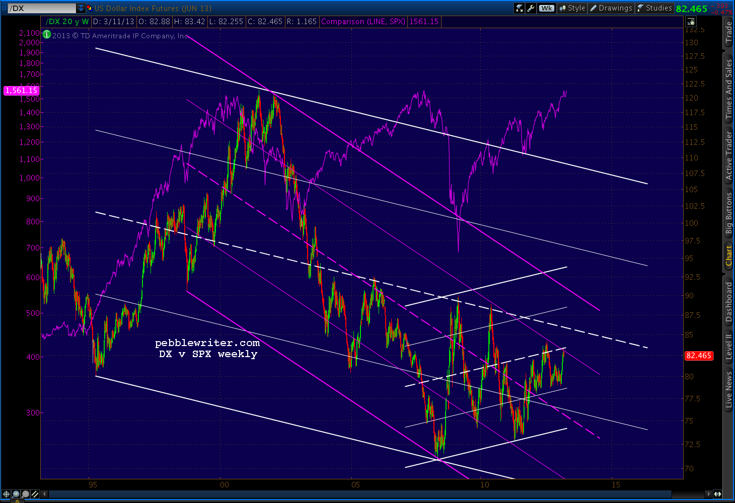
    But, it might not be all that difficult.  DX recently broke back above a trend line drawn from the Jan 2002 and Jun 2010 highs.  This TL looks fairly decent as a channel (yellow below), and reflects another breakout such as the one which occurred in Apr 2012.

    That DX channel breakout, of course, accompanied the SPX slide from 1422 to 1266.  It backtested nicely, then suddenly failed when the Fed announced QE3.  Prices fell back into the channel until the latest breakout in February.

    In keeping with the theme of sudden strong DX rallies being unhealthy for stocks, take a look at the Fibonacci Fan chart below.
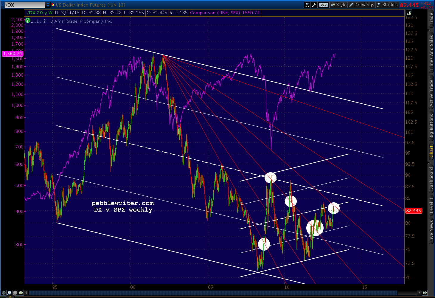
    Each time DX crossed one of those lines — even by just a little — SPX reacted.  DX has reached the latest line — the .707 — and is thus signalling either an equity breakout or breakdown depending on which way it goes.

    Weekly RSI mirrors the rising channel DX has been in since October 2007.  DX RSI recently broke out of the latest falling red channel and through the white channel midline.  After reacting against the purple .75 line, RSI is backtesting the white channel midline.

    If it’s more than a back test and RSI breaks back below the midline, this would confirm DX’s price reversal.  If, on the other hand, DX RSI survives the midline, it’s not hard to imagine a rally to the top of the purple channel or even the white channel .75.

    The daily RSI chart shows a similar situation.  RSI is finding support on the small white midline, the large white midline, and backtest of the red channel it just broke out of.

    A reversal here and a strong rally qualify would qualify as one of those sudden turns that isn’t terribly healthy for equities.

    I know, I know.  With eleventy zillion dollars being pumped into the markets every hour by Bernanke and friends, how in the Wide World of Sports could the dollar suddenly soar and the stock market flop?  The answer to that, of course, requires one more chart.

    I’ve marked some of the more obvious “sudden, strong rallies” in DX which, as discussed above, frequently coincide with sudden, strong declines in stocks.

    But, note how many of them occur as SPX is nearing one of its own channel lines drawn off the 2000 and 2007 tops.
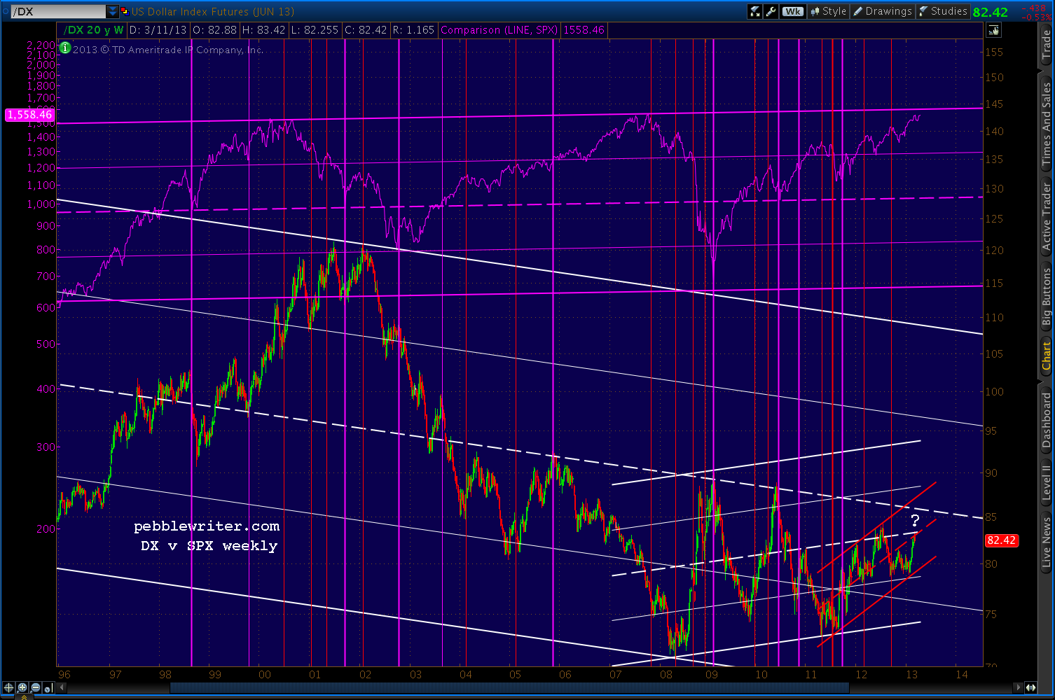
    We’ll get into that and other channels in the forecast coming up next. But, it’s fascinating that SPX is only a few points from a channel top dating back 13 years just as DX has arrived at the confluence of such important support and resistance lines.  For both, it truly is do or die time.

    I’ll continue with the forecast for members after a quick break.

    continued for members(more…)

  • Picking up Pennies

    Just about every other index has reached an important harmonic and/or chart pattern target. Given the NFP print, this could be the day SPX finally reaches 1553-1555.  Best to be long on the opening, and ready to re-short fairly quickly.

    The dollar isn’t waiting, surging nearly 1% on the day and resolving the question as to which channel to watch.

    DX is very near a tag of the red .786 (83.064) and the purple 1.618 (83.179).  But, more importantly, it is coming up to the intersection of the midlines of two important channels.

    Look for heavy resistance at these levels — until the equity sell-off begins in earnest.

    Likewise, the EURUSD is off over 1% and approaching the white .786/yellow .500 — also the scene of an important channel line.

    Will the currencies react first to the equity strength, or are they positioning ahead of what they know will be an equity pop and drop?  As the grown-ups in the room, I believe currencies are doing the latter.

    Our premise called for a back test of the channel line or TL off the July 2011 & Sep 2012 highs, but the market is eager to go ahead and get there.  Who am I to stand in the way?

    UPDATE:  9:35 AM

    Got to 1551.65, only 1.74 away from the white 1.618 – which is close enough for me.   I have nothing against staying in until the actual tag; just watch your stops in the event it turns quickly.

    I’ll pick it back up if we get a second push through 1551, as it would not be unusual to see a bit of an overshoot — somewhere between 1553 and 1560.  Likewise, a drop through the yellow TL down around 1535.50 probably signals “game over.”

    Remember, this completes a Crab Pattern from the 2011 crash from 1370 to 1074.  Are we guaranteed a big sell-off here?  Of course not.  But, odds are it will be substantial.

    UPDATE:  10:08 AM

    If SPX is going to bounce higher, it should do so by 1543 — the 1.272 Fib on the small white harmonic grid and the bottom of the tiny channel SPX hung out in for the past several days.  For anyone who missed the last six points because of the gap open, this is your second chance.

    UPDATE:  10:27 AM

    SPX getting the bounce here at 1543… will take another crack at 1553-1560.

    In the meantime, let’s take a look at how we got here.  If you had asked me at the end of 2011 which upside scenario looked most likely, I would have suggested the Crab Pattern that started at 1370 in May 2011 and put in a bottom at 1074 in October (in white, below.)

    There were three potential Point X’s in a row: 1370.58 on May 2 (in white above), 1347 on July 21 (in red) and 1356.48 on Jul 7 (not shown.)  And, 1370.58, the high following the 1576 to 666 sell off from 2007 to 2009, was the most prominent.

    My reservation was that it reversed at the .707 Fib level rather than the more common .618, .786 or .886.  The .707 is the red-headed stepchild of the Fibonacci ratios.  It’s the square root of .500, which itself doesn’t get much respect as a Fib ratio.  Geeks and wannabe’s CLICK HERE for details…

    When SPX finally pushed above 1370 in March 2012 and started approaching the 1.272 Fib levels between 1422 and 1451, we had to choose from among the three possibilities for a Butterfly Pattern completion [see: All the Pretty Butterflies.]

    I went with the red pattern because of its more precise tag on the .786 and was rewarded with 20%+ gains from a perfectly-timed short.  And, I assumed the red pattern would continue to drive future harmonic swings.

    As we approached the red 1.618 at 1515.24, I noted that it intersected with the purple 1.618 (1518.57) and the yellow 1.272 (1510.19) — not to mention the yellow trend line running very precisely through the July 2011, April 2012 and Sept 2012 highs.  To me, this was a very solid conclusion based on very reliable patterns.

    We got the sell-off.  In fact, we got three sell-offs, one from each of those Fib levels.  On the final tag at 1518.57, we got a little overshoot to 1530 (a smaller harmonic pattern completion) before beginning a correction all the way to…1485.  Yep, not even a lousy 3%.

    In harmonics, it’s not usually the tops that bother me, it’s the 2nd waves.  The rebound from 1485 went to 1525 (a healthy .886 retracement) and even sold off nicely — before zipping back up to complete an IH&S, take out the 1530 high and…well, here we are.

    Harmonics are great.  They offer concrete turning points at which the market usually reverses.  If it doesn’t, you’ve either picked the wrong Point X (1347 instead of 1370) or the wrong pattern.  In other words, there’s a solid decision matrix; you know when it’s time to go to Plan B.

    Fundamental analysis isn’t anywhere near as precise — especially in the short to medium term.  And, as we’ve seen this past year, there’s plenty of money to be made by going long at bottoms and short at tops.  You just have to be prepared to switch gears when your assumption — no matter how well thought out — turns out to be wrong.

    If SPX exceeds the Fibs at 1553/1555 and/or the IH&S target at 1465, there’s not much more in the way of targets other than the previous high of 1576 (October 2007.)  Many other indices have made new highs, so maybe TPTB will feel it necessary for SPX to do so as well.

    more later…

    UPDATE:  1:55 PM

    The bounce off 1543 still going strong.  15-min RSI just broke out of a falling channel from this morning’s rally.  A move back to the white RSI channel midline might permit 1553/1555 or slightly higher.

    continued for members(more…)

  • Update on Bonds: Mar 07, 2013

    If rates really are heading back up in the near future, we’d expect to see bonds take a hit (and stocks, too, but that’s a different post.)  Back on Jan 21, we focused on the 10-year treasury (ZN.)

    We observed that ZN had just completed a large Crab Pattern and broken down from a rising wedge, and appeared to be due for a “significant retreat.”

    The chart below shows a big Crab (grey), followed by another Crab (red), a Bat (white) and another Crab (purple.)  Each previous Crab Pattern completion has been followed by a significant retreat, so we might suspect one here with the purple pattern completion.

    Since then, both the purple and white channel lines have broken down, suggesting more downside ahead. The intersection of the white channel bottom and purple channel midline is coming up in early April, and prices have fallen from 132’160 on Jan 21.  But, where’s the “significant retreat?”

    Shifting focus to the 20-year as represented by TLT (just for grins), the charts show continued weakness over the next couple of months — provided TLT can push through some important support.

    The harmonic picture is negative enough – given the potential Gartley or Bat Pattern in play. But, the white and red channels have both recently surrendered a support line.  Backtests are complete, and the next support is down around the .786 at 114.5 — though I suspect the .886 at 112.26 will get the nod.

    Note that it intersects with the falling white channel midline, the falling red channel bottom and the large white rising channel midline — all around late May-June.

    A slight overshoot would tag the .500 at 110.18 on a larger harmonic grid (purple) and establish a Point B for a pattern that might lead prices back down below the white midline.

    The fly in the ointment?  Check out the dashed red trend line cutting across the middle of the chart. It has influenced a few turns, and is just below current prices at around 115.60.

    Stay tuned…

  • Interest Rates: Breaking Out?

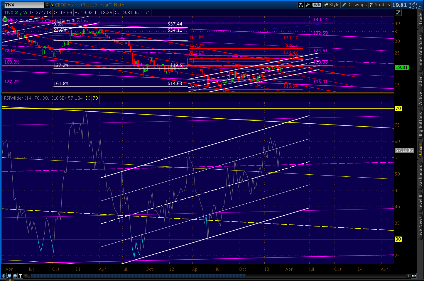
    With the usual caveat that I’m not a bond guy (seriously, what’s the point?) I took a fresh look at interest rates on the 10-year note.

    The obvious downtrend over the past 15 years is well-captured by the purple channel below.  It has been marked, however, by a series of rising white channels, some of which I have charted.

    When rates fell below the channel bottom last May, it might have ushered in a new, steeper decline suggested by the falling red channel.

    However, since bottoming in July, TNX regained the purple channel bottom, backtested it, and has put in a series of higher highs and higher lows that precisely echoes the slope of the previous channels.

    Its latest feat is pushing up through and backtesting both the red channel .75 line and the purple channel .25 line.  In the process, it has climbed back above the white channel midline and faces the psychologically important 2% mark yet again (the red, dashed TL.)

    From a harmonic standpoint, TNX looks well-positioned to test 2.28% in the next month.  Note that the July lows completed a Butterfly Pattern at the 1.272 on the purple grid and a Crab Pattern on the 1.618 on the white grid.

    Note the precise turn at the .500 Fib level, hinting at a Bat Pattern completion at the .886 of 22.83.  The .886 intersects with the purple channel line late next week — though the precise placement of such a long-term channel is always subject to some interpretation.

    To get there, however, TNX will have to push back through 20, the .618 Fib line at 20.14, and the top of the red channel – currently around 21.34.

    The RSI picture is promising.  The weekly chart shows the positive trend, regardless of whether you subscribe to the pessimistic (yellow channel) or optimistic (purple channel) view.

    A close-up of the above chart shows steadily improving relative strength since April 2011 and an important reversal at the midline.  The intersection of the white and yellow channel tops looms out there around April 3.

    The daily RSI, in addition to showing a steadfast refusal to become overbought, shows the recent break above the yellow channel’s 25% line.  Provided RSI can push through the dashed red trend line (corresponding with the .618 and 2% price levels discussed above), there is plenty of room to run.

    The intersection of the yellow midline and the purple channel top is around March 20.

    Like many markets, TNX is at a critical juncture.  It’s put up or shut up time.  A push through 2% would likely usher in 2.28% in short order, followed by a backtest of the red channel and subsequent push higher.

    If we expand the white channel (yellow, above) we get a glimpse of what the upside case looks like.  A turn at the red .886 would intersect with the .382 Fib of a harmonic grid drawn from the Feb 2011 highs.  The .618 of that pattern — not all that distant from the red 1.618 — would intersect with the midline of the yellow channel at 28.46 around the middle of August.

    A return to the top of the purple channel, currently around 3.4%, could come as early as July, but a more moderate case would be between Oct 2013 and Jan 2014.

    GLTA.

  • A New Analog: EURUSD

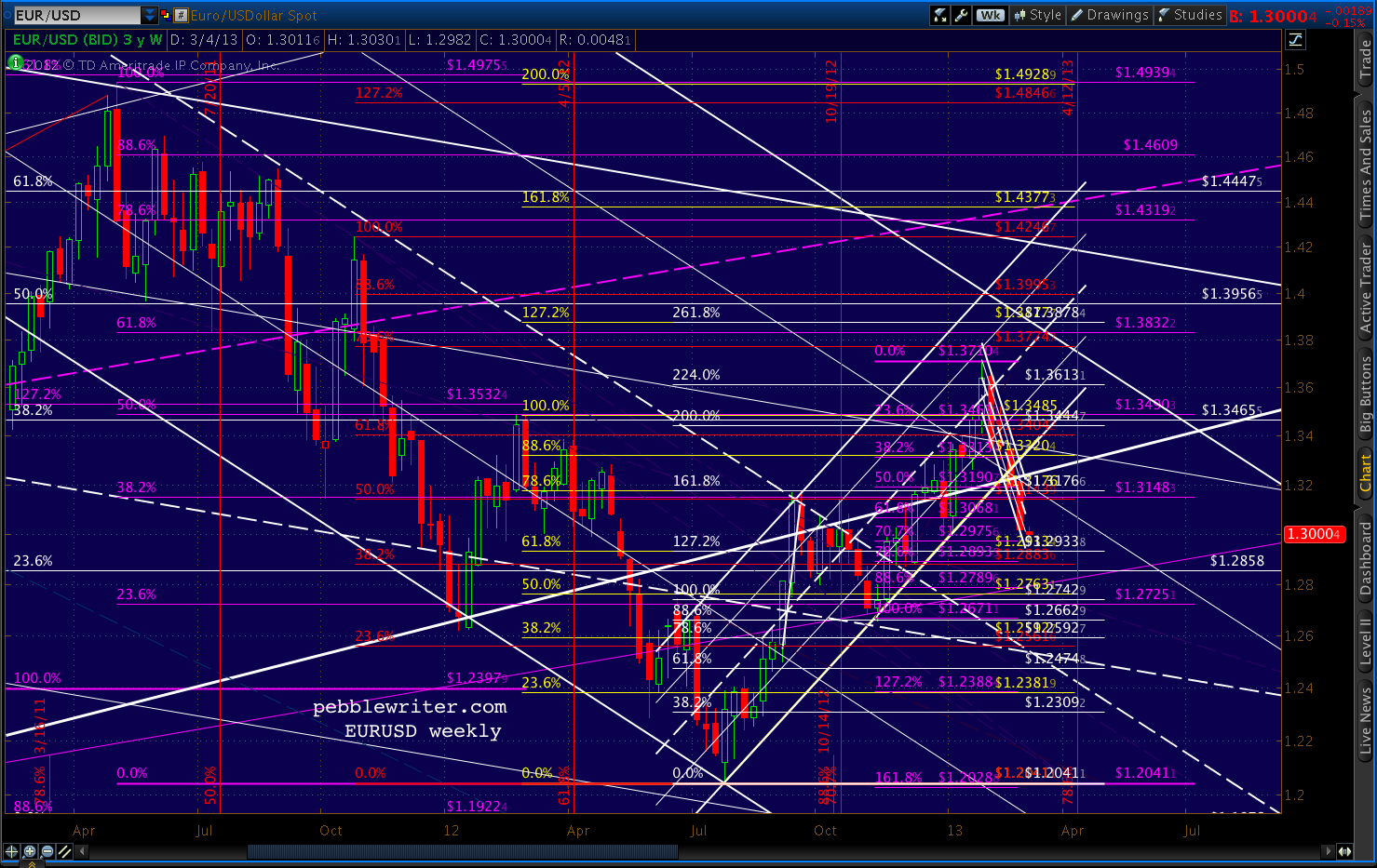
    As noted back on Feb 21, the EURUSD has broken down from its rising channel (white) and accelerated to the downside, breaking the Jan 4 1.2996 low and the psychologically important 1.30 level.

    The intersection of the purple .618 and two white channels at 1.38 will have to wait (till my next visit across the Pond, no doubt.)

    Losing the rising white channel hurts momentum quite a bit, but it’s the drop back through the 75% line on the falling white channel that represents the bigger problem for the pair.

    This channel dates all the way back to Dec 06. Reaching the top for the third time is still possible, of course, but it’s that much harder now that the pair needs to retake the higher channel line and mount a fresh attack.  Suppose it doesn’t?

    I’ve redrawn the falling white channel as red and will lower its top (for now) to reflect that possibility.  I’ve also sketched in a more relaxed rising channel (light blue) that reflects potential channel support at current prices (the intersection of the falling red .75 and the rising light blue .25.)

    I don’t know whether the pair needs to retest the falling white midline or not.  The bottom of the new light blue channel intersects with the red .75 in mid-March.  Also there is the .25 of the very large rising purple channel, which provided a huge bounce in Jun 2010.  It’s easier to see in the LT chart below.

    Here’s the really big picture.

    Several months ago, I noticed that the entire chart looks a bit like an expanded replay of the little dip way over to the left.  Playing with channels, I got some interesting results.

    The huge rising white channel seems to matter quite a bit. Note the support it offered from Aug 93 – Jan 97.  When it broke, the pair fell precipitously to the midline, shedding .15 in about six months.

    The midline offered support again through Feb 99, then completely fell out of bed (equities maxed out in Mar and Aug 2000.)

    EURUSD spent 18 months in the penalty box confirming the channel bottom until finally breaking out early in 2002.  It nearly reached the midline again two years later, and spent almost 4 additional years grinding higher – reaching 1.60 at a little over the 1.618  before zigzagging lower to its present level.

    We’ll circle back to these charts Tuesday and take a look at the analog’s implications for the US dollar and equities.

    To be continued…


  • Charts I’m Watching: Mar 1, 2013

    Getting a nice sell-off following the completion of the Bat Pattern we were tracking yesterday.  Shown below on the eminis…

    The downside path is clear.  But, bulls will probably go for the obvious IH&S with what should be a decent bounce somewhere around 1495-1500.

    The dollar reached our 82.136-82.281 target from several days ago, and the EURUSD has lost another important level of support: 1.30.

    More in a few…

    UPDATE:  09:40 AM

    SPX opening down sharply…Note that it turned yesterday at 1525.34, only 36 cents from one of the two targets we identified just before it opened at 1515.99.

    The market didn’t fall out of bed overnight, so I’ll take a long position on the open this morning in anticipation of tagging the .786/.886 combo at 1521.11/1521.19 or the .886 at 1525.70.

    I remain full short from 1525.34 (the 2:20 update for members) but will play any bounces as mentioned above.

    The key level today is 1496 – the bottom of the purple channel.  If this is broken, lots more downside where that came from — especially if the previous low at 1485 is taken out.

    UPDATE:  10:00 AM

    Nice post on Zerohedge earlier: You Rarely Know You’re in a Recession Until it’s Too Late.

    Referring to an ECRI report, ZH makes the following points:

    1) Think back to 2008, a couple of days before the Lehman failure. Looking at the data in hand, you would see GDP growth at about 1% in Q1 and 3% in Q2. More specifically, Q2 GDP growth had just been revised up on August 28 from 1.9% to 3.3%, sparking a 212-point Dow rally that day. http://www.nytimes.com/2008/08/29/business/29econ.html?_r=0

    2) In March 2001, 95% of economists thought there would not be a recession, but one had already begun.

    3) No economist predicted the 1990-91 recession beforehand.

    4) Hardly any economists recognized the severe 1973-75 recession until almost a year after it started. Indeed, that recession began with the ISM at 68.1, and payroll jobs growth did not turn negative for eight months.

    5) In 1970, unaware that the economy was nine months into recession, none other than Paul Samuelson said that the NBER had worked itself out of a job, meaning that improved policy expertise had made recessions very unlikely.

    6) In three of the last 15 recessions – specifically, in 1980, 1945, and 1926-27 during the Roaring Twenties – stock prices remained in a cyclical upturn.

    ECRI has caught a lot of crap for their recession call last Fall.  I know the feeling, as most economists I know (yes, I travel in exciting circles) think the worst is over.  I wish I shared their optimism.

    I mention this because of the positive ISM Mfg Report released this morning.  It’s being cited as proof of expanding activity.  Remember, the PMI is a survey of purchasing managers’ opinions about their business.

    They read the same newspapers and websites, watch the same TV, and are subject to the same MSM brainwashing as the rest of us.  A better than expected snapshot in time of their opinions does not mean the economy is just fine.

    UPDATE:  10:35 AM

    We got a bounce off 1501 — pretty close to the 1495-1500 range where we expected it.

    Any push back into green territory would be cause for an intraday long with tight stops, but not for giving up shorts.

    We just hit the .500 Fib of this morning’s decline, and the .618 is at 1516.63.  The top of the white channel is up ahead at 1518.50.  Any of these would take the index positive on the day.

    Would that mean the correction is over?

    continued for members... (more…)

  • Charts I’m Watching: Feb 28, 2013

    Yesterday was a great example of the beauty of Harmonics.  In conjunction with my RSI work and channel work, we were able to rack up 23 points on a day when the big picture is still fairly negative (remember Italy, the sequester, negative GDP, retailers’ horrid guidance?)

    By drawing important Fibonacci lines in the sand, we made the market prove to us it had more upside by crossing those lines. As we’ve discussed many times before, Harmonic Patterns don’t, by themselves, always tell you what the market is going to do in a particular time frame.

    But, they do an excellent job of “if-then” forecasting, such as “if the market reverses at Point A, we can be very confident of reaching Point B.”  Again, combining this information with other fairly reliable patterns, we can capture most of the points most of the time

    The market didn’t fall out of bed overnight, so I’ll take a long position on the open this morning in anticipation of tagging the .786/.886 combo at 1521.11/1521.19 or the .886 at 1525.70.

    Fresh charts in a few…

    UPDATE:  9:45 AM

    The channel placement is still somewhat speculative.  But, again, in a volatile situation like this, the market will show us whether it has more potential or not.

    We are nearing the .786 retracement of the move down from 1530, and the .886 of the move down from 1525.  They’re on top of one another, lending added validity.  So, all else being equal, we can expect a reversal here — especially given the 60-min RSI chart.

    Note we’re taking a 2nd crack at breaking out of the yellow channel at 61 — the range in which most moves fail.  Stay tuned.

    UPDATE:  9:50 AM

    Just tagged our target level, so I’m booking the 5 points from this morning here at 1521.29.

    A strong move back up through 1521 opens up 1526.  The immediate downside target is around 1510 a combination of Fib levels and the next lower purple channel line (the 25%.)  If that doesn’t hold, the bottom of the purple channel is currently down at around 1494.

    BTW, I’ve had a number of questions about the new fund in the works and the changes it might bring for this website.  I think the past few days are an excellent example of why a fund makes a lot of sense.  Yesterday, I was in and out of the market (on these pages) six times for a total of 23 points:

    1. Bought at 1497
    2. sold at 1507 (+10)
    3. bought at 1507
    4. sold at 1514 (+7)
    5. bought at 1514
    6. sold at 1520 (+6)

    Twenty-three points on 1497 is a little over 1.5% — a decent day, especially given that it occurred on a bounce in the midst of a downturn, which are generally tricky.  Twenty or thirty of those in a year would be a great year for most investment advisors.

    Given that it takes a few minutes to identify a situation, a few more to chart it, a few more to make the chart readable for members, and more still to post it online and compose a cogent comment or two, it’s challenging to get that information out to readers fast enough so that you can capture every single point that I do.

    Then there’s the issue of how to trade the information.  I just shorted SPX at 1521 with the expectation of an initial 10-point drop.  Suppose it pops up to 1525 60-seconds later?  Were you stopped out?  Do you hold on?   Wait, now it just dropped 20 points!  You refresh the screen…where’s the update!?

    While you’re anxiously refreshing the webpage, I’m looking at RSI channels (in multiple time frames), various chart patterns, checking the dollar/euro/bonds/VIX, looking for any news just out, etc.  I make a determination and either trade on it or sit pat.

    I then start the process of updating the chart and posting it online with supporting comments.  Best case…3-5 minutes.  Worst case, all hell is breaking loose and it takes 10-15 minutes or more.

    This is why I like the idea of a fund.  For better or worse, it’s the quickest, most efficient way to transfer value from my noggin into your net worth.  Investors can go on with their business meeting/golf game/ski run and leave all the sweating it out to me.

    BTW, I know a fund isn’t for everyone. For the rest of us, the website will continue to provide the exact same kind of information it always has.  But, it will evolve, ideally becoming more efficient with streamlined delivery accompanying the charts for the pebblewriter.com veterans and investment professionals who want to go it alone.

    For example, those who have been around for a while would completely understand a comment like “hit .786/.886 combo at 1521, Gartley/Bat or Butterfly Point B?  Charts later.”   That way, I could cut down on the time it takes to convey the essence of the post.  I’m also looking into ways to post the information on a chat-like platform, which might also eliminate email and log-in problems.

    The trick with investment advisor clients is finding a way to deliver timely information at a reasonable price without giving away the secret sauce to potential competitors.  It will mean substantially higher fees for future subscribers ($2,500 on Mar 4), but won’t affect current members who have taken advantage of the current membership offer.

    Have you locked in your subscription price yet? CLICK HERE

    More shortly

    UPDATE:  12:50 PM

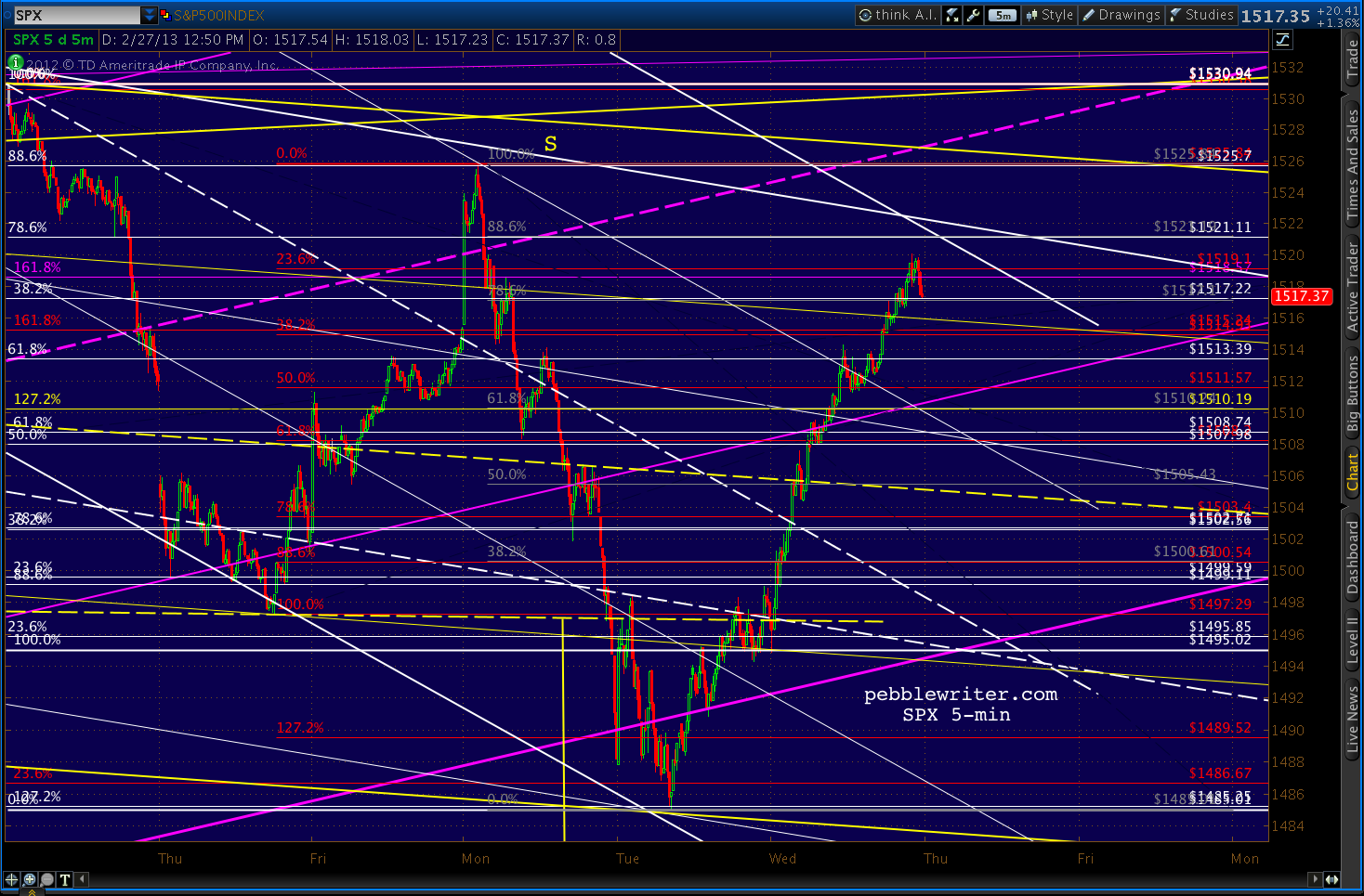
    SPX won’t go down without a fight.  It has retraced almost .886 of its declines from 1521.37, meaning it’s about to reverse at 1520.65 and head lower (a Bat Pattern) or is destined for the 1.618 at 1525.29 — also the .886 retracement of the 1530-1485 decline (1525.70) and the level of the last high on the 25th.

    As noted earlier, a push through 1521 opens up 1526.  SPX has till about 1:30 EST to decide: push up through 1521 or a channel breakdown.

    Note the close proximity of the white channel line, which will always, always offer support… until it doesn’t.

    The RSI picture is mixed at present, so we’ll stay focused on harmonics and channels.  Looking at other indicators, the dollar is hanging in there in its own rising channel.

    It recovered its midline just before equities opened this morning, and broke out of its a channel on its 15-min RSI.  It tagged 82, but hasn’t yet been able to break above — much less reach its short-term target of 82.136-82.281.

    UPDATE:  1:20 PM

    There’s our answer, a breakout above the .786/.886 Fib at 1521.11.

    Playing the long side again, with initial target of 1525.70, trailing stops starting at 1521.

    Charts in a few…

    UPDATE:  2:05 PM

    Getting pretty close, now.  This should also be a tag on the large purple channel midline and the proposed yellow channel top.

    UPDATE:  2:20 PM

    Let’s review the implications to our forecast of tagging 1525.70.  We started into this yesterday, but got interrupted by a pretty wild intra-day ride.

    continued for members(more…)

  • The Big Picture: Feb 27, 2013

    ORIGINAL POST:  6:00 AM

    SPX ended yesterday just below our 1497 trigger point at the neckline.  I know the bulls would love to blow through this level and negate the H&S, but I think they’ve really got their work cut out for them, especially given the political mess in Italy and the looming US sequester.

    Bernanke isn’t likely to say anything new today.  And, judging from AAPL’s price action, the market isn’t looking to Cupertino for salvation.  The durable goods data?  Ho hum…  Saying it was a good number if you ignore defense and aircraft is like saying a shark attack was fine except for those pointy things in their mouths.

    Defense is due to get a lot worse starting next Monday.

    I’d put slightly greater odds on a breakdown of the purple channel.  As for targets, I’ve mentioned the 1474.51 level a lot – the Sep 2012 high and roughly where the SMA 50 was at the EOD (hat tip to Mike for the question.)

    I still think this area has potential, as a retracement to the .886 of the 1576-666 decline would set up a move to 1576 itself.  Why?  Think of stair-steps, where each major Fib tag or break is followed by a back test to a significant lower Fibonacci level.

    continued for members(more…)

  • Bernanke Speaks

    PLEASE NOTE THAT MEMBERSHIP RATES ARE SET TO INCREASE ON MARCH 4.

    *   *   *   *   *   *   *   *

    A new day, a new bounce.  As we discussed late yesterday, SPX has reached the bottom of the purple channel that’s guided it since 1343.  So, naturally, we’ll get some reaction — probably at least to the white midline at 1495.

    Whether it sticks or not is pretty much up to Ben.  Press conference at 10AM EST.

    The yellow channel on the 30-min RSI shows decent support here.  Looks like resistance at the purple midline, though, likely in conjunction with the white midline mentioned above.

    I’ll be surprised, though, if we don’t make it all the way back to 1497 for a proper back test of the H&S neckline – yellow dashed line.

    UPDATE:  09:40 AM

    That’s close enough for me.  I’m closing my ST long position taken yesterday (3:50PM update) at 1490 for a 6-pt gain and will let my core short position ride — for now.

    Many Bernanke pep rallies have left me feeling like a crash test dummy.  I’ve learned to keep my stops tight or stay on the sidelines all together.  For intrepid day traders, I suggest staying nimble.  A breakout or breakdown is to be expected.

    But, we did just complete a H&S Pattern, and that counts for something — as do the incomplete harmonic patterns.  We’ll take a look as soon as the Bearded One is done scolding Congress for messin’ up a good thing.

    UPDATE:  12:30 PM

    Equities are clinging to gains following Bernanke’s testimony — which was mostly a non-event.  IMO, he said nothing to help the bulls’ or bears’ case, which means Italy and the sequester will likely drive prices over the next several days.

    We should continue to see periodic bounces over the balance of the day, but the onus is on the bulls now to turn the trend.  We’ll keep an eye on the 5 and 15-min RSI charts to determine breakouts that merit an intra-day long, and revisit the daily charts to get a sense of intermediate-term possibilities.

    continued for members(more…)

  • Charts I’m Watching: Feb 25, 2013

    FOR MEMBERS LOOKING FOR NEWS AND INFORMATION ON THE FUND CURRENTLY IN THE WORKS, CLICK HERE.

    ANNUAL MEMBERS WHO SUBSCRIBE TO THE FUND WILL BE ELIGIBLE FOR PRIORITY, PREFERENTIAL PRICING AND MEMBERSHIP FEE REBATES.

    PLEASE NOTE THAT MEMBERSHIP RATES ARE SET TO INCREASE ON MARCH 4.

    *  *  *  *  *  *  *  *

    ORIGINAL POST: 09:30 AM

    High potential for a pop and drop this morning, with key levels being 1523.74 and 1527.10.  I’m operating on the assumption that this is a bounce in the midst of a larger move lower.

    Recall that we shorted at 1530.50 on Feb 19 (the 2:45 update) and went long for a bounce at 1499 on Feb 21 (10:20 update.)

    I’m taking profits on the long position here at 1523.60 and going full short again.  Any move up through 1524 is cause to consider an intra-day long.

    Why am I suspicious of this rally? The dollar has back-tested the 25% line in the big rising channel, as well as the 1.272 Fib in what looks like a Crab to the 1.618 at 82.281 (and red .618 at 82.136.)

    The DX daily RSI also looks strong, having broken out of and back-tested the red channel and making a beeline for the intersection of the white and yellow channels.

    UPDATE: 10:00 AM

    SPX is taking a crack at the .886 at 1527.10.

    I’ll take an intra-day long position at 1524 with tight stops.  Keeping the short position unless we move up through 1530.

    UPDATE:  10:10 AM

    That move didn’t take long to fail. A reversal here leaves a nice tag of the top of the white channel, a tag of the 75% line of the light blue channel, a near tag of the .886 (1525.84 v 1527.10) and a nice reversal candle on the 60-min chart.

    Closing the intra-day long at 1524, and full short again from 1523.60 (above.)

    UPDATE:  11:25 AM

    SPX broke back down through the big purple channel midline, which augers well for further downside.  Watch for a backtest to the midline (around 1519.)

    UPDATE:  2:00 PM

    We’ve racked up a nice 24 points since shorting this morning, which is especially cool on the heels of the 26-point gain from our long position (the bounce from 1497) and the 32-point gain since originally shorting at 1530.50 on the 19th.  That’s a 5%+ week — much appreciated after the market’s directionless churning in the days leading up to 1530.

    As we approach the .886 retracement (1500.54) of the rally from 1497 to 1525, we should be on the lookout for a bounce at the still-important 1500.  A good place to start is the  RSI channels on short-term charts like the 5-min. A break of the upper bound of a well-defined channel is always a warning signal of building momentum.

    The US dollar is approaching our 82.22 – 82.28 price target and the top of the daily RSI channels we charted this morning.  It will likely need a breather before attempting higher.

    Much of its strength is being attributed to euro weakness which, of course, is being blamed on Berlusconi’s unexpected success in the Italian elections.  It goes without saying that his reelection would be a disaster for the euro zone.

    The EURUSD, which had carved out a solid channel to the moon (well, 1.39 anyway) broke down and backtested the channel that’s guided its upside since last July.

    We should expect some support here at the .886 of the 1.2996 to 1.3710 rally at 1.3078 (also a potential price channel bottom in yellow.)  It’s also the bottom of an RSI channel (below in white) on the daily chart.

    But, I’m not so sure that this support will hold.  We could be looking at a drop to the bottom of the red/yellow/white RSI channels, meaning the pair takes out 1.30 support.

    As unpopular as Monti is with Italians, Germany thinks he’s just swell.  He’s been a team player, falling in line with Merkel’s efforts to salvage Germany’s investments throughout the continent.

    Berlusconi, who was heavily criticized by his former contemporaries around the time of his resignation, is a wild card whose election, at best, would leave Italy with a divided leadership at a time when a unified front seems essential to the euro’s continued survival.

    This is not what the bulls needed, especially as they try to get through the sequester week unscathed.

    UPDATE:  3:00 PM

    Adding the complications of the euro mess to the sequester mess makes for a very tricky path ahead for equities.  Last week, I theorized that a decline to 1490 would make for a deliciously ambiguous setup (for market makers, at least) to fleece the greatest possible number of investors.

    Does that scenario still make sense?

    continued for members… (more…)