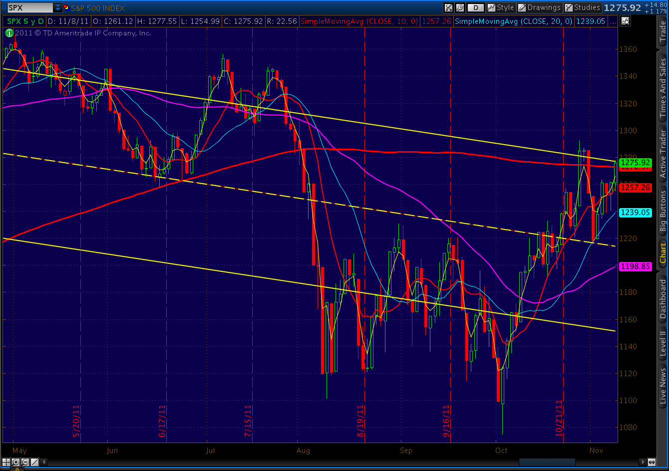
Posts

  • Charts I’m Watching: November 11, 2011

    UPDATE:  4:20 PM

    Today’s action fulfilled the small Butterfly pattern’s target, reaching 1266.98 versus our target of 1267.38.  This was also the .786 from the recent 1277 high, so we are probably safe in calling this latest move complete.

    Still, there is at least a 50/50 shot at a higher high over the next two weeks.  It would most likely come around the 1307-1313 level as a result of one of this jumble of harmonics patterns playing out.

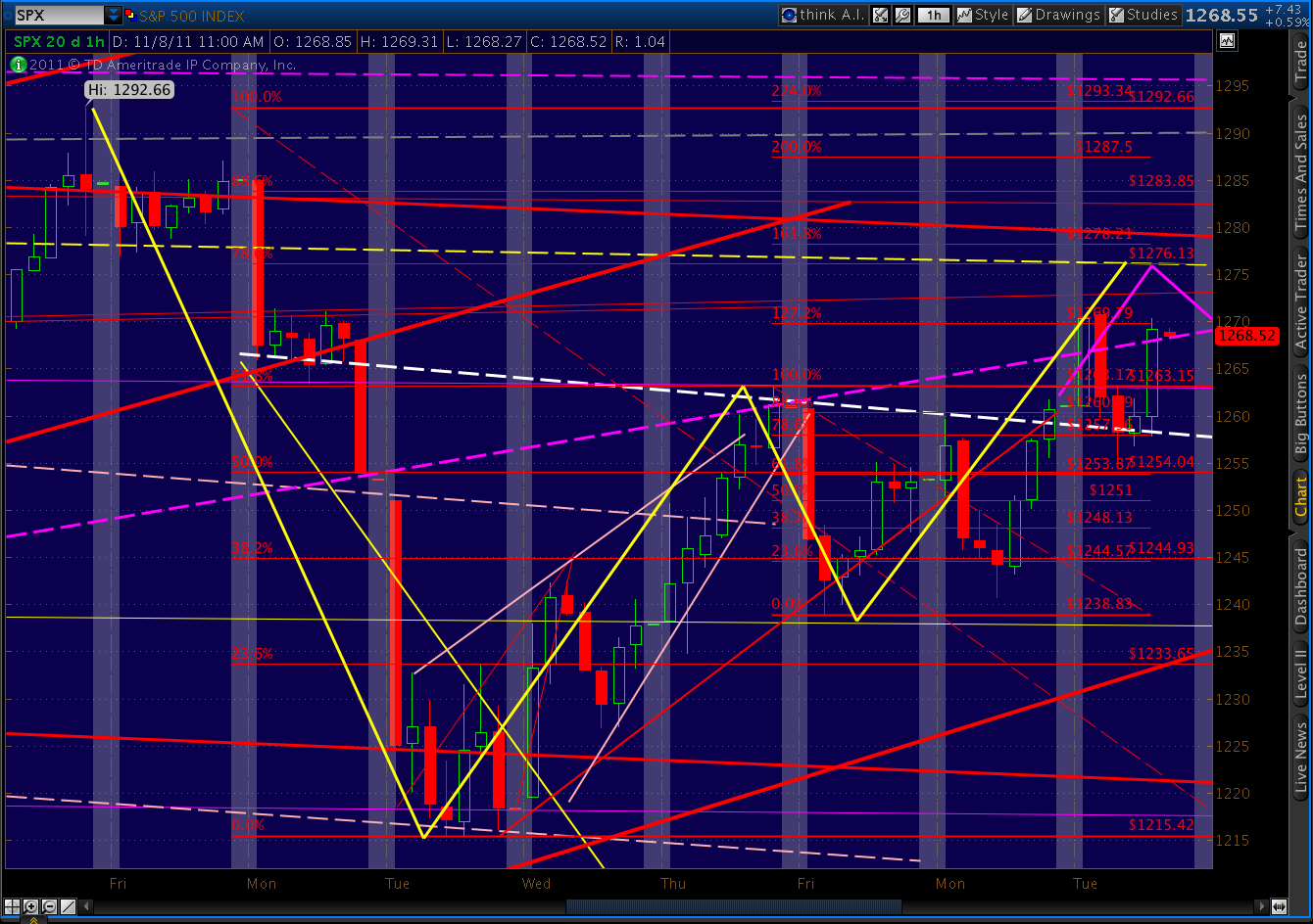
    Harmonics with Upside

    Close-up of Patterns Above

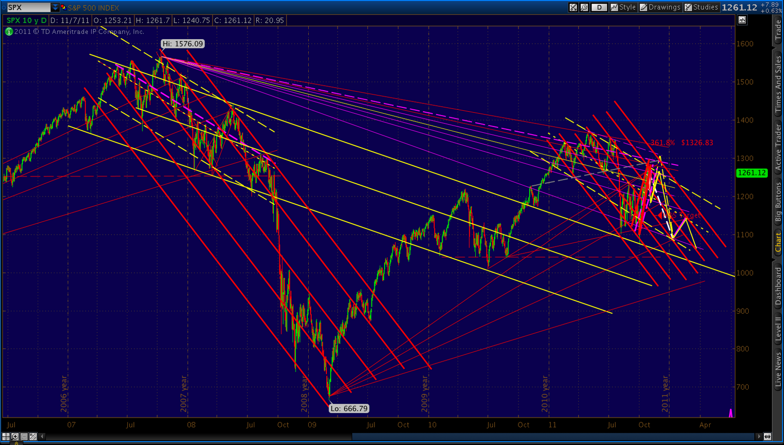
    The downside case is a little less complicated.  First, the big picture:

    More in a few minutes…

    And, in the interest of staying humble…

    Here’s my forecast (the purple line) from early July, complete with my view of the proper channel lines (thin red lines) way back then.  I’ve taken the liberty of adding another channel line to connect the July highs with the recent peaks that I originally thought would maybe reach 1258 in September — going on to reach 1040 by November.  Oh, well.  Guess it could still happen…

    Note the 87-day cycle lines.  These date back to May, when I first noticed a weird regularity to the market’s plunges [see: Sure It Works in Practice].  I’ve since refined the cycle, which in 2011 got stretched and compressed just as it did in 2007/8.  Since one of these original dates just occurred, it’s probably time to revisit the pattern.  I’ll try to post more over the weekend. 

    ORIGINAL POST:

    The Butterfly we discussed yesterday has played out perfectly at the 1.272 at 1258…so far.   We also discussed it going on to fulfill the 1.618 at 1268 which, after the Michigan sentiment numbers, looks like a distinct possibility.  Also, 1271 marks the .886 retrace of the recent drop from 1277.55.  It could work as a Bat pattern Point D.

    Personally, I’m starting to lighten up on longs and raising cash a bit more than normal (usually, if I have lunch money, I’m under-invested.)  I’ll probably add to existing longer-term shorts around 1268, depending on which way the wind’s blowing.  Though I’m convinced the market will be much, much lower in the next 30 days, I’m not yet convinced that we won’t see one last run at 1307-1313 before turning back down.  Hence the somewhat straddled position, with longer-term shorts and near-term longs on which I’m lightening up.

    But, remember, I’m almost always early.  So, this course no doubt will leave some upside profits on the table and get me into shorts at too high a price.  I can live with that.  And, in this market, I’d much rather be early than late.  Everyone has to trade at their own comfort level.  Not everyone is going to be comfortable buying puts on a day when SPX is up 26.

    Here’s the chart I put up yesterday, showing the competing harmonic patterns:

    The larger (dashed, yellow) Butterfly could go on to tag 1313.  Or, we could turn down immediately after completing the small Butterfly (solid yellow, on right) at 1268, and head down to 1199-1215 which, readers will recall, is our line in the sand — regardless of whether we head higher in the interim.

  • Charts I’m Watching: November 10, 2011

    UPDATE:  2:30 PM

    Watching all the Green Mountain Coffee news reminds me of a post I made in August

    Worth keeping an eye on these things, folks.

    UPDATE:  1:00 PM

    Dill just correctly pointed out a potential bullish Butterfly that began with Point X at 1215 the other day.   If the bearish Butterfly we’re working on right now plays out, taking us to a Point C at 1258 or 1267 as mentioned in the 11:30 update, then look for the reversal to 1199 or so.  It would be the Point D of the new Butterfly, as well as the 50 SMA and the 1.272 target of Tuesday’s Butterfly.

    Is that confusing enough?  I’ll draw a chart, but you won’t like it.  For harmonics traders, this is what I would call a target-rich environment.  Too many targets, in fact.

    The Butterfly we’re watching play out right now is the small yellow one to the right.  It targets 1258 or 1267.  From there, some reversal targets include the 1.272 at 1218 or the 1.618 at 1206.  I mostly favor 1218 because, being right next to 1215, it would maximize confusion and ambiguity, a hallmark of this market.

    These targets, BTW, line up nicely with those of the Butterfly we completed Tuesday, namely 1212 and 1208 (the other yellow pattern, to the left.)

    The Butterfly Dill mentions (shown in white) puts in a Point C at 1258 or 1267 and heads for a Point D of 1199 or 1177.  Naturally, if we pass though 1215, this will be much more likely and clearly violates my line in the sand.

    Then, there’s the original larger Butterfly pattern I mentioned a couple of days ago when we completed the Gartley.  That pattern, as you’ll recall, would take us to 1313.  It’s shown above as the green dashed line.

    So, there you have it.  Lots of choices. FWIW,  my gut is that we’ll reverse at 1258, head down to 1210-1215, then either  collapse or take one last shot at 1313. 

    UPDATE:  11:30  AM

    The .786 at 1228 has, as we expected earlier, continued to be tested this morning.   In fact, the testing has taken on the form of yet another Butterfly pattern (bright yellow Fib’s).  If it plays out, it could take us back to 1258 or 1267 (the 1.272 or 1.618 fib levels) before reversing. 

    ORIGINAL POST:  10:00 AM

    The Gartley and Butterfly patterns we were watching played out perfectly.  The question now is how large the move down will be.  Typical targets revolve around a retracement or extension of the DA leg, ranging from .618 to 2.618.

    Here are the patterns themselves.  The purple Gartley pattern and the yellow Butterfly pattern completed within 2 points of one another at 1276 and 1278. 

    The initial target of a Gartley is .618 of the DA leg, which would be 1238.61.  SPX’s initial plunge in roughly the first hour of trading was 1239.58 — 1 pt from our target.  Not too shabby.

    Now, take a look at the purple Fibonacci markers to the right of the chart.  These mark all the retracements and extensions of the Gartley DA leg.  The 1.618 extension is generally considered a pretty robust move; it stands at 1177.90.  Although any fib level before that can and likely will provide a bounce or even a reversal.  Note the close yesterday right at the .786 level.

    The Butterfly pattern DA leg Fib levels are indicated in red.  A Butterfly pattern typically pays off more than a Gartley, so a 1.618 extension is fairly routine.  That would take us down to 1215 or so.

    As I wrote yesterday, 1215 is pretty much a line in the sand for me.  A fall below that level makes one last leg up look much less likely, while a hard bounce at 1215 or above leads me to believe we’ll tag 1307 or 1313 by December 5 before the face ripping commences.

    But, keep an eye on these fib levels.  We’re heading up, but I think it’s nothing more than a bounce at this point.  Look for the market to at least retest the .786 fib (1.272 for the Butterfly) at 1228, and quite likely head down to 1215.  Whether we go lower from there….we’ll just have to wait and see.

    There’s plenty of reason for us to continue down, but look for TPTB to pull a miracle stick save which, like all the others, is simply a baseless rumor.  While all the attention has been on Greece and Italy lately, we have a rather momentous date with our own fiscal destiny with the supercommittee’s report due on November 23. 

    More later.

  • Charts I’m Watching: November 9, 2011

    UPDATE:  2:20 PM

    Continuation H&S; pattern close to completing on NDX.

    UPDATE:  10:30 AM

    Guess that worked out okay.   I had no idea when I posted — just before falling into bed last night — that the market would nosedive only 90 minutes later.

    That’s the thing about technical analysis.  It works extremely well at forecasting moves that, after the fact, are always credited to some other headline-making event.  Like the straight man in comedy, or the point guard that delivers the assist for the MVP’s dunk.   It’s the Rodney Dangerfield of investing.

    Now, the bigger question of whether this is the start of wave 3 or the completion of a strong B wave, with a final push to 1307-1313 to come.  If we arrest before 1215, there’s a very good chance that we’ll go on to complete a big Butterfly pattern, seen below:

    Butterflies have a .786 Point B and typically extend out to the 1.272 Fib (although occasionally to the 1.618 which would be 1340.)  The key is where Point C lands.  It could go as low as A, but shouldn’t be any lower (with rare exception.)  In fact, 1215 is my defacto line in the sand to determine whether we have one last leg up or not.

    Here’s an update on EUR/USD.  I haven’t had to touch this chart in weeks.  The channel continues to hold like a charm.  Note that it’s the same slope as the previous channels that contained major moves.  Don’t see any need to toy with it, now.

    ORIGINAL POST:  12:45 AM

    I’m looking for a reversal at 1276-1278 after completing our bearish Gartley and Butterfly patterns.  Short-term targets range from 1214 to 1238.  For more, see yesterday’s post.

    Here’s an updated chart reflecting the 2011 v 2008 analog we’ve been following since May.  We’ve gone over this so many times over these past six months, everyone’s probably pretty sick of it.  But, I have a feeling it’s not quite done with us.

    There have been three primary divergences between the two tops: (a) the depth of the initial plunge (days 57-69); (b) the rise instead of a decline around day 85; and, (c) the slope of the rise since day 108.   The fact that we diverged in a meaningful way around day 85, but then came back and resumed following the 2008 market point-by-point leads me to believe we could be experiencing another, similar divergence.

    IF in fact that’s what’s happening, it’s worth looking at the potential rising wedges for the last act of this wave 2.    Here’s a closeup of the 2011 market — the bottom half of the comparison shown above:

    The yellow rising wedge (with nothing much in it) is my approximation of where the 2008 market went during wave 2.  In other words, it’s where the market would have been had there been no divergence during this period. 

    The purple rising wedge captures pretty well the wave 2 action — except for the Oct 27-31 departure that is a pretty obvious divergence from the 2008 pattern.

    And, the red rising wedge is the one we’ve experienced so far, Oct 27-31 and all.  The key difference is that it treats the early November rise as a backtest —  a reality if 1292 was, indeed the wave 2 top.

    Maybe it’s something else entirely.  For instance, if you clear out everything but the bottom of the purple and top of the red wedges, you get two precisely parallel lines that form a pretty decent looking channel.  The channel midline even works pretty well.

    So, which is it?  From a casual perusal of fellow forecasters, I’d say there’s plenty of confusion to go around.   In all candor, there are good arguments for each, offered by people whose work I respect.

    My favorite two scenarios are that: (1) wave 2 is over and we’re on our way down; or, (2) Tuesday’s high at 1278 (and a .786 Fib level off 1292) is a Point B that’s part of a larger Butterfly pattern.  The downturn I’m expecting Wednesday will lead to a higher low (Point C) between 1215-1238 that reverses for a final rise to 1307-1313 around December 5 (day 150 from the analog.)

    If the plunge I’m expecting reverses by 1215, I’ll figure it’s option 2.  If it keeps on going, well… welcome to wave 3.  Next stop 980.

    Stay tuned.

  • Charts I’m Watching: November 8, 2011

    UPDATE:  8:30 PM

    We reached the target we discussed yesterday and this morning; now, just looking for the reversal.  In the meantime, here’s a nice view of the 2008 vs 2011 similarities.  Pretty darned similar, when you see them up close like this.

    The principal differences are the depth of the plunge below the channel after the “big drop” and the slope of the recovery.

    2007/8 Top

    2011 Top

    The diagonal lines are 1-std deviation regression channel and the moving averages are: 10 (thin red), 20 (pink), 50 (purple) and 200 (thick red.)

    The jury’s still out on whether corrective wave 2 is done or not.  But, my best guess is it either completed at 1292 on Oct 27 or will complete at 1307 around the first week of December.  Maybe some bright young EW expert will take a crack at the 2008 wave count and impress us with the similarities, if any…

    ORIGINAL POST:  2:00 PM

    The Gartley and Butterfly patterns we were watching yesterday appear to be playing out as anticipated.  The larger Gartley pattern (in yellow) reversed at the .618 last Thursday and is potentially shooting for the .786 at 1276.

    To get there, it’ll mean the smaller Butterfly pattern will have to approach its 1.618 extension (1278).  So far, it tagged its 1.272 at 1269 and is gathering momentum for another few points rise.  If that next leg fails to materialize, we’ve still got a nice little double top and a completed Butterfly that should smack it down to 1220.

    Either way, I’m expecting a strong reversal to at least 1238.  As always, stops are a very good idea in a market like this.

  • USD/JPY: How Low Can it Go?

    Whether you’re Toyota or an investor in distressed Japanese debt, the USD/JPY relationship has rocked your world over the past few years.  I’m no expert on the Japanese economy, but I find the Yen’s chart patterns pretty straight-forward.  First, the view from 35,000 feet:

    Weekly since 1996

    The most prominent features are the falling channel and the falling wedge.  Note the channel (yellow, dashed) has a midline (purple) that’s completely taken over since 2001.

    It forms the lower bounds of a falling wedge that dates back to 2007 or so.  As most investors know, falling wedges are a bulls best friend, because prices typically break out from their clutches sometime before the apex (the point at which the two lines converge.)

    Thomas Bulkowski, one of my favorite sources on chart patterns, says the average lifespan of a falling wedge is 57-59% of the distance from inception to the apex.  That makes the Yen’s falling wedge quite the old geezer.  The apex is technically around June 2012 at around 73.50, and by any measure we’re 90-95% of the the way there.

    So, what would a breakout look like?  Some think it just happened.  Looking at a little closer, there’s a wedge within the wedge — marked below in red.


    Daily since 2007

    On October 31, Japanese finance minister Azumi directed the central bank to sell about $100 billion dollar equivalent of Yen, sending it down nearly 5%.  The results can be seen below:

    Daily since 2010

    The hope was that taking a 5% bite out of speculators’ positions would make them think twice about accumulating/bidding up Yen — important when inflation has been running below zero (aka deflation) for years.  Depreciating the yen is the surest, fastest way to get inflation back to at least zero.

    In any case, it almost worked.  The pair jumped out of the smaller, red falling wedge — only to be stopped cold by the upper boundary of the larger falling wedge.  It’s now in back test mode, which means it should backtest the red wedge (currently approx. 76) before resuming its climb.

    Remember that with the USD/JPY, a bet on the strength of the Yen is a bet against the strength of the USD.  While a 5% jump is nothing to sneeze at, most currency traders will tell you that intervention has limited impact in the longer-term.   Lately, dollar strength has come as the result of plunging equity prices.

    So, if the falling wedge is going to pay off in a big way, it could mean we face another sizable leg down in stocks in the very near future.   While it will likely result in another Aug 4th-like spike, the real question is whether it’ll stick.   That raises significant questions about the long-term prospects for the US economy, not to mention TPTB’s determination to continue devaluing the dollar (not hard to do, when they’re running the printing presses 24/7.)

    If you see the glass as half-full, you might expect a US economic turnaround that includes positive growth, mildly increasing prices that ultimately result in higher interest rates and a climbing dollar.   

    If you see the glass as half-empty, you might expect a spike in the USD the next time the market crashes (early December, at the latest),  a worsening recession or outright depression, deflationary pressures across multiple asset classes and lower interest rates.  

    While these conditions will initially inflate the USD, its fate will ultimately rely on whether it’s able to retain its “least dirty shirt” status.   It might not, which would bring a whole new world of hurt down on Japan and its ballooning Yen.  I’ll be watching the falling wedge, as well as a channel that has an equally likely chance of playing out. If the USD/JPY can break out, it stands a good chance of reaching 95 in the next year or so.

    Stay tuned.

  • Charts I’m Watching: November 7, 2011

    UPDATE:  6:15 PM

    Finally, what feels like a little clarity…   Last Thursday, we retraced to the .618 Fibonacci of the 1292 to 1215 dip — meaning, we recouped 61.8% of the drop from the 1292 high on 10/27 to the 1215 low on 11/1.

    For newbies, these events are significant, as they are the first step in building a Gartley pattern.  Gartley’s are simply a series of reversals that look something like this:

    The concept is that the market undergoes a series of failed breakout attempts that, upon the last turn, leads to a reversal.  In a bearish Gartley, for instance, the market falls from X to A, then reverses —  retracing (recovering) 61.8% of the drop to B.  The fact that it doesn’t go any further is the first failure.

    It reverses and falls to C, which is typically 38.2 – 88.6% of the distance from A to B.  The fact that it doesn’t go any lower is the second failure and sets up the third reversal.  From C, the market heads up again to a level that, in a Gartley pattern, is 78.6% of the distance between X and A.

    It sounds confusing, but it’s not.  The percentages are based on Fibonacci numbers — a very cool way of looking at the universe that dates back to ancient India (200 B.C.) but was “popularized” by Leonardo of Pisa (also known as Fibonacci) in 1202.  Fibonacci numbers and the Golden (Phi) Ratio are endlessly fascinating, explaining such divergent designs as sunflowers, insect wings and the layout of Egyptian pyramids. 

    Fibonacci numbers are instrumental to the construction of Harmonic Patterns, one of which is the Gartley.  Other well-known patterns include the Bat, the Butterfly and the Crab — each of which has its own set of targets for reversals.

    For a real life example of how effective a Gartley pattern can be, see the charts below.  At 9:50 this morning, I noticed we had reached the .786 retrace of a several day old pattern.  It called for a reversal at around 1258.01 and drop to the 1246 area.  In fact, the market reversed at 1259.62 and fell to 1240.75 within the next 3 hours.  This set up a very profitable trade.

    So, why the history lesson?  Check out this chart:

    As mentioned above, we reached Point B at the .618 level last Thursday.  With today’s drop to and reversal at 1240, we established Point C.  All that’s left is Point D at 1276.13.  A reversal there could signal the end of wave (ii) and the commencement of the long-awaited, very aggressive (iii) of 3 down.

    Note also that the 1276.13 .786 target is only 2 points away from the 1.618 Fib on the smaller pattern — the “W” formed over the past two days.  This small pattern could be a Bat pattern, which reverses at the .886 after a .786 Point B.  This would indicate a reversal at 1260, which is about where we ended today’s session.  But, just as likely, it is a Butterfly pattern that reverses at the 1.272 or 1.618 or a Crab pattern that reverses at the 1.618 (1269 or 1278.)

    Both Butterflies and Crabs allow a .786 Point B.  So, the likely target is either 1269 or 1278.  In this case, with the likely target of the larger Gartley pattern being 1276, I’m inclined to expect a 1.618 extension on the smaller pattern (I’m more confident when different patterns indicate the same target.)

    BTW, as Dillzs99 points out, Gartley’s sometimes “fail” to reverse at the .786 and become Crabs, extending out to the 1.618 level.  If this were to happen, the target for the larger pattern would be around 1340.  This, of course, would mean 1292 was not “the” high for this pattern. 

    So, which is it?  My money is on 1276/1278.  We already breached the 200 SMA (currently 1274) by 18 points with the 1292 high.   In 2008, it was a 13-point breach.   The 1292 peak was about a 70% retrace of the 1370 high; in 2008, the retrace was just shy of .618.   And, I like the look of the daily RSI trend line (going back to Nov ’10) which nicely accommodates the 1292 high, but probably wouldn’t a 1340 high.  The MACD also looks like it’s very, very ripe for a roll.

    I also like the pattern that set up on the McClellan Oscillator.  It closely resembles the well-developed, concave shape of the last two 100+ point plunges — deviating nicely from its trend line and putting in no fewer than 6 peaks above the 200 line.   In fact, the backtest the MCO just made argues for no higher prices at all, but it’s not so precise that I would use to override the Harmonic forecast.

    It’s worth noting, however, that nearly every trip to the 295+ level has brought at least a 100-pt drop in the SPX.

    Last, I’m keeping an eye on the regression channel off the 2011 top.  I’ve drawn it to be parallel to the 2007/8 top’s, and thus far it’s done a pretty good job of forecasting.  It’s shown here as the three yellow lines (with the dashed midline.)  Tomorrow, it’s around 1274, in the right neighborhood if my harmonic assumptions are right.  This is admittedly an eye-balling kind of exercise, and is extremely sensitive to user (my) error.

    So, if we get our reversal at 1274-1278, what next?  An initial 61.8% retracement (of the DA distance) would only get us back to 1238, still in the channel we’ve been in since Sep 22 if it happened tomorrow.   We often see 1.272 or 1.618 reversals, though, meaning the move could take us as far as 1198 or 1178.

    First, let’s see if we can take advantage of the 40+ point swing that should come our way over the next couple of days.   Then, we’ll see if this wave 2 is done, or extends out to early December as I pondered the other day.

    UPDATE:  2:20 PM

    Haven’t seen the news, but clearly some kind of juicy rumour just got the markets all excited.   But, we’re approaching the .786 and .886 at 1255-1258. 

    UPDATE:  11:00 AM

    ORIGINAL POST:  9:50 AM

    SPX completed a little Gartley pattern this morning, reaching the .786 Fib at 1258.01.  Obvious divergence on the 5 min charts.  Look for a nice reversal to at least 1246.

    More later.

  • Charts I’m Watching: November 4, 2011

    UPDATE:  12:45 PM

    $5 Billion in POMO later, there’s an effort being made to turn the rising wedge break into a rising channel.

    It could happen, so stay alert for a break through the red channel line (bottom.)

    But, I still think the larger channel off the 1074 bottom will call the shots for now.  A return to the lower channel line will complete the H&S; pattern, thus leading to a channel break.

    Seen on the 60-min chart, this looks like a back test of the channel center line to me.

    While we’re at it, remember that this whole channel is very likely simply the back test of the much bigger rising wedge from 1074 to 1292, seen below as the solid red lines.

    We see this sort of pattern play out at a lot of tops.  A rising wedge broadens into a channel, reforms a larger wedge (even multiple times), forms the left shoulder of a H&S;, peaks at the head, then starts back down, falling first from the wedge, then finally the channel.

    That’s why it’s so important to keep an eye on confirming measures such as fan lines, trend lines and harmonic patterns.

    ORIGINAL POST:

    The larger rising wedge has broken this morning, leaving us a decent shot at completing the head & shoulders pattern we’ve been watching.

    The first key level is making a lower low than the 1227 the smaller rising wedge yielded.  The next goal, of course, is 1212 to complete the H&S.;

    Note the RSI on the 60-min chart has crashed through its supporting trend line, and the histogram has officially rolled over.

  • Charts I’m Watching: November 2, 2011

    UPDATE:  1:00 PM

    A close up of the channel, showing a likely reversal a the midline — which is also the .382 as mentioned below.   Note the possible setup for a H&S; pattern (pink dashed neckline @ 1213) with potential to 1140.

    Here’s a closeup.

    UPDATE:  11:45 AM

    The dollar, solidly back in its channel, appears to be backtesting.

    Watching to see if the channel midline holds on what is likely a corrective wave from Monday and Tuesday’s dip.

    Also, note we broke through the SMA 10 yesterday and today are engaged in a backtest.

    Last, there’s a little rising wedge on the 15-min that coincides with the .382 on the last move down.  It’s a logical turning point, right about 1240.  I’d prefer to see a little more divergence on the RSI first, but wouldn’t be surprised to see the rally fail here.

    BTW, the solid yellow line is my forecast from last week.  It has no value as a trend line or fan line, merely my best guess as to where the market was heading.

  • Charts I’m Watching: November 1, 2011

    UPDATE:  7:00 PM

    I think it’s safe to say DX and EUR are right back in their channels.  There’s a very long ways to go from here.


    UPDATE:  11:00 AM

    The headline could read something like:

    Politicians Threaten to Resign over Prime Minister’s Appalling Plan to Allow People to Vote

    If that sounds like a joke from the pages of The Onion, guess again.  Here’s the actual story.

    ORIGINAL POST:  9:15 AM

    The Fan Line That Just Won’t Quit (now 30 for 172) once again… didn’t quit.  This looks every bit like the solid reversal I was looking for last week.  The Greece rescue package has finally been recognized (better late than never, CNBC) as the sham miracle cure it is, with yesterday’s 32-point plunge as the exclamation point.  Now, the Greeks themselves will have a chance to show us all just exactly what they think of this deal (as though the riots were somehow ambiguous?)  The market impact of this latest development should be at least yesterday’s equal.

    I keep coming back to “write downs or riots.”  Italians will respond the same when it’s their turn to choose between slashing social services or letting banks suffer the consequences of stupid business decisions.   That’s oversimplifying it, of course, but do mobs care about the finer points of macroeconomics?  And what about mobs that organize and become potent political forces? 

    Will the US be any different when our turn comes?  Remember how Los Angeles erupted when Rodney King was beaten by a bunch of cops?   What kind of reaction will there be when unemployment, welfare, medicare, etc are slashed 30%?   How will the 99% take that lovely bit of news?

    *******************

    Meanwhile, back at the markets… I’ve updated my charts from the past week or two.  Our potentially derailed 2011 v 2008 analog has, as we discussed last week, another shot at reaching its original target.  Last Thursday, it looked like this:

    At the time, I thought there was still a chance the market would resume its original trajectory, which calls for about 1260 around December 1.  Now, 70 points later (according to the futures) it looks a little more likely.

    A plunge to one the targets we identified last week (the white circles below) would establish a lower bound to a much wider rising wedge (that would be mistaken for a channel with greater potential) with the 1260-1265 target.  This forecast is shown below as the solid yellow line.

    The equally likely alternative, of course, is that this morning’s “news” is suddenly too much to bear, and the market gets on with wave 3 in a big way. This scenario is the purple line below.

    Last, there’s the dashed yellow line, which is what happens if folks are too slow on the uptake as to just how miserable a mess this Eurozone situation is.

    More later.

  • 2011 v 2008: Day 125

    UPDATE:  4:00 PM

    Heading off for the weekend and probably won’t get to post.  One last thought… in looking at the rising wedge we’re in, the apex seems to be around 1340-1350.  Wedges can and do expand (as this one has, many times).  But, breakouts typically occur around the .66 mark, which in this case would be about the 1250-60 level (there’s that number, again.)

    Veering off into hunch-land here, but I can’t get over the feeling that everything after 1256 has been a throwover, and this last leg’s days are numbered.   Maybe this weekend, investors will have a chance to more carefully evaluate the increased risk to the financial system of the “miraculous” Greece/ECB deal. 

    Have a great weekend, everyone.

    UPDATE:  10:00 AM

    Continuing the train of thought from below…  If the channel lines below were to dominate, it raises some interesting questions with respect to the 2011 v 2008 analog.

    Note, for instance, that the upper most channel line ends up at 1260 or so, a level that would have been perfectly consistent with the rising wedge terminus that the 2008 analog initially targeted (see the analog chart below, the purple rising wedge).  Not only that, it was the right target in the right time frame if the analog meant anything.

    When I say “ends up,” I mean that it makes some potentially significant intersections there.  For one, it’s the .618 from the 1370 top, not to mention the June 16 bottom — considered pretty significant resistance once upon a time.  That turned out to be the neckline for the huge H&S; pattern that, when it broke, threw us into a bear market.  Last, there’s a potential channel from our Sept-Oct lows (dashed lines) that’s still waiting for some touches on the lower line.  If you extend out the likely lower line, it passes through that same point.

    What would that imply for yesterday’s high?  I haven’t a clue.  But, I did notice some more interesting facts about Mr Big.  For one, it’s the .786 from the July 1356 top which, as Mitchkeller correctly points out, might have been our conventional top.  It also lines up with what was the neckline (yellow, dashed) from the original ginormous H&S; pattern.  And (drumroll please) it also intersects with the fan line (purple, dashed) from 2007 that passed through the Feb 18 1344 high.

    Remember this line?  I first noticed it on May 5 when it stopped a plunge off the May 2 top  [See: The Trend Line That Just Won’t Quit.]  I’ve since referenced it at least a dozen times because, well,  it just won’t frickin quit.  Since Feb 18, it’s legitimately stopped 28 market moves of both bullish and bearish persuasion.  That’s 28 out of about 170 sessions since the first crack in the bull market, roughly 16.5%! 

    Call me crazy, but a fan line that’s stopped 16.5% of the market moves in the past whatever timeframe is worthy of our attention.  It’s entirely possible that yesterday was the most amazing stop of all.  A stop for all time. A stop that makes young girls swoon, and old men grow misty-eyed just talking about it.  And, we were there.  We were there.

    p.s. There’s a catch (isn’t there always?)  If this fan line really is that amazing, then I’m obligated to see if it plays out in other time frames and price levels.  And, it does.

    One of the sister trend lines (of the same slope) is up above, where it connects the May 2 and the July 7 tops.  That would seem to leave the door open for a further advance.  If the FLTJWQ doesn’t stop this advance, I’d bet dollars to doughnuts its big sister does.

    And, while I’m pulling things out of my ass, here’s an interesting idea.  Suppose we do a 100-pt dipsy doodle like we did starting Feb 22 and go down to better form the channel off the Sep and Oct lows?

    There are several potential targets, including fibonacci’s and channel lines both.  Something to think about.

    UPDATE:  3:00 AM

    Another way of looking at things…   Back in 2008, the TL off the 2007 high carried a lot of weight.

    Here’s the equivalent line in 2011:

    Just for grins, I’ve drawn a bunch of parallel lines.  Looks too good to be a coincidence, no?

    ORIGINAL POST:

    Ah, the good old days.  Day 121 was so simple, so uncomplicated.  We were a little ahead of ourselves, but a nice little downturn was in the offing and all would be good, again.

    What a difference 4 days makes.  Either the 2011 v 2008 is over, or we’re going through the kind of divergence we saw around day 85.  Here’s the latest:

    The purple rising wedge is what I expected, based on a continuation of the analog.  The yellow rising wedge is where we find ourselves, instead.

    Note that day 151 was the last peak in the 2008 pattern.  Day 151 in this pattern would be around December 1.  So, given that we’re nudging the .786 on day 125, and only expected to reach the .618 by day 151…what gives?

    I can make a pretty good case for 1307 (the .786 Fib) being the top.  It would align pretty nicely with a trend line coming off the May 2 and July tops (the dashed purple line.)  And, that intersection occurs around the first of December.  But, and it’s a big but, we’re only 15 points south of that level today.  Could we really take over a month to add 15 points?

    Not likely, unless this entire wave 2 move up was only the A leg, and we have significant B and C waves to come.  I’ll defer to the EW experts among us, who say that scenario is highly unlikely (although chime in, if you like.)

    A more likely scenario is that the pattern will continue, but in a different time frame — namely, uh, now.  If we continue ramping like we did today, those 15 points will arrive in the next 15 seconds and Wave 2 will be kaput.  We can resume partying like it’s 1929.

    The bulls, of course, would argue that we’ll keep going like this for another month, piling on a zillion points to the upside because the eurozone problems are fixed and consumers are spending money again (“fixed” being a gross exaggeration, and money being spent via credit cards — but that’s just me being a pessimist.)

    Stay tuned.