
Posts

  • Charts I’m Watching: Feb 4, 2013

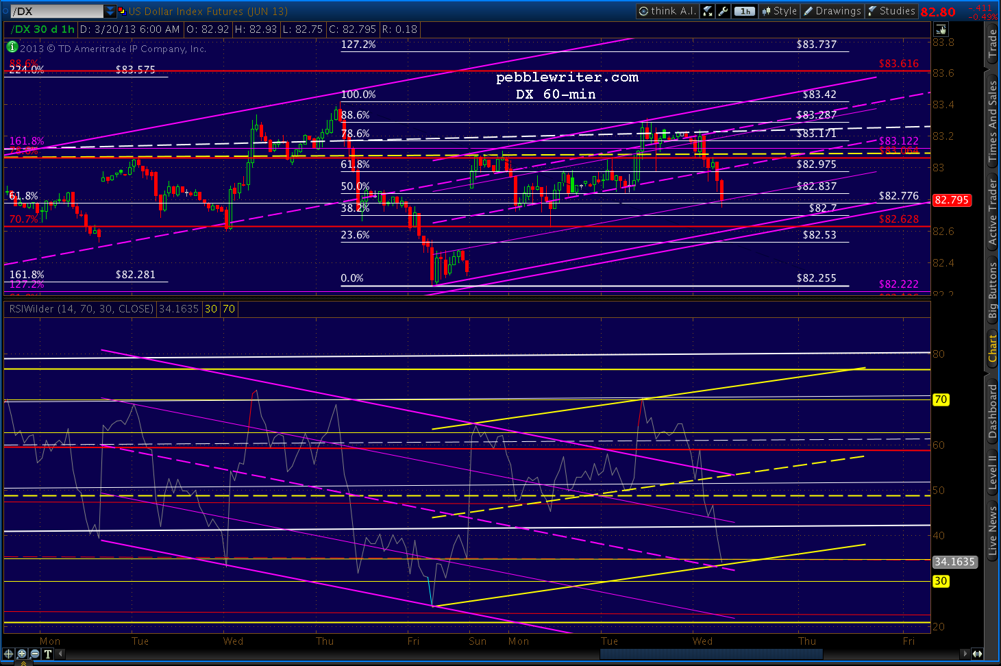
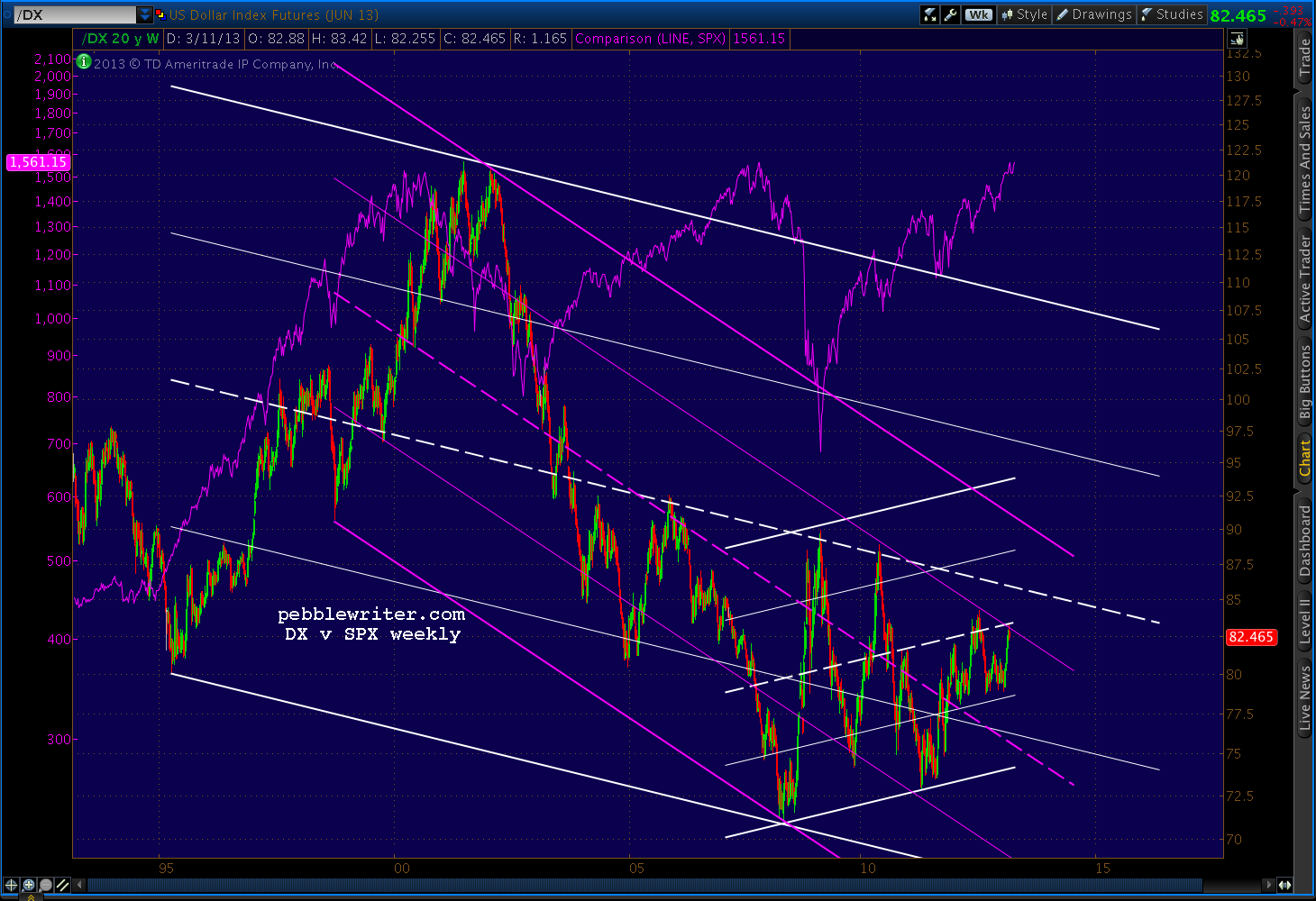
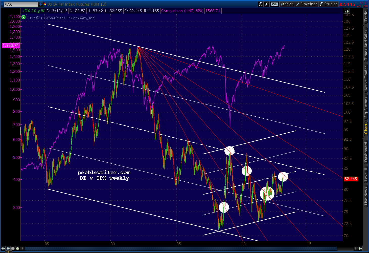
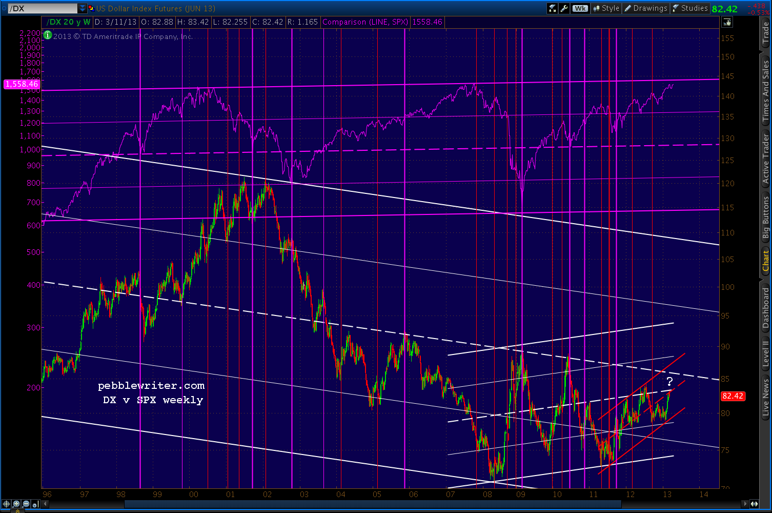
    The US dollar bounced off the .886 of its Sep – Nov 2012 run…again.  This is the fourth time it has found support in the 78.725 – 79 range, though each subsequent bounce has been lower than the previous one.

    The result is a descending triangle that arrives at the bottom of an uptrend (the white channel below) and a 2nd back-test of the latest channel (red) that was originally broken out of on Jan 2.

    The primary driver has been euro zone weakness, with the EURUSD back-testing the midline of the white channel after a bull run that equaled that of this past Aug-Sep.

    Though, the yen is also pitching in — reaching our secondary price target well in advance of the forecasted date range.

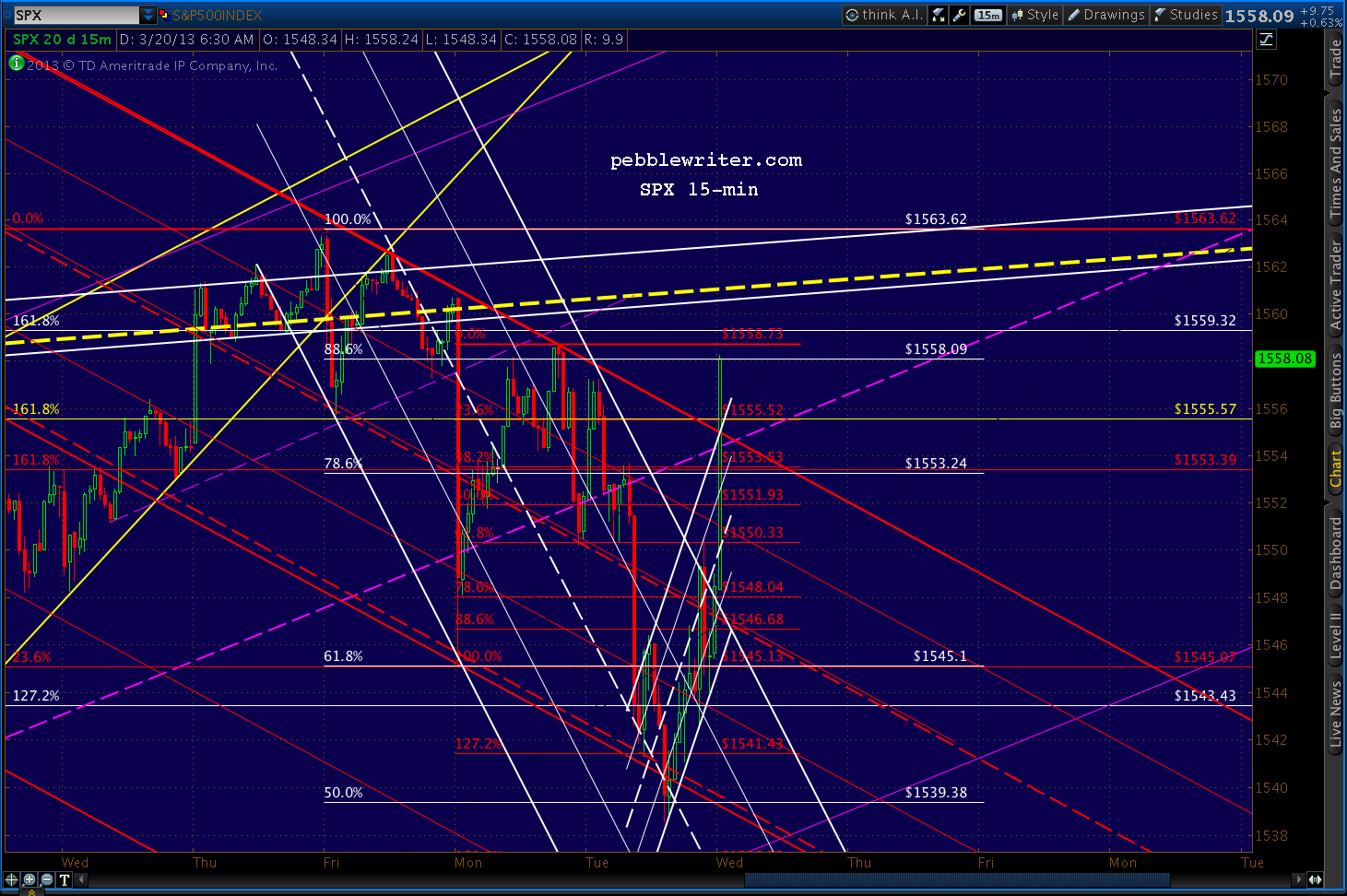
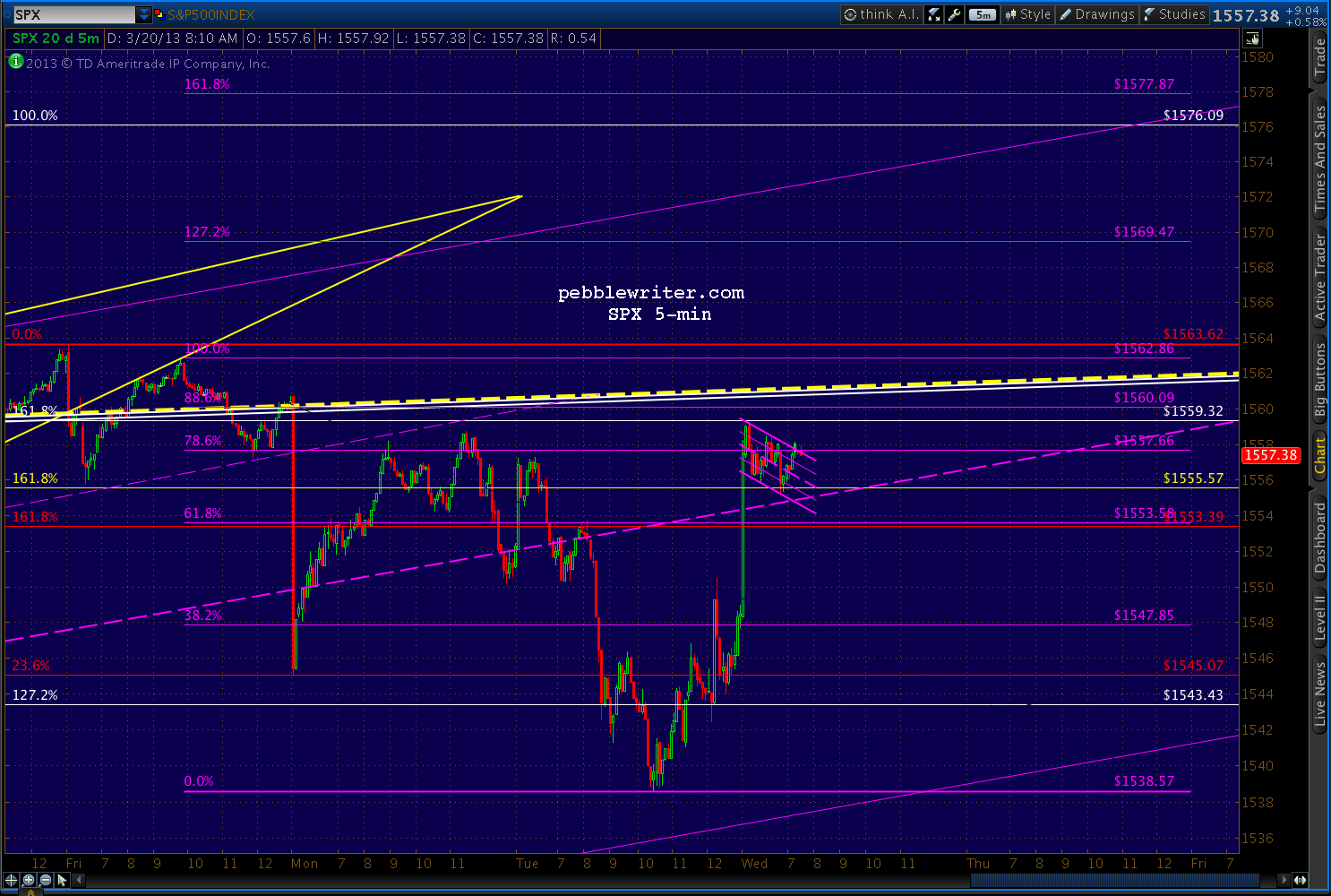
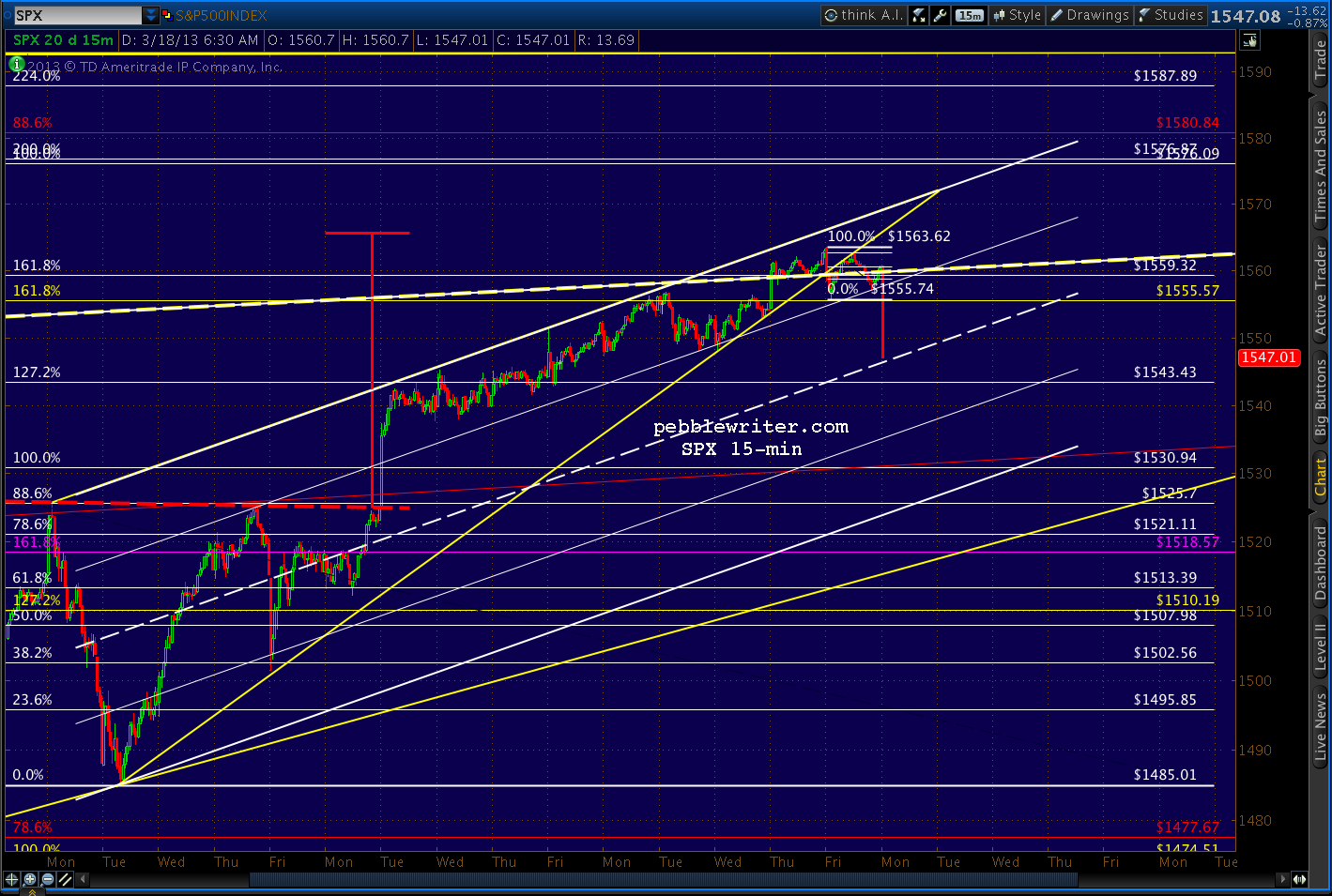
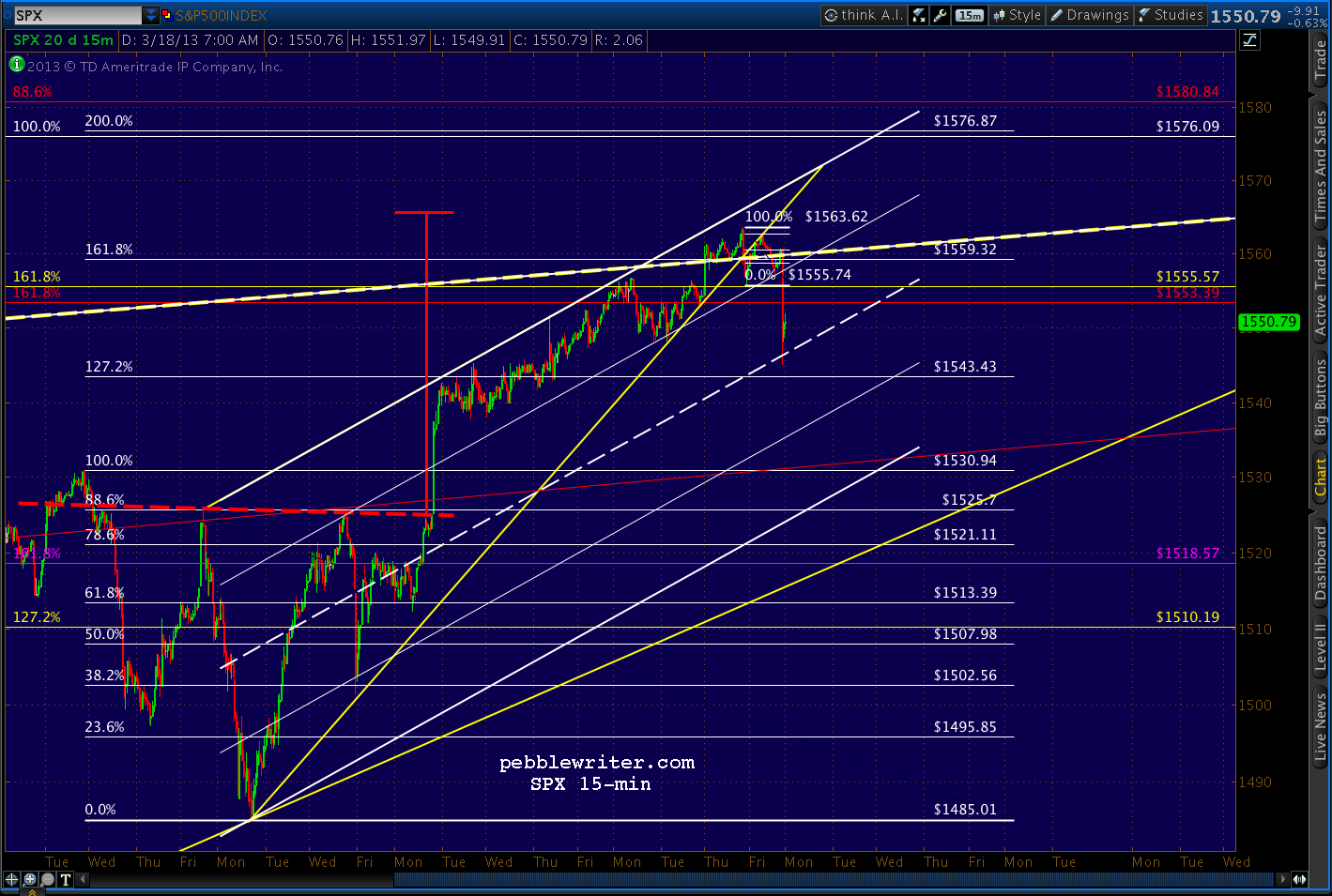
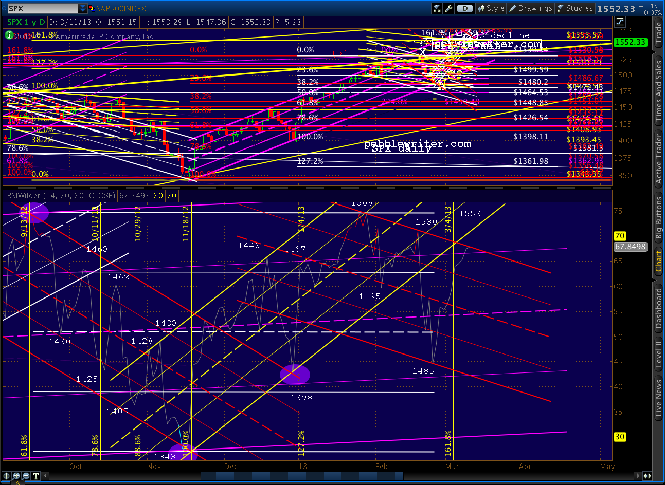
    SPX was off over 10 points this morning, making our decision to short Friday at 1514 appear to have been the right move.  SPX is heading toward the next lower purple channel line, where it will likely get at least a bounce in the 1500-1501 range or the .886 Fib at 1498.77.

    The question is whether the market is just taking a breather or beginning something more significant.  I’ll spend the next hour or so examining the road ahead.

    continued for members(more…)

  • Charts I’m Watching: Feb 1, 2013

    ORIGINAL POST:  9:15 AM

    E-mini futures are up big overnight, but have yet to exceed Wednesday’s high.

    A positive revision in BLS’s Nov and Dec employment numbers makes 2012 look better than it did, but I’m not sure how it helps today’s 12.3 million unemployed or 8 million underemployed or 2.4 million marginally attached…


    Markit Mfg PMI actually a little lower than Jan 24 flash numbers.

    Verdict: not chasing this ramp job unless it exceeds recent highs — which I don’t believe it will, at least not from this news.

    Remember, we have Reuters/U of Michigan Consumer Sentiment coming up at 9:55 and ISM’s Mfg Report on Business at 10:00.

    Watch the channel midline here…

    continued for members(more…)

  • Update on USDJPY: Jan 31, 2013

    The pair continues on a tear, putting in a miniscule consolidation at the 87.5 – 89 range where I expected more of a correction and reaching our secondary target a full 10 weeks ahead of schedule.

    Will we still get a significant correction here?

    continued for members(more…)

  • When The Music Stops: Jan 31, 2013


    Lots more economic data out today.  Unemployment claims jumped 38,000 – much higher than expectations, but personal income also beat (thought to be explained by income shifting by those concerned about higher 2013 tax rates.)

    Real Consumer spending is probably the data set that best settles the conflict — up an anemic 0.2% in December (real) versus 0.6% in November.  So, either everyone did their Christmas shopping early this year, or retail sales fell off a cliff.

    Against this mixed picture, January Chicago PMI came out at 55.6 versus consensus of 50.5 and December’s 50.0 (revised down from 51.6.)  Employment and new orders shot up, but so did inventories (after contracting for several months).  While, deliveries, prices paid and backlogs continued to contract. In short, this looks like a rebound from the November slow down largely blamed on the fiscal cliff.

    Also, not that this is a regional, not national, survey.  It sometimes offers a somewhat, but not always, predictive view of the important national ISM Mfg Index due out tomorrow.  In fact, many of the other regional surveys have shown increasing weakness.  The Chicago vs the national data are compared below.

    The market sold off early following the employment data, but rebounded a bit as investors digest the PMI report.  All eyes are on the important data being released tomorrow:

    Markit Flash PMI (covering about 85% of respondents) released on Jan 24 showed an acceleration of output, new orders and employment, but a deceleration of export orders, backlogs  and purchases.  Output prices barely moved, and inventories actually increased.

    Remember, this is only a survey of purchasing managers.  So, it doesn’t, for instance, differentiate between an expansion based on overly optimistic expectations or one justified by an upturn in demand.  Thus, while it tracks mfg output (as reported by the Fed) in general, respondents’ perceptions are often more optimistic than was ultimately justified by actual outcomes.

    We’ll revisit the data tomorrow, but for now it has the appearance of series of lower highs and lower lows, i.e. a falling channel.

    There’s no telling what the economic data will look like tomorrow, let alone how the market will react.  But, it’s interesting that the last Flash PMI data, which was generally regarded as very positive, was good for an 8-pt rally on the opening (which was quickly negated for a flat close.)

    I’ll also be keeping an eye on construction spending, which has been trending down as shown in the Briefing.com charts below.  Spending on commercial construction has been increasing at a declining rate for some time, and recently began contracting.

    The rate of increase in residential construction also recently turned down, so it’ll be interesting to see if this is a trend in the making.

    The market has been relatively quiet this morning.  After reaching the lower end of our upside target range yesterday, SPX broke through the red trend line and the white channel midlines we discussed, back-testing the white channel as expected.

    Since then, it declined to test the next lower channel bound.  The pattern from here gets very interesting, especially when one considers the RSI channels.

     continued for members(more…)
  • But, When It Was Bad…

    In my younger days I played Rubgy, a drinking party with a little sport thrown in to make it legit.  I don’t know if it’s still so, but back in those days, when the parties (always with the opposing side, much more civilized than American football) reached a certain level of inebriation, someone would start up with some limericks.   Who knows why…

    They were always off color, often hilarious, and sometimes even made sense in spite of the fact that the guy delivering it was, by then, completely arseholed.  There were no less than a dozen variations on the Longfellow poem There Was a Little Girl.

    There was a little girl,
        Who had a little curl,
    Right in the middle of her forehead.
        When she was good,
        She was very good indeed,
    But when she was bad she was horrid.

    One of the cleaner variations finished with “and when she was bad she was incredible.”

    As I watched the news roll in over the past 12 hours, I couldn’t get that poem out of my head.  Got an economic boo-boo?  Not to worry, the Fed will kiss it and make it all better.   We’re all so conditioned to that idea that no one bats an eye when it’s reported like as did CNBC:

    Frankly, I’m surprised they even threw in the word “possibly.” It’s probably only because, as Cramer assures us, this enormous GDP contraction from the previous quarter was a “one-off” event.

    More details on the report — the first negative quarter since 2009 — shortly.  But, the chart from Briefing.com clearly illustrates a lower low to go with the Q3 lower high.  Sorry, folks, but that’s a trend that points downward — especially when you layer in a sequestration and tax increase coming up next quarter.

    Of course, this horrid economic news pales in comparison to the importance of the Blackberry 10 launch.  Which, of course, will hopefully distract our attention from the craptastic AMZN earnings report — which, almost got the stock back to where it was two days ago…imagine if they’d had two positive footnotes in there! — and Boeing, the future of which is sitting on tarmacs in the form of fifty 110,000 kg paperweights (with another 800 on order.)

    The market’s reaction to all this?  Off a whopping 3 points on SPX and 20 on the Dow.  Oh, well, I suppose it could be up 10.  I’m taking on odds on how many minutes it takes for the BB-10 launch to replace the GDP headlines on CNBC.com…

    continued for members(more…)

  • Charts I’m Watching: Jan 29, 2013

    Currencies are relatively quiet this morning in the midst of a slew of earnings and economic data. The dollar looks like it could hit our downside target of 79.50 – 79.59 from Jan 25 [see: Update on DX] this morning if the yellow channel holds, but note that its midline intersects with the bottom of the white channel (support) just below current levels.

    EURUSD looks like a lock to tag the 1.618 at 1.3490 we’ve been tracking the past few days.

    This e-mini chart caught my eye this morning…

    With the overnight slide of 8 points, the e-minis give the impression of a broken channel and back test.   Now, it might be one of those dips from which we quickly recover as occurred on the 16th.  But, for those playing the intra-day moves, this bears watching.

    This ES channel equates to the small purple channel within the larger white one on SPX.  So, as yesterday, watch the channel midline for signs of something more significant.  It’s currently around 1498.30.

    The 15-min RSI should see a bounce at the red trend line if the trend is to remain on track.

    As we discussed yesterday, there is a great deal of economic data due out this week.  But, all pale in comparison to the FOMC announcements following their two-day meeting getting underway right about now.

    Last we heard, dissension was growing over how and when to throttle back on QE.  The language that alarmed the Dow 20,000 crowd:

    While almost all members thought that the asset purchase program begun in September had been effective and supportive of growth, they also generally saw that the benefits of ongoing purchases were uncertain and that the potential costs could rise as the size of the balance sheet increased. Various members stressed the importance of a continuing assessment of labor market developments and reviews of the program’s efficacy and costs at upcoming FOMC meetings. In considering the outlook for the labor market and the broader economy, a few members expressed the view that ongoing asset purchases would likely be warranted until about the end of 2013, while a few others emphasized the need for considerable policy accommodation but did not state a specific time frame or total for purchases. Several others thought that it would probably be appropriate to slow or to stop purchases well before the end of 2013, citing concerns about financial stability or the size of the balance sheet. One member viewed any additional purchases as unwarranted.

    Needless to say, an increase in hawkish rhetoric could really do a number on this rally.

    Odds are we’ll see another day like yesterday, with market makers shuckin’ and jivin’ to try and convince us a larger move is underway — the better to shake loose some of our hard-earned money.  But, I unless we see a huge miss on economic data or earnings, I don’t expect any fireworks until Bernanke steps up to the microphone (though much of the juicy stuff will have to wait for the minutes to be released.)

    UPDATE:  10:00 AM

    The Conference Board’s Consumer Confidence Index came in well below expectations: 58.6 vs expectations of 65 and Dec 2012’s 66.7.  Most of the rise in pessimism was the result of worsening job market conditions.  Those expecting more jobs in the months ahead dropped from 17.9% to 14.3%. Twenty-seven percent expect fewer jobs — unchanged from last month.  A full 22.9% (up from 19.1%) expect their incomes to decline.

    Briefing.com tracks the data and puts it in a nifty little chart (reflects data through December.)  There are a lot of potential interpretations here, but to me it comes down to “expectations coming back in line with reality.”

    And, though I don’t have the time to construct a chart, I’m pretty sure that expectations — the yellow line — have tagged the top of a descending broadening wedge (megaphone) while present conditions have formed a garden variety falling channel.  Both appear to be at or near their upper bounds, meaning a breakout or a fall is imminent.

    Global Economic Intersection posted an interesting article last month that showed the relationship between consumer confidence and past recessions.  Definitely worth a read for those who pay attention to such things.


    So far, the market is pretty much shaking it off, with a dip to the white channel midline the extent of the reaction.  If the midline holds yet again, there’s a good chance we’ll hit our upside target later today or tomorrow.

    continued for members(more…)

  • Charts I’m Watching: Jan 28, 2013

    A positive durable goods report, mixed CAT earnings and the usual meaningless NAR drivel (this time negative, but being spun as a lack of inventory) have combined to drive SPX down 5 points.As we discussed Friday, the bottom of the purple channel (1498) and/or midline of the white (1496.50) are good trigger points for those who play intra-day moves.  Look for a bounce there.

    The bottom of the white channel is currently 1485, the level at which a move lower would seriously undermine our current position.  Otherwise, our core position remains long.

    The dollar, which broke back down below a channel line on Friday, had a 2nd nice bounce off the next lower channel line, but as yet hasn’t broken out.  The short-term harmonic picture continues to be ambivalent.

    Keep an eye on the RSI channels, which still point lower in the short run amidst a general move higher.

    The EURUSD continues to linger in double-top territory — also the completion of a Crab Pattern (small, purple.)

    Note that this is also a .500 and .382 Fib of much larger patterns, so we should get a sizable reaction here.

    I’m adding two pages to the website this morning.  The first is a general discussion of harmonics trading techniques — something I’ve been wanting to do for months.  Part 1 has already been posted under the harmonics section of the “learn” tab.

    The second, which will be posted shortly, is a brief summary of my current core position and will be available under the “markets” tab.  Many of you have asked for such a page, but I’ve hesitated because of the risk of misinterpretation.

    Someone taking a quick look might see a long position, for example, without noting the commensurate high risk of a sharp downturn that was discussed in the daily post the day before.  There’s also the risk that a short-term trade is misinterpreted as long-term, or vice versa.  At tops and bottoms, when we’re waiting for the market’s stripes to emerge, core and short-term trades aren’t always easily distinguishable from one another.

    Last, such a page will out of necessity be a snapshot — a peek at where things stood at the time of its posting.  The outlook might have changed two minutes ago but not have been posted yet.  Someone who reads the full daily post would realize a change is in the works, but this page wouldn’t yet reflect it.

    But, with those caveats out of the way, I’ll post it later today for members only.

    UPDATE:  11:30 AM

    SPX bounced at the white channel midline as suggested earlier (1496.33 v 1496.50 target) and is back above 1500.

    I believe our short-term forecast is right on track.

    continued for members(more…)

  • Trading with Harmonics

    The first of a two-part article on harmonics trading strategies.

    Part 1.  January 28, 2013

    Harmonics are a great source of information about the market, but they don’t tell you how or when to trade any more than do MACD crosses or breadth indicators.  So, how do you use them?  This discussion of the basic process might serve as a good starting place for beginners.

    I consider harmonics like trade alerts.  That is, every time we approach an important Fib level, I stop and consider whether the market is likely to react or not, then make a trade decision accordingly.

    There are pages for each specific pattern under the Learn>Harmonics tag on the Home Page.  But, they all relate to one another.  Let’s walk through a real world example.

    SPX has fallen from 1576 to 666 and seems to have bottomed (how to know it’s bottomed is the real trick.)  I draw a Fibonacci Retracement grid on the price range (100% for 1576, 0% for 666) and make sure every important level is showing as on the chart below.  For a discussion of Fibonacci levels, click here.


    ThinkorSwim makes this very easy with a built-in drawing tool, as do many other platforms.  If your platform doesn’t provide it, you might want to think about changing, or at least opening up a TOS account to facilitate your charting (and, no, they don’t pay me to say that.)  You can read about harmonics and study the charts I post, but there’s no substitute for doing your own charting.

    Back to our example: because we went long at the very bottom, we set our sights on the higher Fib levels.   All harmonic patterns are marked using the letters X, A, B, C and D.The inception point (high) is X, the low is A.  B is the first reversal, C is the next, and D is the completion. The location of the reversals relative to specific Fib levels tells us what kind of pattern we probably have.

    Suppose we’ve watched SPX climb all the way up to 956, where there’s a 9% correction down to 869.  Because this reversal occurred below the .618 Fib level, we might have a Bat Pattern on our hands.  Bat Patterns complete at the .886 (1472) so we’ll make a note of that for future purposes and consider 956 a potential Point B.

    We sail right through the .382 and .500 levels, then experience another 9% correction at just above the .500 (1150 to 1044.)  Again, it’s below .618, so it could be signalling a Bat Pattern.  But, it’s a relatively minor reaction, so we treat it as only a potential Point B.

    Now we’re approaching the .618 at 1228.74 — the most important of the Fib levels.  Because the two prior reversals were pretty tame, we might suspect more from this one. We begin to contemplate a short position, and look for other signs of a reversal.

    Because we’ve been watching closely, we notice a smaller Crab Pattern setting up as we approach the .618 (the purple pattern below.)  It features a Point D at 1215.93 — slightly below our .618 at 1228.74.  So, we feel pretty confident about this being a good trade entry.

    Are there other chart patterns such as a rising wedge, channel, fan line, etc. that also hint at a reversal?  In fact, there’s a nice channel that’s formed over the past 9 months, not to mention a broken RSI channel (in red) just shy of the Crab completion.  And, we’re nearing the 1240 target of the Inverted Head & Shoulders pattern completed at the 2009 bottom.

    These would all be good reasons to consider a short.  Taken together, they make for a pretty compelling argument.  Where, though?  Other traders are watching the same charts we are, so there’s a chance the reversal will come a little early.  We don’t wait to wait too long and miss the top.  But, of course, every point too early is a point of lost profit.

    In the end, timing is a judgement call based on many factors, including liquidity, risk tolerance, the type of instruments we’re trading, other positions in the portfolio, etc. and is worthy of its own article.

    Let’s assume we make the decision to open a short position around 1213 on the April 15 — in case SPX doesn’t make it all the way to 1215 or 1228.  We feel pretty good about our decision when SPX is down to 1186 the following day and 1183 the next.  That’s a 2.5% move in two days — not bad.

    On the third day, however, our plan is looking iffy.  SPX gaps up on the open and hits 1208.  Three days later, it pops above the Crab target of 1215.93 and tags 1217, seemingly in search of the .618 at 1228.74.

    Suddenly, we’re underwater by 15 points or 1.25%.  Is it time to bail?  Again, it depends on the type of investor you are.  Options traders might have closed their puts for large profits already, while swing traders might be happy as long as SPX doesn’t exceed 1230-1235.  Buy and hold types might have used the Fib level as a warning of a potential downturn and hedged or lightened up on their long positions.

    Checking our charts, we can see that neither the price nor the RSI channels have been broken to the upside.  In fact, the little red RSI channel which helped convince us of the downside potential shows the latest push higher came with a lower RSI score (negative divergence) and a pretty pathetic back test.  So, we’re inclined to hang in there.

    It turns out to be a great decision.  The following day, RSI plunges through the midline of the purple channel.  SPX plunges 38 points from its high, stabilizes for four days, then really starts falling apart.  On May 4, SPX reaches the white channel midline, a possible bounce spot.  We’ve already made 4.5% since shorting at 1213 less than 3 weeks ago.  Time to bolt?

    To be continued…

  • The Dow: Time to Double Down?

    Many are watching the Dow Transports’ recent all-time highs, wondering if Dow Theory suggests new highs for the DJIA as well.

    Without wading into the debate over which interpretation of the theory holds water and which are all wet, I think it’s important to recognize that the DJIA is one of those indices not making new all-time highs lately.

    Should the Industrials not break above 14,198.10, this would be considered a Dow Theory non-confirmation, at least on a larger scale.  The last time this happened was in July of 2011, when the Transports made a new high of 5627.85 and the DJIA failed to best its May 2 12,876 high.

    We can argue about cause and effect, but there’s no argument about what happened next.

    Eighteen months later, the DJT has again broken out to new all-time highs.  DJIA has not.  Here’s the current visual, which shows the current degree of divergence is much larger than back then.

    The Industrials, in fact, are a great candidate for a double-top.

    Drilling down, we can see DJIA has nearly completed a Crab Pattern at the Fibonacci 161.8% extension (14,201.84) of the July-October 2011 crash (the white pattern.)

    It intersects nearly perfectly with the previous 2007 high of 14,198.10 at the very point where the purple channel top and white 25% channel line also intersect.  But, it need not even reach that level to be considered a double top (within 1%.)

    And, only a few points away we find a Butterfly Pattern target (small red pattern) at 13,985.65 and a Crab Pattern target (in white) of 13,963.50.

    The last leg up in the move since October 2011 has been 1424 points — roughly 87% of the leg 3 rally between June and September of 2012.  A Fibonacci 88.6% of the leg 3 rally would register at 13,912 — well within the margin of error for any of the harmonic patterns mentioned above, and only 16 points above today’s high.

    And, for those who, like me, love to channel stuff, the DJIA’s daily RSI has its own bearish tale to tell.

    Could DJIA blow through 14,200 confirm the Transports’ all-time high and spoil the bears’ party?  Of course.  There are still plenty of earnings reports to sift through, including AMZN, CAT, FB, YHOO, IP, PFE and F in the next few days.  We could get great Durable Goods numbers Monday, Case-Shiller Home Price Index on Tuesday, or a bullish FOMC outcome on Wednesday.

    But, anyone counting on new all-time highs should remember July 2011 and consider protecting their downside.

  • Update on DX: Jan 25, 2013

    Currency markets have been quiet the past few days, with the dollar showing some indecision as investors try to wrap their minds around a potential new high for equities.

    Since we hit our downside target at the white .786 on the 13th, DX has been non-committal.  My best guess is a repeat of the .786/.886 retrace down to the red zone before DX takes off higher, but this is neither assured nor necessary for our equity forecast to play out as expected.

    continued for members(more…)