

Most charting purists hate the Dow. Not only is its price level manipulated like all the other indices, but any time it’s not performing up to par, they replace the dogs with Wall Street darlings. The data, therefore, is suspect from the start.
What really turns my stomach, however, is how this sewer rat of an index crapped all over three very solid and reliable chart patterns that should have resulted in a serious downturn in December 2013.
The megaphone, channel and Fibonacci patterns visible below all pointed to a plunge at 16,300. And, by plunge, we’re talking a reversal from the 1.272 extension at 16,300 to at least the former high at 14,198 — a 12.9% drop. Instead, TPTB used the cover of low-volume holiday weekends to push DJI up through that significant resistance, resulting in a 12.5% gain over the next 18 months. Between what shoulda’ happened and what did, it was a 25% swing.
There was a moment on October 15, 2014 when DJI momentarily dipped back below the 1.272, but Fed President BullarD grabbed the nearest microphone and waxed enthusiastically about QE4, thus erasing any thoughts the index had of adhering to charting protocol.
The 15.75% rally over the next 7 months was pretty spectacular. The bulls seemed invincible. Then August 2015 rolled around and, suddenly, things looked dicey again:
√ back below 1.272 extension
√ back below megaphone upper bound
√ back below channel top
continued for members…
But, this being a big central banker week coming up, we shouldn’t read too much into the recent weakness. They have shown many times just how capable they are of derailing chart patterns such as those mentioned above.
Friday’s action, for instance, showed the index closing above the 1.272 and a potential falling channel midline. Would it really surprise anyone if TPTB were able to push the Dow back above the megaphone top, too?
With BoJ meetings coming up Sep 14-15 and FOMC on Sep 16, we should know more very shortly. The downside case is represented by a Crab Pattern target down near the 2007 high of 14,198; the upside case starts with testing the broken megaphone lower bound at around 17,200.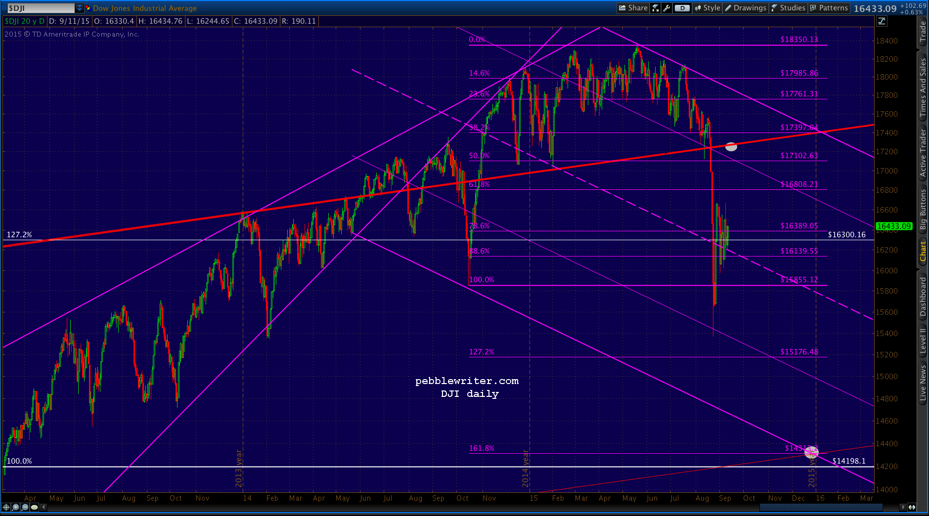 Stay tuned.