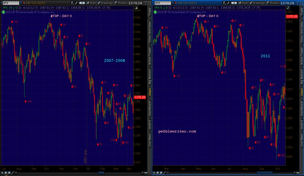

Stocks can rise for good and valid reasons. But, they can also rise for no reason at all other than it gives them more room to fall without serious damage being done to important support levels. Such is the case with last night’s ramp job.
 With a wide range of potential outcomes in the US elections tomorrow, this is a good time to look back at the last election and how that outcome might inform our outlook.
There are five basic scenarios:
(1) Republican president, Republican Senate
(2) Republican president, Democratic Senate
(3) Democratic president, Republican Senate
(4) Democratic president, Democratic Senate
(5) 2018 VP1 strikes Washington DC and, mercifully, we get a clean slate
Not too many years ago, Republicans stood for fiscal conservatism that would have considered trillion dollar deficits unthinkable. But in 2017, long before COVID-19 arrived on the scene, the CBO forecast the deficit exceeding $1 trillion by 2020.
 That, of course, occurred with a Republican president and Senate. The debt in 2016 was $19.6 trillion – about 104% of GDP. By 2019 it was $22.7 trillion. This year, it has already topped $27 trillion – about 136% of GDP.
So, it’s fair to ask whether which party controls the White House and Congress will make much of a difference.
continued for members…Let’s take a quick look at where we are with all the factors we watch closely.
SPX managed to close back above the H&S neckline on Friday…  …after ES steadfastly refused to break down below its rising yellow channel midline.
  As we’ve discussed, this was important support. We saw VIX play an important role by reversing at a backtest of the yellow .618 and white .382.
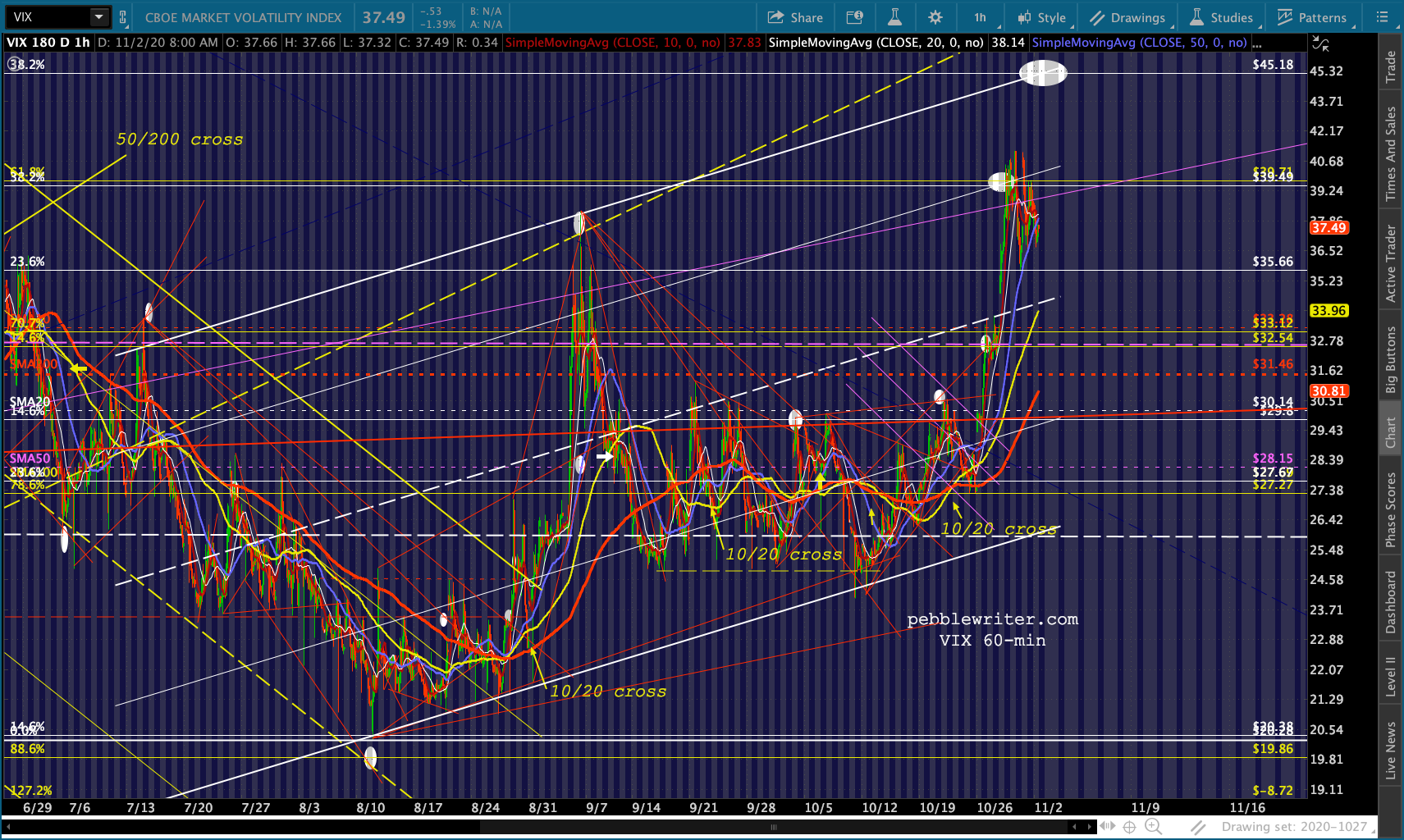 We also saw USDJPY hold the midline of a falling channel and, since then, “break out” of the little falling red channel it was in – even topping its SMA10 for a while.
 This has allowed NKD to bounce despite its rising wedge having broken down…
  …and aided EURUSD’s failure to bounce…
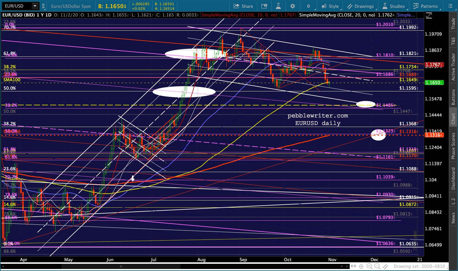 …in enabling what I believe is a headfake breakout in DXY.
  Remember, its rising purple channel has broken down and been backtested. The logical next step is a backtest of the larger white channel midline at the white .786 of 91.358.
Gold and silver are getting a relief bounce, but note that GC is backtestging its twin channel midlines and SMA100… …and SI has backtested its SMA10 and SMA20 (which are seeing a bearish cross.)
 CL and RB have reached our targets at the bottom of their falling channels and should bounce here despite England joining France, Germany, Ireland and Belgium in shutting down.
 Let’s look at how each of these might react following tomorrow’s US election.
First, from a macro standpoint, I assume that a stimulus package will be just as difficult to enact during the lame duck period as it has been for the past couple of months – perhaps more so, given the lack of political pressure/fear of not being reelected.
I believe the biggest risk facing the Fed (that they care about, at least) is an equity correction. The second biggest risk facing them is an appreciable rise in interest rates. I believe there is simply no way that the Fed can afford to let interest rates break out.
Look at Japan as a guide. As debt approached and surpassed 2X GDP, it became absolutely necessary to drive rates to zero.
 The Japanese bond market is more tightly controlled than that of the US and the debt/GDP is significantly higher, but the US is on the same path. Remember, the current debt/GDP ratio is more like 136%.
 As long as the ratio continues to grow, which it will with such rapid debt growth, the need to keep rates at or near zero will continue. This is the principle which has guided the charts below. The first illustrates the need for rates to crash.
 These next ones illustrates how clearly the cycles in the 10Y repeated themselves, how the breakdowns off the top of the falling channel correlate with equity corrections…
 …and how DXY can move in tandem with or opposite to the 10Y.
 My apologies for the delay in posting the rest of this…lots of conference calls today.
IMO, the argument for lower rates for the foreseeable future is very solid. But, that doesn’t mean we can’t have periodic pops in rates in order to help stocks out in the short run. If TNX pops up to 90 bps for a few days or weeks, it’s not going to ruin the fiscal picture.
I believe that’s what’s been happening over the past few months – since the March crash. Note that the breakouts in early June and late October were all instrumental in boosting stock prices. TNX broke out three times, closed a prior gap, and then collapsed down to support. Each time, ES rose along with it on the breakout. And, each time, it fell when TNX did.
 The correlation with DXY wasn’t nearly as strong. At times, they rose in tandem and at times they were very negatively correlated. The three TNX breakouts mentioned above were either neutral or were accompanied by DXY downturns.
This is because the algos were focused on the prospects of the “reflation trade” where the economy is doing so well that it reignites inflation. The problem with the relation trade, in addition to being a short-term sugar high, is when it steepens the yield curve.
We’ve seen this over and over with our yield curve model, where the 2s10s consistently drives stocks lower when it fails to break out and, especially, when it experiences major breakouts as it did in 2000 and 2007. We’re seen the model play out well throughout 2020, with the Feb-Mar decline, especially, the result of the breakout of the 2s10s back above the dashed white line connecting the previous lows.
 Of course, a breakout in the 2s10s is driven by more than just the 10Y pulling away. It is just as vulnerable to the 2Y plunging faster than the 10Y. When the 2Y breaks down, it can be devastating to stocks as we’ve seen quite often over the years.
Virtually every time the 2Y has broken down below one of the rising or horizontal yellow TLs below, stocks have plunged. Rallies off support and rallies back above horizontal resistance have benefited stocks.
 The Feb-Mar crash was signaled by a breakdown of the rising yellow TL dating back to 2013 (marked by a purple arrow.) The subsequent breakdowns of horizontal support added fuel to the fire until the 2Y finally dropped below its all-time lows of 16 bps.
 It’s no surprise that the 2Y has hovered in a very tight range ever since then.
  You have to zoom in on it to see any movement at all.
 The rub for bears watching the yield curve model for a sell signal is that at 16 bps, the 2Y has little room to drop before hitting zero (of course, that’s what we thought about WTI!)
But, it’s the distance it puts between itself and the 10Y that matters, as we saw in 2000-2003… …and again in 2007-2009.
 See if you can spot the divergence in 2020.
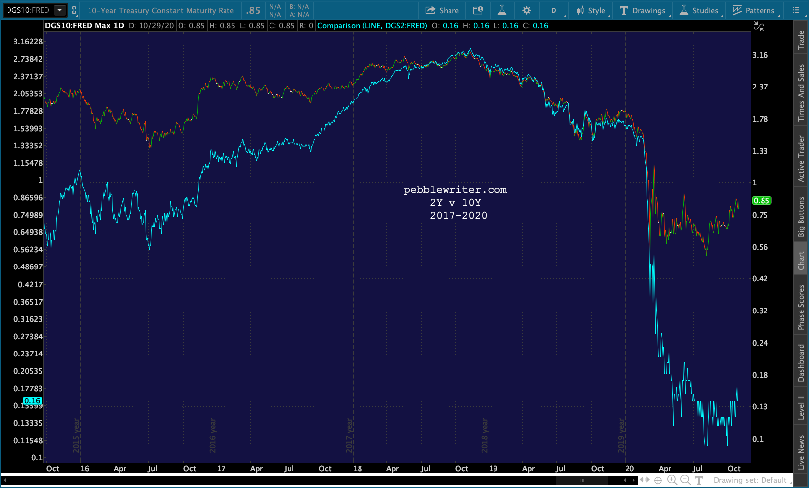 A close-up that covers the past year shows the 10Y creeping higher since Mar, with the 2Y not really keeping pace over the past few months – hence the test of the 2s10s recent highs.
 In an equity meltdown, the 2Y could certainly reach zero. The 10Y would have to drop to 69 bps in order to maintain the same spread. But, given that it fell as low as 40 bps in March, it seems reasonable to expect (1) the curve could flatten considerably, a common occurrence when stocks are plunging, or (2) the 2Y breaks down below zero.
If TPTB are trying to prevent an equity meltdown, they had best keep the spread pretty much where it is – with modest breakdowns in both the 2Y and 10Y that preserve the 60-70 bps spread.
How does this relate to DXY? In Feb-Mar, DXY plunged sharply as stocks were selling off, then spiked to new highs beginning Mar 9 – peaking when stocks bottomed. The ES chart below shows the 4.5% selloff which occurred after Trump’s win became apparent.
 DXY has no trouble rallying as the 10Y was soaring at the time – gapping up to new cycle highs in Dec 2016 before beginning a gradual decline into Sep 2017.
 DXY’s rally fit nicely with USDJPY’s sharp rally off its Nov 9 lows…
 …and EURUSD’s backtest and collapse.
 After 15 hours, I’m running on fumes. I’m going to break for the night and continue this in the morning.