The dollar continues to settle, and is currently below the purple channel bound. DX tagged the .786 of its rally from Apr 16, so should reverse from there or, alternatively, the .886 at 81.956.
The USDJPY, which fell through the purple midline last week, reached the .618 of its last leg up and is likely to rebound to backtest the purple midline before correcting any further.
SPX needs to reach about 1596 to complete the latest IH&S in the works.
We’ll play along on the upside at the opening, but beware of the upcoming Fib levels.
UPDATE: 9:35 AM
The opening surge took SPX above the red .618 of the move down from the latest tag of the TL from the 2000 and 2007 highs (red, dashed below.)
If SPX can maintain any downside momentum, that could suffice as a corrective wave. But, there’s no operative falling channel at the moment, so not much evidence to support that idea.
 I’m inclined to let it run, but maintain stops near our entry point just in case.
Remember, SPX bulled its way back into the broken purple channel on the 23rd — an unusual occurrence with bullish overtones. It damaged, and probably destroyed, the traditional H&S pattern (in red, above) that was setting up.
I’ll continue to believe in the ability of the TL from the 2000 and 2007 highs to limit the upside until proven wrong. But, the inability of the bears to seal the deal with that H&S is disturbing to the downside case.
Looking at the white harmonic grid above, the upside goal is obvious. But, it means breaking through that TL in what appears to be an already overextended market. The bulls shot themselves in the foot with the push above 1573. The yellow IH&S would have been much more believable if we’d seen a reversal to the bottom of the purple channel there.
Now, we’re looking at an insanely steep neckline that doesn’t exactly inspire confidence. Given the mixed signals, we don’t have much choice but to continue playing the swings — at least until there’s some sort of breakout or breakdown.
The next one is coming up at 1590.92 — the .886 of the drop from 1592.64 and roughly a tag of the purple .25 channel line.
That’s the .886, and the channel line. I’ll close the long here at 1591 and revert to short, but with stops at 1593ish just in case there’s something bigger in the works.
SPX just tagged the TL (red, dashed) connecting the 2000 and 2007 highs. From a harmonic standpoint, this is bullish. But, this TL — which was only broken intra-day on the 11th — is technically very important. A sustained push through 1593.50 and I’d say we’re heading up to at least 1596-1601. But, I wouldn’t abandon my shorts until that point.
 Note that we’ve now tagged the purple channel line, rather than merely coming very close as we did earlier this morning.
UPDATE: 12:25 PM
That didn’t take long. We’re pushing on through 1593.50, so I’ll take an interim long position here and ride it up. Targets and implications coming in a few…
UPDATE: 1:05 PM
By pushing higher than 1592.64, SPX has increased the chances of the 1592.64 high from Apr 25 being a Point B in a Crab Pattern pointing higher. I’m probably going to go ahead and close my short position when this back test is complete (probably 1593ish) and go full long.
Just keep in mind that we’ll probably bounce around quite a bit between 1594 and 1597.50 — the previous high and the neckline of the IH&S pattern.
UPDATE: 1:25 PM
That’s close enough. I’m closing the short position and will go full long from here at 1593.53.
Note that we’ll probably see a pull back at the neckline and prior high around 1597.30 – 1597.70. IH&S patterns don’t usually race right through the neckline. But, if they do, they usually back test.
Also, note that the TL from the 1994 and 2003 lows is just overhead at 1601.50. It’s entirely possible that it could put the kabosh on any further rally as it did on Apr 11.
Let’s talk for a minute about the big picture. If 1592.46 is a Point B, then it suggests a Crab that targets 1635 — about the same level as our IH&S Pattern. It could come around the middle of May, which is when the purple midline crosses that price level. That date keeps popping up on my charts, and I’ve discussed it many times as being potentially significant.
1635 could also come in the next two days if it’s the white channel midline that pulls rank. We haven’t talked much about the white channel lately, but it’s had a lot of influence ever since July 2011.
 Here’s a look from a little further out…
 We’ve had this potential target on our charts ever since the 1536 low. Actually, that’s not true at all.
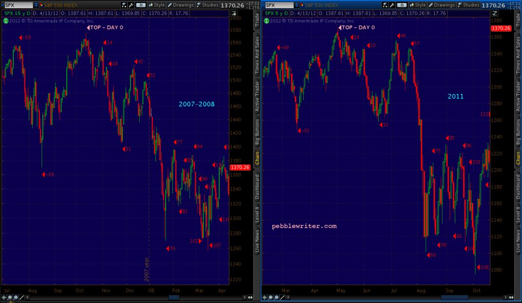
I first mentioned it on July 20, 2011 in the final days of the 2011-as-2007 analog [see: Ten Lousy Points.] For those who weren’t reading the blog back then, I saw 2011 setting up as a virtual carbon copy of the 2007 top [for a full discussion, click HERE.]
May 2, 2011 corresponded to Oct 11, and July 21,2011 was shaping up as Dec 26, 2007.
I went back and described in some detail the events leading up to December 26, 2007:
Even though it was the week before Christmas, not everyone was full of good cheer. Unemployment had ticked up from 4.7 to 5.0%. Bear Stearns had reported its first ever loss, shuttered two hedge funds and had its credit rating lowered from AA to A. And, housing starts had dipped to a dismal 1.2 million.
Fortunately, TPTB came to the rescue. The Fed lowered the discount rate from 4.5% to 4.25%. And, in an unprecedented show of cooperation, it was announced that the Fed, Bank of England, Bank of Canada, ECB, Swiss National Bank would coordinate to make available up to $64 billion to ease credit conditions.
There was a Santa after all! The Dow soared 205 points, the S&P; 500 over 21. The next two days tacked on 13 more points. At that point, SPX was just 10 lousy points from completing an inverse head & shoulders pattern that might have sent it up 125 points to 1635. That’s a bunch of Beemers!
We all know the rest of the story. Suffice it to say there were a lot of hangovers those next few weeks that had nothing to do with New Year celebrations. SPX dropped 120 points in 2 weeks, 230 points in 4 weeks and 750 points by the following Christmas.
Sure enough, July 2011 was a repeat of Dec 2007. SPX got within 13 (rather than 10) points of completing an IH&S that would target 1453. On that failure the following day – July 22 – SPX began a plunge that would see it lose 246 points in 11 sessions.
 Here’s what it looked like when it was all over.
So, as we approach the completion of the IH&S that practically guarantees that same 1635 figure, forgive me if I’m a little nervous about whether it will actually complete. And, if it does, it still has to get through that yellow TL from the 1994 and 2003 lows.
UPDATE: 3:10 PM
SPX just fell out of bed, or at least the white channel. Going to have to go short here if it pushes lower than the prior 1592.64 high. Otherwise, this is just a full backtest of that level.
 Assuming 1592.64 holds and this is just a shakeout attempt, SPX needs to get past 1597.35 to reach the neckline and complete the IH&S.
If it does, it still needs to get past 1601.96 (the red 1.618 and the yellow TL) for 1635 to be in play.
I have a very funny feeling about this…
UPDATE: 11:30 PM
It’s vexed me that the purple channel broke down back on Apr 17, only to resurrect itself on the 23rd. Not one to tolerate being vexed, I’ve continued to play with the channel bounds. Here’s a variation that seems to work really well and, if right, is flashing a warning signal right here at its midline.
I’ve drawn it in red below, but will change it to purple in future charts to maintain the continuity of our discussions.
 Presenting the new purple channel, along with its (really) big brother:


Comments
6 responses to “Charts I’m Watching: Apr 29, 2013”
Hi PW,
In the 1:25 update you suggest that the 1592.46 (on 4-25-13) could be a point B of a Crab pattern, however the retrace from that barely exceeded the 23.6 Fib retrace. Just trying to understand how flexible the parameters are for (Crab) harmonic patterns, as the BC leg should have been .382-.886 of AB. Am I being too literal on these definitions?
Great question. First, we did have a turn at the .707 (1579.50.) It lasted all of 5 minutes, but it was technically a .382 (almost exactly) retracement at a level that is keeping with Crab Patterns.
But, more importantly, I always have to remind myself that not every move will be harmonic. Channels can and do extend well beyond 1.618, 2.24, etc all the time without a legit Point B. AAPL is a great example. Another is the SPX and most other indices between 1995-2000.
Harmonics tell us what “could” happen at a very specific price point — not that it necessarily “will” happen or by how much.
Forgot to count the mini flash-crash, now it makes sense. Thanks!
IWM has not broken out so leading or lagging we shall see
on the SPX this looks like a decent place for a turn. Downsloping resistance (gray line), another resistance line coming from underneath (pink line), within two bars of a sequential sell and an hourly 13 confirmed all with the hourly RSI just peeking above 60 gives me the go for a -delta SPX trade. For some reason I can’t post any charts, but that might be better for all!
Good luck.
Thanks, I like it. I hadn’t noticed that pink line. I had it drawn in more as a loosely fitting channel, but yours looks more like a rising wedge — which fits the circumstances better IMO.
BTW, your falling gray TL has some company — note the parallel yellow lines below, drawn as a channel on the current chart. The .75 line on the yellow channel and the bottom of the purple channel intersect tomorrow morning around 1576. Probably worth watching if we don’t break through here.
Disqus continues to puzzle me. Usually, when you attach charts, it won’t actually show with your comment until you refresh the screen after posting the comment. I can see yours just fine.
If you get a message from Disqus saying we’re having trouble with the picture you’re trying to add, just ignore it. It’s usually there, but doesn’t yet show. If you try adding it again, you’ll end up with two pictures like I just did.