

The great thing about low inflation is that central bankers can continue accommodative monetary policy without too much criticism. Stocks love easy money.  The crummy thing about low inflation is that it makes it that much tougher to prop up the US dollar. For some reason, investors just don’t believe the FOMC will keep hiking rates while prices are falling. Investors are funny that way.
A lower USD, of course, means a lower USDJPY. Stocks don’t like a falling USDJPY — which has, again, dropped through its SMA200. For its part, DXY has spent over a week bumping along an important channel line, and is testing it again today.
  With USDJPY struggling, the onus has been on VIX, CL and RB to help prop up stocks.
VIX did it’s best yesterday, with a dramatic turnaround at its SMA200 as expected. But, the charts suggest it could be pushing 14 by next Wednesday.
RB is trying to rally, but the last two inventory reports argue for lower prices, not higher. And CL…well, it’s the key, isn’t it? As we discussed earlier this week, it’s one sure way to get PPI/CPI up to where it needs to be. That’s important, because the Fed’s inflation problem is morphing into a credibility problem.
If inflation were measured accurately and not gamed the way it has been for years, there would be no credibility problem at all. Between healthcare, gas and housing, true inflation is closer to either 6% or 10% (Shadowstats.com.) Of course, if the Fed ever acknowledged this, higher interest rates and cost of living increases would increase the deficit and debt to untenable levels. So, instead, we live in a world where average Americans are increasingly unable to make ends meet, where their income can’t keep up with the bills despite what the official data says. The savings rate is dropping just as fast as consumer credit is rising.
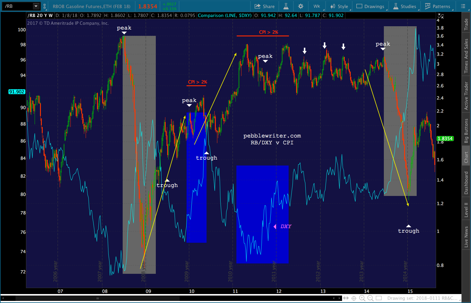
 At what point will oil’s rally and the dollar’s drop run out of steam? If the past is any indication, we have two specific patterns with which to concern ourselves.
continued for members…
First, let’s start with a good inflation chart — this one from the excellent Doug Short.
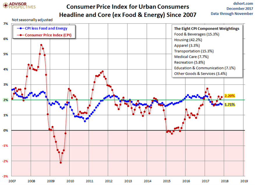 Focus first on the last time CPI shot up through the 2% level – between 2010-2012. There was an initial push between Dec 2009 through May 2010 and another, much more substantial push between Feb 2011 and Apr 2012. The troughs for CPI were in July 2009 and June 2010. The peaks were Jul 2008, Jan 2010 and Sep 2011.
Other key inflection points were in Jun 2014 – the last time CPI topped 2% before plunging back below zero — and the sub-zero trough reached in Jan 2015.
Now, let’s look at how oil and gas behaved during those same periods. The huge slide in oil and gas prices between Jul and Dec 2008 corresponded exactly with the plunge in CPI from 5.6% to 0.09%.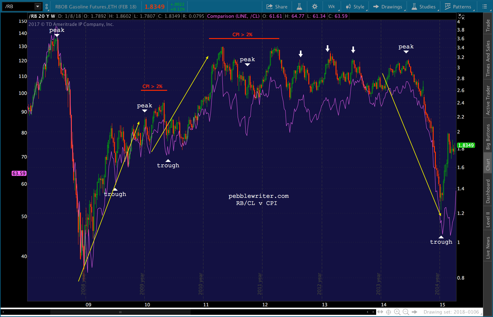 CPI finally got back above 2% in Dec 2009 only because oil and gas rallied so sharply between Dec 08 and Dec 09. As the year-over-year comparisons leveled off over the next six months, CPI fell back below 2%.
It got back above 2% only when oil and gas broke out in Feb 2011. It lasted until April 2012 because that’s wen the YoY comps in oil and gas turned flat and/or negative.
There were a few bumps up to 2% CPI that corresponded exactly with the periodic spikes in oil and gas (the white arrows.) And, CPI peaked in Jun 2014 when oil and gas did – before falling off a cliff. This sent CPI from 2.13% to -0.09% by Jan 2014.
Now, let’s look at DXY and DXY during that same period. Note that the 2010 period of 2%+ CPI was marked by a strong rally in DXY (highlighted in blue.) The 2011-2012 period also saw DXY rally strongly.
Interestingly, the periods where CPI dropped sharply also featured strong rallies in DXY (marked in gray.)
to be continued…