
Let’s talk about debt. In 2018, the federal government spent $523,017,301,446.12 in interest (a 14% increase over 2017) on what is now over $22 trillion (a 7.5% increase over 2017) in debt. The divergence between those two rates of increase is important.
The interest expense is growing faster than the amount of outstanding debt because interest rates have risen. When I produced this chart in September, the average interest rate on government debt over the previous year was 2.378%. In February 2019, it was 2.581%.

Although 10Y yields topped out last October as expected [see: Suddenly Interest Rates Matter], the average interest rate on outstanding debt has continued to increase. Combined with the fact that outstanding debt is accruing at over $1 trillion per year, this presents a very serious problem.
It also offers some very important clues as to what the Fed and other central banks will do over the coming year.
continued for members…
Since there are no prospects for budget deficits to disappear, we must assume the total debt will continue to increase. If it continued to increase at only 7.5% per year, that would be enough of a problem. Holding the average interest rate steady at 2.581% would mean an additional $39 billion in interest expense.
But, of course, it won’t hold steady. We are paying interest on interest, and the deficit is certain to expand as we enter a recession. So, we can expect an increase on the rate of increase — in other words, an exponential increase.
Given that average interest expense is at 2.581%, is it a coincidence that 10Y notes have returned to the 2.6% range? Hardly. The relationship between interest rates and inflation has always been important. It became critical when fuel prices, pressed into service to support stocks: (1) ratcheted up inflation; (2) thereby ratcheting up interest rates which threatened the country’s ability to pay its bills; and, (3) decimated consumers’ budgets.
As we discussed almost a year ago [see: Oil & Gas, Inflation and Interest Rates: A Delicate Balance or Goal Seeking?]…
Oil and inflation are strongly correlated. Inflation and interest rates are strongly correlated.
 Spikes in inflation above 2% or above obvious resistance have been bearish for equities.
 As the major variable in short-term changes to CPI, the YoY change in gasoline prices have been (ridiculously) strongly correlated with CPI.
 The net result of these relationships is that while higher oil prices can be an effective tool to provoke equity rallies, it’s a self-limiting proposition as the resulting higher inflation causes interest rates to rise to untenable levels.
That’s where we were in October, when interest rates, oil and gas not so coincidentally peaked within 2 days of each other. Oil and gas subsequently dropped over 30% and 10Y notes dropped from 3.248% to 2.554% on Jan 3.
What stands out in the chart below is that oil prices gave up practically all of their 2017-2018 gains while TNX gave up not quite .618 of its 2017-2018 gains. This was important, because those relatively higher interest rates were needed in order to keep the US dollar strong.
 Why a strong dollar? The US is a net importing nation. A weaker dollar would ratchet up inflation and put additional pressure on interest rates.
By now, you’re probably beginning to mutter the words “wow, no free lunch.” And, it’s true. It’s important that oil and gas continue to rise just enough to keep CPI high enough (preferably 1-2%) to avoid fears of a recession. But, it’s even more important that they don’t rise too much and push interest rates too high.
This is one of my favorite new charts. Note how closely aligned the peaks and troughs are between CL and TNX. The cycle is very clear: when TNX gets too high, CL plunges and resets TNX to an acceptable level. The cycle brackets show that the time between CL lows has been very consistent.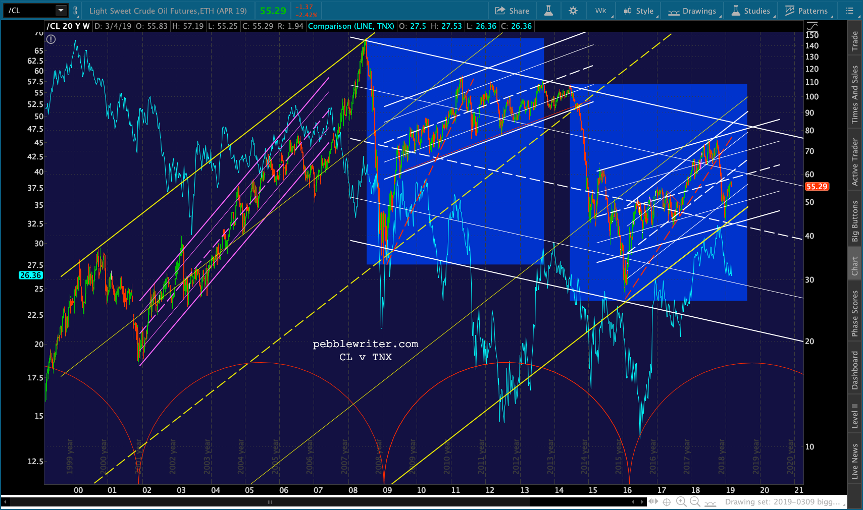 Now, note how closely aligned the peaks and troughs are between CL and SPX.
 Note the rising yellow channel for CL has been waylaid by the falling while channel which began at the 2008 highs — peaking one 7/11/08, exactly one month before the most vicious drop in SPX began.
CL peaked again on May 2, 2011, the same day that SPX did before shedding 23% – bottoming on the same day in October 2011. In 2014, CL broke down nine months before SPX peaked and began its 15% decline.
But, SPX’s decline was delayed by 9 months by USDJPY’s concurrent 19% spike that we’ve discussed many times before. USDJPY’s spike is what allowed CL/TNX to decline without scuttling SPX’s ascent to its 1.618 Fib at 2138.

continuing…
UPDATE: 9:50 AM
SPX and ES just tagged their SMA200s. TPTB should put the brakes on here and produce a bounce. But, the algo drivers suggest we will push on down to SPX’s .618 at 2713.88 or the 2.24 at 2703.62. Time to take profits or at least adjust your stops.

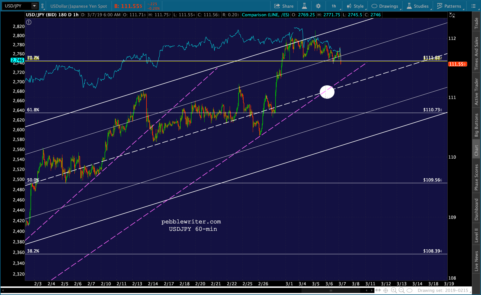
 Tentative support here for USDJPY as the midline and TL are better targets than the .707 Fib.
  CL tagged its SMA100 and channel line yesterday, so it has decent bounce potential if needed.
 RB, on the other hand, has run out of room and should be shorted.
 FWIW, VIX has reached the purple midline. It’s not much resistance, but that doesn’t matter much if TPTB wish to rescue SPX at 2750. A better target is 18.80 – 20.
 Note that COMP well overshot its SMA200. Its next support is a backtest of the .618 at 7381.02
 Also on the currency side, EURUSD is finally giving up on a rally thanks to Draghi’s throwing in the towel. Its .618 should finally be tested…
 …which might just be enough to get DXY up to its 97.94 target.
