

In July 2022, in the wake of 9.1% CPI, we discussed the sequence of events which landed the Fed in the unenviable position of having to attack inflation without causing a recession [see: Oil and Inflation.]
The Fed is finally on the case, raising interest rates and trimming back their balance sheet. But, it’s hard to know how large a decline in stock values they can stomach before at least signaling a pause.
…the guys behind the curtain are going to need to come up with some pretty fancy footwork: a plan that keeps energy prices falling, inflation back under 4% and the 10Y back under 2.5% – all without bringing on a recession that sends stocks down 50% and real estate down 20%.
Personally, I don’t think it’s possible. I think the recession and falling asset prices are not only inevitable, but necessary.
Six months later, the problem is essentially the same. CPI has fallen to only 7.1% while the S&P 500 – currently off 19.2% from its 2022 highs – fell as much as 27.5%. If a 2% drop in inflation produced a 27.5% plunge in stocks, what damage would another 3% do?
Fortunately, the path taken by the 2022 market left some valuable clues. We discussed many of them in our recent Review of 2022. Over the next few days, we’ll do our best to see what lies ahead for 2023.
* * *
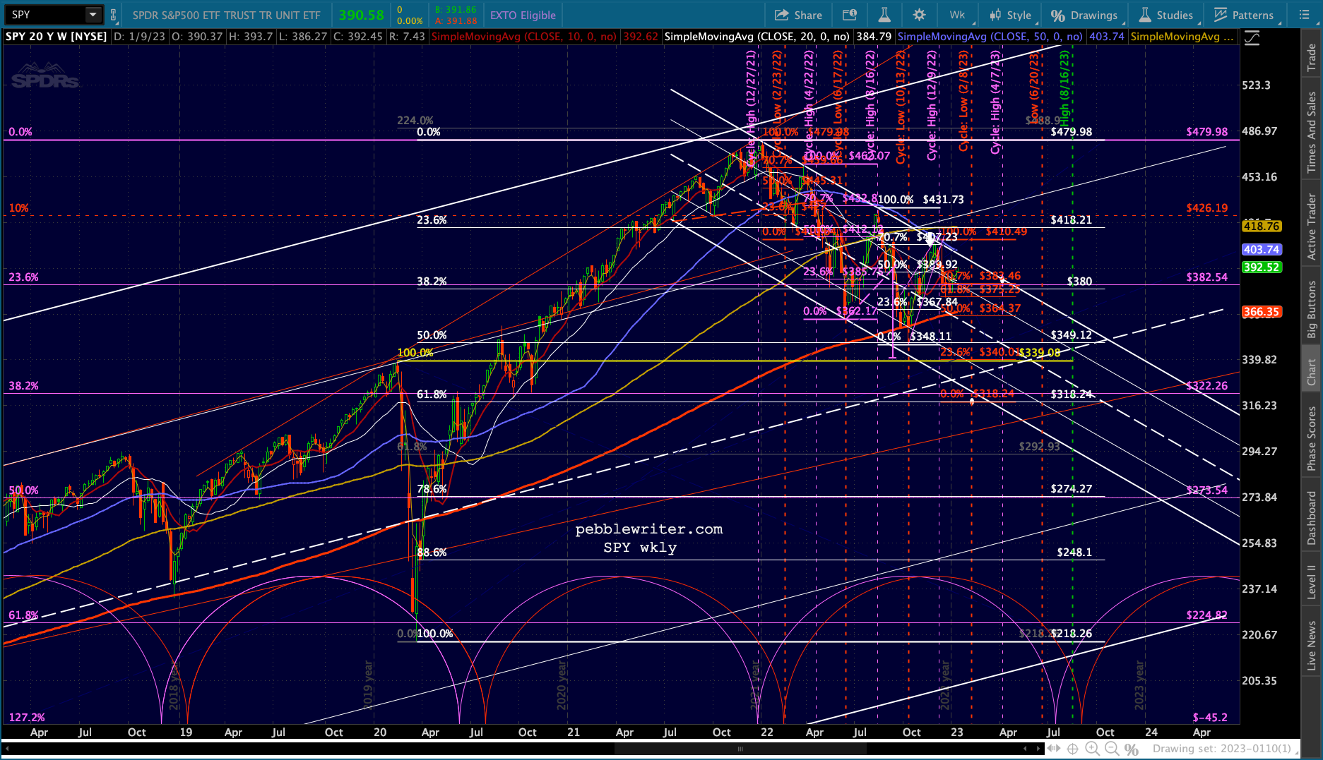
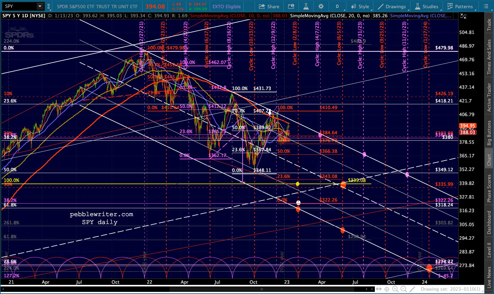
We start with SPY, the ETF which tracks the S&P 500. What if I were to tell you that the significant lows during the year were all 80 sessions apart from one another? And, what if the bounces from those lows each retraced 71% of the recent drop? And, what if the highs during 2022 were all aligned in a straight line?
You might think it laughable that the market would behave so predictably. Yet, that’s exactly what happened.
 And, that predictability is what chart patterns and technical analysis is all about.
continued for members…
If we look at each of those Fibonacci grids, we can see that the lows were exactly 80 sessions apart from one another. We show the cycle pattern in red below.
 We can also see that the significant highs were all very close to the midpoints of the cycle lows. We show them below in purple.
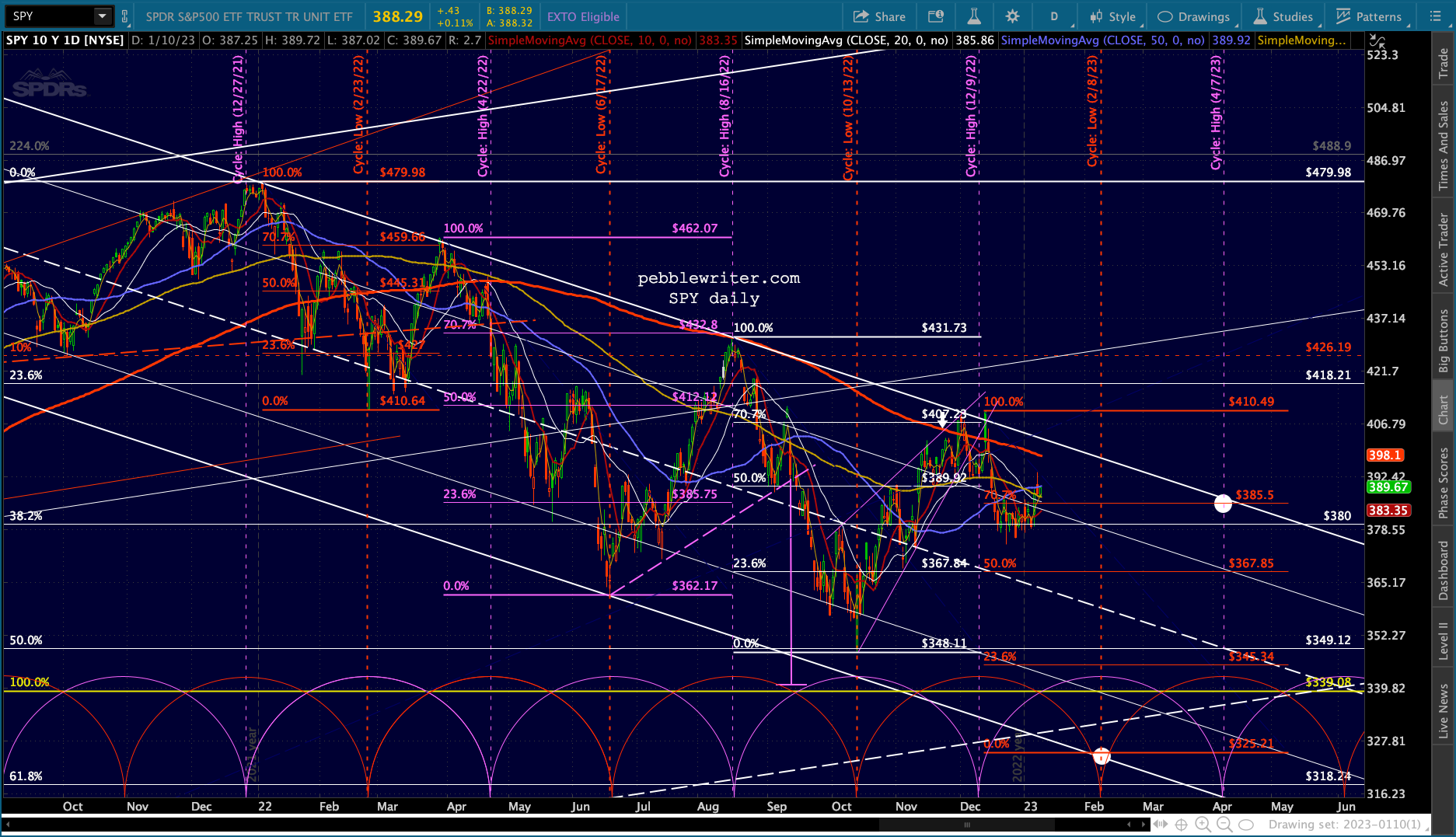 Note that one of them didn’t fit the cycle. The Mar 29 high at 462.07 came well before the pattern indicated on Apr 22. Yet someone who shorted on Apr 21 when SPY backtested its SMA200 would still have done quite well.
Speaking of moving averages, note that the Aug 16 and Dec 13 highs also backtested the SMA200.
The placement of the next grid is obviously uncertain. But, if the 410.49 high on Dec 13 holds, then a drop to roughly 325.21 (presumably around Feb 7) would put the 70.7% retracement back at the channel top by the time of the next cycle high around Apr 7.
A drop a little further, to the white .618 at 318.24, would put the .707 Fib at 383.46, still within striking distance of the white channel top.
 The white .618, by the way, would mean a drop below the 2020 highs – a level of support we’ve discussed many times in the past. From a psychological standpoint, it essentially represents putting the pandemic behind us.
 From a charting standpoint, it might be more appealing to the bulls were it to be delayed until May 2023. But, that depends on how you draw the white channel from the 2009 lows.
If we insist that the Feb 2020 highs bump up against the channel’s .786 line instead of the Jan 2022 highs reaching the channel top, then the white midline doesn’t reach the Feb 2020 highs until May. [Note: This alignment is my preference as the alternative produces many more instances of the white channel lines not fitting with turning points.]
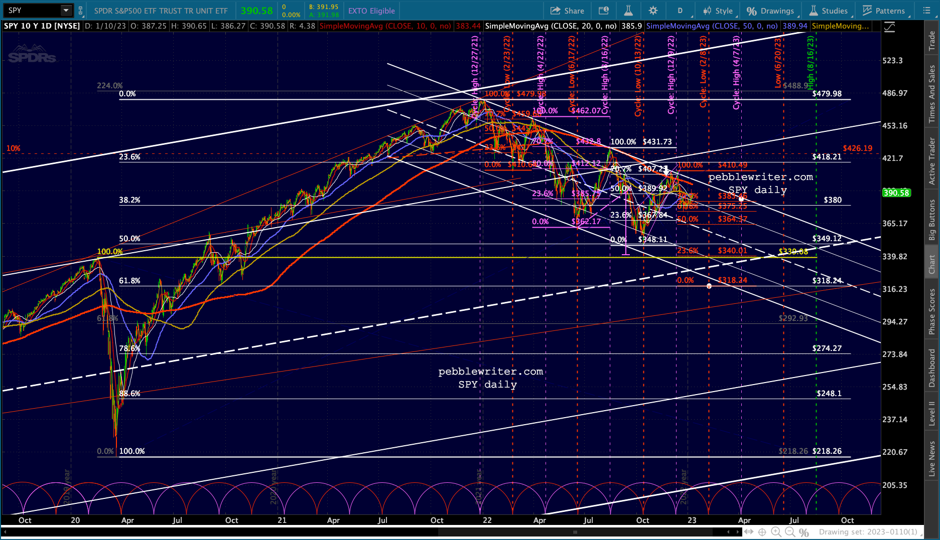
The big picture:
 And, the closeup:
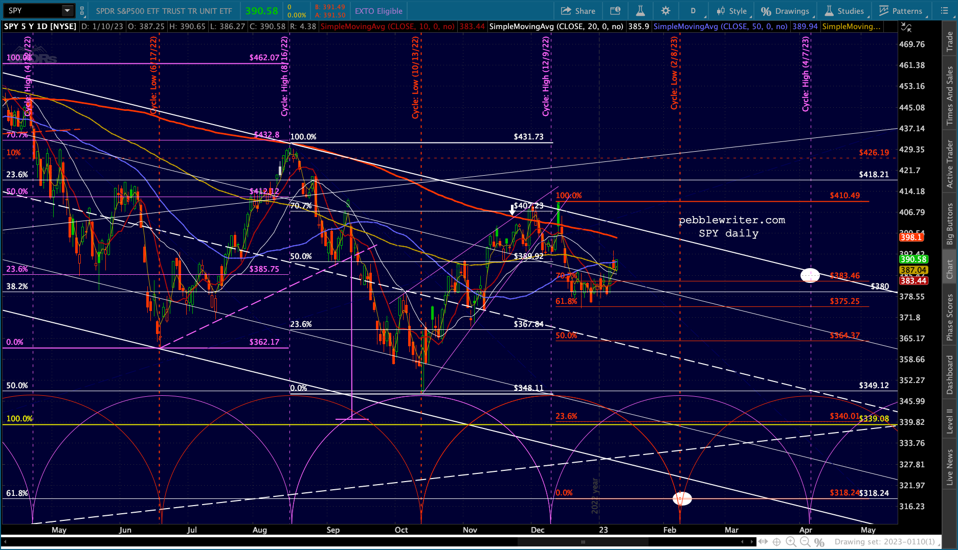
 Without question, the downside target is the most difficult aspect of this forecast. The bottom of the falling white channel (as drawn) was tagged on Jun 17, but the other lows never made it low enough for a tag – reaching a higher channel Fib level in most cases.
The one which reached nothing in particular was the Oct 13 low. It reached the white .500 Fib, but otherwise there was no apparent reason for the bounce other than COMP reaching potentially important Fib support [see: Update on COMP.] In fact, inflation had come in hotter than expected that morning.
Had the reversal not occurred, it seems likely that the plunge seen after the CPI print would have resulted in SPY reaching 339.08. Instead, we got this, which led to a 17.9% rally into the cycle high point.
 As we pointed out the following day, the bounce was the product of the COMP Fib level bounce and VIX reversing back below newly-achieved support. Toss in a little short covering and the fact that OPEX was coming up in a week…
So, although we can see a very clear picture of when the lows might be, there is little clarity about where they’ll be. What if we’re wrong, and there isn’t a big selloff after all? Is there a case to be made for that?
Unfortunately, yes. And, it comes courtesy of the Dow. While SPX and COMP were constructing well-formed falling channels, DJIA broke out of its channel on Nov 10. It sort of backtested the channel top on Dec 16, but hasn’t yet dealt with the SMA200.
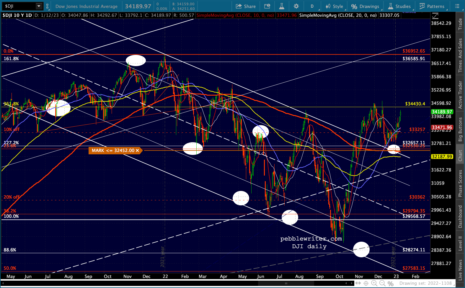 I would be surprised if it didn’t even backtest the SMA200 – which would mean a backtest of the channel top as well. If it does backtest both, that be a great place for TPTB to take a stand.
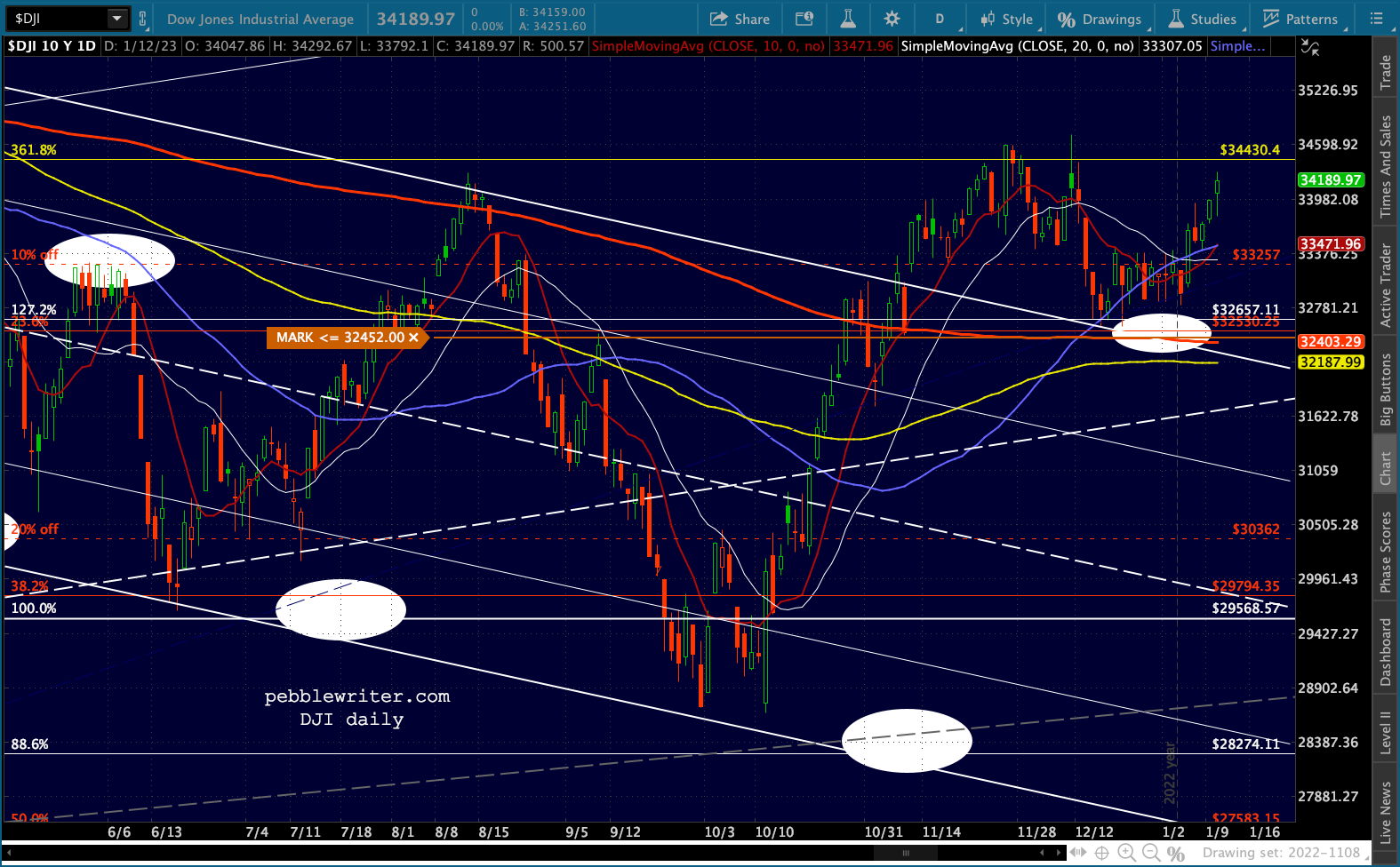 As of the morning of Jan 13, that would mean a 5.22% drop. A 5.22% drop in SPX would be about 3775 for SPX and in COMP would mean 10,427. Neither of those levels would align with anything significant that I can see. So, such a drop – if it were to materialize – would be another of those that terminates/rebounds at a nonsensical price.
I have no love for the Dow – a sham index with very little legitimacy. However, it has a following, especially among retail investors. It shows up in the Journal, Bloomberg and CNBC. So, as discussed above, it often matters even though it shouldn’t.
If the market sells off as we expect, keep a very close eye on the Dow’s SMA200 – currently at 32,403 to make sure it doesn’t come to the rescue.
COMP, by the way, tells a very different story from the Dow. The channel top has been clear, but it couldn’t even make it back to the channel top, let alone break out in November.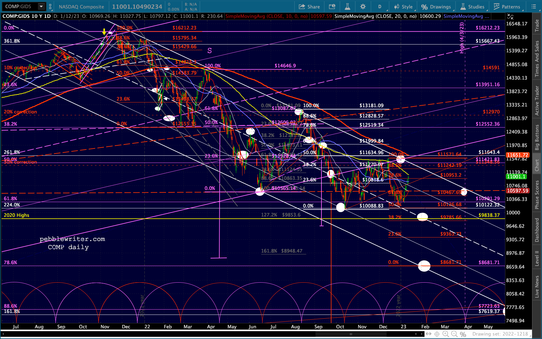 Unlike SPX, it has typically rebounded only to about the .618 instead of the .707 Fib. If we place the red .618 at the top of the falling white channel on what would presumably the next high (around Apr 3) it would mean a drop from here to 8681.71 (also the purple .886) of 21.3%, followed by a rebound to 10467 of 20.6%.
The equivalent in SPX would be 3134, roughly where the white .618 is in the SPY chart below. Since COMP and SPY are roughly in line with one another, I tend to give their charts more credence. But, I would still be quite cautious in taking a bearish position due to the DJIA problem noted above.
 I’ll continue to work on these charts over the weekend. Next up: currencies and commodities.
Currencies
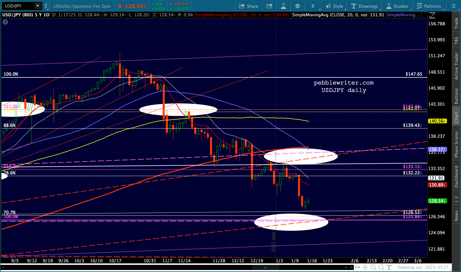
The USDJPY broke out of a long-term channel and completed two large Inverted Head & Shoulders patterns last year: shown below with red and purple necklines.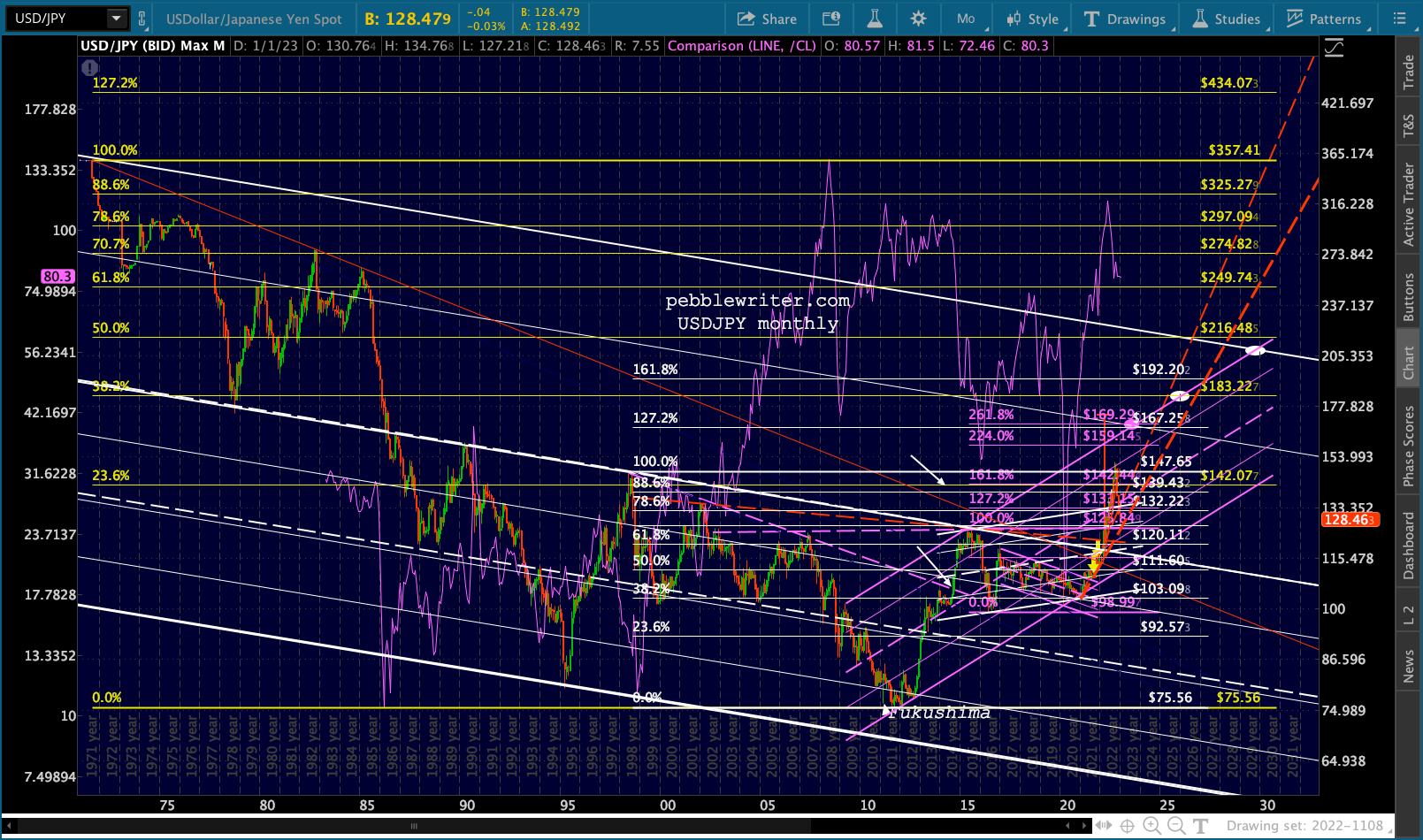 It seemed as though USDJPY would have little trouble reaching at least the IH&S target at 173.25, especially after topping the 1998 highs. But, the narrative of a well-controlled JGB market (which the BOJ now owns the majority of) started to crack as the oil price rally was supercharged by the yen’s drop and inflation started to soar.
 As occurred in 2014-2015, it became apparent that the yen’s plunge had to be arrested — unless oil prices plunged. And, that’s exactly what happened. USDJPY finally came back to backtest the purple neckline and the Jun 2015 highs, somewhat on a TL with the 2021 lows.
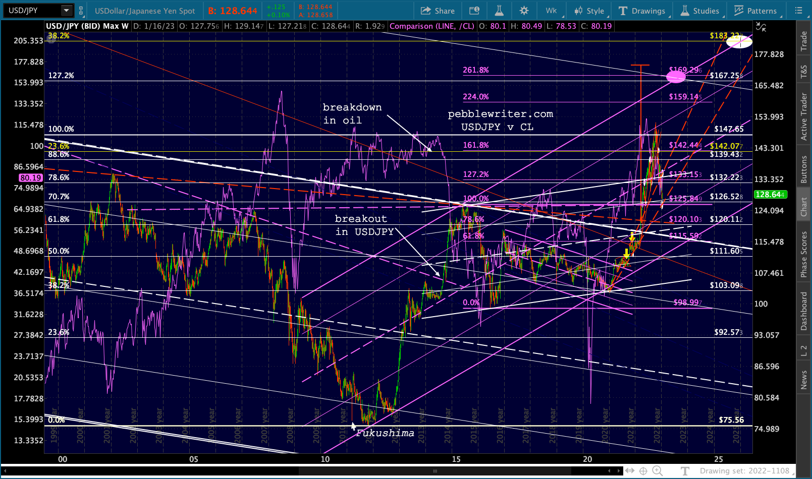 As a result, USDJPY is now at a critical point of support.
 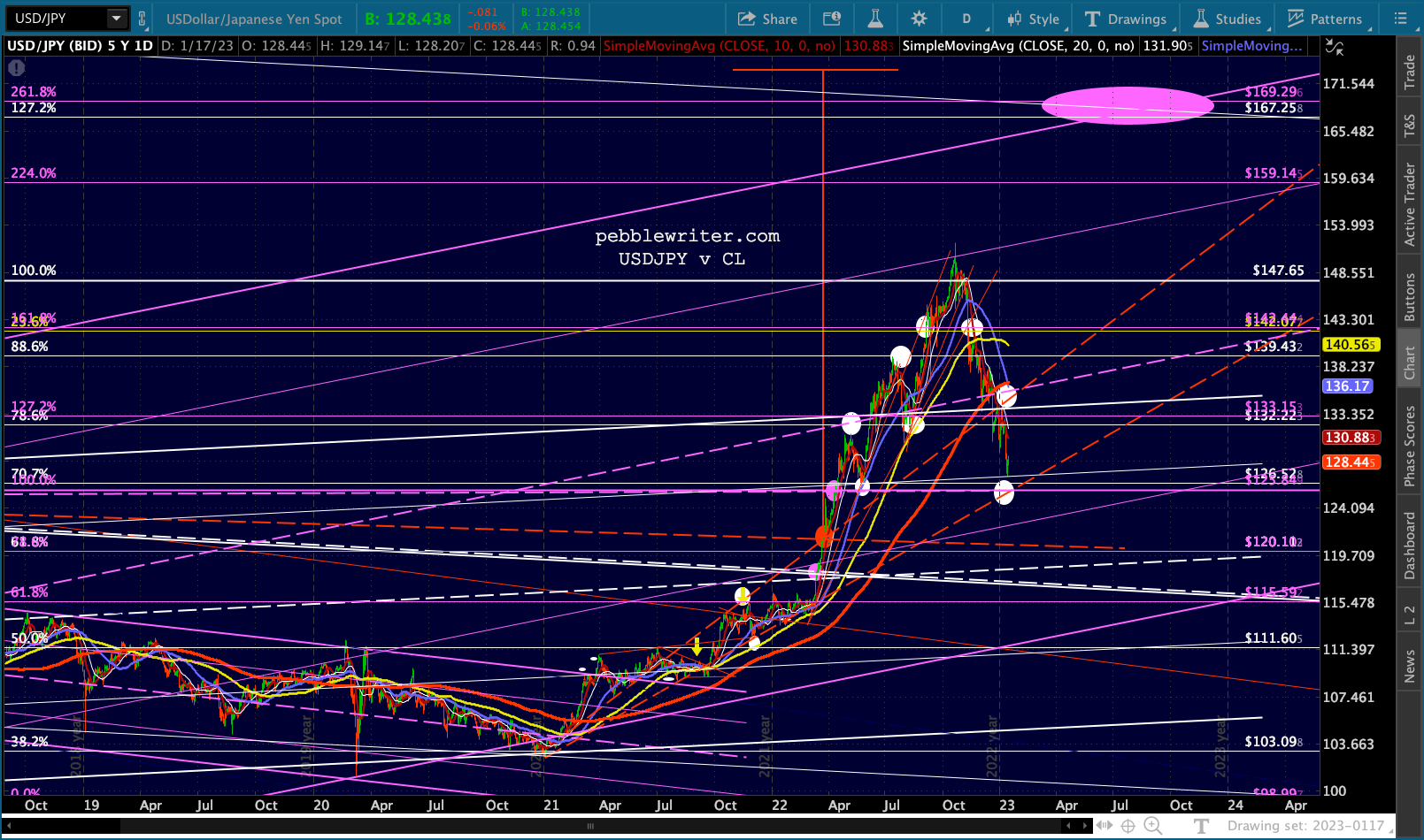 Unlike almost every other central bank, the BOJ has continued to rely on yield curve control (YCC) to put a cap on 10Y rates – raising it recently from 0.25% to 0.50%.
But, when inflation is 4%, 0.50% interest rates seem positively ludicrous. Governor Kuroda will leave his post in April, leaving the future of Japan’s monetary manipulation very much up in the air.
It’s no secret (at least to our members) that currency manipulation has been a central tenet of Japan’s efforts to prop up the Nikkei. Like the Dow, the NKD recently broke out of what was a pretty well-formed channel. At its current level, it has the ability to drop back to the 2020 highs without doing too much damage. A drop to the white .500 would take it all the way to the rising white channel bottom.
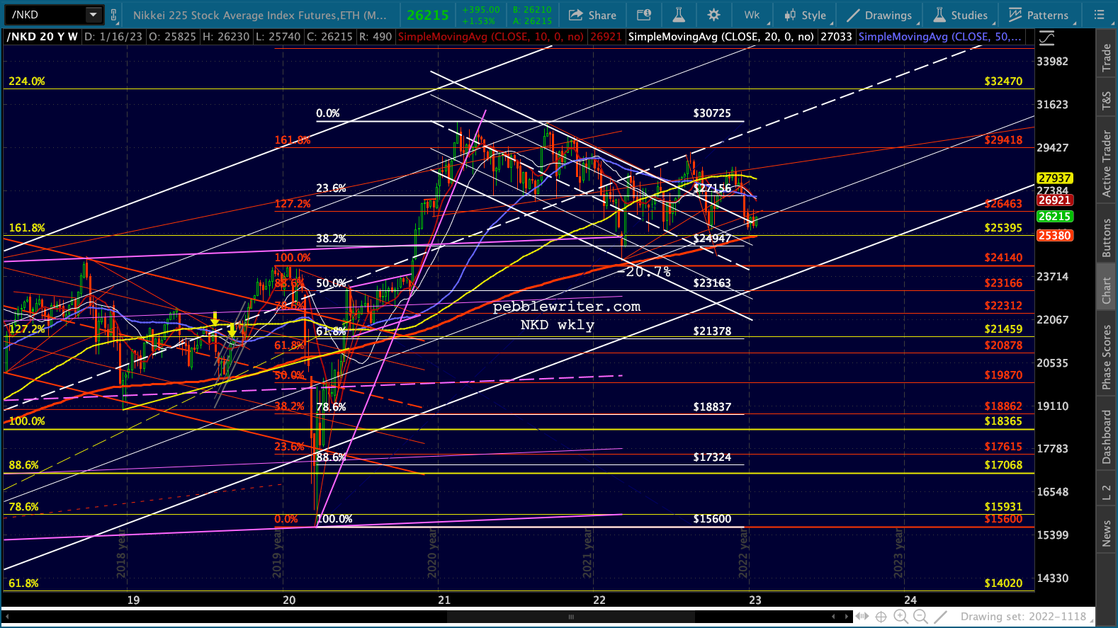 Will it happen? We should know very soon, as the NKD is on the brink of a death cross this morning.
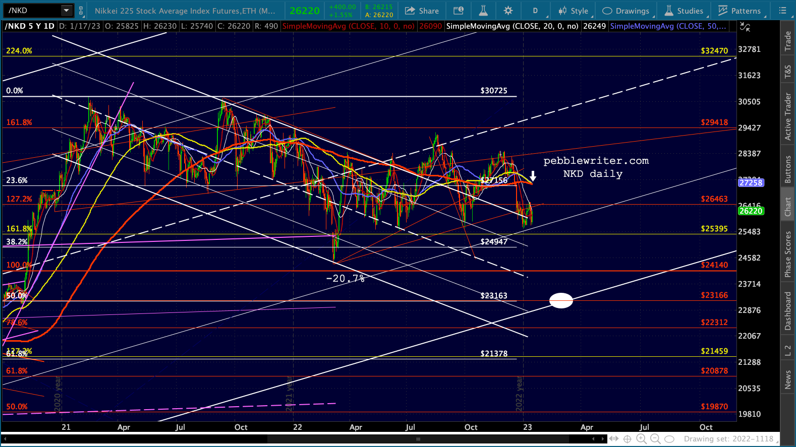 The next lower support would be the yellow 1.272 and white .618 at 21378-21459, which would give USDJPY even more room to correct.
If the idea of a death cross seems overly dramatic, note that the USDJPY also faces one.
 While I would never put it past the BOJ to ignore reality and artificially suppress rates, it seems more likely that they’ll at least let rates drift higher over the short run – particularly if oil prices don’t drop even lower.
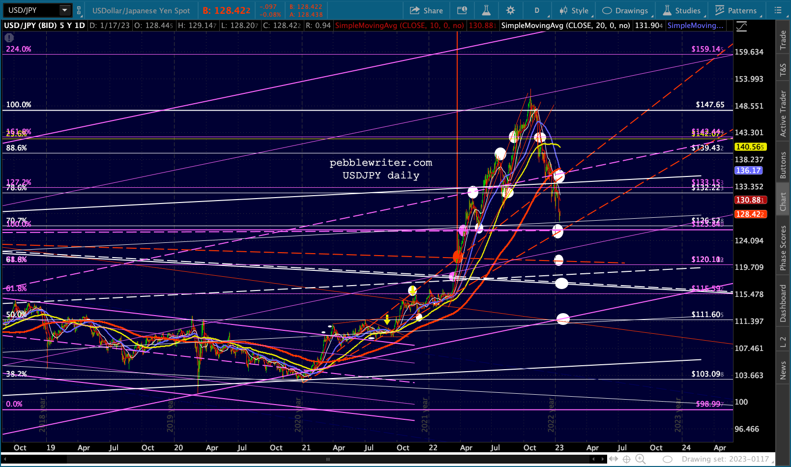 It’s safe to say this would be bearish for stocks as well. If, on the other hand, the backtests hold, then the IH&S target of 173.25 is still in force.
EURUSD was a very reliable short for the past 1 1/2 years, tumbling in a steeply falling channel through multiple levels of support. Upon completing a Crab Pattern at the white 1.618 in Sep 2022, it began to rebound sharply.
A common target for a completed Crab pattern is the .618, which in this case is at 1.1285. But, to get there, EURUSD would have to push through some important resistance.
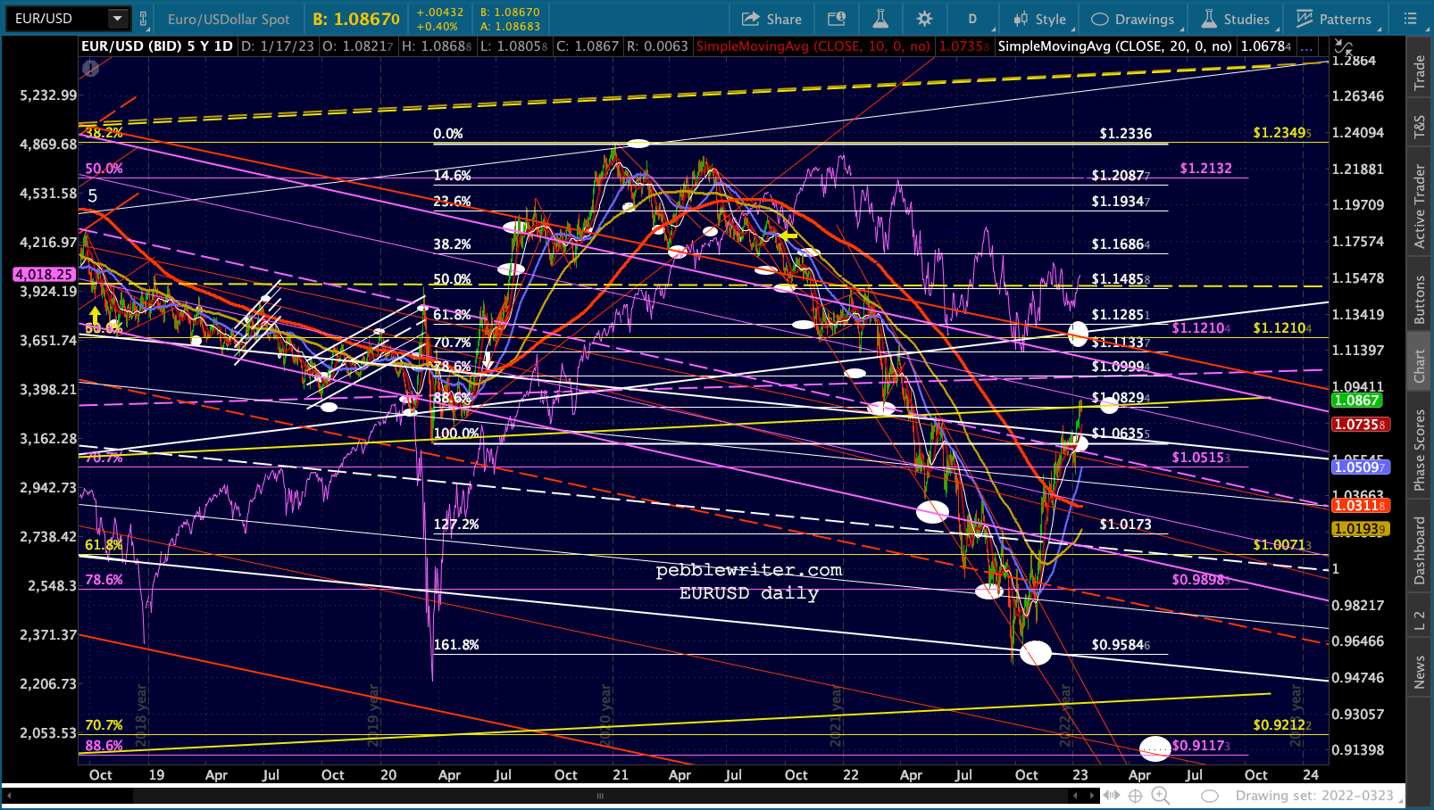 The most important is the yellow channel .236 line. EURUSD bounced off it several times in 2015, 2016 and 2020 before finally plunging below it in 2022. This latest rally represents a backtest.
  If the .236 holds, then the channel bottom is down at 93.6ish, with our long-term targets of .9117 (the puprle .886) and the yellow .786 at .8449 if the channel doesn’t hold. If the .236 doesn’t hold, then
The fundamental picture for EURUSD is incredibly tricky. To correctly forecast it, you must know what the ECB intends to do, of course, but also what to expect from the Ukraine invasion, the eurozone weather over the winter, the Fed’s intentions, OPEC’s intentions, etc.
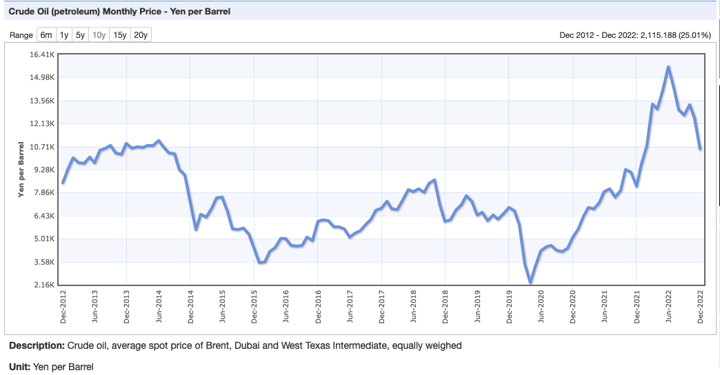
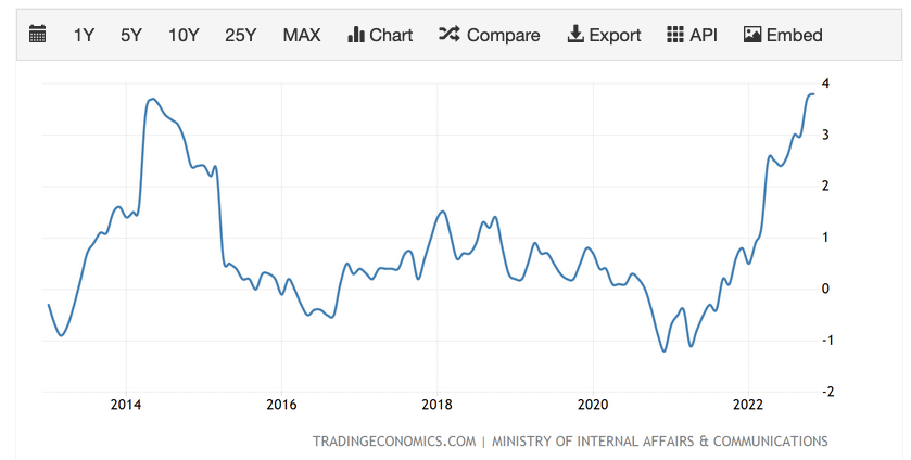
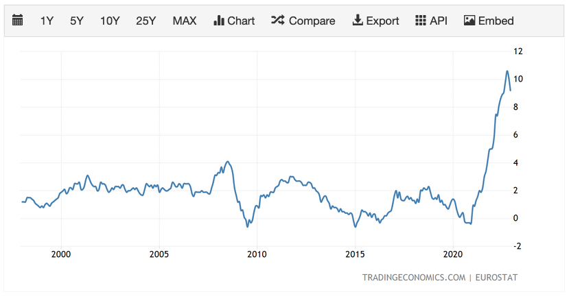
Setting aside the Ukraine situation, the most important element is the price of oil. As the euro drops, oil (priced in USD) becomes more expensive. So, the recent rally in EURUSD (euro strength) helps offset the high price of imported fuel…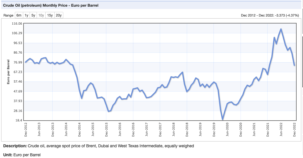 …allowing inflation to reverse recently from 10.6% in October to 9.2% in December. If the weather continues to be unseasonably warm across the continent, the impact of high oil prices will be diminished further and a rise in the value of the euro would be less necessary to maintain the economic status quo.
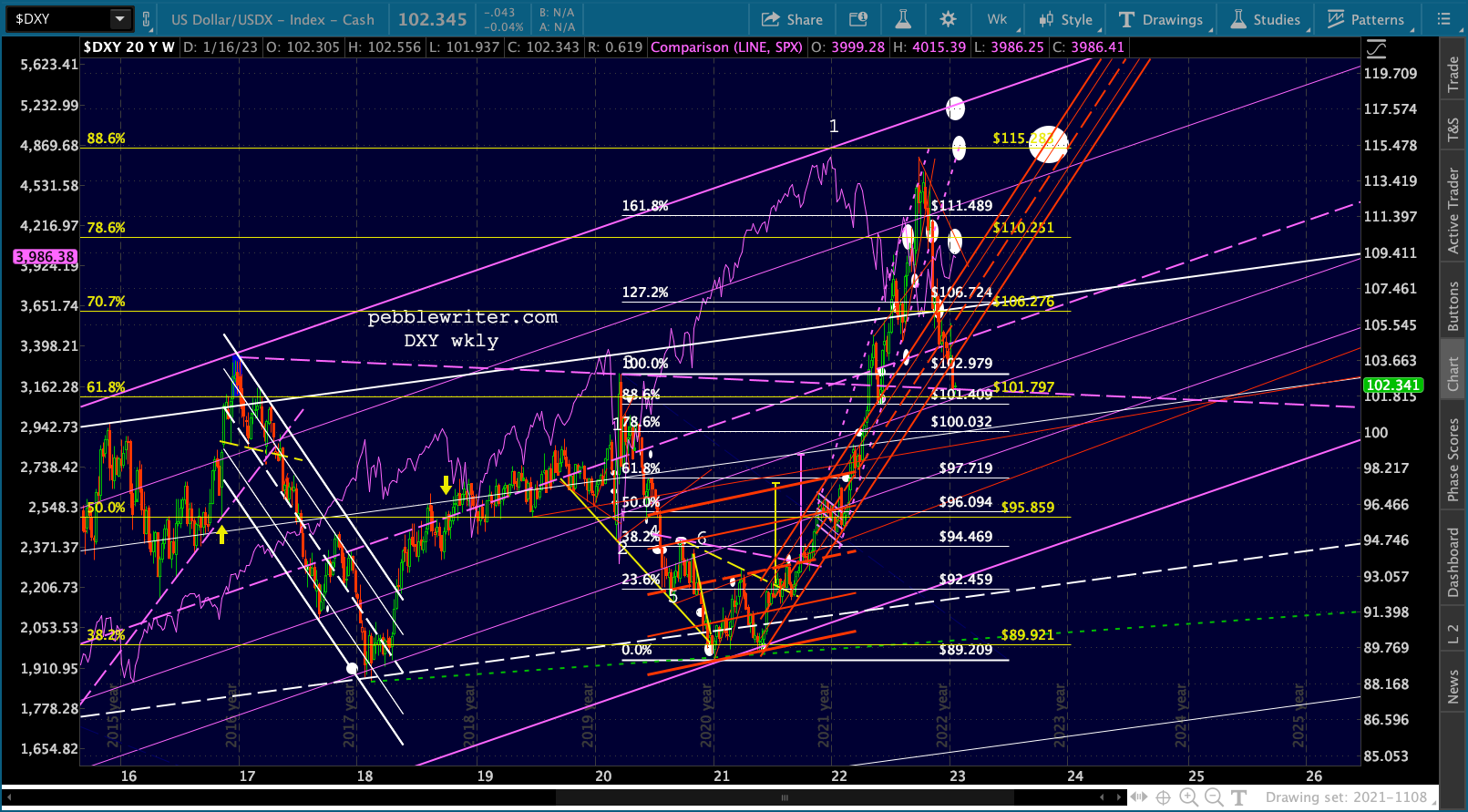
 As we discussed previously, DXY is backtesting important support: the TL connecting the 2016 and 2020 highs as well as the yellow .618 at 101.797.
 As the central bank with the most influence over the global economy, the Fed needs to retain some control over inflation. Over the past year, it has shown little to no abilityto convince OPEC+ to willingly lower oil prices to allow inflation to moderate back to 2% – at which point the rapid rise in debt and debt service expense might be manageable.
As a result, a serious drop in the value of the USD is not an option. The Fed might not be able to manipulate the price of oil, rent, wages, etc. But, we can be reasonably sure they can and will manipulate currencies. As long as CPI is too high, DXY will not be allowed to implode.
From a charting standpoint, it’s tricky. It broke out of the steeply rising red channel, then broke back down through it to a TL connecting the two most recent highs – also the scene of the white .618 (a normal retreat after a 1.618 tag) and the white channel .382 line (note, the channel colors on DXY have been switched going forward to accentuate the one which wasn’t broken out of.)
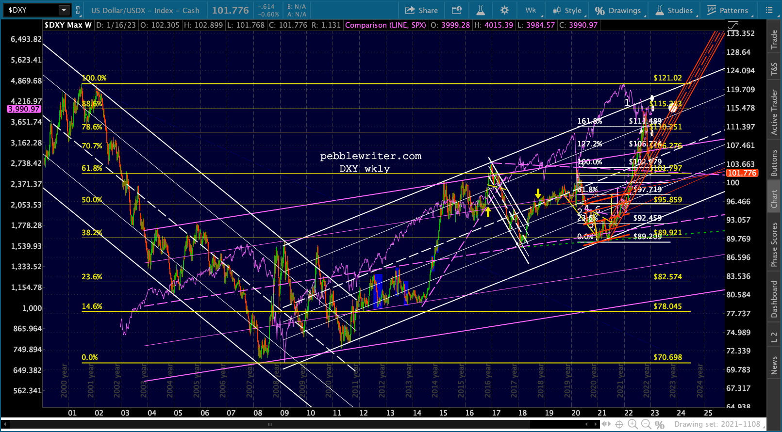 If the equity cycle continues and SPX is about to plunge 15% or so, then a strong rebound in DXY and plunge in EURUSD will begin no later than Jan 23. If it doesn’t, then DXY’s next support is the .886 at 101.409, followed by the .786 at 100.032 and the .618 at 97.719. But, it’s hard to imagine the Fed allowing that to happen until inflation is licked.
 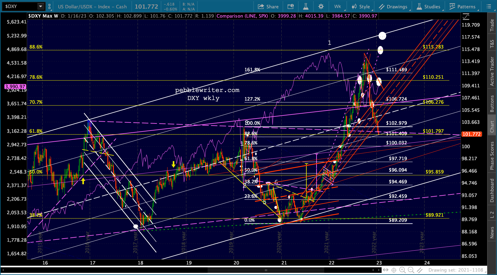 Gold and silver have been on a tear since breaking out of falling channels in November. What might have been a run for the year-end barn for all risk assets has persisted into the middle of January, taking GC past the ample resistance of its 200-week moving average as well as numerous channel and Fib lines.
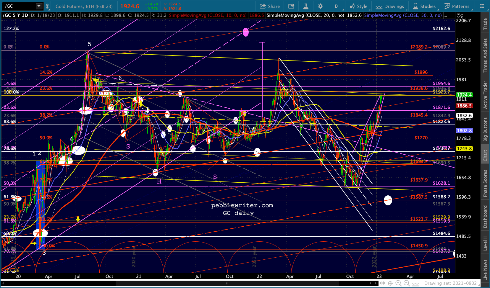
The reality is that GC has been notoriously difficult to chart with channels and only slightly easier with harmonic patterns. Many channels have started off looking very good, only to suddenly break down or out. The one constant this past several years is that GC hasn’t been able to push past and remain above its 2011 highs despite historically high inflation.
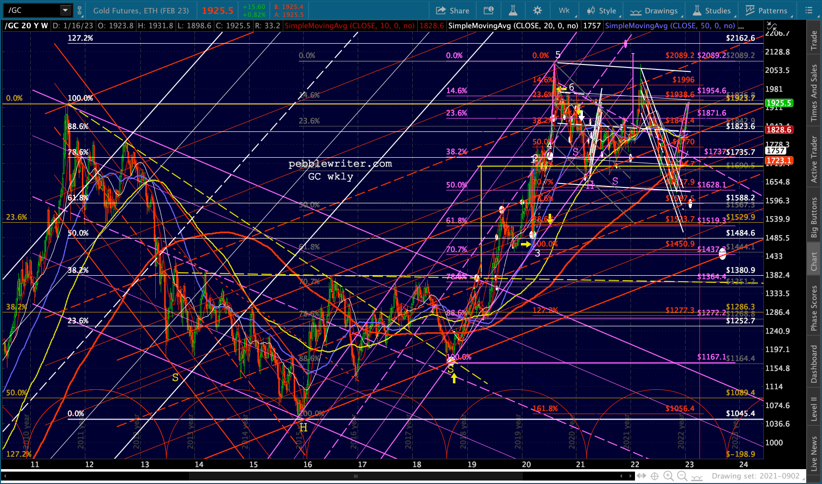 I have always believed that TPTB don’t want it to ever become a significant threat to paper money. Between that, its naturally low correlation with USD, and its high correlation with equities, it has mounted two failed efforts to break out – with neither one lasting longer than a few months. The reversals, however, have been limited to the bottom of the yellow flag pattern shown below.
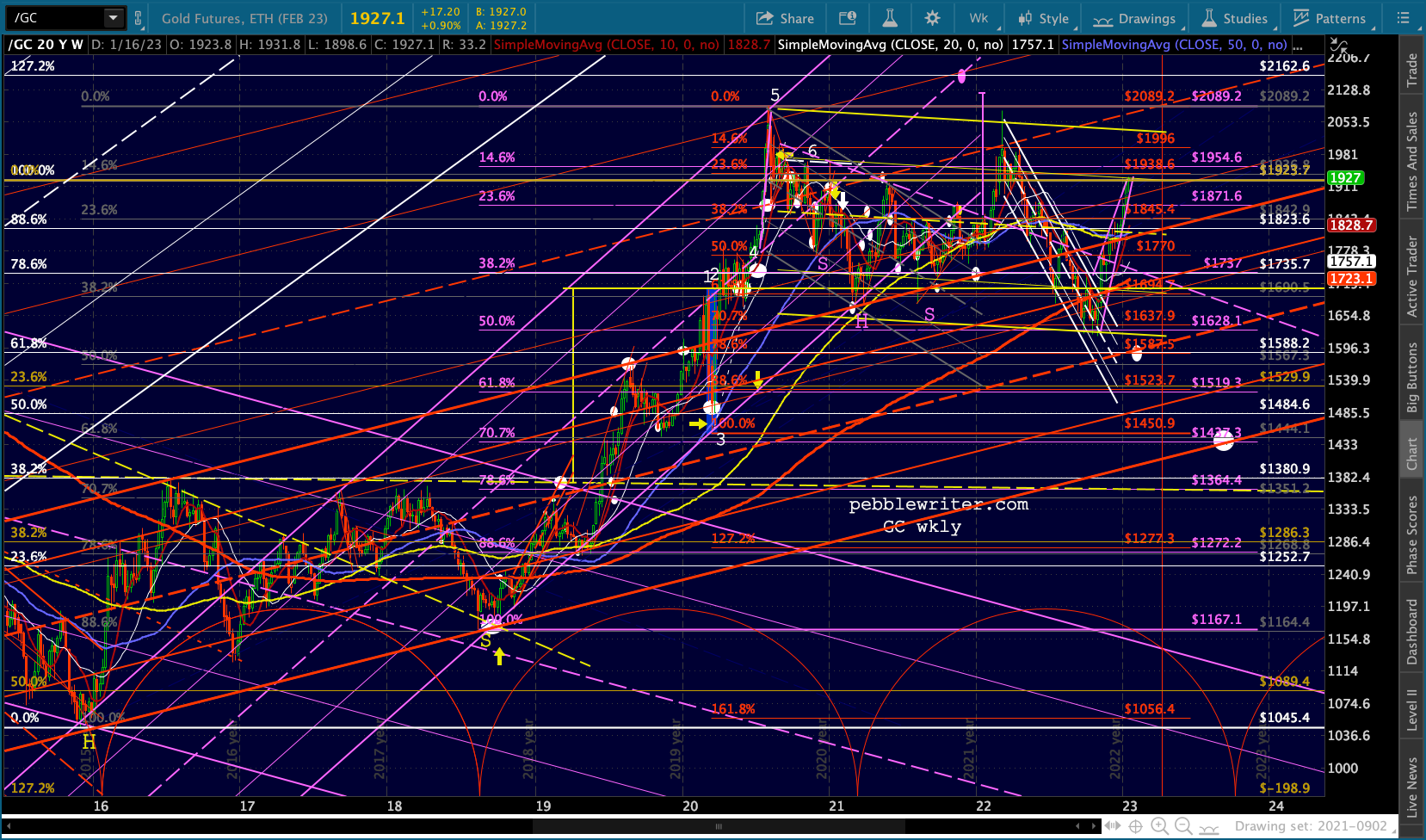 The result has been a widely fluctuating flag pattern that has made only slightly lower lows and slightly lower highs which suggests GC will remain in a trading range of 1600-1924 for a while.
As of right now, it has formed a rising wedge that terminates at the 2011 highs (1923.70.) If it can push through, it has potential to 2017ish. If not, it could be as low as 1588 in the coming weeks. I have low conviction as to either direction at this point.
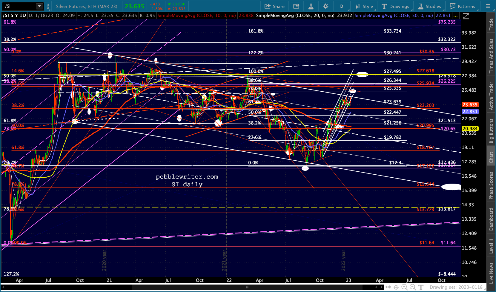
 Silver has been somewhat easier to chart, with the decline since early 2020 taking the form of a falling white channel/flag pattern.
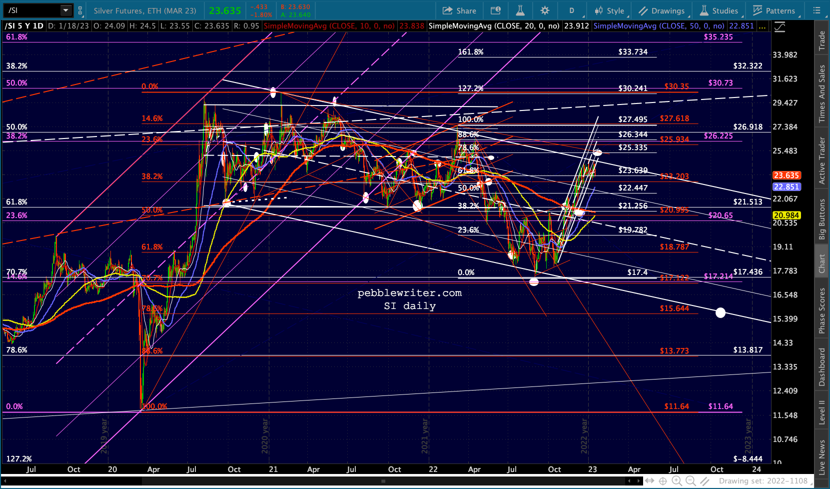 This is a small corrective channel within a much larger rising white channel…
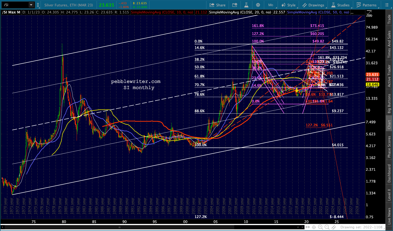 …or, alternatively, a huge flag pattern ranging roughly from 4 to 50.
 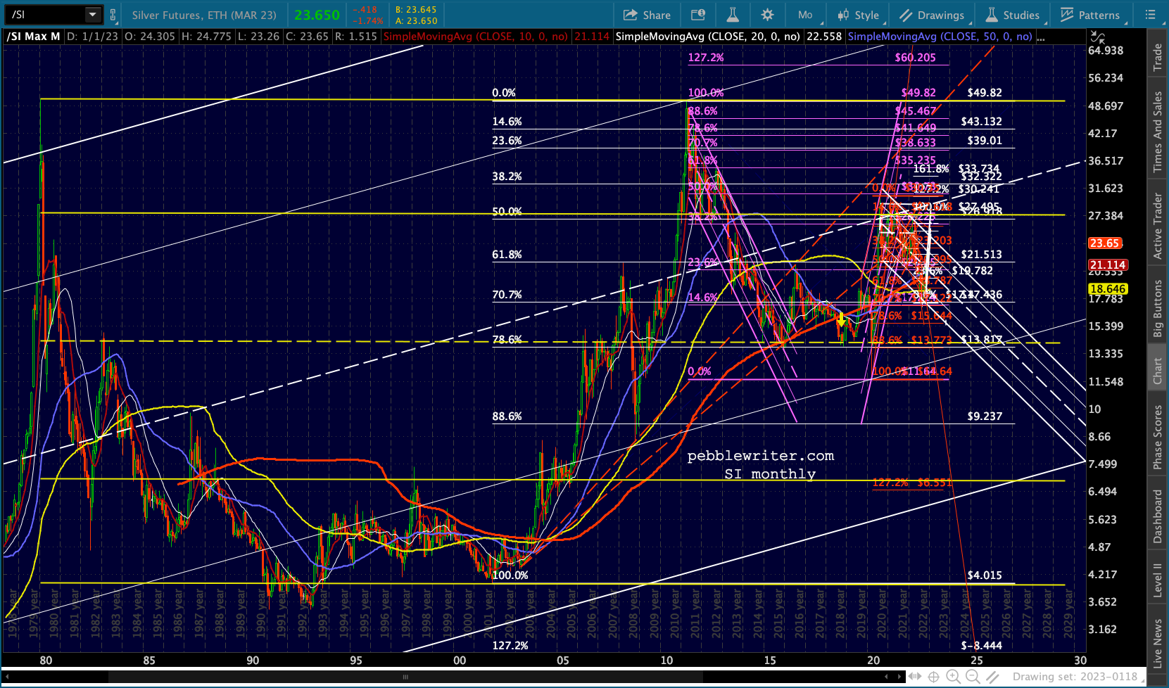 If SI were to fail to break out of the falling white channel (which could range as high as the .786 at 25.34) it could eventually find its way to the white channel .236 line, which interestingly is also the neckline of a gigantic H&S pattern (purple.)
  Focusing on the giant rising white channel, SI has been unable to top its midline. With respect to the yellow flag, it was stopped cold at the .786 line, but held the midline. As such, I expect it will remain in a trading range between 13.77 and 30 for the forseeable future, with a bias toward the lower end of the range unless it can break out of the small white falling channel.
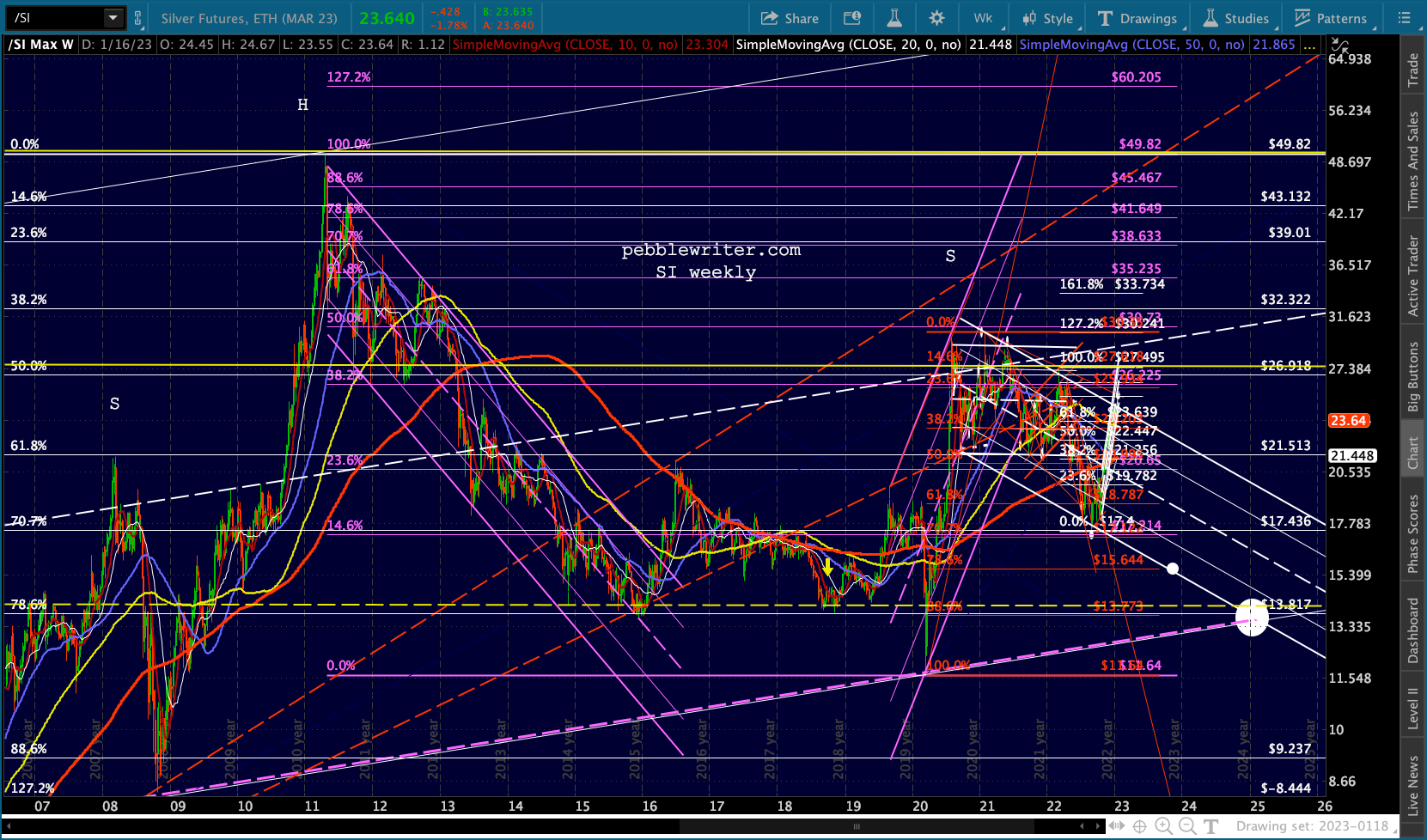 The inability of SI to recoup even 50% of its losses from the April 2011 highs (40.82, with CPI around 3.5%) probably speaks volumes about its upside potential. If it can push through recent highs, it has potential to 25.34 and 27.50.
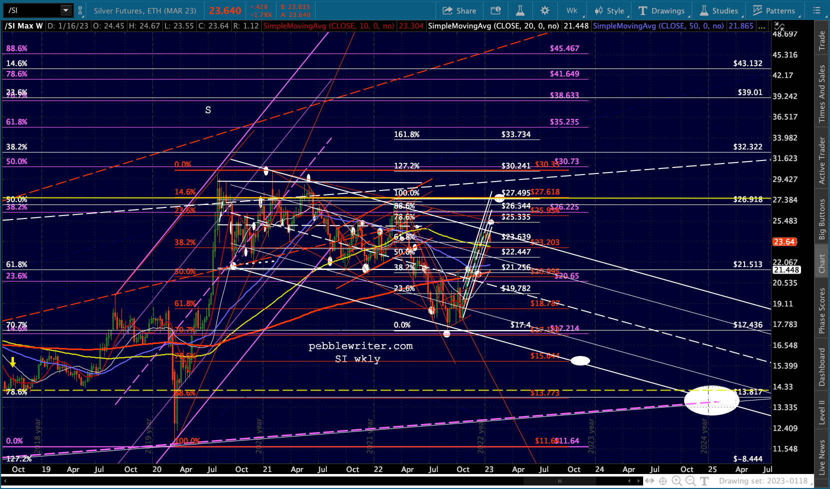 Otherwise, it’s pointed at 15.64 by the end of 2023.
 I’m going to take a break and try to finish this forecast tomorrow. Coming up: oil, gas and the bond market.
Oil and gas are, in my opinion, the most difficult charts to decipher at this point in time. The fundamental question of what to expect is impossible to sort. Will Russia pull out of Ukraine? Will they reenter the global market? Will the rest of OPEC+ be more accommodative? Will COVID surge again this winter? Will China be able to fully reopen or has its reopen simply guaranteed a more horrible COVID outcome?
Since the above questions are so difficult, I fall back on my understanding/belief regarding central bank tendencies: do whatever is necessary to bring inflation back under control with as little damage to the economy as possible. And, do all of that quickly so that the next market meltdown can be muted by a new round of rate cuts and QE.
I also believe there is a very strong likelihood that we’re already in or will soon be in a serious recession. And, if there’s anything the Fed would like even less than strong inflation, it’s stagflation.
With those caveats in place, I offer the following charts. CL is at the bottom of the white channel below and has backtested the large white falling channel.
 If the rising white channel breaks down, the rising purple channel makes sense, offering targets at 62.43 and 53.87 later in 2023. Note that 62.43 would be equal to the Dec 2021 lows and on a TL with Aug and Dec 2021 lows – a potential neckline.
  Taking the same approach for RB, we get the targets 1.88 and 1.61.
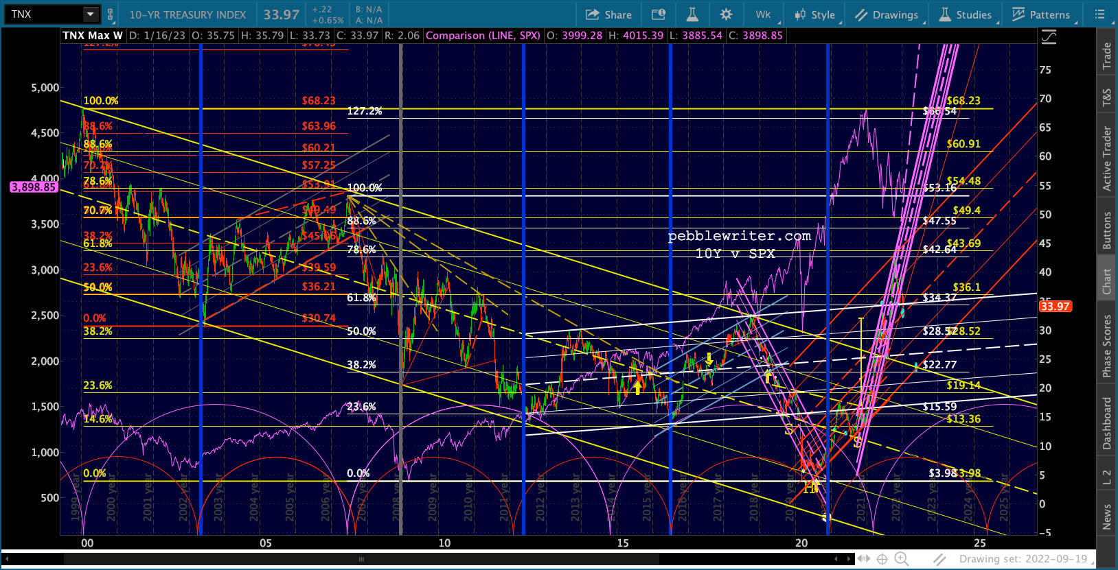
 Now, there’s a reason why those targets might be way off base; and, it involves the 10Y. Our long-time downside target for TNX called for a backtest of the 200-day moving average.
It seems highly likely we’ll get that backtest in the next few days.
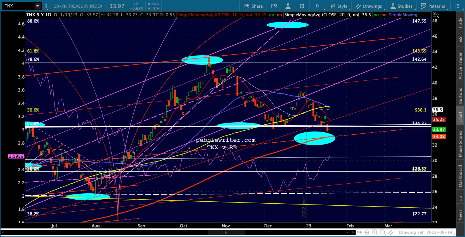 This would also be the midline of the large red channel from 2019.
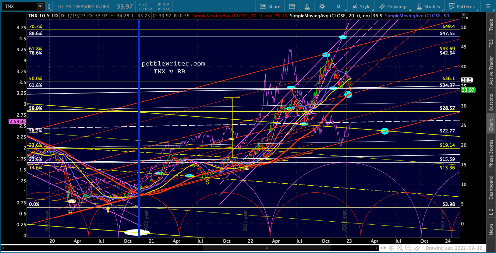 The purple channel already broke down – making the 47.55 target that much harder to achieve. If the Fed is working hard to raise rates to stave off inflation, could we really expect the 10Y to drop another 1.1%? Probably not – though a serious equity swoon from here might do the trick. It’s worked before.
 This is something I’ll be working on for the next few days. In the meantime, back to the daily posts. With any luck, we’ll get some resolution re DJIA and its SMA200 and have a better idea what to expect going forward.
Stay tuned.