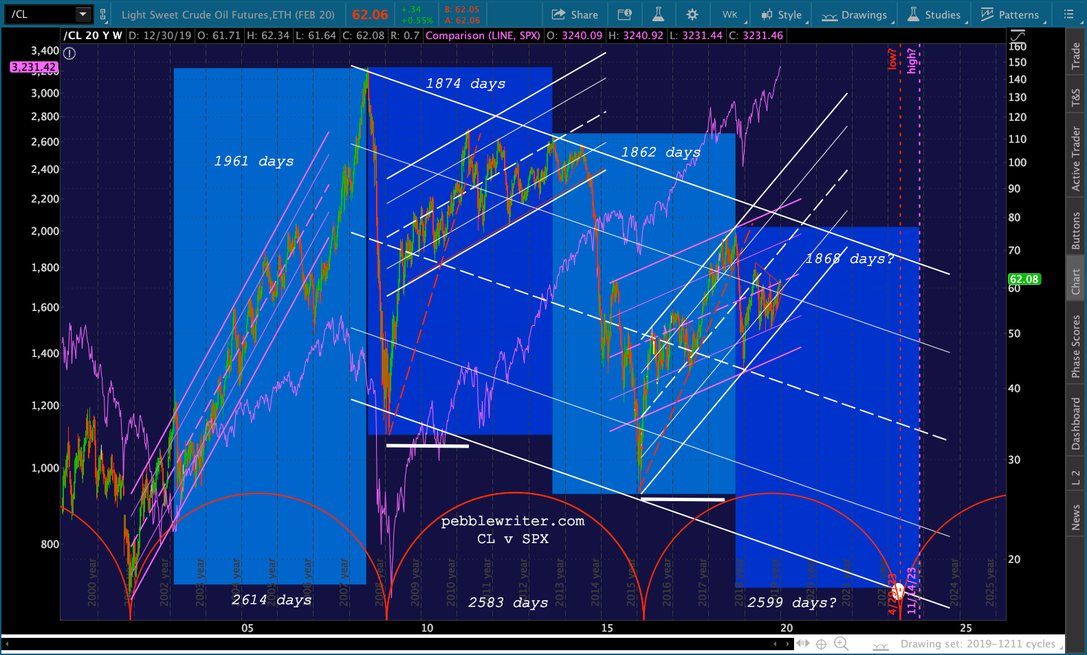
One of the more interesting price cycles I’ve worked on over the years is that of oil. Oil and gas have proven to be lucrative trading vehicles, and their price movements have been extremely helpful in forecasting interest rates, currencies and inflation.
The most fascinating cycle I’ve discovered is the periodic peaks and crashes in WTI. The chart below shows that important highs (highlighted) have occurred like clockwork.
2003 – 2008: 1961 days
2008 – 2013: 1874 days
2013 – 2018: 1862 days
The last three important lows have been just as consistent and illustrate the on-again, off-again correlation between oil prices and equities. [The strong, positive correlation was marred by a significant divergence between June 2014 – Mar 2015.]
The chart begs some very important questions: will the cycle continue and, if so, will equities follow suit?
2001 – 2009: 2614 days
2009 – 2016: 2583 days
2016 – ???
In my opinion, this is the most important chart to watch over the next year or two.
continued for members…
First, a quick update for those following the general markets today… we’re long overdue for some profit taking. ES’ rising white channel should be tested again, with support coming at the red channel midline at 3229 and the SMA10 at 3220.35.
If the SMA10 finally breaks down, the red channel bottom intersects the purple 1.272 and SMA20 at 3177. If it could hold out until Jan 3, it would backtest the broken purple channel top.
 And, USDJPY and VIX indicate there’s plenty of takers. USDJPY is likely to reach at least the SMA200 again. If it doesn’t hold, there’s plenty more downside.
  And VIX is approaching an important line in the sand at the SMA200 at 15.02.
 The view from SPX’s standpoint:
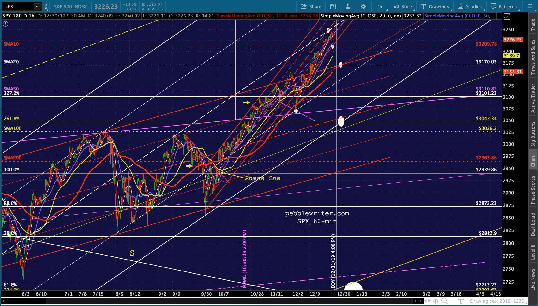 And, the terminal moves presented by CL and RB:

* * *
Now, back to the oil cycle… Note that the cycle lows have all been extreme and very well-defined. The 2009-2016 cycle of 2583 days was 98.8% of the duration of the 2001-2009 cycle.
A third cycle of 2599 days (the average of the two) would end in Apr 29, 2023. If the large falling white channel were to continue working, the price target would be in the neighborhood of 17.50 — very close to the Nov 2001 low of 17.12 which came amidst the 52% crash in SPX between 2000 and 2003.
 The Jan 2009 low of 33.2 was only slightly above the .886 retrace of the incredible 2001 – 2008 rally from 17.12 to 147.27.
 We’ve discussed countless times the reasons SPX why didn’t collapse to the same extent as it had previously when CL plunged in 2014-2015. Bottom line, there was a concerted effort to hold the line at SPX 1823, an important Fib that was backtested many times.
The principle tool was the yen carry trade. USDJPY not only broke out above a long-term trend line from 1998. But, it sliced through multiple important Fib levels, including the .618 at 120.11. Combined with persistent VIX shorting and ongoing heroic monetary expansion, this significantly limited SPX’s decline. USDJPY’s rise was intentional and was designed to prop up stocks in the wake of the Fukushima disaster and the US debt downgrade. Eventually, though, USDJPY could rise no more. Even though the price of oil was plunging, the yen became so cheap that Japan faced inflation issues that could have resulted in much higher interest rates (this was prior to the BoJ essentially cornering the bond market.) CPI reached nearly 4%…
 …which, if interest rates hadn’t dropped further…
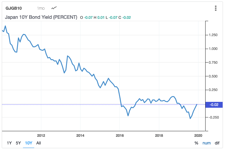 …would have combined with Japan’s soaring debt to produce untenable debt:GDP. It has leveled off around “only” 240% only because interest rates have been held at or near negative levels.
 It seemed as though the “Japan problem” was solved — at least as long as interest rates could be held at or below zero and inflation could be kept in check by controlling oil and gas prices.
It was a lesson that the US would need to learn as US interest rates crept above 3% while debt was rapidly expanding in 2018… 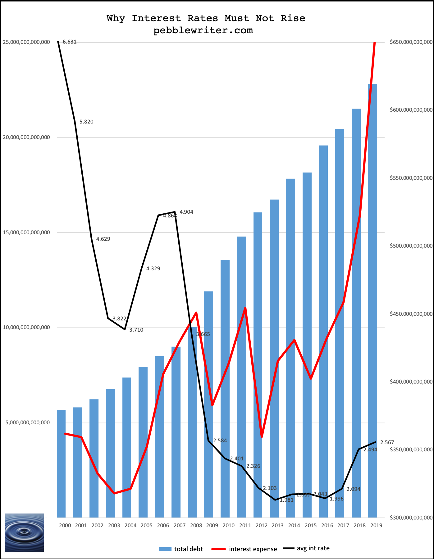 …all in the midst of rising inflation* caused by rising oil and gas prices. The chart below shows YoY moves in each.
 A close-up:
 Of course, rising CPI resulted in higher interest rates. But, as CPI came back down, interest rates also fell.
  If we examine a closeup, we can see that the 10Y crept above 3% last year when CPI nearly reached 3%.
  And, if we zoom in on the 10Y, we can see that it recently broke out above a TL dating back to last 2018.
 This wouldn’t be a big deal with a $5 trillion debt, but it’s a very big deal with debt in excess of $22 trillion.
The chart below shows interest expense and the debt. Fortunately, interest expense hasn’t risen as quickly as debt. The inherent lag combined with falling rates has moderated the effect.
 But, what if rates break higher again, driven by rising oil and gas prices?
The only way to prevent it is to slash CPI. And, aside from the numerous games being played, the simplest way to slash CPI was to slash oil prices.  A close-up:
 This brings us back to our chart – the most important chart. Is there an argument for a much lower low in 2023? I believe that there is.
Below, I’ve highlighted those significant lows which have occurred since the beginning of the 2000-2003 crash. For you skeptics (which I always welcome) who might be wondering, I don’t go back any further because I think things fundamentally changed after the tech crash. It had been a long time since the last truly scary decline in 1987, and the tech crash woke central bankers to the fact that markets needed their intervention.
 Let’s set aside for the moment the much-debated fundamental aspects: war in the Middle East, the rise of hybrid and electric vehicles, etc.
The very obvious need for lower interest rates and therefore lower inflation requires that oil and gas prices continue to fall.
To be continued…
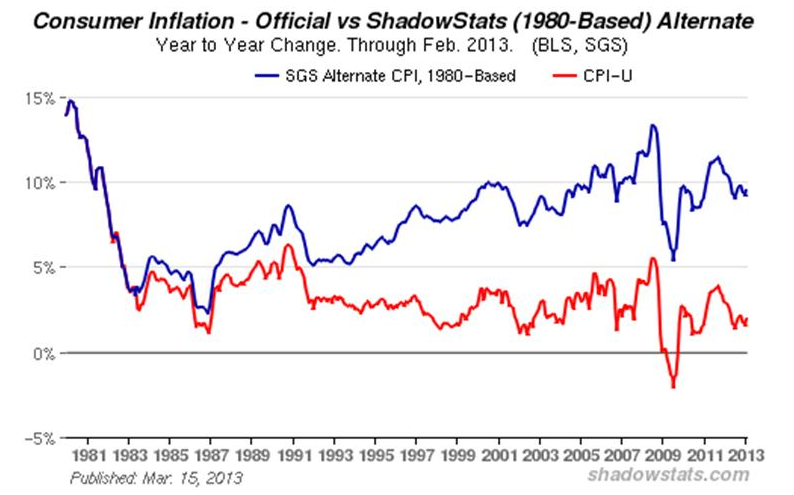
* The correlation between oil, inflation and interest rates has been there for ages. But, understand that CPI is completely bogus. For details, see John Williams excellent study on ShadowStats.com.