
A little over a month ago, we wrote that crude light (CL) had reached a two month-old target and what appeared to be a potential buying opportunity: the intersection of a key Fibonacci level and a long-term channel bottom.
We were pleased with that call…until the rebound ran out of gas only a day later.
Some say the continued decline is Saudi Arabia’s way of bringing US shale growth to a screeching halt. Others suspect that it’s the US government at work, tanking Russia’s oil-dependent economy. It’s also possible that that chart, for all its symmetrical beauty, was drawn in the wrong scale. I’ll explain.
I chart just about everything in logarithmic scale — particularly those charts that span a long period of time and contain large swings in price. But, once in a while — for no particular reason — an arithmetic chart just makes more sense.
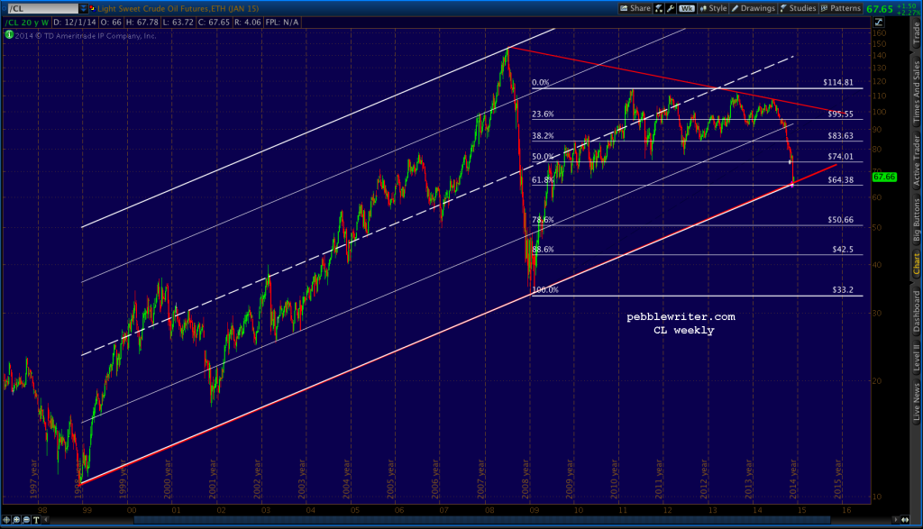
Here’s the updated chart in logarithmic scale in all its channel-busting ugliness.
 Switching to arithmetic scale, it’s obvious that the white channel doesn’t even belong. Before clicking back to that cat video, though, check out the alignment of the 1998, 2001 and 2009 lows — connected here by the yellow dotted trend line.
 A trend line that goes back that far is certainly subject to placement error (to use the tails or not?) But, simply connecting the Dec 12, 1998 and Jan 15, 2009 lows puts that TL at about 45-46 — a couple of points below today’s low — and, not too far from the white .786 Fib.
Does it matter? We’ll find out in the next few days. If nothing else, it’s a good reminder to check out the alternative view from time to time. A casual perusal of the blogosphere reveals plenty of folks who chart arithmetically. Maybe this is one of those times when log scale wasn’t the best choice.
Suppose CL drops below 46. What then?
We discussed the bleak channel and TL standpoint. From a price Fibonacci standpoint, the next major support is another 13% lower — the white .886 at 41.49. A time Fibonacci chart shows that the June 2014 highs (the red 1.618) were right in line with the major low in 1998 and high in 2008. In other words…also bearish.

And, it’s probably not too crazy to start talking about the purple Fib lines. If the 2009 low of 32.34 is broken, the purple .886 at 26.13 is pretty much the last line of defense until the 10.65 lows from the (drumroll, please) Last Century.
Regardless of whether one looks at log or arith charts, the strong positive correlation between oil and stocks (SPX, in purple below) over the past 20 years is obvious. It broke down this past year when stocks decoupled from, well… just about everything.
But, given the level of financial institution involvement with the oil industry ($550 billion in bonds and loans since 2010), it’s probably safe to say that a continued slide in oil can’t help but leave a mark.
 Stay tuned.